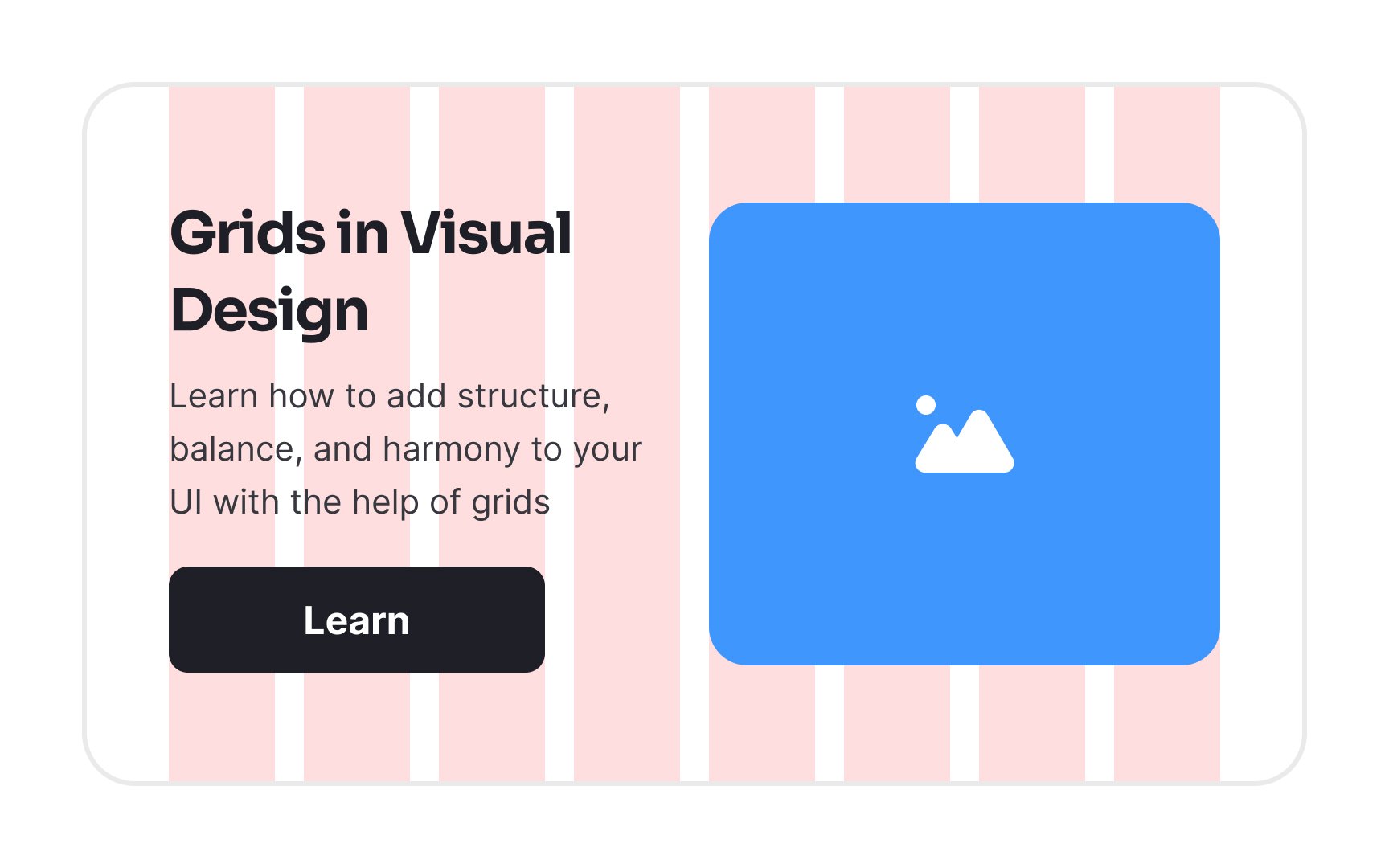
Intro to Design Grids
Discover the different types of grids and how they can be used to craft your design layout
Grids are one of the fundamental building blocks of a well-structured, organized design. They lend order to every other element in your design and guide you through creating a layout. Think of grids as guidelines for creating your layout.
Understanding how the grid works is key to creating dynamic UI and a better user experience. On the other hand, gridless designs can feel disordered, confusing, and cluttered.
In digital design, the
Grids help designers align and structure content consistently throughout the project. With the help of design format properties (like golden ratio or active zones), grids maintain balance from page to page, enhance the visual hierarchy, and create focal points to guide user attention.
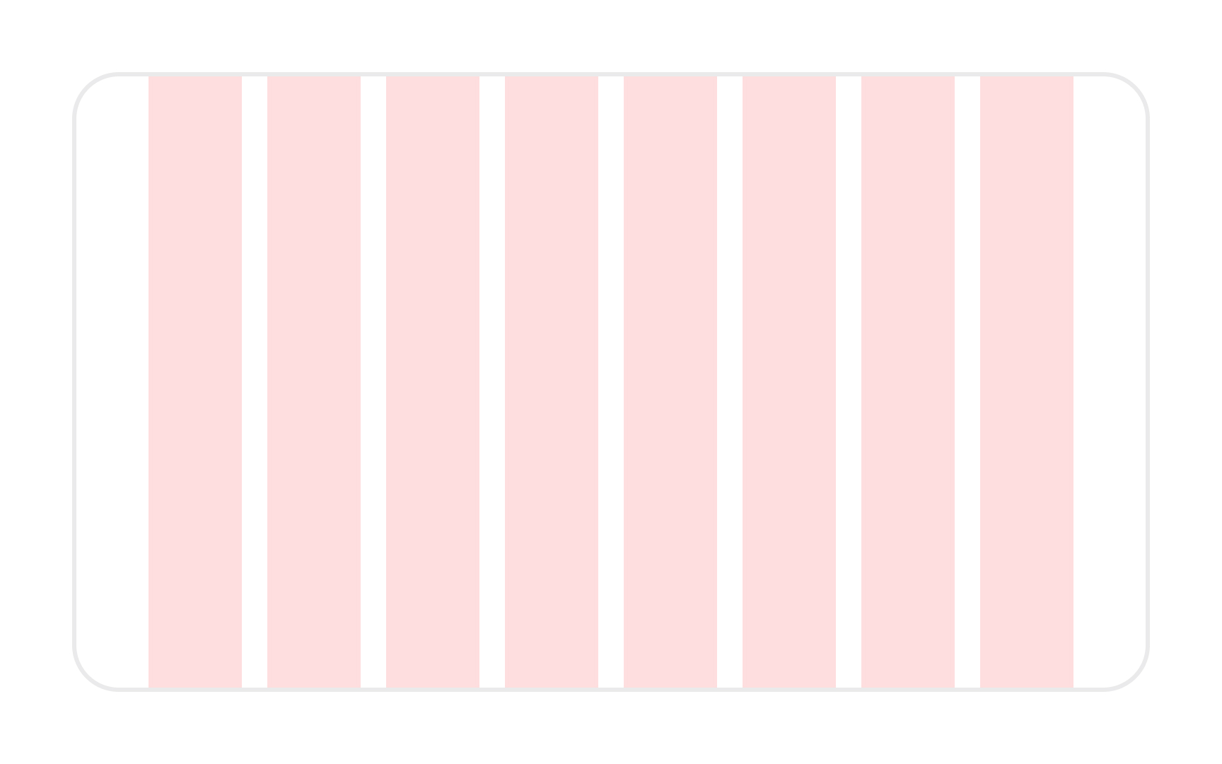
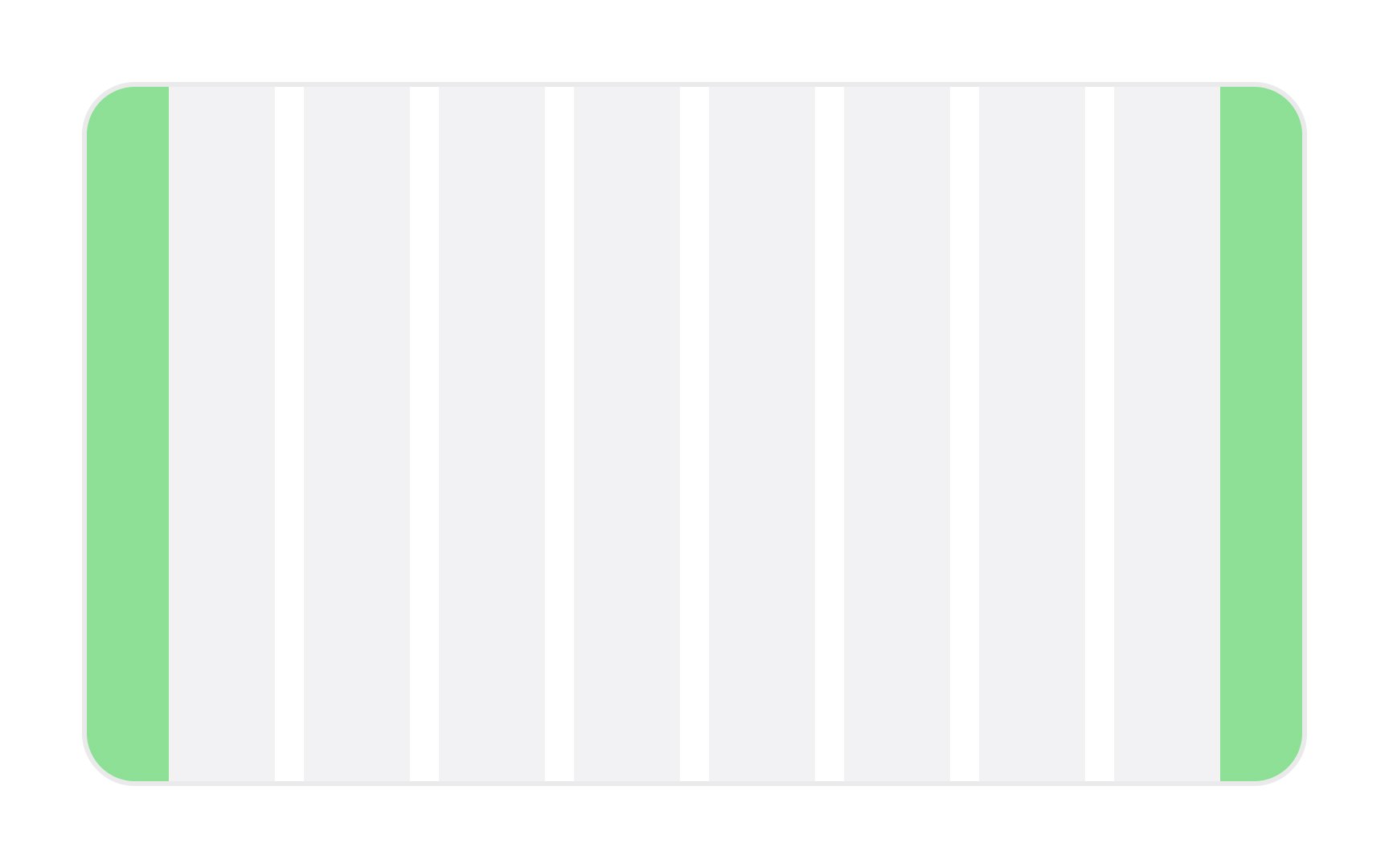
Columns are vertical spatial areas that hold
Depending on the grid's exact specs, the column's width scales proportionally to the available screen space. All content usually falls within the bounds of the columns (though content often bridges more than one column).[1] Some elements can "break the grid" to draw attention, but in most cases, try to align all of the grid's contents to a column.
A 12-column grid is common for large viewports, while smaller viewports use fewer columns.
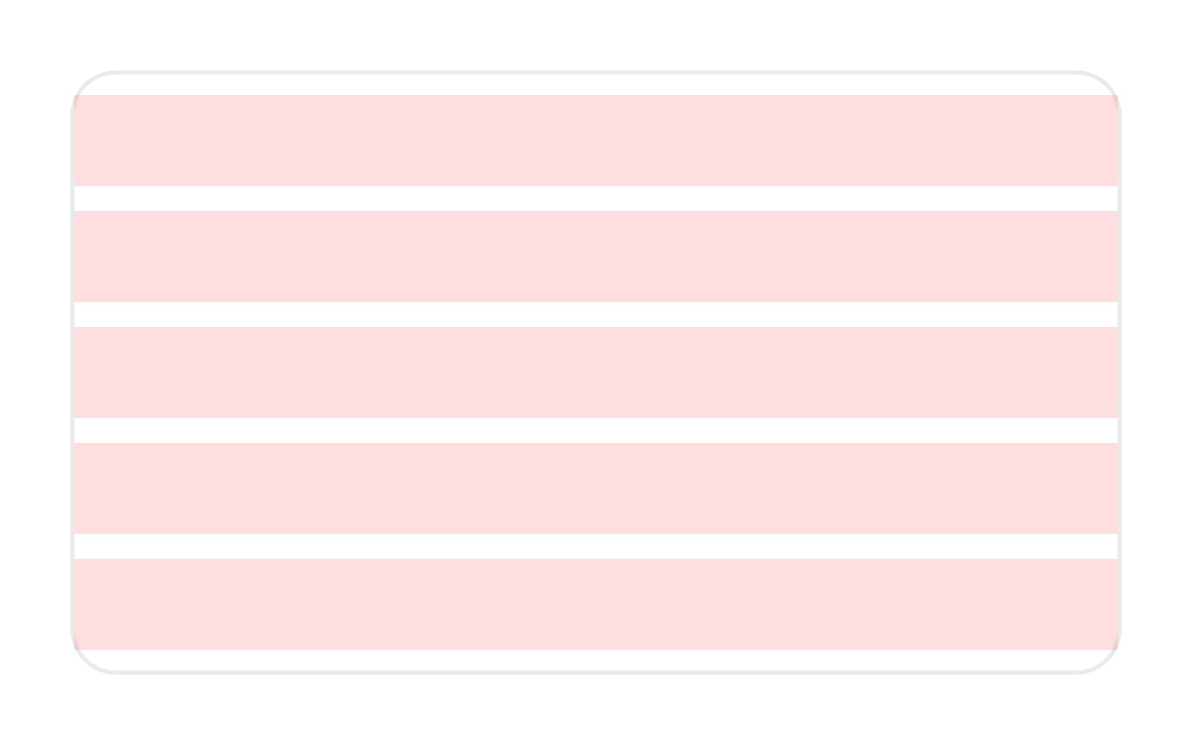
In UI/UX design, rows serve as the horizontal counterpart to
Although they may not be as commonly emphasized as columns, rows are essential for a balanced and easy-to-navigate design. Think of them as the horizontal guidelines that help users scan content effortlessly.
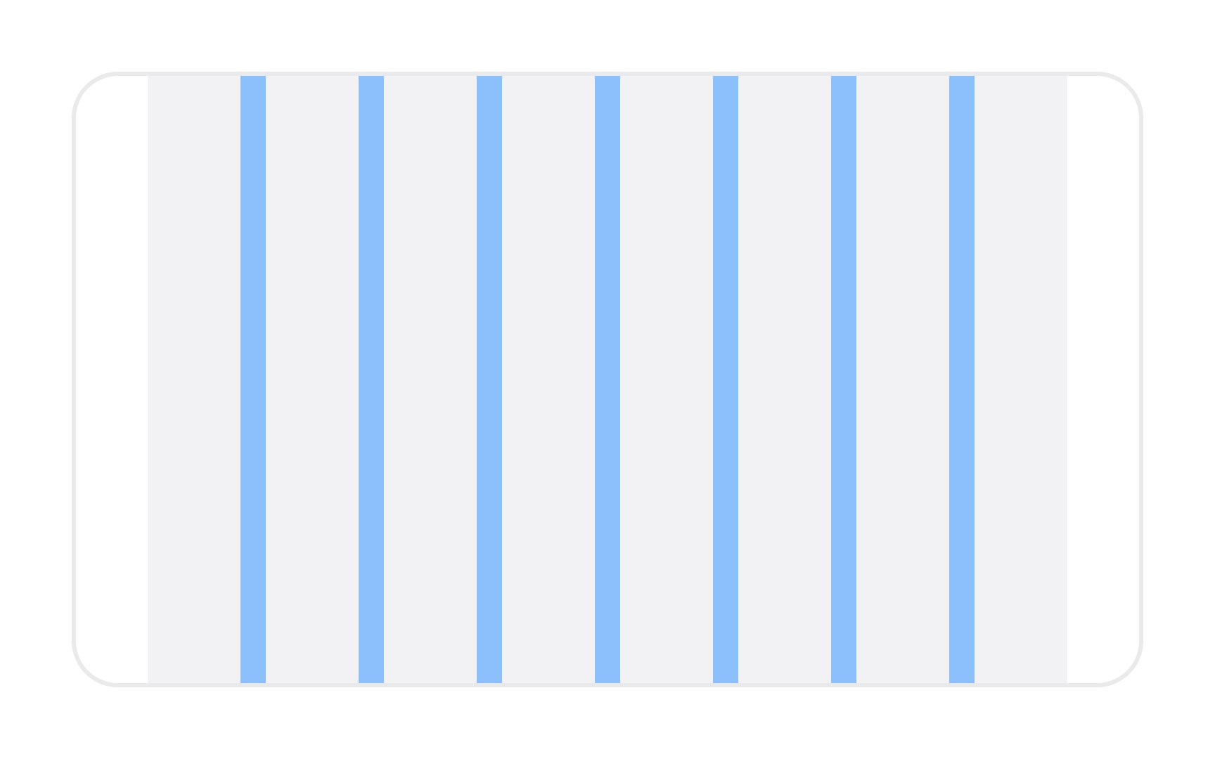
Between each column or row, you’ll find gutters. They are also called
To maintain a visual balance, gutters should always be equal between columns or rows. There are 3 gutter sizes: compact, cozy, and comfortable, each roomier than the previous one. You might be familiar with these terms from the display options in Gmail’s interface. Be careful using compact gutters, as they can add tension to your design.
Margins are the empty spaces between the edges of the format and the
Pro Tip: Set the minimum margin so your grid doesn't bump up against the screen on smaller displays.
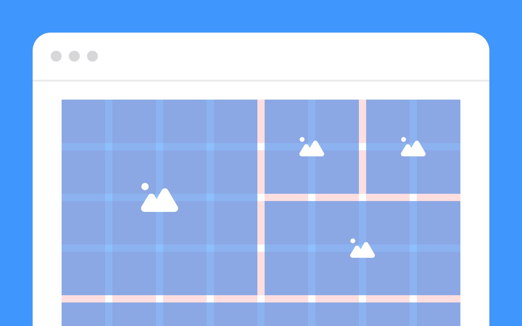
Modules in a
When users interact with your interface, these modules guide their visual journey, aiding in a more intuitive experience. So, while columns provide vertical structure and rows give you horizontal rhythm, modules are where the real action happens. They're where your content resides, organized neatly within the boundaries set by your grid.
Fixed grids refer to a type of
This approach is suitable for projects where content presentation needs to remain consistent, such as in print materials or websites with a specific design aesthetic. However, it's important to consider responsiveness and adaptability for different screen sizes when opting for fixed grids, as they may not always provide the best experience for users on all devices.
Pro Tip: Design fixed layouts according to the most common screen resolutions among your target audience.
Fluid grids are a dynamic approach to web design that adapts
Fluid grids are achieved through the use of relative units like percentages instead of fixed units like pixels. This responsive design technique helps prevent content from becoming cramped or stretched, creating a harmonious appearance no matter the screen size.
Like fluid grids, responsive grids adjust based on the screen size.
Designing responsive grids requires more planning than fixed or fluid grids. Designers must decide at which screen sizes the
Pro Tip: Choose fluid grids for proportional scaling across all screen sizes. Use responsive grids for more control over layout adjustments at specific breakpoints for an optimal user experience.
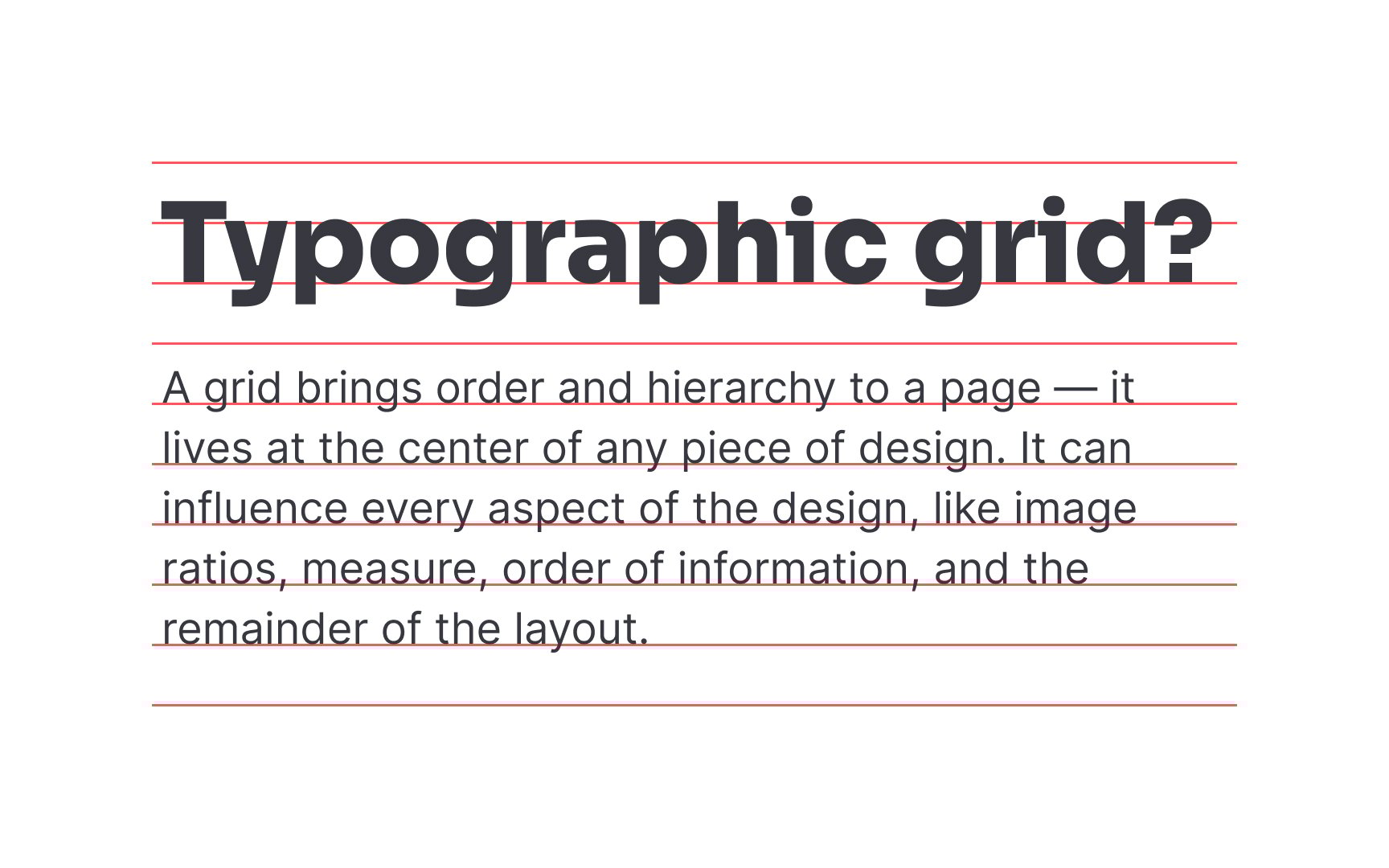
A baseline is the line where text sits. A baseline
The baseline grid contributes to the
Most designers stick to an 8-point baseline grid and use multiples of 4px for more precise adjustments in spacing or line height.
Fixed elements maintain a consistent size, unaffected by changes in screen or
Consider using fixed elements for core branding components or essential interface sections that should remain constant for users across different devices or screen sizes. Always balance their use with the overall design flow to achieve a cohesive and user-friendly interface.
Fluid elements adapt gracefully,
When designing with fluid elements, it's essential to set minimum and maximum limits to prevent them from becoming too small to interact with or so large that they overpower the design. Consider using fluid elements for sections where scalability is key, such as adaptable


Similar lessons

Intro to Design Layouts

Intro to Design Composition
