Designing for Autism Spectrum Disorder
Learn the nuances of designing accessible products for those on the autism disorder spectrum
Autism Spectrum Disorder (ASD) affects how individuals process sensory information and interact with digital interfaces. Creating accessible digital products for users with ASD involves understanding their unique cognitive processing patterns, sensory sensitivities, and interaction preferences. Digital experiences that work well for autistic users often feature clear visual hierarchies, predictable navigation patterns, and careful consideration of color, motion, and sound elements. By incorporating specific design considerations around cognitive load, sensory processing, and clear communication patterns, digital products become more inclusive for neurodivergent users while improving usability for everyone. These considerations extend beyond standard accessibility guidelines to address the distinct ways autistic individuals may experience and interact with digital interfaces.


Many autistic users experience heightened reactions to bright or saturated colors, which can cause visual stress and cognitive overload. Natural
Also, consider implementing color themes that users can customize according to their preferences. This approach acknowledges the spectrum nature of autism and allows users to adjust the interface to their specific sensory needs.

Clear communication is essential for making digital products accessible to users with Autism Spectrum Disorder. Many autistic individuals process language literally, making it important to use direct, concrete words that clearly convey meaning. Simple language helps all users understand content quickly, regardless of their cognitive processing patterns or cultural background.
Here are some tips:
- Use familiar words and strip off metaphors, figurative expressions, and idioms that may vary in cultures and cause confusion. If you can't omit complicated words, explain them in simple words.
- Avoid abbreviations such as "e.g.," "i.e.," or "etc.," and always spell out acronyms the first time you use them in text.
- Avoid using unclear references or abstract humor that could cause confusion.
Breaking
Typography choices directly affect readability for autistic users. Sans-serif fonts like Arial, Verdana, or Open Sans offer clear letter shapes without decorative elements that could cause visual distraction.
Structure content using clear visual hierarchy and meaningful headings. Each paragraph should focus on a single idea and contain no more than 20 words per sentence. Use adequate white space between paragraphs to create visual breathing room. This spacing helps users process information at their own pace and reduces the risk of cognitive overload.
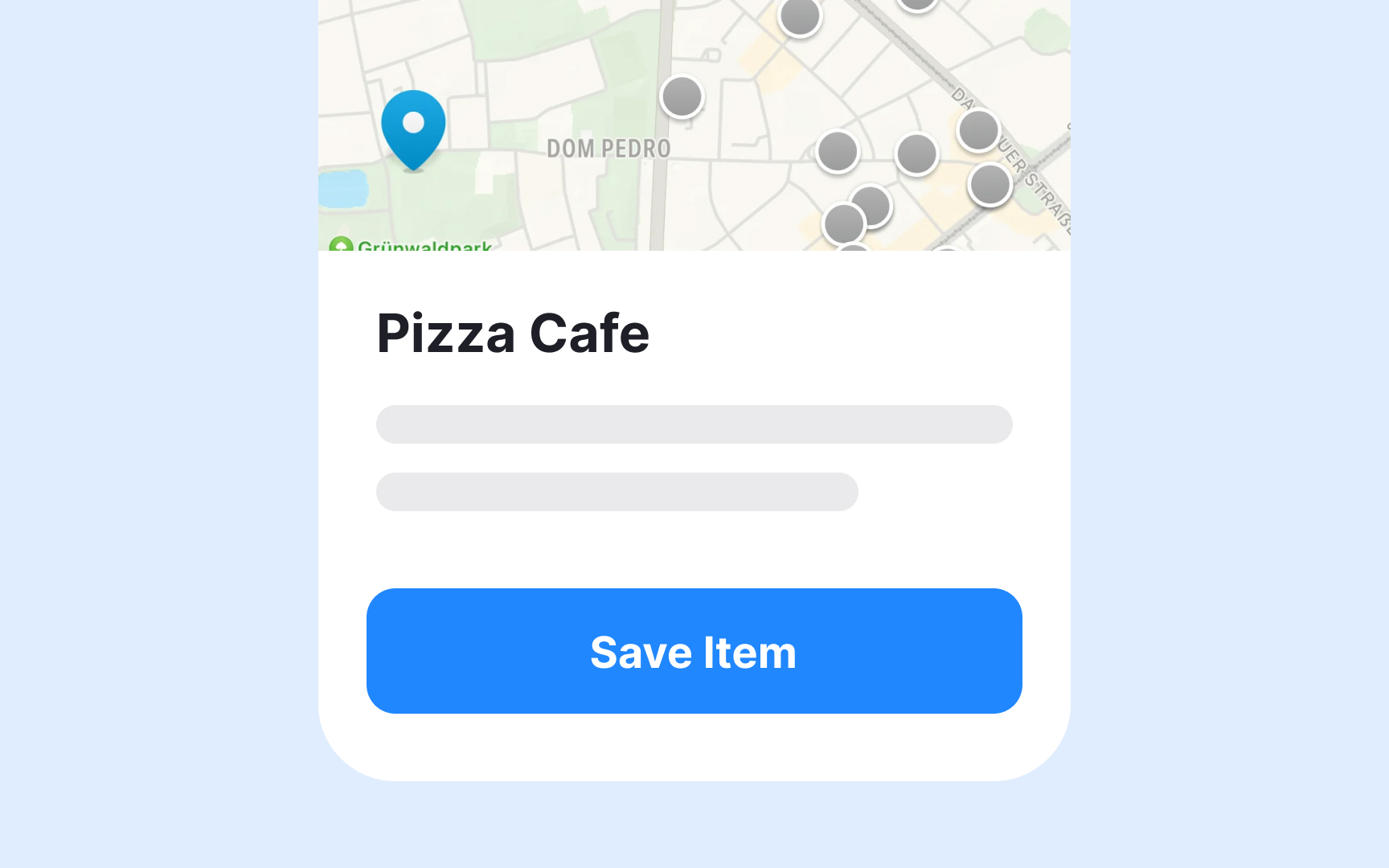

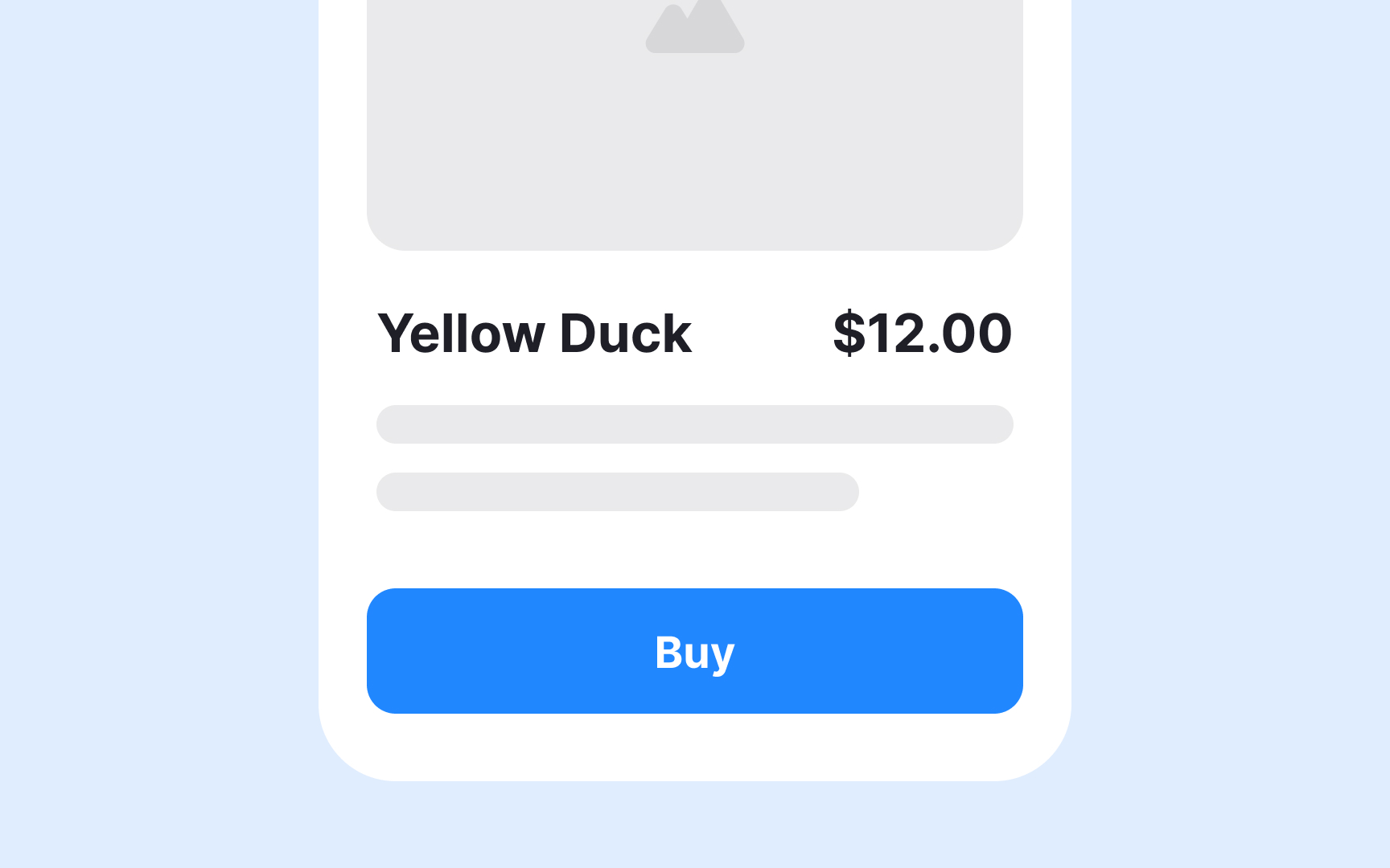
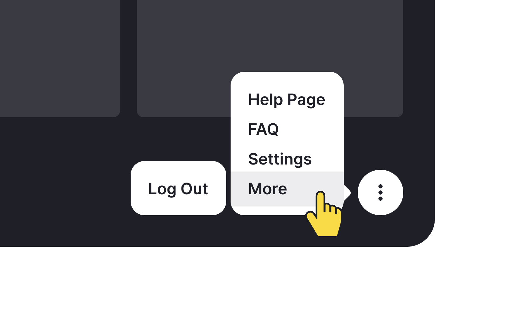
Generic labels like "Click Here" or "Submit" provide insufficient information about what will happen when the button is activated. Descriptive labels like "Save Document" or "Send Message" clearly communicate the specific action and its outcome.
Action-oriented labels help autistic users build accurate mental models of interface
Maintain consistent button labeling patterns throughout the interface. If a button initiates a specific action on one screen, use the same label for similar actions on other screens. For destructive actions like deletion, include clear warning labels and confirmation steps to prevent accidental activation. This predictability helps users with ASD navigate the interface more confidently.

Supporting text with relevant images creates multiple pathways for understanding
On search results pages, product listings, or
Adequate spacing between elements creates clear visual boundaries and helps break
Implement generous spacing between lines and paragraphs, around interactive elements, and between different content sections. This consistent spacing hierarchy helps users identify distinct content groups and understand relationships between interface elements.
The extra space around clickable elements also makes them easier to target, supporting users who may have motor control challenges.
Each autistic person experiences sensory input differently, making customization options essential for
Create easily accessible personalization controls that persist across sessions. Place these settings in a consistent location and make them simple to find and adjust. Include preview options so users can see the impact of their changes before applying them. Remember to provide a "reset to default" option for users who want to start over with their customizations.
Clear
Navigation menus should follow a logical, predictable structure with clear
Support multiple
Top contributors


Topics
From Course

Share


Similar lessons

Intro to Accessibility

Inclusive Design Basics
