Icon Terminology
Explore the various types of icons and their uses in UX design
Icons can add so much personality to even the most minimalist designs. Mastering the use of icons allows you to use them to enhance user experience and actually make your products more usable.
Understanding the types of icons, how they’re best used, and what makes a good icon will help you implement them effectively in your UX designs.
There are a lot of different kinds of
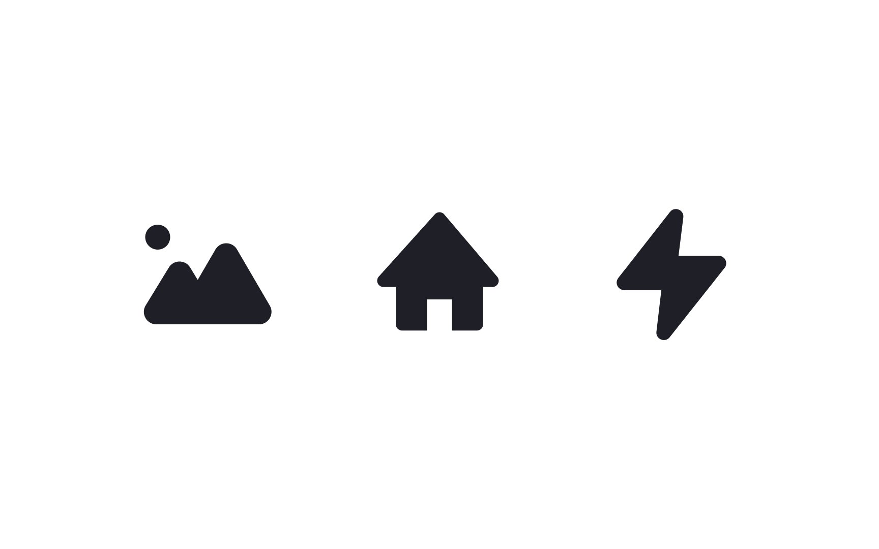
Filled icons are graphical symbols and are usually solid. They can be scaled to whatever size you need and can be customized with different colors and shadow effects. Because they’re generally a solid color, filled icons can work really well at small sizes, but may not hold much visual interest at larger sizes.
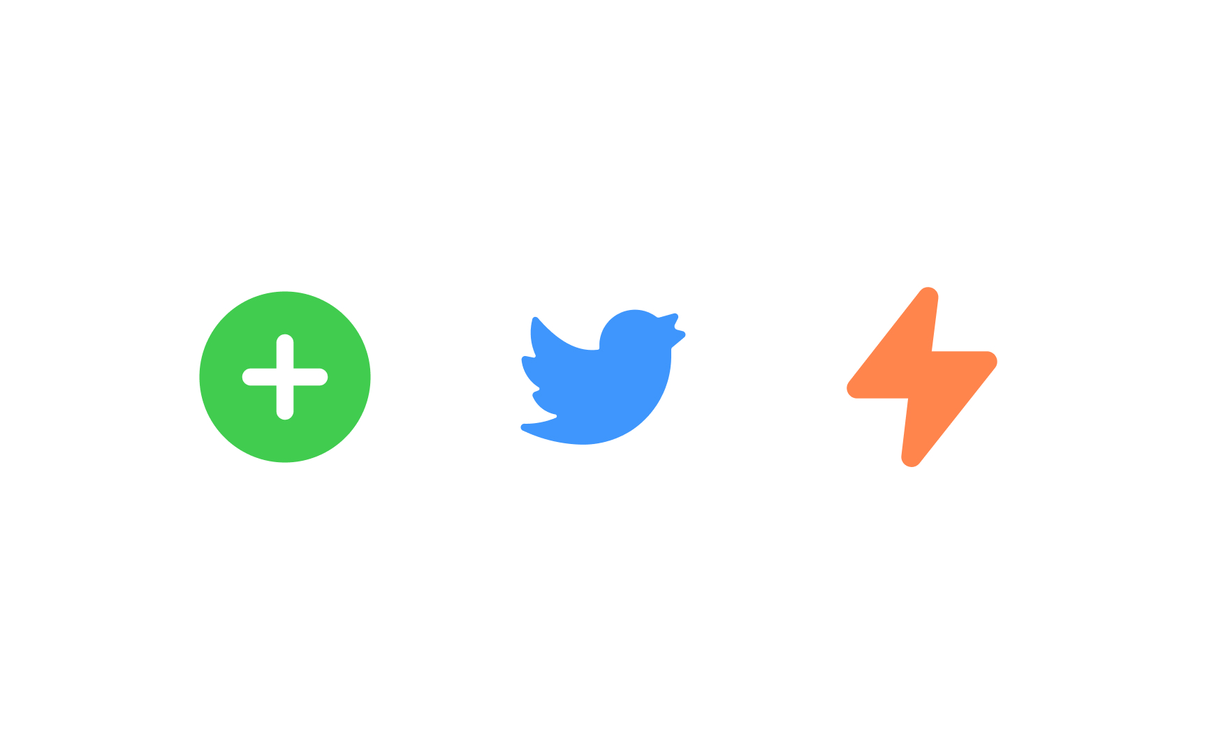
Colored
Pro Tip: Make your icons clear without relying on color, ensuring universal accessibility.
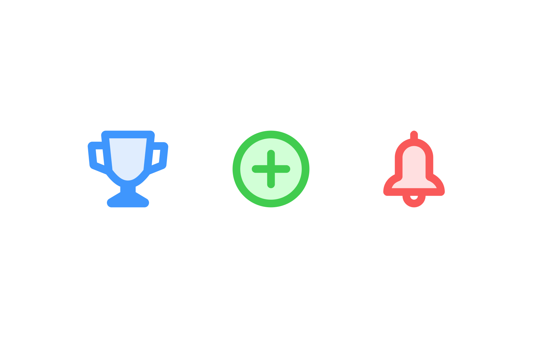
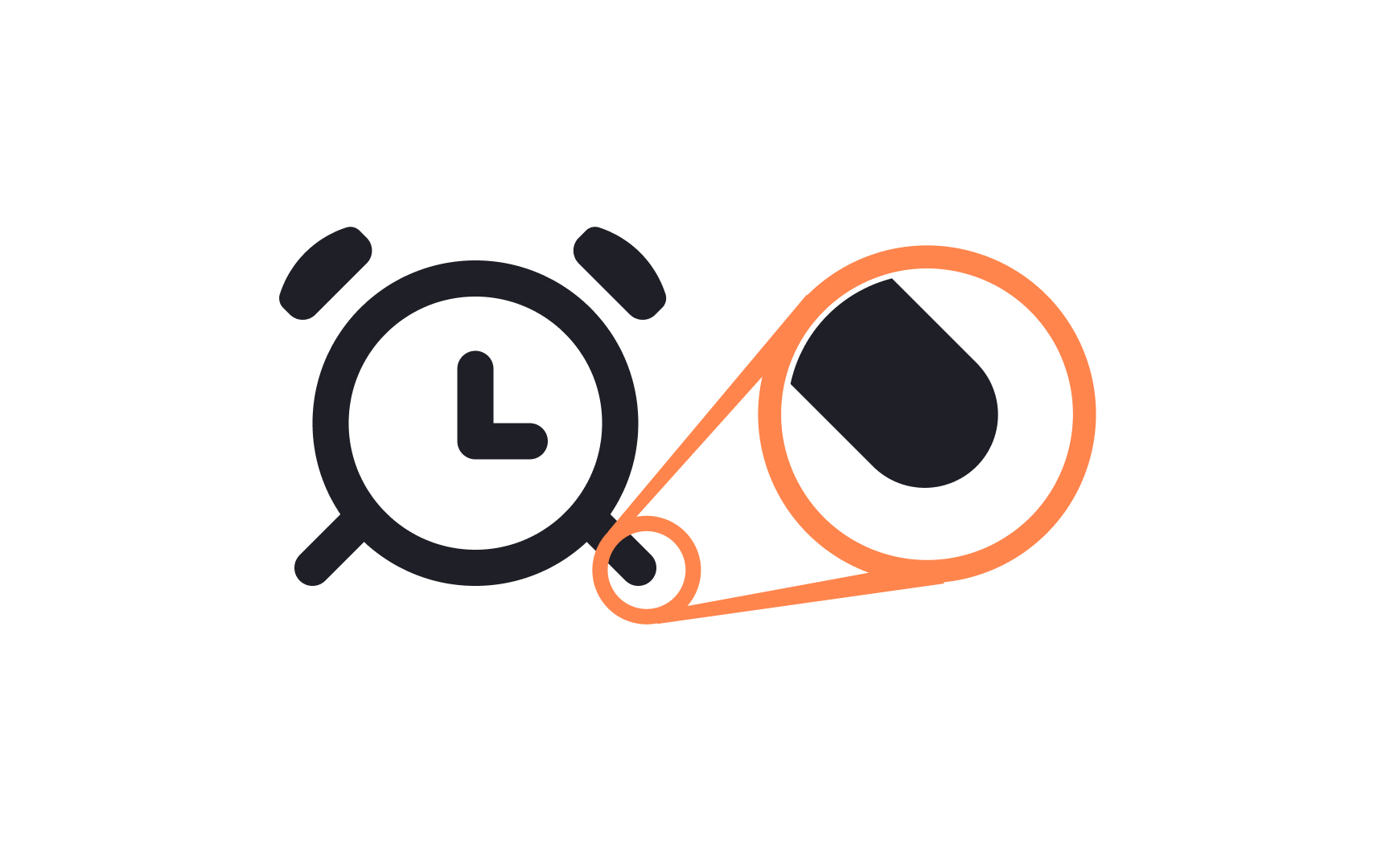
Duotone
To create a duotone icon:
- Take an icon
- Split its elements into two layers such as an outline and fill space
- Select a starting hue
- Experiment with layer opacity
Duotone icons can add some extra visual interest to your designs without overpowering them. Just beware that at very small sizes, they can be hard to decipher from the accessibility standpoint.
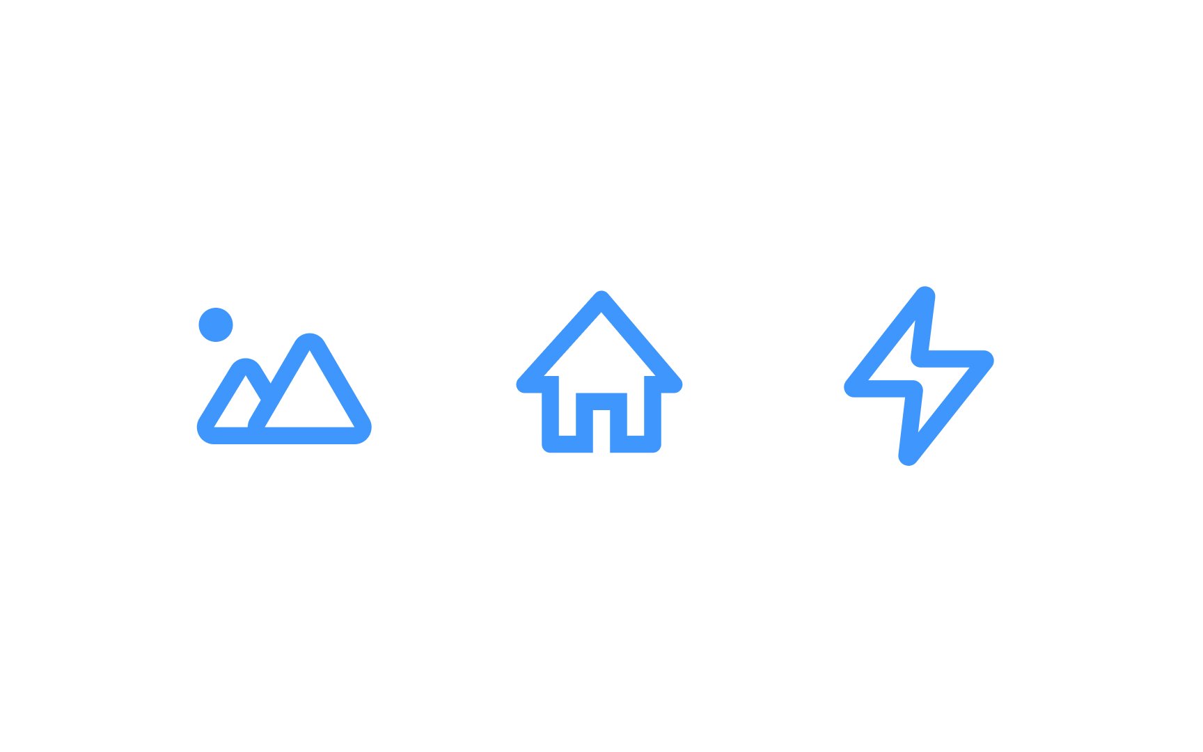
Outlined
Pro Tip: Avoid adding too many strokes and details to icons. It increases cognitive load and slows down the user journey.
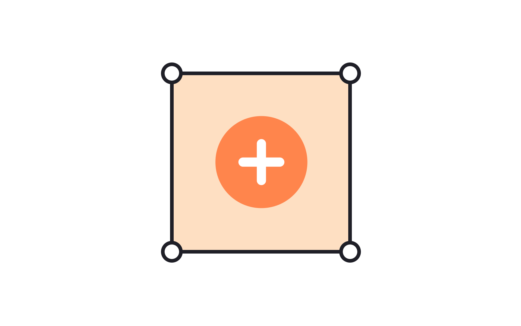
An icon container is a designated area, often a square or a circle, that houses an icon. It helps visually separate the icon from other elements on the screen and can improve the touch-target size, making it easier for users to interact with the icon. Using containers also helps maintain a uniform appearance across different
In design software like Adobe XD or Figma, an icon container is typically created by drawing a shape (such as a square or circle) in the
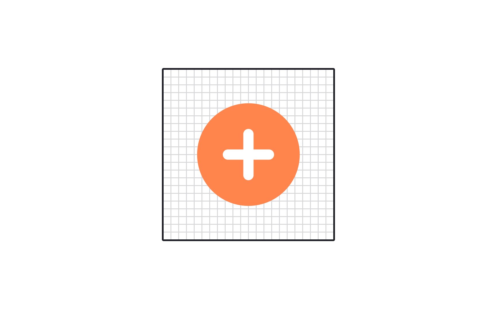
Icon grids usually maintain consistent spacing between
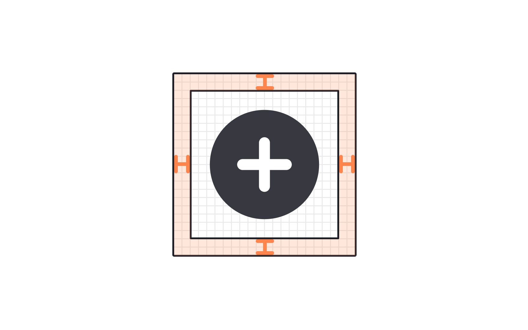
The primary purpose of icon padding is to enhance the
The minimum recommended icon padding is generally around 8 to 10px on each side. However, this padding value may vary based on design guidelines, platform requirements, and the specific context of the user interface.
While the grid gives a basic structure to start from when designing an icon, keylines provide a more nuanced guide. The keylines are like a starter kit for creating your
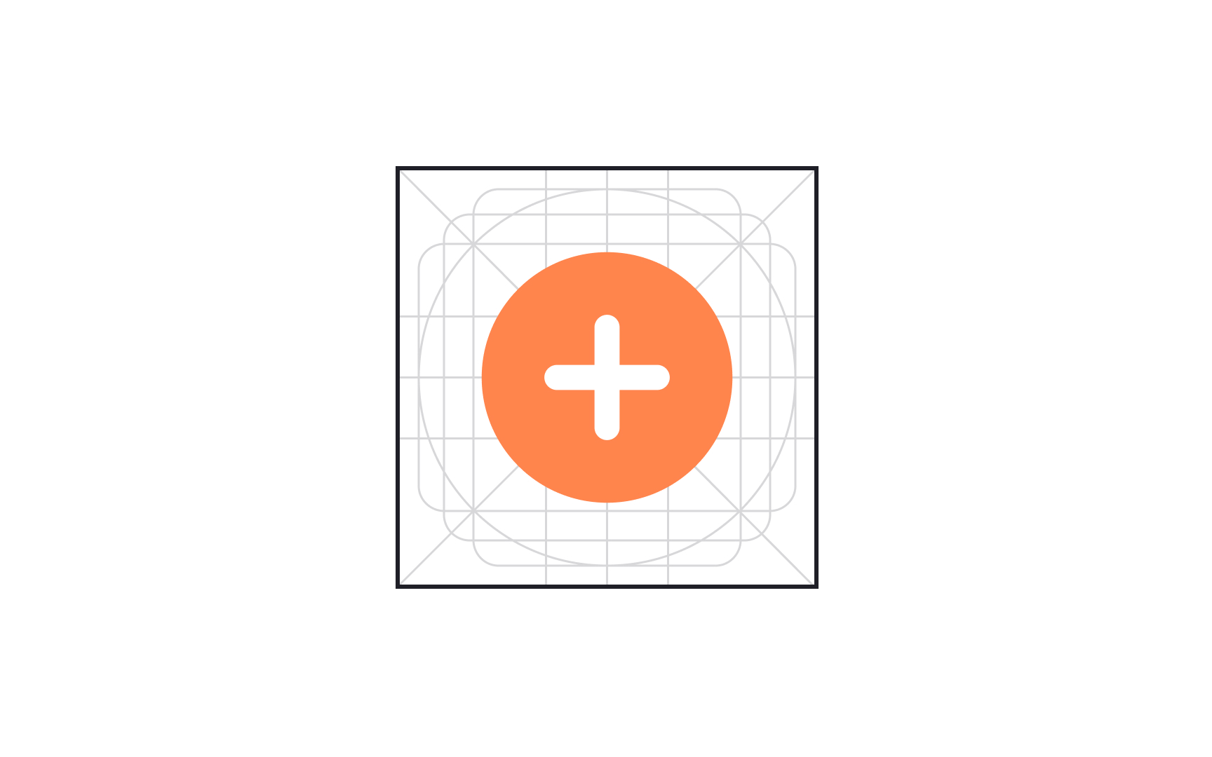
Icon border radius is a parameter that indicates how rounded or pointed the corners are. This parameter helps designers create visually consistent

Universal
For example, the search icon is traditionally a magnifying glass. Getting creative by using binoculars instead is only going to confuse users. While you can adjust the exact style of the icon to fit your design, the basic shape and idea behind it should be the same.
Unique
Logo icons would be one example of unique icons. The Sketch logo is a stylized diamond. For someone unfamiliar with the program, the diamond will be meaningless. But for those who have used the product, it’s immediately recognizable. Keep that kind of impact in mind when using unique icons.
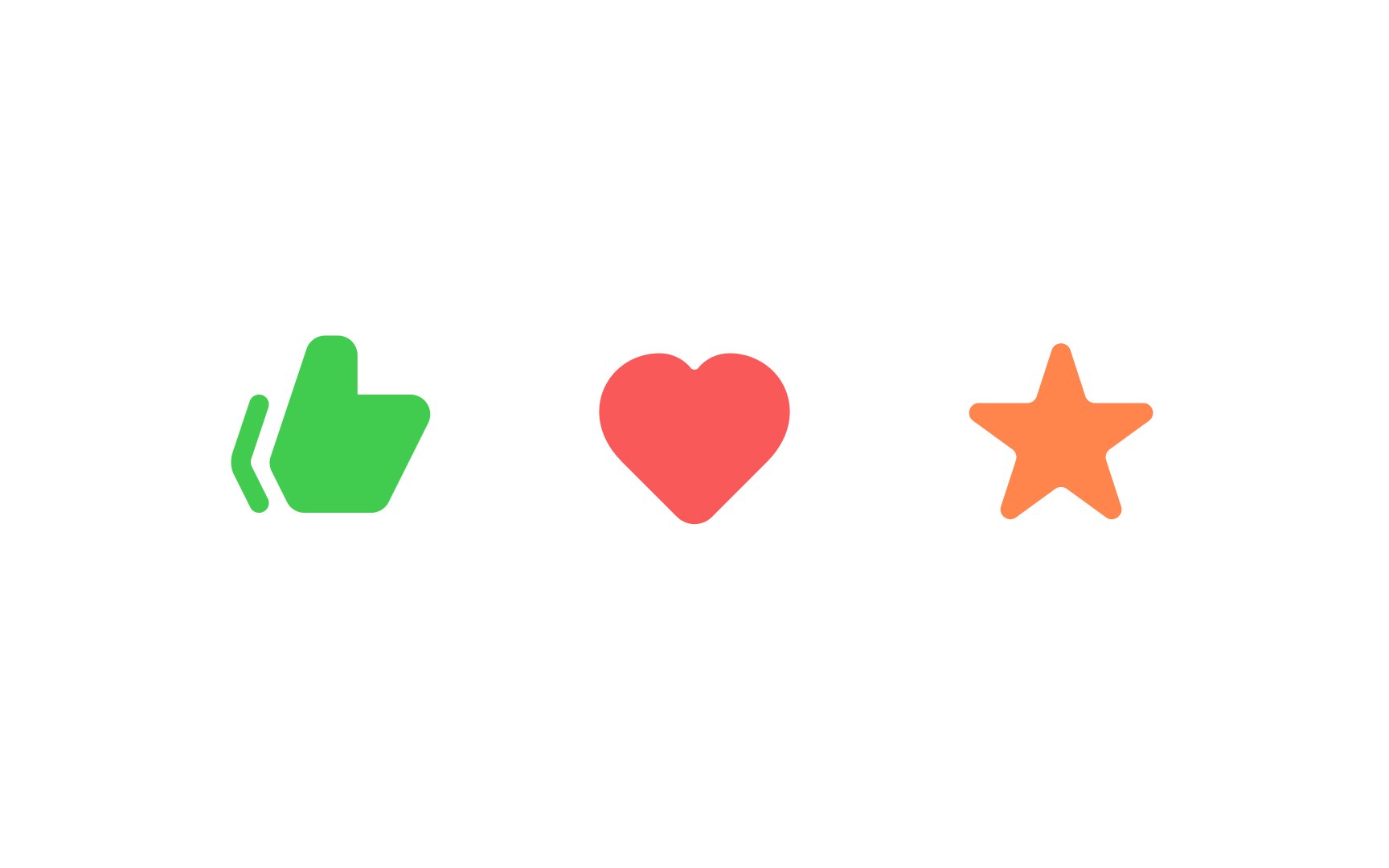
Conflicting
Conflicting icons can sometimes have different meanings on different sites. Going back to the heart icon, on Instagram it likes a post, but on Facebook it loves a post, and on sites like Etsy it will add a product to your favorites list. That doesn’t mean you shouldn’t use a heart icon. Just be aware of the different meanings users may attribute to it and make sure your usage is clear and consistent.
Pro Tip: Provide a label to clarify meaning and remove any doubt.
Nowadays, users can access your
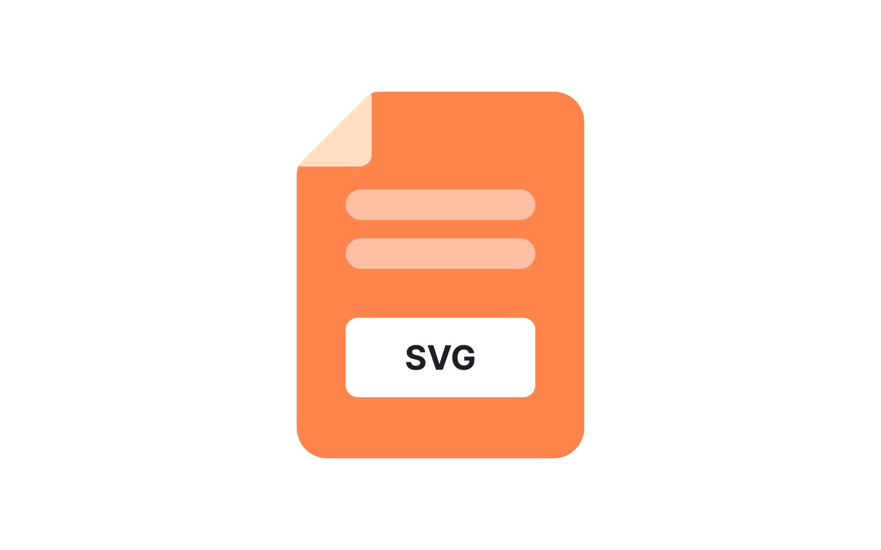
There are several advantages to using SVGs:
- Easily scaled without quality loss
- Optimized for
search engines - Can be edited (like
color or size) directly in CSS - Can be easily animated
SVGs can be made accessible by adding
Icon fonts are also vector-based and even smaller in size. However, browsers treat icon fonts as text and apply text anti-aliasing rules to them. This practice of smoothing the edges of fonts makes fonts more readable but may affect icons. If you want to avoid it, SVGs should be your choice.[2]
References
- Material Design | Material Design
- What Are SVG Icons: Scale Them AND Keep the Quality | Flat Icons
Top contributors


Topics
From Course

Share


