Minimizing Cognitive Load
Discover ways to avoid and minimize cognitive for a smooth and delightful user experience
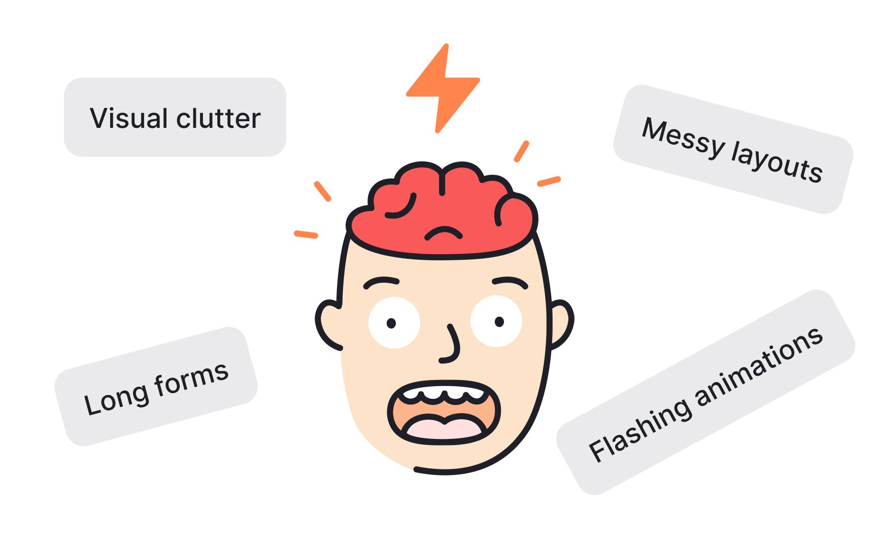
Cognitive load refers to how much mental effort is required to use a product or service. If a website or app is complex and confusing, it can make it hard for users to interact with it effectively, which creates a high cognitive load. Understanding how users think and what they find easy or difficult can help you create more user-friendly interfaces. In this lesson, we'll explore how to minimize cognitive load by aligning with users' psychology to make interactions smoother and more intuitive.
In UX design,
When a website or app sends us too much or confusing information at once, it can exceed users’ capacity to process it efficiently. This can slow them down, cause them to miss key details, or lead to frustration and giving up on the task. So it becomes important to understand these limits and create user-friendly designs that don't overload users’ mental capacity.[1]
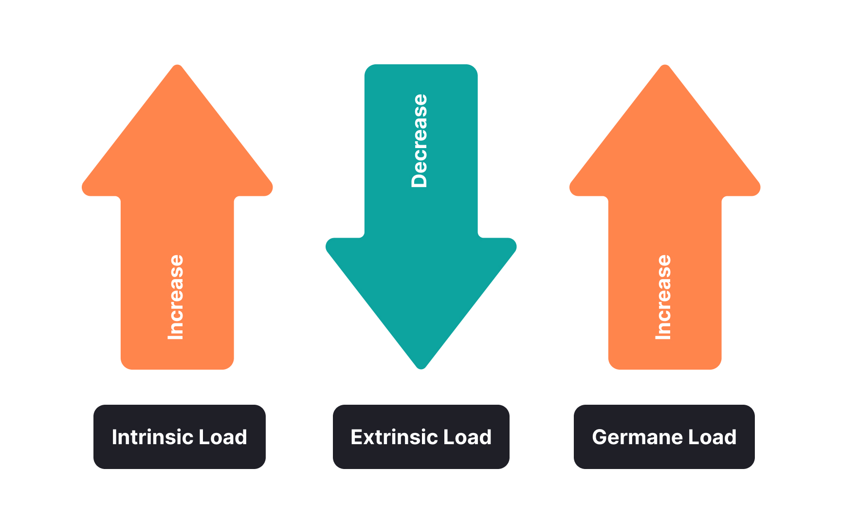
Intrinsic
Extrinsic cognitive load comes from the way information or tasks are presented in the interface. If the new software’s interface is cluttered or poorly organized, it adds unnecessary difficulty, making even simple tasks confusing and hard to navigate.
Germane cognitive load is the effort put into actually learning and becoming proficient with the interface.
Effective UX minimizes extrinsic load and manages intrinsic load, while enhancing germane load, making the overall user experience smooth and rewarding.
Minimizing clutter is one of the best ways to reduce
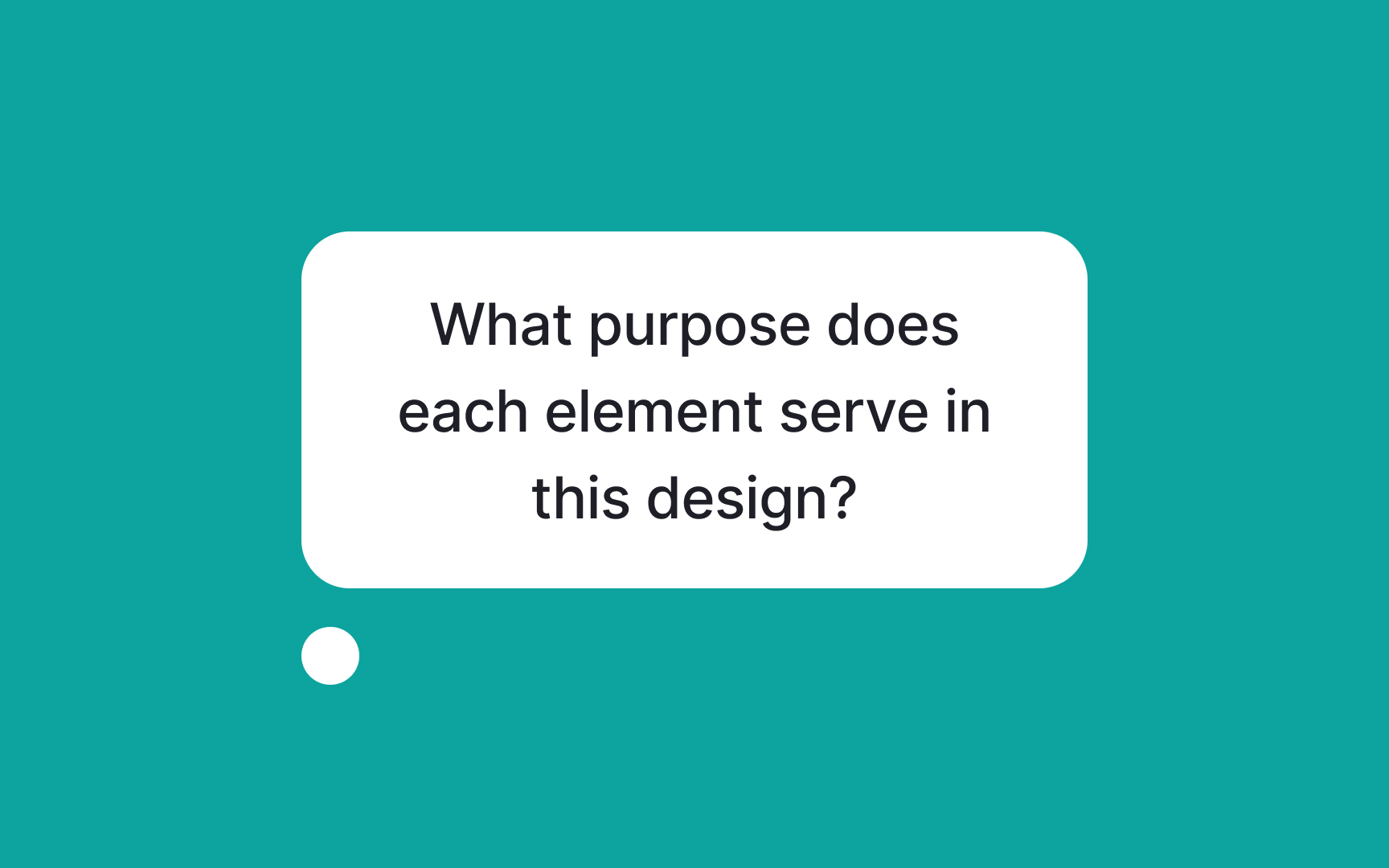
Start by questioning the purpose of each element within your design. This means critically evaluating every piece of information, functionality, and even design embellishments that are part of your interface.
Ask yourself, "What purpose does this element serve?" If the answer isn't clear or if the element doesn't directly enhance the user's experience or help them achieve their goals, it likely doesn't need to be there. This helps you strip down your design to the essentials, making your site or app more straightforward and user-friendly.
A mental model is what users expect based on their past experiences with similar interfaces. When a design aligns with these expectations, it's easier for users to understand and use without extra effort.
Here are some ways to do it:
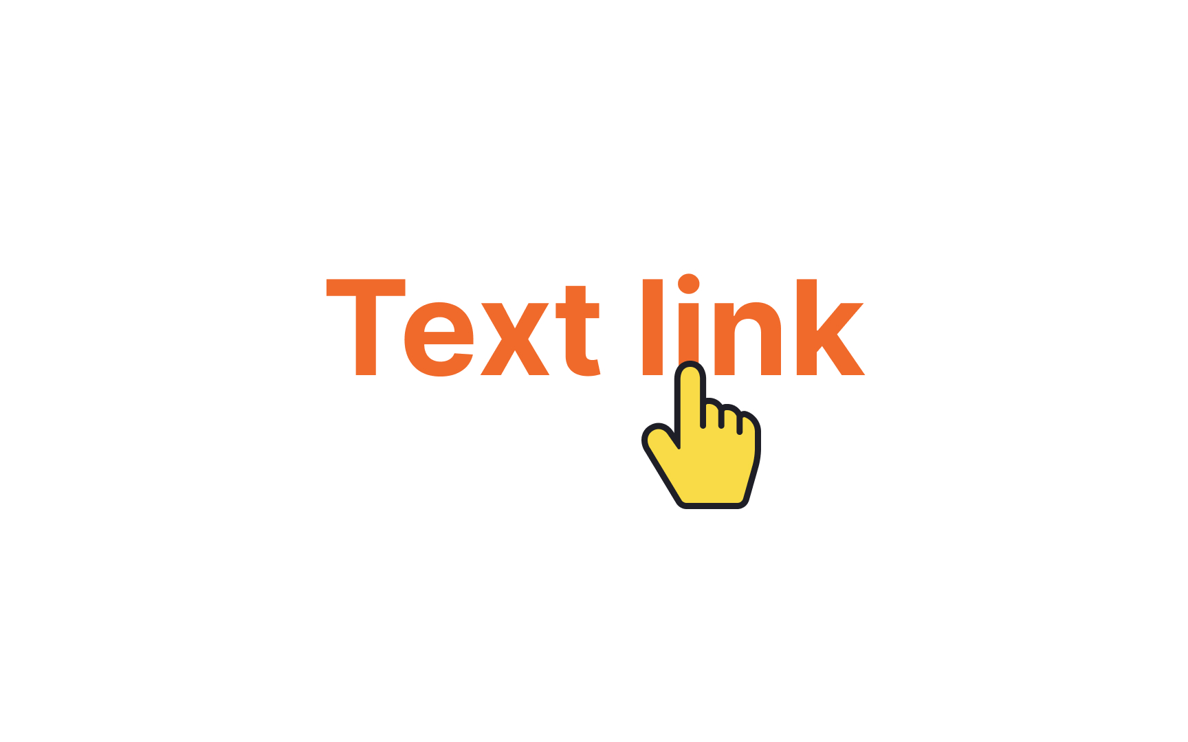
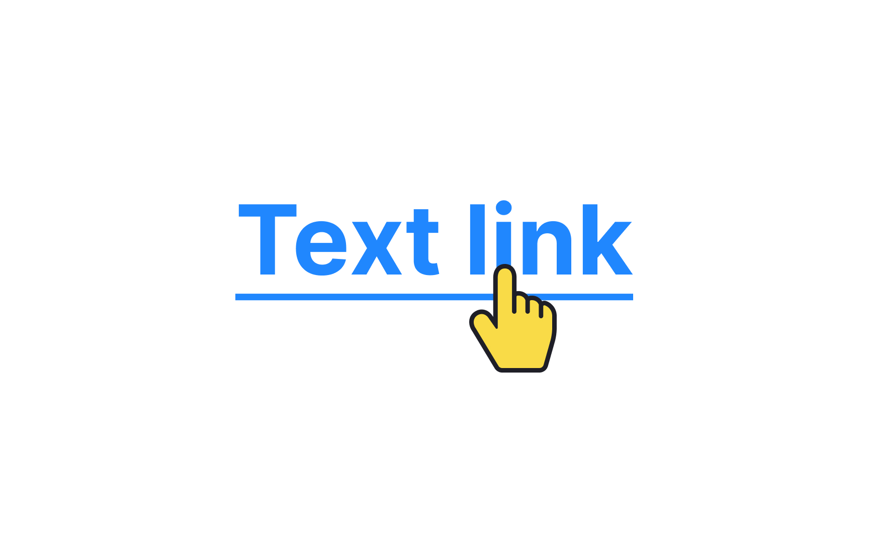
- Use common placements: For example, social media platforms often have navigation bars at the bottom or the top, e-commerce sites usually have a shopping cart icon in the top right corner, and news sites typically follow an F-shaped pattern for content
layout . - Use common terminology: Use common terms for buttons and actions. For example, use "Cart" for online shopping and "Play" for media streaming apps.
- Use common gestures: For example, swiping left or right to browse through a picture gallery, pinching to zoom in or out, or pulling down to refresh a page are some of the standard gestures commonly used in mobile interfaces.
This reduces the need for users to learn new ways of interacting, thus lowering
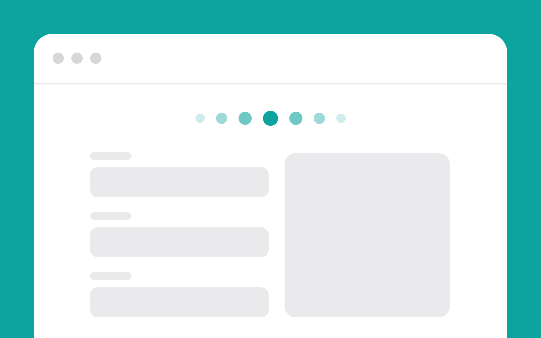
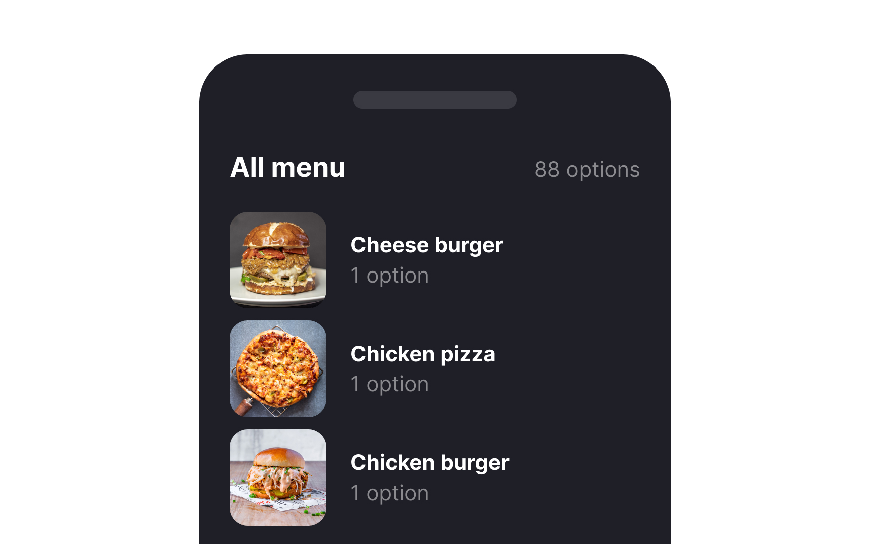
It's important to remove unnecessary steps in any user task to minimize
- Form filling: Simplify forms by only asking for essential information. Use autofill where possible to speed up the process.
- Navigation: Streamline
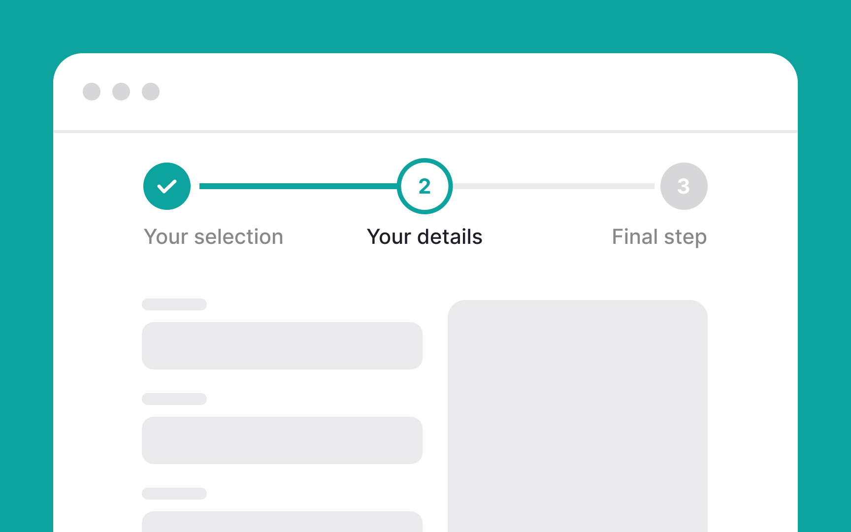
navigation by reducing the number of clicks needed to reach important sections. Make sure the most frequently accessed features are easiest to find. - Checkout processes: In e-commerce, simplify the checkout process by eliminating redundant steps and using a progress indicator to show users how many steps remain.
- Onboarding: Limit the number of steps required to start using the app or service immediately.
Pro Tip: Examine the user journey to identify any steps that may not be entirely necessary at any particular moment.
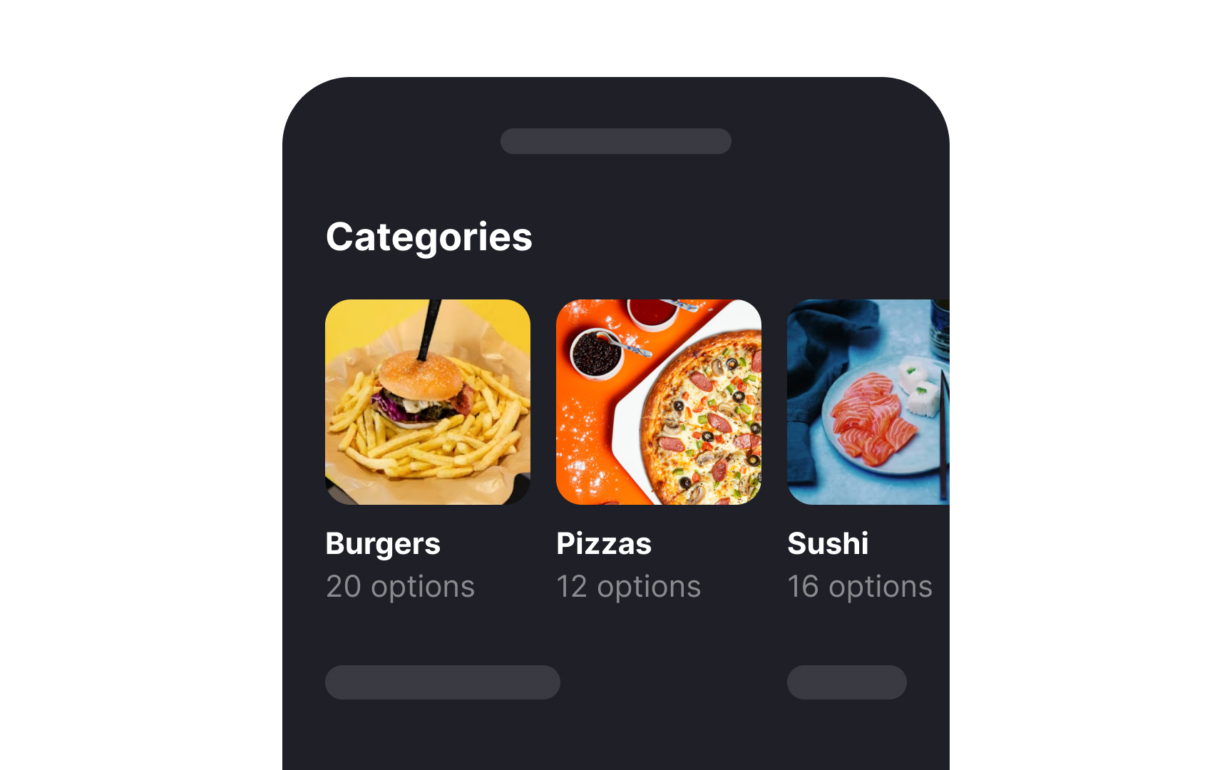
The proximity principle of Gestalt
For example, consider a productivity app that includes features like tasks, notes, and reminders. Grouping related options together, such as putting all task-related actions (add task, edit task, delete task) in one toolbar, and all note-related actions (create note, organize notes, share notes) in another distinct section, uses the proximity principle effectively. Users won't need to hunt through unrelated options to find what they need, making their
Chunking is a design technique where information is grouped into small, manageable units or chunks. This helps reduce
In UIs, chunking can be applied by organizing
Chunking text
Here are some effective ways to chunk text content:
- Use brief paragraphs with clear spaces between them to make the text easier to digest and less overwhelming.
- Keep lines of text short, ideally between 50–75 characters.
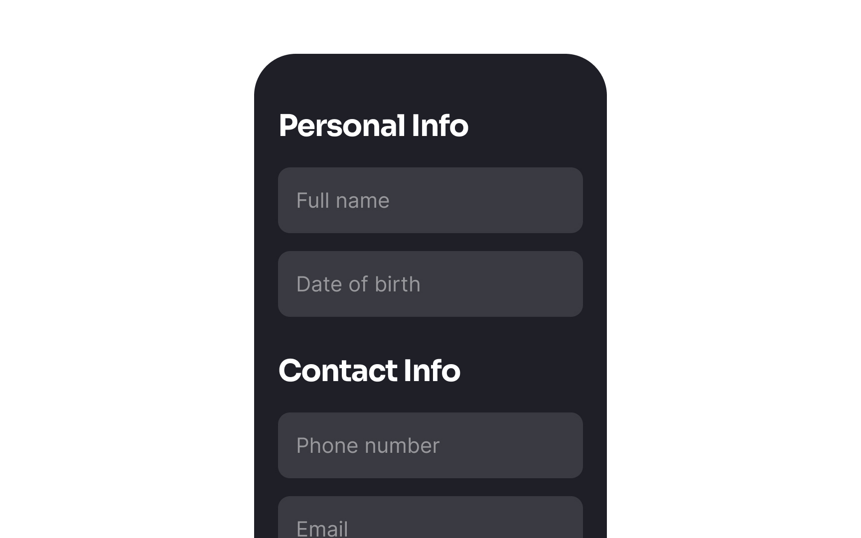
- Create clear visual hierarchies where related items are grouped together under common headings or organized in lists.
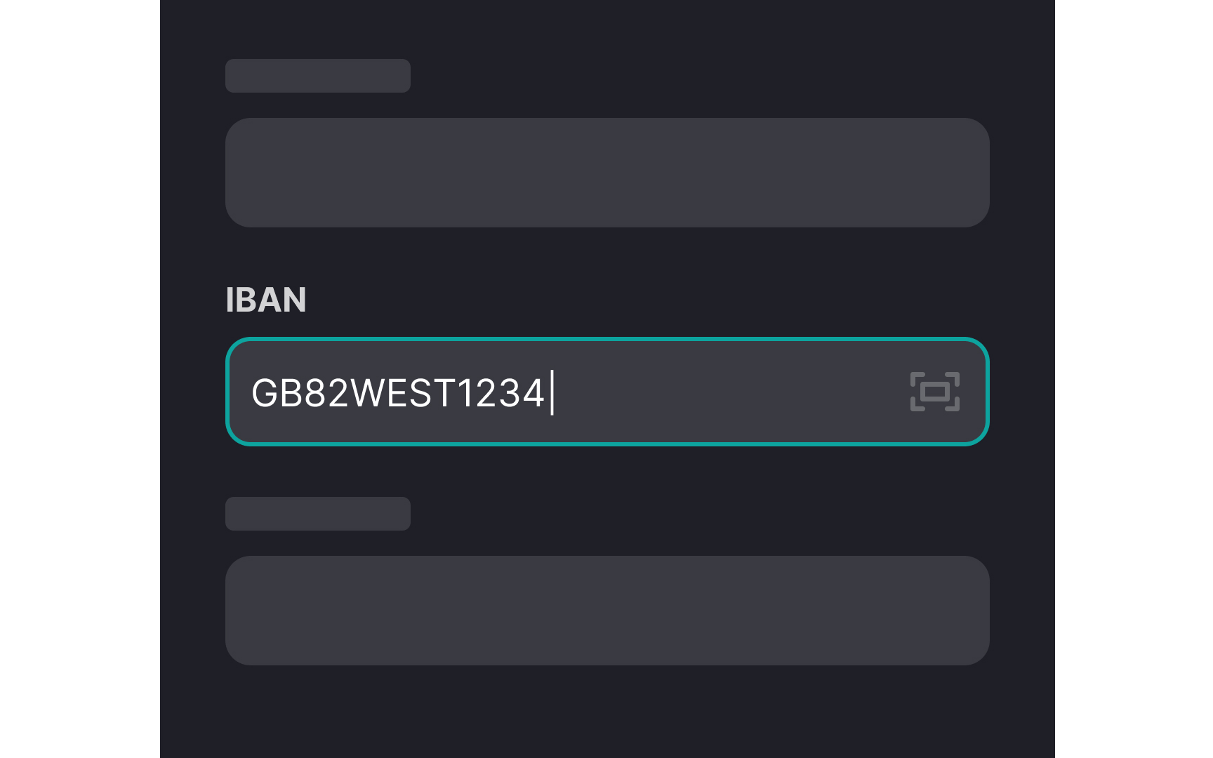
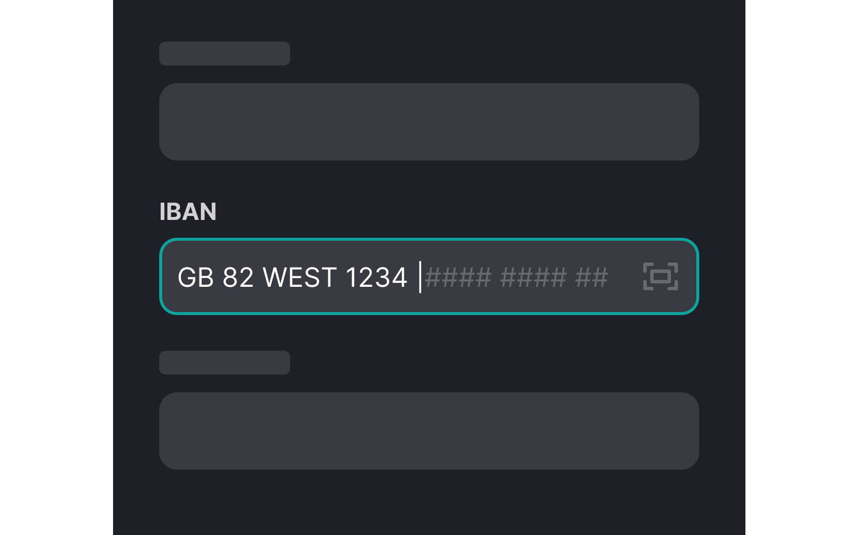
- Break up long strings of numbers or letters, like phone numbers, credit card numbers, or dates, into smaller groups. For example, format a credit card number as "1234 5678 9012 3456" instead of a long unbroken string.[3]
Pro Tip: When users input data into forms, provide autoformatting to organize their entries into chunks.

Simply breaking text into chunks helps, but further supporting quick scanning with chunk formatting ensures users can easily grasp the main points.
Here’s how you can optimize chunk formatting:
- Use headings and subheadings that stand out from the rest of the text. Make them bolder and larger to guide the reader’s eye through the
content . - Emphasize important words or phrases by making them bold or italic. This draws attention to crucial information and helps users quickly understand the core message.
- Organize information into numbered or bulleted lists to break down complex data into digestible pieces, making it easy to scan and comprehend.
- For longer sections, include a brief summary at the beginning or end. This gives readers an overview of the content, helping them decide if they want to delve deeper.
Chunking multimedia
- Visual separation: Use background colors, horizontal lines, and ample white space to clearly separate different chunks of content.
- Video and audio chunking: Organize videos or audio files into chapters or topics that users can access individually without having to watch the entire video in sequence.
- Transcripts with subheadings: Provide transcripts for audio or video content that are segmented by subheadings. This not only makes the content accessible to those who prefer reading over watching but also allows users to easily navigate to specific parts of the video content.
- Group related tools: In applications with many features, like a design software, group related tools (like brushes, erasers, and pencils) together in the
toolbar . - Labels for image categories: When grouping images or graphics, use clear, descriptive labels for each category.
Using familiar visual cues helps minimize
Here are some ways to incorporate familiar visual cues:
- Iconography: Use common
icons , such as ashopping cart for purchases, a house shape for home, or a magnifying glass for search. These universally recognized symbols help users intuitively understand their function without additional explanation. - Color coding: Employ standard
color meanings — red for errors or warnings, green for go or success, and blue for links or information. This leverages users’ pre-existing associations with colors to convey information quickly. - Layout conventions: Stick to standard
layout practices, such as placing thenavigation menu at the top or left of apage and the logo in the upper left corner. This aligns with user expectations and reduces the need for them to learn new navigational schemas.


Using common design patterns in
Here are some examples of common design patterns:
- Search bars: Always put
search bars at the top right or center of thepage alongside a magnifying glassicon . Users often look for search functionality in these spots. - Buttons: Use standard button styles for actions like "Submit," "Cancel," and "Back." Keep these
buttons consistent incolor and shape across the site. - Modals: Use modal windows to ask users for permissions contextually.
- Sign-up pages: Allow users to create and access their accounts using their existing social media credentials, such as Facebook or Google.
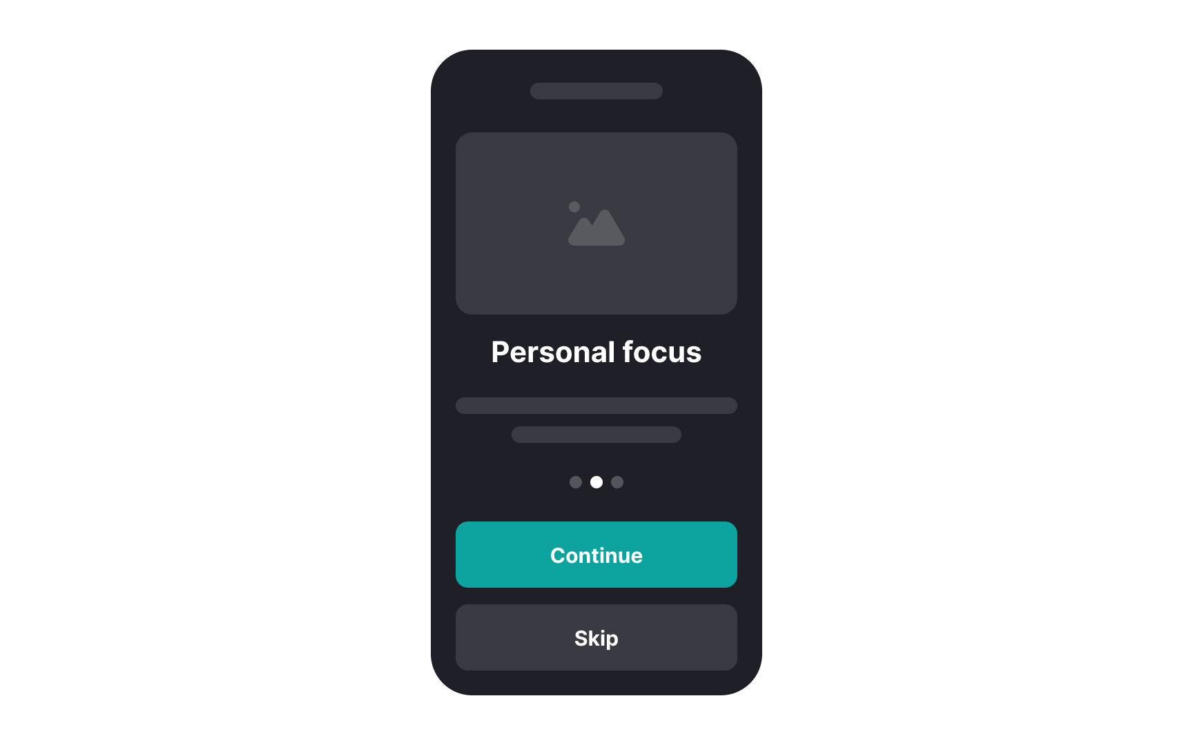
Including onboarding for new users helps reduce
Here are some guidelines:
- Keep it simple: Use short, clear instructions. Avoid long paragraphs.
- Interactive walkthroughs: Show users how to complete key tasks with pop-up tips or guided tours.
- Progress indicators: Let users know how many steps are left in the onboarding process.
- Highlight key features first: Focus on the most important features that users need to get started.
- Allow skipping: Give users the option to skip the onboarding if they prefer to explore on their own.
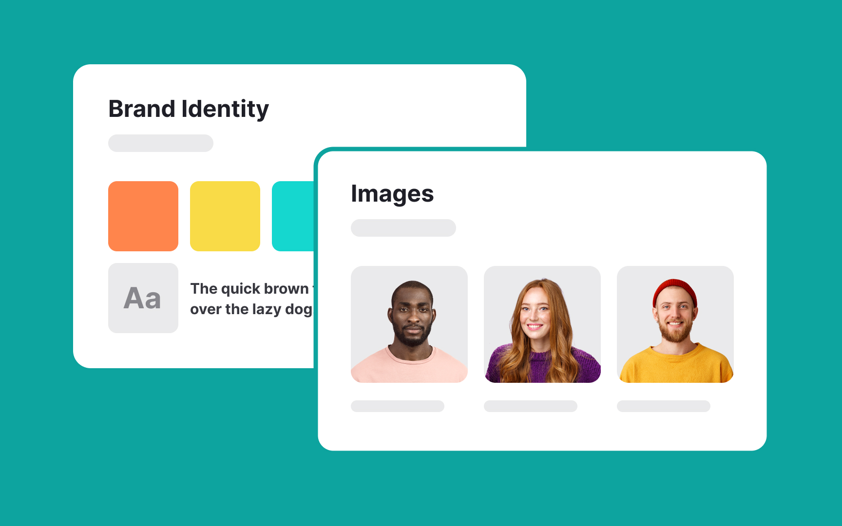
Using a style guide to guide your design choices helps reduce
Here’s how to put together a basic style guide:
- Specify which typefaces, fonts, and
colors to use across the interface. - Define the design and placement of
buttons andicons . - Set standards for
layouts , like where menus andsearch bars go to makenavigation easier. - Include logos,
images , and styles. Consistent branding builds familiarity and trust. - Detail how elements should be spaced and aligned. This creates a clean, organized look.
References
- Minimize Cognitive Load to Maximize Usability | Nielsen Norman Group
- Proximity Principle in Visual Design | Nielsen Norman Group
- How Chunking Helps Content Processing | Nielsen Norman Group
Top contributors

Topics
From Course

Share


Similar lessons

Cognitive Biases

UX Laws
