Adding Wireframes to Agile User Stories
Discover the value of incorporating wireframes into Agile user stories
User stories follow a simple format: As a [user], I want [goal], so that [benefit]. This structure captures intent but leaves implementation details open to interpretation. Wireframes fill that gap by showing exactly how the interface should look and behave. Adding wireframes to user stories creates shared understanding across roles. Developers see the layout, interactions, and edge cases visually rather than imagining them from text descriptions. Product managers confirm their vision matches what will be built. QA teams know what to test against.
The visual element also improves estimation accuracy during sprint planning. Abstract requirements are hard to size. A wireframe showing a complex form with validation rules, conditional fields, and error states gives the team concrete information to estimate against. Studies suggest teams using wireframes reduce mid-sprint design changes significantly. Wireframes attached to stories become lightweight documentation that travels with the work. New team members can understand features quickly by reviewing the visual alongside the written requirements.
Every
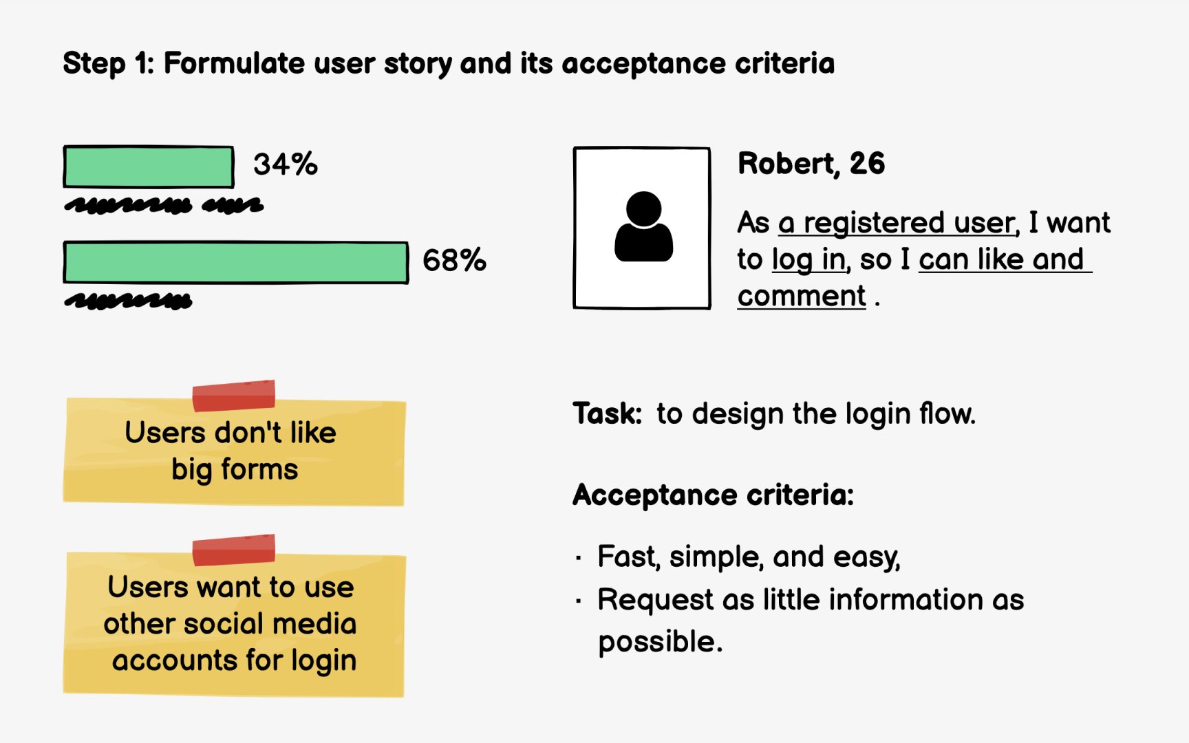
For example: "As a returning customer, I want to reorder my previous purchase, so that I can save time on repeat orders." This structure keeps the focus on user value rather than implementation details.
Acceptance criteria define what success looks like. They become testable conditions your wireframe must support. Good criteria are specific and measurable: "User can view order history from the last 12 months," "Reorder button appears on each past order," "User receives confirmation before the order is placed." These criteria tell designers exactly what elements the interface needs.
Many Agile teams include wireframes in their Definition of Ready, a checklist that stories must meet before entering a sprint. For UI-focused stories, this typically means wireframes are attached showing
Pro Tip: Write acceptance criteria before wireframing. They become your checklist for what the design must include.
After defining the
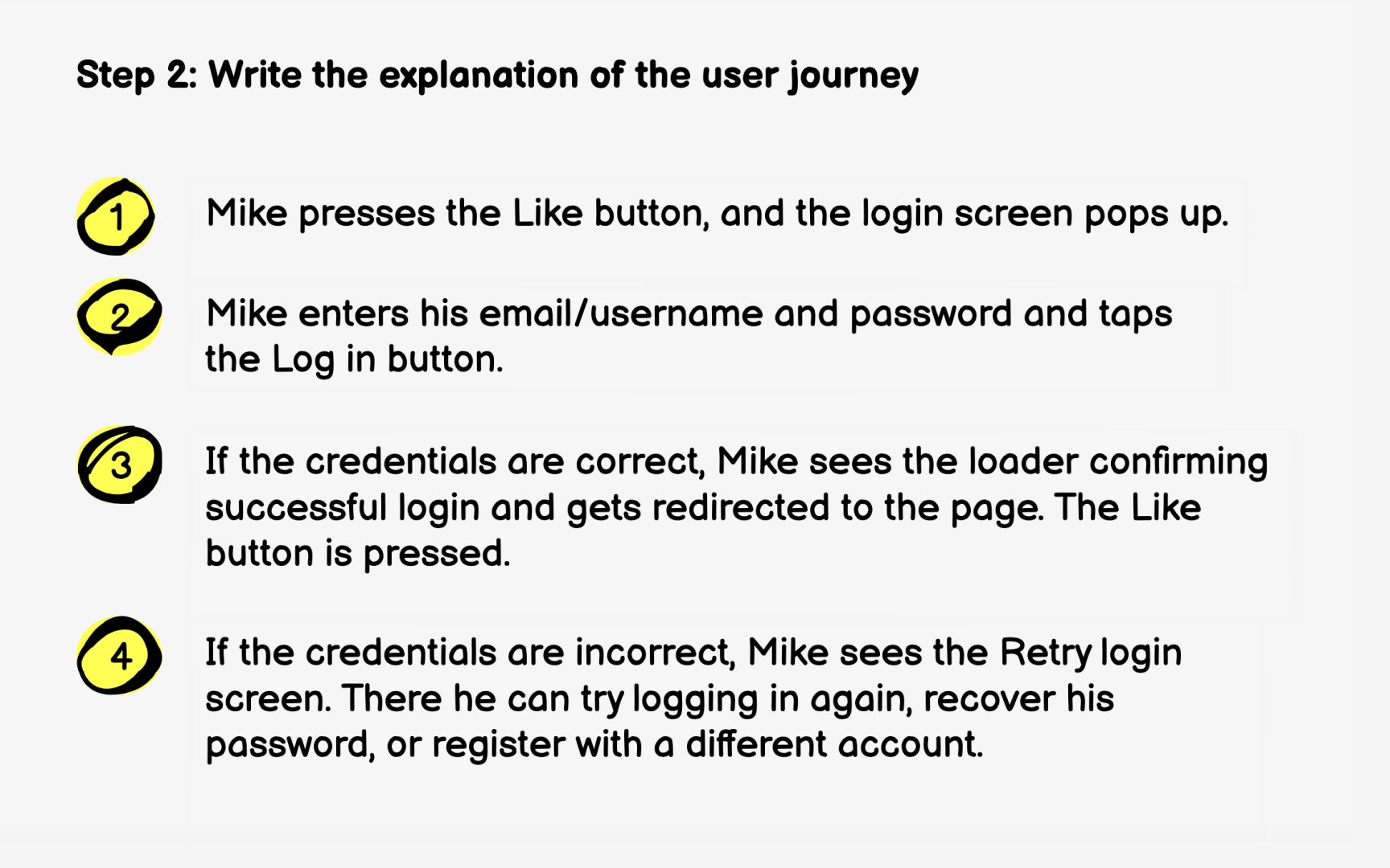
Write from the user's perspective using non-technical language. For example: "Sarah opens the app and taps her profile icon. She selects 'Order History' and sees a list of her past purchases. She finds the coffee subscription she bought last month and taps 'Reorder.' The app shows her the order summary with the same shipping address. She confirms, and sees a success message."
Keep the journey concise but complete. Include decision points where users might take different paths. What if Sarah wants to change the shipping address? What if the item is out of stock? These branches become scenarios your
The user journey also surfaces questions to discuss with stakeholders. Does reordering use the original payment method or require re-entry? Can users modify quantities? Resolving these questions before wireframing prevents rework later.
Pro Tip: Read your user journey aloud. If it sounds confusing, the actual experience probably will be too.
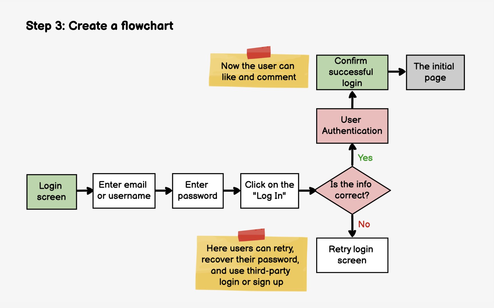
With your user journey written, map it visually as a flowchart. This diagram shows how users move through screens and how their actions lead to different outcomes. You'll get a clear picture of how many screens you need to
Start with the entry point, the action that triggers this flow. For a reorder feature, that might be tapping the "Reorder"
The flowchart reveals complexity that prose descriptions can hide. A simple-sounding feature might have multiple
Tools like FigJam, Miro, or Whimsical make flowcharting collaborative. Share your draft with developers early to catch technical constraints. They might note, for example, that checking inventory requires an API call that affects the flow's responsiveness, which influences your wireframe decisions.
Pro Tip: Color-code your flowchart paths: green for happy path, yellow for edge cases, red for error states.
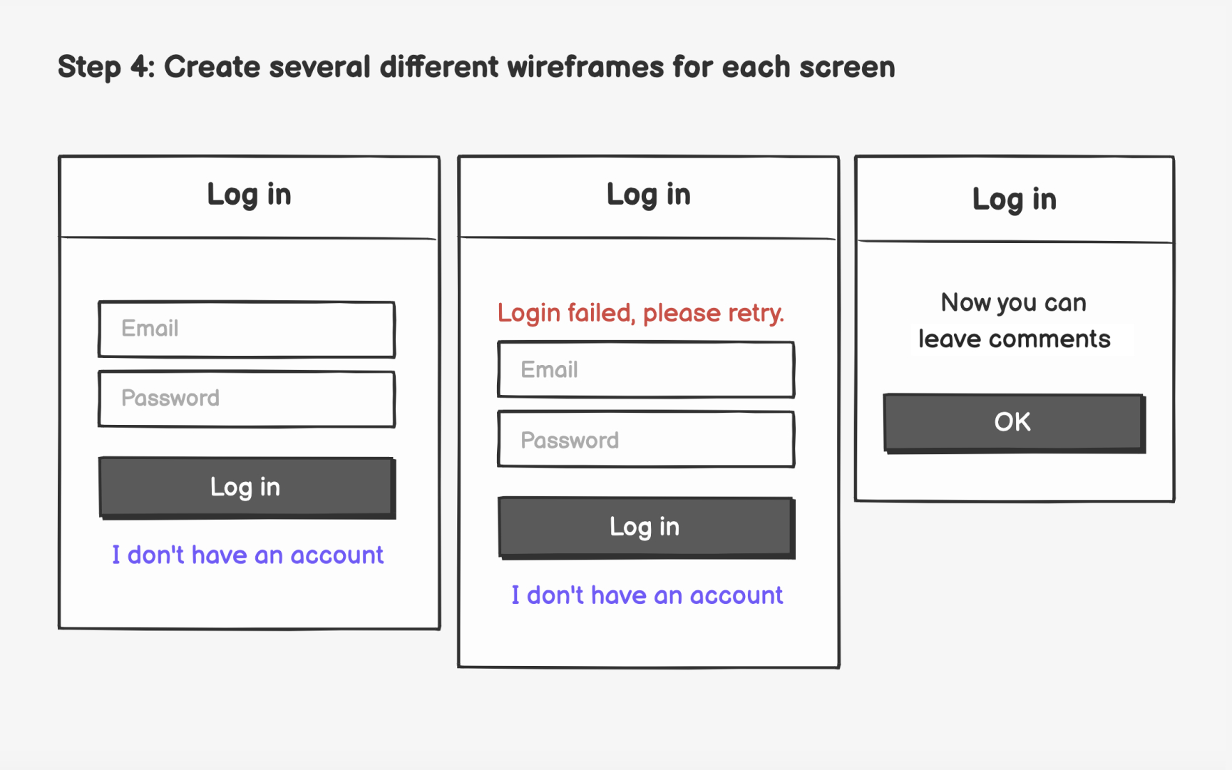
Now that you know which screens you need, start sketching multiple
For each screen, identify the required elements from your
Create at least 2-3
Evaluate your variations against user needs. Which layout makes the most important information immediately visible? Which reduces the steps to complete the task? Share options with teammates to get fresh perspectives before committing to a direction.
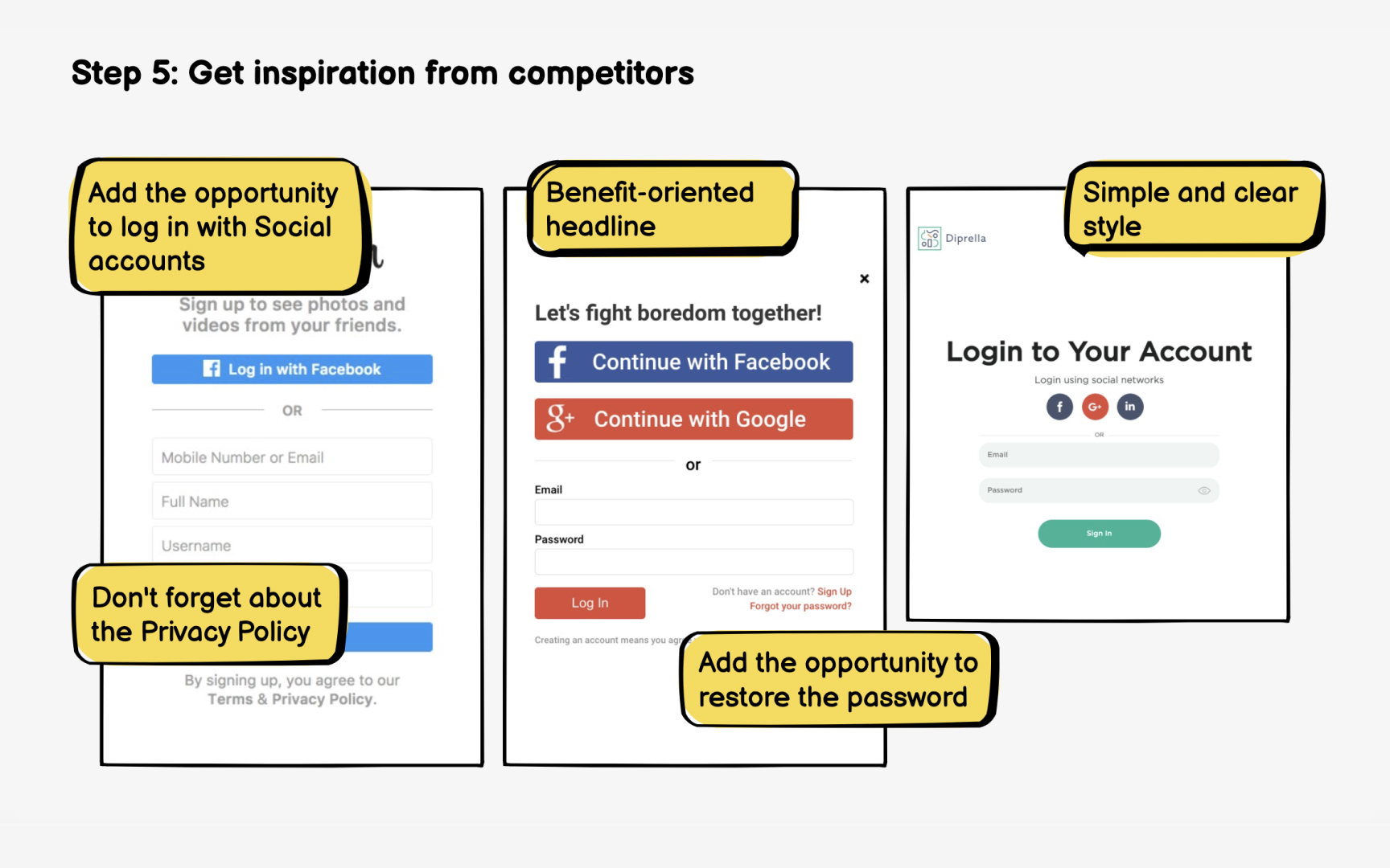
Before finalizing your
Search Mobbin, Pageflows, or similar pattern libraries for relevant screens. Looking for reorder flows? Search "repeat order," "buy again," or "
The goal isn't copying competitors. It's identifying gaps in your own design. After reviewing examples, you might realize your wireframes are missing a quantity selector, a "save for later" option, or clearer delivery estimates. These discoveries strengthen your solution.
Also look for approaches that don't work well. Negative examples teach you what to avoid. If competitor reviews mention confusing checkout flows or hidden fees, ensure your wireframes address those pain points explicitly.
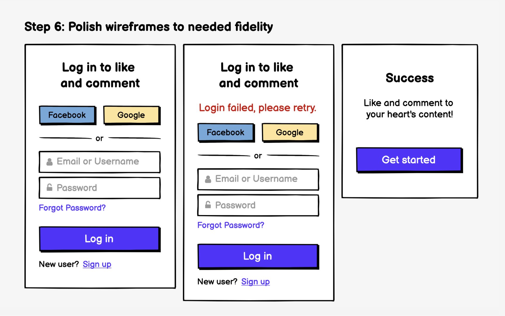
With your
Replace placeholder text with real content. Actual
Add enough visual structure for developers to understand the layout without specifying final design details. Show the hierarchy between elements, indicate which text is a heading versus body copy, and clarify spacing relationships. You're communicating structure, not dictating pixels.
For stories entering the upcoming sprint, wireframes should be detailed enough that developers can estimate and build confidently. For features several sprints away, lower fidelity is appropriate. Don't over-invest in polish for work that might change based on earlier learnings.
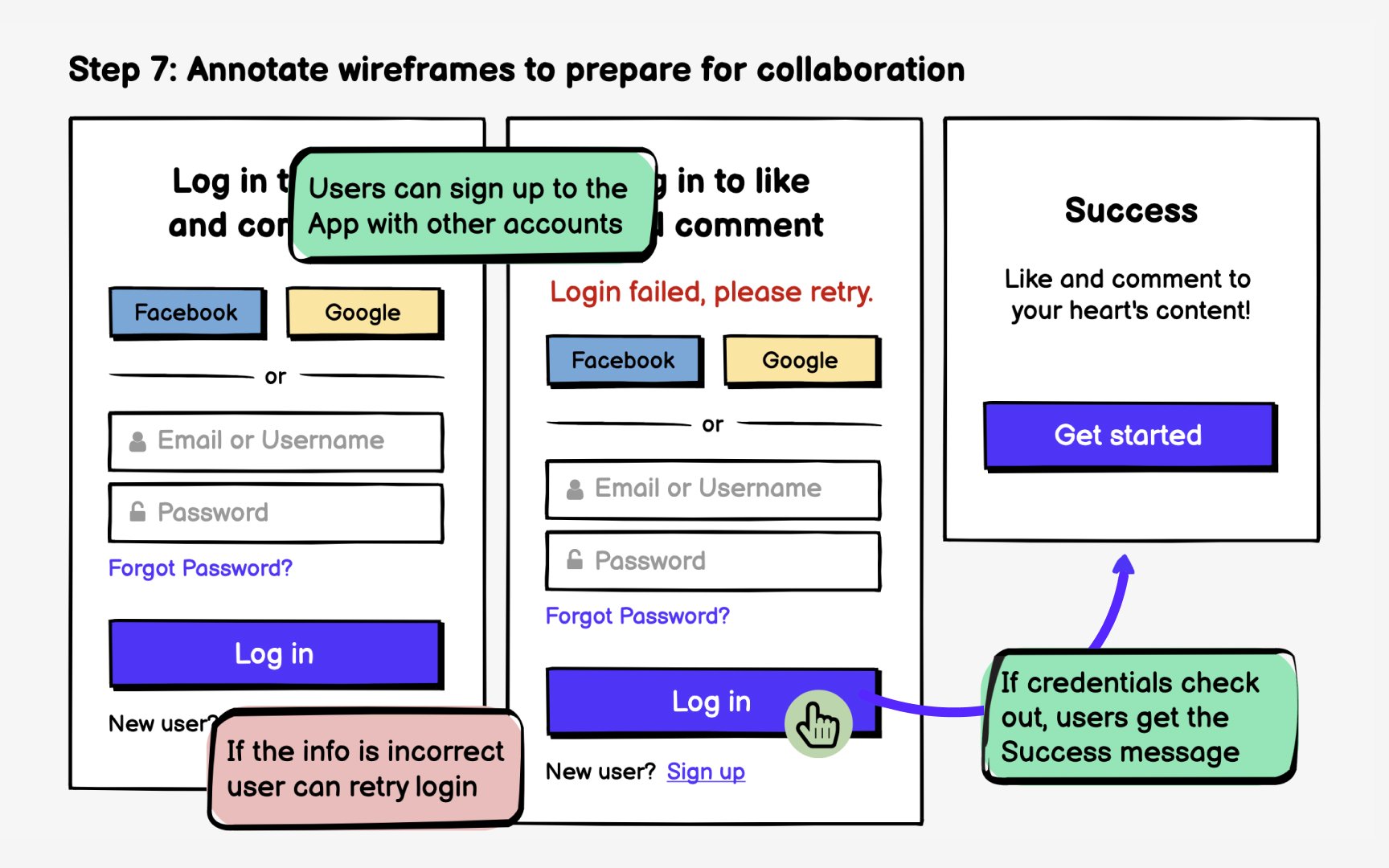
Document
Call out conditional logic clearly. "This banner appears only for first-time users." "The express
Modern tools streamline annotation workflows. Figma's commenting features let you attach notes directly to elements. When wireframes are embedded in Jira or Confluence, those annotations travel with the story. Developers can reference them without switching tools or hunting through design files.
References
Top contributors


Topics
From Course

Share


Similar lessons

Intro to Wireframing

Wireframe Fidelity
