Typography in Design Systems
Create a predictable, scalable, and accessible typography system that supports a clear hierarchy across products.
Typography can quietly break an interface or make it feel unmistakably polished. A small shift in size, weight, or spacing can change how users read, navigate, and trust what they see. When text styles lack structure, the interface becomes harder to scan and feels inconsistent. When they follow a clear, predictable logic, the entire product gains clarity and rhythm.
A strong system starts with solid foundations: a base size that supports comfortable reading, line heights that give text room to breathe, and a type scale that grows in proportional steps. Harmonious ratios and grid-aligned increments help these decisions feel intentional, creating typography that behaves consistently across layouts.
Semantic hierarchy strengthens this structure. Clear heading levels help users understand how content is organized, while thoughtful naming conventions reduce hesitation during design and implementation. Accessibility reinforces all of this by ensuring spacing, line height, and letter-spacing remain readable for a wide range of users.
When these elements work together, typography becomes more than a set of styles. It becomes a dependable system that shapes how information is understood and how teams work together to build unified experiences.
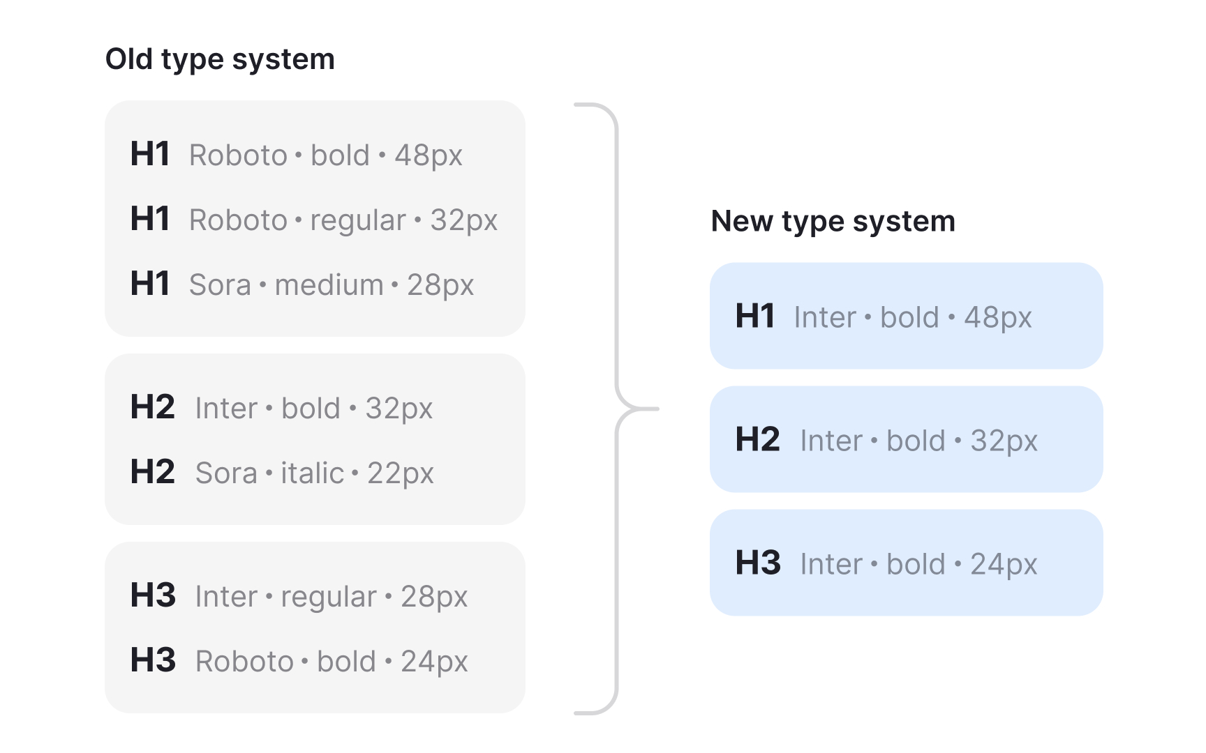
A type audit helps understand how
The next step is reviewing the visual hierarchy. Listing all current text sizes and weights helps spot patterns and inconsistencies. Some products end up with many similar sizes or styles that do not relate to each other. Seeing them together makes it clearer which ones are unnecessary and which styles appear often enough to keep. This gives a starting point for defining a cleaner, more intentional set.[1]
Pro Tip: Check several screens, not just one. Inconsistent patterns show up only when you compare pages side by side.
A clear base size is the anchor of every typography system. It sets the reading comfort level and determines how easily other styles can scale. Many interfaces start with a body size around 14 to 16 pixels because these values remain readable across dense
Once the base size is stable, designers can build predictable relationships between styles. Using consistent units like rem helps the system scale with user settings, and sp units do the same in native environments . This improves
A reliable base size also simplifies decisions for teams. Instead of comparing arbitrary numbers, designers can generate
A well chosen base size also minimizes inconsistencies during handoff. Developers can rely on a single reference point instead of interpreting multiple unrelated values. It becomes easier to maintain
Pro Tip: Choose a base size that stays readable in your most text heavy screens. It prevents issues later across the entire scale.
Line height directly affects how easily users follow lines of text. If spacing is too tight, the eye struggles to track the next line, especially in longer paragraphs. If spacing is too wide, text loses cohesion and slows reading. A practical starting point for body copy is a line height around one and a half times the font size, which aligns with WCAG guidance and keeps text open without feeling disconnected . Designers often refine this value by testing several options in real
Line height also interacts with vertical rhythm and spacing systems. When line heights align with a 4 or 8 point
Pro Tip: Always review line height inside real paragraphs. Short samples hide spacing issues that appear during actual reading.
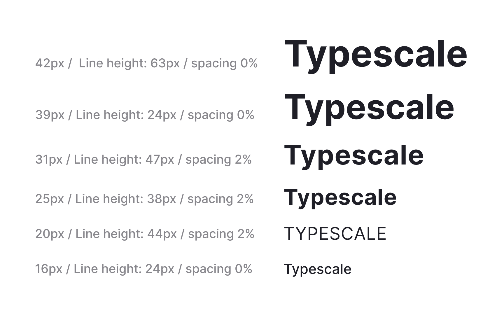
A modular type scale creates predictable steps between text sizes. Instead of choosing values one by one, designers define a ratio and generate sizes from a shared base. This keeps hierarchy consistent across
A scale becomes more effective when its values align with spacing systems. Rounding sizes to multiples of 4 or 8 helps the
Tools like Typescale help compare ratios during early exploration. Seeing multiple scales side by side makes it easier to evaluate how quickly sizes grow and whether each step remains usable for headings,
Pro Tip: Pick a ratio that creates visible steps, then round to grid friendly values to keep the system easier to maintain.
Semantic hierarchy ensures that text styles match their meaning and purpose in the interface. Headings represent structure, not just visual size. Using levels from H1 to H6 in a logical sequence helps users understand how
Different platforms group text roles in specific ways. On the web, common groupings include headings,
Pro Tip: Choose names that describe a text style’s role so people select it for the right purpose.
Font weight shapes how users perceive hierarchy and emphasis. A readable system does not rely on size alone. Weight helps distinguish headings,
- Regular works well for long paragraphs because it preserves comfortable reading.
- Medium aligns visually with icons, especially line icons that often appear near text.
- Bold gives emphasis when needed but should be used sparingly to avoid losing contrast between levels.
Weight also affects how text appears next to elements with different densities. A light weight can feel lost on busy
Pro Tip: Check weights next to icons and UI controls to confirm they feel visually balanced.
Paragraph and letter spacing improve legibility by giving text enough separation to read comfortably. Letter spacing adjustments benefit smaller sizes that often appear in captions or metadata. Slightly looser spacing helps distinguish each character. Larger display sizes sometimes benefit from slightly tighter spacing because the increased scale already gives characters more breathing room.
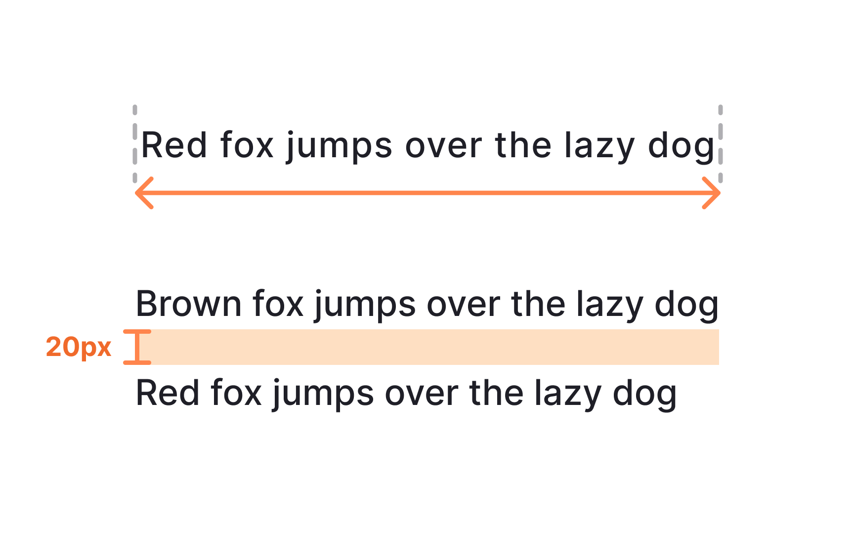
Paragraph spacing helps users identify where one thought ends and the next begins. Clear separation prevents large text blocks from blending together. WCAG suggests using spacing after paragraphs that is at least twice the font size, which improves comfort when scanning longer
Some
Pro Tip: Test spacing within full text blocks. Adjustments that look small in isolation often have a large impact in real layouts.
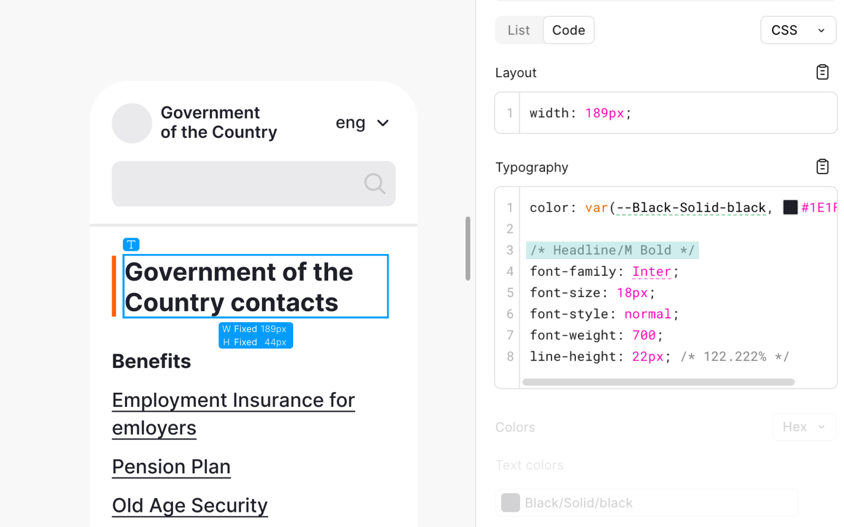
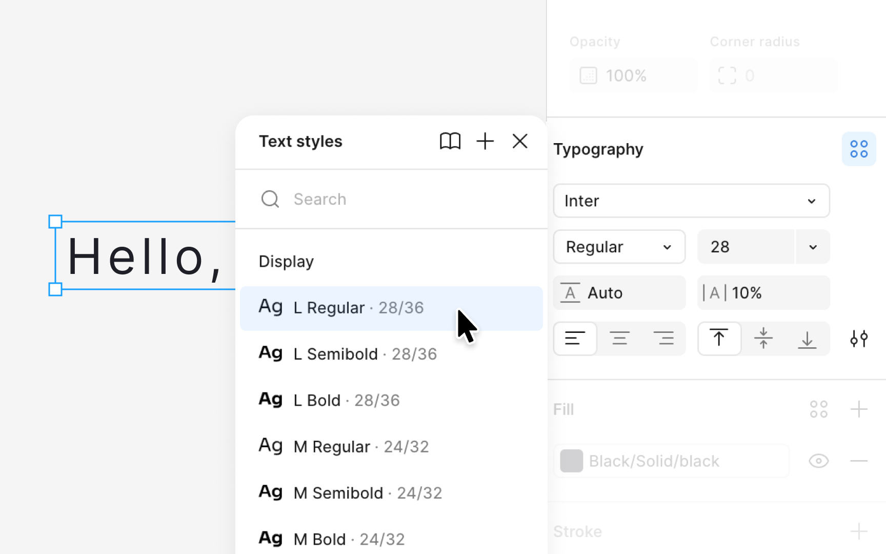
Creating text styles in Figma starts with preparing a text layer that already includes the
Publishing styles makes them available across files in your
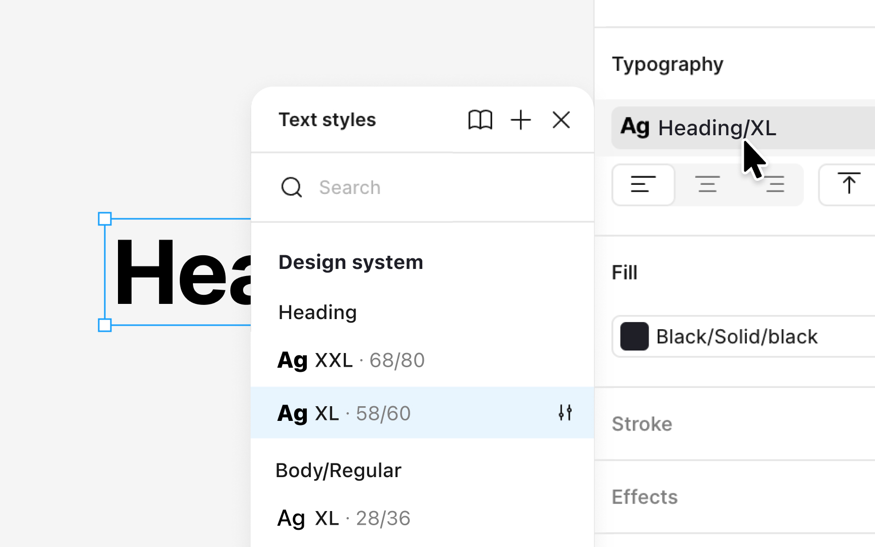
Figma groups text styles automatically when slashes appear in their names. A slash tells Figma to treat the name before it as a folder and the name after it as the item inside that folder. For example, a style named “Heading/XL” creates a group called “
To edit any style, select the layer, open the style picker, right-click the style, and choose Go to style definition to edit. This takes you to the Local styles panel where the original style lives. From there, open the Edit
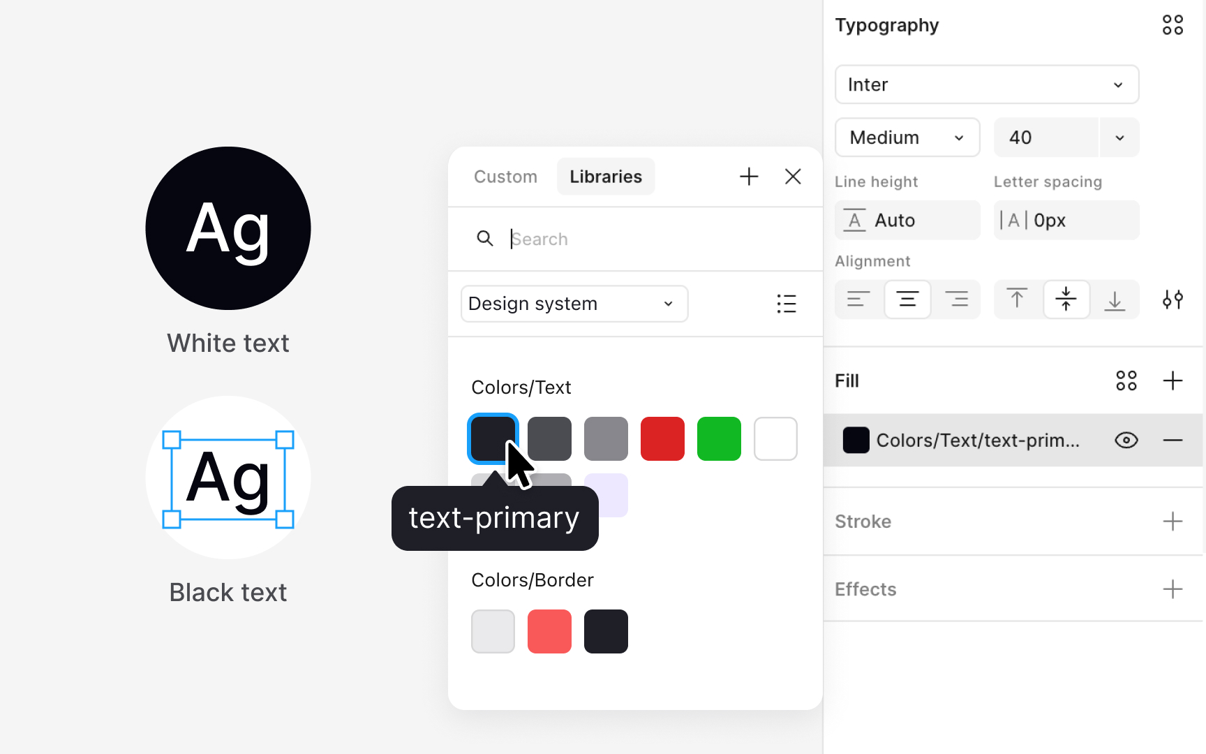
Text styles in Figma do not include color, so applying color styles separately is an important part of building a full
Color styles can also help communicate intended usage. Many teams create text-specific color styles, such as colors designed for light backgrounds or for dark backgrounds. These styles can include descriptions in their details to clarify where they work best. Pairing color styles with
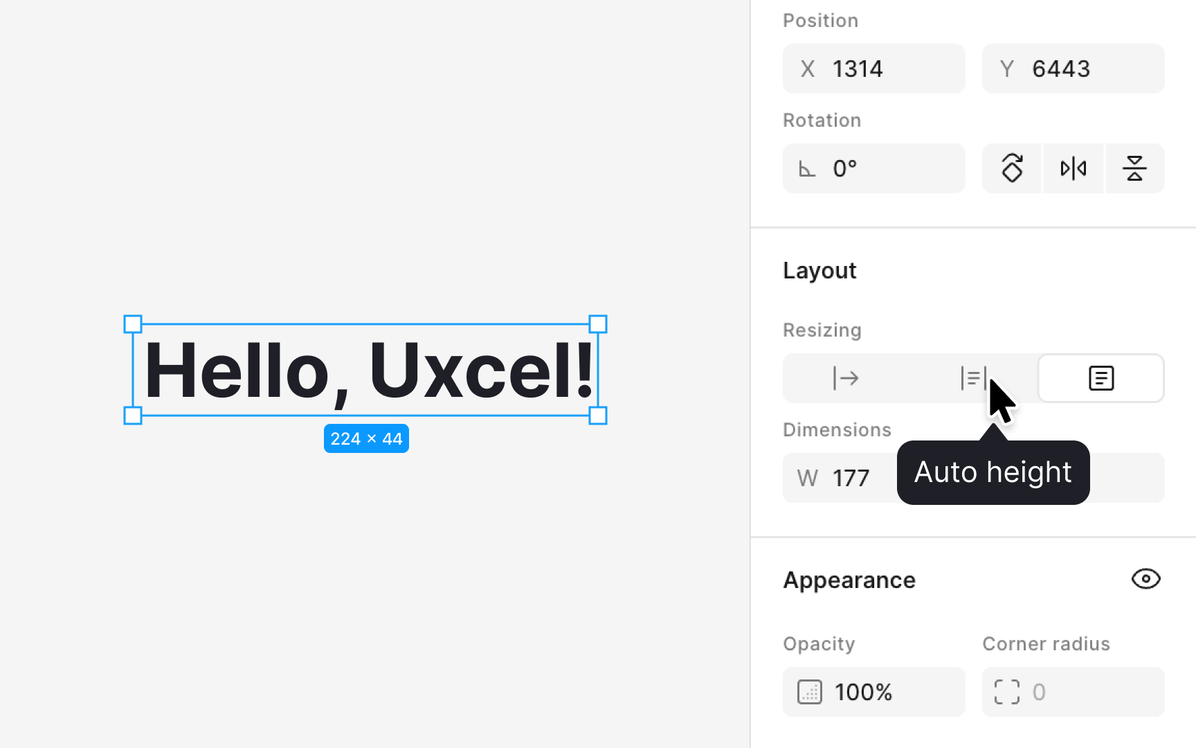
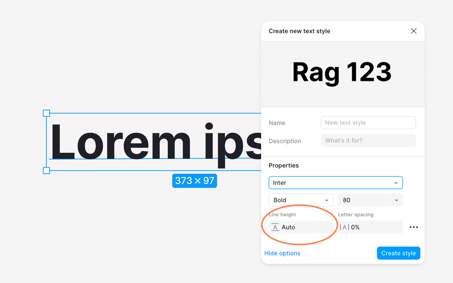
This accuracy matters during development. If text boxes are too tall or too short, spacing that designers measure in Figma will not match what developers see in code. Auto height ensures the text box height reflects the actual line height value, which leads to more consistent spacing between components. When preparing files for production, reviewing text layers and switching them to this mode helps avoid
Pro Tip: Switch text layers to Auto height before handoff to prevent spacing mismatches.
References
- Create and apply text styles | Figma Learn - Help Center
Top contributors

Topics
From Course

Share


Similar lessons

Anatomy of UI Components

Atomic Design by Brad Frost
