Spacing & Sizing in Design Systems
Create predictable, balanced interfaces by applying consistent spacing and sizing rules.
Fonts can be beautiful, and colors can be on-brand, but uneven gaps make everything feel slightly off. When spacing feels right, an interface suddenly looks polished. Good spacing brings a sense of calm and balance. It turns a basic layout into something that looks intentional, trustworthy, and even premium.
A spacing and sizing system gives this quality a structure. Instead of guessing gaps or adjusting elements by eye, teams rely on a shared base unit and a predictable scale. This removes noise from the design process and keeps components aligned across screens and breakpoints. Consistent spacing also shapes how information is grouped, how users scan content, and how hierarchy is perceived.
Sizing follows the same idea. When components, images, and text sit on the same scale, they feel related. Buttons have a clear visual weight, cards feel stable, and layouts gain rhythm. With predictable spacing and sizing rules, interfaces become easier to build, easier to maintain, and much easier to read.
Spacing and sizing often look similar at first glance, yet they serve very different purposes in a design system. Sizing controls the dimensions of elements themselves, such as the width or height of
Systems often use linear or geometric progressions like 4, 8, 12, 16, 24, and 32 …64px to build consistent sizes for components, media, and typographic primitives. These scales become even more reliable when aligned with a shared base unit.
Spacing deals with the empty space around and between elements. It controls margins, paddings, gaps, and the visual rhythm of
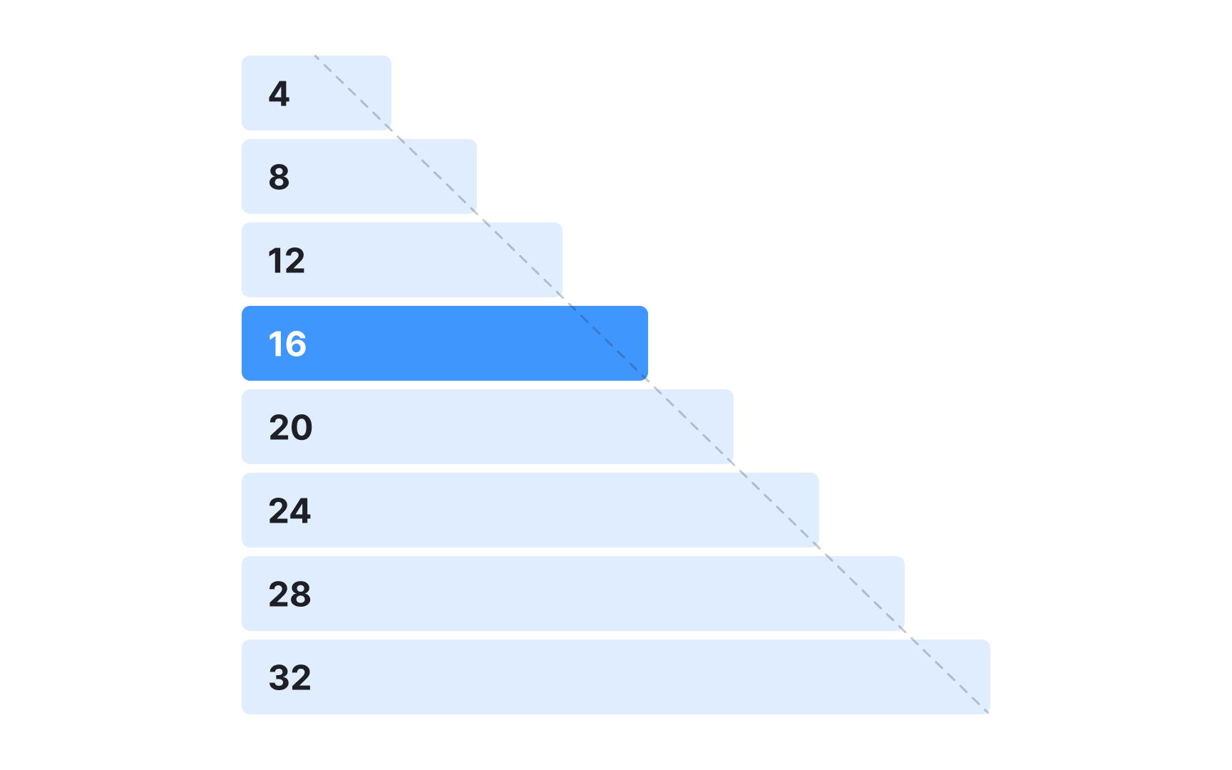
A spacing system starts with a single base unit that all other values build on. Many design teams use an 8px base because it keeps spacing options simple and visually consistent. This scale appears in several systems. Atlassian uses 8px as the foundation for values that range from tight 2px increments to wider 80px distances. Other systems follow a similar approach since an 8px unit is easy to divide into quarters and halves, which helps when refining compact
At the same time, 8px is not a rule. Many modern systems use a 4px base to allow finer control, especially in dense interfaces or smaller components. Both approaches follow the same principle: one consistent unit that keeps spacing decisions aligned.
A clear base unit helps create predictable spacing patterns. Smaller ranges work well for tight gaps inside compact components, while medium values give elements like inputs or cards more breathing room. Larger sizes help structure full
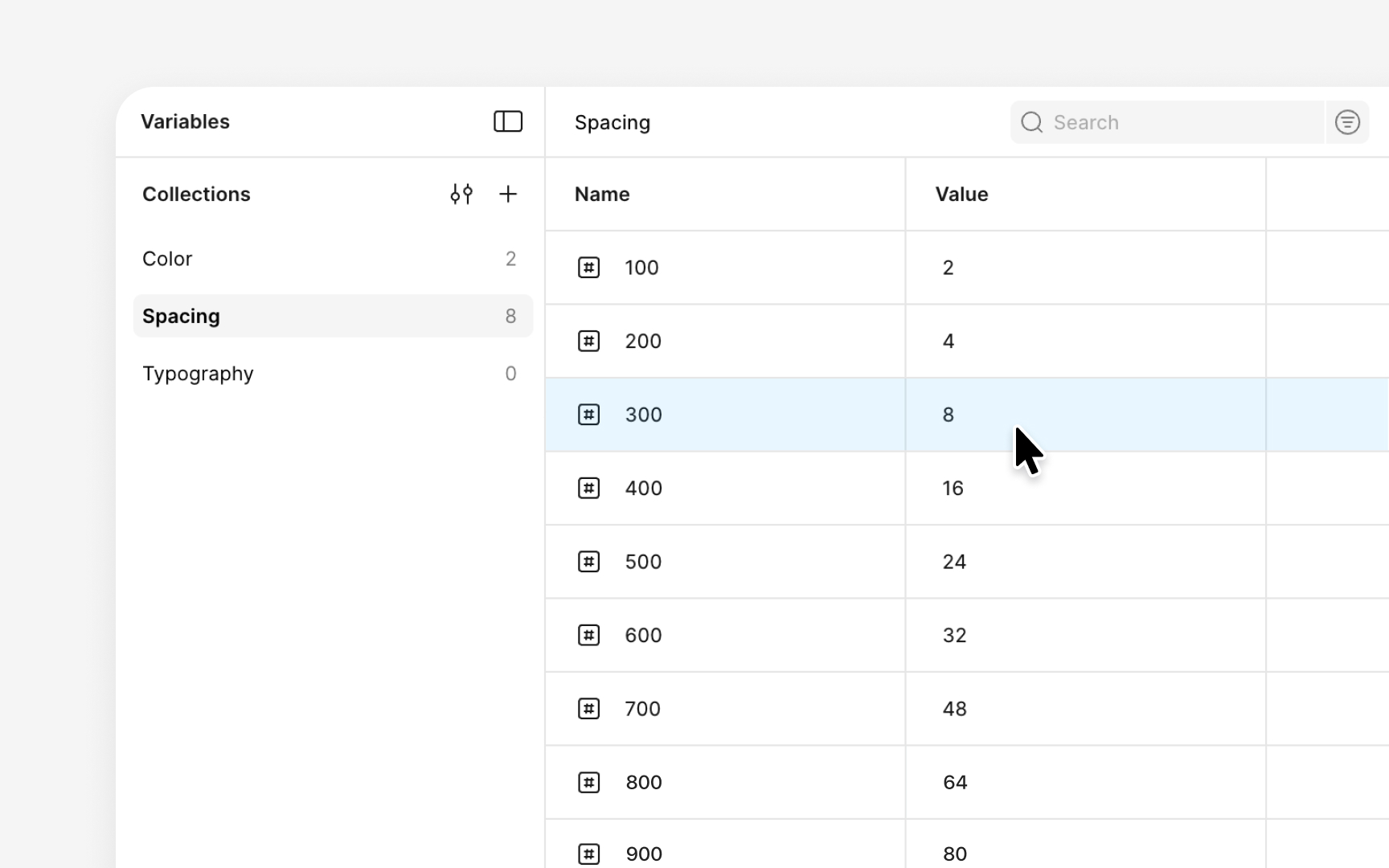
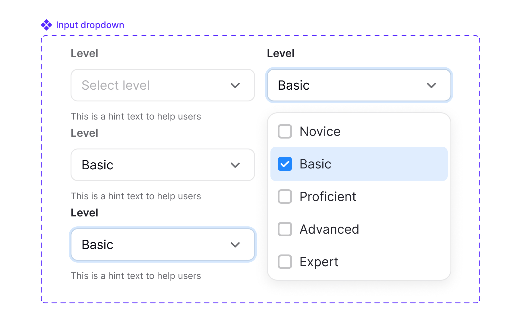
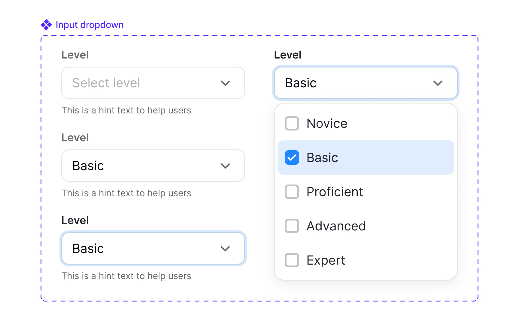
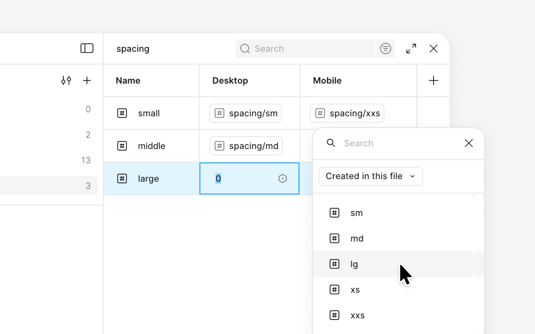
A spacing scale becomes much easier to use when it is implemented as a set of variables. In Figma, this begins by creating a collection dedicated to spacing. Each value is added as an individual variable, often built from a base unit using clear, predictable increments such as 2, 4, 8, 16, 24, 32, 48, and 64. These values are typically named in a numeric sequence like spacing-01, spacing-02, or spacing-03, which keeps the scale ordered and easy to scan. This forms the set of raw spacing values.
On top of the numeric scale, some teams choose to add a second layer of semantic aliases. This is a convention rather than a rule. Each alias points to one of the numeric variables, keeping the system stable while making everyday usage more intuitive, for example:
- spacing-xs → spacing-02
- spacing-sm → spacing-03
- spacing-md → spacing-04
This approach allows designers to think in terms of functional size without losing the clarity of the underlying scale.
With variables in place, the spacing scale can be applied consistently across components and layouts. Designers can use them for auto
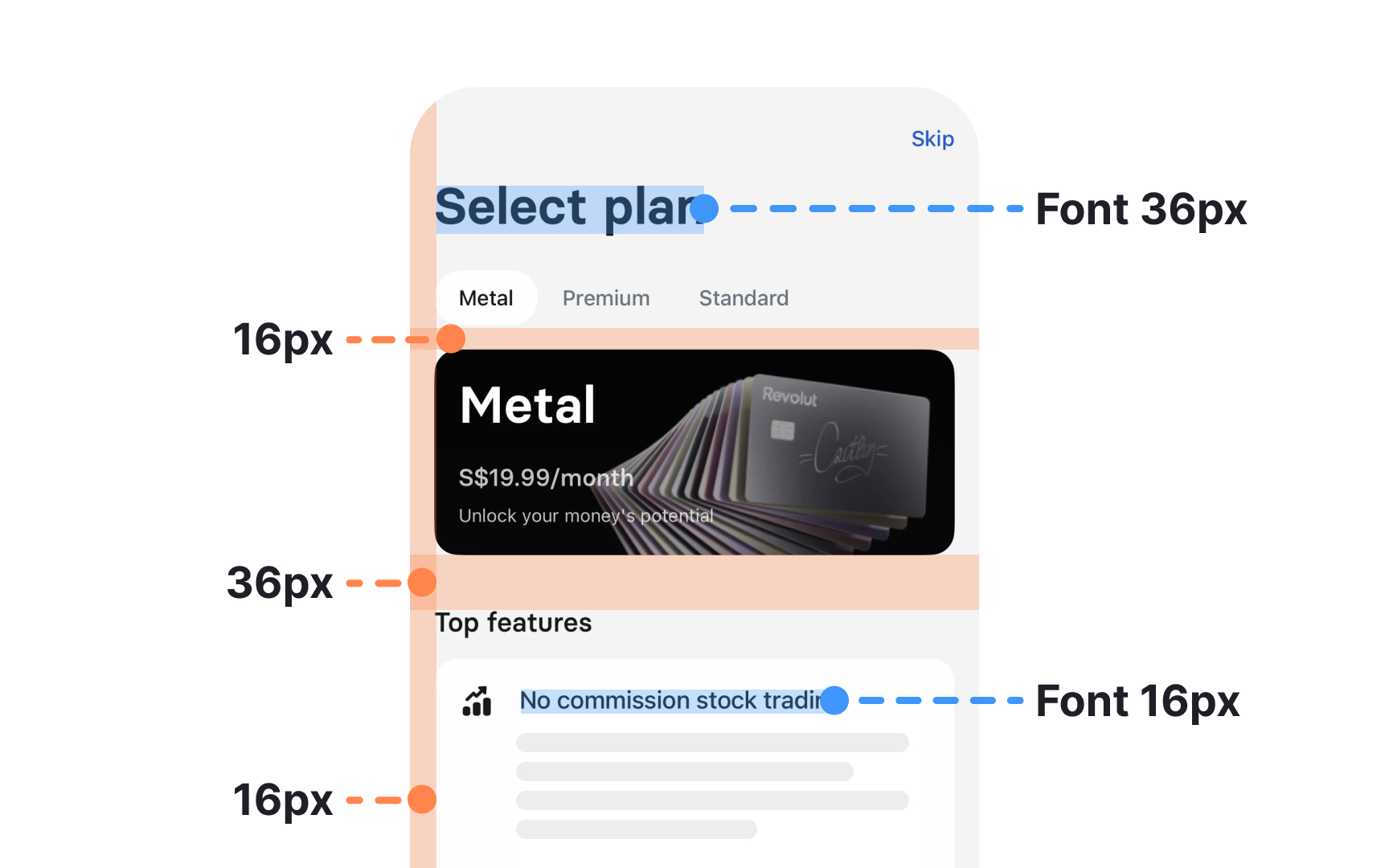
Spacing helps readers understand which elements belong together and which ones serve different purposes. When spacing follows clear rules, the
Hierarchy also depends on how spacing interacts with scale and whitespace. Increasing space around an element can make it feel more important, while reducing space can signal that items belong to the same group. Regular rhythm, created through repeatable spacing patterns, helps users predict how the layout behaves as they move down the page. Lists, cards, and sections become easier to read when they follow the same spacing logic, since users quickly learn what each distance communicates.
Spacing can be adjusted optically when needed. Some components may require subtle changes because their visual weight affects how gaps appear. These adjustments should be treated as exceptions to the core spacing rules. If they are used more than once, they need to be documented and tokenized so they remain consistent and intentional without breaking the overall system.
Pro Tip: When unsure whether two elements should sit closer or farther apart, check if they serve one action or two different ones.
Internal spacing creates room inside a component, while external spacing separates it from surrounding elements. Keeping these two types of spacing in balance makes
Internal spacing shapes how
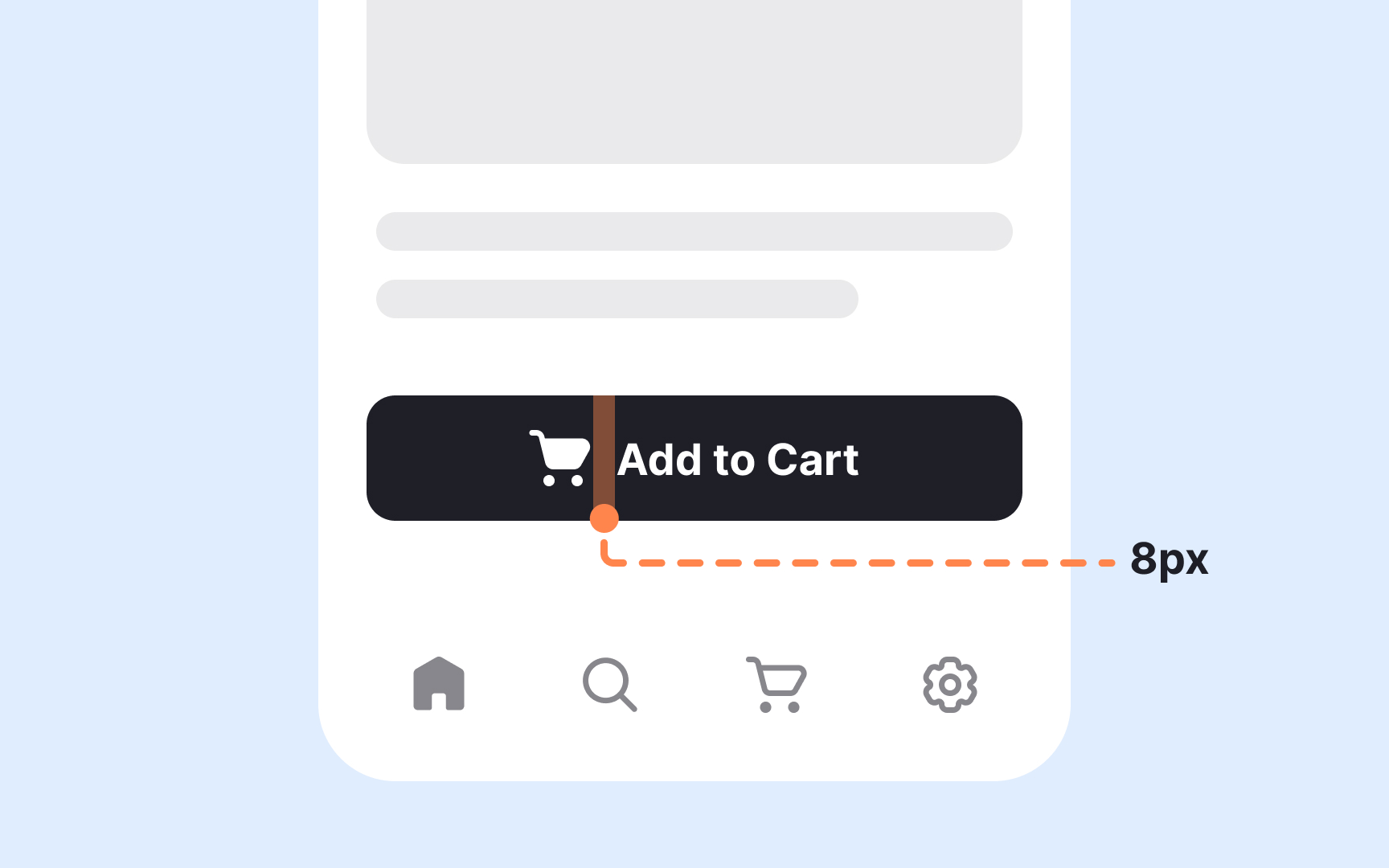
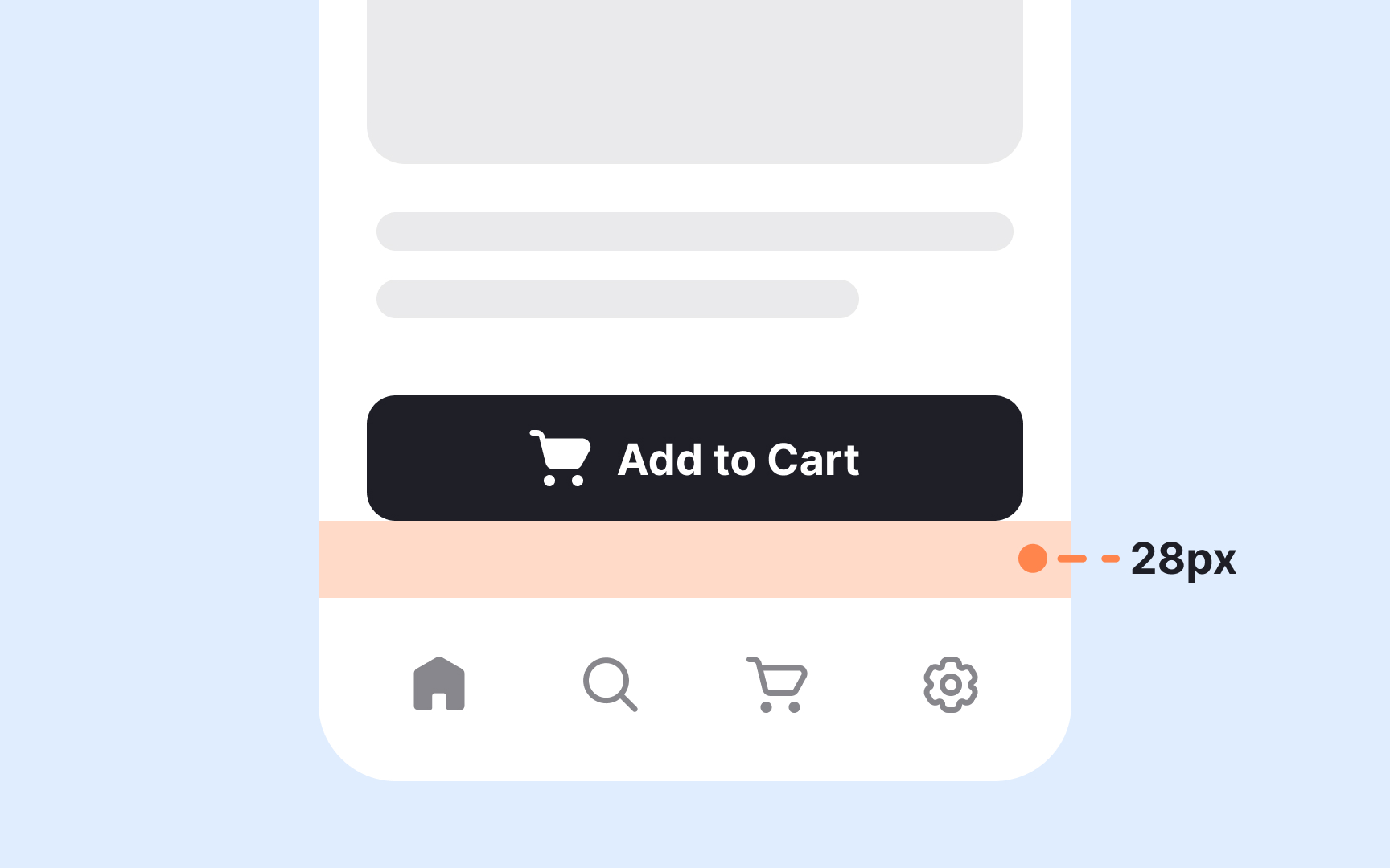
A spacing system becomes more flexible when its variables adapt to different device sizes. In Figma, this is done by creating multiple modes inside the same spacing collection. Each mode contains its own values while keeping the structure and naming of the scale unchanged. This approach allows the same spacing aliases to adjust automatically for mobile, tablet, or desktop layouts.
The setup begins by creating modes such as mobile, tablet, and desktop within the spacing collection. Each variable then receives a value for every mode. For example, the md alias can reference 16px in the mobile mode and 24px in the desktop mode. Both values come from the spacing ranges seen in systems that use an 8px base unit, which typically include 16px for medium spacing and 24px for roomier layouts. The name stays the same, but the spacing adapts to the screen size. Designers can switch modes to preview how those changes affect component spacing and overall density.
After assigning values, these adaptive variables can be used for auto
Pro Tip: Keep each mode aligned to the same scale structure so spacing changes consistently across breakpoints.
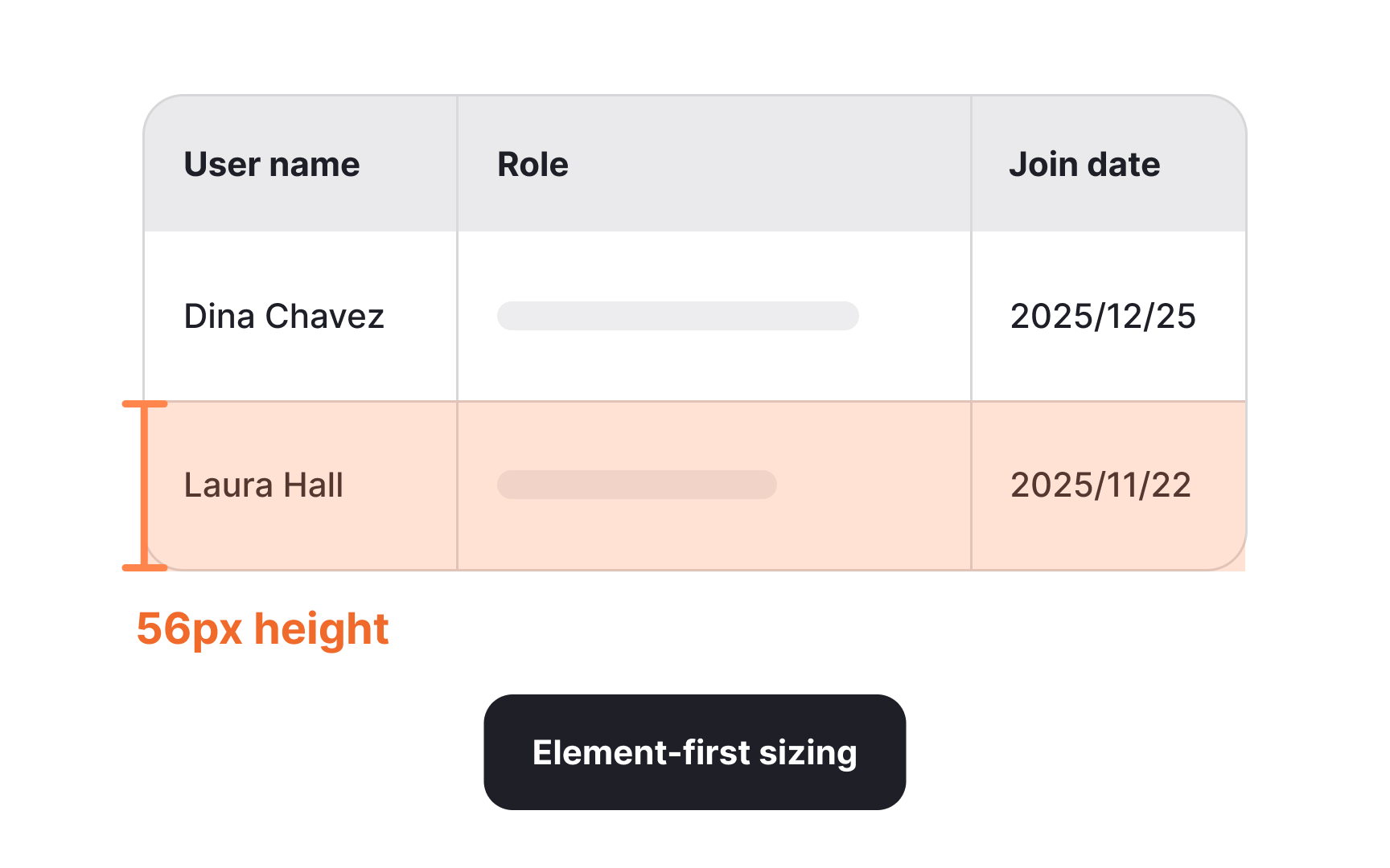
Component sizing can follow two different approaches depending on what the interface needs to prioritize. Element-first sizing focuses on setting a fixed height or width for a component. This method is useful when the element needs to stay visually consistent across many layouts.
Content-first sizing takes the opposite direction. Instead of fixing the overall dimensions, this approach preserves the internal
Choosing between the two approaches depends on the purpose of the component. Elements that need visual uniformity across screens are better suited to fixed sizes, while content-heavy areas benefit from flexible dimensions.
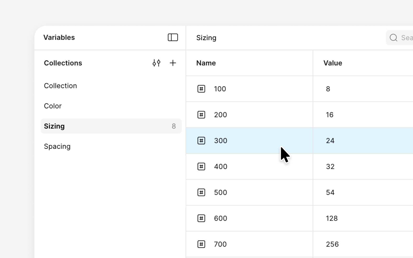
A sizing system becomes easier to maintain when all values are organized into a dedicated variable collection. In Figma, this begins by creating a new collection focused entirely on sizes. Inside this collection, each numeric value is added as an individual variable. These values follow the sizing scale, which often includes increments such as 8, 16, 24, 32, 40, and 64. Adding them as separate variables keeps the system clean and makes the scale easy to extend. Using simple numeric names like 100, 200, 300, or size-8, size-16, and size-24 helps keep everything sorted and predictable.
Once the numeric layer is defined, alias variables can be added to make the system more intuitive. Each alias references one of the numeric variables and gives it a clearer purpose. This creates a two-layer structure similar to the spacing system. For example, aliases such as sm, md, lg, and xl can point to values that match the intended scale. The naming becomes easier to use in daily work, while all updates still flow from the core numeric values.
After the collection is complete, the size variables can be applied across components. They can control the dimensions of
Most spacing and sizing systems rely on predictable increments. For example, a scale built on an 8px base often grows in clean steps such as 8, 16, 24, 32, 40, 48, 64, 80, and so on. These values stay aligned with the base unit and help keep components visually consistent. In practice, though, some elements need a size that sits between these regular steps. Maybe a component looks too cramped at 256 but too loose at 320. When that happens, a custom value can be added without breaking the entire system.
One way to handle this is to create a separate variable with an irregular numeric name. Instead of following the main sequence like 600, 700, 800, the custom value can use a number that stands apart, such as 725 for a value like 300. This naming makes it immediately clear that the value does not belong to the normal scale. It still solves the design need, but it does not confuse designers into thinking it is part of the standard progression. However, this should be done carefully, since frequent exceptions are one of the fastest ways a
Custom values work best when they have functional or irregular numeric names. A functional name, such as card-media-height or table-row-gap, explains exactly where the value is meant to be used. An irregular numeric name signals that the value is a one-off and should not be reused casually. Both approaches protect the structure of the main scale while giving designers enough flexibility to fine-tune
If a custom value ends up being useful across multiple components, it can be reviewed and added to the official scale later.
Spacing and sizing work best when they support each other across an entire
These shared rules help layouts stay consistent across screen sizes. Column grids with defined gutters create predictable horizontal spacing, while the spacing scale shapes vertical rhythm. When elements like cards or
Applying both systems together also reduces the number of one-off decisions designers need to make.


Similar lessons

Anatomy of UI Components

Atomic Design by Brad Frost
