Iconography in Design Systems
Create icons that stay consistent, legible, and aligned with the visual language of your design system.
Icons look simple, yet they carry a high amount of responsibility. Icons look simple, yet they carry a lot of responsibility. They guide users, communicate actions, and support navigation in tight spaces where words do not fit. In modern design systems, icons are treated not only as static visuals but as dynamic elements that respond to state changes such as hover, active, disabled, or loading. A well-defined iconography standard helps teams manage this complexity and keep interfaces predictable.
Clear rules around grids, size, stroke, and metaphor ensure that every icon feels like part of the same family. When the shapes, corner treatments, and visual weight are consistent, icons become easier to scan and quicker to recognize. This also reduces cognitive load for users across features and platforms.
Standardizing naming, grouping, and file structure keeps the library manageable as it grows. Designers can confidently add new icons and avoid duplicates, while engineers benefit from stable assets and predictable formats. With a shared approach to structure and style, iconography becomes a reliable tool rather than a point of friction.
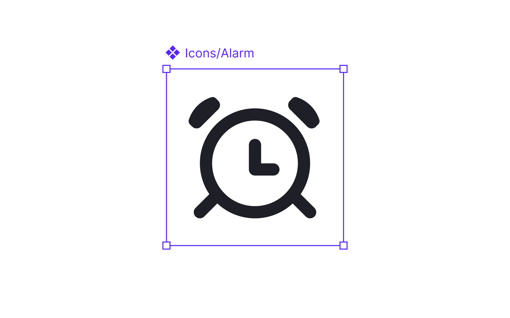
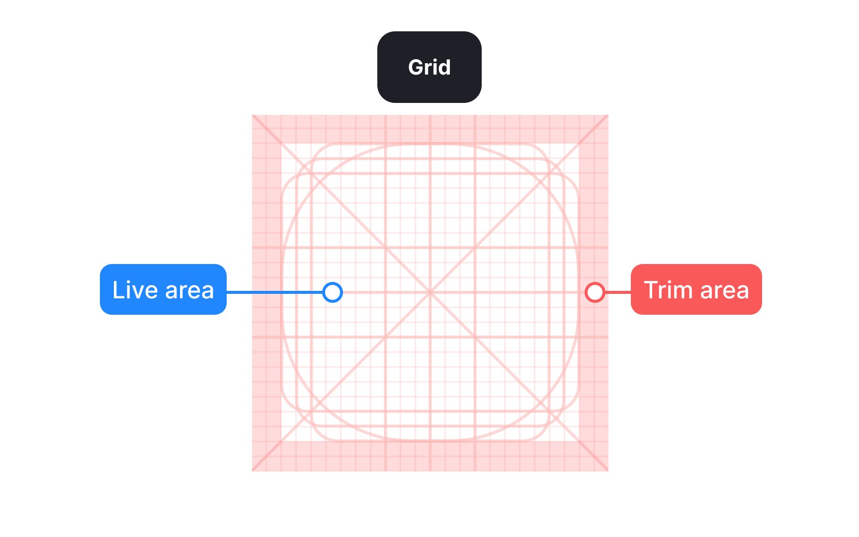
Icon size is defined by the outer frame, such as 16, 24, or 32 pixels. This frame sets alignment and bounding rules, making it easier to place
Inside the frame, a grid helps position shapes and separates the live drawing area from the trim area. The trim creates breathing room so icons do not feel cramped. Not all icons should fill the frame evenly. Compact or square shapes often need more padding, while narrow or elongated shapes may extend closer to the edges. This optical balance ensures icons feel equal in size and weight, even when their shapes differ. Beginners often fill the entire frame, which can make some icons feel too heavy or visually dominant.
Smaller frames usually use tighter trim and thinner strokes, while larger frames allow more space and thicker strokes to maintain balance. For example, a 16 pixel icon often uses a 1 pixel stroke, while a 24 pixel icon may use a 1.5 pixel stroke. Larger sizes can increase further to keep visual weight consistent. Treating each size as its own design task and adjusting shapes optically rather than scaling them mechanically helps icons remain clear, balanced, and consistent across the set.[1]
Pro Tip: Keep corner rounding consistent across icons. Even small differences can make shapes look uneven at smaller sizes.
Metaphors determine how quickly users understand what an icon represents. The most reliable
Because of this, clarity matters more than novelty. Icons built on uncommon or ambiguous metaphors often force users to stop and think, which slows interaction and increases the risk of misunderstanding. Relying on patterns that are already common across platforms helps keep interfaces predictable, especially in dense
For this reason, pairing icons with text labels is strongly recommended. Labels remove ambiguity and make the intended action clear, even when an icon is unfamiliar or slightly repurposed. Together, icons and labels support faster recognition, better accessibility, and more confident decision-making.[2]
Pro Tip: If a metaphor needs explanation, it is likely not the right choice for an icon.
Simplicity is essential for
Excessive detail tends to blur or disappear when an icon is viewed at small scales. Fine lines, inner patterns, or unnecessary angles can become hard to read and may create uneven visual weight within the set. Minimizing detail keeps shapes crisp and helps icons stay legible across different screen densities.
Keeping forms simple also reinforces consistency. When all icons follow the same level of refinement, they appear more cohesive as a system. This makes it easier for users to scan interfaces and easier for teams to expand the icon set without constant stylistic adjustments.
Pro Tip: If removing a detail does not change the meaning of the icon, leave it out.
For example, an outlined icon may represent a default state, while the filled version indicates a selected or active state, such as a favorite, a bookmark, or visibility on and off. Used this way, variants communicate meaning instead of adding decoration.
To maintain consistency, each style must follow the same structural rules. Stroke alignment, corner treatments, trim areas, and overall proportions should match across variants. When these rules stay consistent, switching between outlined and filled versions feels intentional rather than disruptive.
Using variants responsibly also supports
Pro Tip: Use filled icons sparingly. When everything is emphasized, nothing stands out.
Different densities also affect how much detail an icon can safely contain. Smaller sizes work best with simplified shapes because thin lines or small gaps may disappear on high-density or low-density displays. Larger sizes can support slightly more detail, but they must still follow the same structural rules to remain part of the same system.
Using scalable formats such as SVG helps icons stay crisp without generating multiple raster files. These files preserve vector shapes and allow icons to adapt to different screen densities without losing sharpness. They also make it easier for teams to maintain consistent behavior across platforms.[4]
Pro Tip: Use SVG for handoff. It keeps icons sharp across densities and reduces maintenance work.
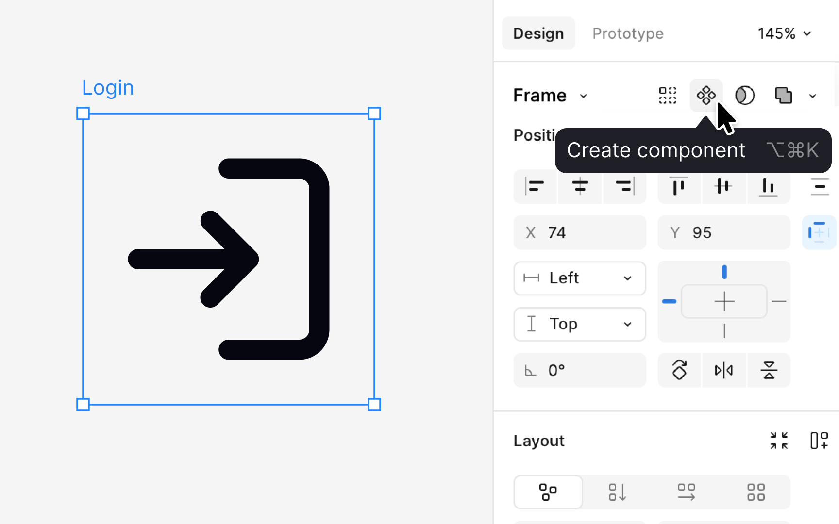
Before an
This step should happen only after the icon has been fully reviewed and approved. Once the designer is confident that the shape, proportions, and alignment are final, the icon can be readied for production use.
At this stage, the final drawing is flattened into a single clean vector layer. Flattening removes hidden paths, effects, and strokes that could cause issues later. It also ensures the icon has a predictable internal structure that matches the rest of the set and behaves consistently when reused, updated, or replaced.
After flattening, designers apply a color token such as content primary. This token keeps the icon responsive to theme changes. Once the color is applied, the icon is placed inside a frame that matches its intended size, for example, 16 or 24
Pro Tip: Always flatten the icon before creating a component. It prevents broken overrides later.
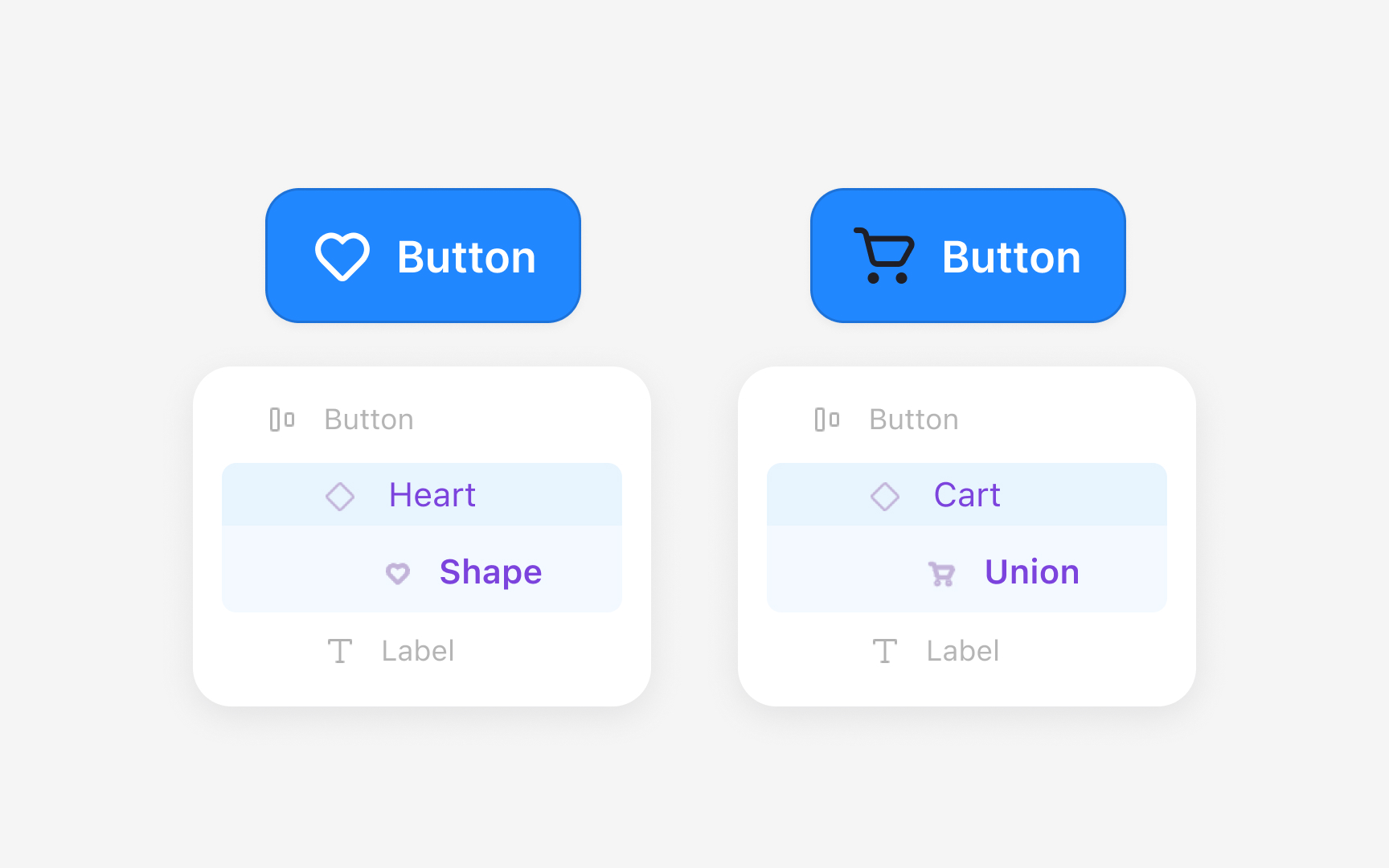
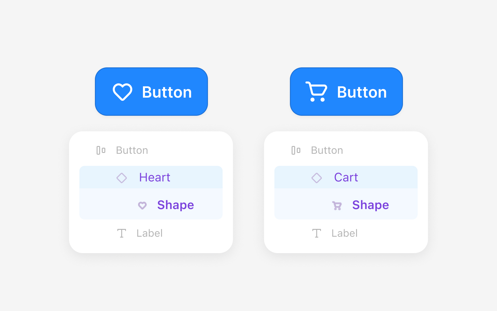
Organizing an icon library starts with grouping
The internal structure of each icon is crucial for keeping overrides intact when swapping icons in
Keeping identical layer names, order, and structure across all icons prevents this problem and keeps the library stable.
Pro Tip: Use one flattened vector named exactly the same across all icons. Even a difference in letter case causes overrides to reset.
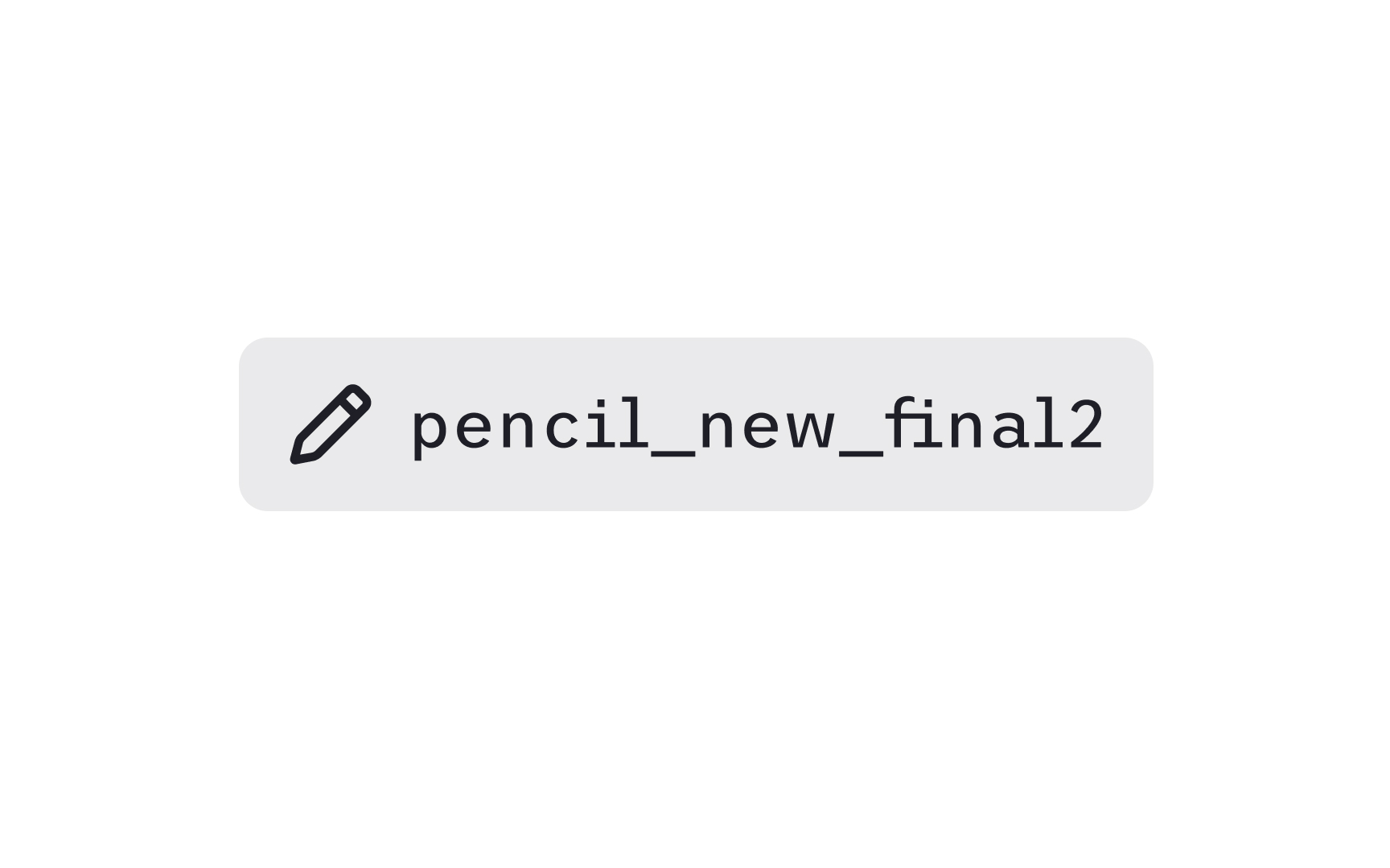
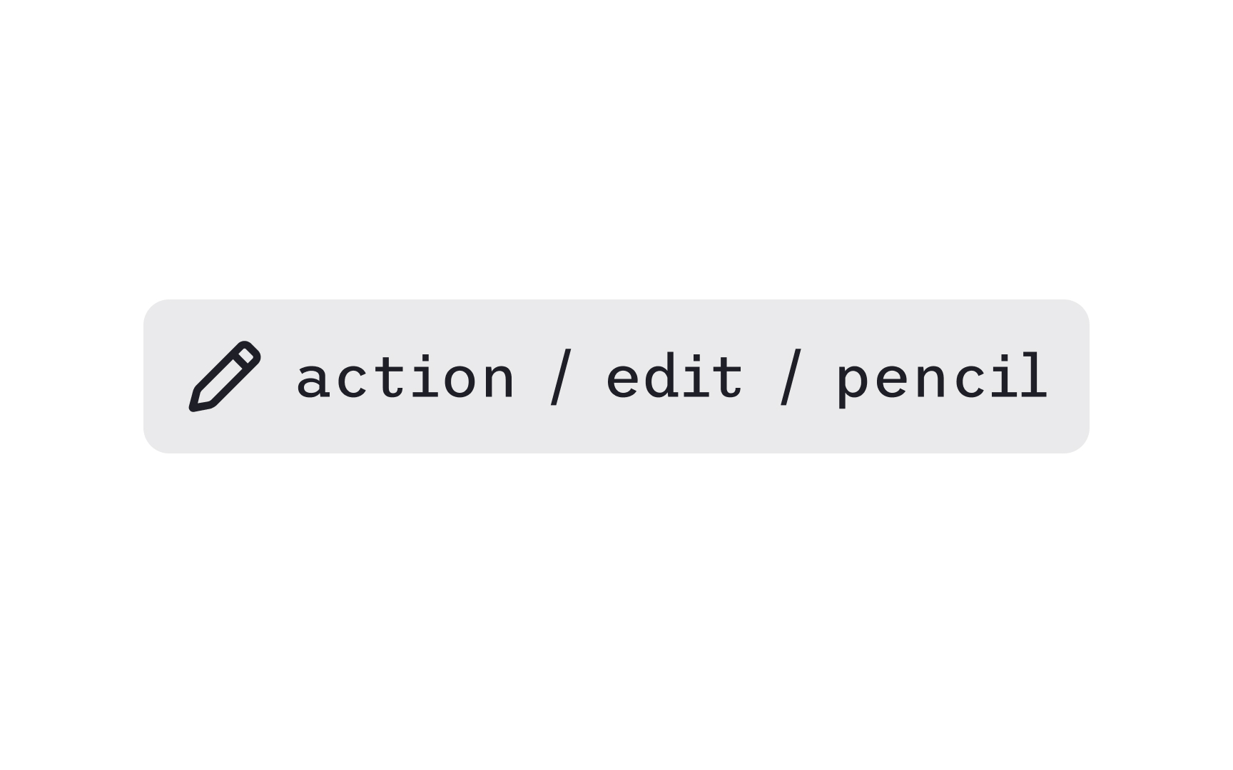
Clear naming helps teams find
Tagging adds another layer of findability. Tags capture all the different terms designers might use to locate an icon. A single icon can include tags like draw, pen, vector, or write, so any of these
Consistent naming and tagging also prevent duplicates. When teams follow the same patterns, they avoid creating multiple icons that represent the same concept. This reduces maintenance work and keeps the visual language aligned across products.
Pro Tip: Tag icons with both the action and the object, for example “edit,” “pencil,” and “write.”
When
There is no single correct alignment approach. Some systems align icons to the text baseline, while others use optical centering, where the icon is visually centered relative to the text block rather than mathematically aligned to the baseline. Optical centering often produces more balanced results, especially when icons have irregular shapes or different visual weights. The key is consistency within the system, not strict adherence to one method.
Clear spacing between the icon and the text improves recognition. Many
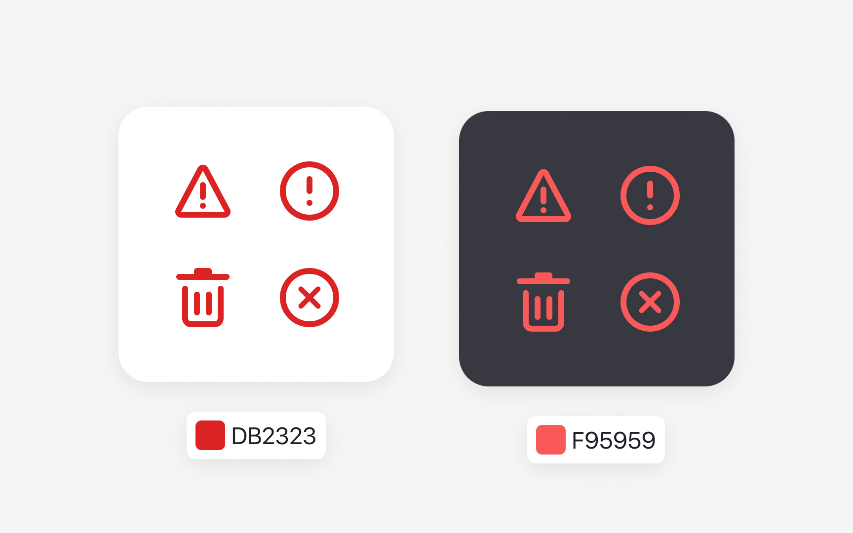
Pro Tip: Use semantic color tokens for icons so they adapt reliably across light and dark themes.

Accessible
Legibility is another important factor. Meaningful icons must remain clear at their intended size. Outlines should stay thick enough to be visible, and shapes should avoid unnecessary complexity that may
Accessible color choices help users with low vision or color blindness. Icons must meet
Pro Tip: Never rely on color alone to convey meaning. Pair status colors with a clear shape or symbol.
References
- A complete guide to iconography | DesignSystems.com
- Overview - Iconography - Atlassian Design System | Atlassian Design System
Topics
From Course

Share


Similar lessons

Anatomy of UI Components

Atomic Design by Brad Frost
