<?xml version="1.0" encoding="utf-8"?>

Depth is one of the easiest ways to guide the eye and signal interaction, focus, and hierarchy. A surface that lifts slightly feels important. A flat one fades into the background. Even before users interact with anything, elevation quietly tells them where to look and what matters most.

In a design system, this becomes a shared language. Instead of guessing which shadow to use or how high a card should appear, teams rely on clear elevation levels and matching shadows. These rules keep the whole product consistent, from basic layouts to overlays that sit on top of everything else.

Shadows help bring this structure to life. They show where the light comes from, how far something sits from the surface, and when an element reacts to touch or motion. A small lift on hover or a deeper shadow during a drag can make the interface feel more responsive and intuitive.

Good elevation also supports accessibility. Shadows alone can be too subtle, so strong surface contrasts and meaningful steps between levels make depth easier for everyone to understand.

When elevation is treated as a system rather than decoration, it keeps interfaces calm, clear, and predictable. It gives every layer a purpose and helps teams build products that feel well-structured at first glance.

Exercise #1

Understanding what elevation communicates

Understanding what elevation communicates Bad Practice
Understanding what elevation communicates Best Practice

Elevation creates the illusion of depth in a flat interface by placing surfaces on different depth levels, often described as a virtual z axis. Elements that appear higher feel closer to the eye because shadows make them look lifted. This is why a raised card, a floating action button, or a modal immediately draws attention. Elevation helps users understand what is more important without relying on extra borders or colors.

Elevation is not only about static hierarchy. Many design systems also use it to communicate interaction. When an element lifts slightly on hover, focus, or drag, it signals that the surface is interactive and can be acted on. This feedback helps users understand what is clickable or movable. When elevation is misused, for example when cards look raised but are not interactive, it can create confusion and false expectations.

A design system brings structure to elevation by defining clear levels and rules. Each level has a specific purpose, from base surfaces to cards to temporary overlays and interaction states. With consistent shadow values, lighting direction, and usage guidelines, new components naturally align with existing ones. This prevents teams from inventing random shadows and keeps the interface predictable, even when many layers and interactions appear on the screen at the same time.[1]

Pro Tip: When deciding which element should rise above others, compare their roles rather than their size. Priority comes from purpose, not from dimensions.

Exercise #2

Breaking down the anatomy of shadows

Breaking down the anatomy of shadows

Shadows are the visual signal that makes elevation readable. They are built from a few core properties that work together to create depth. Offset shows where the shadow falls and hints at the direction of the light. Blur determines how soft or sharp the shadow edge feels. Spread controls how large the shadow grows as the surface lifts. Adjusting these properties changes how high an element appears, even when the shape itself does not move.

Realistic depth often depends on combining more than one shadow. Layering soft and sharp shadows together creates a natural glow around raised surfaces. A softer shadow can suggest ambient light, while a sharper one can signal directional light. This layered approach helps components feel grounded in their environment instead of floating unnaturally. Shadow color also plays a role. Very dark tones can look harsh, while subtle tints blend better with the surrounding UI and keep the elevation feeling smooth.

Design systems support this consistency through defined shadow tokens. Pairing the right shadow type with the right elevation level prevents mixed styles and keeps the hierarchy clear across all components.[2]

Exercise #3

Light direction and consistent shadow placement

Light direction and consistent shadow placement

Light direction shapes how shadows fall across the interface. When the light comes from one side, the shadow lands on the opposite side. Using a single light direction across an entire product keeps depth predictable and prevents surfaces from looking disconnected. If shadows fall in different directions within the same screen, the layout can feel unstable and harder to understand.

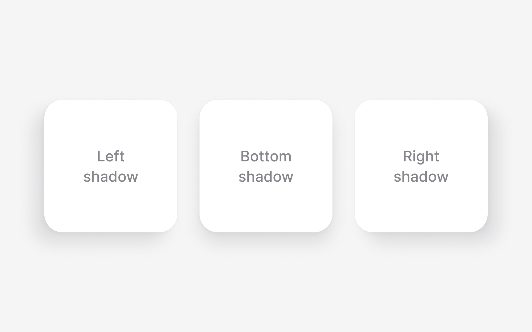
Defined shadow positions help solve this problem. Systems often use left, right, or bottom shadows as standard placements. These positions are not decorative. They give each layer a clear sense of orientation so the interface feels grounded in the same environment. Keeping the light source stable also strengthens hierarchy because lifts and overlaps become easier to read at a glance.

Pro Tip: When choosing a shadow direction, check it on busy layouts. Inconsistent angles are easier to spot when many elements appear together.

Exercise #4

Building a clear elevation scale in Figma

Building a clear elevation scale in Figma

An elevation scale starts by turning shadows into reusable effect styles in Figma. Each level is saved with specific offset, blur, spread, and color values so depth stays consistent across components. Structuring these styles as a simple sequence makes it easy to apply the right level without manually adjusting shadows.

The scale becomes clearer when each level has a defined purpose. Lower levels often support base surfaces, mid levels hold cards or containers, and higher levels represent overlays and modals. Linking these styles to components through tokens keeps the hierarchy stable and prevents designers from creating one off shadows.

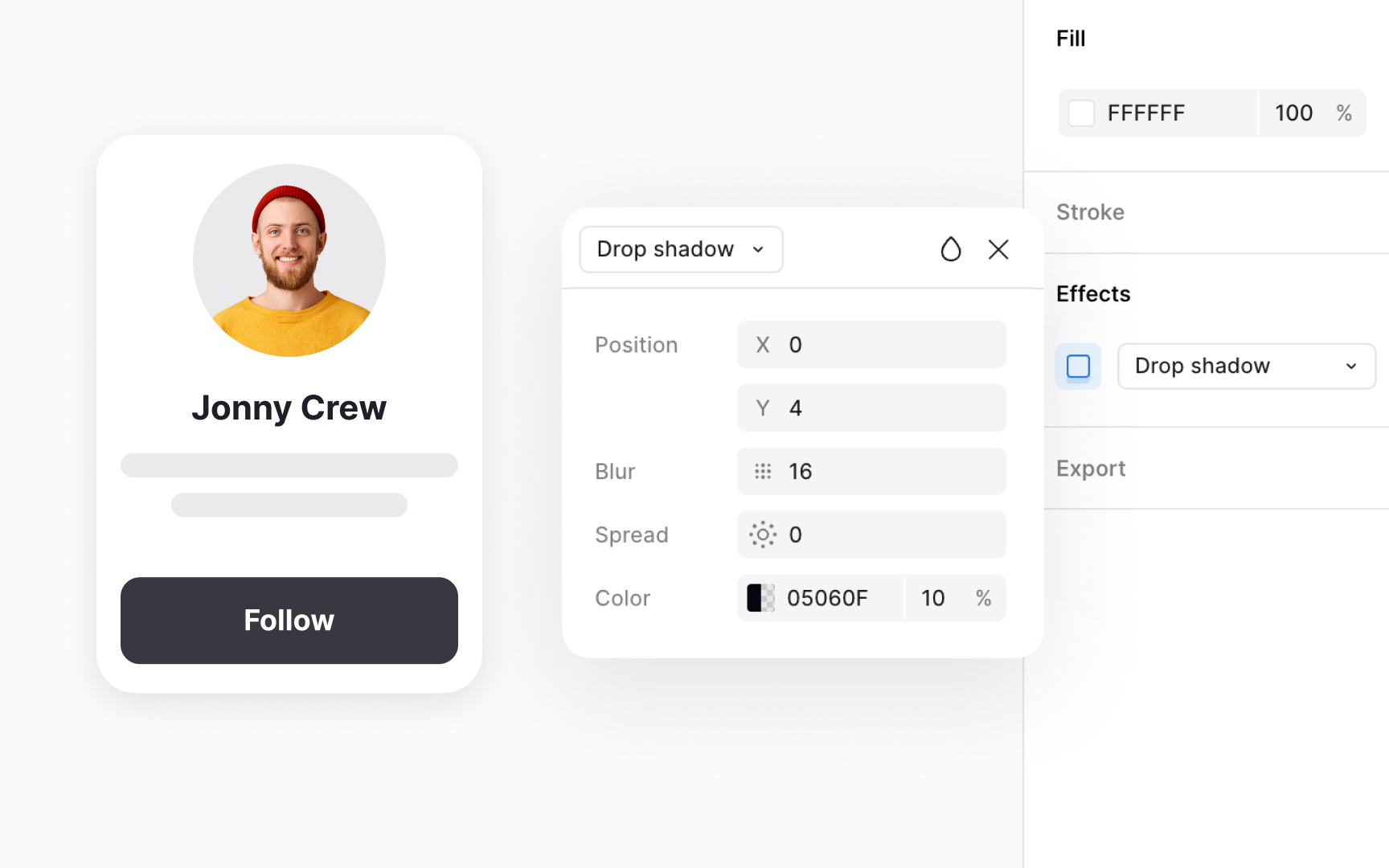
Keeping all elevation styles grouped in the Figma library makes the system easy to maintain. When a value changes, every component using that style updates automatically. This alignment between design tokens and code tokens helps teams keep depth predictable across screens and platforms.[3]

Exercise #5

Naming elevation levels in a design system

Naming elevation levels in a design system Bad Practice
Naming elevation levels in a design system Best Practice

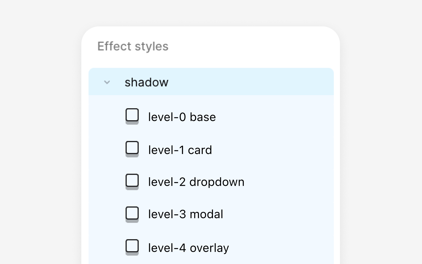
Naming elevation levels helps teams understand how each layer behaves without inspecting shadows or tokens. A simple numeric scale is one of the easiest ways to do this. Levels like 0, 1, 2, 3, 4 create a clear progression from flat to highly elevated. For example, level 0 can represent the base layout, level 1 can be used for cards, and level 4 can mark the highest surfaces in the interface.

Some systems pair numeric levels with functional labels to make the intent clearer. A combined name like ‘elevation-1 card,’ ‘elevation-2 dropdown,’ or ‘elevation-3 modal’ shows both depth and purpose in one place. This structure blends order with clarity. Teams can quickly understand which components belong to which level and how those levels map to real use cases.

Naming also affects how elevation tokens work across platforms. When the same naming pattern appears in Figma styles, token files, and code, components gain predictable depth. Surfaces such as overlay or raised can then apply the correct tokens without custom adjustment, keeping complex layouts visually stable.

Exercise #6

Shadow color and theme behavior

Shadow color and theme behavior Bad Practice
Shadow color and theme behavior Best Practice

Shadow color affects how readable elevation is across different themes. In light mode, shadows usually appear darker and help lifted surfaces stand out from a pale background. In dark mode, shadows can be harder to see because the background is already dark. To compensate, some systems lighten elevated surfaces so the contrast between layers remains clear. This pairing of lighter surfaces with subtle shadows keeps depth visible without adding harsh edges.

Some design systems also use tinted shadows instead of pure black. Slight color adjustments help shadows blend with surrounding surfaces, especially when the interface changes tone between themes. This prevents shadows from feeling heavy in light mode or disappearing completely in dark mode. When elevation tokens define both the shadow color and the surface tone, cross-theme behavior stays consistent for every component.

Pro Tip: When testing elevation in dark mode, focus on contrast between surfaces first. Shadows only support the effect when the surface tone is clear.

Exercise #7

Using elevation to guide user focus

Elevation helps direct attention by making certain elements feel closer to the user. Increasing depth on an important surface naturally pulls the eye toward it. This is why raised elements often hold interactive components like cards, and why overlays use the highest elevation to interrupt the flow when something needs an immediate response.

Elevation also supports interaction feedback. Subtle lifts on hover or changes during drag movements help users understand where they are in the interface. Small elevation steps keep motion smooth and prevent components from feeling jumpy. Clear separation between levels ensures each interaction feels intentional rather than accidental.

Using elevation thoughtfully avoids visual noise. When too many surfaces are raised, the layout loses hierarchy. Limiting elevation to the elements that truly need attention keeps the interface organized and reduces cognitive load.

Exercise #8

Designing elevation with accessibility in mind

Designing elevation with accessibility in mind Bad Practice
Designing elevation with accessibility in mind Best Practice

Shadows alone are not always enough to communicate depth. In low contrast environments or on dark backgrounds, shadow details can become difficult to see. When shadows blend into the surface, users may struggle to understand which elements sit above others. Accessible elevation relies on more than subtle blur changes. Clear separation happens when multiple properties change together. Higher elevation levels use larger X and Y offsets and a wider blur span, which creates a stronger sense of lift. Lower levels use smaller offsets and softer shadows that stay close to the element’s edge. In dark mode, some systems also lighten elevated surfaces so the difference remains visible.

Accessible elevation also avoids decorative shadows that do not represent real hierarchy. Extra shadows can create visual noise and draw attention away from important surfaces. Keeping elevation tied to meaningful roles reduces this confusion. Each level should support a specific purpose, such as separating a card from the background or highlighting a temporary overlay. A predictable structure helps more users rely on depth cues to navigate content, even when the interface becomes complex.

Pro Tip: If an elevation level feels unclear, adjust the surface tone first. A stronger contrast often improves readability faster than increasing shadow strength.

Complete lesson quiz to progress toward your course certificate