Color in Design Systems
Build a color system that stays consistent, flexible, and ready for real product needs.
Color shapes how an interface feels long before users read a single word. When a palette is structured well, it becomes easier to stay consistent, communicate hierarchy, and support accessibility across an entire product. Clear roles for each color help teams avoid guesswork and keep visual decisions aligned, even as the system grows.
Tonal ranges bring stability to a palette by creating predictable steps from light to dark. These ranges can be built with simple, hands-on methods that give designers full control instead of relying only on automated tools. Modern features like variables in Figma then make it possible to turn these colors into organized, reusable assets that fit naturally into everyday workflows.
A reliable color system becomes a shared language. It supports smoother collaboration, reduces unnecessary variation, and makes product decisions easier to maintain over time.
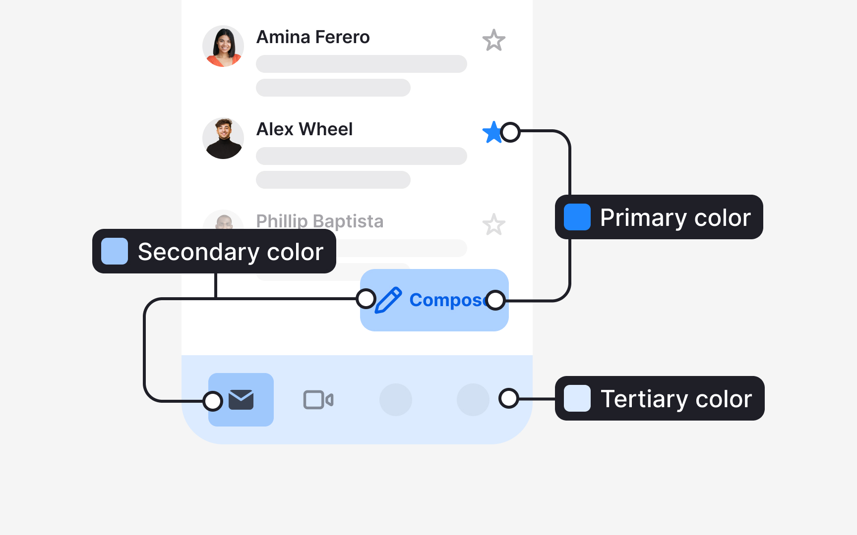
Accent colors in a system gain meaning through the roles they carry. Material Design 3 divides these roles into primary, secondary, and tertiary, each supporting a different level of emphasis in the interface:
- Primary accent roles support the most important actions. They include 4 values: the primary
color , the on-primary color for text and icons placed on it, the primary container, and the on-primary container. These roles help highlight key elements such as a prominent action button or an active state. - Secondary accent roles support elements that still need visibility but not strong emphasis. They also consist of 4 values that describe how fills and text pair within this quieter role. These roles are used for components like filter chips or tonal buttons.
- Tertiary accent roles introduce complementary accents. They bring additional contrast when a design needs a distinct visual cue without relying on the primary or secondary colors. Their four values help apply these accents consistently across fills, text, icons, and containers.[1]
Another way to define primary colors for a
This approach often reveals patterns that are not obvious at first glance. It helps identify the main brand color, the shades most commonly used for surfaces, and the specific hues that support key functions like success, warning, or error states. Colors that appear consistently across many components are added to the primary set so the design system represents the product as it is, not as a theoretical ideal. This prevents the palette from introducing unrelated colors and makes future updates smoother.
Once this primary set is established, each color is checked against the existing interface. If the UI contains similar colors that serve the same purpose, they can be merged or replaced with the defined primary values. This reduces visual noise caused by near-duplicates and creates a cleaner base for expanding the rest of the system. This method also supports
Pro Tip: When reviewing the UI, pay attention to colors used for feedback. These often define your functional palette long before you formalize it.
Secondary and tertiary colors can be defined by looking at how a product already uses
This inventory also exposes colors that appear only in a few places but still play a meaningful role. A subtle background tint, a supporting highlight, or a color used in specific
Once secondary and tertiary candidates are identified, the remaining UI should be checked for near-duplicates or irrelevant colors. Any color that does not serve a specific purpose can be replaced with a defined secondary or tertiary value.[3]
Pro Tip: Group similar colors during your audit. Families of near-identical shades often reveal the natural starting point for secondary and tertiary palettes.
Functional
A typical audit reveals several similar
Pro Tip: When merging similar functional colors, keep the one that appears most consistently in important UI states.
Surface
Once the main neutrals are identified, they can be assigned simple roles, such as primary background, secondary background, or
Pro Tip: If two neutrals look nearly identical, merge them. Subtle differences rarely serve a meaningful purpose.
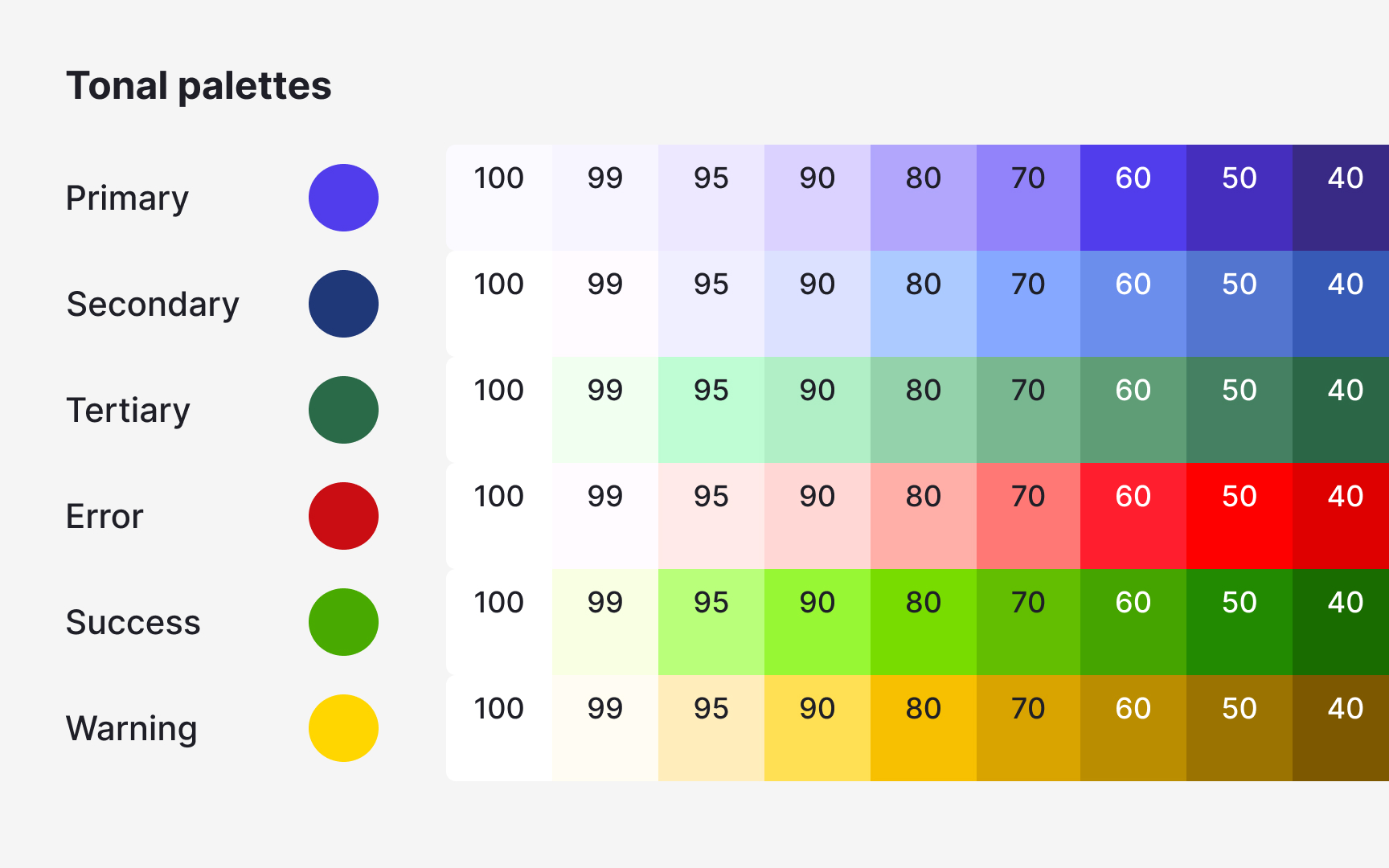
After defining the key primary colors, the next step is to build the tones that sit above and below them. These tones can be chosen by personal preference or created through a more controlled process. A tonal scale makes the palette easier to use because every
To create lighter tones:
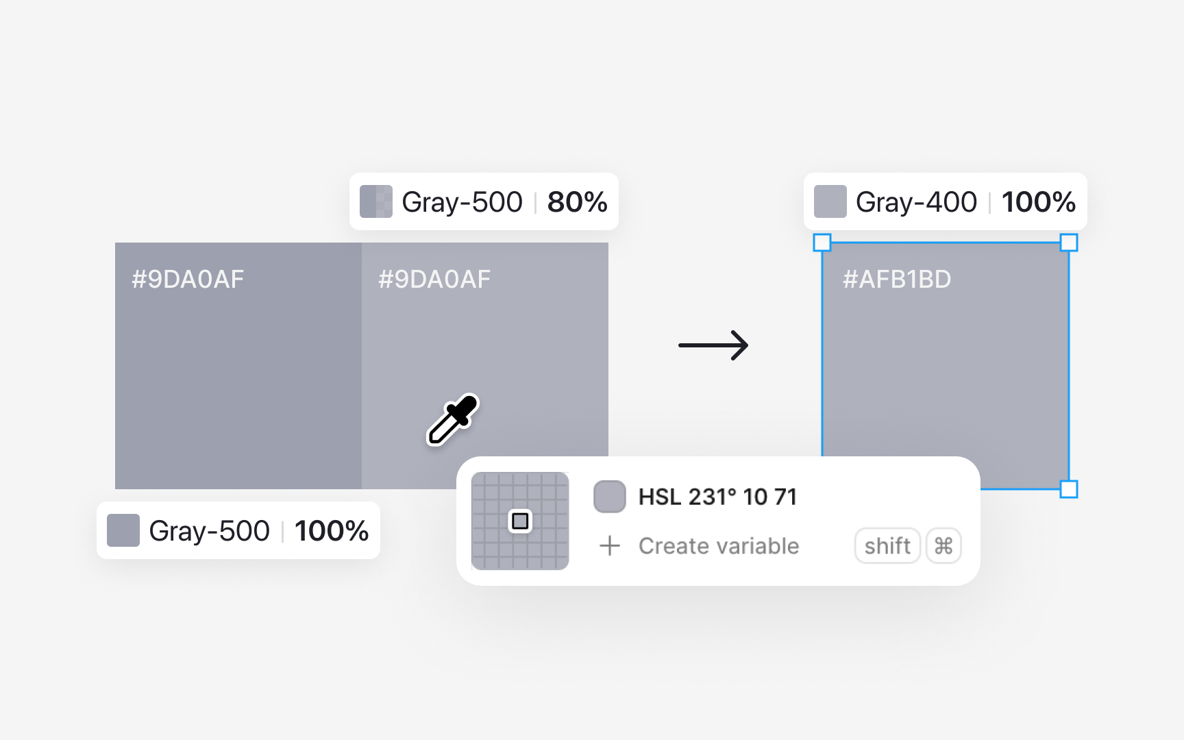
- Start with the base color, for example gray 500.
- Draw a rectangle filled with this color and lower its opacity to around 80%.
- Duplicate the rectangle and use the color picker to sample the new visible color. This becomes gray 400.
- Repeat the process by lowering opacity further, such as to 60%, and sample again to create gray 300.
Saving each sampled tone as its own value keeps the scale consistent.
For darker tones, place the base color rectangle on a black or very dark background. Adjust the opacity until the color looks slightly deeper. Once the shade feels right for the next step, use the color picker to sample it and save that color as gray 600. Continue this process for darker values, such as gray 700. Each sample becomes a stable color in the palette instead of relying on live opacity changes.
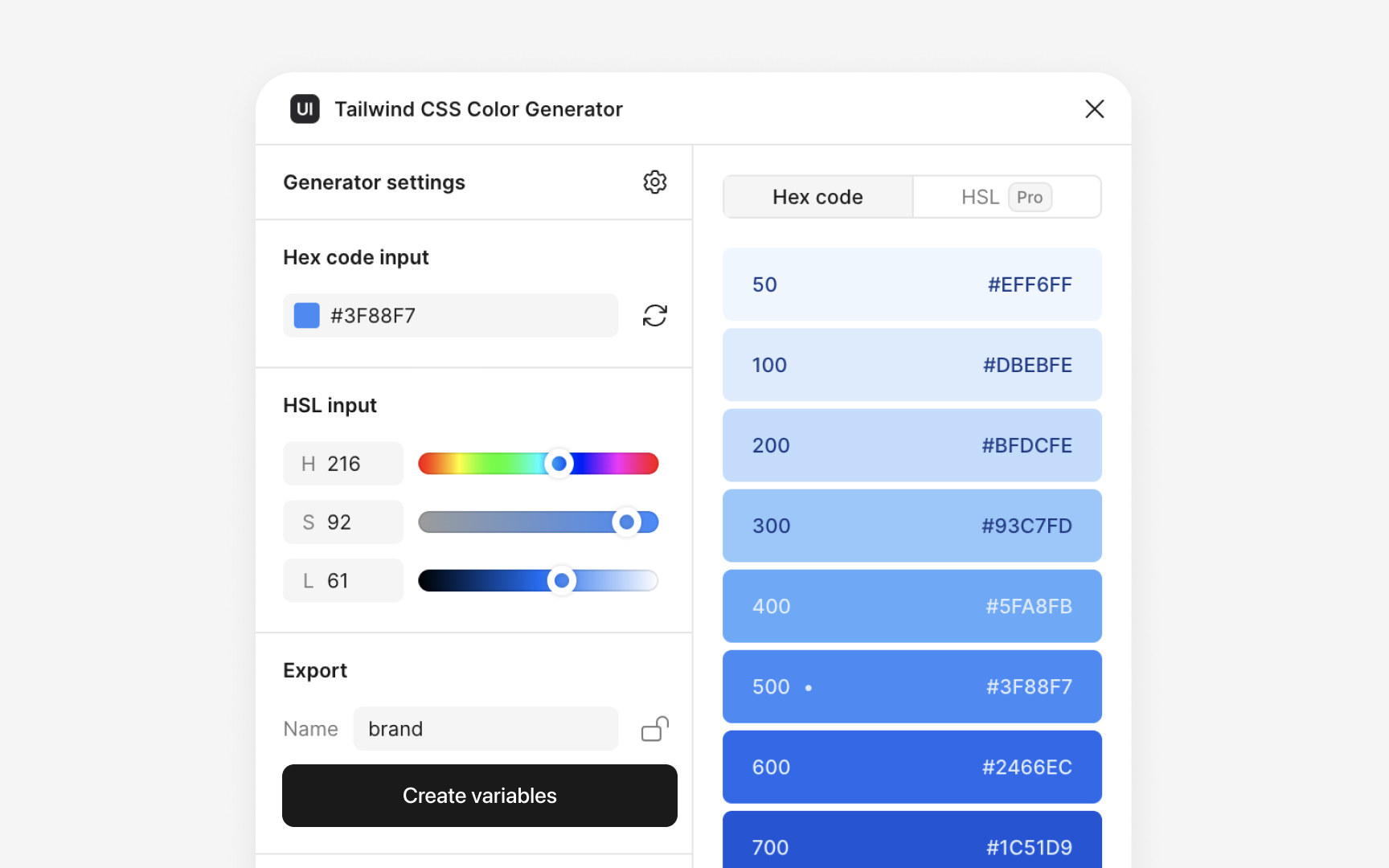
Figma plugins can speed up the process of building tonal scales when you need to create many steps quickly. Plugins like
Even when plugins help generate the first draft, the final tones still need manual review. Comparing plugin-generated values with your opacity-based samples ensures the chosen colors stay consistent with the rest of the palette and remain readable across different surfaces. Plugins help with speed and exploration, while manual checks keep the palette controlled and accurate.
Pro Tip: Use plugins to explore options quickly, then refine the final tones through sampling to keep the palette coherent.
Naming conventions help teams understand each
- Functional naming, where colors are labeled based on what they represent, such as
base-blue,base-gray, orbase-red. This approach highlights which values act as the core colors in the system. - Numeric naming, where numbers show variations of a color, like
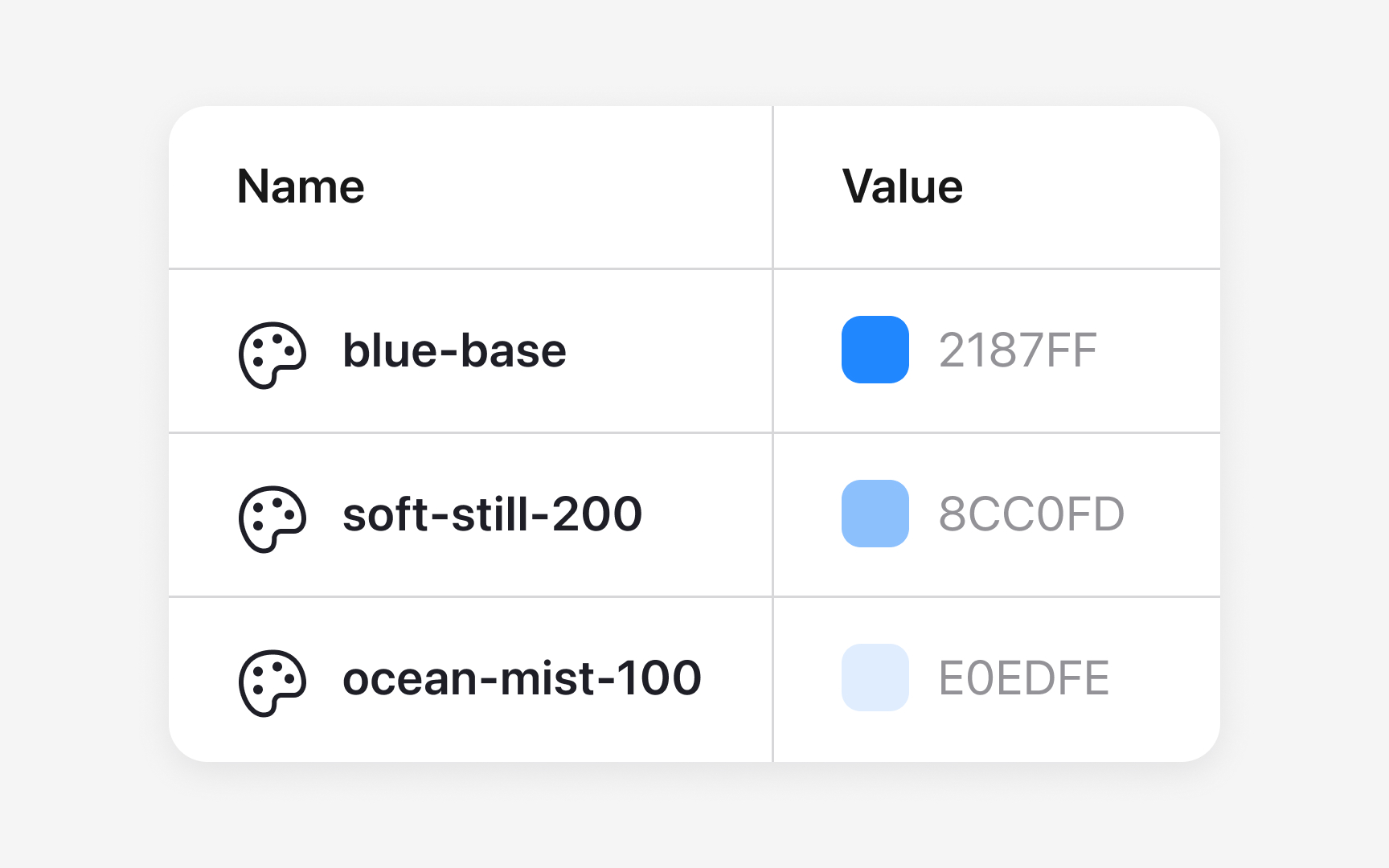
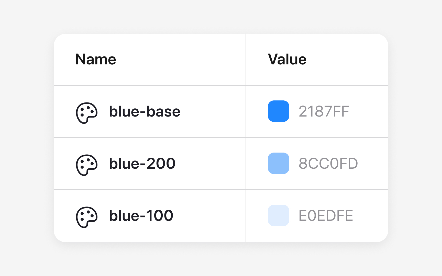
silver-1orsilver-darken-15. These scales make it easier to add or adjust tones without guessing their relationship to the base value. - Combined naming. For example, a palette might use
blue-base,blue-100,blue-200, andblue-300to show a clear family structure while also giving each tone a defined place on the scale. This mix keeps names easy to read while still supporting expansion.
Whatever the chosen approach, the key is consistency. When every color follows the same pattern, the palette becomes easier to navigate, update, and use across both design and development.
Pro Tip: Make sure your naming pattern works for future tones, not just the ones you have now.
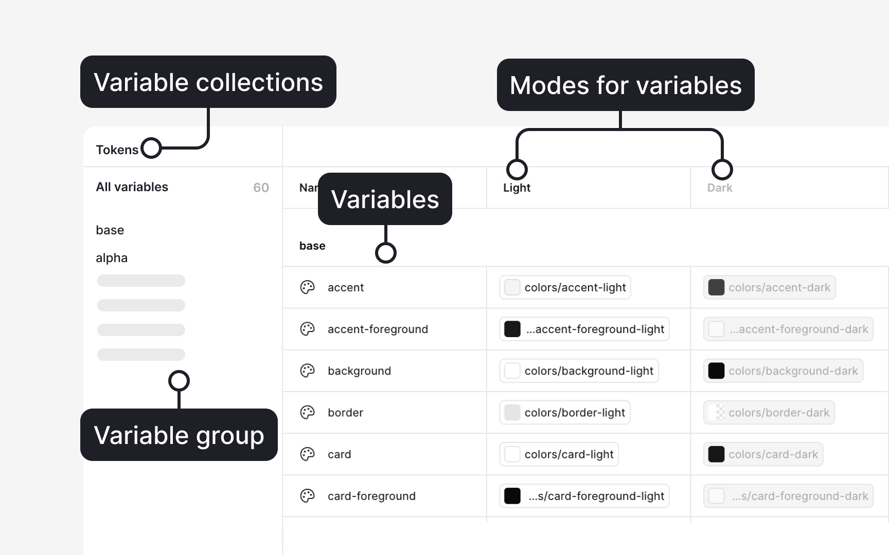
To open the Variables panel, make sure no layer is selected on the canvas. Then look at the right sidebar and click the
Click Create variable, choose Color, and give the variable a clear name. Use Collections to group related variables, such as “
To connect variables, open a color variable, click the color field, and select Alias. This links the variable to another base value so changes cascade through the system. Collections also support Modes, such as “Light” and “Dark,” allowing the same variable to hold different values depending on the theme.[4]
Pro Tip: Use short, structured names like brand/blue-500 or surface/200. It keeps variables easy to scan when you work fast.
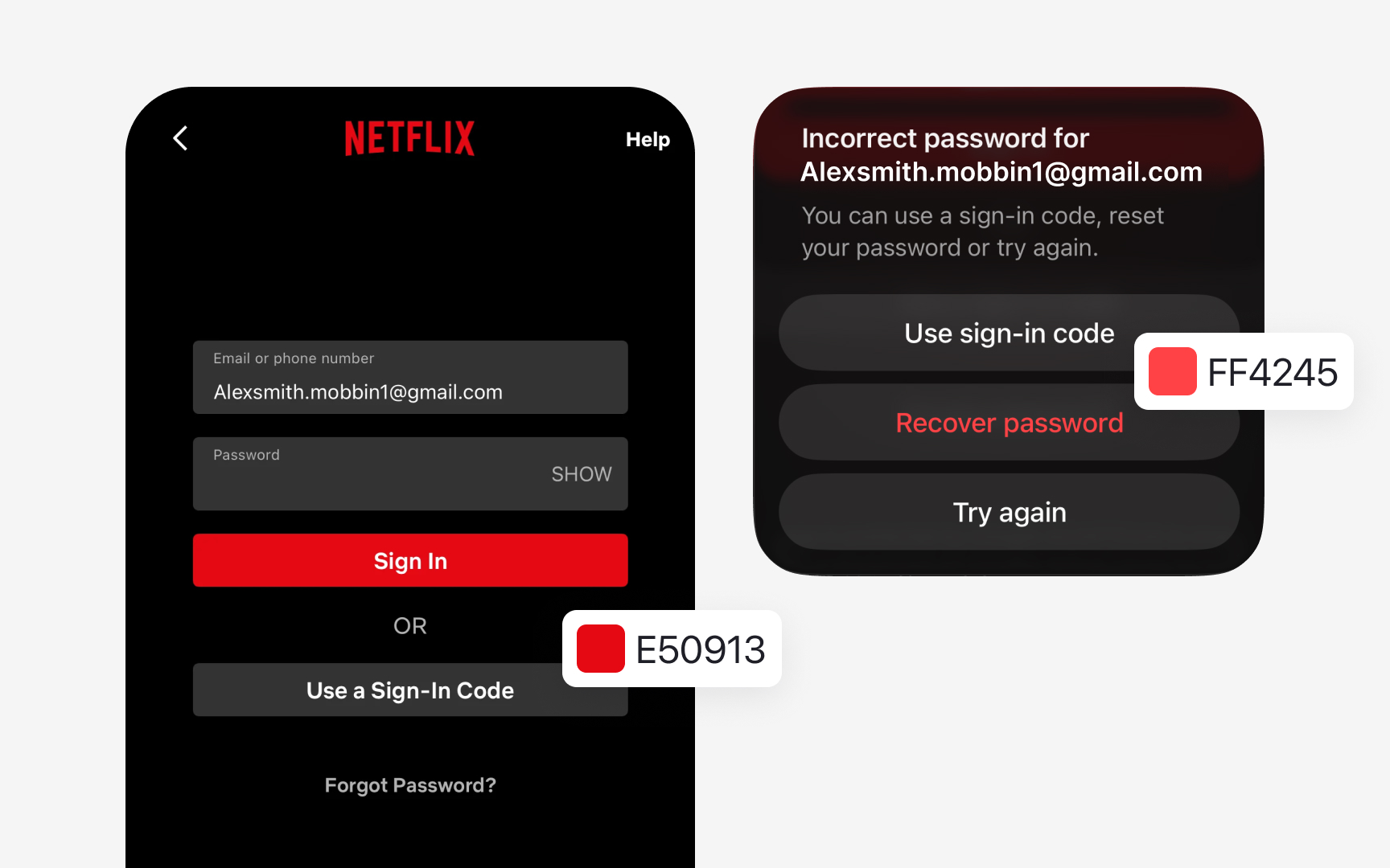
Some products have brand colors that conflict with functional meanings. Imagine the brand
Some interfaces also rely on colors that appear rarely, such as lines in charts or data segments. If the product uses such colors, for example, for graphs, create a small “Data Colors” group instead of letting these values exist as one-offs. This controlled set can include three to five colors that support visualizations without expanding the main palette.
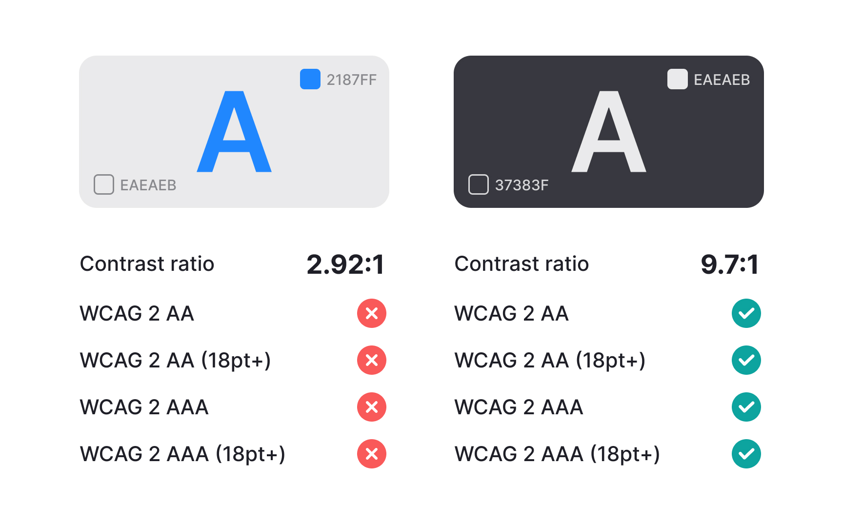
After defining your palette, every
To make future work easier, create a small list of approved color pairs that always pass accessibility checks. Store this list in your
References
- Color roles - Material Design 3 | Material Design
- Create and manage variables and collections | Figma Learn - Help Center
Top contributors

Topics
From Course

Share


Similar lessons

Anatomy of UI Components

Atomic Design by Brad Frost
