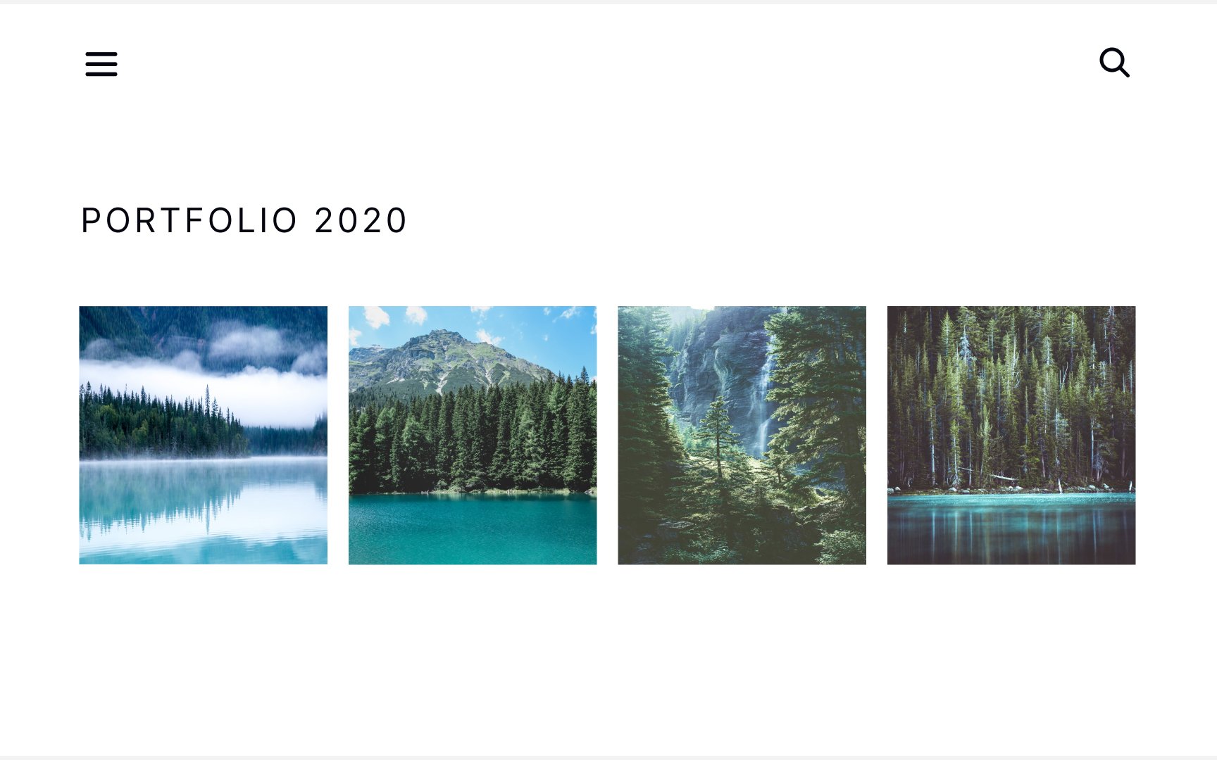
Design Composition Tips & Tricks
Uncover valuable design composition tips and tricks to enhance your creative process and create visually captivating designs
Design composition helps deliver the intended message and influences how effectively users can find information and generally the whole user experience. There are small things every designer can do to greatly enhance their designs. For example, introduce visual hierarchy or add the illusion of depth and motion. Learn using small design tricks that assist in creating the most professional, intuitive, and visually aesthetic interfaces.
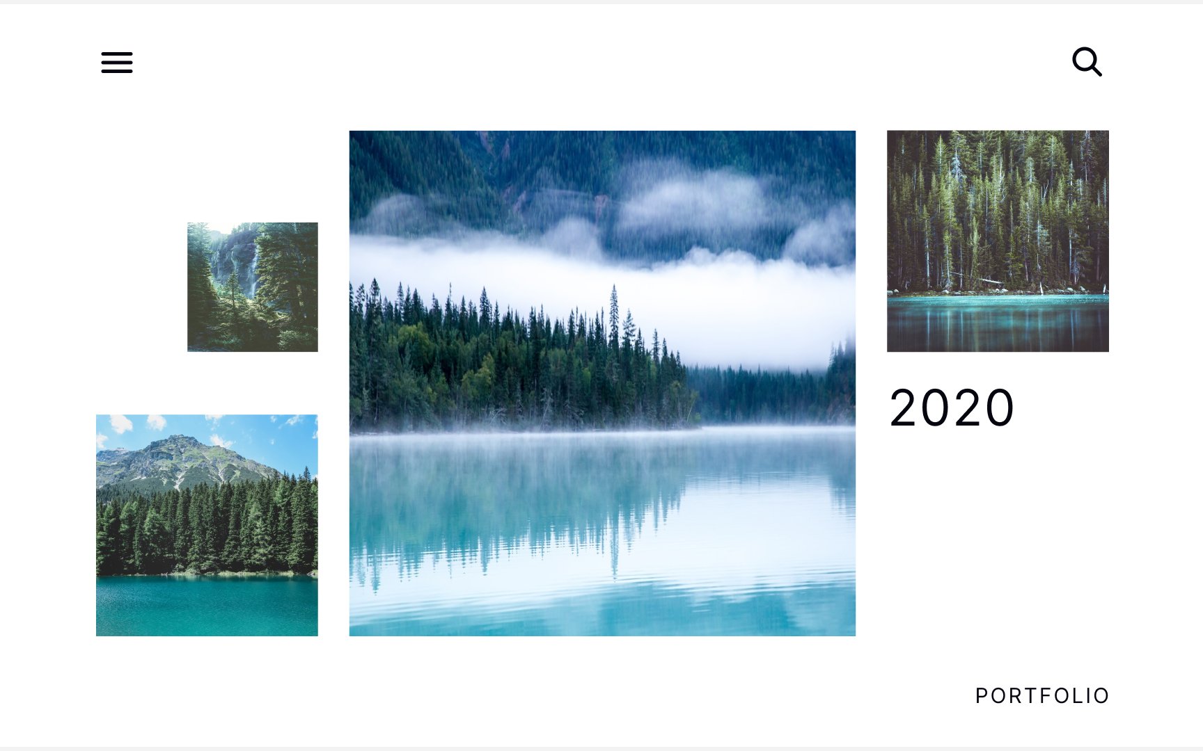
In UI design, size doesn't matter as much as scale. Scale is an understanding of how an object's size relates to the size of other objects and the size of the space they are in.[1]
Imagine you want to send a picture of watermelon to your alien friend. How can you convey how big the fruit is? Place some other common fruits like oranges and apples next to it. Seeing them side by side, your alien buddy can easily understand that watermelons are quite large.
Scale creates a
Pro Tip: Play around with the scale to see how it can change the mood, shift perspective, or ease the tension.
Web page design isn't the only area where the role of negative space is vital. It's highly useful while creating engaging and memorable brand logos. Many well-known logo designs, like FedEx, NBC, or Toblerone, are the results of the effective use of negative space.
Here are the 5 advantages of using negative space in logo design:
- It highlights your creativity. Negative space logo designs need more effort to create, and users appreciate smart and fun designs.
- It keeps your logo simple. Instead of adding more elements and overcrowding the design, you can work with what's already on the page.
- It makes your design more memorable. Well-done negative space logos get people thinking and stick in their minds.
- It engages consumers. Using negative space in logos allows you to create "hidden messages," which is an easy way to engage consumers and drive them towards your brand.
- It makes your logo stand out. Using negative space can help set your logo apart by giving it a unique twist on a standard design.[2]
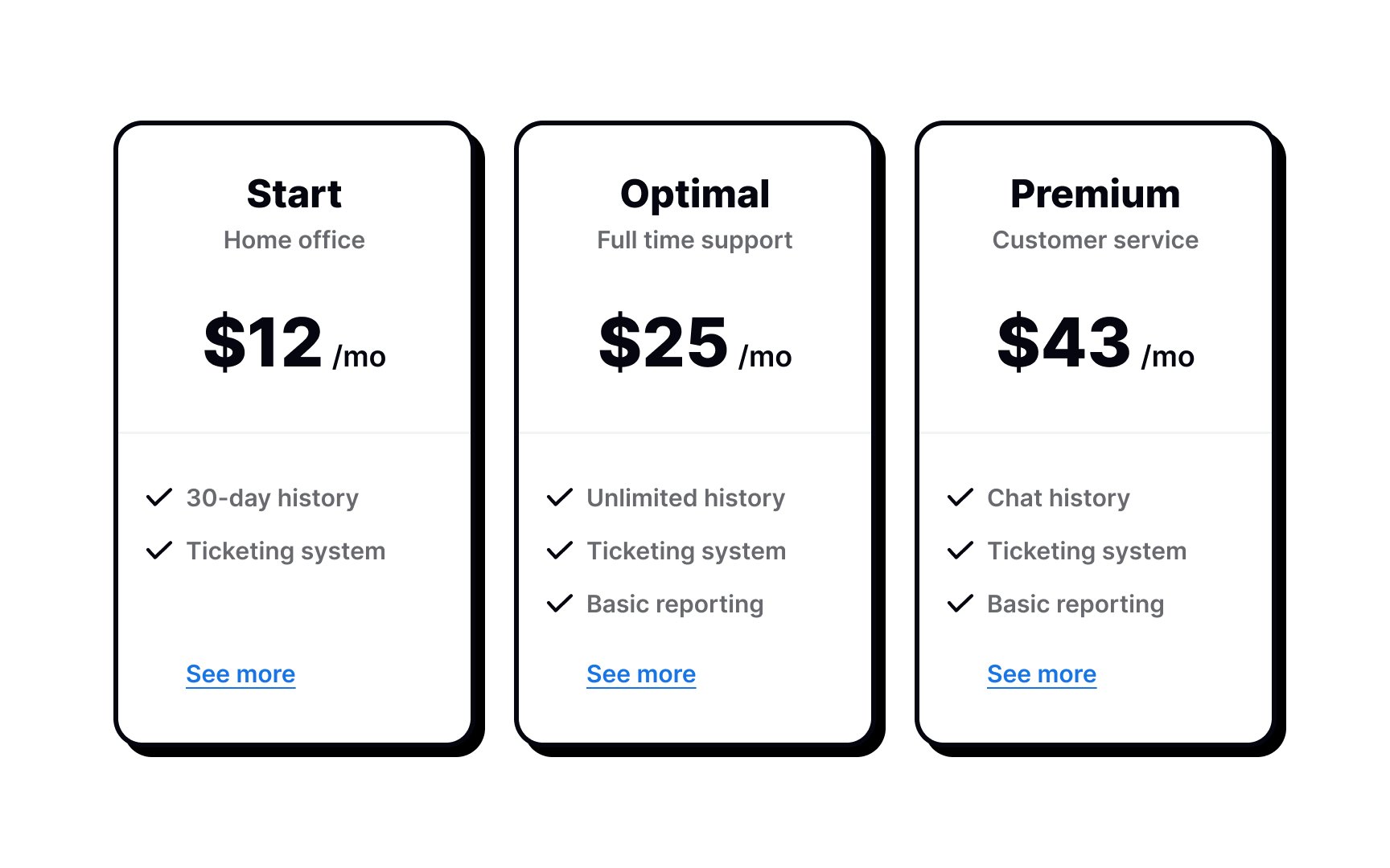
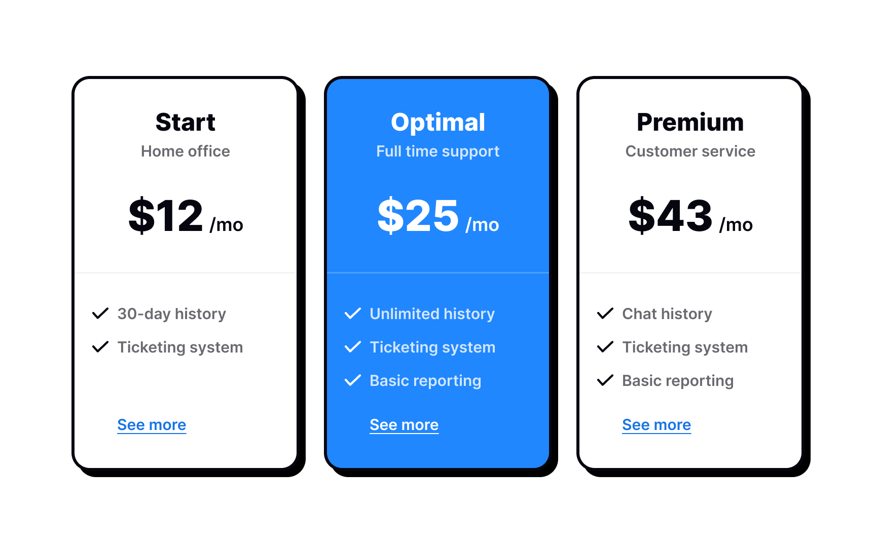
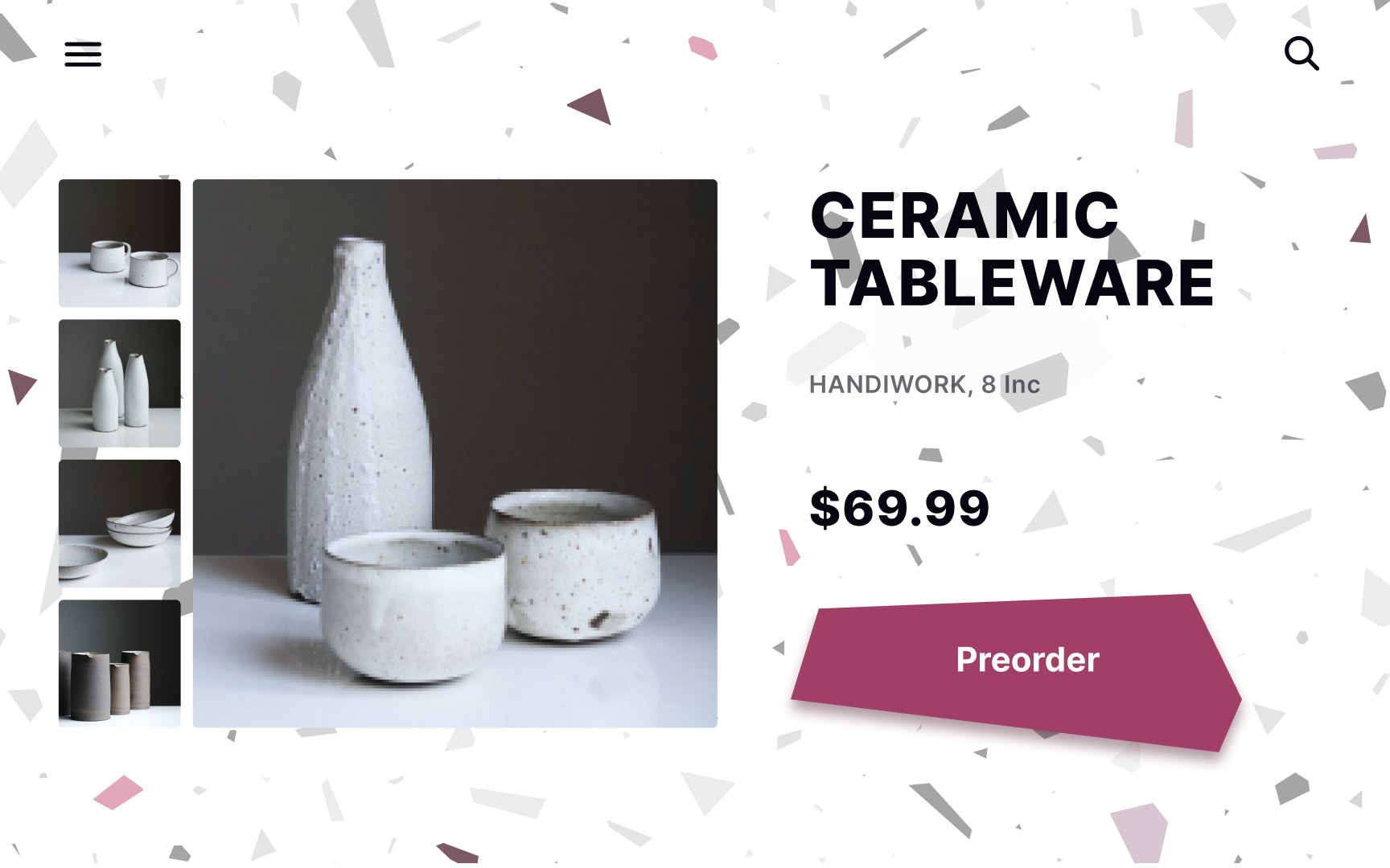
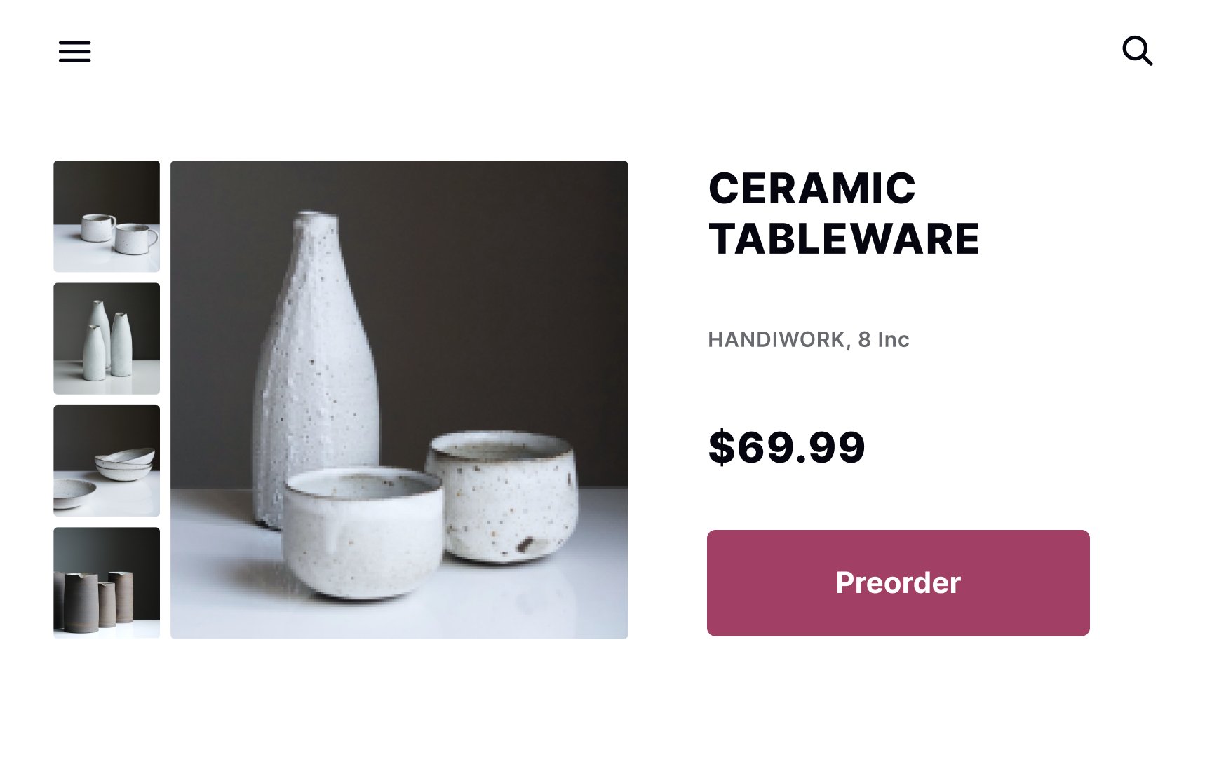
Highlighting is another excellent tool that designers can use to emphasize important elements. A common example is highlighting the best value plans on the subscription
You can establish visual hierarchy using:
In the example, the title,
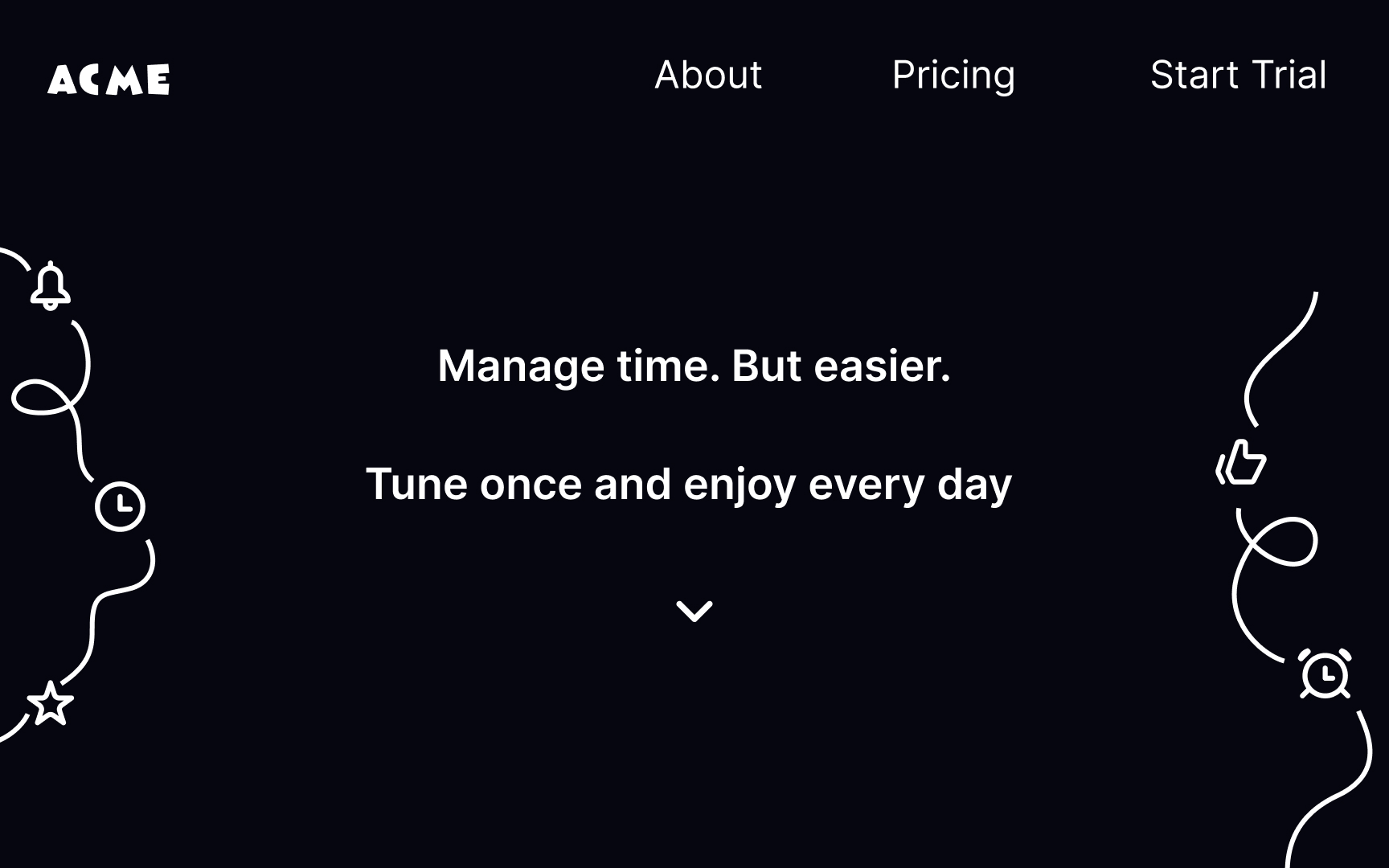
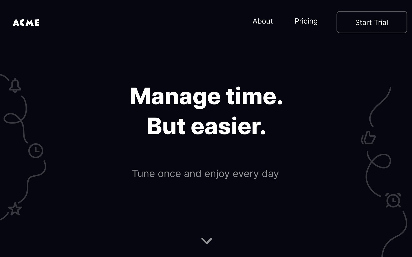
Animation is a great tool to enhance interactivity and make your designs more impactful, dynamic, and alive. However, not everyone has the time and budget to animate their designs.
What if we told you that you could create
Adding motion lines behind a design element is one of the most common visual cues to imply movement. At the same time, 3D shapes add depth, making the
Other ways of adding motion to static designs include:
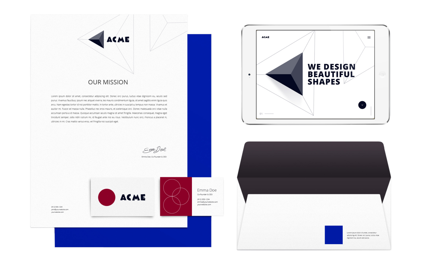
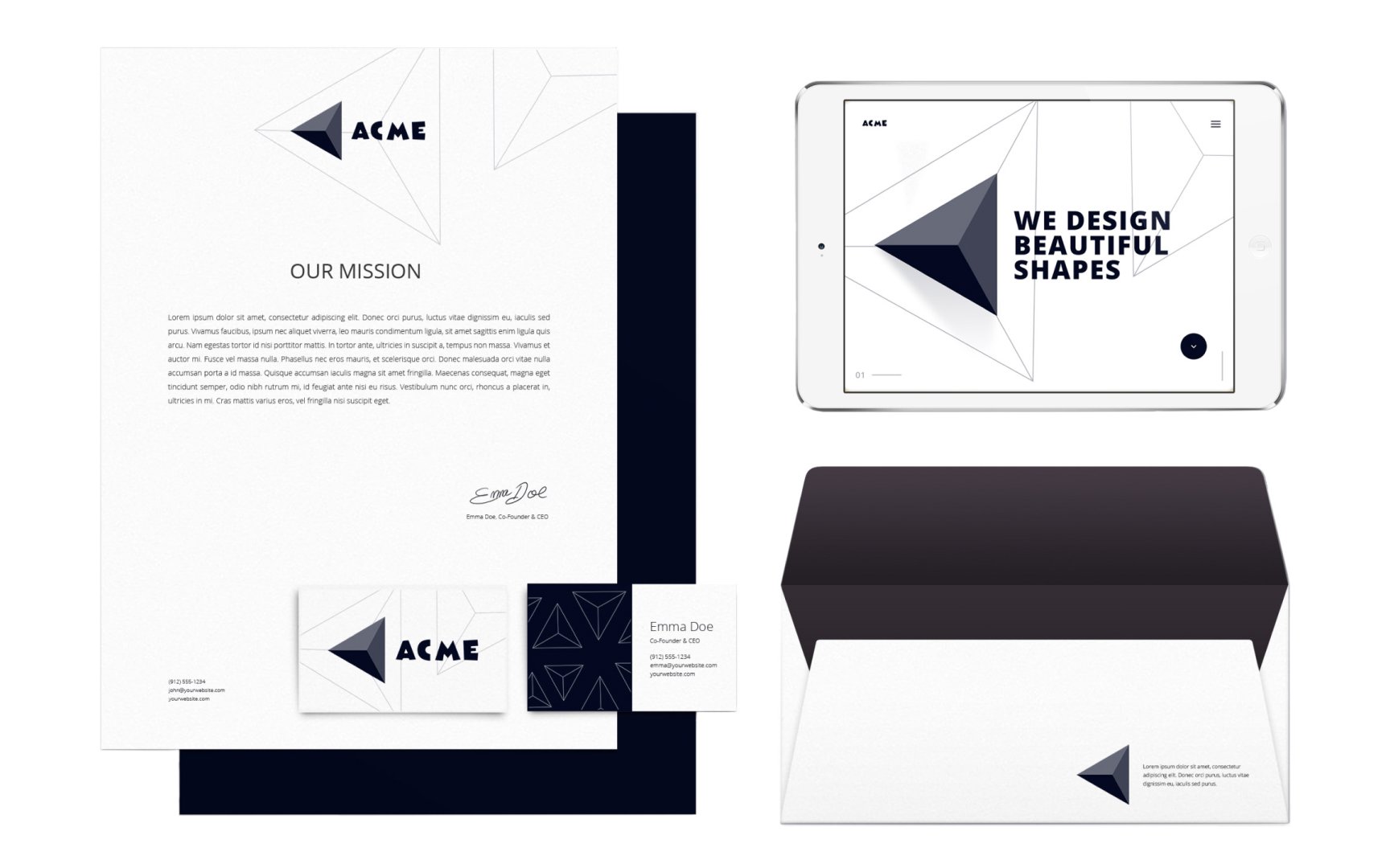
Adding depth to your design makes them look more realistic, vibrant, or even old-school. 3D design can be intimidating, but the good news is that you can simulate depth in 2D designs.
In the example, the use of shadows makes the
Other ways of creating depth in 2D designs include:
- overlapping elements
- adding transparency (farther objects seem more opaque)
- manipulating size and scale
- playing with line thickness variation (the thicker the weight of the lines the closer the object seems)
- and adjusting the perspective[5]
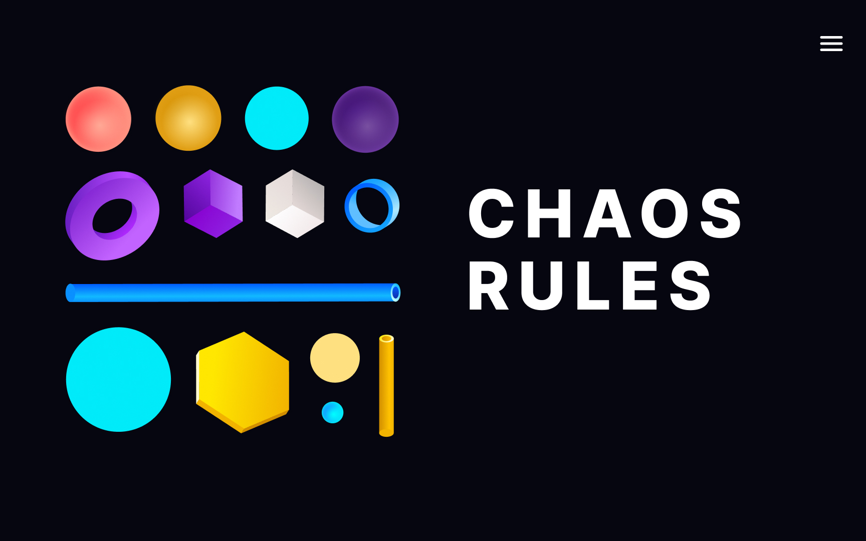
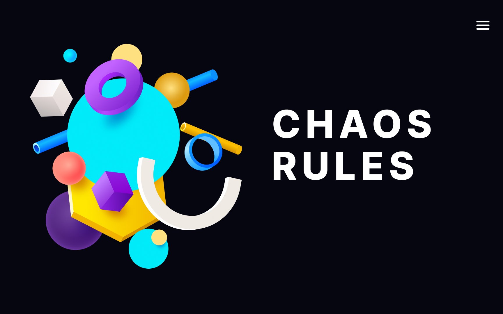
As the chaos theory states, chaos is just a form of order. In web and app design, symmetry has visually pleasing benefits but can be difficult to achieve and is not appropriate in all contexts.
Symmetry works well for traditional designs and those that want to portray an aura of trust. One can say that symmetrical designs feel balanced and unthreatening.
Asymmetrical
Bringing too many details in the design makes it look overcrowded and difficult to navigate. It overwhelms users and increases cognitive load.
Design trends have moved more and more toward the "Less is More" ideology. It implies the
How to achieve a minimalistic look? Here are some tips:
- Focus on the main element of the
page - Apply
visual hierarchy (place the most important content at the top and less important at the bottom) - Get rid of the excessive text in the content
- Use a simple and convenient navigation system
- Only incorporate functional animation[6]
Consistency in
Here's a list of some benefits that UI design consistency brings to the table:
- It increases usability. Users know what to expect if your website or app behaves predictably.
- It eliminates confusion. Visual consistency helps create a logical structure and prioritize
content . - It evokes an emotional response. Being confident that they know how to navigate your product evokes a positive emotional response. In turn, this results in a pleasant
user experience .
One of the best ways to maintain consistency is to create a design system that introduces a shared set of principles and rules to build components.
Pro Tip: Keep in mind that users of different platforms have different expectations. If you are designing for an iOS app, look up the iOS Human Interface Guidelines and strive to adhere to them. If you are designing for Android, take a look at the Material Design Guidelines.
References
- What is Visual Hierarchy? | The Interaction Design Foundation
- How to Create the Illusion of Movement in Static Design | The Shutterstock Blog
- How to Add Depth to Your Design - Shutterstock Blog India - Creative Photography and Video | Shutterstock Blog India - Creative Photography and Video
Top contributors


Topics
From Course

Share


Similar lessons

Intro to Design Layouts

Intro to Design Grids
