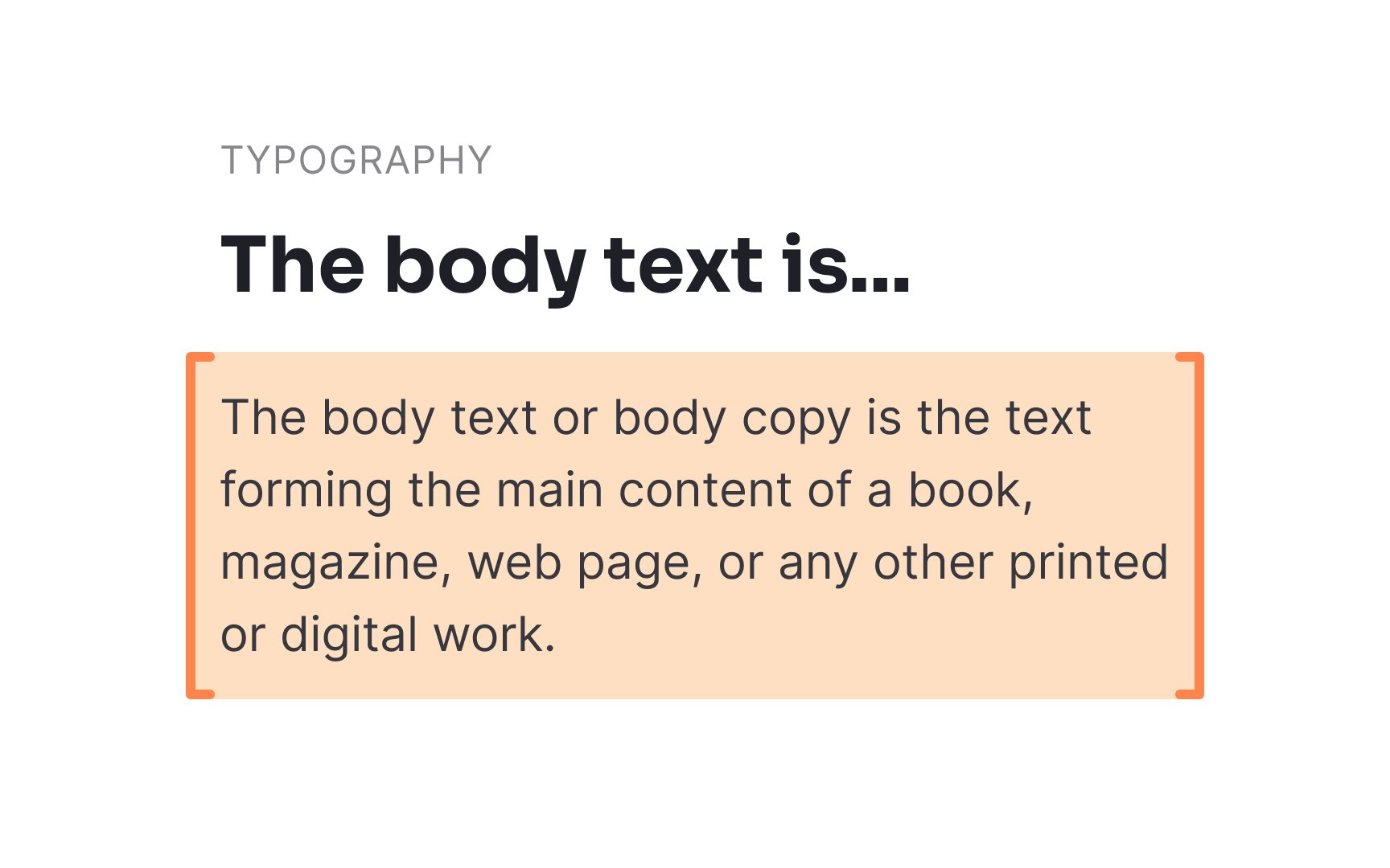
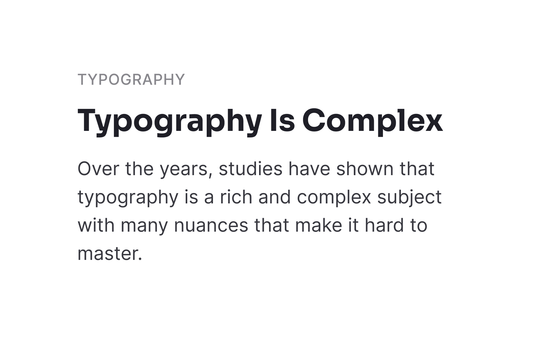
This text is meticulously designed to be both readable and legible, ensuring a comfortable user experience while conveying the intended message.
Pro Tip: 12pt is the minimum size you should use for body text, specifically for text-heavy pages.
Discover the different components and properties of type along with its use cases
Text exists everywhere. You'll find written pieces even in products that specialize in visual content and don't include long descriptions or articles. Typography is, therefore, an important component of design.
Like any other field, typography has a great variety of terms unfamiliar to non-designers (sometimes, even to designers!). To speak the same language with your designers and copywriters, you need to know the difference between a typeface and font and not confuse a heading with the body text.
Designers make careful decisions around:
The goal is to use these elements in balance to create text that’s both visually appealing and easy to read.
A
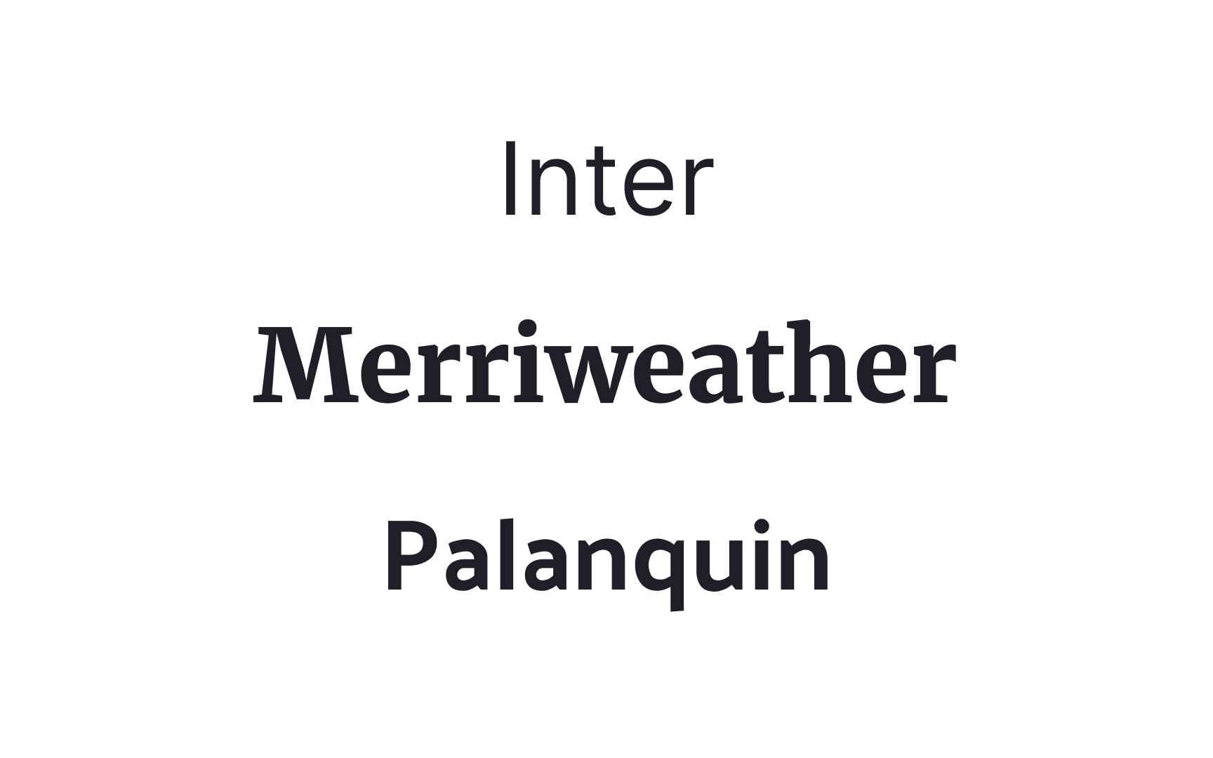
You may select Roboto as the primary typeface for a project, but you'd use various fonts like 12pt Roboto Regular and 9pt Roboto Bold.
A font is a specific variant within a
It's common for people to use the terms "font" and "typeface" interchangeably outside of professional design circles. However, in the realm of
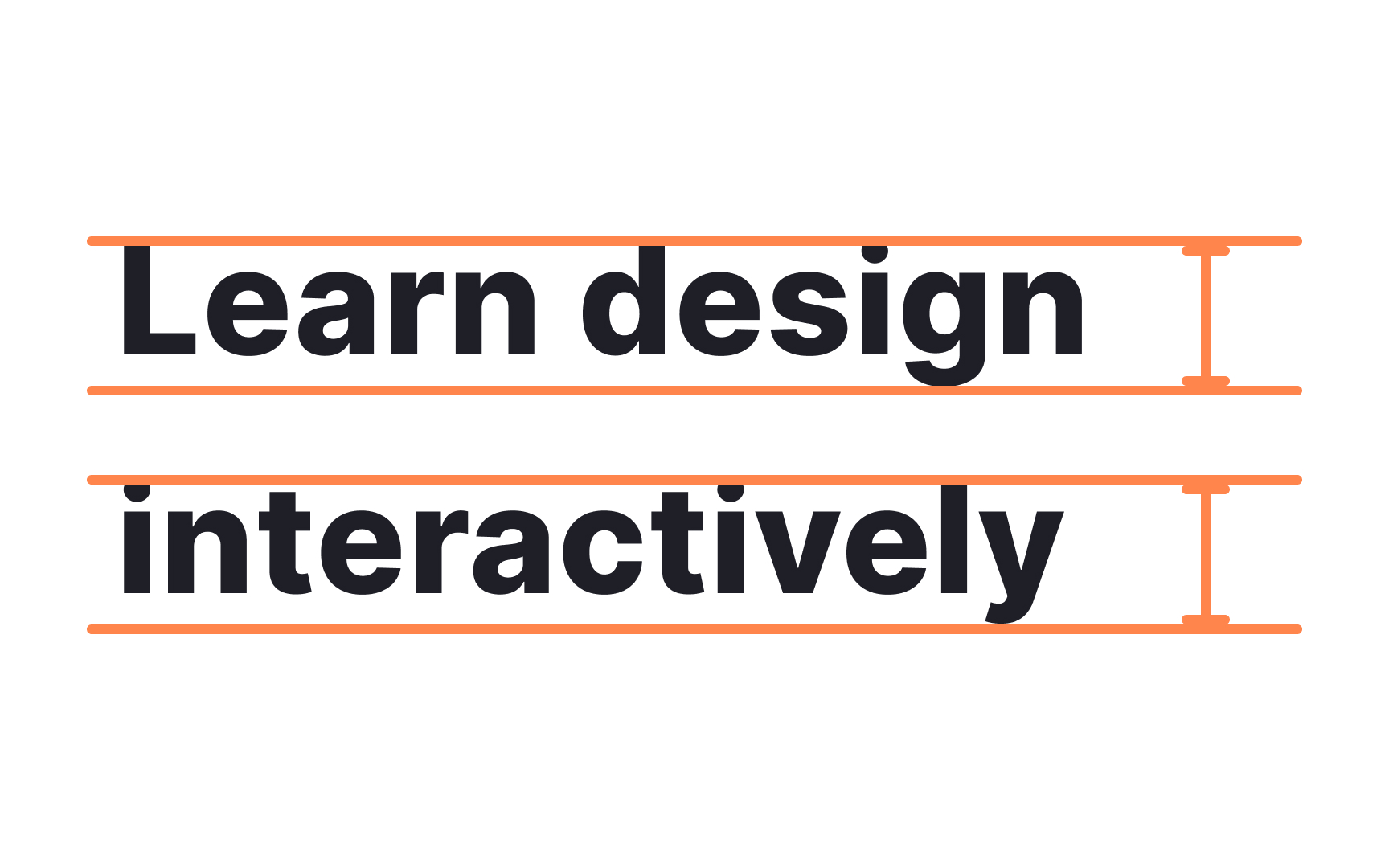
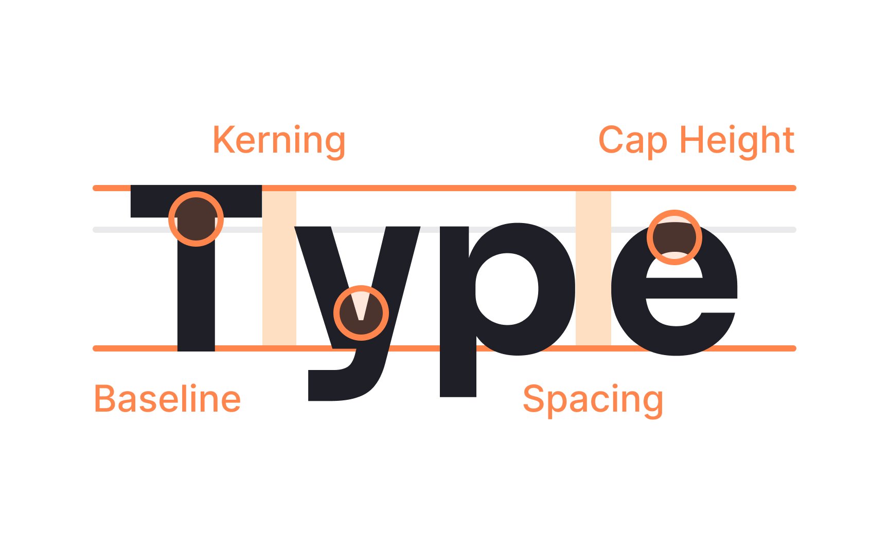
Font size is the height of a
Font size equals the distance between the top of the ascender height to the bottom of the descender height. Designers usually use points (8, 10, 12, etc.) to measure font size, where 1 point equals 1/72 inch or 0.35 mm.
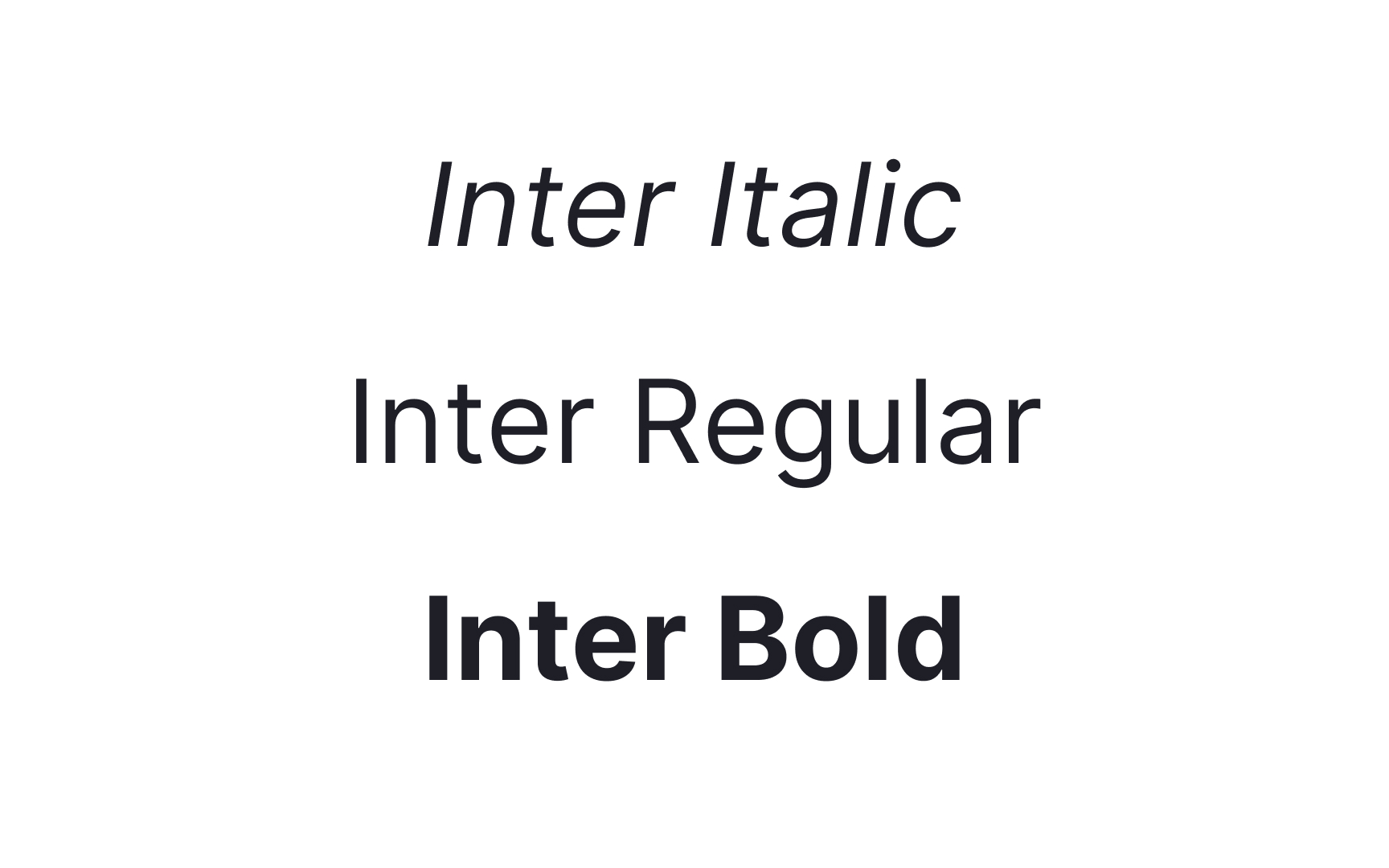
Font weight refers to the thickness of the stroke in a given
This text is meticulously designed to be both readable and legible, ensuring a comfortable user experience while conveying the intended message.
Pro Tip: 12pt is the minimum size you should use for body text, specifically for text-heavy pages.
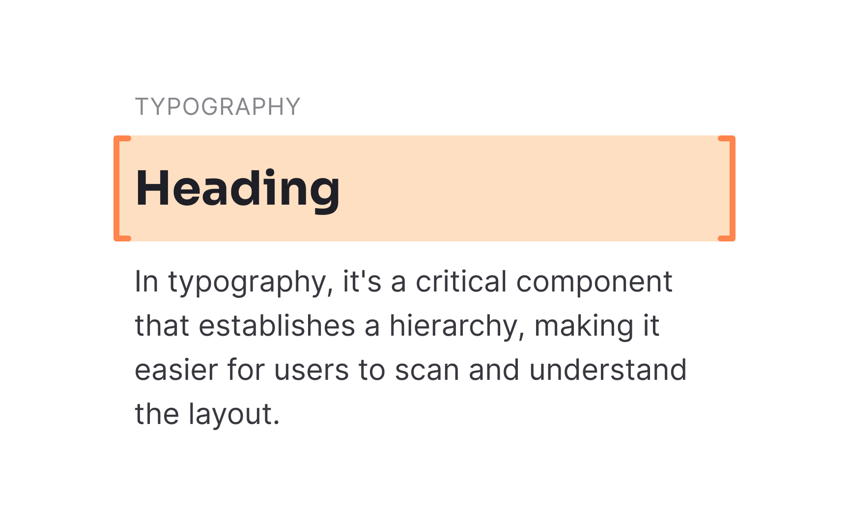
A
Whether you're navigating a website or reading a magazine, headings give you a snapshot of what each section is about, aiding in quick navigation and better comprehension.
Pro Tip: Headings can use size as well as weight and style to stand out from other content.
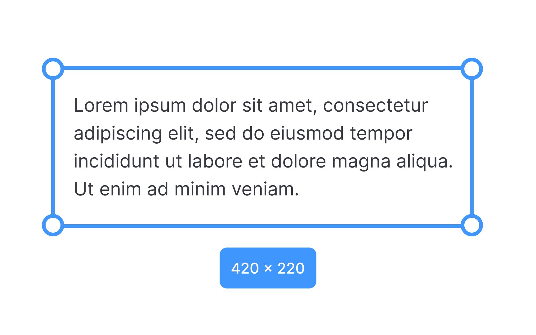
A text block refers to a cluster of text elements, like paragraphs or blockquotes, arranged together to form a visually coherent unit. This grouping typically assumes a rectangular shape, hence the term "block." In the context of low-fidelity wireframing, text blocks serve as placeholders, often filled with dummy text.
These placeholders help designers visualize the spatial relationships between text elements, facilitating decisions on
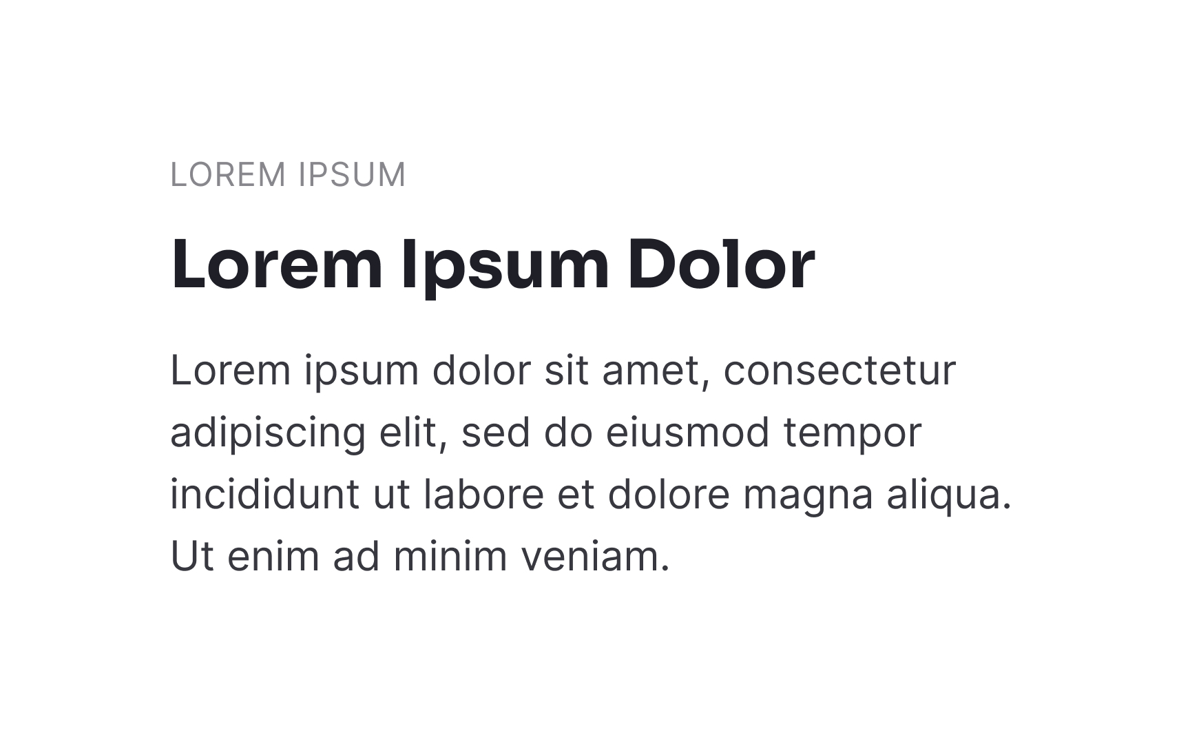
Lorem Ipsum is the
Generally, Lorem ipsum is a short-term fix before designers replace it with the actual copy. Such dummy text is helpful in the very early stages of wireframing, entry-level planning, and brainstorming ideas.
Microcopy refers to short bits of copy that guide users through the product and help them achieve their goals. Some examples of microcopy include:
Microcopy helps guide, engage, and cue users into products' functionality. It is responsible for shaping a significant part of the