Intro to UI Modals
Discover the different types of UI modals and their use cases
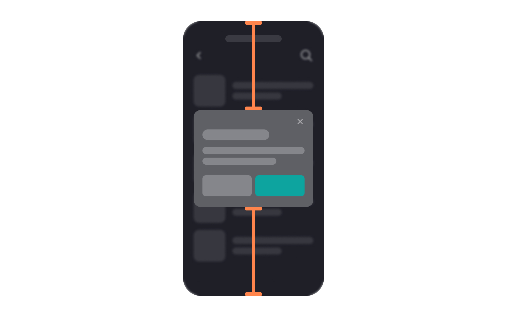
Modals are windows that appear on top of a parent screen. They are also called modal dialogs or overlays. The term "modal" comes from the fact that it creates a mode that disables the parent screen but keeps it visible. Users must interact with the modal dialog to return to the main screen.
Modal dialogs can be an elegant solution to a UI problem. They simplify the UI, save screen space and instantly grab users' attention. At the same time, overusing modal dialogs can annoy users. So, knowing when to use them and how can come in handy.
When
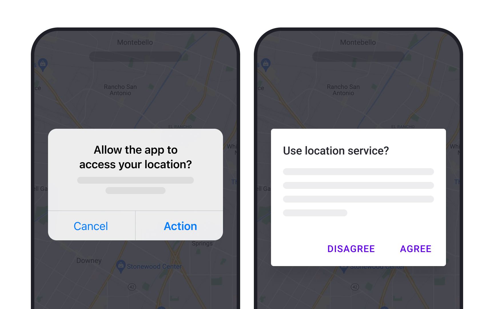
Non-modal dialogs (also called modeless), on the other hand, do not block interaction with the rest of the application. They can easily be ignored or minimized by users and do not cause any disruption to their tasks.
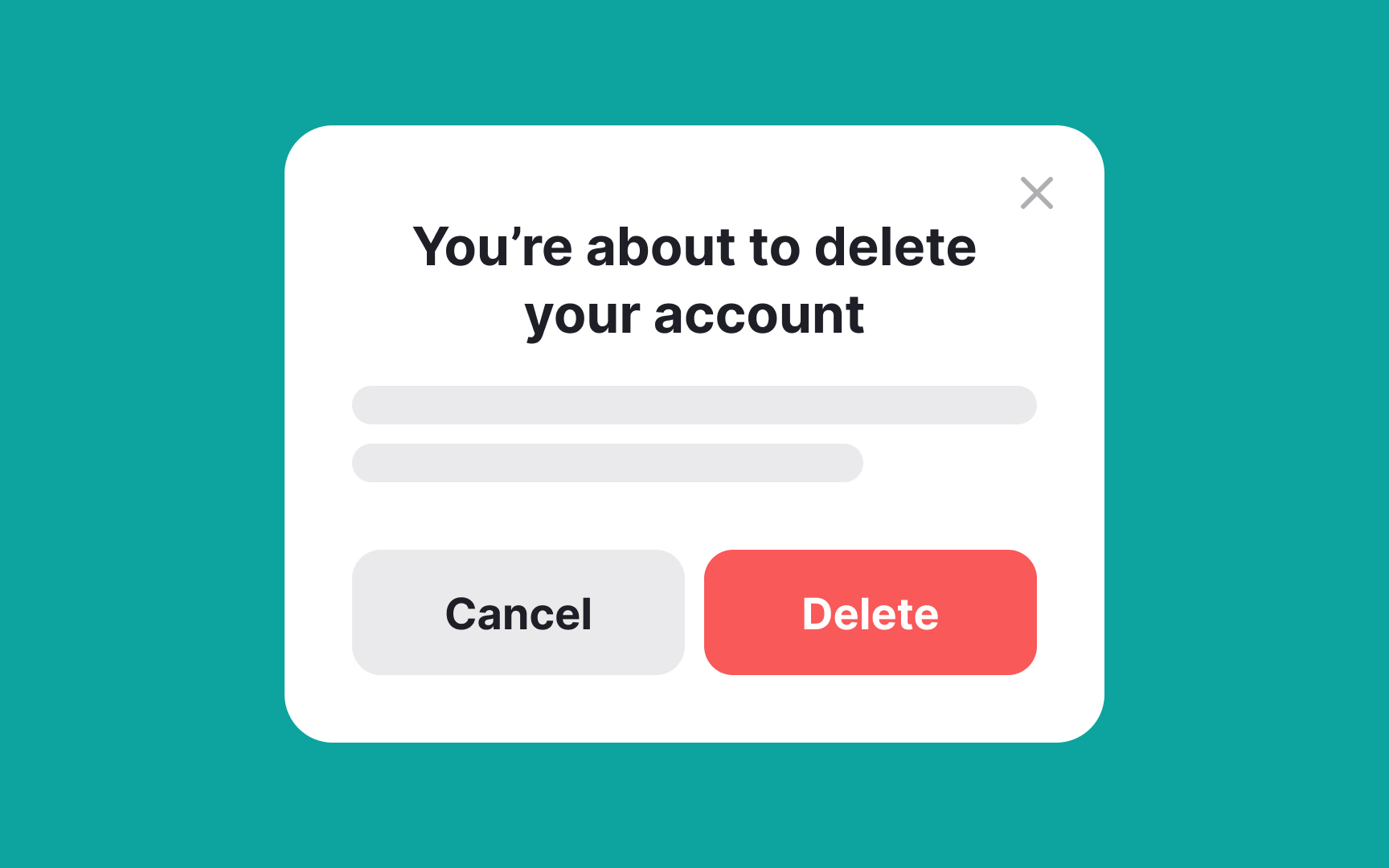
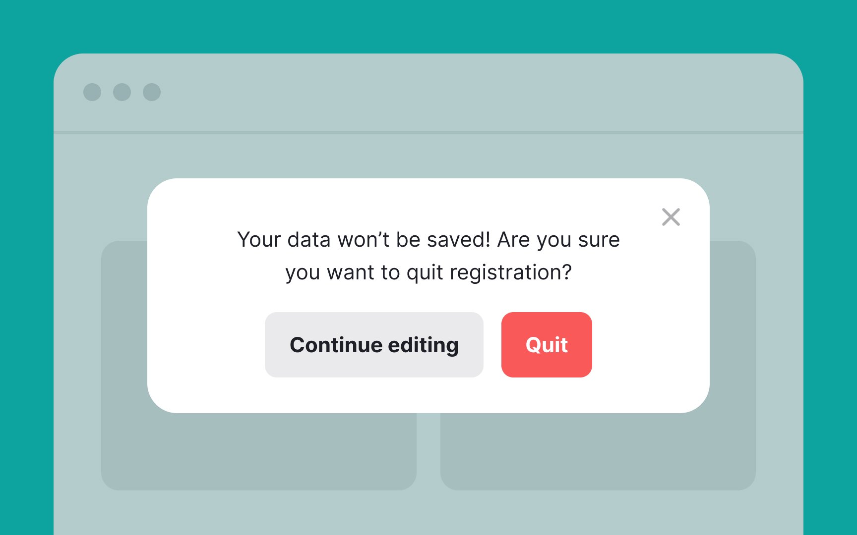
The modal ensures the action is intentional, offering a last chance to cancel. It can also provide crucial information, such as the number of files to be deleted, so users understand the impact of their decision. By concentrating focus on the action at hand, modals minimize the risk of accidental or uninformed choices.
However, it's good practice to consider alternative, less disruptive elements like inline forms for tasks that don't require immediate user attention. When used thoughtfully, modals can make the process of gathering important information more efficient and focused.
However, it's crucial to use this attention-grabbing tool sparingly to avoid annoying users or diluting the impact of truly critical messages. The key is balancing the urgency of the information with the user's ongoing experience.
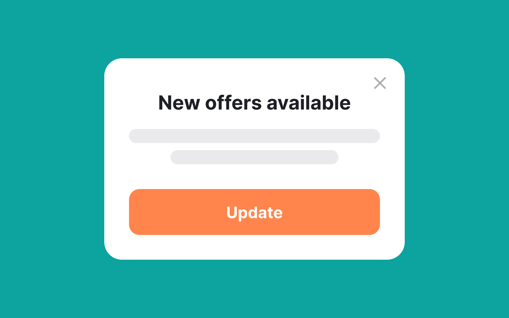
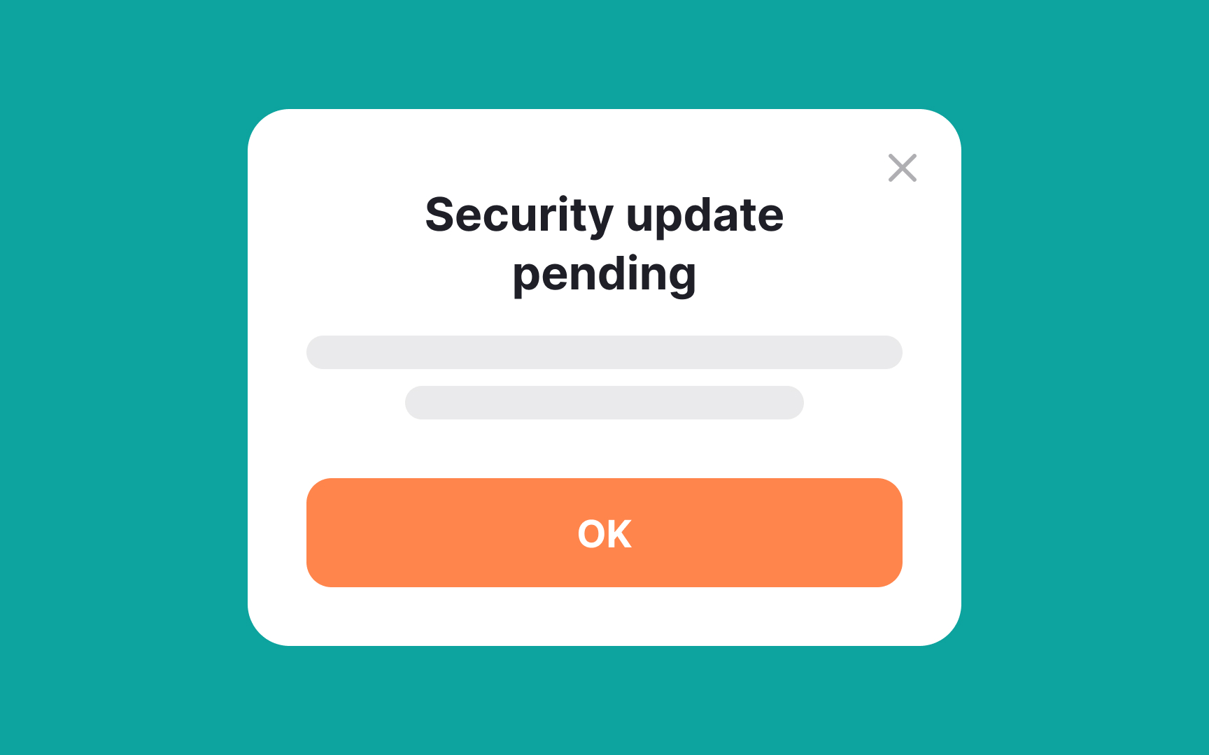
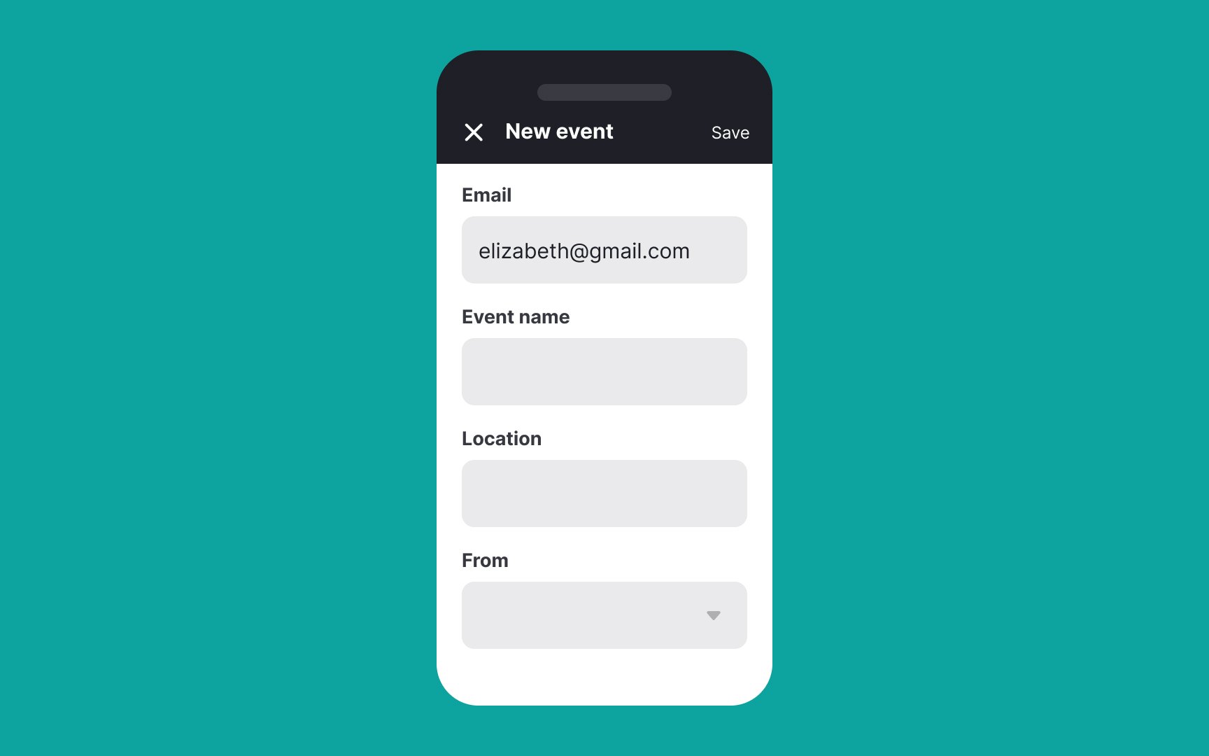
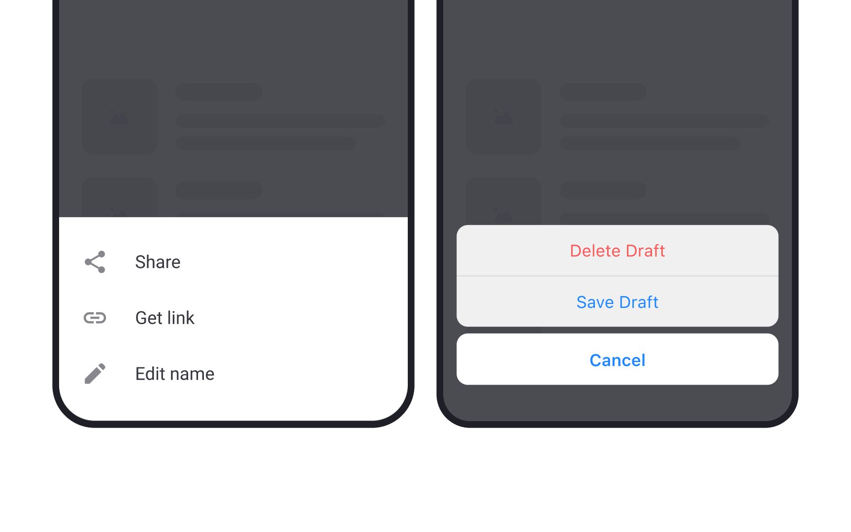
Popup
These modal dialogs can appear in response to user-initiated actions, such as clicking a button or link, or they can be triggered automatically by the system in response to a specific event, such as an error or warning.
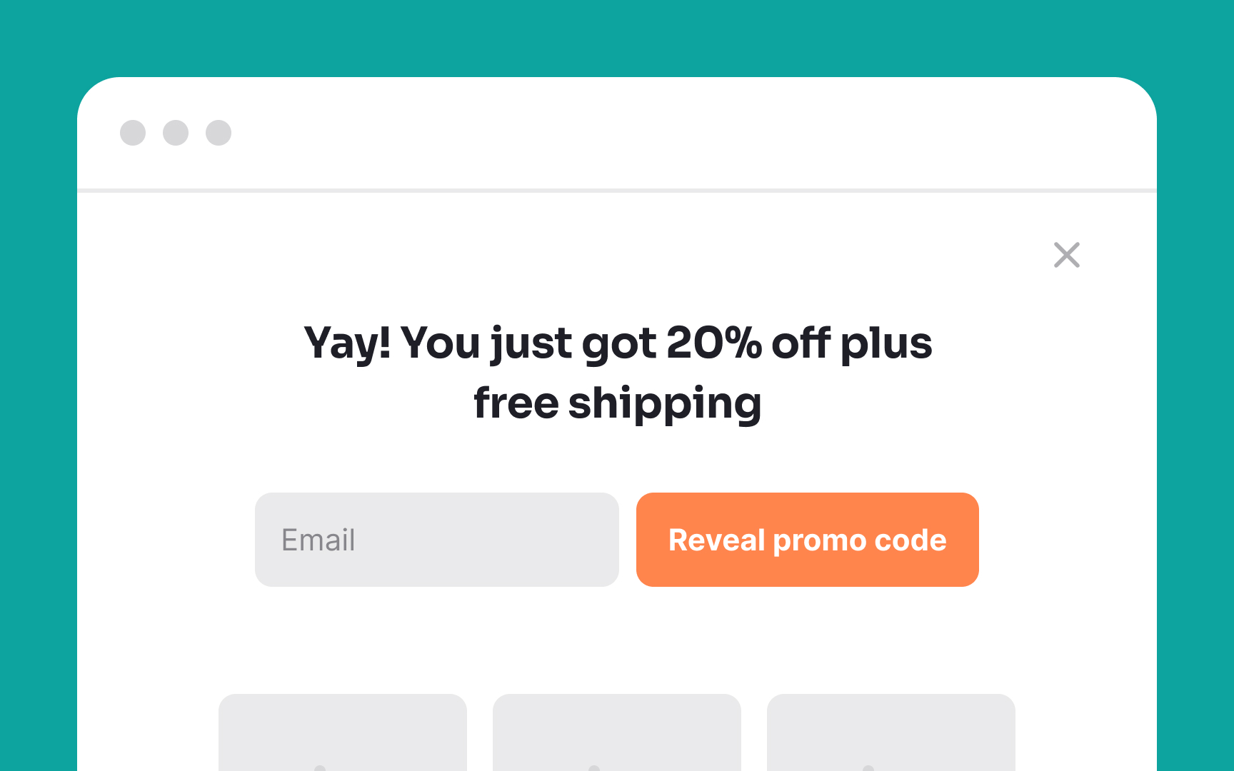
Fullscreen desktop
While effective in grabbing attention and minimizing distractions, these modals must be used judiciously. Overuse can disrupt the user experience, causing more annoyance than engagement.
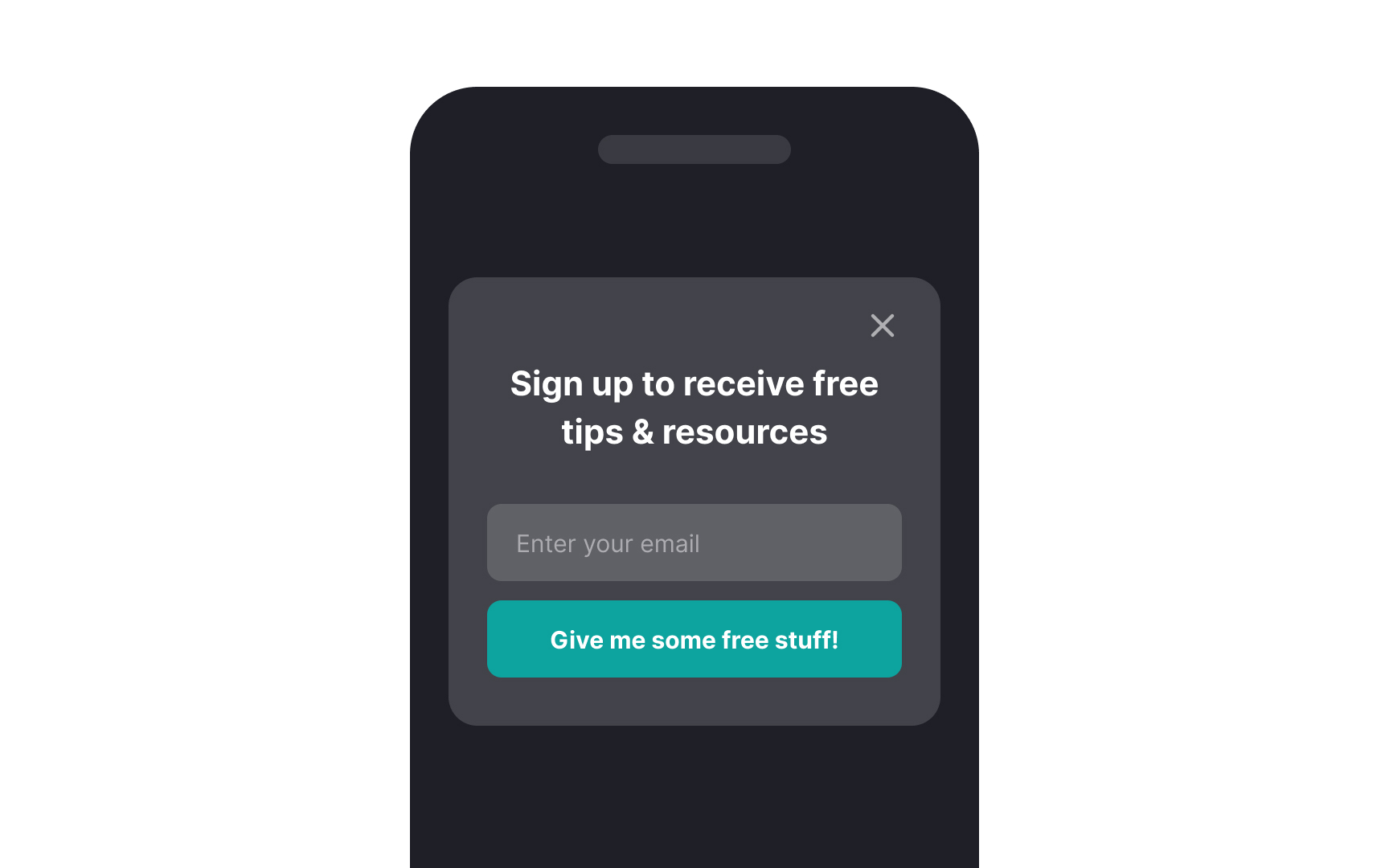
Fullscreen mobile
Making these modals easy to dismiss is crucial. Users can get frustrated if they can't quickly exit the modal to return to the main content. It's all about striking a balance between capturing attention and allowing for smooth navigation.
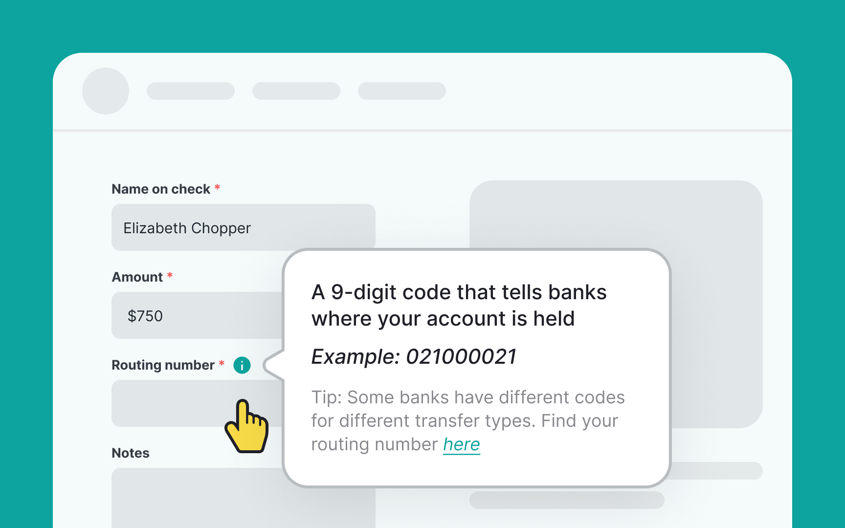
Popovers are small overlay windows that show up when users interact with specific areas on a website or app. Unlike popup
These mini-windows are activated by actions like hovering, clicking, or touch gestures. They're handy for sharing extra product details, offering customization options, or suggesting a next step. Popovers shine in situations where users need a bit more info or guidance without being pulled away from what they're doing. So, they offer a balance between enlightening the user and maintaining workflow.[1]
Pro Tip: Avoid using popovers to display vital information since they can be easily overlooked.
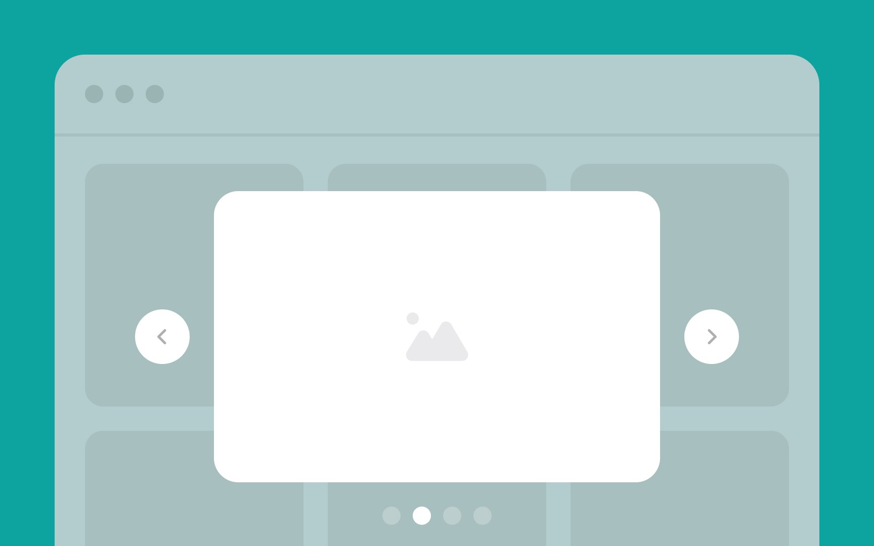
Lightbox
A significant perk of using a lightbox modal is that it lets users focus on the
Pro Tip: If more than one image or video can appear in the same lightbox, provide users with visual cues to indicate that.
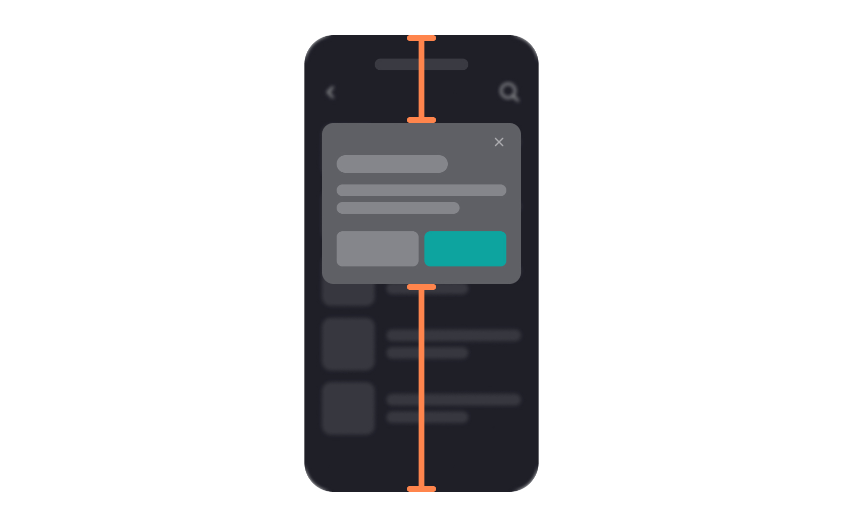
Centering
This isn't just about aesthetics; it also ensures that the modal stays put even if the browser window gets resized. Keeping the modal stable contributes to a seamless
Pro Tip: This rule does not apply to popovers — they are better off being displayed close to the interactive elements that trigger them.
Designing mobile
In Android, these are known as
On iOS, they're called alerts. They have a title, optional content, and buttons, using the San Francisco typeface. The primary button is slightly bolder, and dividers separate content and buttons.[3]
Understanding these subtle differences helps designers create modals that are both effective and consistent, no matter the operating system.
Both
Though the names differ, the core function is similar: providing users with an unobtrusive way to access more options without disrupting the current app context. Both are handy tools in mobile design where screen space is precious.
References
- Popovers | Apple Developer Documentation | Apple Developer Documentation
- Dialogs – Material Design 3 | Material Design
- Bottom sheets – Material Design 3 | Material Design
Top contributors


Topics
From Course

Share


Similar lessons

Common UI Component Definitions I

Image Terminology
