Designing Mobile Selection Controls
Discover how to design mobile selection controls that help users complete tasks without any friction
Selection controls allow mobile users to select options, switch settings on and off, pick dates, or a range of dates. Some controls may seem interchangeable, but their wrong application can drastically increase the interaction cost.
Correctly designed selection controls help users move forward with their tasks without even noticing the process. Poorly applied checkboxes, radio buttons, or toggles impede users and slow down their flow, forcing them to apply extra mental or physical efforts that result in frustration and, eventually, abandonment.
While similar to
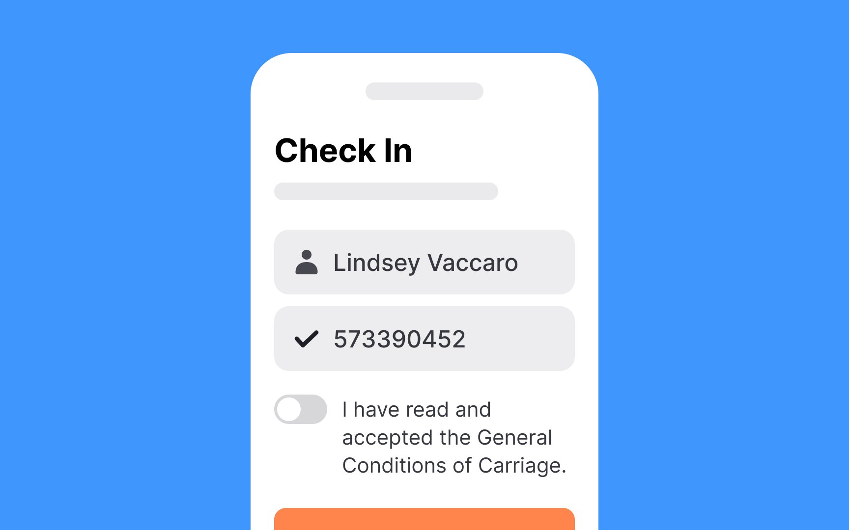
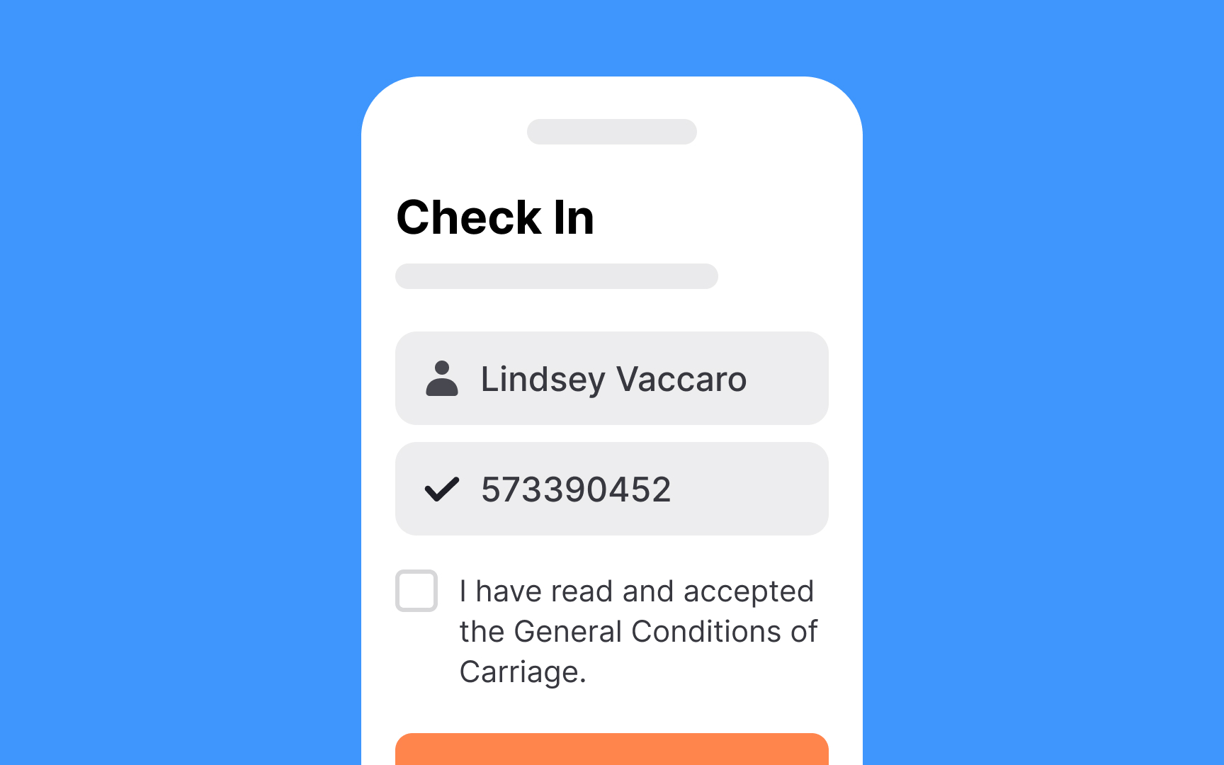
Use checkboxes for:
- Actions requiring final review and confirmation via Submit button
- Forms with additional steps after selection
- Multiple-choice options within one category
- Actions needing clear on/off states
Design checkboxes following standard control guidelines: recognizable shape, clear icons, and adequate touch targets.
Labels vary by context: brief for option lists, but can be longer for standalone checkboxes (like Terms and Conditions agreements).
Unlike
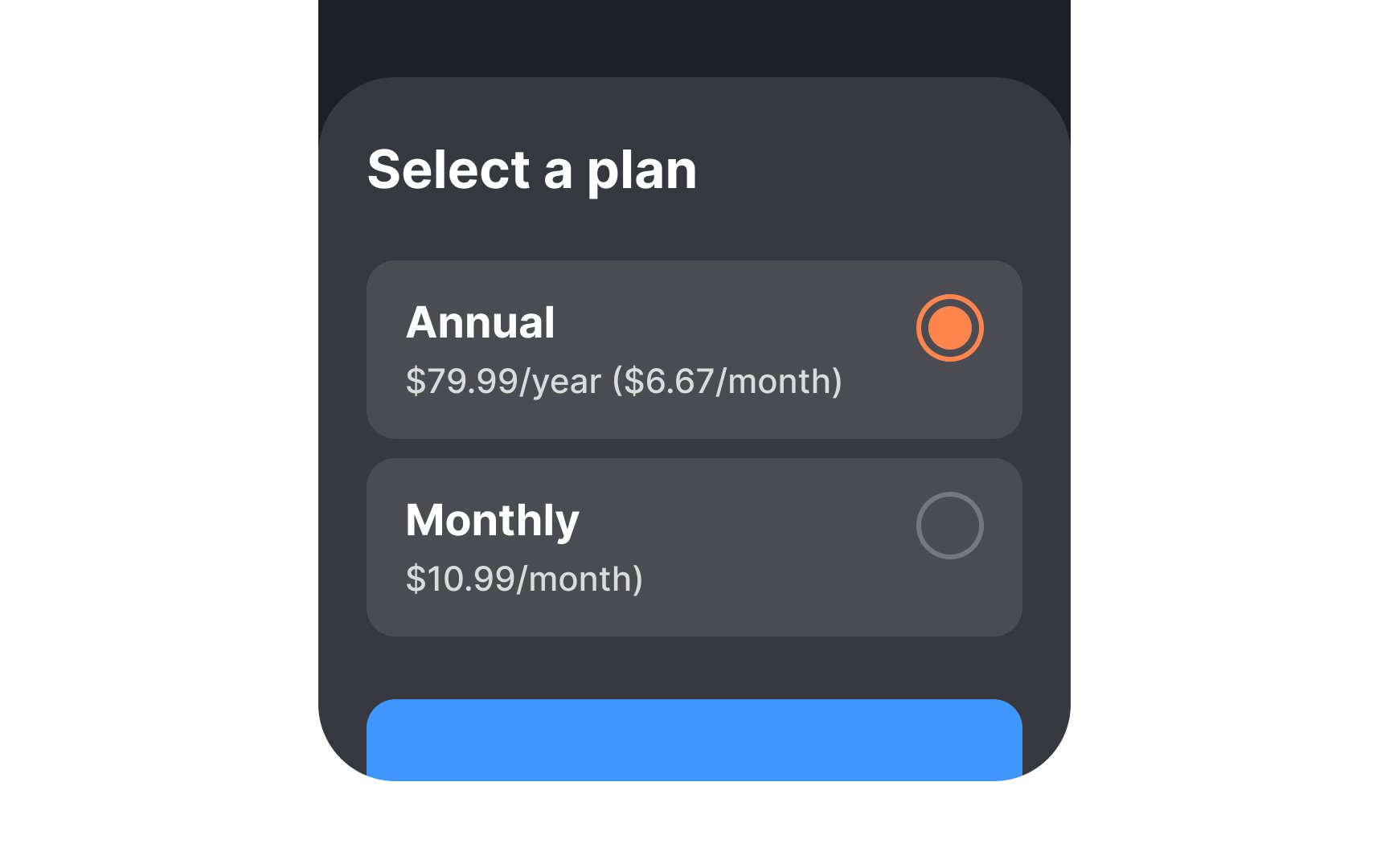
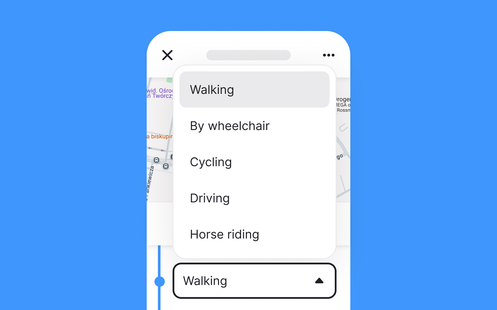
Key principles for radio button design:
- Use for two or more mutually exclusive options
- Align options vertically for better scanning — horizontal layouts need more space between
buttons andlabels - Choose radio buttons over dropdowns for fewer than 5 options to reduce the
interaction cost - Set research-based default selections that match common user choices
- Make both button and label tappable
- Maintain standard circular design to ensure familiarity.[1]
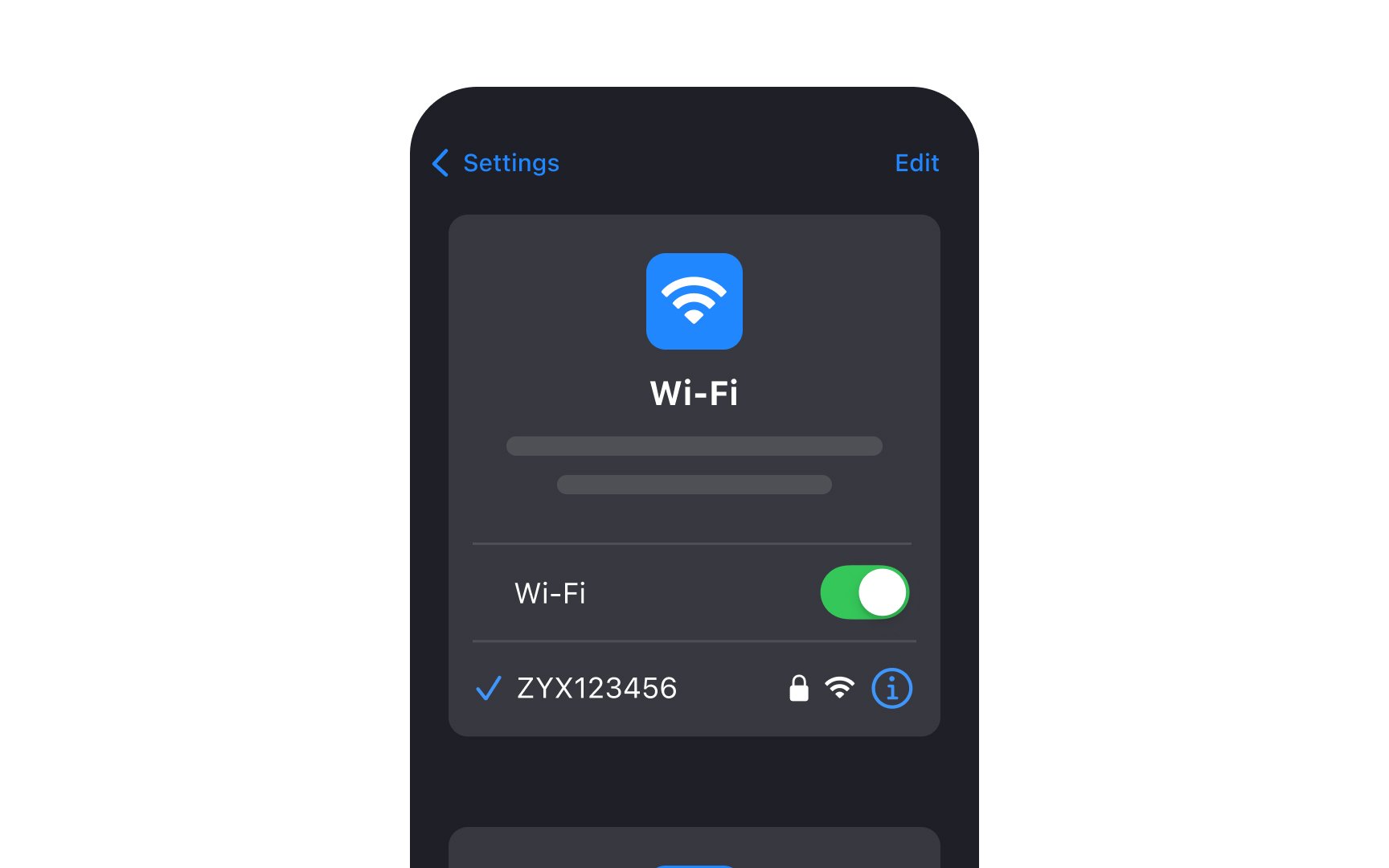
Since designers sometimes falsely replace toggle switches with
- Use toggles when selected options take an immediate effect. That's why we often use toggle switches for the
Settings page where choices get applied instantly and it isn’t required for users to confirm their decision. - Make sure the labels are direct and clear. Avoid using questions and formulate
labels by saying what will happen when the switch is on. For example, the label "Show Notifications" is more straightforward than "Notifications." - Use color contrast to signify the difference between On and Off states. The On state should be more contrasting so that even people with visual impairments can notice the difference.[2]
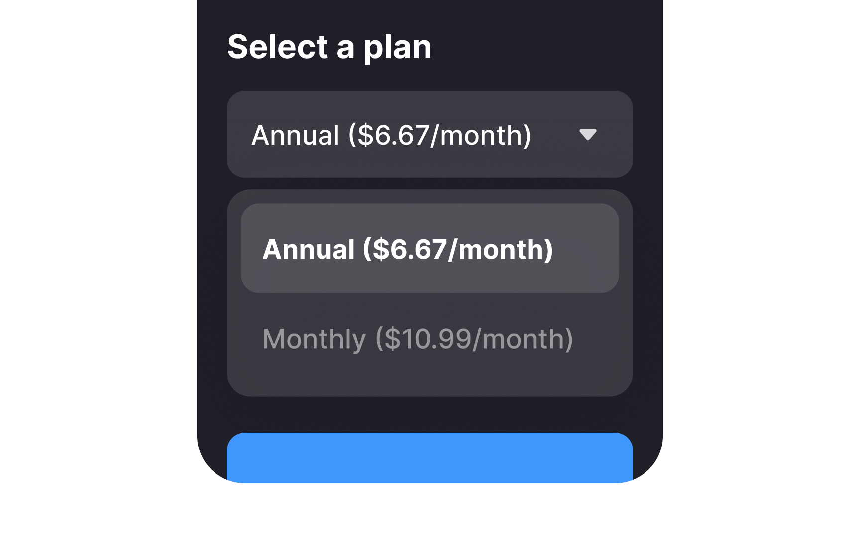
Dropdown menus show predefined options on tap. Basic
Research suggests caution with dropdowns: they hide options, can overwhelm users when expanded, and require significant
Consider these alternatives:
- Optimize option lists: For lengthy dropdowns, add auto-suggest search and prioritize frequent options at the top
- Use simpler controls: For 5 or fewer options, use
radio buttons to make choices immediately visible - Consider text input: Though typing requires effort, it's often faster than dropdown selection for familiar data like birth dates
- Set smart defaults: Include common selections based on user research to reduce interaction steps
- Automate when possible: Let systems detect information automatically (like card type from number) rather than asking users.[3]
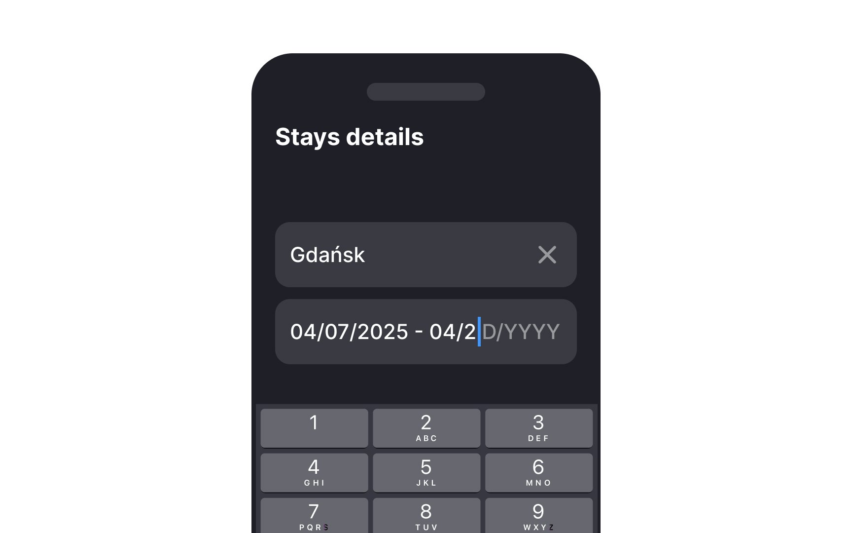
Mobile offers two picker types:
- Input pickers: For manual date entry, best for distant past/future dates (like birthdates)
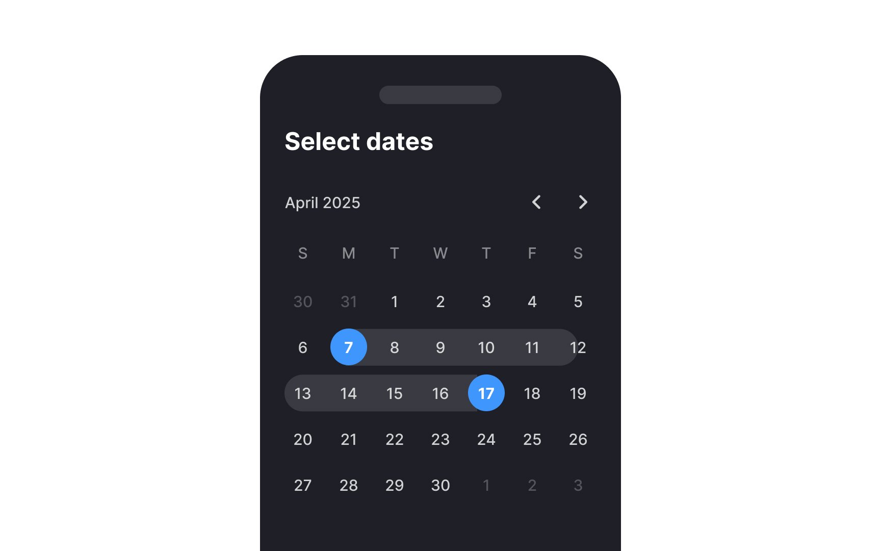
- Calendar pickers: Dialog-based selection, ideal for dates within a year of the current date to avoid excessive scrolling
Apple's alternative uses bottom-screen wheel scrollers for medium-sized lists with logical ordering.[4]
Key design principles for calendar pickers:
- Enable clear navigation: Show all months of the current year on one screen and years on separate screens. Avoid nested
dropdowns . - Distinguish dates: Clearly differentiate the selected date from the current date (varies by platform — Google Calendar emphasizes the current date, iOS the selected).
- Handle invalid dates: Disable unavailable dates using a grey color or making them untappable.
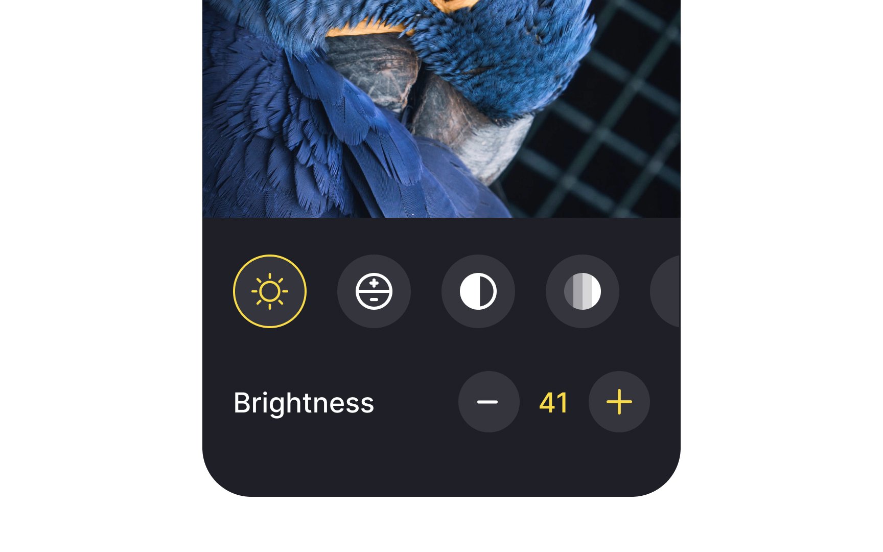
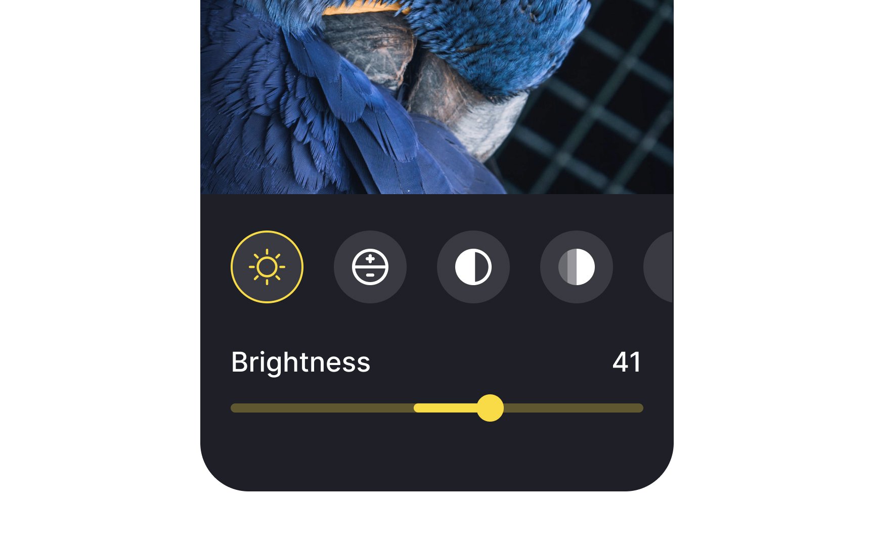
Slider controls are UI components for adjusting
On mobile, designers should be careful with sliders, making sure they're easy to handle. The thumb should have a proper touch target size so even older people or individuals with motor disabilities can drag it without effort.
You can customize the track color, thumb icon, and left and right
Sliders aren't the best solution when the preciseness of value matters. Consider using
References
- Checkboxes vs. Radio Buttons | Nielsen Norman Group
- Toggle-Switch Guidelines | Nielsen Norman Group
Top contributors


Topics
From Course

Share


Similar lessons

Designing for Mobile Interfaces

Responsive vs. Adaptive Design
