CSS Images
Learn how to leverage CSS to optimize and enhance images that create visually stunning and optimized web pages
Both HTML and CSS allow you to add images. What's the difference? Images added with the HTML <img> tag have semantic meaning — they are treated as content, and you can add alt text so that search engines and assistive technology can recognize that content.
CSS allows you to add images for decorative purposes and offers a wide range of options to customize them. You can set the background picture, change list item markers and cursor shape, add masks and whole icon libraries, and more. Learn about the many different options CSS offers to add images to your designs.
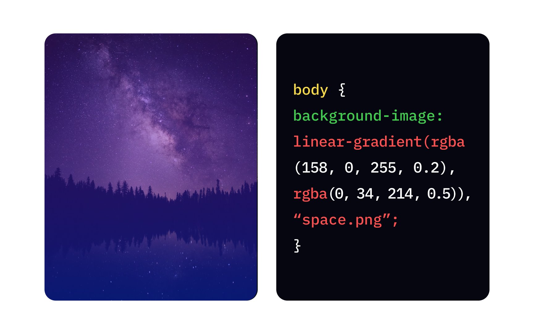
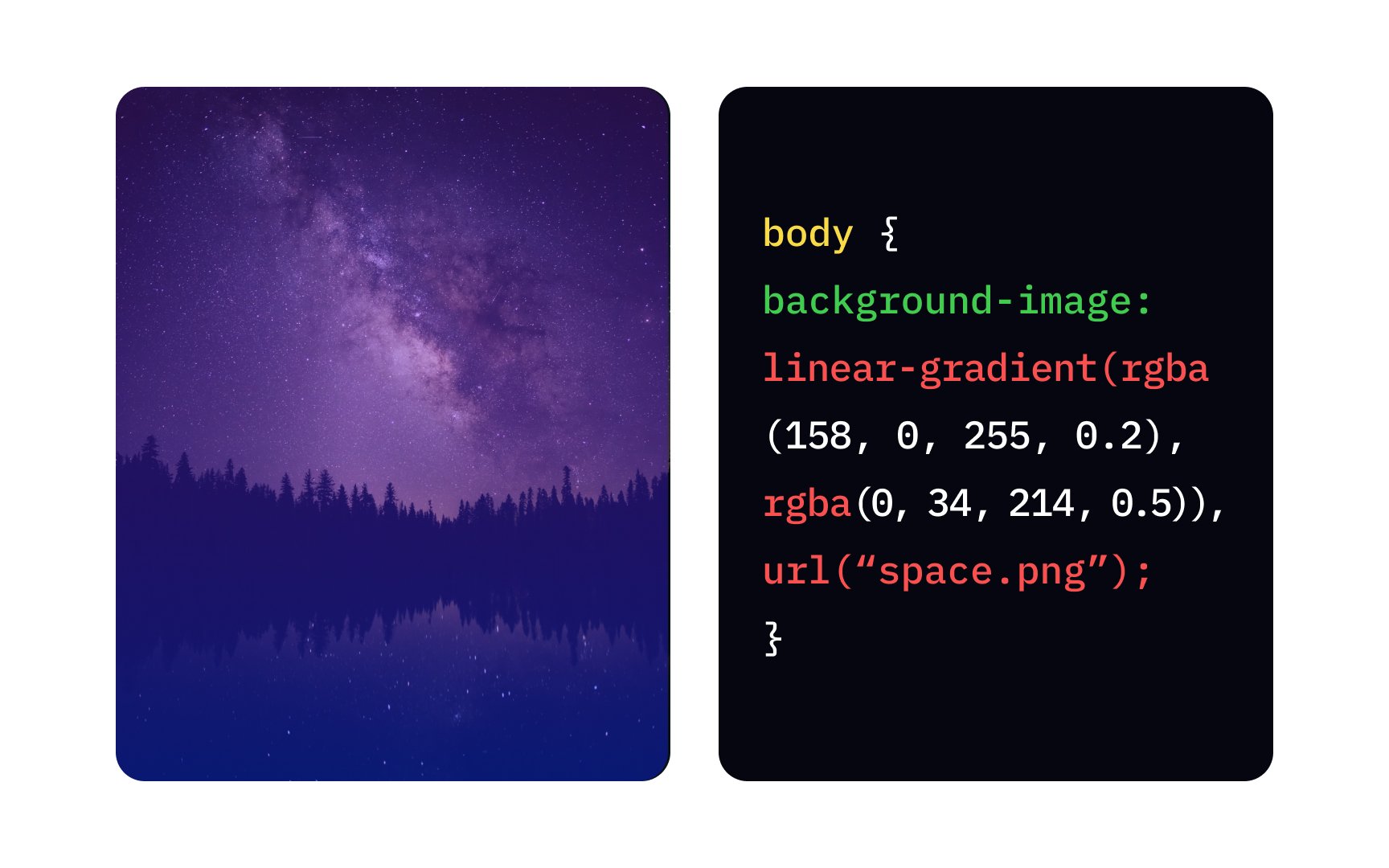
The background-image property sets the url() function, putting the address in the quotemarks inside parenthesis: background-image: url("space.png");.
In the example above, we also added a gradient — a transition between purple and blue (we'll talk more about gradients in one of the next lessons). Adding gradient data type to your background-image declaration will affect the background image.
There's also a shorthand property background that allows you to set individual properties like position, size, repetition, and more in a single declaration.[1]
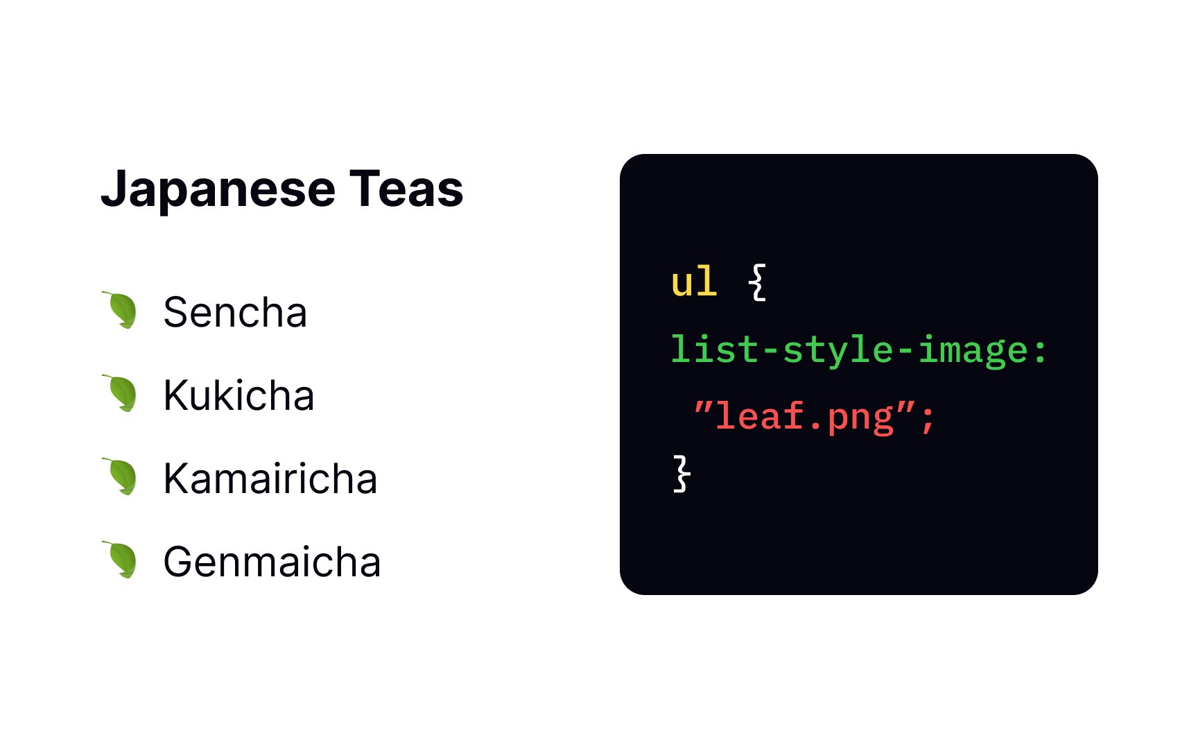
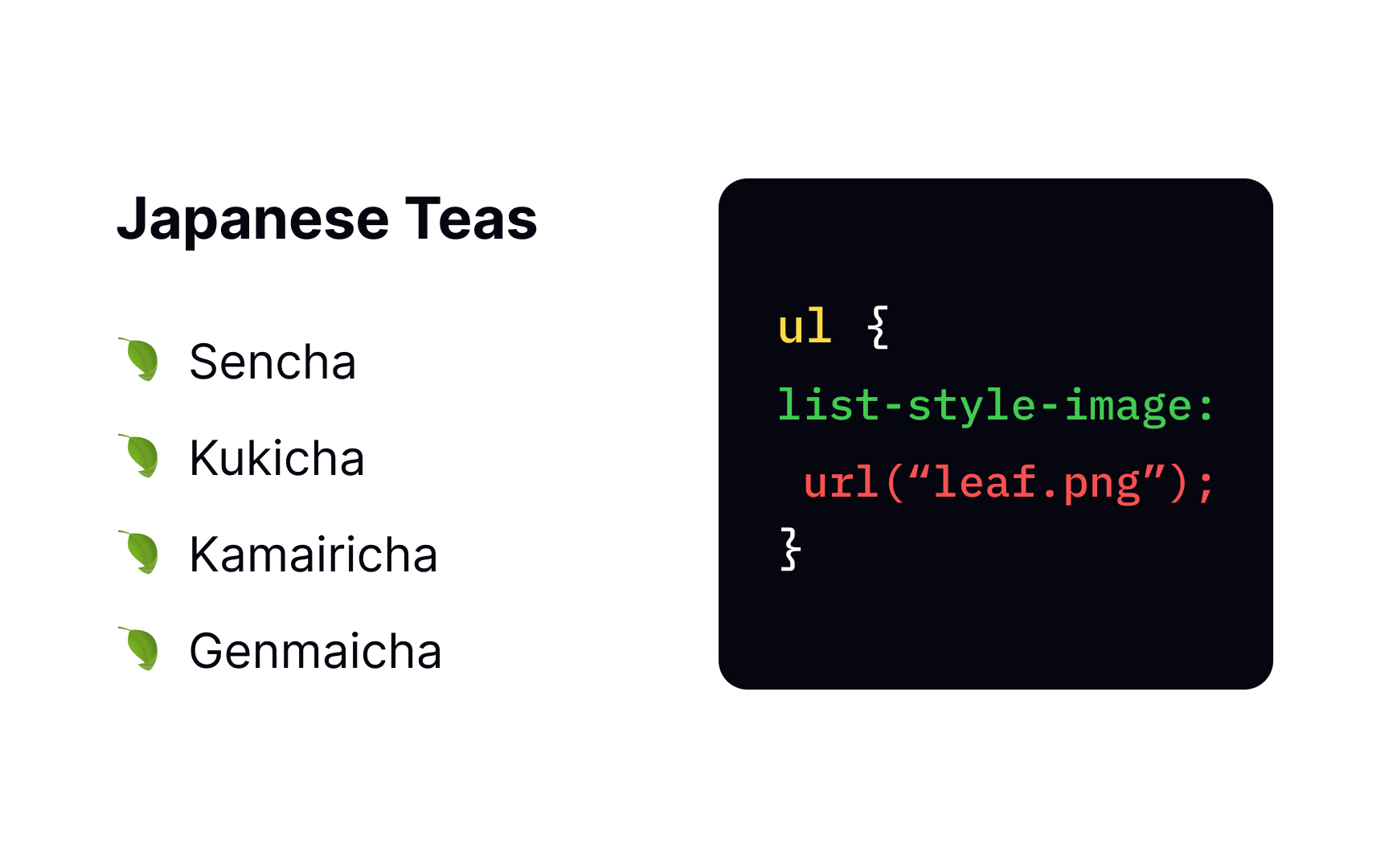
By default, browsers use bullet points for list markers in unordered lists. The list-style-image url() function to specify the image's address. In this example, the style rule assigns a transparent PNG image "leaf.png" as the list marker for all the items in the unordered list.
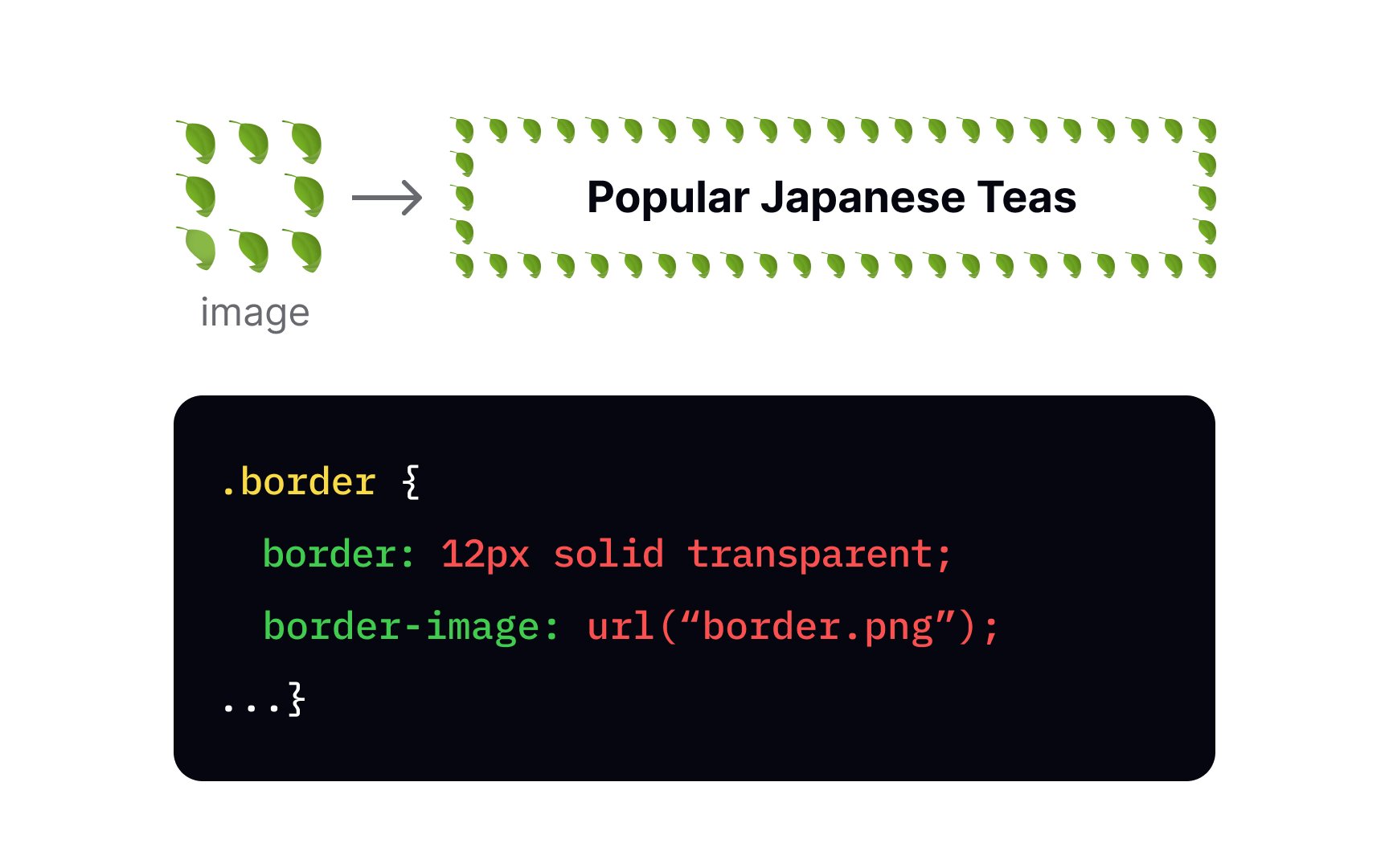
If you're tired of plain boring borders, good news — border-image url() function. You can tweak it if you want the image to be sliced, repeated, scaled, and stretched.[2]
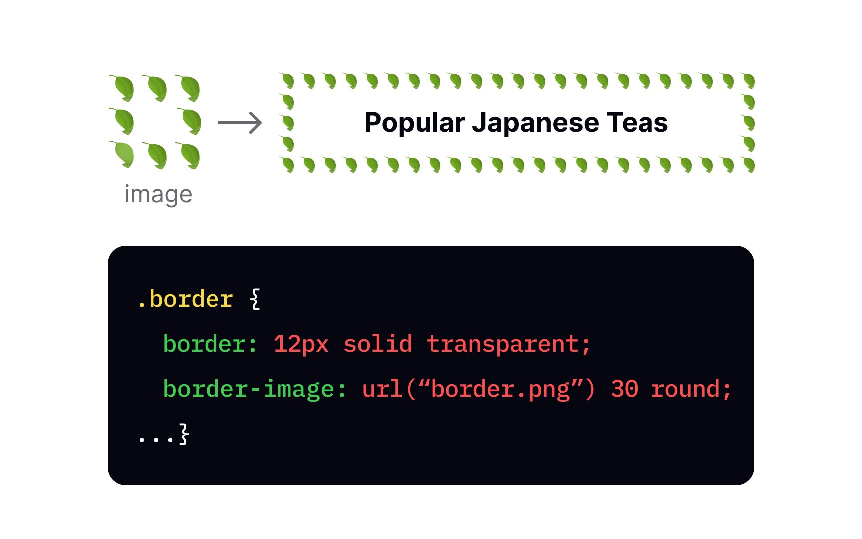
In the example, the value 30 sets image offset to 30 pixels and the value round means that the image's edge regions are repeated to fill the gap between each border.
Pro Tip: You should also specify border width, style, and color with the border property anyway, in case the border image fails to load.
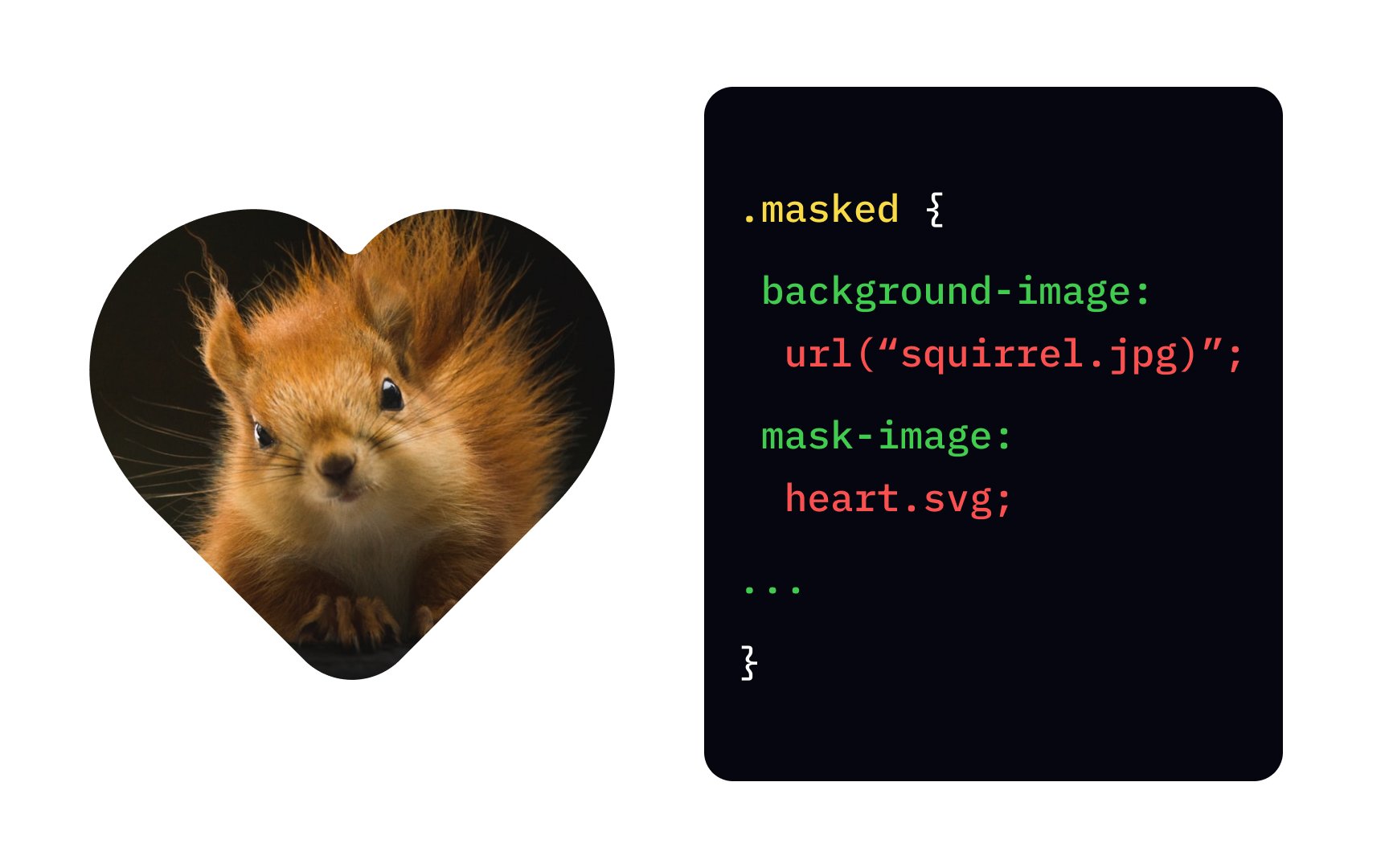

The mask-image
The image type should support transparency, so your best options are SVG and PNG. Use the url() function to set the address of the image you want to use as a mask.
As we mentioned before, all
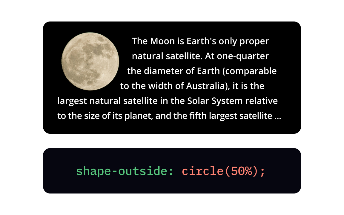
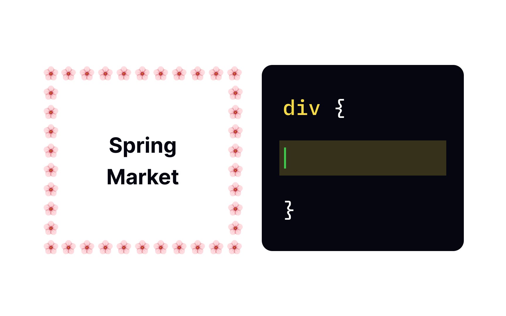
The shape-outside
By default, browsers display the mouse pointer over any blank part of a web page, the gloved hand over any linked or clickable item, and the edit cursor over any text or text field. The cursor
To add one or several cursor images, specify their addresses with the url() function, separated by a comma. The declaration must end with a generic cursor keyword value[4] in case the browser fails to load images. In the example above, this value is a pointer.
Pro Tip: If the url doesn't have special symbols, quotation marks are optional.
Visual
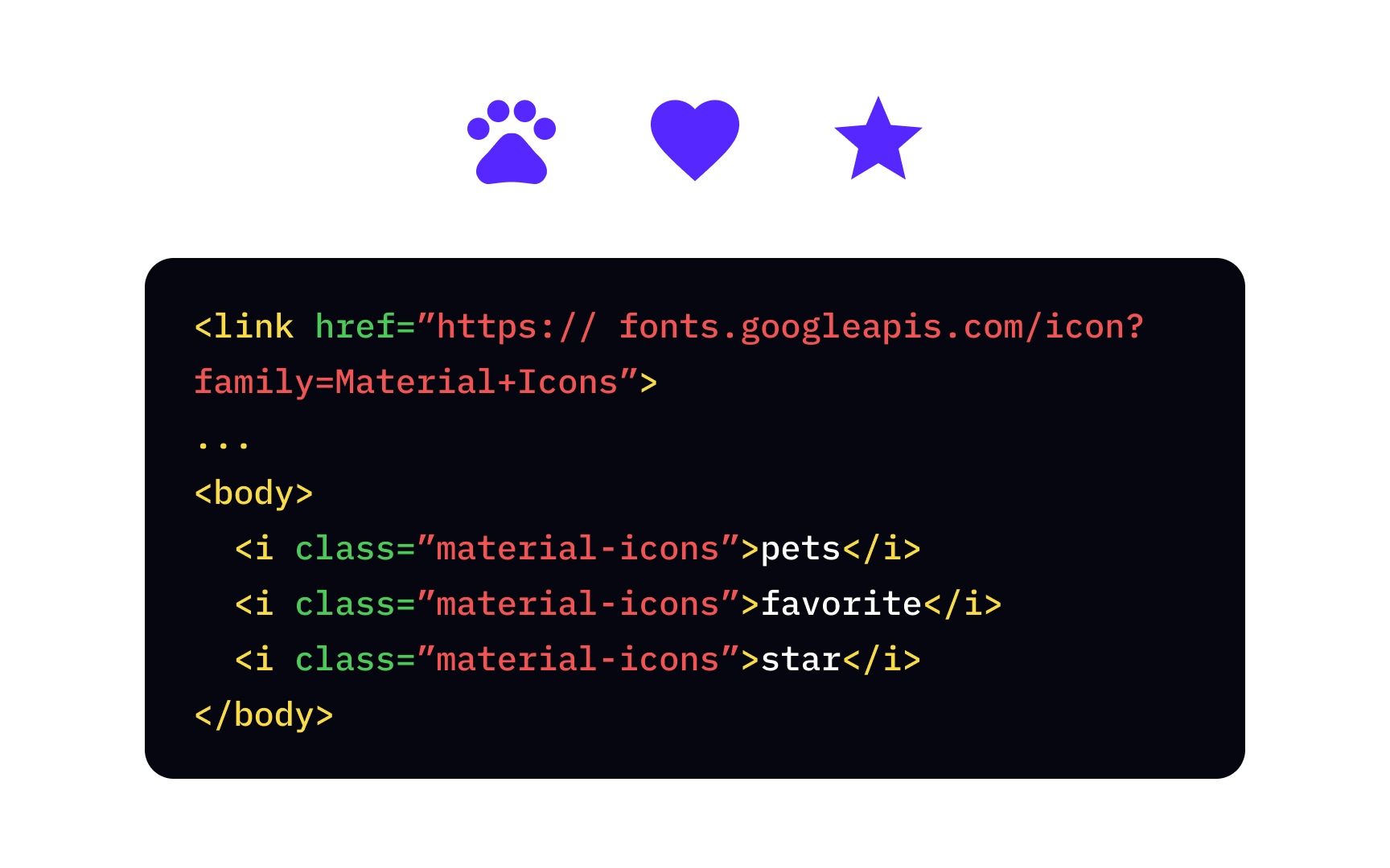
Adding icons from the library requires several steps:
- Link the
CSS file of the icon library in the<head>tag - Create an
<i>element with the classmaterial-icons Search for the icon's name on the library's website- Add the icon's name between the start and the end
tags
Because icon libraries are actually fonts, you can use CSS styles to adjust the icon's size, color, and shadow, just like for any other text on the web
The border-image-source
Another way to set the border image source is with the border-image shorthand property. This property allows you to set the address, outset, repetition, width, and how the image will be sliced in one declaration.
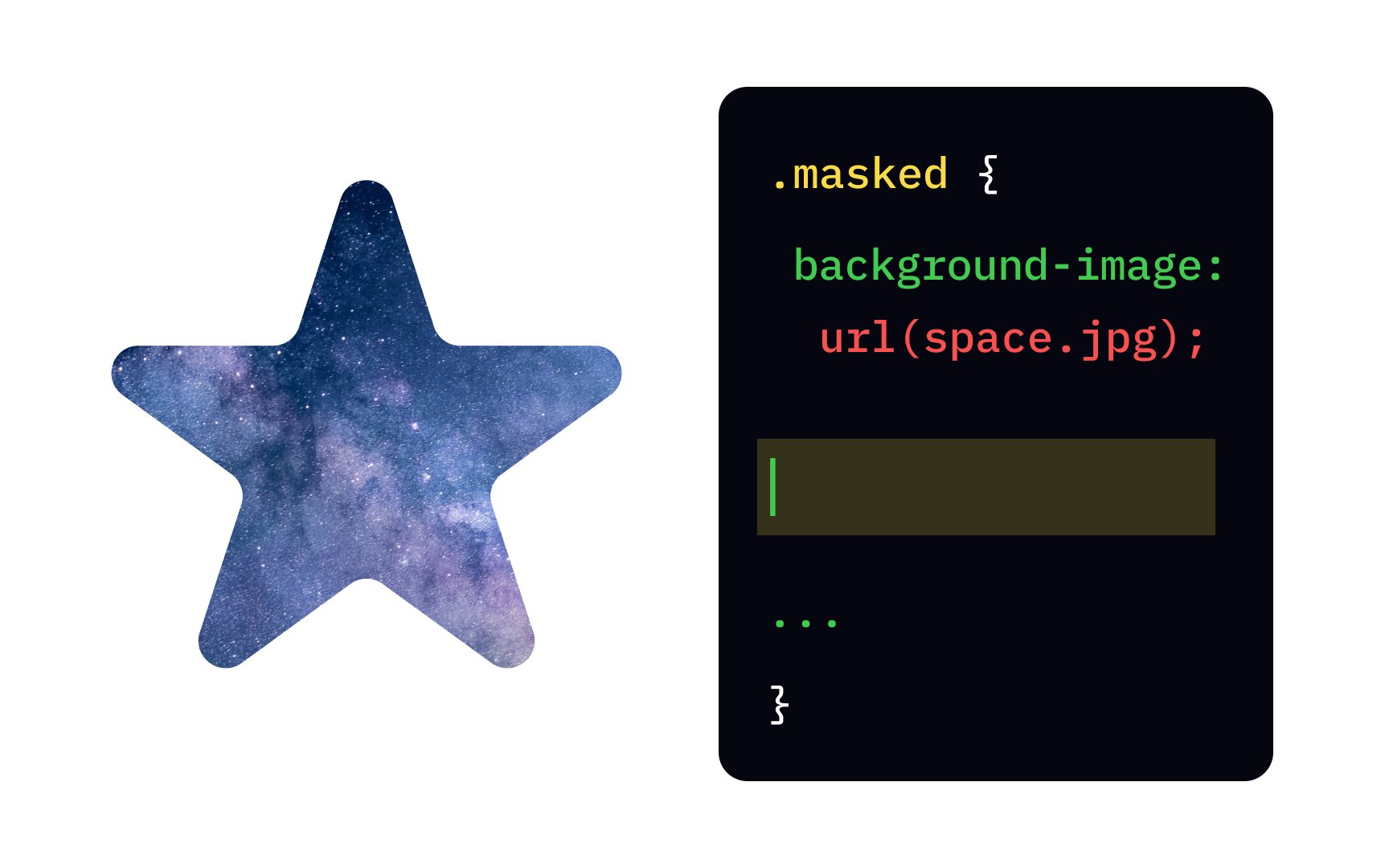
To add a mask layer, use the mask-image url() function.
This property also takes linear-gradient mask to make the top of the background transparent, fading towards the opaque bottom.
References
- shape-outside | CSS-Tricks | CSS-Tricks
- mask-image | CSS-Tricks | CSS-Tricks
Top contributors

Topics
From Course

Share


Similar lessons

CSS Basics

Introduction to CSS for Designers
