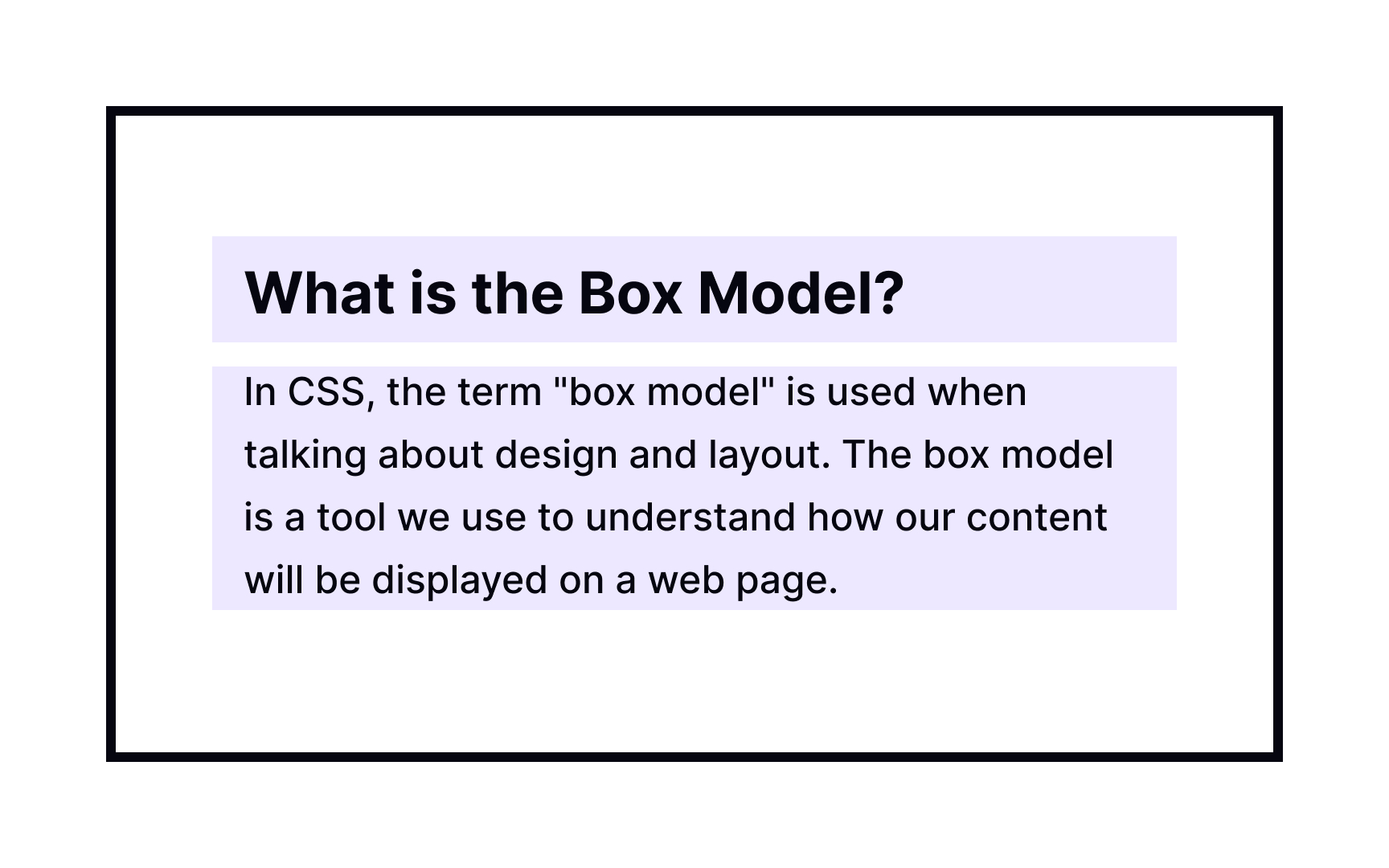
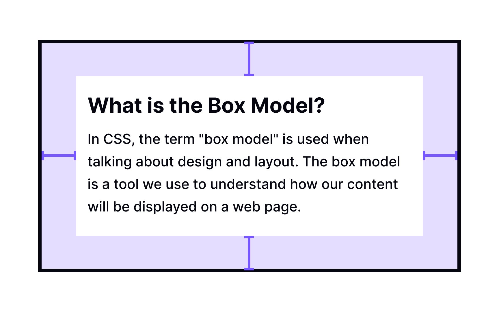
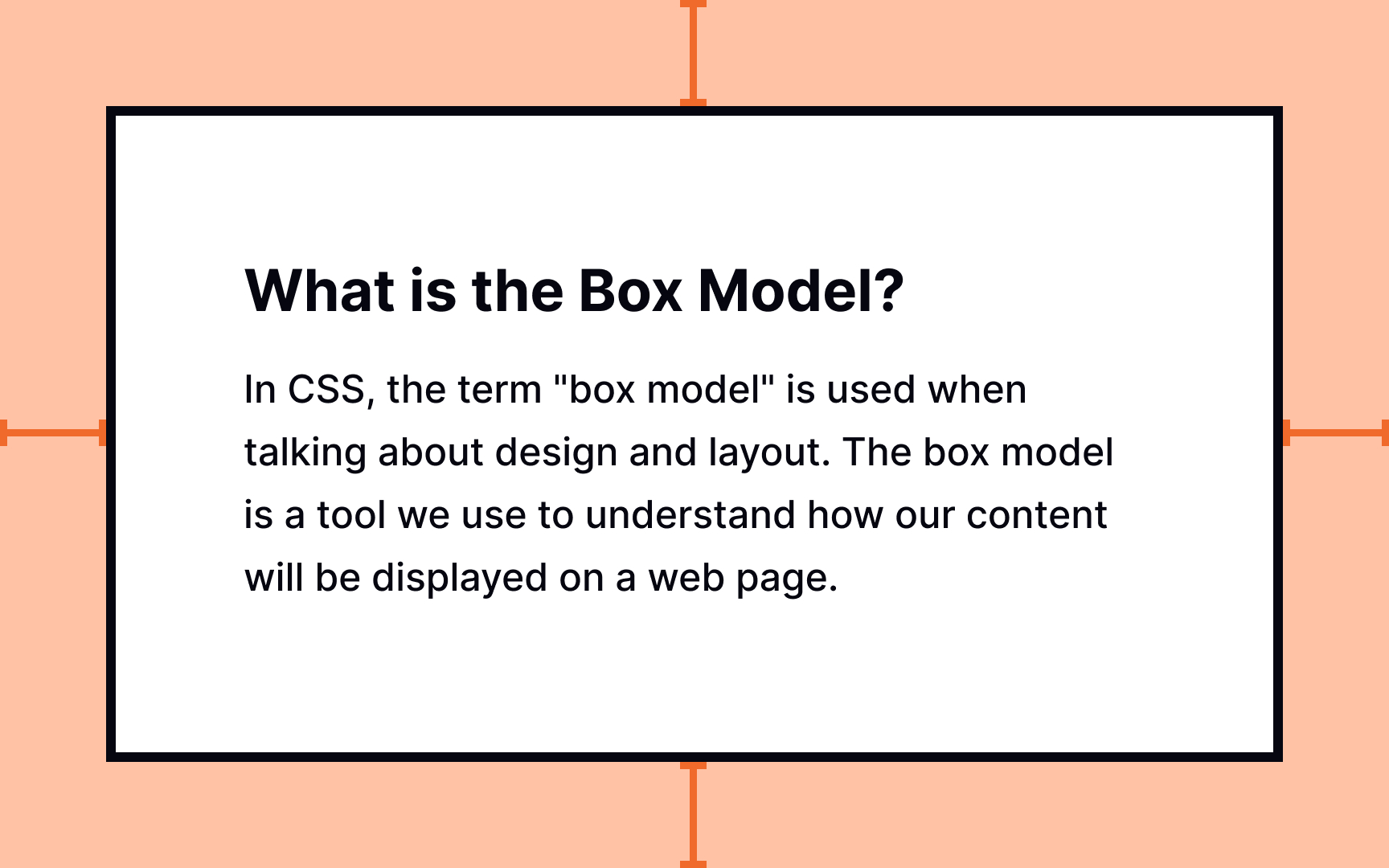
CSS Box Model
Demystify the CSS box model and grasp how elements are structured and positioned within a web page, enabling you to create well-defined layouts and designs
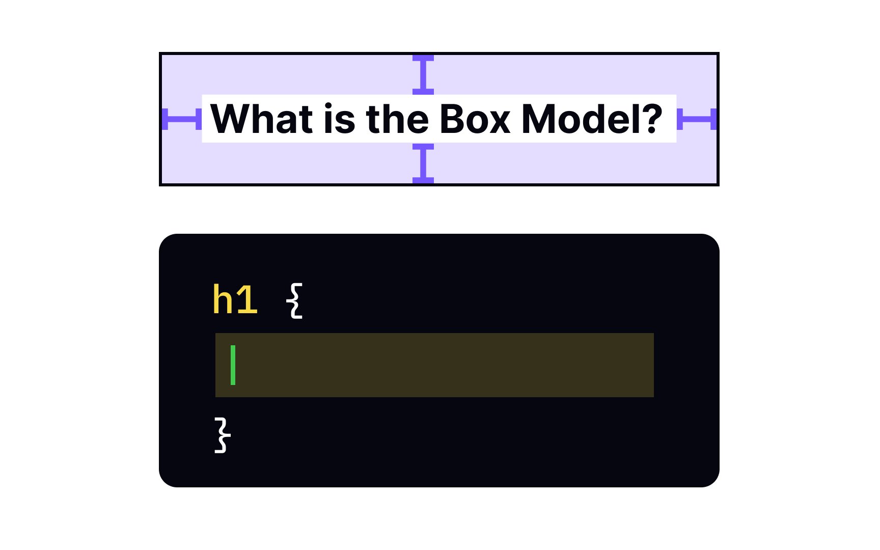
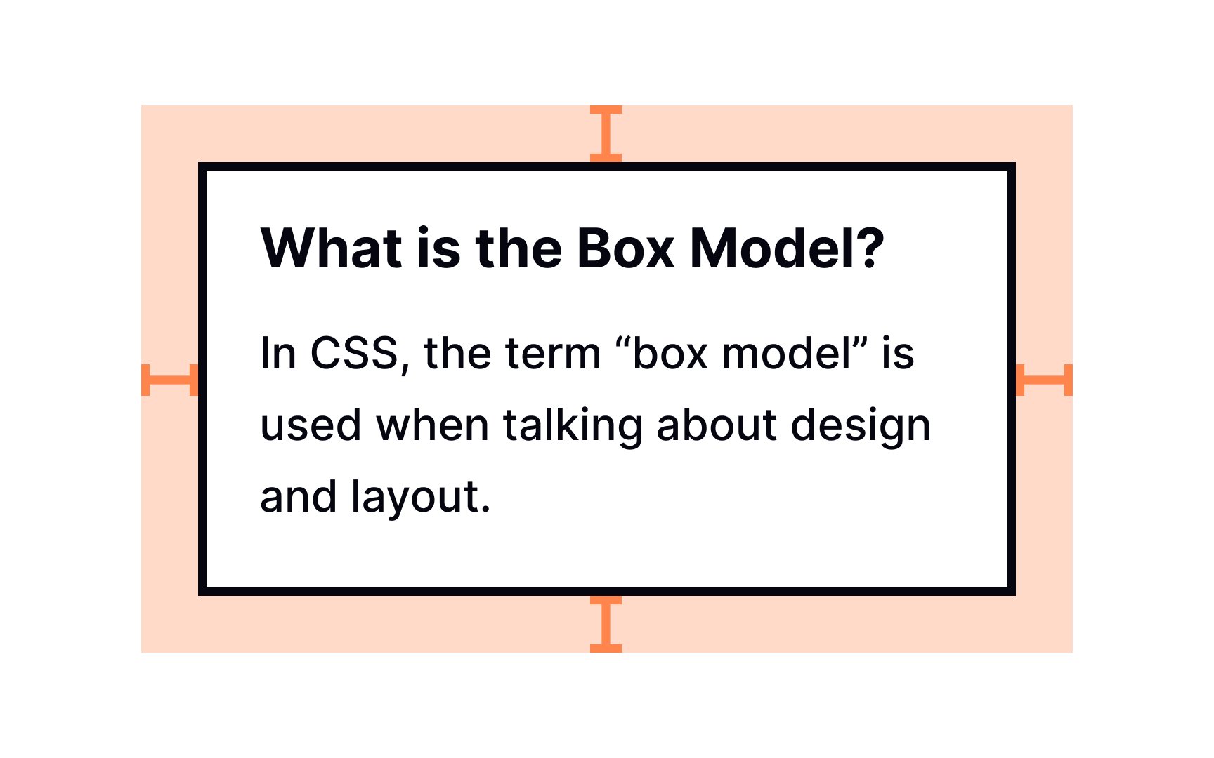
For now, human imagination exceeds web design possibilities. For designers, understanding how laying out pages works on a technical level helps understand if the design can be brought to life. And the key concept to it is the CSS box model.
In CSS, every HTML element on the page is wrapped in a box. The box consists of margins, borders, padding, and the actual content. Boxes can have different properties and interact with each other in different ways, and the CSS box model describes how these boxes are laid out on a web page.
In this lesson, we're unboxing the CSS box model. Jump in!
All web pages consist of elements rendered one after another. The
According to this model, each
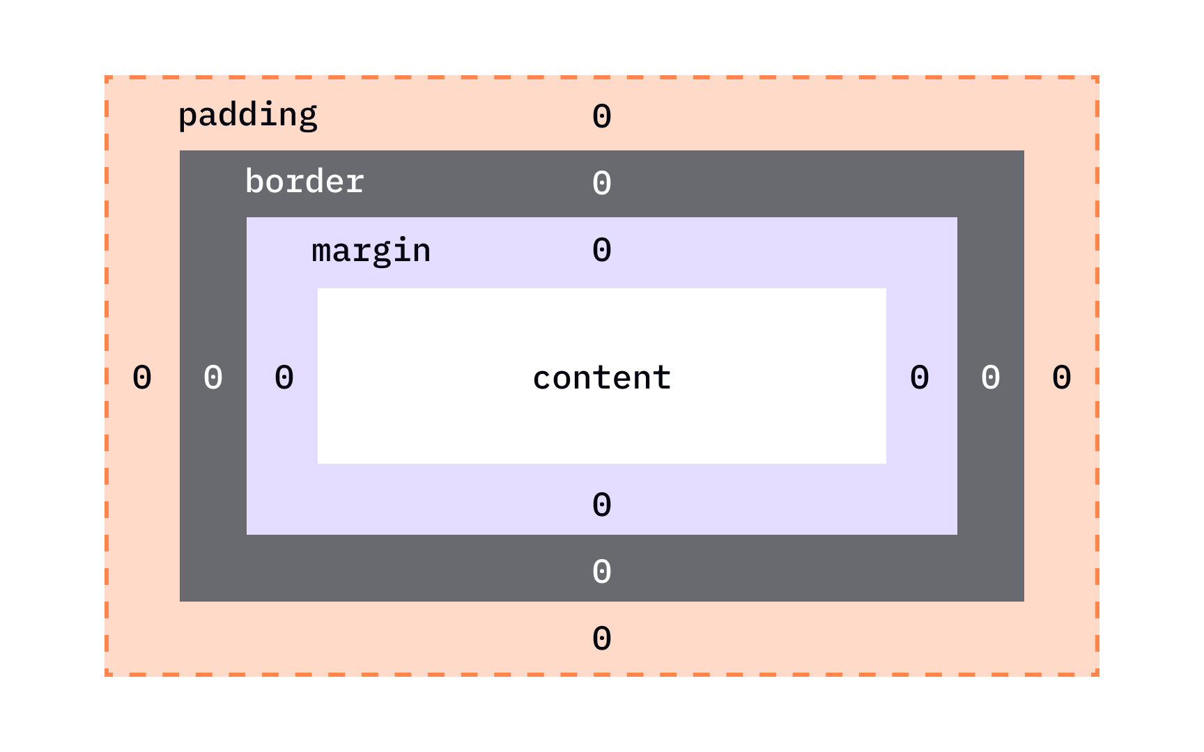
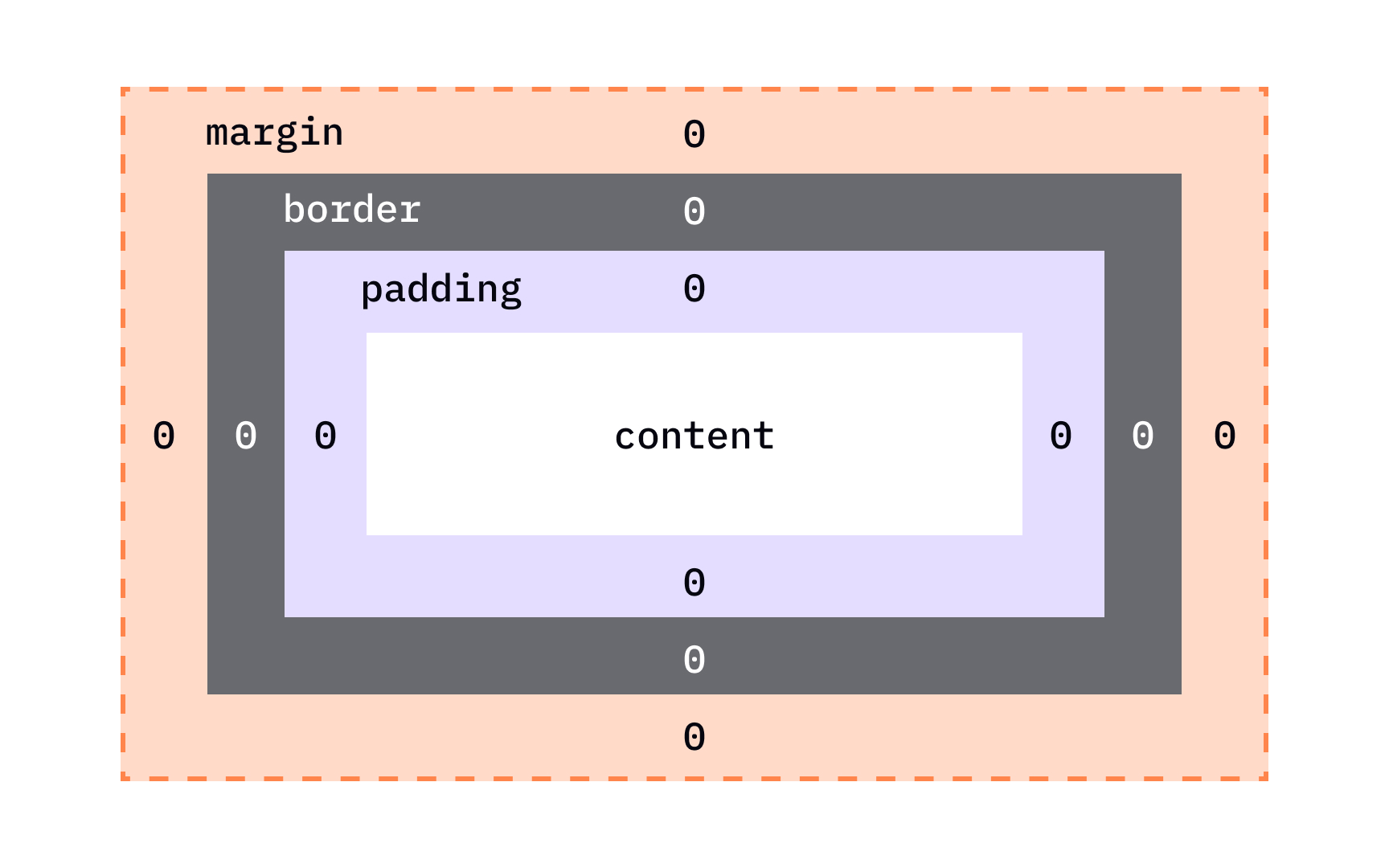
The box itself is akin to a Russian doll — it's actually 4 boxes placed inside the other, starting from the innermost:
- Content: the text, image, or other media
content inside the element - Padding: the space between the box's content and its border
- Border: the line between the box's padding and margin
- Margin: the space between the box and surrounding boxes
Together, this is everything a browser needs to render an element's box.
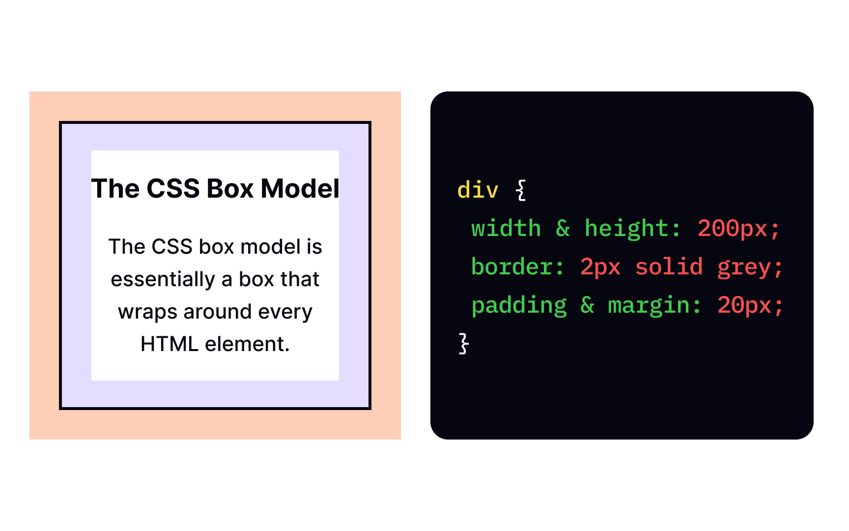
Basically, the
To set the size of the width and height and related properties.[1]
For padding, border, and margin — as well as specific properties for each side of the element.
If we don't specify any of these properties, browsers will use their default values for specific elements, for example:
body {
margin: 8px;
}
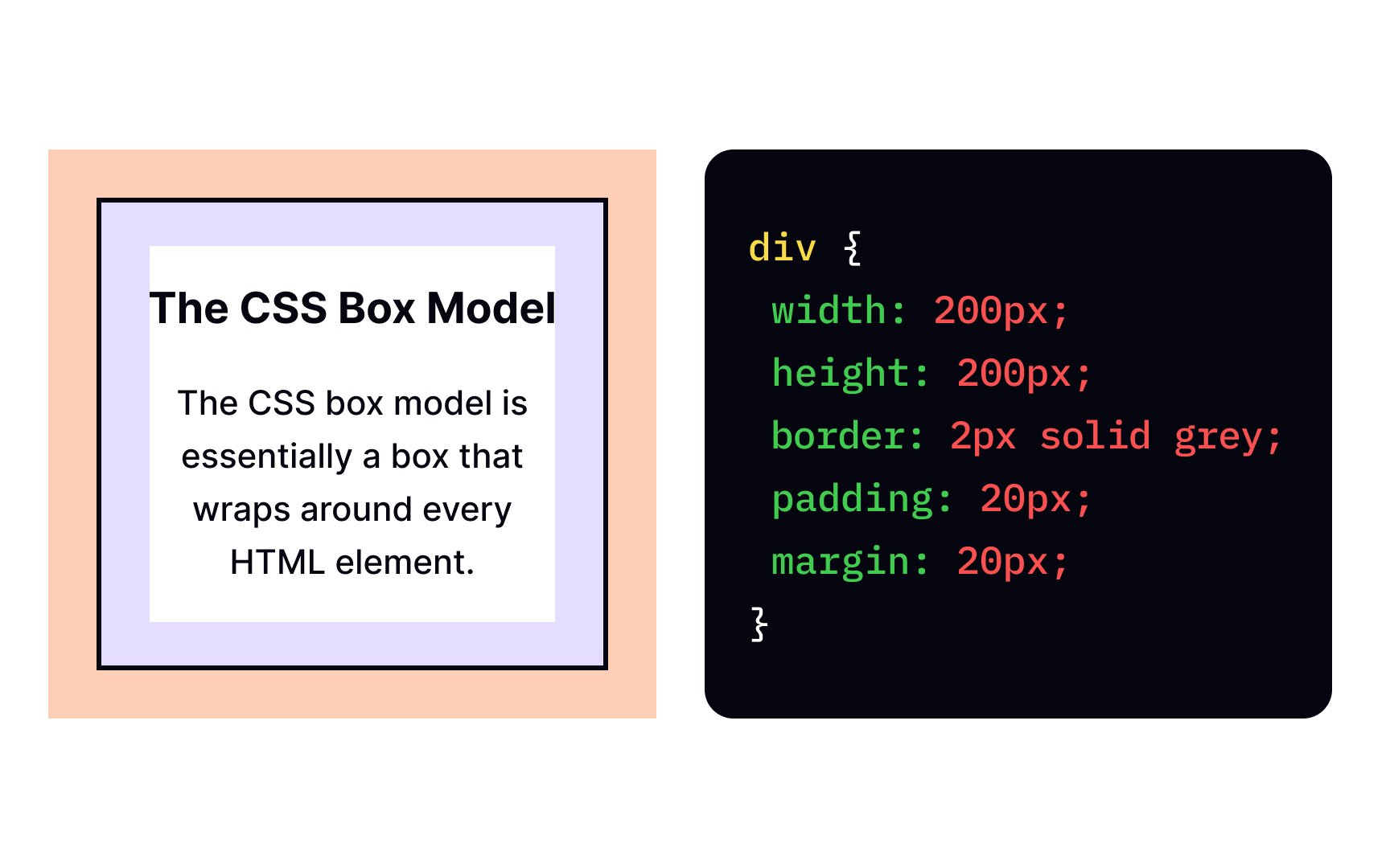
width and height of the element, it only affects the size of the content area and not
padding property defines the padding for the selected element. For example, the following code adds 50 pixels to each side of the <div> container:
div {
padding: 50px;
}
In the example above, the padding is highlighted in purple. But in reality, the background color of the content area expands to fill the padding. It works like that because the padding is inside the border, and everything inside the border gets a background.
Pro Tip: You can use any unit for the padding of an element, not just pixels. Em units are particularly useful for making your margins scale with the base font size.
The border is a line drawn around the border: 4px solid black;.
These values define in the following order:
- The stroke width of the border (
4px) - Its style (
solid) - Its
color (black)
You can also set these things with individual properties like:
• border-width
• border-style
• border-color
• margin-top
• margin-right
• margin-bottom
• margin-left
In the example above, the margin is added with the following declaration: margin: 40px;.
The default value of all 0, which means that all box elements start with no extra spacing. To add space within the element, you'll want to add padding.
Besides the shorthand property padding, you can apply padding to each side of the element individually with:
padding-toppadding-rightpadding-bottompadding-left
Borders are common design elements, but they're also invaluable for debugging. When you're not sure how a box is being rendered, add a border: 1px solid red; declaration to it. Doing so will clearly show the box's
Pro Tip: If not set, border-color takes the value of currentColor, which is the text color.
Here are the key differences to keep in mind:
- Padding is included in the click area of an element, while margins aren't
- The padding of a box has a background, while margins are always transparent
- Margins collapse vertically,[2] while padding doesn't
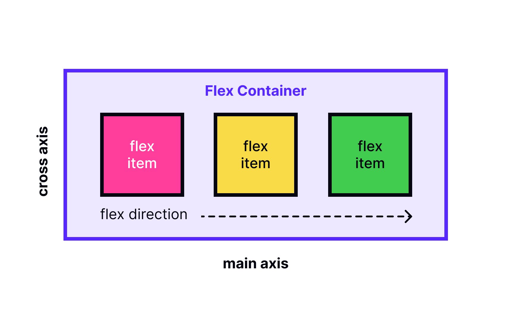
The
Flexbox provides a more efficient way to lay out, align and distribute space among items on a
The main downside of Flexbox lies in its newness and browser support. Older browsers don't support it as well, support it inconsistently, or not at all. Flexbox also gets complicated with more complex layouts.[3]
References
Top contributors


Topics
From Course

Share


Similar lessons

CSS Basics

Introduction to CSS for Designers
