Best Practices for Designing UI Cards
Explore the best practices for designing UI cards that are easy to scan and navigate
Although the basic idea of cards isn't new, there are still a few intricacies that can make or break the whole user experience.
Primarily, the concept of cards was based on the principle of common regions. It states that people perceive multiple items integrated within a boundary like a group of related elements. This principle even overpowers the law of proximity. Due to borders and the same background, elements that are distant from each other appear to be part of the same whole.
That's what cards do. Knowing how to use tools like alignment, shadows, fonts, and colors will help you'd create designs that are easy to scan and navigate.


Horizontal dividers can help separate unrelated elements or emphasize the hierarchy between them. However, they're rarely helpful in card design. Use typography tools and negative space to add distance or make content stand out.
The fundamental rule of simplicity in card design helps get rid of visual clutter that kills legibility and increases cognitive load.

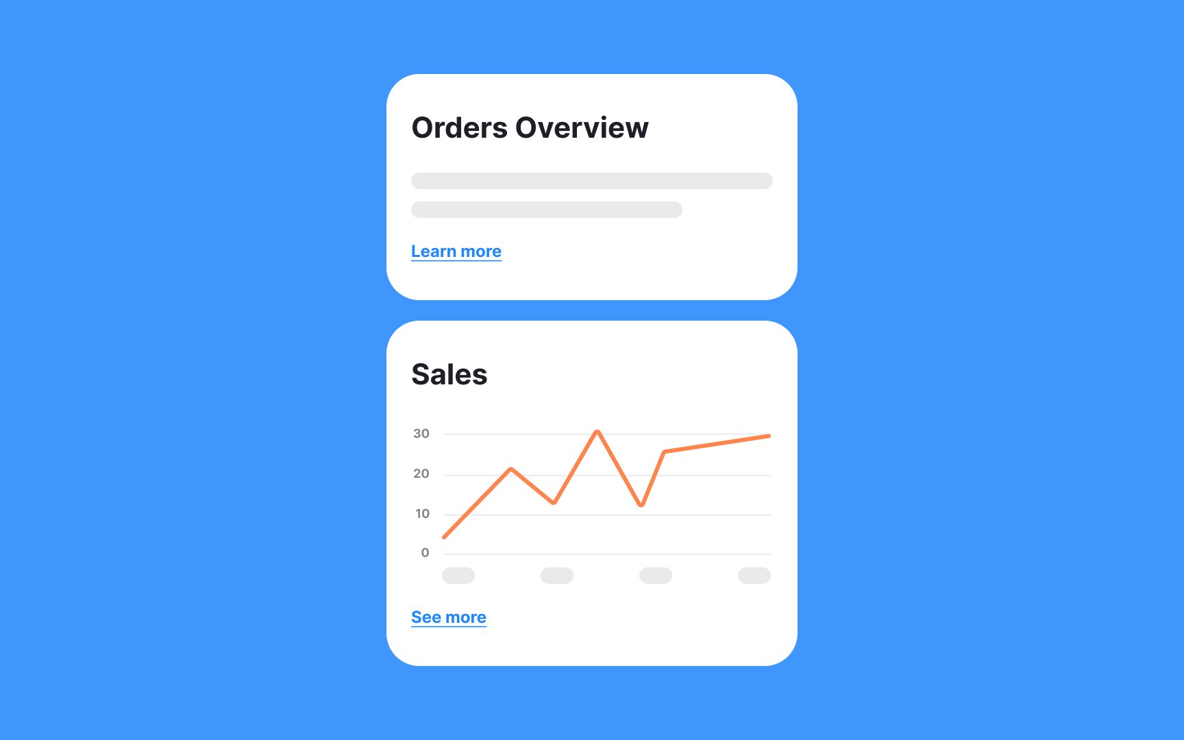
Cards are perfect for splitting heterogeneous items. By establishing boundaries or a common background, cards indicate that elements within are related and those outside are not.
Placing items of different topics within one border increases


Making an entire card clickable simplifies user interactions, especially when there's only one action associated with that card. This design choice reduces the
To signal that an entire card is clickable, use a subtle hover effect, such as a


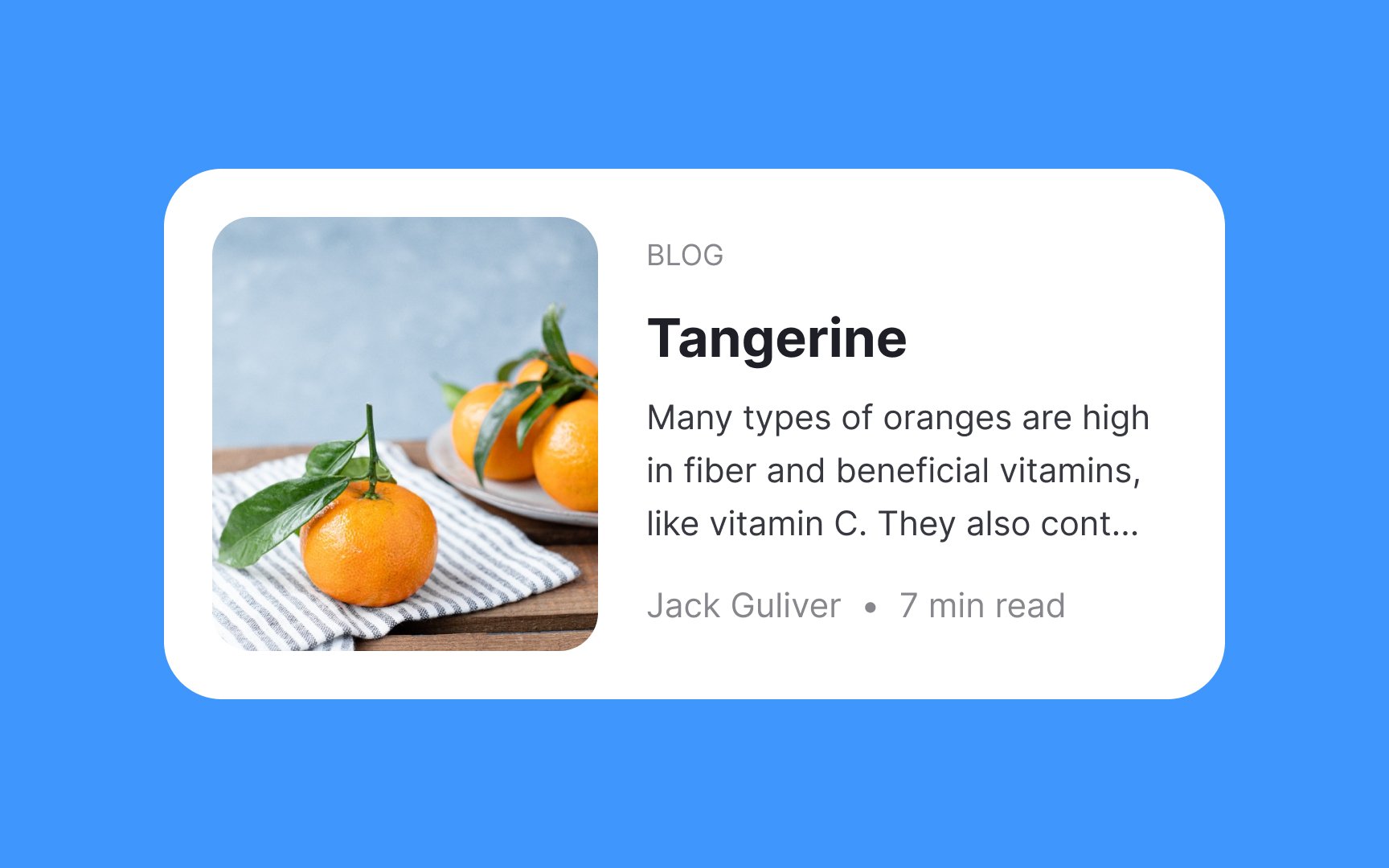
When applying labels over images or videos, strive for foreground vs. background contrast. Make sure people with visual impairments won't have trouble reading labels or text overlaid on images.
The golden rule is to keep the contrast ratio of 4.5:1. The trick is to place a darker cover over the image and adjust its transparency. This way, the image stays visible and contrasting enough.

They're called cards because, well, they look like cards. Without visual tools like
Use clearly defined containers to help cards stand out, get more attention as a group of related


Cards are meant for digestible pieces of
Keep the supporting body text short and truncate it with three dots — it gives a feeling that there's something more to explore and invites users to continue reading.

Thoughtful use of white space within cards not only enhances readability but also guides users' focus towards key elements. Here are some tips on the effective use of space within cards:
- Maintain consistent margins: Keep a uniform distance between the card's
content and its edges to avoid a cluttered look. - Use dividers sparingly: If you must differentiate between elements, subtle
dividers or varying text sizes can do the trick without eating up space. - Group related elements: Place interconnected information or actions close together, guiding users naturally through the card's content.
- Prioritize content: Utilize space to emphasize important information, perhaps through a larger
font or a more central placement within the card.


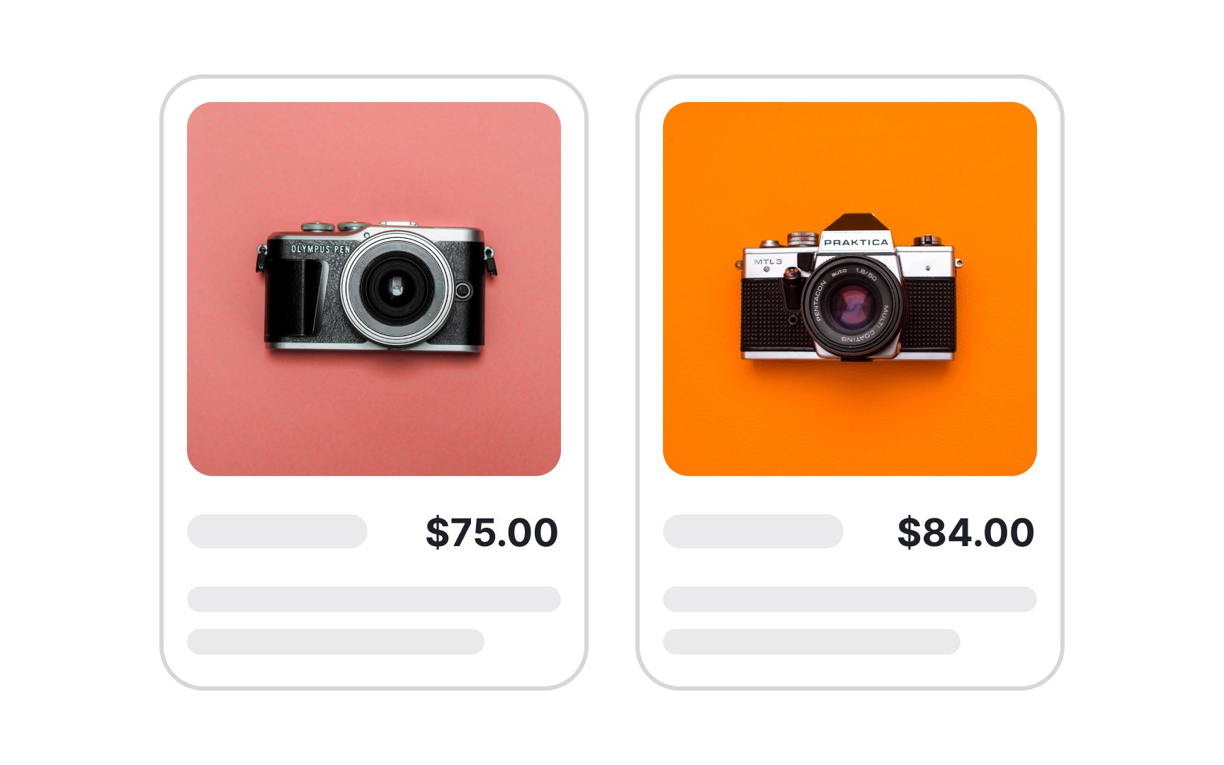
High-quality media says you care about users and their overall experience when interacting with a product. In the long run, such details impact your reputation and gain users' trust. Blurry and grainy


Card
What can you do to make labels concise?
- Remove unnecessary modifying words, slang, and redundant punctuation (commas, semicolons, and clauses)
- Avoid stating the obvious and keep your labels bite-sized, so users can quickly grasp the information and move forward


In
The kebab menu
It serves as an intuitive location for additional options or settings, making it easier for users to find what they're looking for without cluttering the main interface. By adhering to this design convention, you create a more predictable and user-friendly experience, aligning with users' natural behavior and expectations.
Top contributors


Topics
From Course

Share


Similar lessons

Common UI Component Definitions I

Image Terminology
