Mobile Wireframing
Dive into the best practices for mobile wireframing
Wireframing is the cheapest way to find out if your app can actually solve users' problems. Luckily, the major wireframing principles for websites and desktop applications can be easily applied to mobile.
However, mobile devices impose some limitations. Smaller screen sizes and gesture interactions make wireframing for mobile more complex. Plus, users often operate their mobile devices with one hand or when they're on the go and don't focus much on a screen. Furthermore, designers should consider scenarios when users can't access an app due to a poor internet connection or outdated app version.
Although some teams consider the wireframing stage non-essential and skip it, wireframes work like bridges between the initial ideation process and the final product. Wireframing helps designers collect numerous concepts and ideas together, notice inconsistencies or technical constraints, and prevent costly redesign or code-rewriting.
Wireframes are much cheaper than complete high-level prototypes. The level of wireframe complexity is up to you. They can be sketched with pen and paper, drawn in drag-and-drop software, or even be made clickable to simulate some of the major
The main goal is to focus on functionality, not looks, and effectively communicate design ideas.
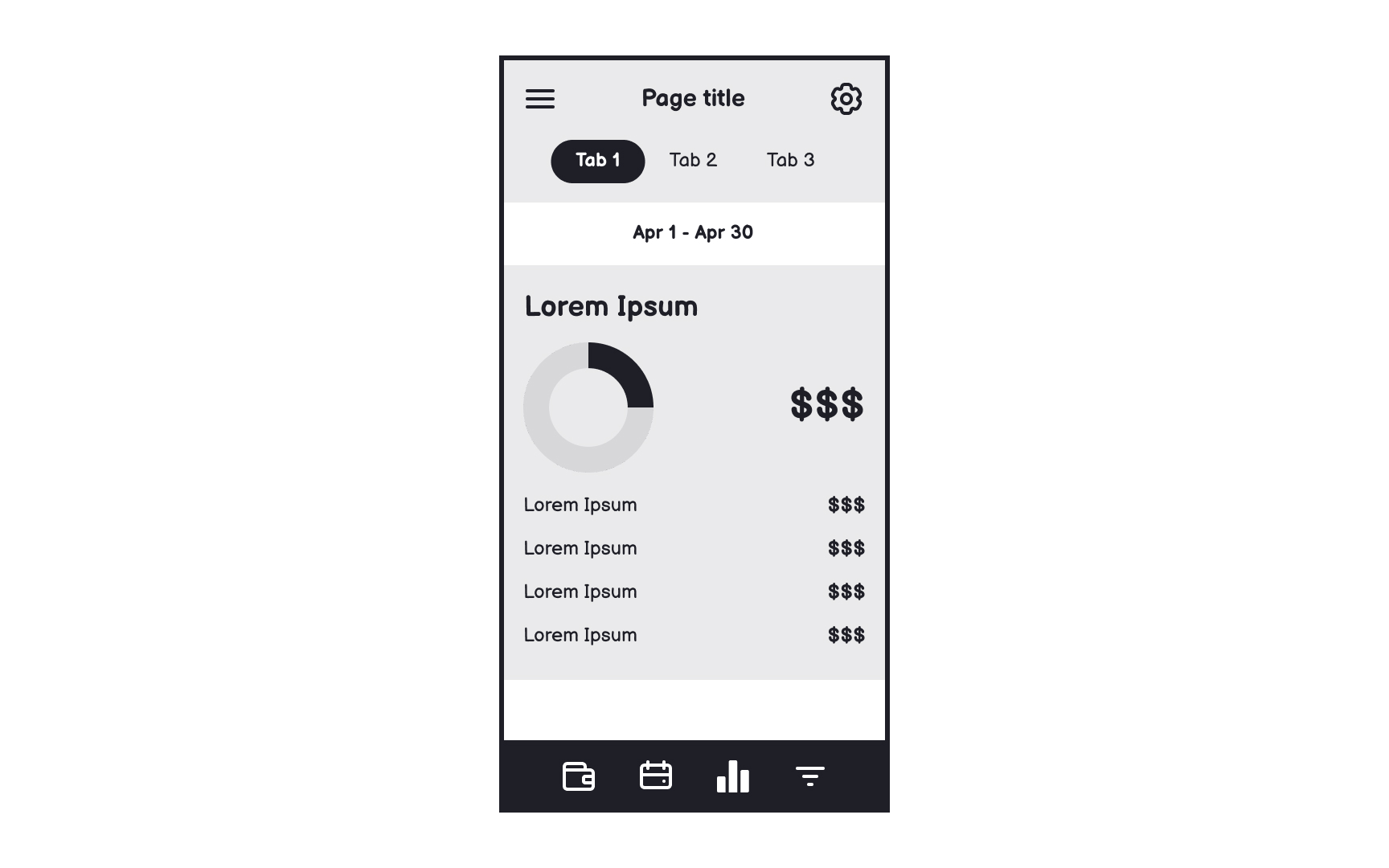
The simplest app wireframes should reflect:
- Content hierarchy
- Placement and dimensions of UI elements
- Space distribution
- Possible user actions
- App features
- Navigation and transitions between app pages
Wireframes help teams stay focused on user needs throughout development. These simple visual representations encourage all team members to evaluate the app from the user's perspective.
When reviewing wireframes together, designers, developers, and stakeholders can easily spot usability issues and discuss solutions. This early visualization helps evaluate if planned features truly serve user needs before investing in detailed design and development.
Benefits of
- User focus: Teams evaluate features based on user needs rather than technical preferences
- Early feedback: Issues are found before expensive design and development begin
- Clear communication: Visual layouts help all team members understand user
interactions - Efficient planning: Teams can validate solutions before committing resources
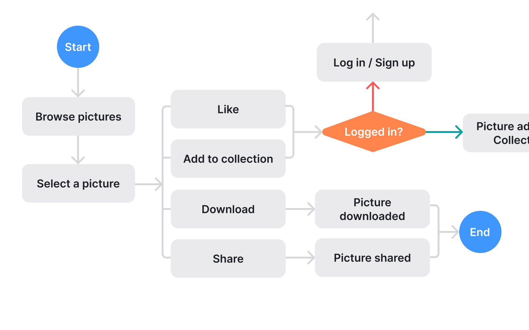
User flows form the foundation for
Using basic shapes and arrows, user flows show both ideal paths and alternative routes. What seems like a straightforward journey often reveals unexpected pathways as you map out user behavior. While visual polish isn't important, clarity is essential - these diagrams help identify all screens needed for wireframing.
Key aspects of user flows:
- Simple elements: Use basic shapes to represent screens and decisions
- Multiple paths: Show different ways users might reach their goals
- Complete coverage: Document all possible user scenarios, including unexpected ones
- Clear structure: Focus on function over visual appearance
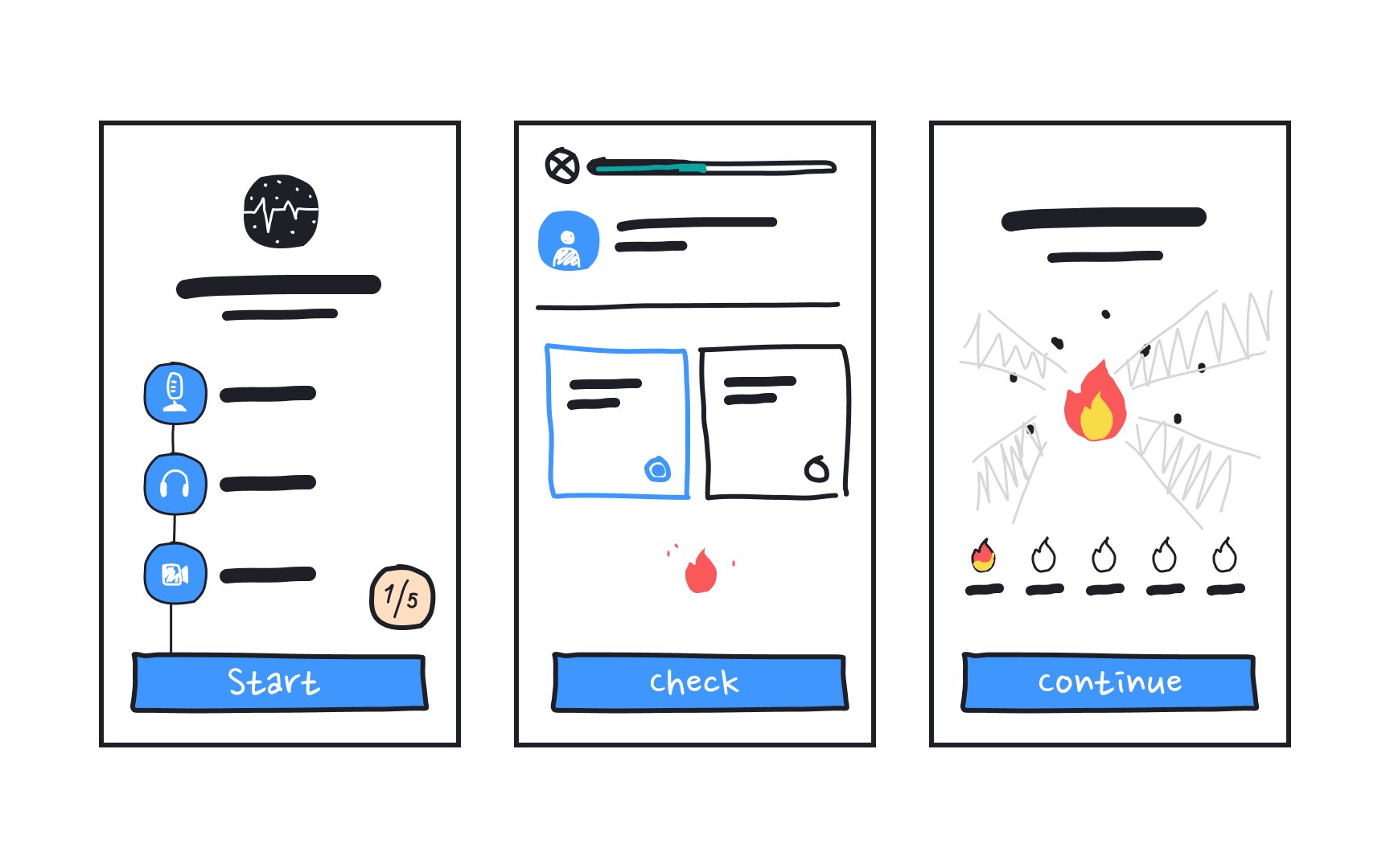
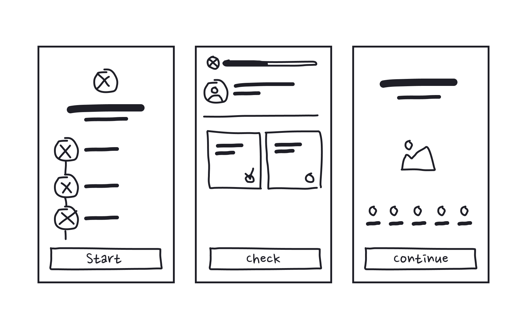
Sketching is the cheapest method to verify and visualize
To begin with, illustrate the entry point, followed by the steps users take to complete a task and the final
- The login
page - Steps users take within an app to reset a password
- The page confirming that the reset code was sent to users' email
- Or a page asking to enter the code sent to users' phone number
While sketching, engage your team in brainstorming and strive to go through the flow from your users' perspective. Evaluate each page from your users' viewpoint and think about what might help them achieve their goals and what may create obstacles.
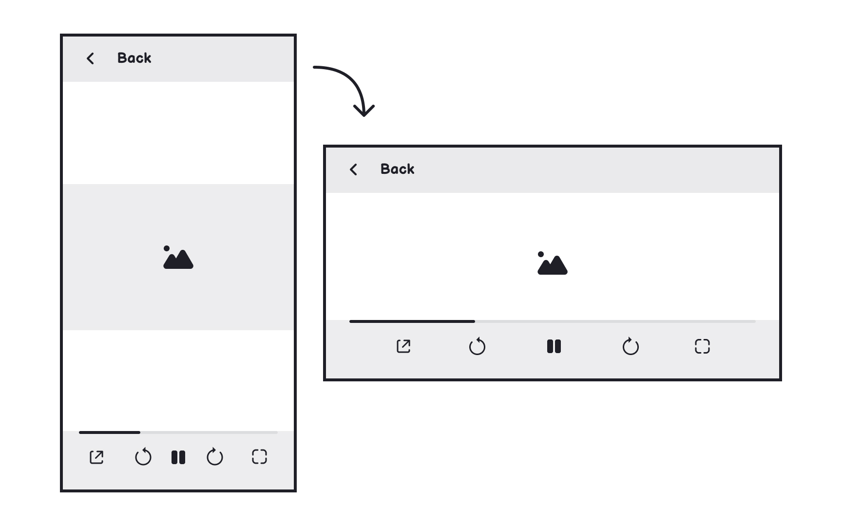
While portrait mode is common for mobile apps, landscape orientation works better for certain features like typing long text or watching videos. Most games also use landscape view.
Types of orientation design:
- Fluid design: Layout maintains structure but adjusts to screen width
- Extended design: Interface adds or removes components based on orientation
- Complementary design: Additional information appears in a new orientation
- Continuous design: A secondary interface becomes available (like video players)
Consider using visual cues to guide users when certain features work better in a specific orientation.[1]
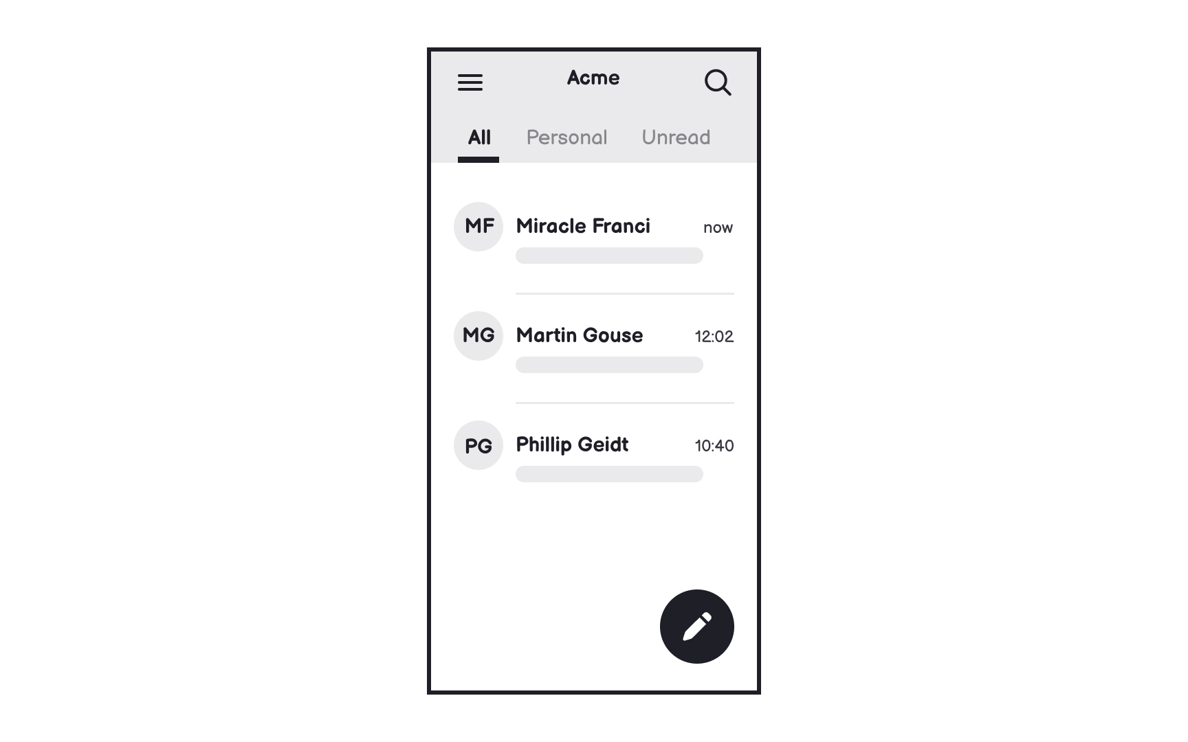
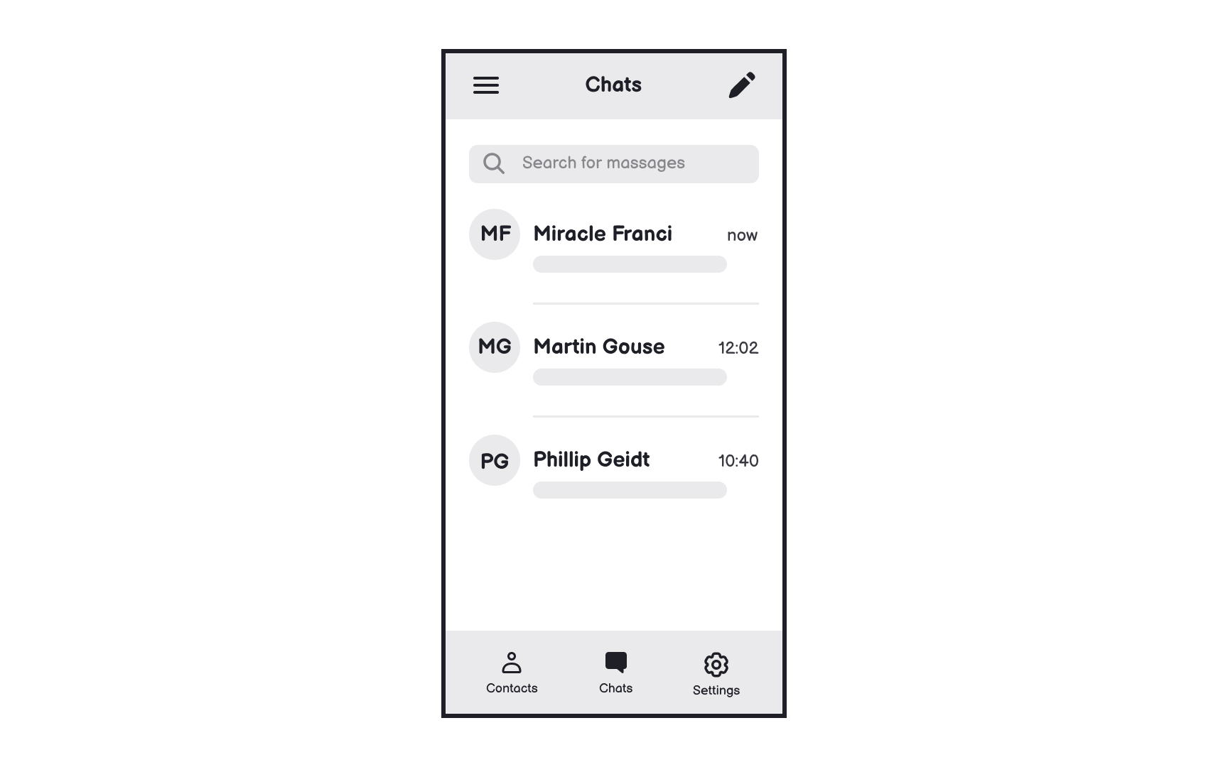
Design patterns — reusable solutions for design problems — create a sense of familiarity and consistency. When users see and recognize familiar patterns, they feel more relaxed about navigating an application.
All operating systems have native design patterns. They work like reusable blocks for solving common problems and saving time.
For example, top tabs, floating action buttons, sidebars, or hamburger menus are common Android design patterns. For iOS apps, you'll probably use the bottom
Design patterns allow for rapid wireframing and create less cognitive load by helping users use functions intuitively.
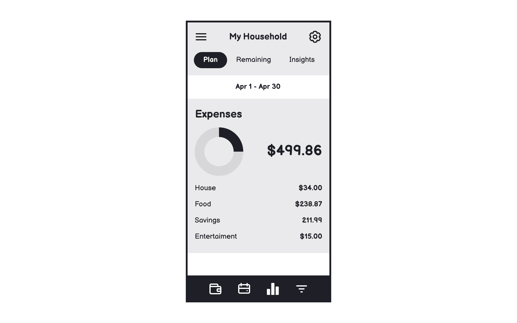
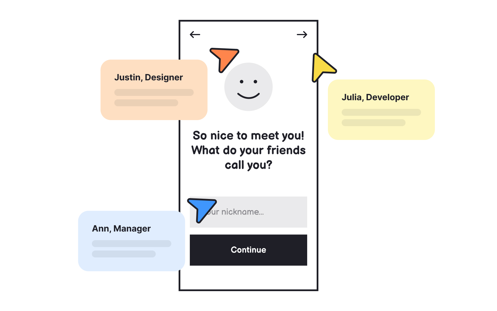
Lorem ipsum helps focus on the
Real content often reveals design issues that dummy text conceals. Text length, line breaks, and content hierarchy might need adjustment once actual words replace placeholders.
Benefits of real content in
- Better testing: Users provide more meaningful feedback with actual content
- Layout validation: Shows how real text lengths affect the design
- Content hierarchy: Reveals if important information stands out properly
- Design problems: Uncovers issues hidden by placeholder text
Pro Tip: If you don't have actual copy yet, make something up or use similar extracts from competitors' products.
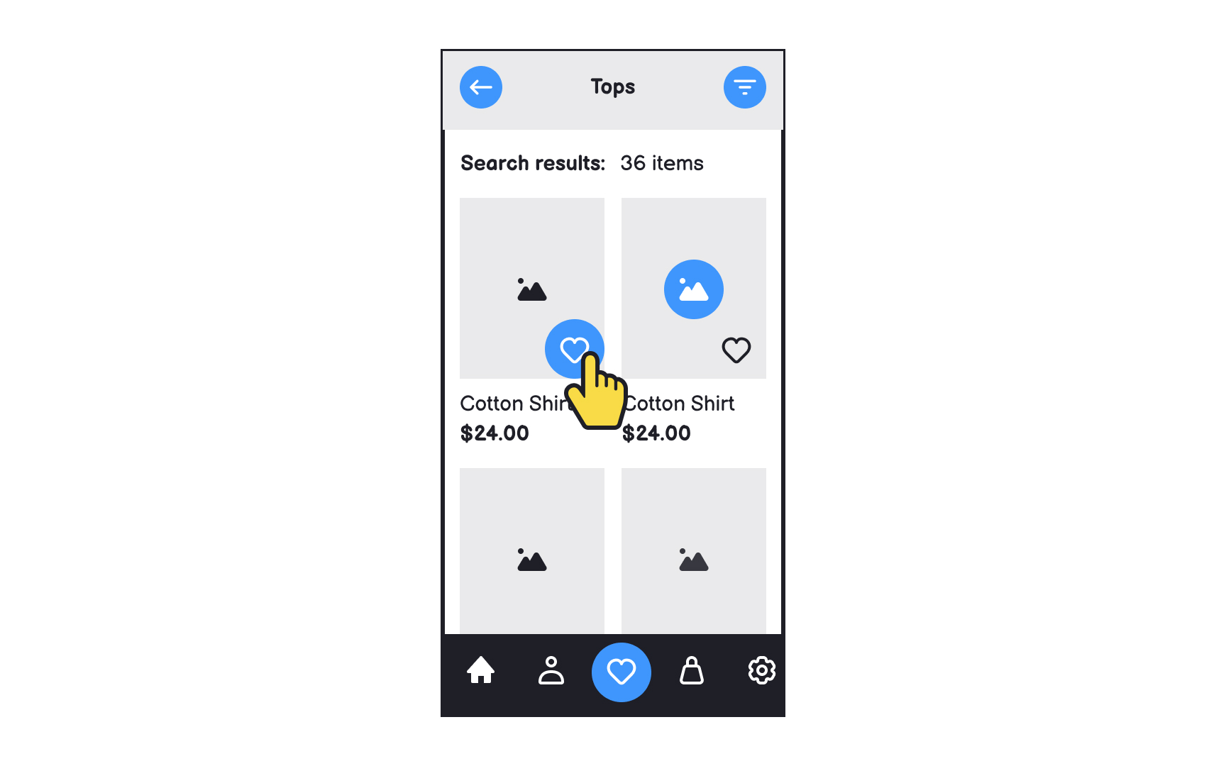
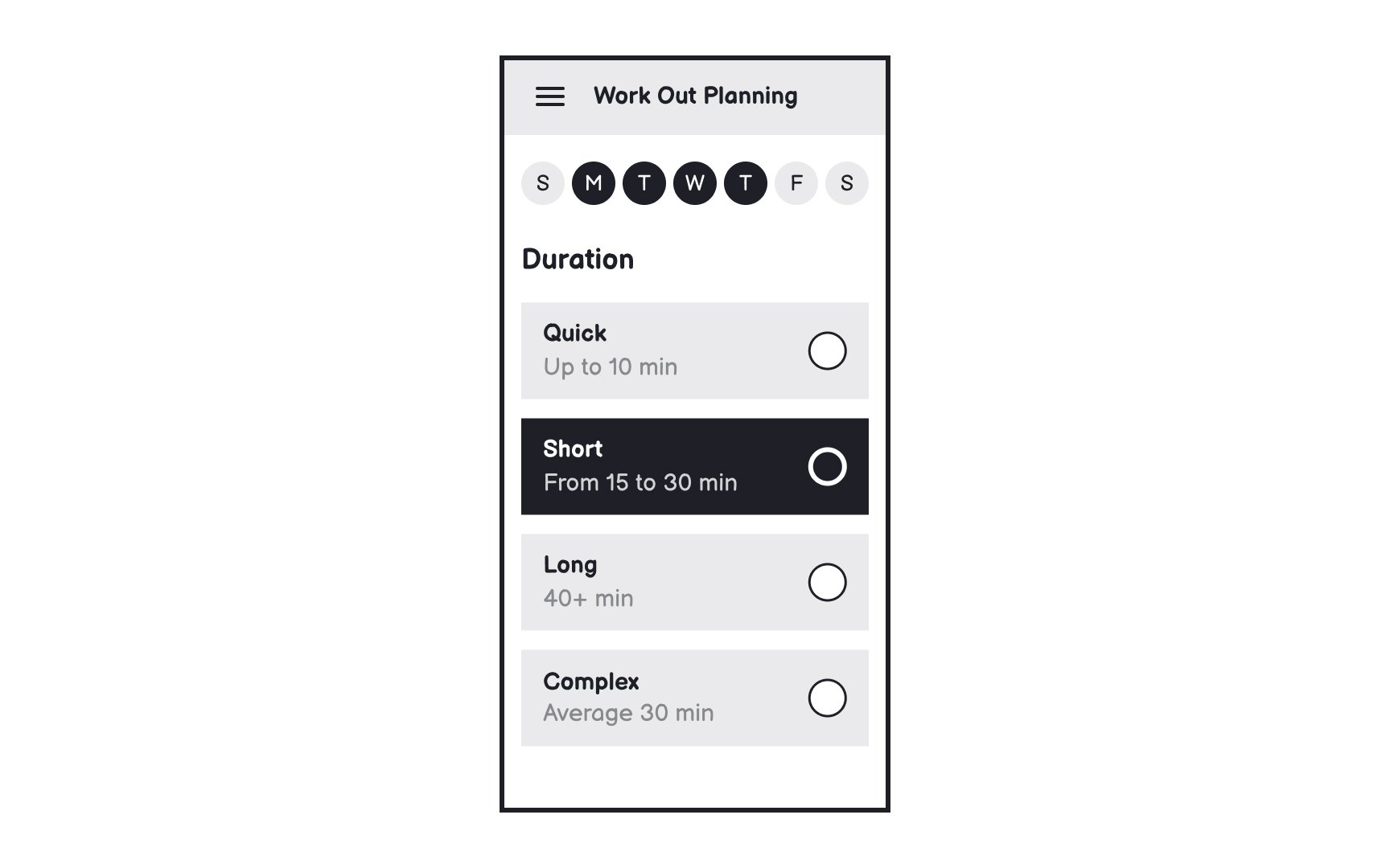
The lack of accessible touch target areas is one of the most typical issues in mobile apps. The lack of space on mobile screens forces designers to make sure all interactive elements, such as
Users often operate mobile devices on the go, so it's essential that they can perform actions efficiently and don't struggle to hit the tappable spot. Consult the OS guidelines if you're not sure which touch target size complies with the standards. Material Design guidelines recommend a touch target size of at least 48x48px, while
Limited space also means your app's
If your target audience includes older adults, children, or people with visual or motor disabilities, touch targets should be notably larger than standard sizes.
References
- Designing For Device Orientation: From Portrait To Landscape — Smashing Magazine | Smashing Magazine
Top contributors


Topics
From Course

Share


Similar lessons

Designing for Mobile Interfaces

Responsive vs. Adaptive Design
