Color Systems & Dark Mode
Master Apple's color system principles and implement effective dark mode experiences.
Color is the backbone of Apple's interface design. The system builds on carefully selected colors that adapt to different contexts and user needs. Each color serves a specific purpose — from highlighting important actions to creating visual hierarchy. System colors take the complexity out of color selection while keeping interfaces consistent across apps.
The color system goes beyond simple aesthetics. It handles real-world challenges like bright sunlight, low-light conditions, and accessibility needs. Each color choice considers multiple factors: how easily users can read text, how quickly they can find important buttons, and how the interface feels across different times of day. This practical approach shows how good design can solve both technical and human needs without compromising either.
The system defines colors that look good on various backgrounds and appearance modes and adapts automatically to vibrancy and
Key
- Background colors: primary, secondary, and tertiary variants for information hierarchy
- Label colors: 4 levels for text hierarchy (primary to quaternary content)
- Fill colors: tints for UI elements and content backgrounds
- Separator colors: visual boundaries between content sections
- Link colors: interactive text elements
- Placeholder colors: temporary or suggested content
- Grouped background colors: organizing related content
Each color adapts automatically to light and dark contexts, vibrancy effects, and accessibility settings. System colors ensure your interface maintains visual clarity across different contexts and user preferences.[1]
Pro Tip: Name colors by their interface role like "label-primary" or "background-secondary" instead of visual descriptions like "dark-gray.”
Unlike colors defined by their visual attributes (like red or blue), semantic colors express purpose and behavior in the interface. These colors communicate meaning regardless of their actual appearance.
Key semantic
- Label colors: express
content hierarchy from primary to quaternary - Background colors: indicate different levels of elevation and grouping
- Link colors: show interactive text elements
- Separator colors: define content boundaries
- Placeholder colors: indicate temporary states
- Control colors: show interactive elements
- Selected state colors: highlight active elements
Semantic colors maintain their meaning while adapting to different contexts like light/dark modes and
In Apple's interface design, colors establish
The primary level includes:
- The main background for the overall view
- Essential content and primary labels
- Key interactive elements (
buttons and links) - Most prominent information
The secondary level includes:
- Content grouping within the main view
- Supporting information and subtitles
- Less prominent controls (secondary buttons)
- Contained interface sections
The tertiary level includes:
- Elements within secondary groups
- Additional details and hints
- Subtle visual boundaries
- Background variations for depth
When establishing
Pro Tip: Think in layers — each deeper level should be visually less prominent than its parent.
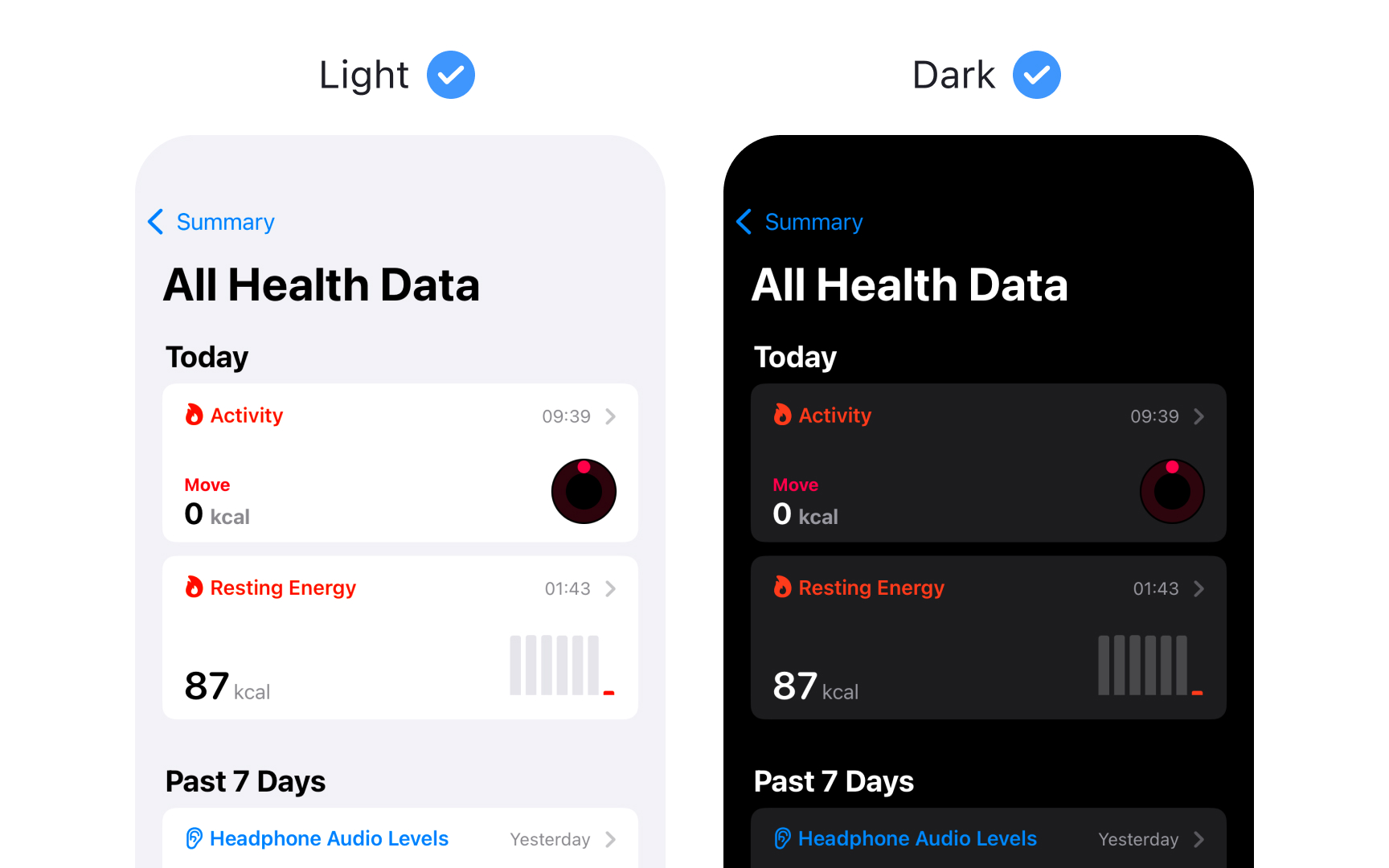
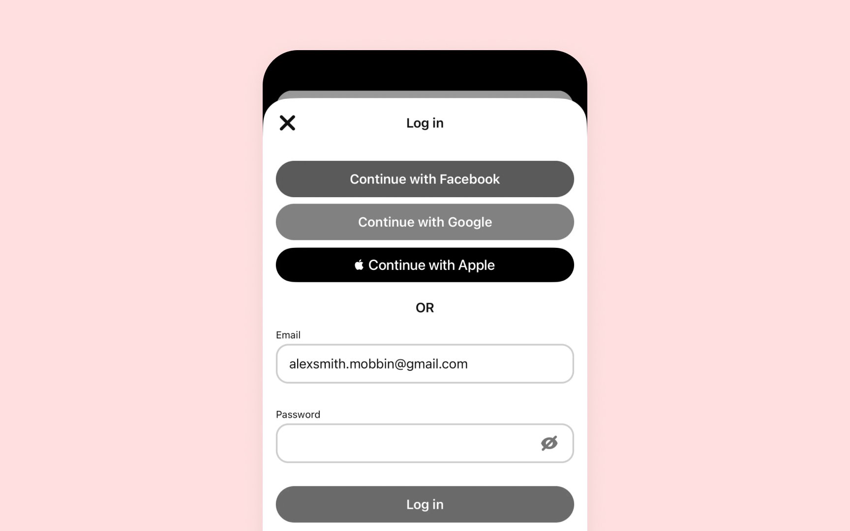
Dark Mode provides an alternative dark appearance that affects all screens, views, menus, and controls. Each platform approaches dark appearance differently to best serve its context and use cases.
Platform-specific behaviors:
- iOS/iPadOS — full system support with dynamic adaptation
- macOS — includes vibrancy effects for depth and hierarchy
- visionOS — uses glass material that adapts to surroundings
- watchOS — primarily dark with optional
color gradients
Key dark mode characteristics:
- Uses a darker color palette throughout
- Increases vibrancy effects for contrast
- Blends foreground and background dynamically
- Preserves brand recognition
- Ensures
accessibility standards
Dark Mode isn't just about inverting colors — it's about creating a comfortable viewing experience that maintains
Pro Tip: Design for both modes from the start rather than adapting light designs to dark later.
Maintaining proper
How to maintain proper contrast:
- Use system-provided
label colors for different text hierarchies (primary to quaternary) - Apply dynamic system colors that automatically adjust contrast
- Keep primary
content at the highest contrast level - Reserve lesser contrast for secondary and tertiary elements
- Use fill colors appropriately for backgrounds and
UI elements
When using custom colors, test them against both light and dark backgrounds to ensure they maintain proper contrast ratios: at least 4.5:1 for standard text and 3:1 for large text (18pt+) and UI components. This ensures legibility across all modes and meets
Materials in Apple's interfaces create depth through translucency and vibrancy effects. Each platform provides specific materials optimized for its environment and
Best practices for materials:
- Choose materials by purpose, not appearance. Materials can change based on system
settings , so select them for their intended use like menus or interactive components - Match content to material thickness. Use thicker materials behind the text and detailed
UI elements to ensure readability, thinner materials for simple interactive components - Use system-defined vibrant colors. When placing text or icons on materials, prefer system vibrant
colors that automatically adjust forcontrast andlegibility across contexts - Consider background impact. Translucency helps maintain context by showing background
content , but too much transparency can harm readability. Test your materials against various backgrounds - Combine with proper contrast. When using blur and vibrancy effects, ensure foreground elements maintain clear visual separation. Avoid non-vibrant colors that might become illegible.[4]
While system colors handle most interface needs, custom colors can enhance your app's visual experience and express its unique personality. The key is finding the right balance between
When to use custom colors:
- Brand identity elements
- Data visualization
- Game interfaces
- Unique status indicators
- Creative apps and tools
Essential requirements:
- Provide both light and dark variants
- Maintain proper
contrast ratios (4.5:1 for text, 3:1 forUI ) - Test with various backgrounds and materials
- Support
accessibility settings - Consider
color blindness implications - Adapt to platform conventions
Color blindness impact:
- Red/green confusion in status indicators. Use blue for success states instead of green, and add checkmarks
- Error states need multiple indicators. Combine red with warning
icons and clear messages - Similar colors appear identical. Ensure different interface states have distinct lightness values, not just hue differences
- Important actions are hard to distinguish. Combine color with shape changes, like filled vs outlined states
- Navigation elements lack clarity. Add underlines for
links , arrows forbuttons
Pro Tip: When designing status indicators, sketch them in grayscale first to ensure they work without color.
Interface colors appear differently across various environments, devices, and lighting conditions. Testing in real-world scenarios helps ensure your interface remains clear and usable.
Key testing scenarios should include:
- Bright sunlight — outdoor visibility
- Dim lighting — evening comfort
- Different room lighting — warm to cool
- Various display settings — brightness levels
- Multiple devices — screen technologies
Modern devices use different display technologies that affect how colors appear. For example, OLED displays create perfect blacks by turning off pixels completely, which is especially noticeable in
Environmental factors like ambient light also play a crucial role. Bright surroundings can wash out screens, while dark environments might make intense colors uncomfortable to view. High Dynamic Range (HDR) creates stronger
Pro Tip: Preview your interface on actual devices under real-world lighting conditions.
Creating harmonious
When combining custom colors, consider these relationships:
- Foreground and background — maintain sufficient
contrast for readability - Adjacent elements — ensure clear visual separation
- Interactive and static elements — make actions discoverable
- Primary and supporting content — establish a clear hierarchy
- Branded and system elements — blend while maintaining platform conventions
Test color combinations in context, considering both light and dark appearances. What works in isolation might create issues when combined with other interface elements or materials.
References
- Color | Apple Developer Documentation | Apple Developer Documentation
- Dark Mode | Apple Developer Documentation | Apple Developer Documentation
- Materials | Apple Developer Documentation | Apple Developer Documentation
Top contributors


Topics
From Course

Images provided by

Share


Similar lessons

Intro to Color Theory

Color Properties
