Color Accessibility
Learn how to implement the WCAG recommendations on color contrast for accessibility
Color accessibility opens digital doors for everyone, including the roughly 300 million people worldwide with color vision deficiencies.[1] Think about how frustrating it is when you can't read text on a sunny day or distinguish between similar colors in poor lighting. Now, imagine facing those challenges constantly. Good color accessibility isn't just about following WCAG guidelines; it's about creating experiences where color enhances understanding rather than becoming a barrier.
When we design with accessible color principles, we're acknowledging that people interact with interfaces in countless different contexts and conditions. Color carries crucial information in our designs, from error states to navigation cues, and when someone can't perceive those differences, they miss part of the story. The beauty of accessible color design is that it actually improves experiences for everyone, not just those with specific needs.

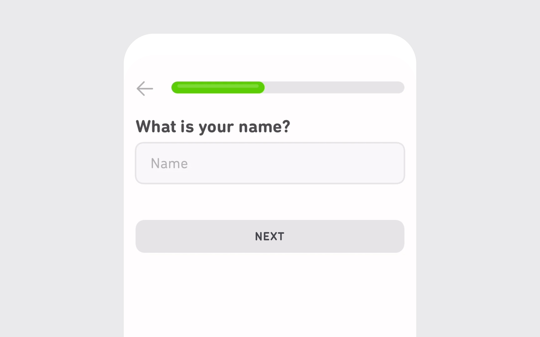
These contrast requirements apply to all text elements throughout an interface, including buttons, form fields, cards, notifications, and
Pro Tip: Use tools like WebAIM's Contrast Checker to verify your color combinations.
Icons serve as visual shortcuts that enhance understanding and improve content scanability. When icons lack sufficient
This guideline is particularly important for interactive icons that trigger actions or indicate status.
Pro Tip: Remember that decorative icons (those that don't convey meaning) are exempt from these requirements, though maintaining good contrast remains a best practice.
Input borders define interactive form elements and help users identify where to enter information. When these borders lack sufficient
Clear, visible borders reduce cognitive load and increase completion rates for forms across all user groups. Remember that some users navigate primarily through form elements using keyboard


Text overlaying images creates visual interest but often compromises legibility. This design approach can particularly challenge users with cognitive disabilities like autism, who may become distracted or anxious when trying to process text against complex backgrounds.
When text must appear over images, maintaining a minimum
The darkness and opacity of the overlay should be adjusted based on the image's
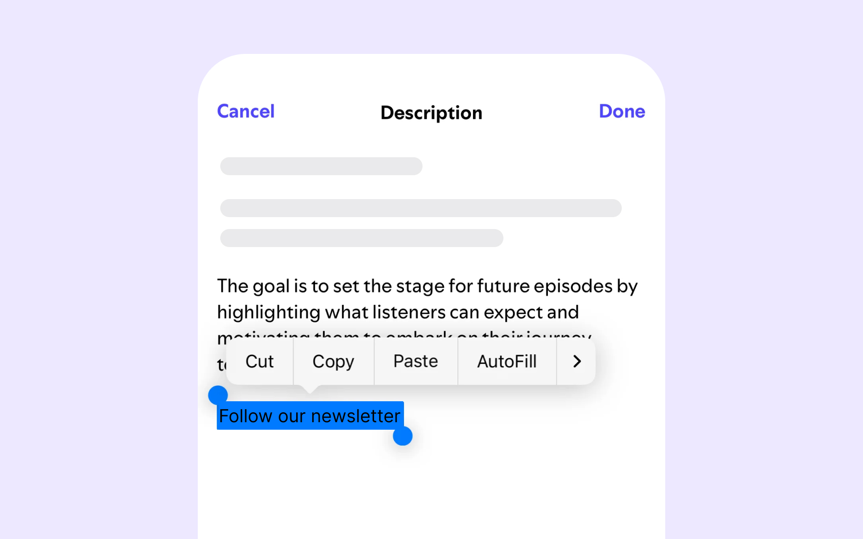
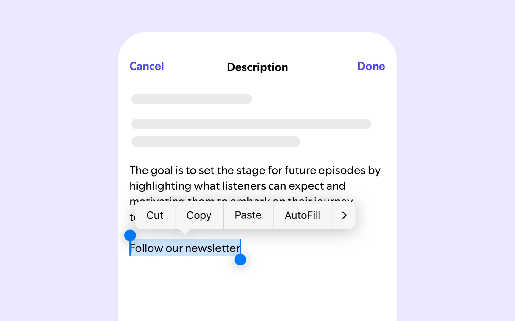
Just as highlighting in physical documents makes important information stand out, digital text selection serves essential functions for copying, sharing, and searching.
Selection states must maintain proper
The best selection designs achieve exceptionally high contrast ratios, ideally above 7:1, to make selected text unmistakably different from surrounding content. When designing selection states, consider inverting text and background
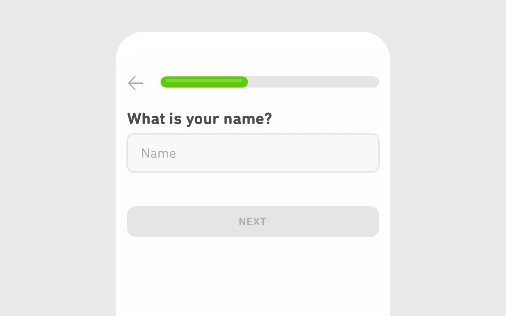
Disabled interface elements represent a unique exception to
Disabled components should visually communicate their inactive state through reduced contrast and other visual cues. This deliberate reduction in prominence helps users understand which elements are currently unavailable. However, the disabled state should still be perceivable as users need to recognize that an element exists but is currently unavailable.
Logo text receives a specific exemption from
Despite this technical exemption, making your logo sufficiently visible benefits both users and your brand recognition. Logos with poor contrast disappear in certain viewing conditions, defeating their purpose as identifiers. A logo that can't be seen is a missed opportunity for brand reinforcement.
Most successful brands maintain good contrast in their logos regardless of the exemption. This practice ensures visibility across different contexts and devices while making the brand more memorable to all users, including those with visual impairments. Remember that a logo serves as a visual anchor for your product or service, and its visibility directly impacts user orientation and confidence.


Following
Extremely high contrast combinations, like pure black (#000000) text on pure white (#FFFFFF) backgrounds, can actually create problems for some users.[3] These harsh combinations can trigger eye strain, headaches, and visual distortions that make reading difficult.
Instead, aim for sufficient but comfortable contrast. Slightly softened combinations like dark gray (#333333) on off-white (#F8F8F8) still exceed


Colors effectively communicate meaning but should never be the only indicator of important information or states. When
Always pair color with additional cues to reinforce your message.
This multi-sensory approach ensures information remains accessible regardless of how users perceive color. It also improves usability for everyone in challenging environments like bright sunlight or when using night mode.


Similar lessons

Intro to Accessibility

Inclusive Design Basics
