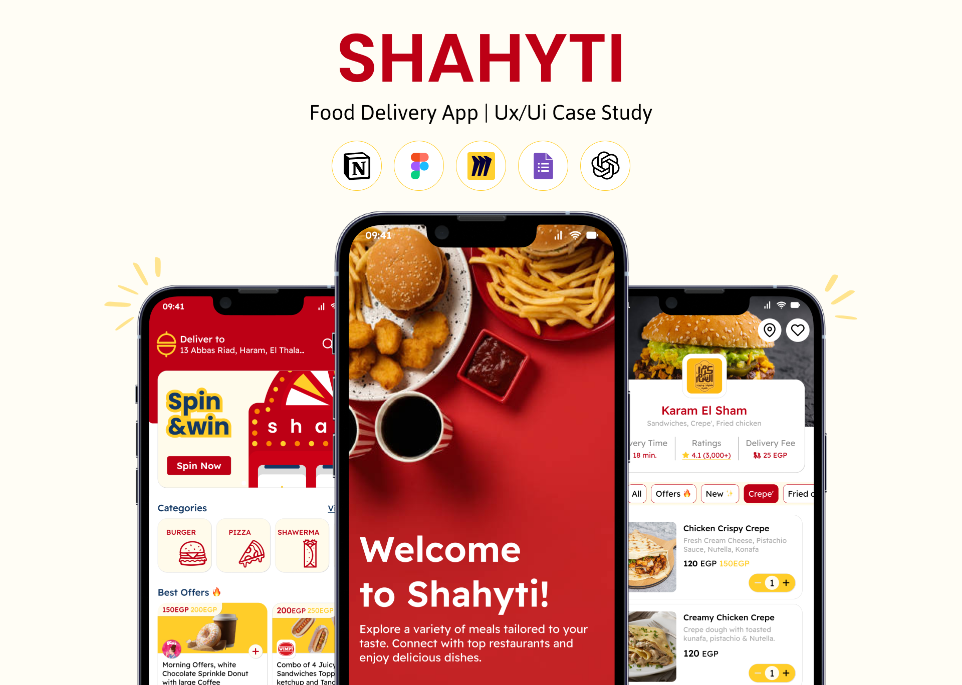
Shahyti - food delivery app
Shahyti is designed to revolutionize the food delivery experience for young, busy professionals in Egypt. By focusing on user convenience, reliability, and a personalized experience, the app aspires to become a go-to solution for modern food delivery needs.
Tools used
Topics
Share
Reviews
2 reviews
Amazing job! I really appreciate the consistency and clear branding in your project, as well as the extensive case study itself. It appears to follow similar practices as other existing, very successful, delivery apps, which is a great thing - I feel that as a user I wouldn't have any issue navigating your app.
In terms of some elements, which could be improved, I'd recommend the following:
- The bottom navbar items are not very visible and appear to be in a disabled state. The user should easily identify which page they're on (which you did very well) but they should also easily see the other options. A good rule to follow is adhering to WCAG accessibility guidelines. Checking the contrast of the font and the background color, and comparing it to the ratio recommended by WCAG can give you an overview into how much darker the icons should be.
- Similarly, the minus sign in meal adding is hardly visible on the yellow background. It should be clear and easy to tap, hence I'd also consider checking the contrast here and making the icon darker.
- Lastly, the icons in the "all orders" page appear to be a bit too big, making the most dominant element and creating a sense of disproportion. I'd consider making them smaller and perhaps putting more emphasis on the name itself or the status.
Overall, great job! Keep it up
Hi Sara! Beautiful and incredibly comprehensive project! I love your competitor analysis and the in-depth survey you conducted—you truly explored what can be improved. The smart use of colours enhances the experience, making users feel even hungrier.
One thing I noticed is that the content feels a bit heavy. You might consider incorporating tints and shades to complement your primary colours and create more visual balance. The illustrations are playful and engaging, but they feel slightly misaligned with the boldness of your branding. Perhaps filled illustrations would be an even better fit for your style.
Overall, fantastic work!
Yuliia
You might also like
SaaS Signup Design
Events Managment App
Customer Journey Map — Offsite Co-Working Experience
Mobile Onboarding: Casa di Pasta
Accessible Signup & Login Experience — Brainex
Accessible Signup Form
Popular Courses

Introduction to Figma

UI Components I

