Creating a responsive multi-client design & component system for an agency

A responsive, multi-client design system in Figma and Adobe XD created for an agency. The goal for this design system was to collaborate with a developer to create a style sheet and component library for low to medium fidelity Adobe XD and Figma wireframes at an agency. It was also a priority to keep branding ambiguous for the agency's many clients with different branding and to optimize design and usability on desktop and mobile.
Tools:
- Figma
- Adobe XD
Role:
- UX Architect / Strategist
Client / Team:
BVK (all rights reserved)
- Mindy Kilgore
- John Behn
Duration:
- 1 year
- January 2024 - January2025
Planning
The Challenge:
The design system was to be used with many clients in many industries, all with different branding, so this design system needed to serve as a template for medium fidelity wireframes and prototypes for clients. I had old wireframes created by the developer for reference, but no access to a style guide. The previous file was started in Adobe XD, which does not have responsive design tools that are as robust as Figma.
Approach:
I aimed to create the following in Adobe XD, then do the same in Figma with more responsive components with auto-layout:
- a style guide
- common UI components
- a pattern library
- layout grids
- icon pack (dark & light mode)
- border radius guidelines
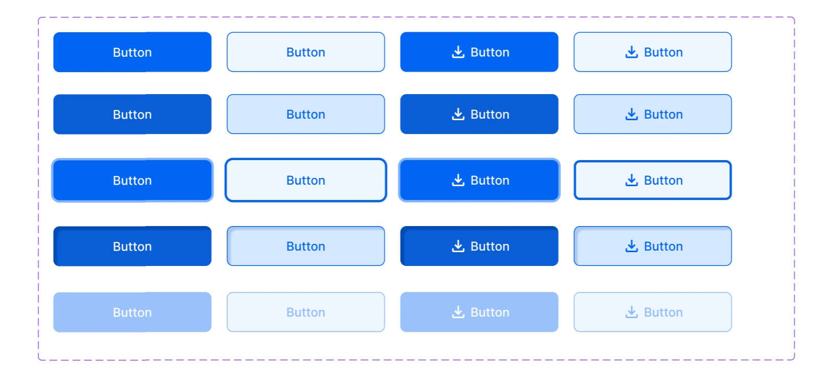
- state changes and hovers
Research
I researched comprehensive lists of all common component types and variations on Apple Human Interface Guidelines and Google Material Design 3.
Lofi Wireframes
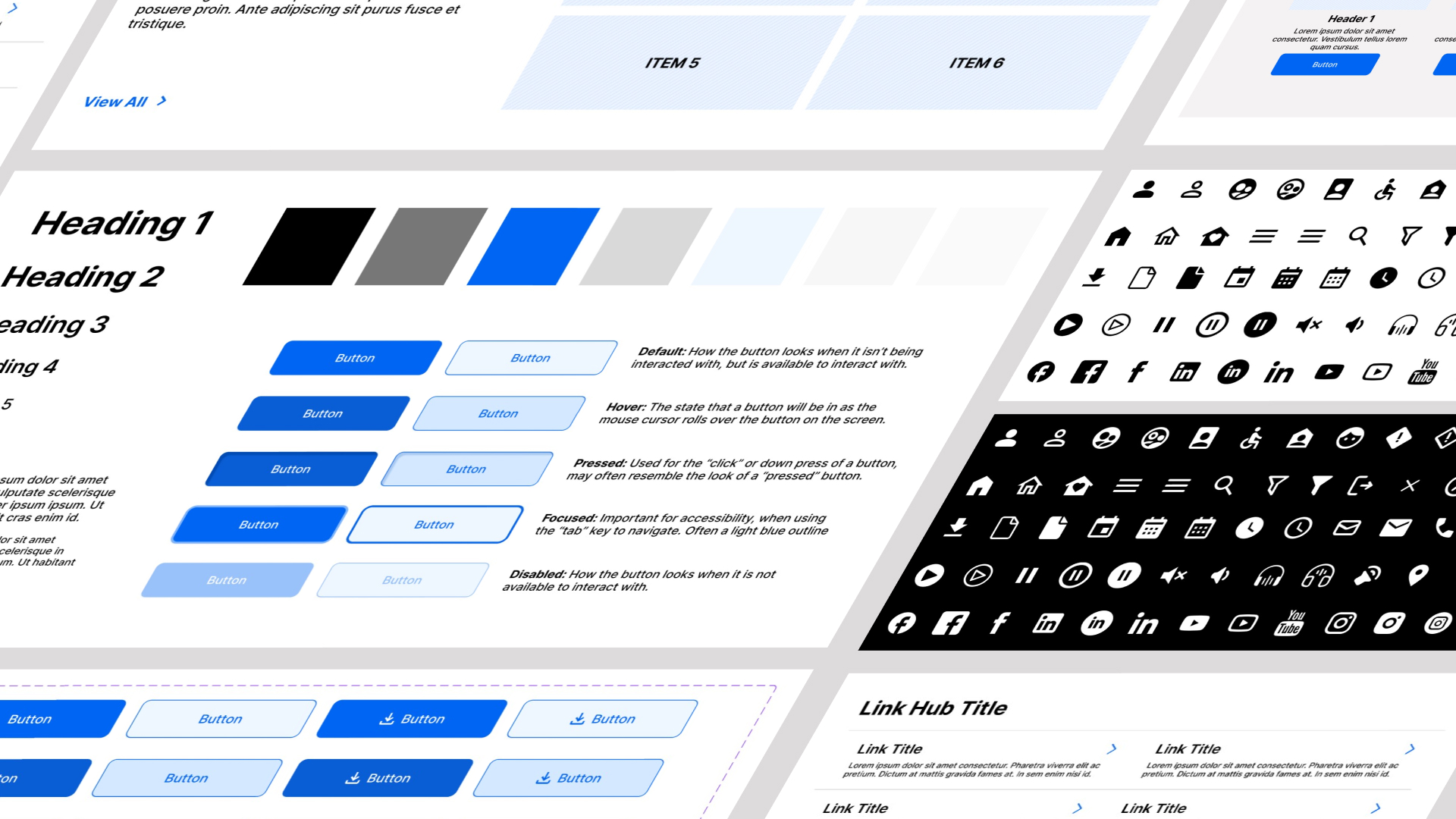
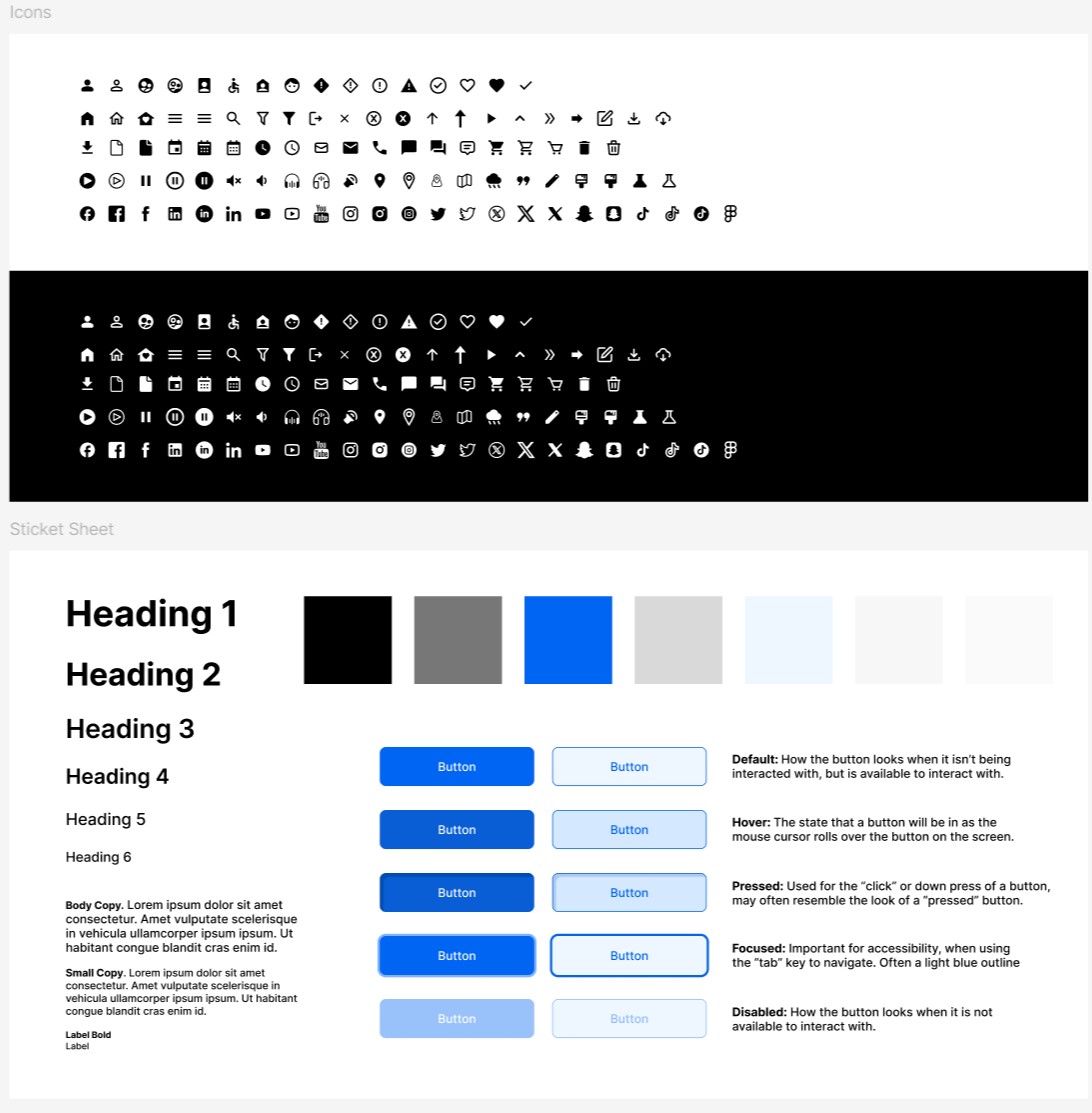
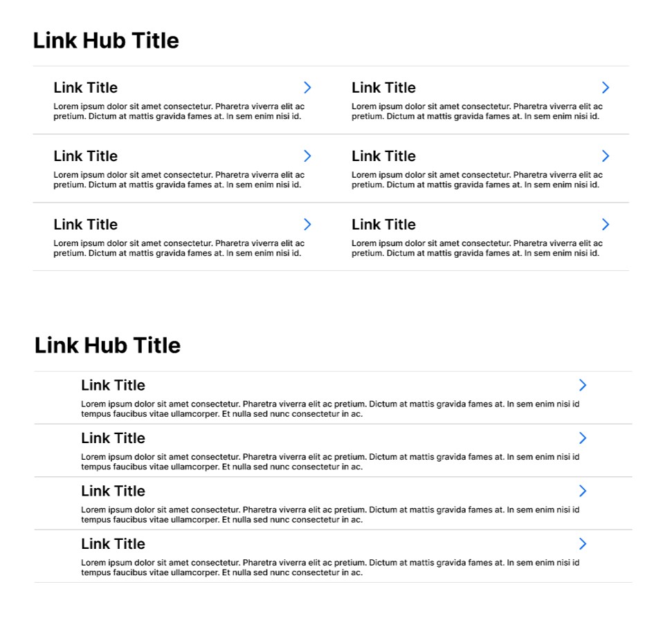
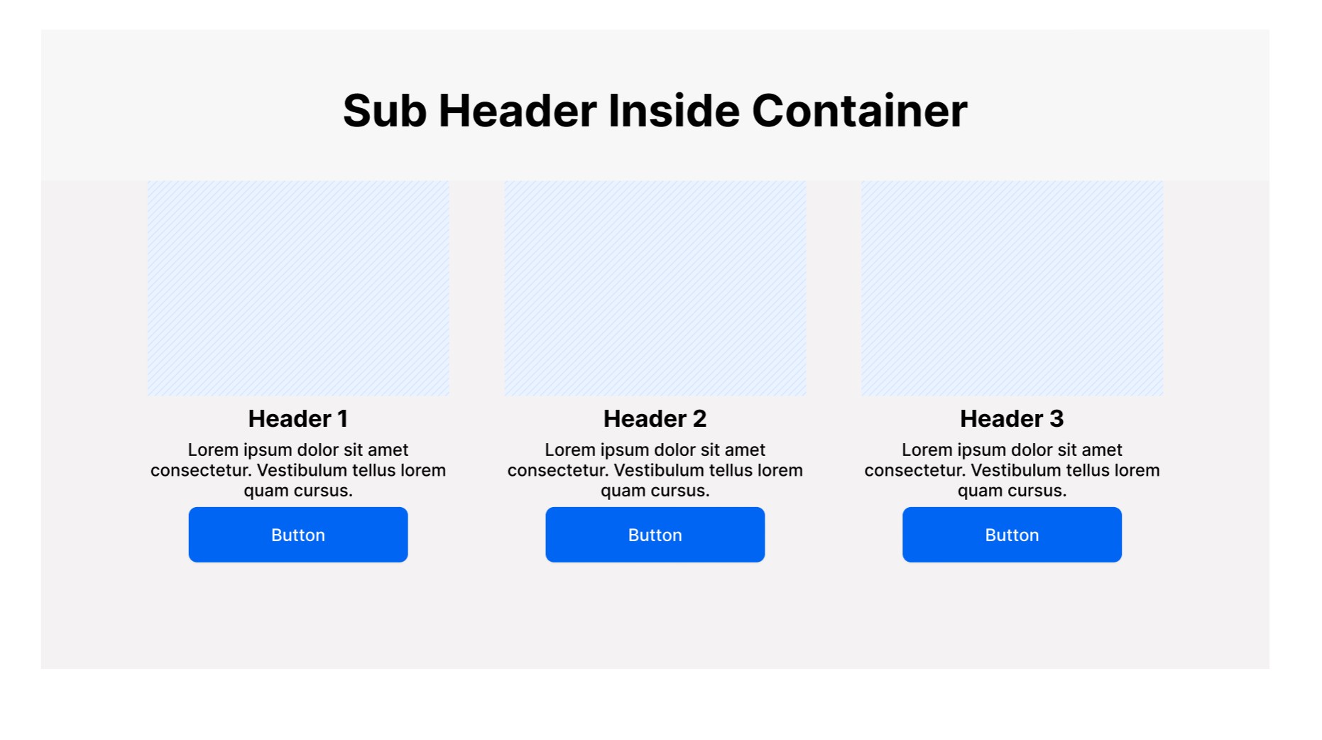
Preview of icon library dark and light mode, style guide, and components. I created over 200 unique components, only a small percentage are shown here:
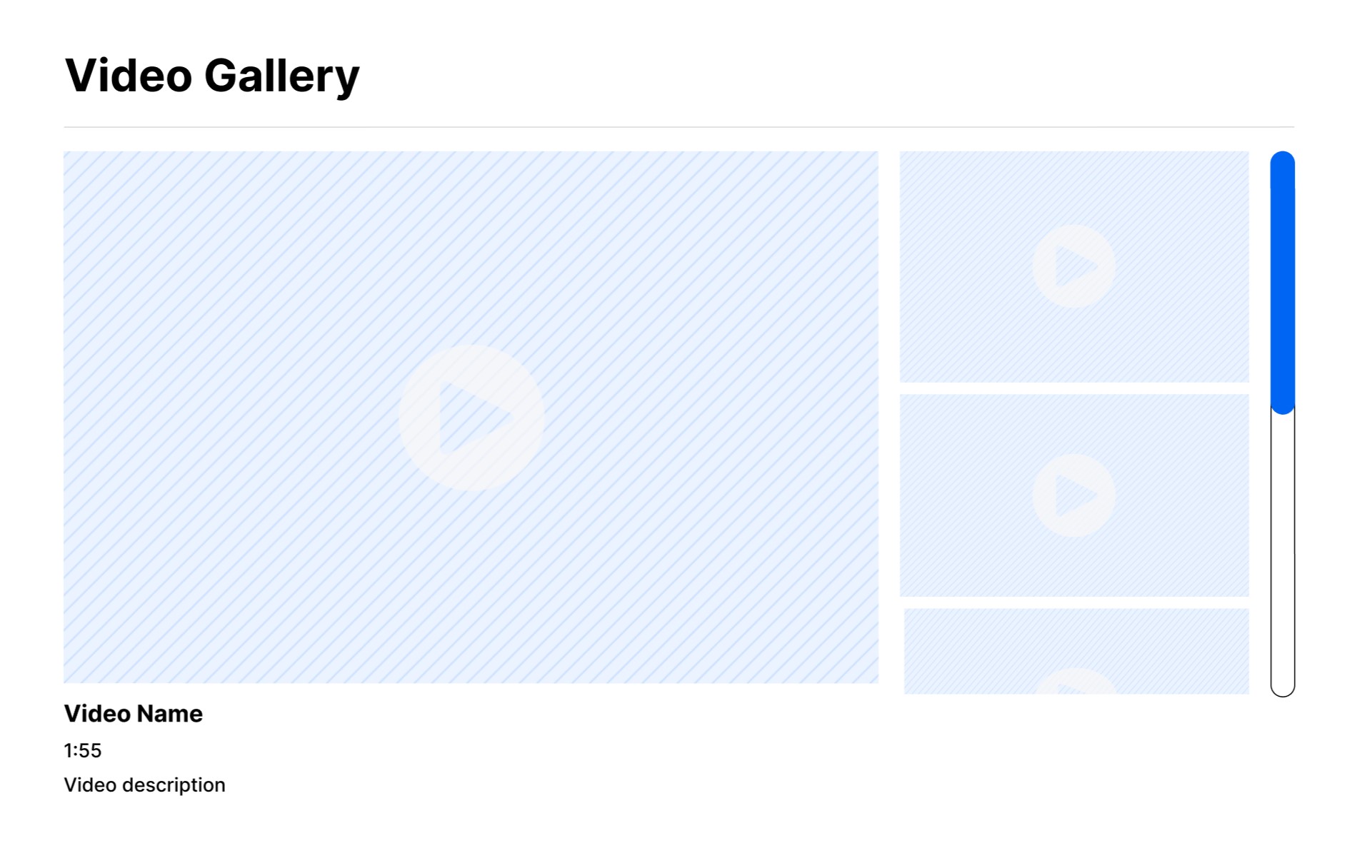
Hifi Prototype
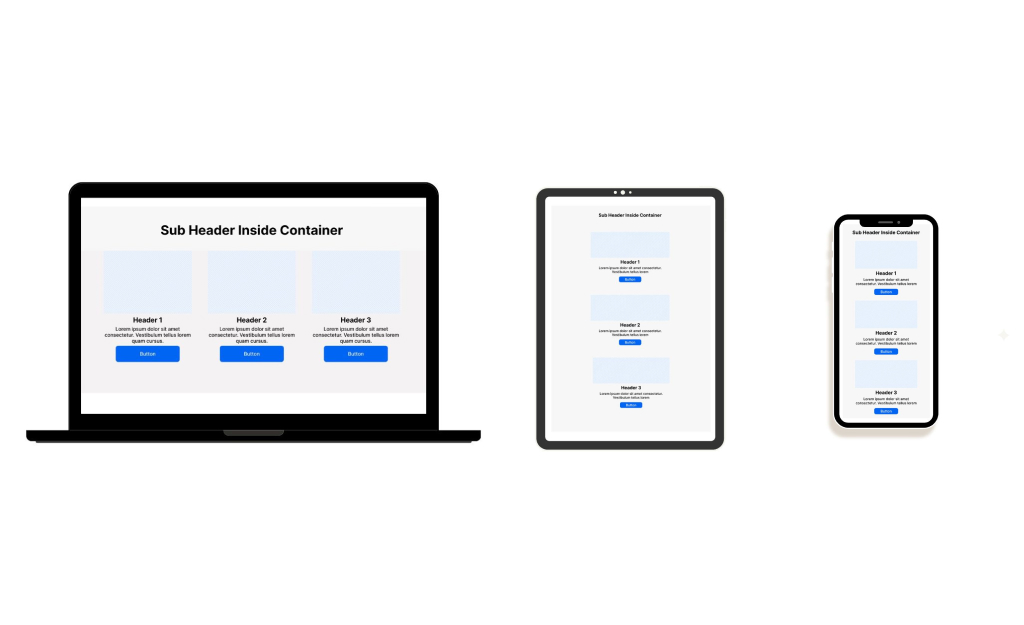
All components were created to be fully responsive in Figma Auto layout and resize for different screen sizes.
Components with different variants were coded to toggle on and off different elements within the component.
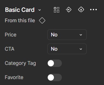
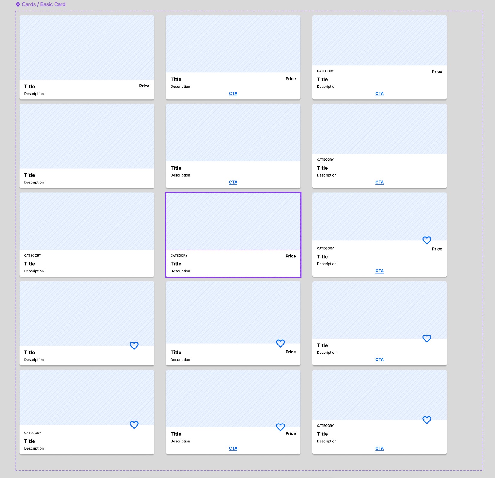
Interactive components also were designed to include hover states, tab focus states, inactive states, and alternative designs.
Insights
Benefits:
- Quicker wires, ability to replicate designs quickly with premade components, design and prototyping time reduced by 40%.
- Responsive components that resize for multiple breakpoints and screen sizes.
- Components that can quickly be customized.
- Eliminate any inconsistency in medium fidelity wireframe style.
- Templates for creating style guides and designs systems for clients in their branding.
Accessibility Considerations
- AA color contrast
- Responsive design for viewing from different screen sizes
- 190x45px touch target for buttons
- Viewable from screen reader
- Designed to be focusable using tabbed navigation
Reviews
2 reviews

Mindy, this is an impressive and highly professional project. You have clearly demonstrated a deep understanding of creating a scalable, multi-client design system that works across industries and devices.
I appreciate how you focused on responsive components, auto-layout, and interactive states to make designs flexible and consistent. Your attention to accessibility, touch targets, and screen reader support shows a strong commitment to inclusive design.
The extensive research you conducted and the creation of over 200 components reflects thoroughness and strategic thinking. The result is a system that saves time, ensures consistency, and is easy for both designers and developers to use.
This work shows senior level design thinking and excellent execution.

Super solid work with supeor detailed explaination, really helpful so I appreciate that. Keep up the good work mate!
You might also like

SONZ - Entertainment platform


Camp & Travel Explorer - App Design


Solar system Dashboard Utility


Signup page for a SaaS website

Uxcel Halloween Icon Pack


PLANTIST

Popular Courses

UX Design Foundations


Introduction to Figma

Design Terminology
