Entrant - Analytical Dashboard

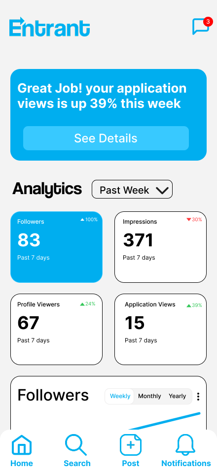
Entrant is a job-seeking platform built specifically for students and fresh graduates, helping them connect with internship and entry-level opportunities in a simple and accessible way. It allows users to create professional profiles, explore relevant openings, and apply directly to companies that are actively searching for early-career talent. By focusing on ease of use and clarity, Entrant reduces the complexity of traditional job platforms and supports users at the very beginning of their career journey.
The analytical dashboard in Entrant is designed to keep users constantly informed about how their profile is performing. It displays clear metrics such as followers, application views, profile visits, and recruiter interactions, turning daily activity into understandable feedback. Instead of relying on assumptions, users can immediately see how visible their profile is and how employers are responding to it. This gives them a realistic picture of their current standing in the platform.
By presenting these insights in one organized space, the dashboard helps users track progress and recognize patterns over time. A rise in followers after updating a profile section or an increase in application views after applying to certain roles becomes easy to notice. This ongoing feedback loop allows users to refine their profile strategically and stay engaged with their career growth through measurable, data-driven insight.

Reviews
5 reviews

I agree with the previous mentors. The design is at a low-mid fidelity stage and needs refinement. Here are my thoughts.
The visual hierarchy is unclear. The "Followers" and "Impressions" cards look almost identical despite carrying different weight. The blue background on the followers card suggests it's the most important element, but I'm not sure if that was intentional. If not use your accent color more sparingly.
The contrast of white text on the blue background raises accessibility concerns. Worth checking with a tool like WebAIM.
The "Past Week" dropdown looks unpolished. The arrow is too large and seems misaligned.
I'm also missing the design context. I don't know what user problems you're solving with this dashboard or why you chose these specific metrics. For students looking for jobs. What's most motivating to track?
To sum up: the foundation is there, the direction is good. Polish the details, rethink the information hierarchy, and show your thought process. That will significantly elevate the project!

Hi Ahmed!
This feels structured and data-driven right away. Dashboards can easily become chaotic, but this one looks organized and intentional.
I like how the information seems grouped clearly instead of just throwing charts everywhere. The hierarchy feels considered, so users can quickly understand what matters most 👌✨ That’s key for analytical tools.
If I’d push it further, maybe add stronger visual emphasis on the most critical metrics like highlighting trends or anomalies more boldly 🚀 But overall, clean, focused, and very practical dashboard thinking.

Hey Ahmed.
At first glance, your design feels somewhere between low fidelity and mid fidelity. I think there’s still some potential to push it further. As a starting point, you could try using softer background.
Since blue is your primary color, I’d suggest using it more selectively. Primary colors work best when they are reserved for clickable or important actions. Right now, the followers section is highlighted in blue while other cards are not, and I’m curious about the reasoning behind that. If the primary color is used too often, it loses its meaning, which is the opposite of what we want.
The last thing that stands out is hierarchy. Looking at this screen, there seems to be a slight imbalance in the typography. Do you have a defined typographic scale? If not, I’d recommend looking into common size systems used in mobile apps and defining one. That will help bring more structure and consistency to the layout.

Good start, but I see a lot of room for improvement here. While the visual hierarchy is pretty clear, the titles and time metrics below the numbers are very similar in size. The title should be bigger or bolded to show clearer hierarchy. I also see inconsistent spacing in a lot of the modules, it's especially noticeable with the numbers in the upper right of each block. The dropdown also looks misaligned, the arrow is too big and not centered and "Past Week" also does not look centered. I worry about the contrast / general accessibility for those smaller bits of white text on the blue background. I might get lost for sight impaired users.
Also I would have liked to see a lot more of your process (research, ideation, more design rationale behind why things are organized the way they are, etc.)
Keep going!
good but UI stroke could be simpler by having a light grey color, also as a second option you can remove the stroke because the very background could be enough to separate cards from the background
You might also like
🖥 Desktop Checkout Flow Design

Website CRM Dashboard

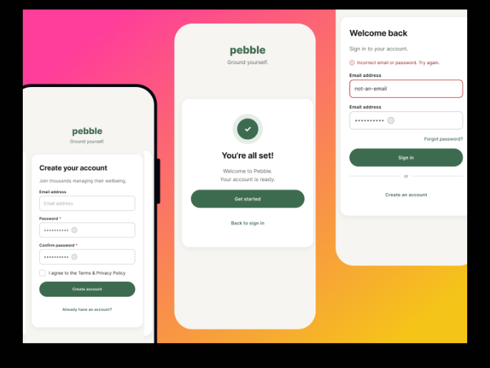
Pebble Accessible SAAS Signup Flow

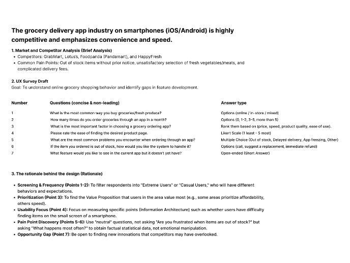
Create a UX Research Survey

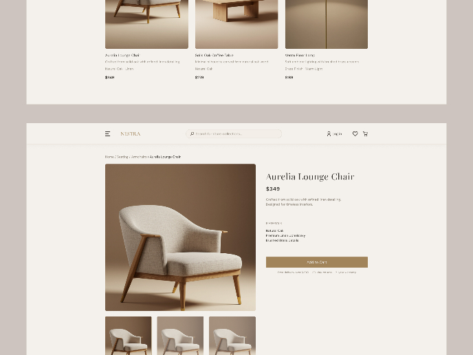
Nestra from homepage to checkout process


QuickScan Onboarding

Visual Design Courses

UX Design Foundations


Introduction to Figma

Design Terminology
