Transit Cairo — Digital Mobility Redefined

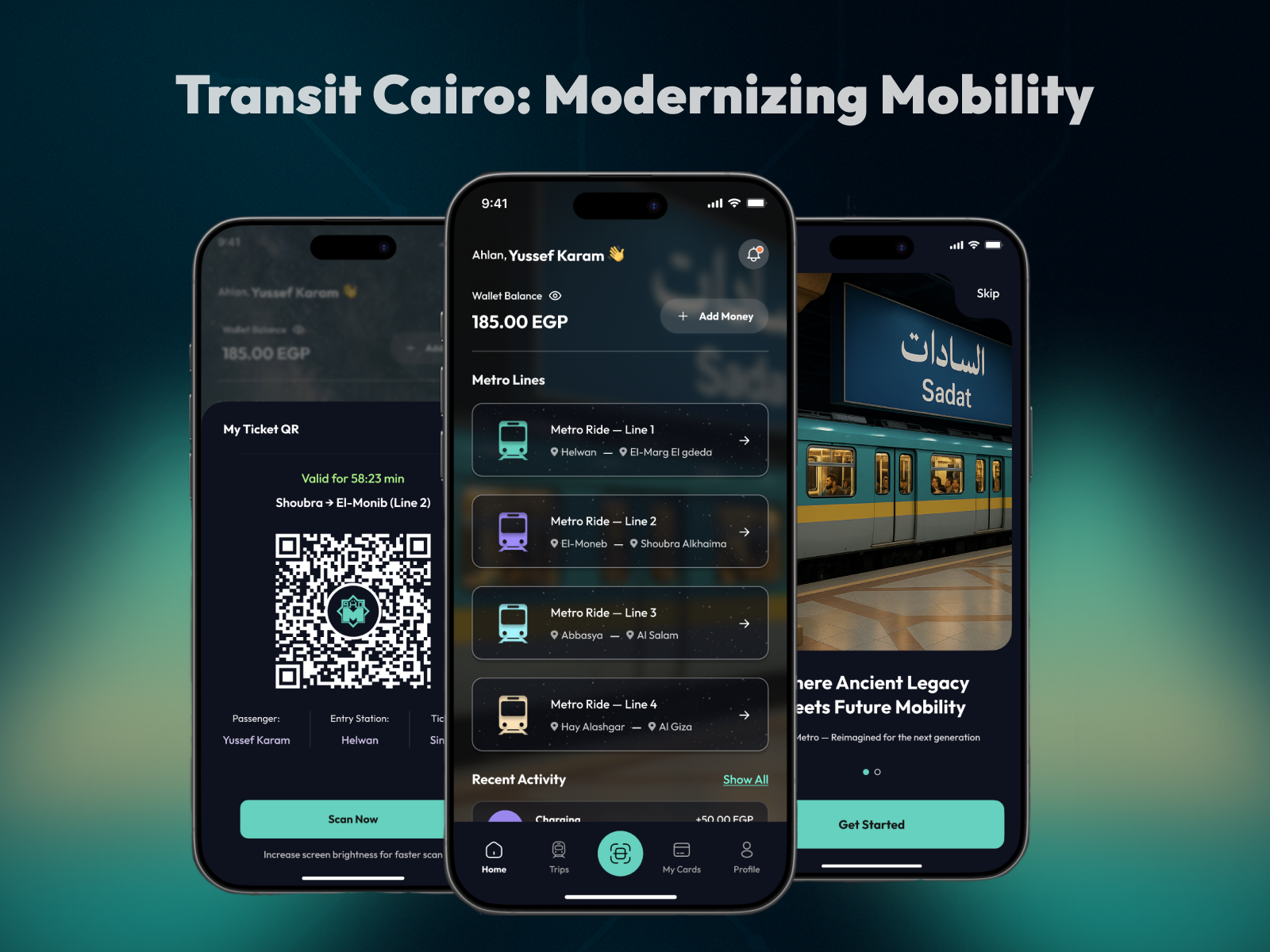
Transit Cairo is a mobile-first digital ticketing experience designed to reduce congestion and improve daily commuting across Cairo’s metro system. The project reimagines how passengers purchase, manage, and access metro tickets by replacing physical queues and paper tickets with a fast, QR-based mobile flow.
The goal was to simplify ticket access, improve passenger flow at stations, and reduce operational strain during peak hours.
Problem
Daily metro riders experience:
- Long waiting times at ticket booths, especially during rush hours
- Heavy reliance on paper tickets, leading to waste and delays
- Slow entry processes that increase congestion at station gates
- Limited clarity around metro lines and routes even its prices for quick decision-making
These issues negatively affect both commuter experience and station workflow efficiency.
Solution
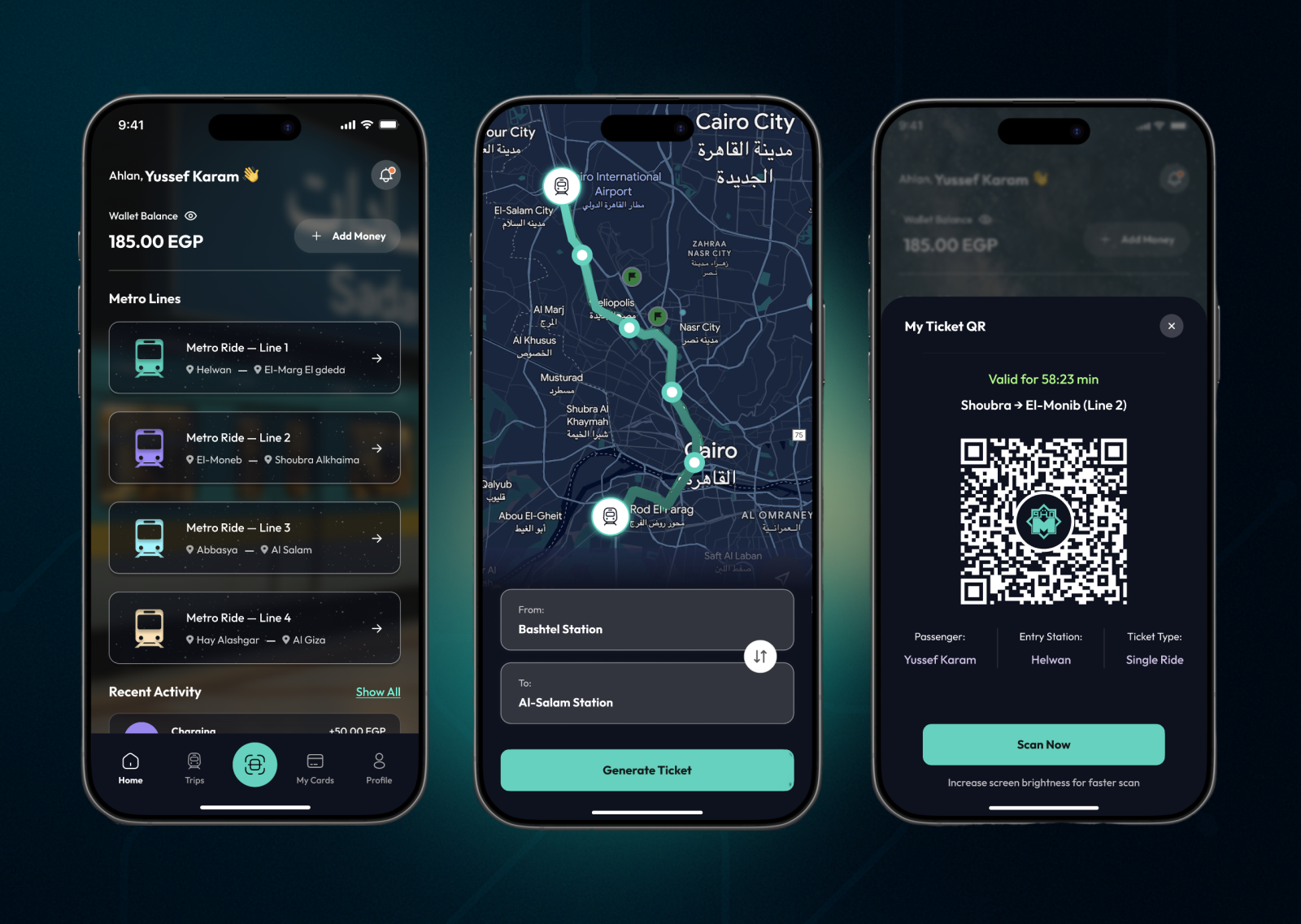
Transit Cairo introduces a digital wallet and QR ticketing system that enables users to:
- Explore metro lines through a clear, structured interface
- Generate metro tickets instantly based on selected routes
- Scan QR codes at station gates for faster entry
- Add balance and manage payments digitally
The flow is designed to minimize steps, reduce cognitive load, and support high-frequency daily use.
Key Features
- Route and line selection for accurate ticketing
- QR-based metro ticket generation
- Digital wallet with balance tracking
- Time-limited digital tickets for controlled access
- Optimized dark UI for underground environments
Impact & UX Outcomes (Estimated)
Based on flow efficiency and comparable digital transit systems:
- ~45–60% reduction in average waiting time at ticket counters
- ~35–50% decrease in paper ticket usage, supporting sustainability goals
- ~30% faster station entry using QR scanning compared to manual ticket checks
- Higher peak-hour throughput, reducing congestion at gates and platforms
- Improved user satisfaction through clear routes, balance visibility, and instant access
Reviews
4 reviews

Hey!
The project looks visually solid. 💪 The dark UI fits the metro context well, and the teal accents create a cohesive color system. Information hierarchy on the home screen is clear: balance, metro lines, recent activity.
🤔 A few things to consider:
- The payment cards on the "My Cards" screen look like mockups with visible numbers. In a real app that's a security red flag. Worth showing masked numbers instead.
- The station selection screen (From/To) is minimalist, but I'm missing suggestions. Like recently used routes or popular connections. For daily use, this saves time.
- The QR ticket has a timer "Valid for 58:23 min" - Great, but what happens when time runs out? Users should know beforehand.
- The map at the bottom of the route selection screen is small and hard to read. With 4 metro lines, an interactive line map could be more useful than Google Maps.
- The onboarding with the Sadat photo looks elegant, though the tagline "Ancient Legacy Meets Future Mobility" sounds a bit marketing-heavy for a daily transit app.
Overall, this is a solid foundation with good dark mode execution and a well-thought-out flow. With minor UX detail tweaks, it could really work! ✌️😊

I really like your app and the fact that it’s solving a real problem. Bringing more transparency into public transportation is a big plus and something users can genuinely benefit from.

The concept is interesting and clearly addresses real problems like long queues and congestion in metro stations. However, I felt some friction when trying to understand the core ticketing flow.
It’s not fully clear what exactly users are purchasing. Are tickets tied to specific metro lines, a full route with transfers, or a time-based access? For daily commuters, understanding what a ticket represents is crucial.
I also noticed that the QR code is time-limited (1 hour), but the system logic isn’t fully explained. Does the timer start after purchase or after the first scan? How are transfers handled, and what happens if a trip takes longer than expected?
Another potential improvement could be showing the full journey, including line connections, rather than only individual lines. This could help users make faster and more confident decisions, especially in a complex metro system.
Overall, the idea is strong, but clarifying the ticket model and end-to-end flow would make the experience much clearer and more realistic.

Hi Yussef!
First impression, this feels ambitious in a good way. “Digital mobility redefined” is a big promise, and the concept actually feels like it’s trying to rethink the transit experience, not just redesign a map.
I like how the structure seems focused on clarity and real commuter pain points. Transit apps can get overwhelming fast, but this feels like it’s aiming for smoother navigation and less friction. That practical angle is strong 👌📍
If I’d level it up, I’d love to see more emphasis on real-world chaos peak hours, delays, route confusion and how the design actively reduces that stress 🚦✨ But overall, solid direction and strong problem framing.
You might also like
Scottagram


Music Player UI - Light & Dark Mode


Pebble Accessible SAAS Signup Flow

Mobile E-commerce Checkout Redesign — Reducing Cart Abandonment Through UX


Create a UX Research Survey


Nestra from homepage to checkout process

Popular Courses

UX Design Foundations


Introduction to Figma

Design Terminology
