Mobile E-commerce Checkout Redesign — Reducing Cart Abandonment Through UX

This project focuses on redesigning a mobile e-commerce checkout flow to reduce cart abandonment and improve completion rates. The goal was to create a structured, low-friction experience that minimizes cognitive load while reinforcing trust at key decision points.
The final solution uses progressive disclosure, guest checkout prioritization, autofill-friendly forms, and transparent pricing to guide users confidently from cart to confirmation.
The Problem
Users were abandoning their carts during checkout. Research and industry insights suggest that drop‑off often happens when:
- Forms feel long or confusing
- Users fear hidden costs
- Delivery expectations are unclear
- Trust signals are missing
- Account creation is forced too early
The challenge was to design a checkout that feels fast, predictable, and safe — while still collecting the necessary information to complete an order.
My Goal
Create a checkout flow that:
- Reduces perceived effort
- Guides users clearly from step to step
- Builds trust before payment
- Keeps pricing and delivery transparent
- Works seamlessly on mobile
Understanding the User Journey
Instead of mapping the checkout as a list of screens, I structured it around the way users mentally experience the process.
High‑Level Journey
- Review purchase
- Provide delivery information
- Complete payment
This resulted in three clear stages:
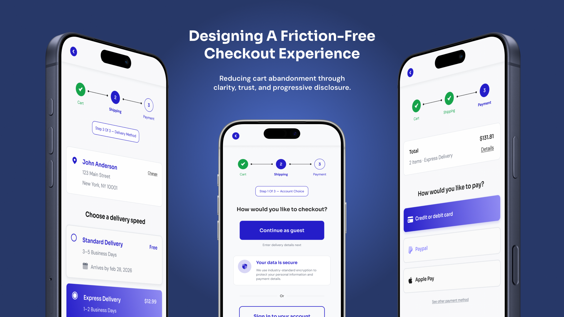
Cart → Shipping → Payment
This stage‑based approach simplifies the experience and gives users a clear sense of progress.
Checkout Journey Stages
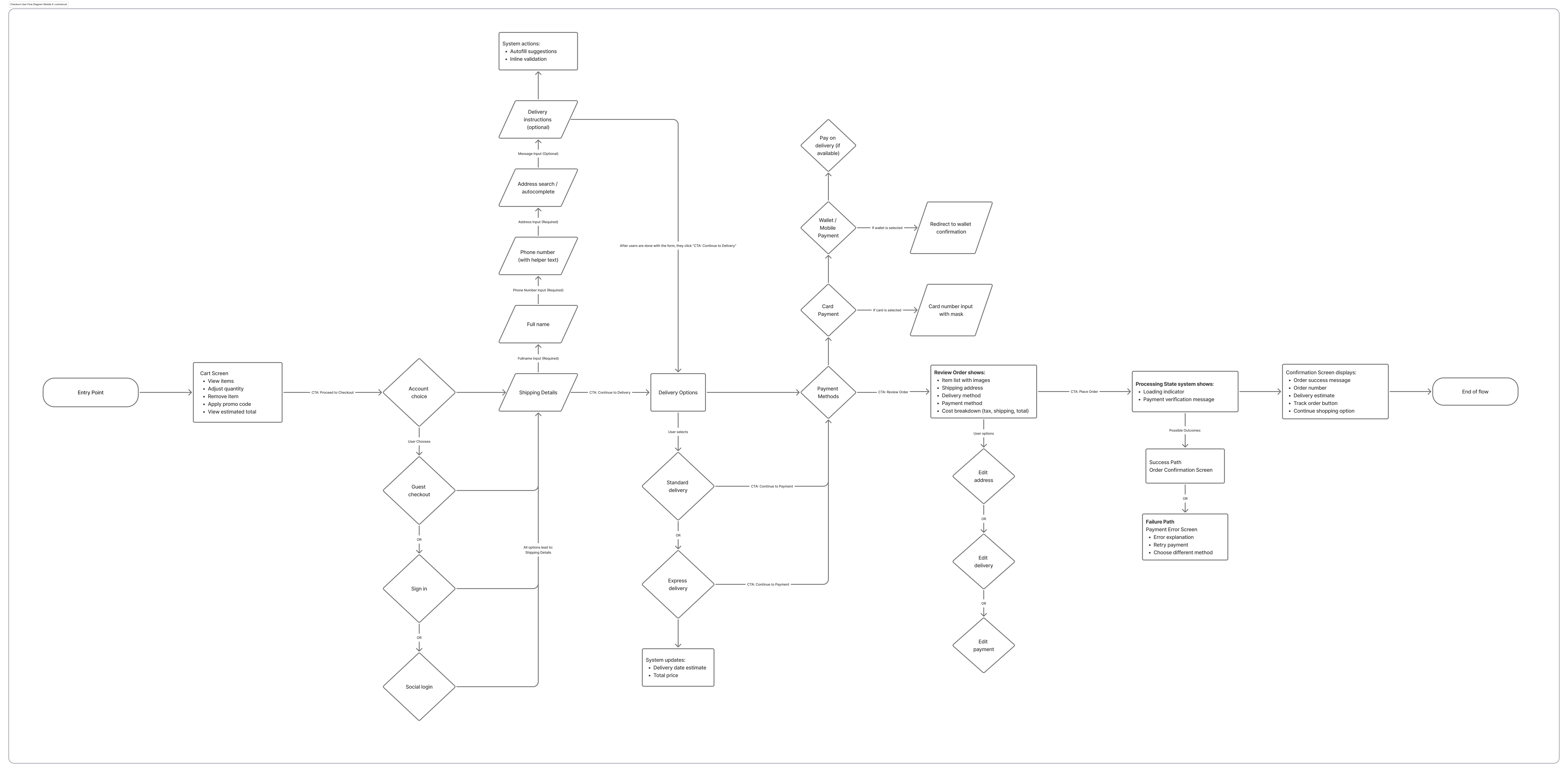
The checkout is structured around user mental models rather than system steps, reducing perceived complexity.
Design Strategy
1. Progressive Disclosure
Instead of presenting one long form, the experience reveals information step‑by‑step. Each screen asks for only what is necessary at that moment.
This reduces cognitive load and helps users stay focused on one decision at a time.
2. Guest Checkout First
Users can proceed without creating an account. This removes friction at the start of checkout while still collecting delivery details.
Account creation is suggested only after purchase, when trust has already been established.
3. Autofill‑Friendly Forms
The shipping form is optimized for speed:
- Address autocomplete reduces typing effort
- Fields auto‑populate when possible
- Inputs use contextual keyboards on mobile
This transforms form-filling from a chore into a guided process.
Optimized Shipping Form

Autofill and clear grouping reduce interaction cost during form completion.
4. Transparent Order Summary
At every stage, users can see their total cost and delivery details. This prevents surprises and builds confidence in the purchase.
Clear totals and delivery estimates reduce uncertainty, which is one of the biggest drivers of abandonment.
5. Trust at Critical Moments
Trust signals appear exactly where users hesitate most:
- Near payment inputs
- Near final confirmation
- Near primary action buttons
Instead of decorative badges, reassurance is tied directly to user decisions.
Trust Signal Placement

Security reassurance appears where users make commitment decisions.
6. Microcopy as Guidance
Short, conversational microcopy helps users understand what happens next and why information is required.
Examples include:
- Explaining why phone numbers are needed
- Reassuring users before checkout
- Confirming next steps after purchase
These small details reduce hesitation and increase confidence.
Visual Design Approach
The visual system was intentionally restrained to maintain focus on task completion.
- Neutral backgrounds reduce visual noise
- A single accent color guides user actions
- Clear spacing improves scanability
- Consistent button placement builds predictability
The goal was to create an interface that feels calm, trustworthy, and easy to navigate.
Final Flow Overview
The finished checkout experience:
- Breaks complex tasks into manageable steps
- Shows progress clearly throughout the journey
- Keeps costs and delivery transparent
- Uses familiar patterns to reduce effort
- Reinforces trust before every commitment
The result is a checkout that feels predictable, safe, and fast — qualities that directly influence conversion.
What I Learned
- Users abandon checkout more due to uncertainty than effort
- Clear progress indicators reduce anxiety significantly
- Microcopy can influence behavior as much as layout
- Trust is built through clarity, not decoration
Next Steps
Future iterations could include:
- Usability testing with real users
- Measuring completion rate improvements
- Experimenting with express payment methods
- Adding saved addresses for returning customers
Post-Launch Feedback & Iterations
After publishing the project, I received valuable feedback from mentors that helped refine both the UX and visual design.
Accessibility improvements
The placeholder text in form fields did not meet contrast requirements and could increase cognitive load. Since all fields already had labels, I removed the placeholders to improve accessibility and clarity.
Checkout flow clarity
The progress tracker originally included the cart in the checkout steps. Based on feedback, I adjusted it so the checkout flow now starts from Shipping → Payment → Review, treating the cart as the entry point rather than a step in the process.
Visual consistency
The initial design used green for completed steps and purple for the active step in the progress tracker. This created visual competition between the two states. I updated the design to use a single purple color system, with lighter purple for completed steps and solid purple for the active step to improve hierarchy and cohesion.
Edge cases and system states
To better represent real-world scenarios beyond the happy path, I added additional UI states such as form validation errors and payment processing/failure states.
These iterations helped strengthen the design’s usability, accessibility, and visual consistency.
Final Reflection
Designing this checkout experience reinforced how small details can significantly influence user confidence during critical moments of a product journey. In e-commerce, checkout is not just about completing a transaction — it’s about reducing uncertainty and guiding users through the final steps with clarity and reassurance.
Through this project, I focused on streamlining the workflow, enhancing visual hierarchy, and providing clear feedback at each stage of the process. Iterating on the design based on mentor feedback also highlighted the importance of accessibility, visual cohesion, and considering system states beyond the happy path.
One key takeaway from this project is that effective UX often comes from removing friction rather than adding features. Clear progress indicators, thoughtful error handling, and consistent visual language can make a complex process feel straightforward and trustworthy.
Going forward, I would continue improving this experience by testing the flow with real users to identify additional usability issues and further optimize the checkout journey.
Tools used
From brief

Topics
Share
Reviews
3 reviews

Hey David,
Great project presentation, well done.
I like that you included a diagram, the screens, and a case study. It gives a nice overview of both the thinking and the final result.
Two things caught my attention. The first one is the text inside the input fields. Even when text is entered, it still visually feels like a placeholder. What I mean is that users should clearly see that something has been filled in, so it might be worth checking the contrast and visual treatment there.
The second thing I noticed is related to the steps. From what I can see, each main step has smaller sub-steps shown in pill. I have a feeling this could become a bit confusing if the main step shows “Step 1” while the sub-step indicator says something like “Step 3/3”. It might be worth exploring a clearer way to visualize that hierarchy so users don’t get confused about where they are in the process.

Hey David!
Amazing job on this project. I love how you've broken down the problem and the rationale behind the checkout flow. Showing users where they are in the process and reassuring them their payment is secure is such a great way of building trust.
A couple of improvements:
- It would be great to see step 1 of the checkout flow and some different states too. This would show you're thinking beyond the happy path and considering other scenarios users might encounter.
- The placeholder text in the form fields doesn't pass contrast checks, and it's worth removing it completely as it tends to add cognitive load rather than help. The NN Group has some great articles on this if you want to learn more.
Overall, great job! You should be really happy with this. :)

Well done David. I like the component based appproach. I will however work on the color pallete a bit as the wireframes on their own loook more refined compared to the hi-fi designs. Also check the contrast for the placeholder texts in the input fields as they may not be very accessible.
You might also like

Smartwatch Design for Messenger App


Bridge: UI/UX Rebrand of a Blockchain SCM Product


Pulse Music App - Light/Dark Mode


Monetization Strategy


Designing A Better Co-Working Experience Through CJM


Design a Settings Page for Mobile
Interaction Design Courses

UX Design Foundations


Introduction to Figma

Design Terminology
