Entrant Accessible Signup and Login Forms

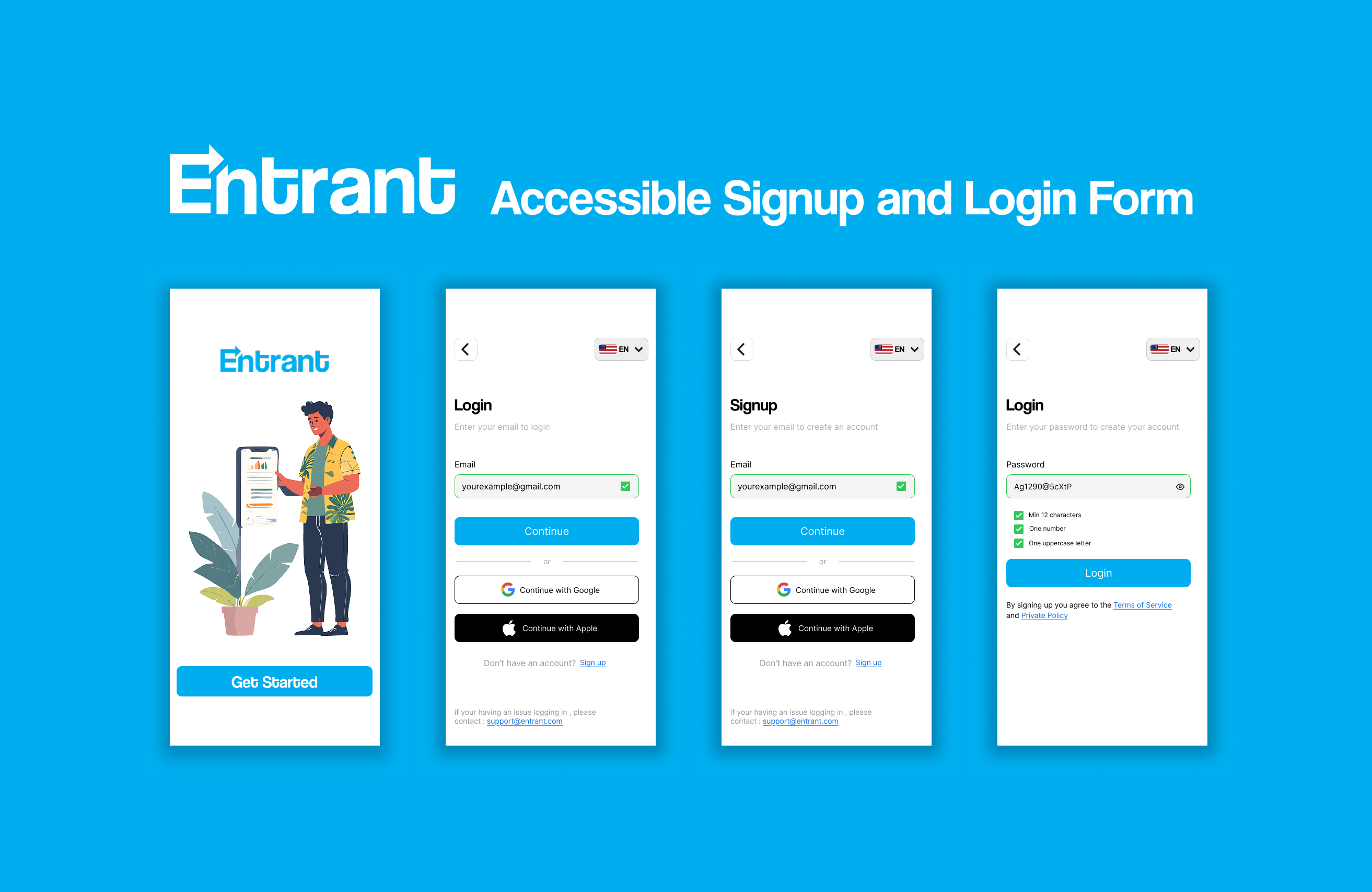
Entrant was the internship-focused job-seeking app for college students and fresh graduates — built around lowering friction, making opportunities feel reachable, and translating the messy hiring world into something humane, navigable, and confidence-building.
Tools used
From brief

Topics
Share
Reviews
7 reviews

Really nice work! I personally would have liked to see some more of the process (user flows, research, sketches, etc.) but this is a solid sign in / up flow.
The information hierarchy is really clear, the UI is clean, and good job thinking of all the error states / inline tips for password creation.

Hi Ahmed
First vibe this feels thoughtful and responsible right away. Focusing on accessible signup and login isn’t flashy, but it’s super important 👏♿
I like how the structure seems clean and distraction-free. Auth flows should feel calm and clear, and this looks like it prioritizes readability and usability over decoration 👌✨ That builds trust fast.
If I’d push it a bit more, I’d highlight stronger feedback states like clear error messaging, focus indicators, and keyboard navigation cues ⌨️💡 That would make the accessibility story even stronger. But overall, solid, user-first thinking.

Very nice job! Both flows are solid, and I like the logic behind them.
One small improvement: since the sign-up and login flows look very similar (with email being the main difference), showing the password directly on the sign-up screen could help users better understand where they are in the process and avoid confusion.
Great job!

Good work, Ahmed! I really like the simplicity and minimalism in your design, it feels clean and focused, which is great.
A few things to keep in mind for improvement and future projects:
- I noticed some inconsistencies between screens and components. Keeping things consistent will make the experience feel more polished and cohesive.
- For future work, renaming your layers can be super helpful. It makes files much easier to manage and collaborate on.
- Using a grid while designing can also go a long way, it helps avoid spacing and padding issues and keeps everything aligned nicely.
Overall, you’re heading in a good direction. With more attention to consistency and structure, your designs will become even stronger. Keep it up!

Hi Ahmed, thanks for sharing!
your UI work is pretty solid here. Check that language select element though, it’s drifting past your right side margin a bit. Keep that right edge flush with the rest and let the left edge rest where it falls.
You’re following a lot of established common patterns, but it’s helpful when you can share your thoughts on things as well. It’s always helpful to show you understand the why behind design decisions, not just that you can follow common patterns.
You're doing a lot of the right things by using what looks to be in-line validation and not relying on color alone for state feedback, but again I’d like to hear how you’re thinking about that.
Last, I wouldn’t rely on Figma to present your work. For me, it took well over 6 seconds to load. If I have 300 applicants to screen through, you’ve already lost me.

Hey Ahmed.
You presented your project nicely, and I like that you included both Login and Signup flows. It’s also great that you’re not relying on color alone, but using shapes and messages to communicate states. That’s a solid accessibility-aware decision.
I do have a few comments around consistency. When an error state appears on an input field, you’re using a circular icon, while a successful validation is shown with a square shape. I’m curious about the reasoning behind using two different shapes for these states. Personally, I would lean toward using the same shape for both, since the icon itself already communicates the meaning.
One more thing to consider is terminology. The word “Login” is most commonly paired with “Register.” I’m curious why you chose “Signup” instead. While both are correct, mixing Login with Signup can sometimes feel slightly inconsistent, especially for users who are used to seeing Login and Register as a standard pair.
Good job!

Clean and friendly 👌
The flow feels smooth, the validation feedback is clear, and the accessibility focus really shows. The screens are easy to understand without overthinking. Nice job keeping it simple and usable.
You might also like

Accessibility Asse


A/B Test for Hinge's Onboarding Flow


The Relational Workspace


The Fitness Growth Engine


Smartwatch Design for Messenger App


GetTracky

Visual Design Courses

UX Design Foundations


Introduction to Figma

Design Terminology
