Working with Texts in Figma
Master the skills to organize and style text in your Figma designs.
The type settings you choose for your typography can significantly affect the clarity and impact of your message. The way you position, organize, and style your text, including font selection, is vital for effective communication. In Figma, you have the freedom to adjust spacing, alignment, line height, and other parameters, enabling designers to establish a clear hierarchy that effortlessly guides users through the information.
Efficient use of these type settings not only makes your content more attractive but also more readable. The right type settings can improve accessibility and, consequently, the overall user experience. Remember, the aim isn't just to select a pretty font and use the right size. The goal is to make information easily digestible for your audience, and Figma provides all the necessary tools to accomplish this.
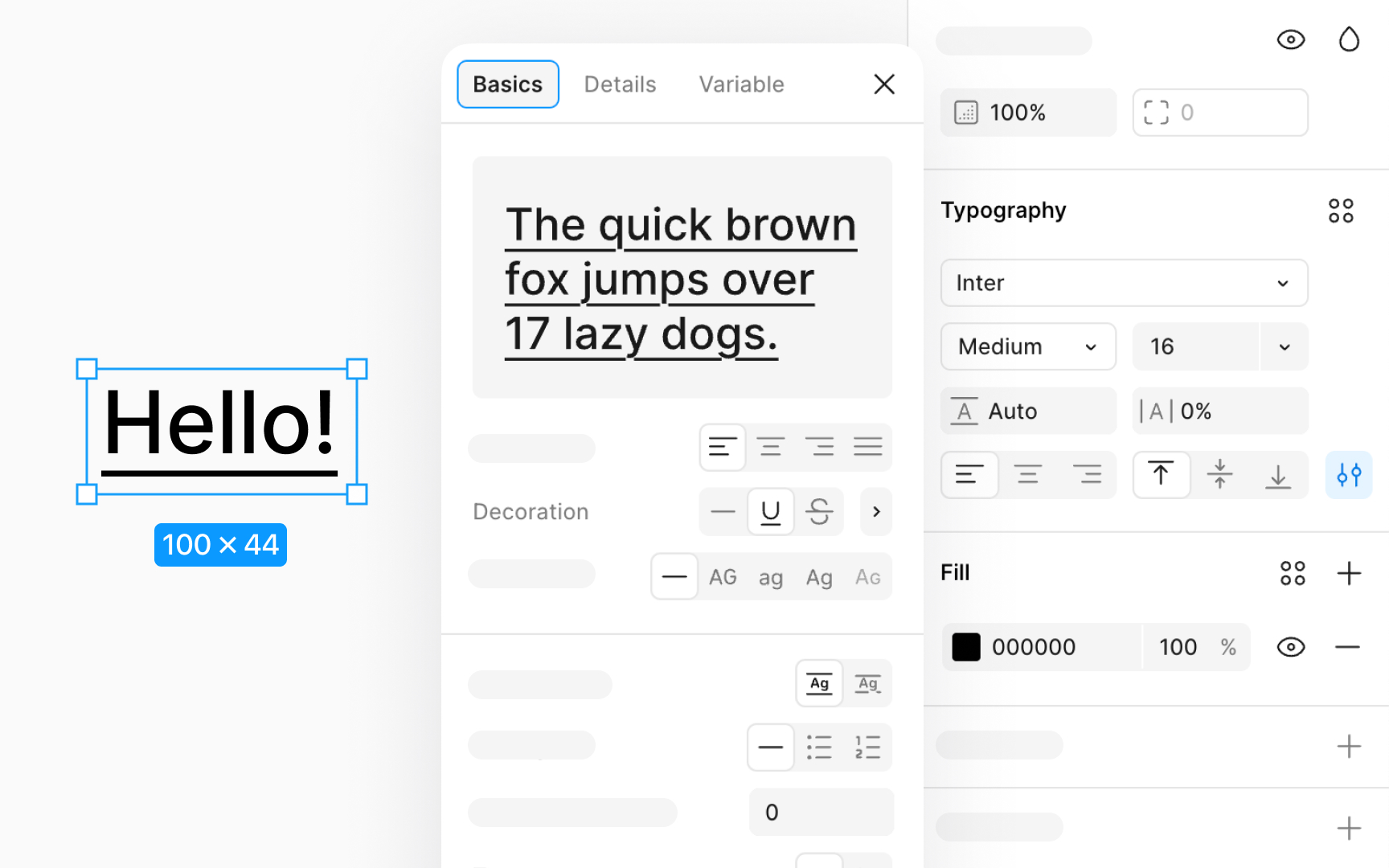
You can make your text stand out or show changes by adding decorations like strikethrough and underline. Here's how it works:
- Strikethrough: This adds a line through your text. It’s good for showing something isn’t right or needed anymore. To add a strikethrough effect to text, first select the text layer. Then, open the Type
settings by clicking the 3-dots icon in theTypography section of the Design panel. In the window that appears, click on the Strikethrough icon. - Underline: This adds a line under your text. It's useful for making parts of the text stand out or showing that something is a clickable link. This is especially important for websites because it makes things easier to understand and use. Click the Underline icon in the Type settings window to add an underline. For those who prefer shortcuts to quickly add an underline, press: Option U (Mac) or Ctrl U (Windows)
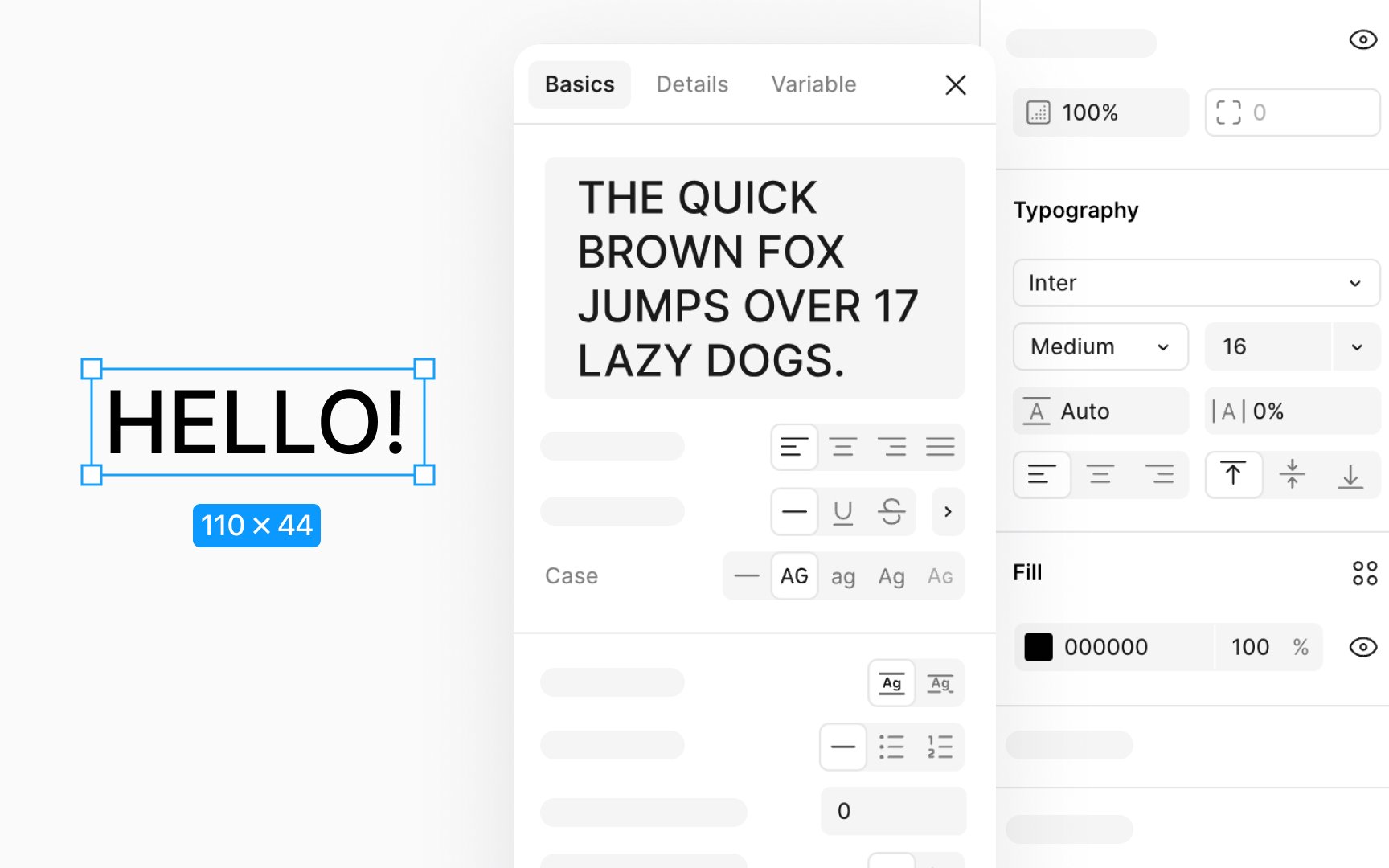
To change the letter case, select your text, then head to the
- Uppercase: Changes all selected text to UPPER CASE.
- Lowercase: Changes all selected text to lower case.
- Capitalize: Makes the first letter of every word Upper Case, known as Title Case.
- Small Caps: Converts text to SMALL CAPS, where uppercase letters are presented in a smaller size that matches lowercase letters but with distinct proportions.
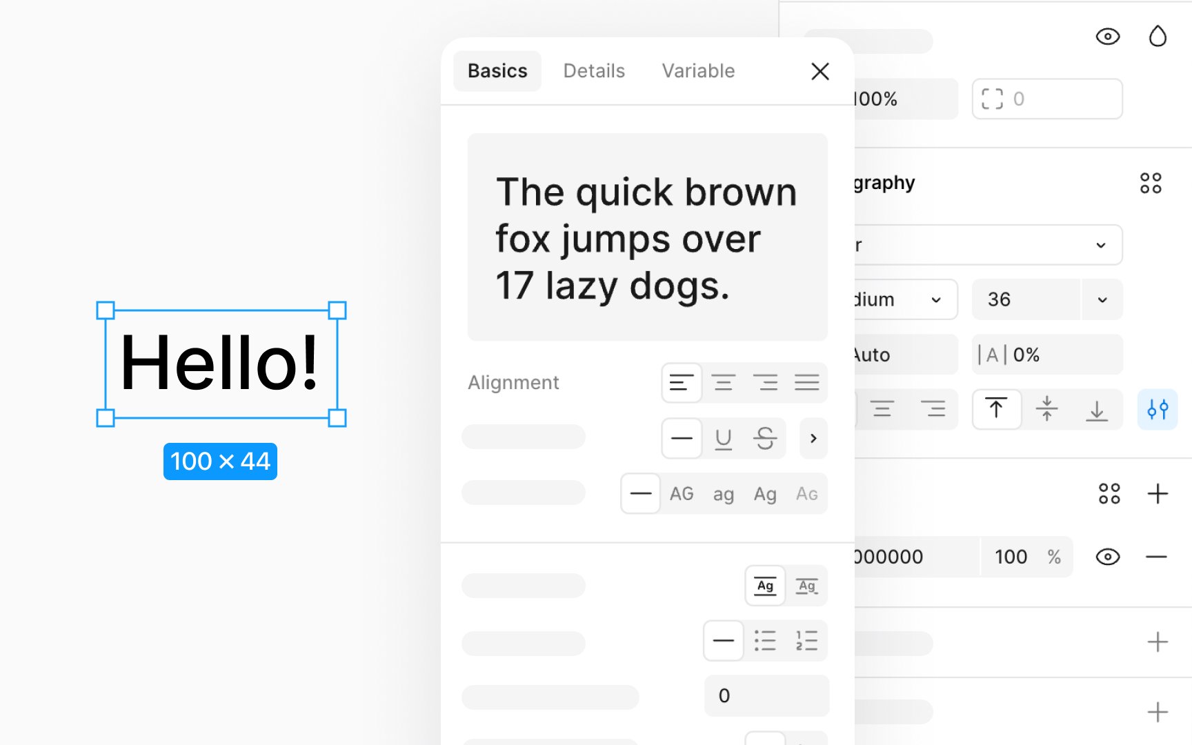
Horizontal text alignment organizes your text neatly, affecting its placement within a box along the horizontal axis. Here’s a simple breakdown:
- Left alignment: This is the go-to for longer texts, like paragraphs, making them easy to read.
- Center alignment: This suits shorter texts or headings, adding a touch of symmetry.
- Right alignment: This can highlight specific elements or align text with right-sided elements.
- Justify: This spreads out your text evenly from left to right, ensuring both edges align perfectly. Each word is spaced uniformly to fill the line.
To choose an alignment style, click the corresponding
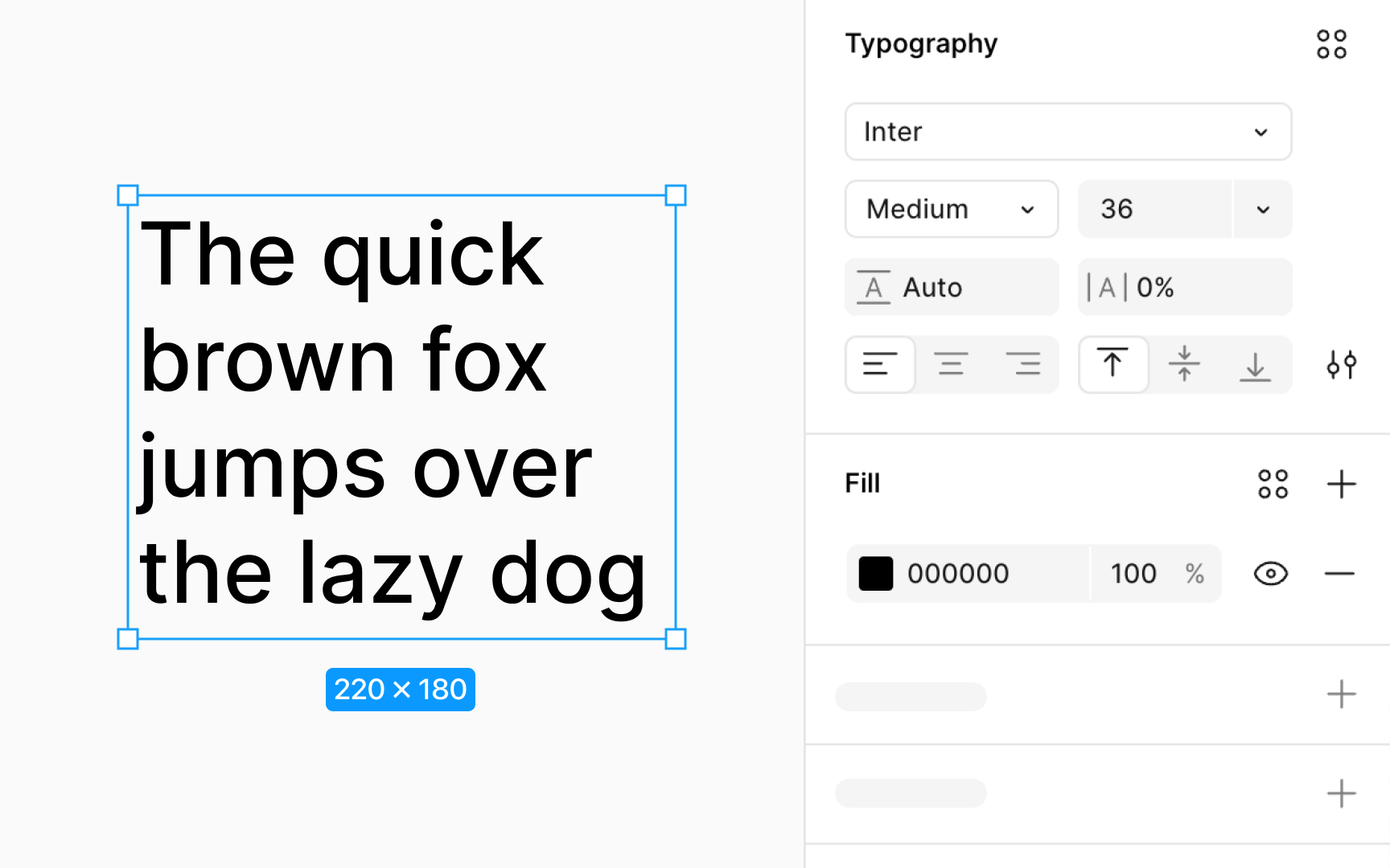
Vertical text alignment helps position your text up and down within its box, making sure it looks just right in your designs. Here's how it works:
- Top: Aligns your text to the upper edge, great for titles or headings at the top.
- Middle: Centers text vertically, perfect for making text pop in buttons or banners.
- Bottom: Pushes your text to the bottom, useful for footnotes or text at the base.
To set it up, click the vertical alignment
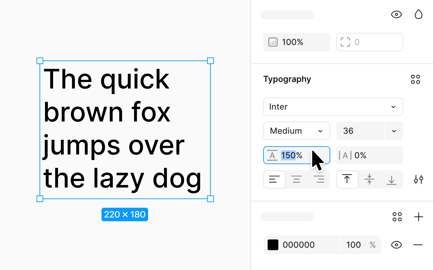
Line height lets you set the space between lines of text to make your paragraphs clear and pleasant to read. It's also known as line spacing. If line heights are too tight, reading becomes tough. If they're too loose, your text might spread out too much.
To adjust this, use the line height field in the
- Mac: Press Shift Option and < to make it bigger or > to make it smaller
- Windows: Press Alt Shift and < to increase, or > to decrease.
You can choose a specific line height in pixels (px) or as a percentage (%) of the font size.
Figma automatically uses the default line height that's built into the
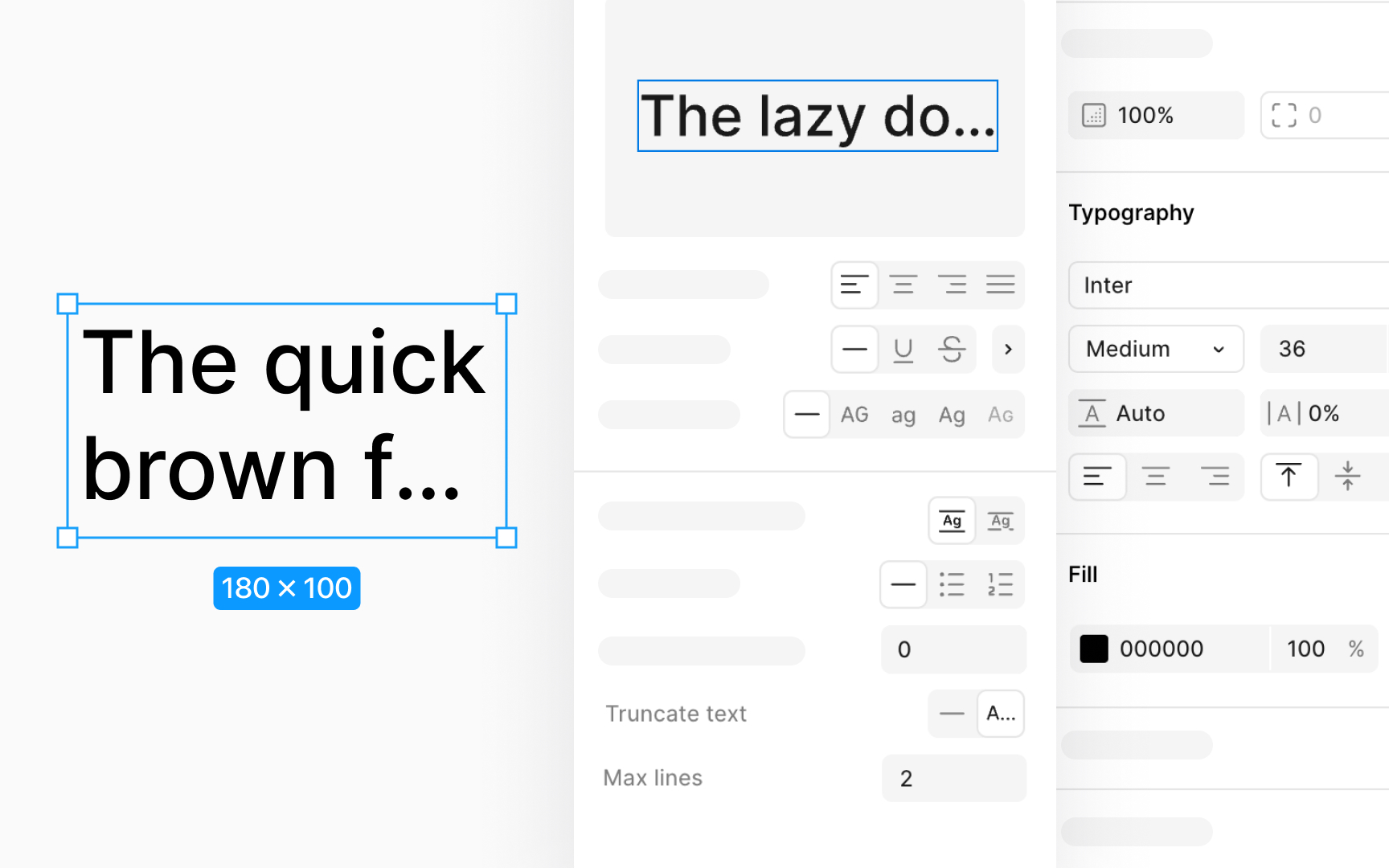
Text truncation hides text that doesn't fit within a given area and adds an ellipsis (...) to show there's more text that's not visible. This is super useful in interface design where you might have names, descriptions, or other
To set up text truncation, look for click on the 3-dots Type
The max lines setting kicks in only if:
- Text resizing is on auto height or auto width
- Vertical resizing is set to hug contents, which is handy for text within auto layout frames.
Using text truncation ensures your design remains elegant and functional, no matter the length of the content.
In Figma, converting text into vectors means turning your text into a shape that you can't edit as text anymore. This is useful for specific design needs, like customizing a
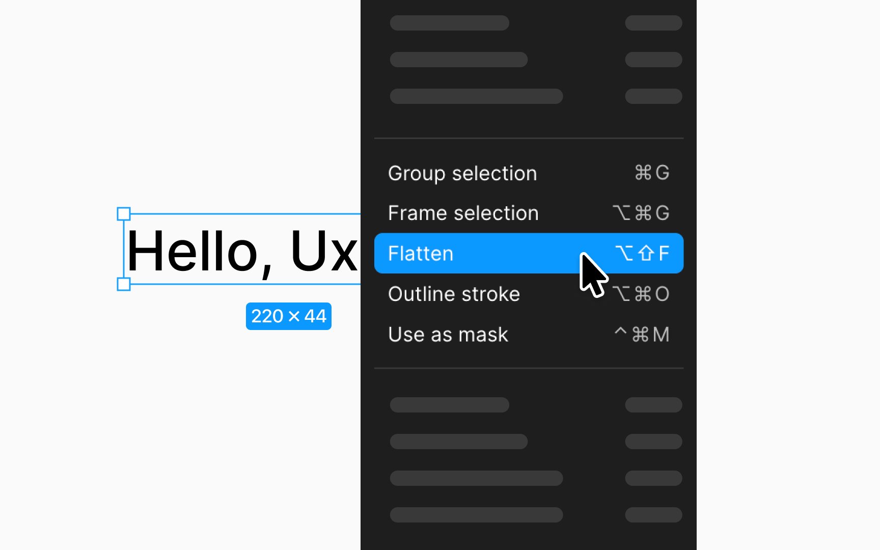
Figma offers two main ways to do this: flattening text and outlining strokes. Flattening text means Figma combines selected objects or layers into one and changes your text into vector paths. To flatten text, just right-click on the text layer (on your canvas or in the layers panel) and choose Flatten. After flattening, everything becomes one layer, and you can tweak it in vector edit mode.
Pro Tip: After flattening text, reverting to its original form isn't possible. If you change your mind, quickly undo flattening with Command Z (Mac) or Ctrl Z (Windows). Alternatively, use version history to revert to an earlier state.
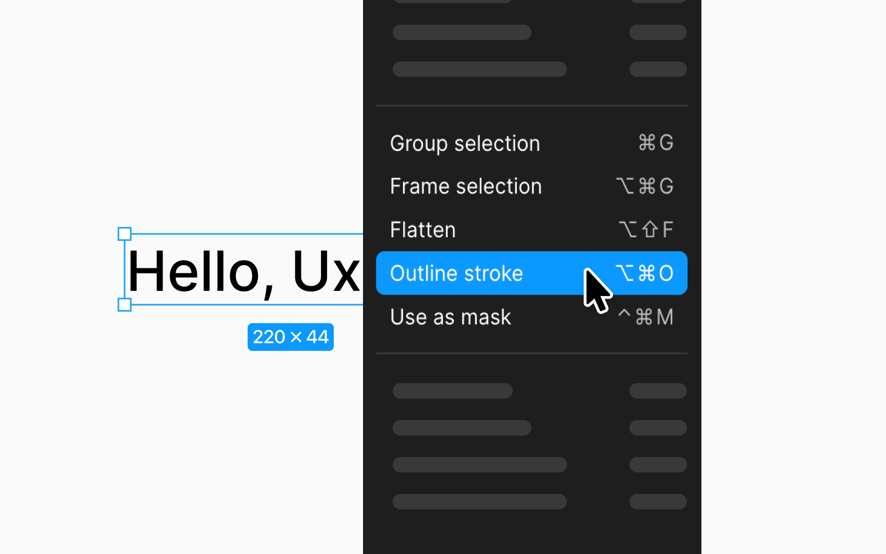
Converting text to vectors can mean two things: flattening text or outlining the stroke. Both change text into vectors, but they do it differently. Outlining stroke focuses on converting each letter of your text into its own vector shape, without merging anything together.
Here's how to do it:
- Right-click the text layer on your canvas.
- Choose Outline stroke.
- If you're looking for a shortcut, use:
- Mac: Command Option O
- Windows: Ctrl Alt O
Unlike flattening text, which merges everything into one layer and turns the text into a single vector path, outlining stroke keeps each letter separate. This means you can move, tweak, or style each letter on its own after it's been outlined. It's especially handy when you need precise control over each character, like when creating logos or custom
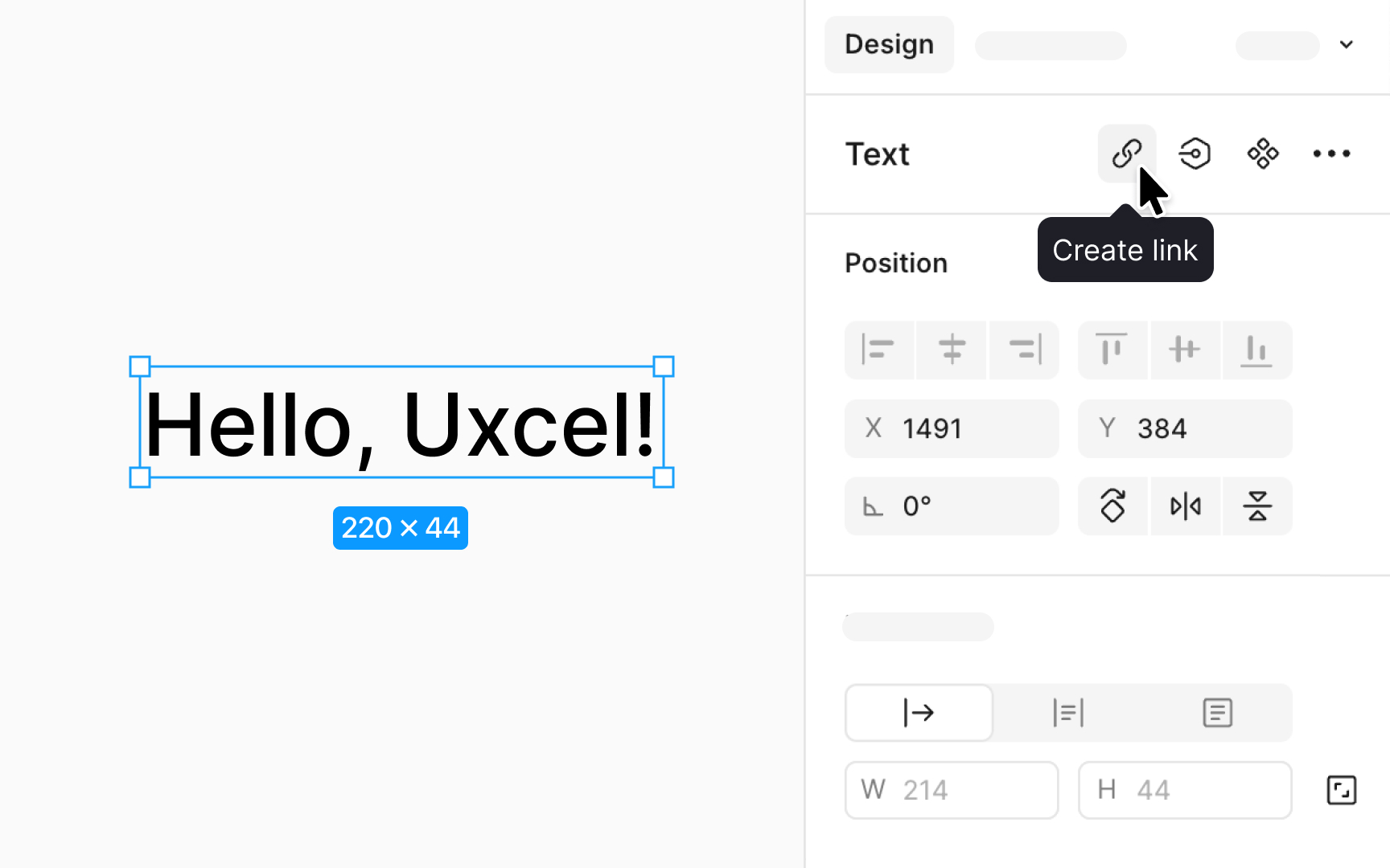
Adding a
- First, click on your text layer. If you're looking to link only part of the text, press Return (Mac) or Enter (Windows) to edit and then select the portion you want to link.
- You have a few options to add a link. After selecting your text, click the Create link
button in the Design panel in the Text section. A text input will pop up above your text where you can type or paste the URL. Alternatively, you can use a shortcut:
- Mac: Shift Command U
- Windows: Shift Ctrl U
Pro Tip: You can paste a URL directly onto your selected text using Command V (Mac) or Ctrl V (Windows). To show the URL as clickable text, paste it twice.
To use new
- Download the font file, usually in .ttf or .otf format. Double-click the font file in a folder on your computer and select Install Font (Mac) or right-click and choose Install (Windows).
- If Figma was open during installation, restart it to refresh the font list, either by reopening the desktop app or refreshing the browser
tab for Figma web. - The new font will now be available in Figma's font dropdown when editing text.
For teams, everyone needs to install the font to ensure consistency. If encountering font conflicts, ensure all team members use the same font version by reinstalling from a shared source and refreshing Figma. This process keeps designs uniform across all devices and team members.
Top contributors


Topics
From Course

Share


