Login & Signup Flows
Discover how to create login and signup flows that do not overwhelm or frustrate users
The signup process is often the very start of the user journey, while the login process is an ongoing part of it. Making both as smooth as possible increases user conversion and retention.
If users run into obstacles while signing up, they’re likely to abandon the process entirely. And if they run into them while trying to log back into their account, they may look to your competition.
Following a few best practices for creating efficient, effective signup and login forms will mean more users completing these processes.
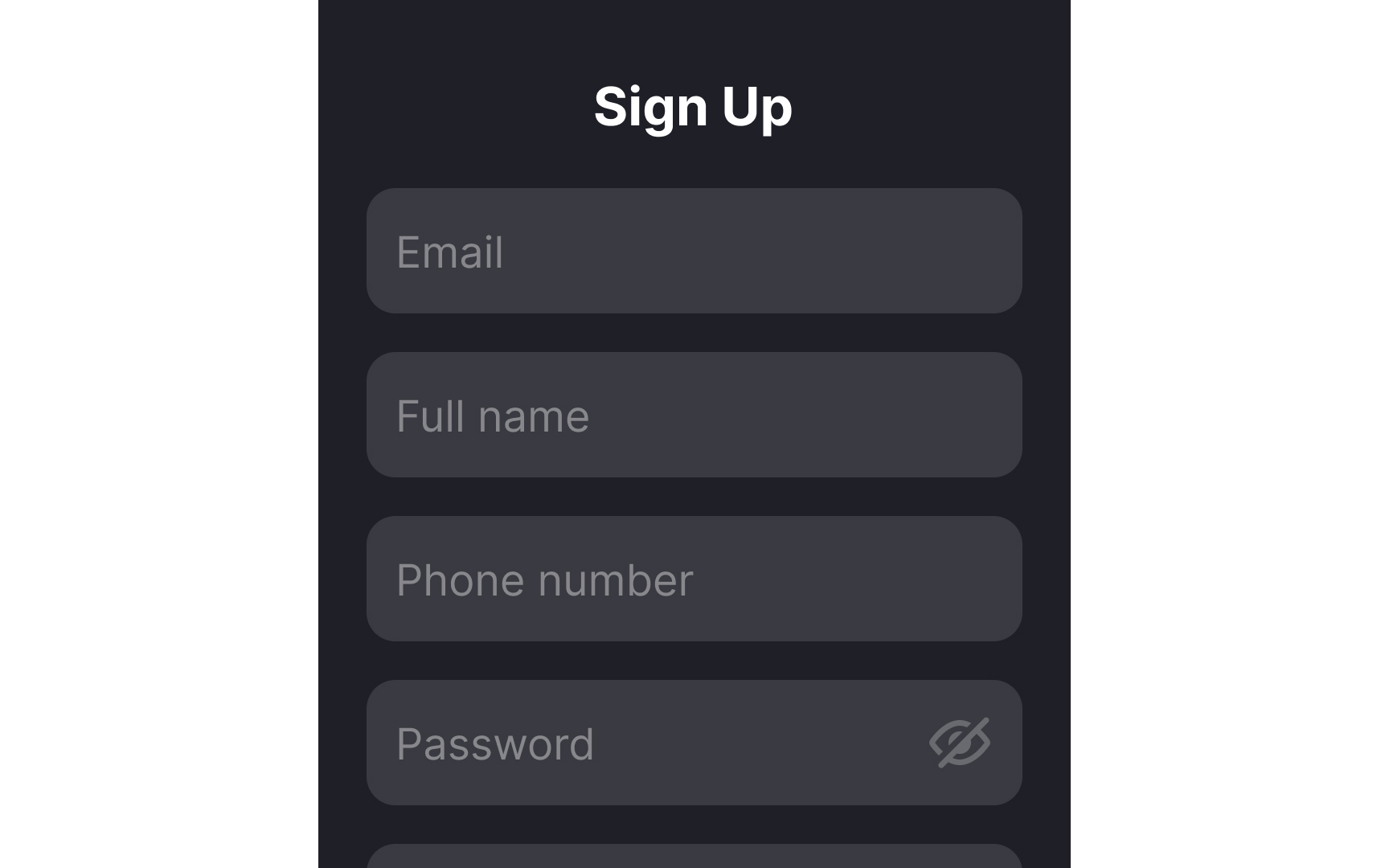
Don’t add extra steps to your
You can always ask users for more information later contextually. For instance, if your platform offers personalized recommendations, you could prompt users to specify their preferences after they've created their account.
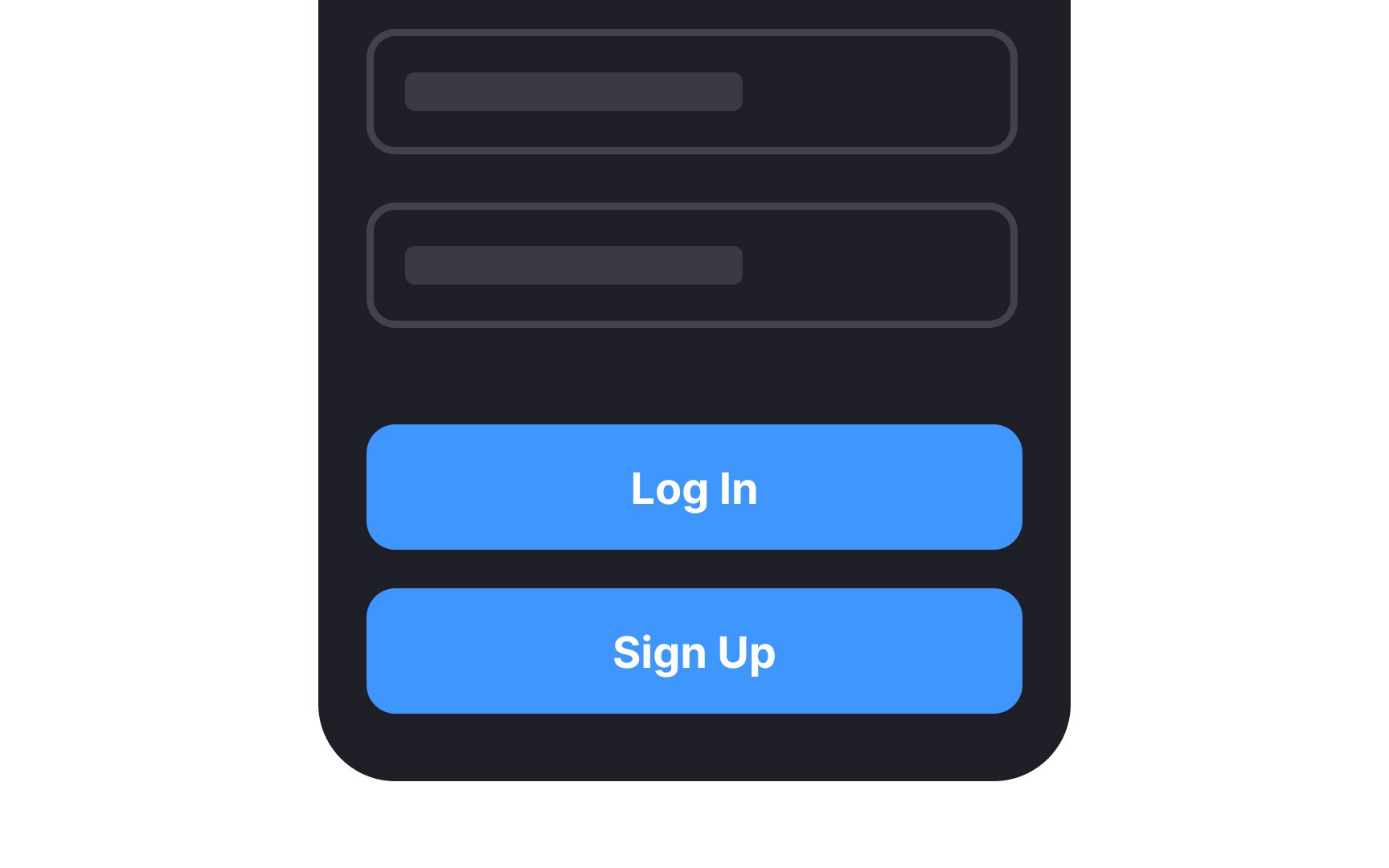
Pro Tip: Don't make users navigate to a new page to sign up when you can embed the form in their current page.
Failing to differentiate between
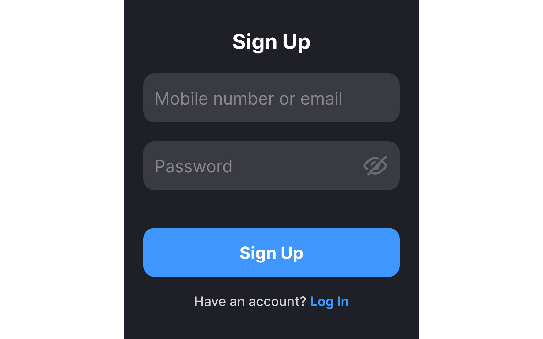
Make sure users understand how to switch between pages. Place the "Don't have an account? Sign Up" text below the form, so it's easy to spot but doesn't steal users' attention from the main content.
Pro Tip: Make sure the signup and login forms link to one another so that it’s easy for users to switch between the two functions.
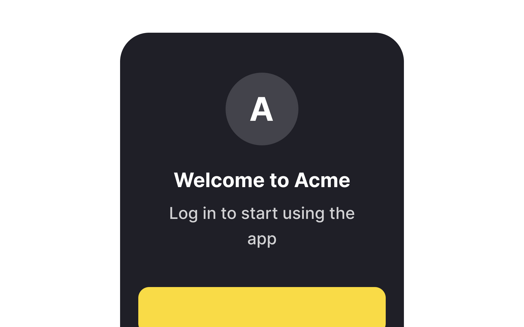

You need to give users a compelling reason to sign up for your product. Make it clear to them what the advantages of creating an account are to increase the likelihood that they’ll create an account. Welcome screens are an ideal place to remind them of the benefits they’ll get by
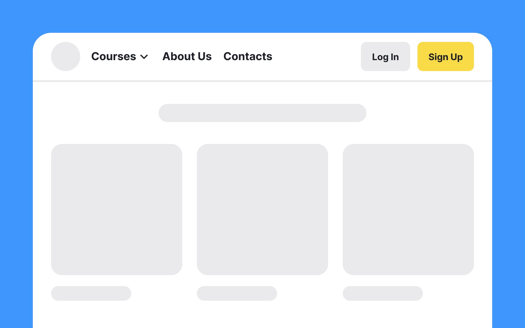
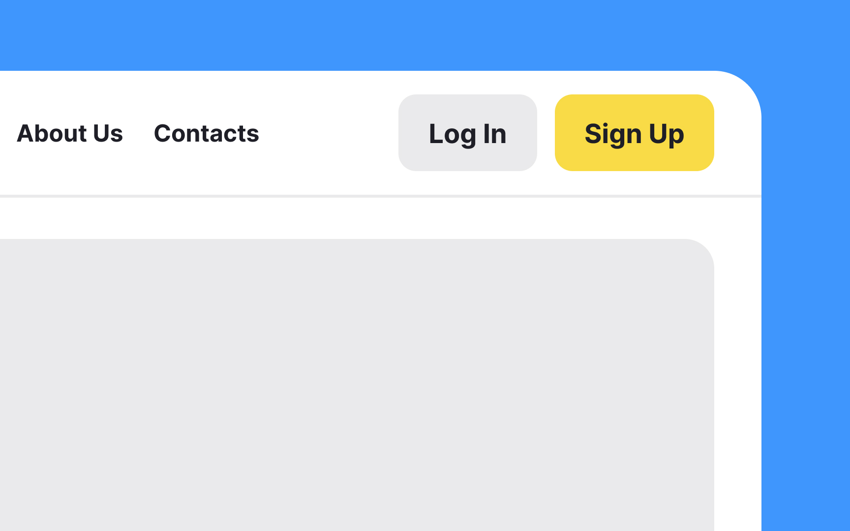
In many digital products, the
While the exact "sweet spot" might vary depending on your layout and user flow, a common
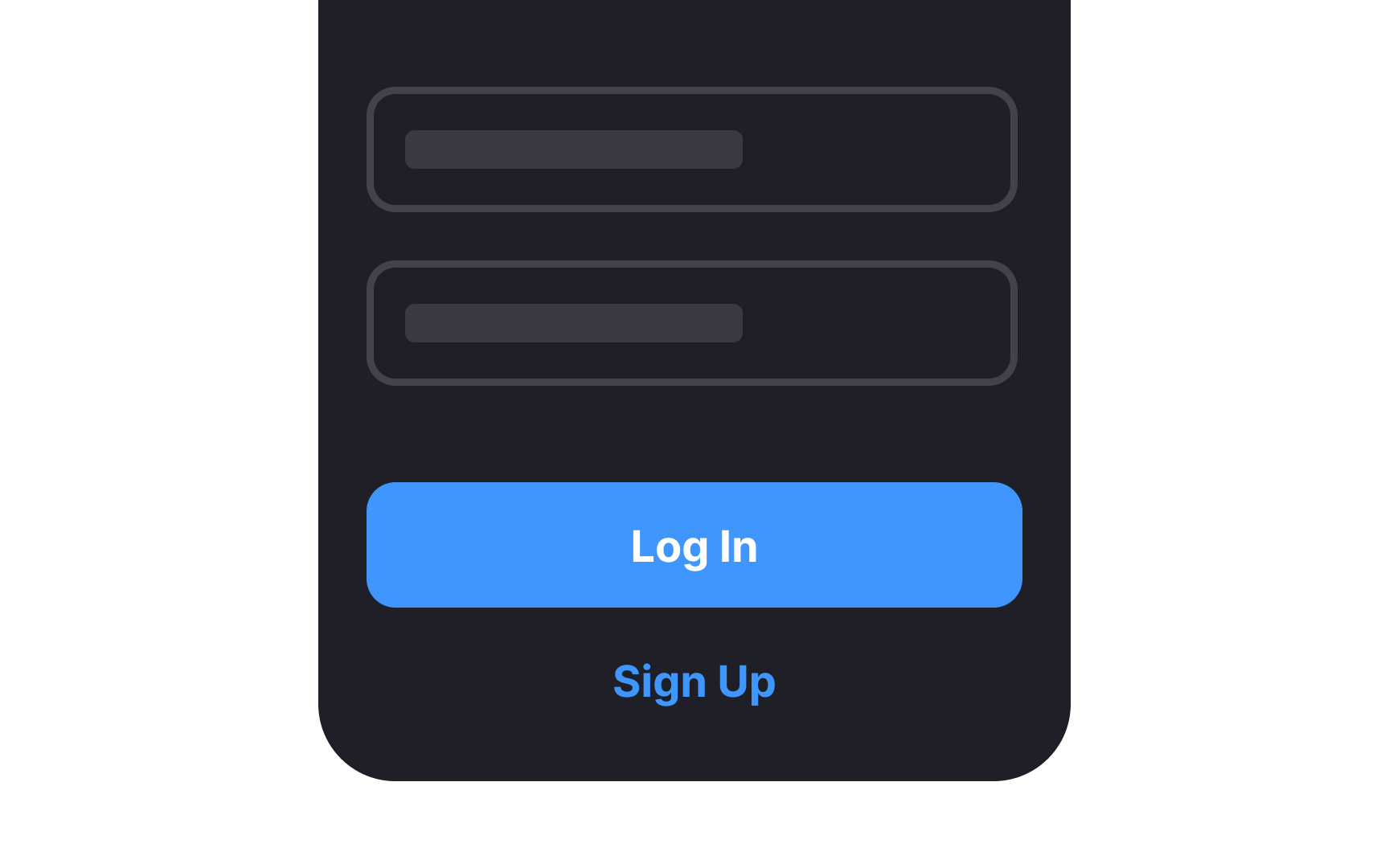
Pro Tip: The main brand color can come in handy here to draw users' attention to the Log In and Sign Up buttons.

The call-to-action (CTA) labels on your
Pro Tip: You can also experiment with more descriptive or engaging labels, such as "Join the Community" for sign-up or "Welcome Back" for login. Just ensure the terms are clear and straightforward.
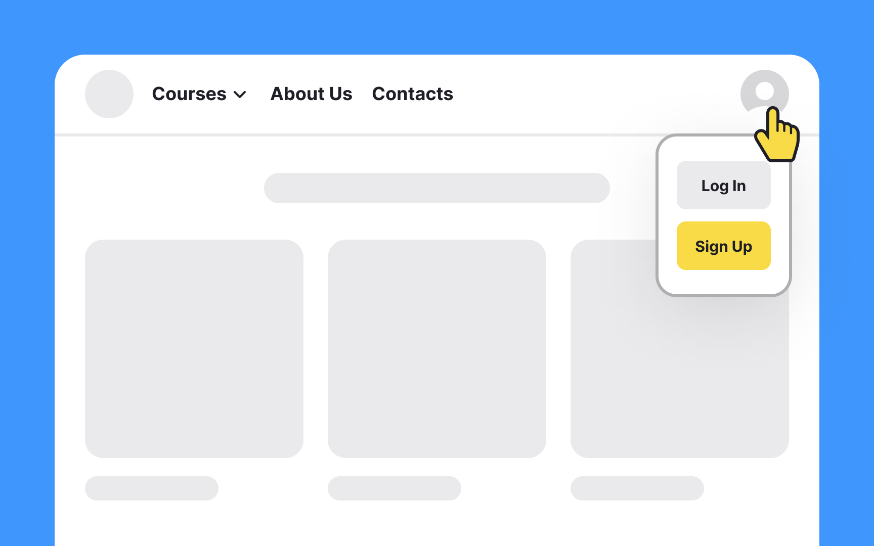
While the actions of logging in and
Button hierarchy isn't merely an aesthetic choice; it serves a functional purpose. Utilize contrasting colors, size variance, and strategic positioning to differentiate between the two actions clearly. For instance, a prominent Log In button on the

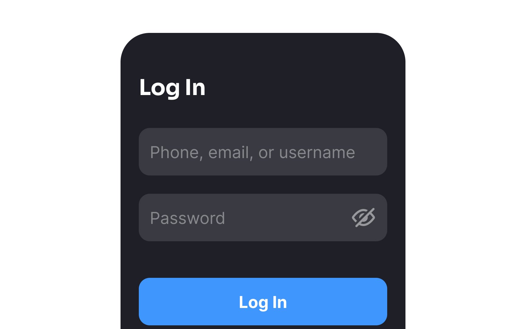
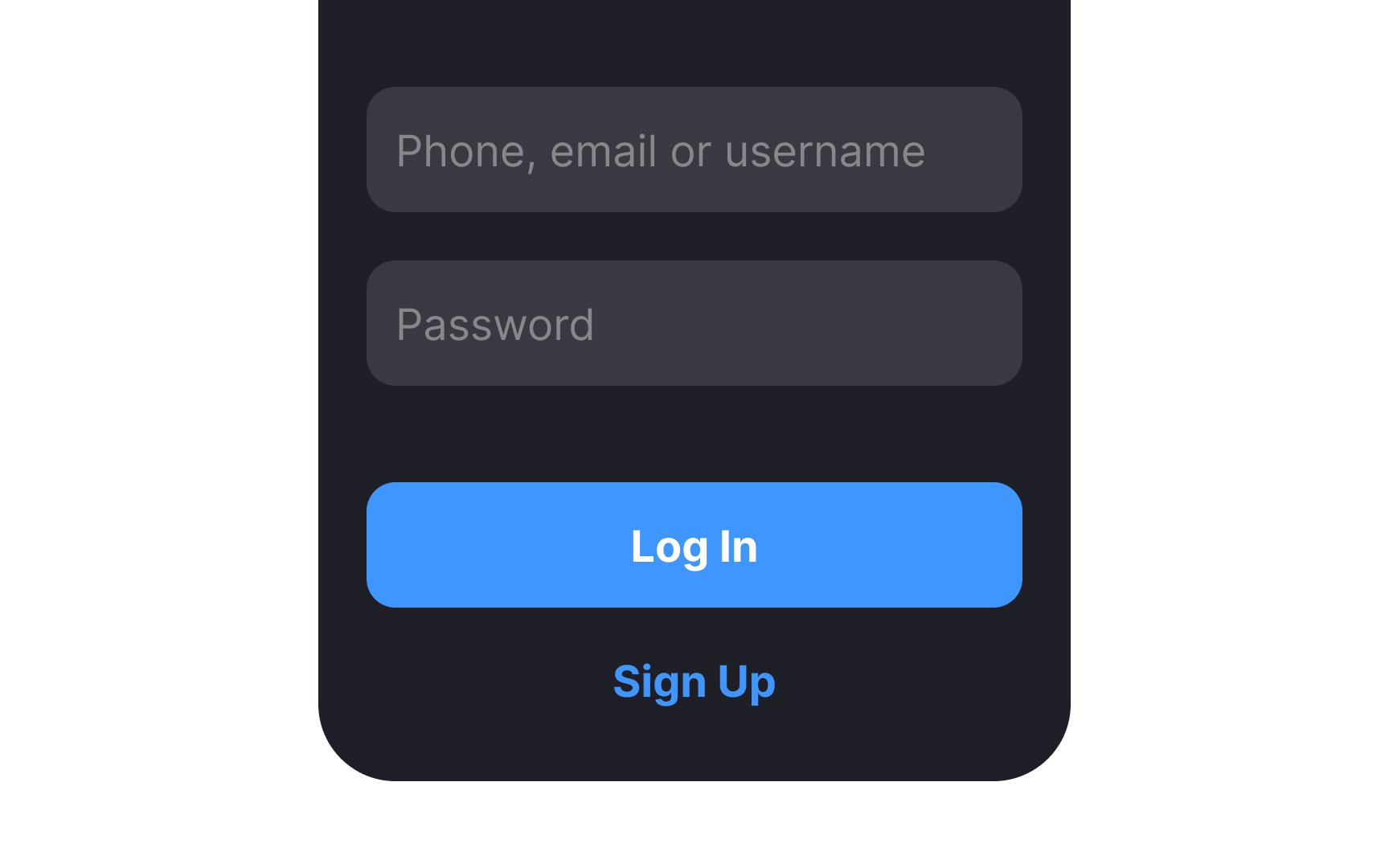
While usernames offer a layer of privacy, they are often more difficult to remember than email addresses or phone numbers, especially if they're not frequently used. This can result in failed
By offering a variety of login options such as email, phone number, or even social media accounts, you give users the flexibility to choose the method most convenient for them. This reduces friction, improves user satisfaction, and helps retain users in the long run.[3]
Including an option to log in via a username is still valuable, but it should be just that— an option, not a requirement.
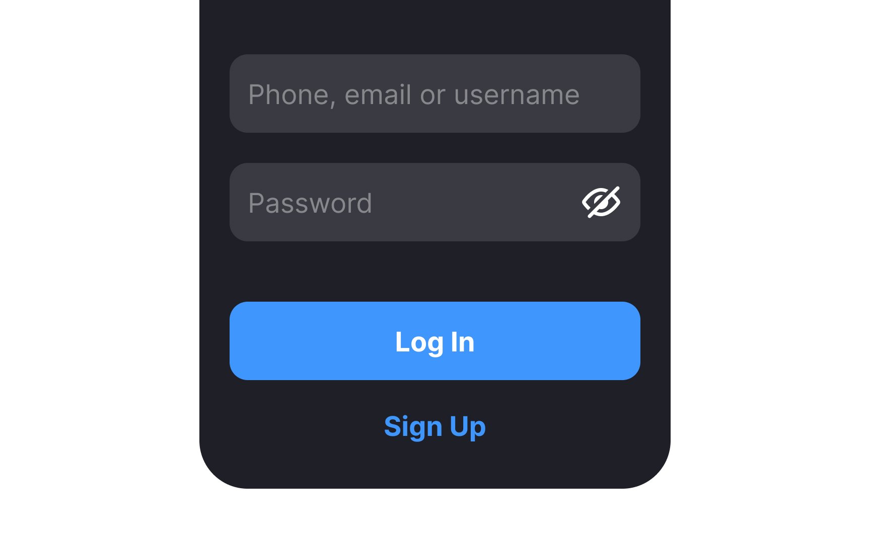
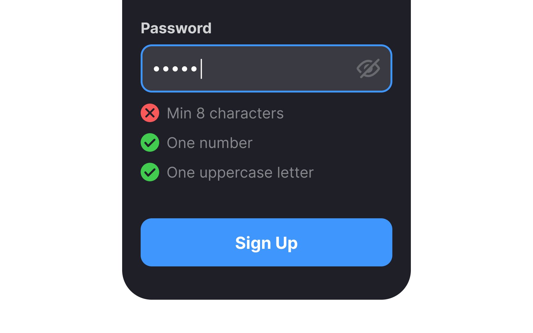
It’s so easy to make a mistake when inputting a
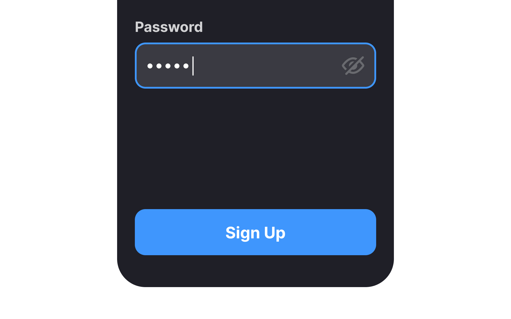
Pro Tip: Always hide the password by default.
Offering users the convenience of remembering their
However, for websites where the stakes are high in terms of security, like banking or healthcare platforms, there's a need to strike a balance. While it may not be advisable to keep users always logged in, you can offer to remember their username. This speeds up the login process without compromising security.
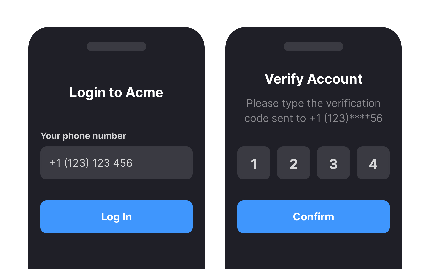
To bolster this approach, consider implementing an additional layer of authorization, such as two-factor authentication (2FA). When users attempt to log in, a unique code could be sent to their registered
Pro Tip: When security is a major priority, obscuring part of the username with asterisks makes the login process faster while also protecting users.
As users
Additionally, consider providing a
References
- What Factors Influence Conversion Rates? | The Jotform Blog | The Jotform Blog
Top contributors


Topics
From Course

Share


Similar lessons

User Onboarding

Requesting User Permissions

Allow signing up with social media profiles
Nearly 80% of users favor social logins for any website. That’s good news since nearly 90% of users are frustrated by constantly having to set up new accounts.[2]
Sociallogin lets users use their existing Facebook, Twitter, Google, LinkedIn, or other social media logins to create an account on your site. It drastically speeds up the registration process and greatly reduces the risk that they’ll forget their login information when returning to your site.
However, keep in mind that social logins can raise privacy concerns while offering limited user control over their data.