Best Practices for Designing UI Menus
Learn the best practices for creating intuitive and navigable UI menus
Menus are an integral part of website and app navigation. They help users find content and use features. Well-crafted menus feel intuitive and easy to navigate.
This is because users are used to certain design patterns. You can think of a design pattern as a general, reusable solution to a problem. For example, adding filters or autocomplete to longer lists or keeping the number of items low.
A good menu design helps users understand the product better and gives the product credibility. And on the contrary, poor menu design can result in fewer users for the product.
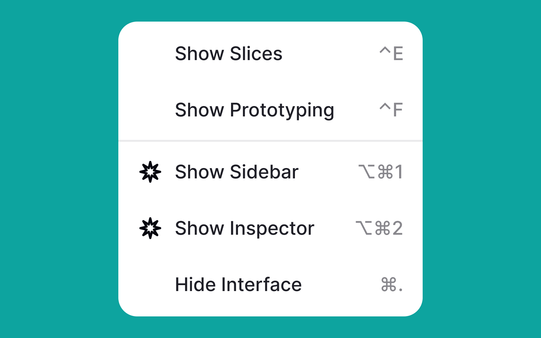
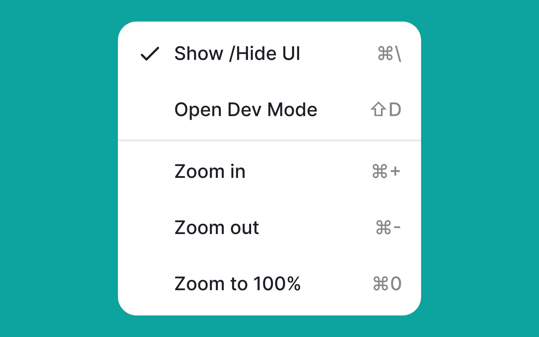
When you have enough screen space, there's no need to tuck away
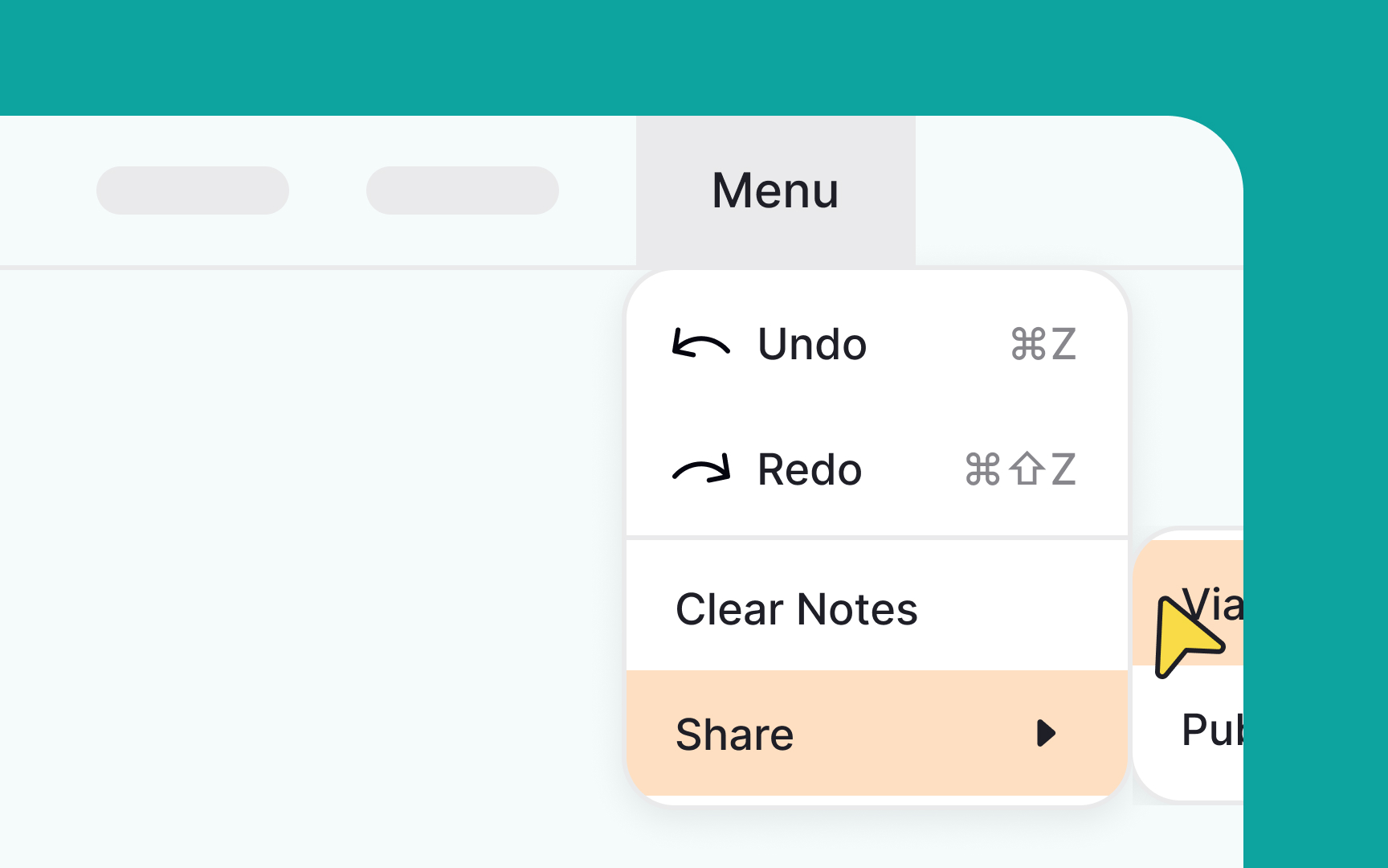
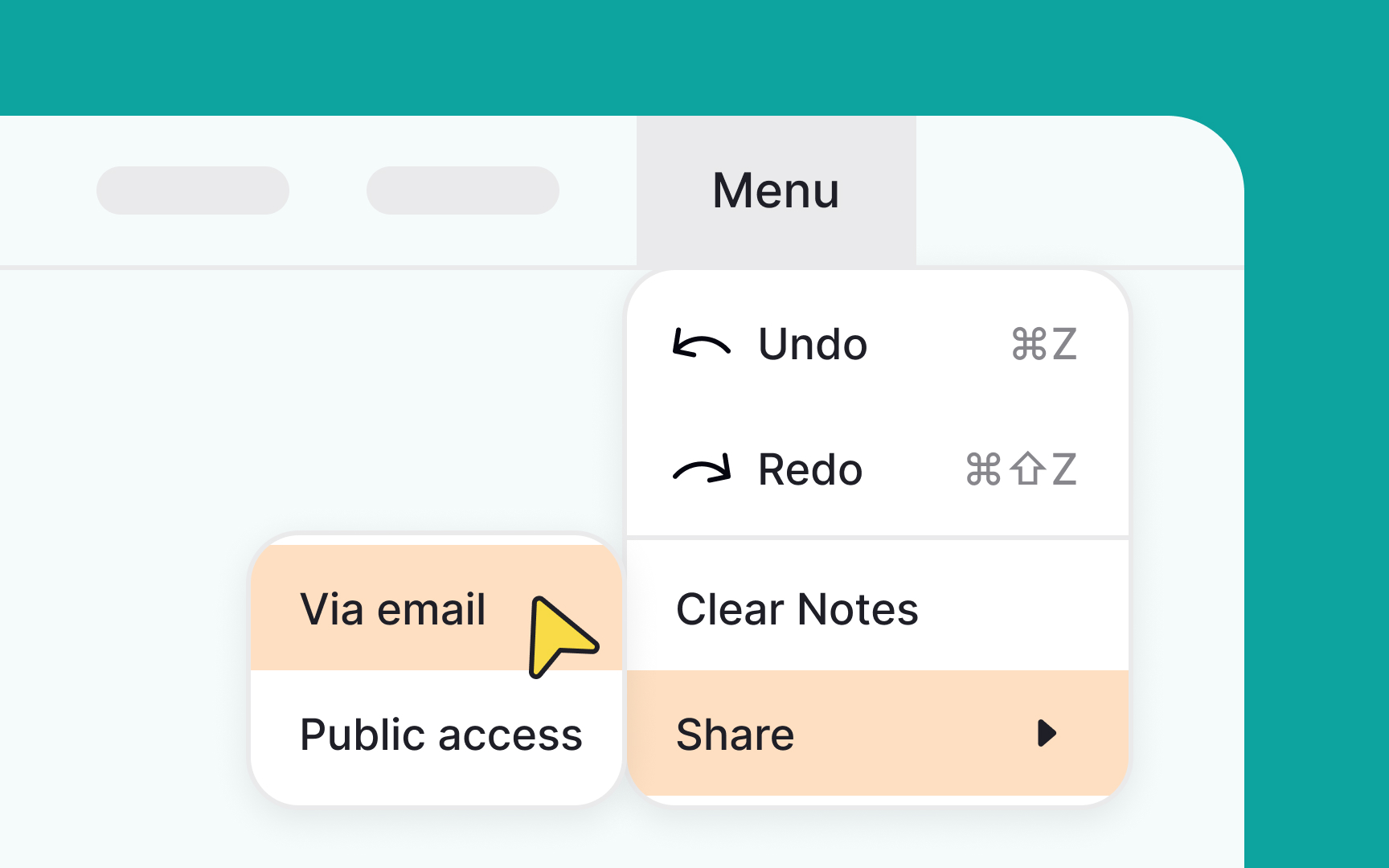
Keep it simple and straightforward: place the most frequently used options at the top of the menu. This way, users can quickly find what they're looking for without having to scroll, making the whole experience more efficient and user-friendly.[1]
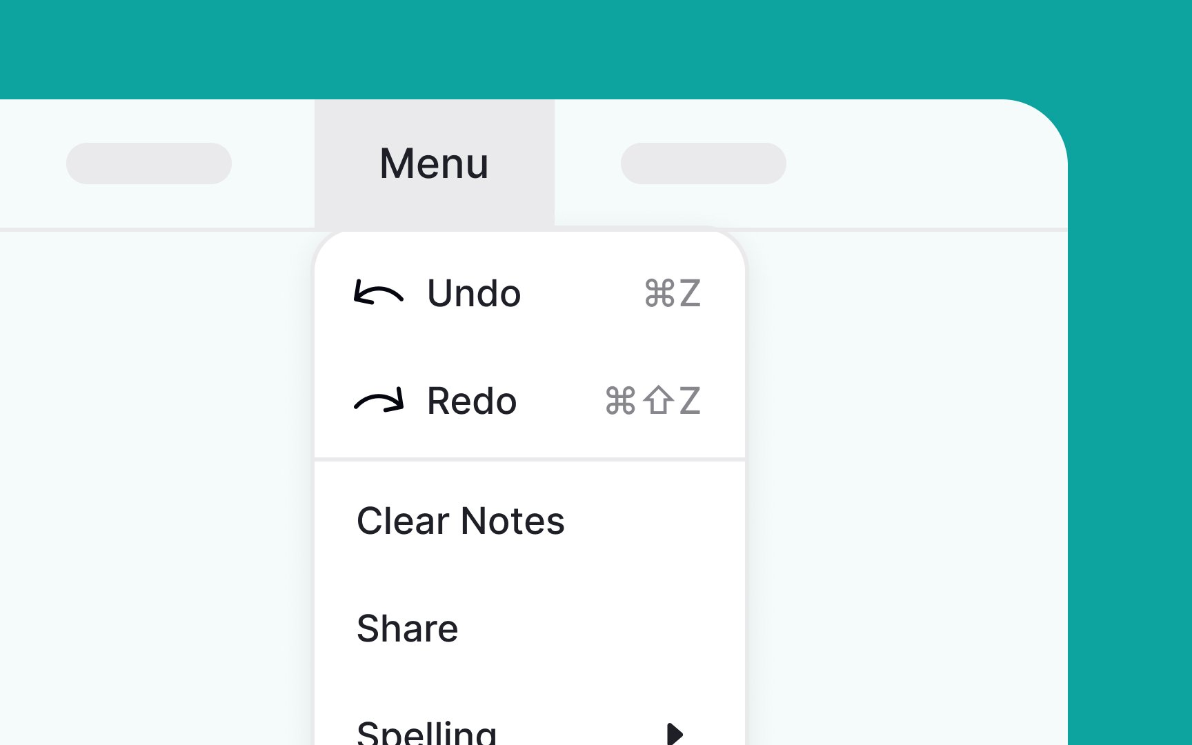
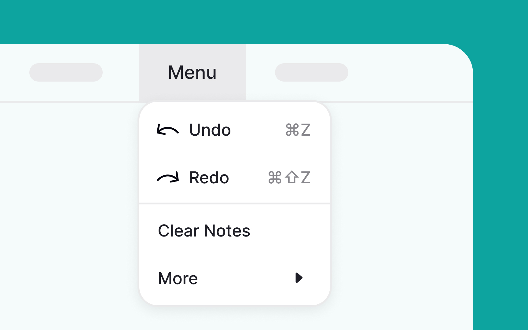
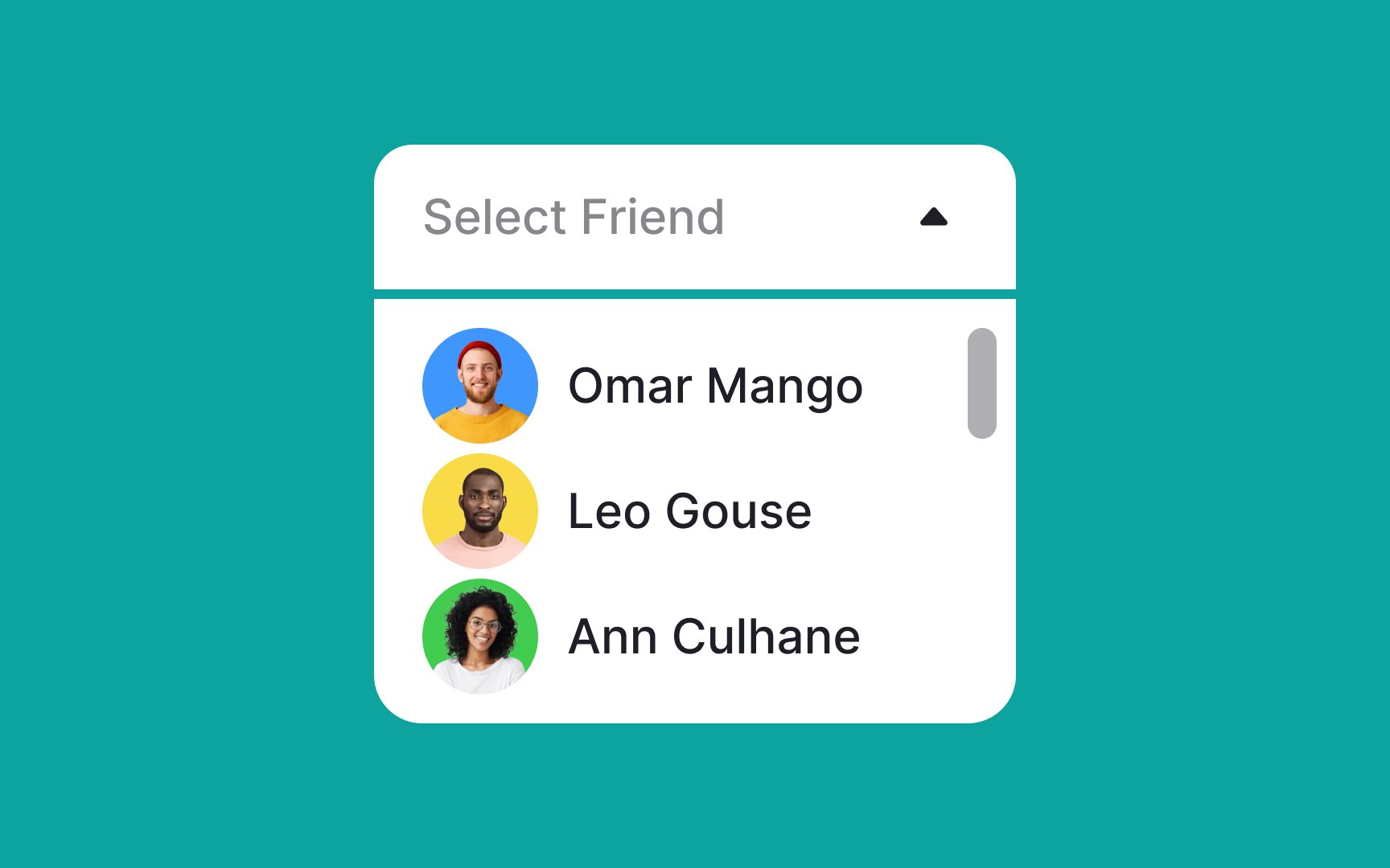
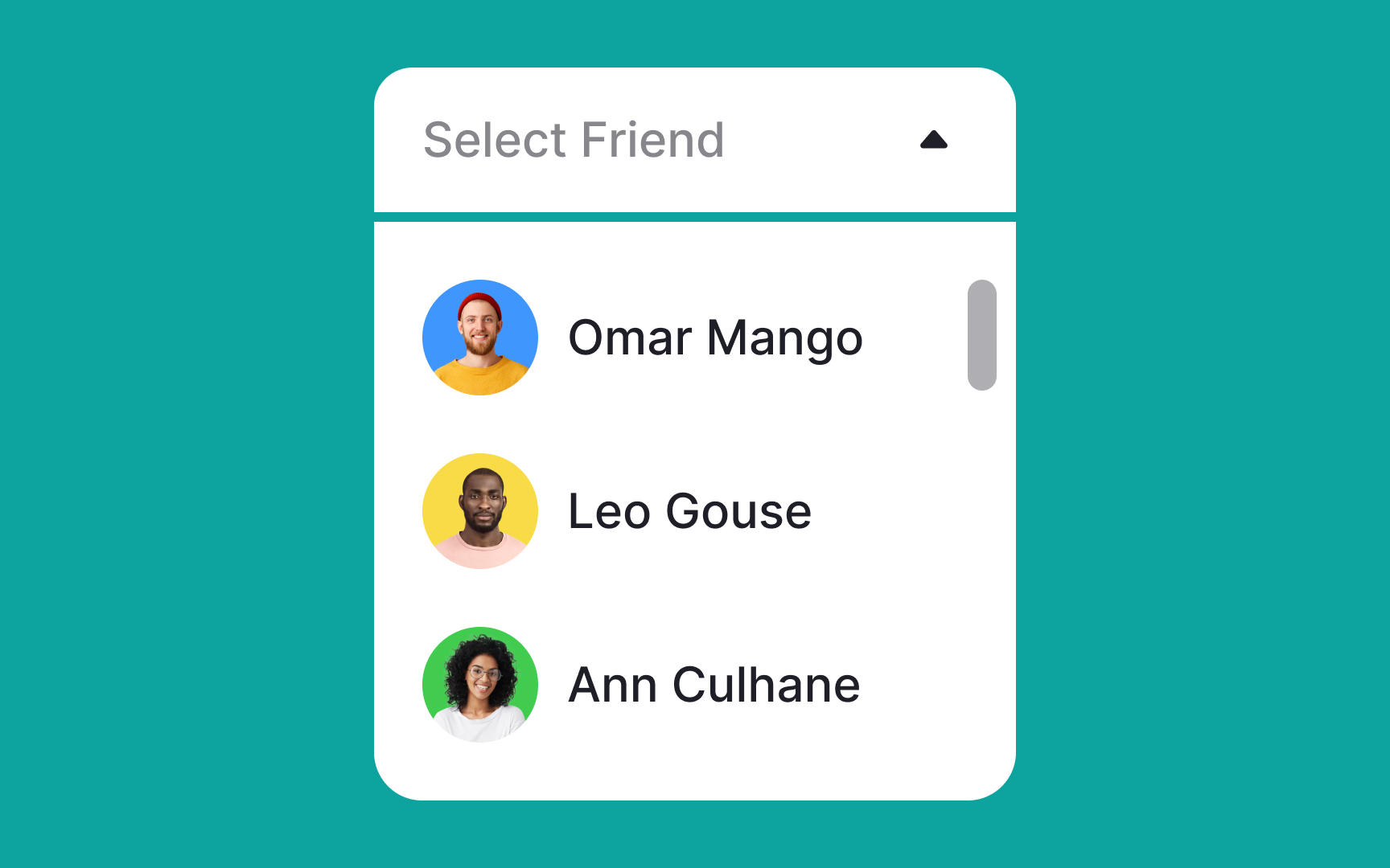
Multiselect menus empower users to select multiple options at once, enhancing flexibility and choice. To improve usability, ensure that users can clearly see all their selected items and have the ability to easily remove any of them directly from the
Requiring users to backtrack just to deselect an item interrupts the flow and adds unnecessary friction. By simplifying the selection and deselection process, you can offer a smoother, more intuitive user experience.
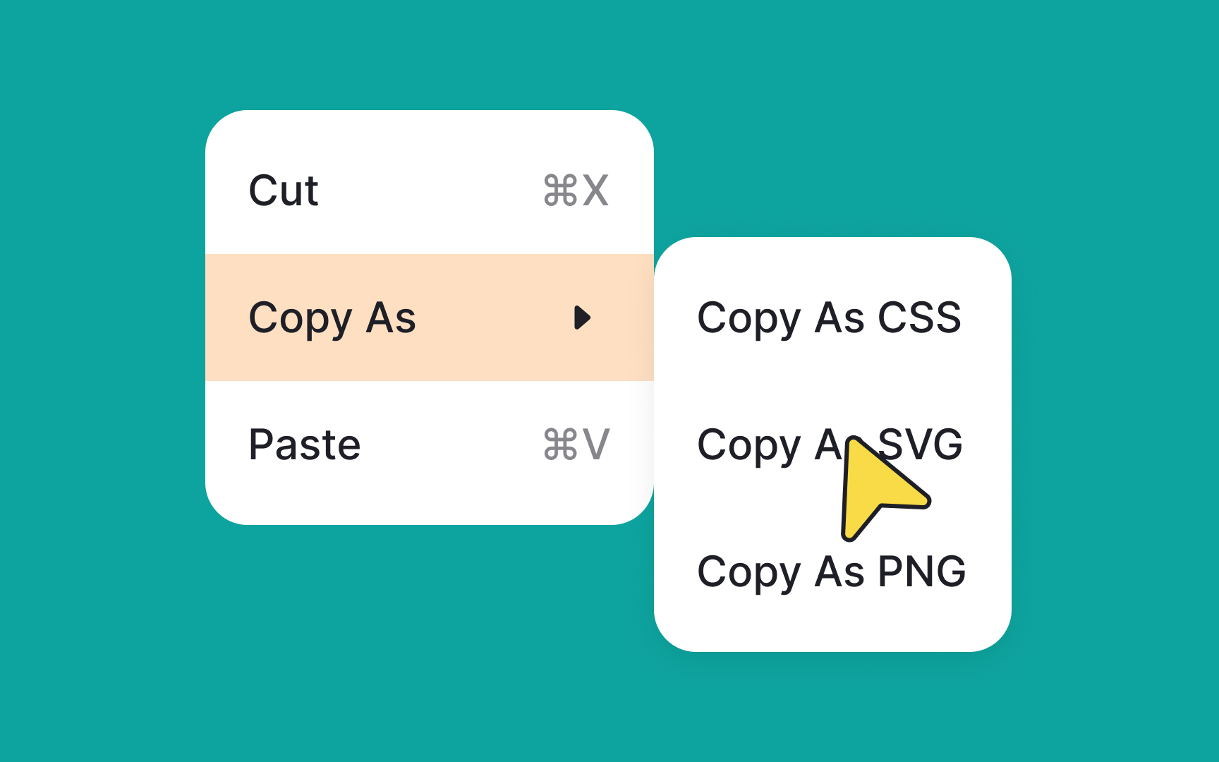
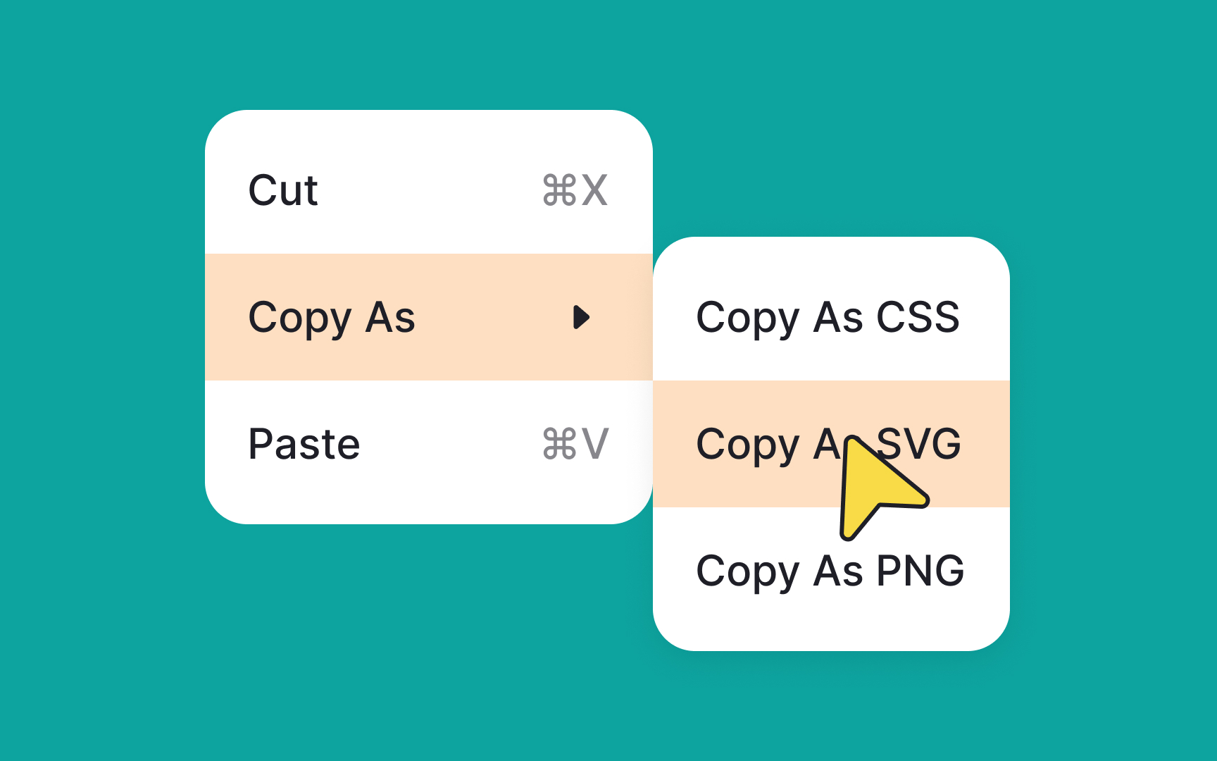
When you're designing cascading menus, it's essential to be mindful of the available screen real estate. Utilize wireframes or mockups to anticipate how the menus will unfold, ensuring there's enough room for each option to be clearly displayed.
You can use design tools that allow for dynamic adjustments, so you can simulate different scenarios. This way, you can adjust the direction or structure of the menus based on the actual space constraints you encounter.
When choosing
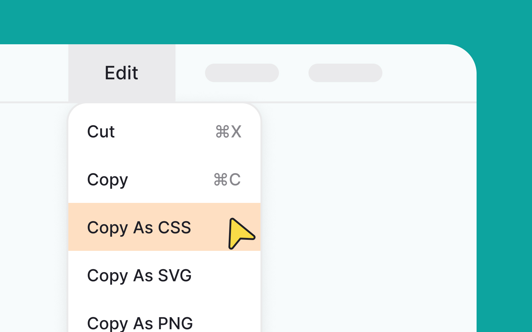
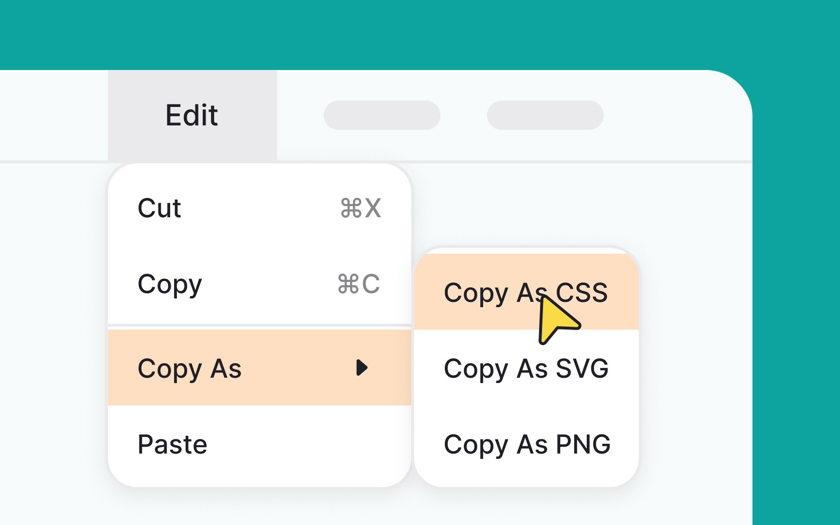
This means that you need to consider the most important actions — like copy, paste, or save — and leave them in the primary list. Less critical items can go on the second, less visible, hierarchy level. A menu list like this will help users spot a needed action much faster.
Great design requires balance. Make sure the
In the first place, keep
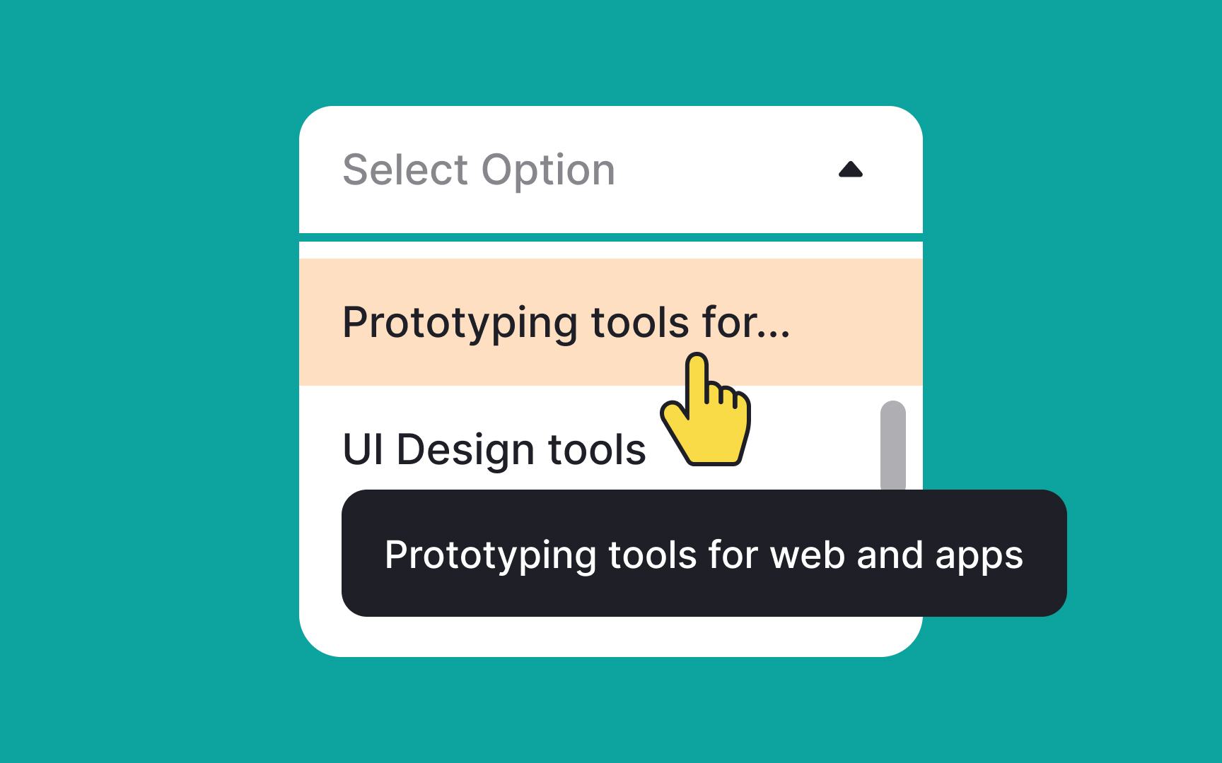
If you absolutely can't avoid long labels, consider truncating them and using tooltips to reveal the full text. This keeps the menu layout clean and consistent. On mobile devices, where space is at a premium, ensure that labels are as concise as possible without losing clarity. If a label overflows to the next line, it's a sign that it needs further refinement.
In Google's
Elevating menus helps specify them as actionable or information-rich elements, effectively drawing attention away from the rest of the interface. The use of shadows and color contrast further accentuates this visual layering, making it easier for users to navigate and interact with the
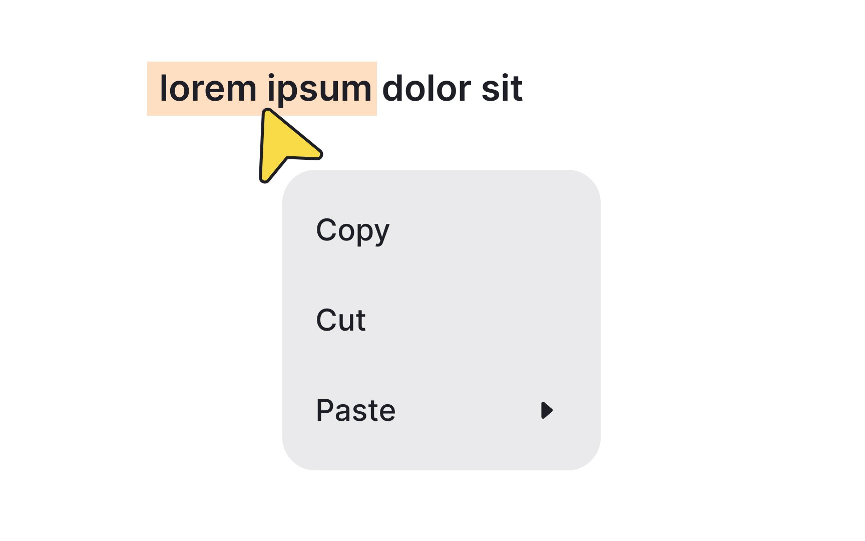
To create user-friendly menu labels, use conventional labels such as Paste instead of Insert. The labels should be relevant to the menu and simple so that even non-native speakers can understand them.
And most importantly, test your labels. What seems clear to you might confuse your users. Research methods such as card sorting can help you get feedback on your labels.[5]
Pro Tip: Verbs and verbal nouns are perfect for labels as they imply action.
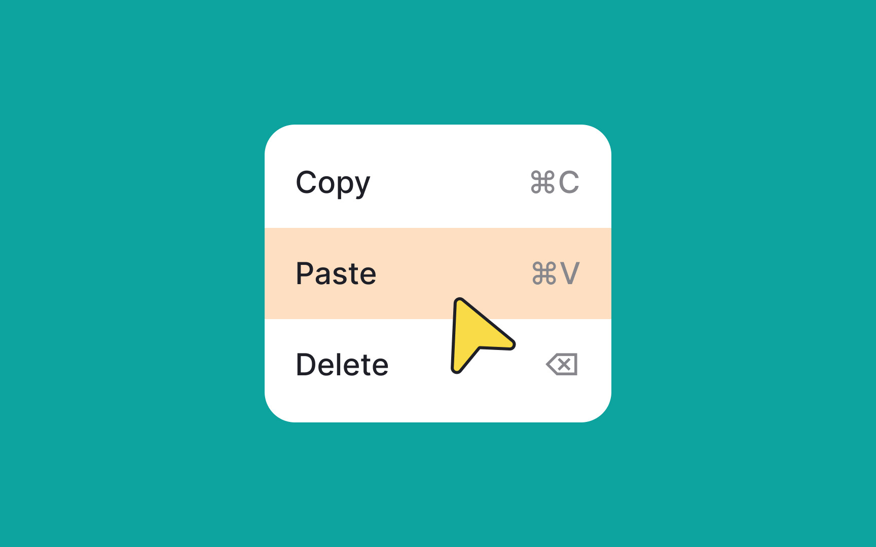
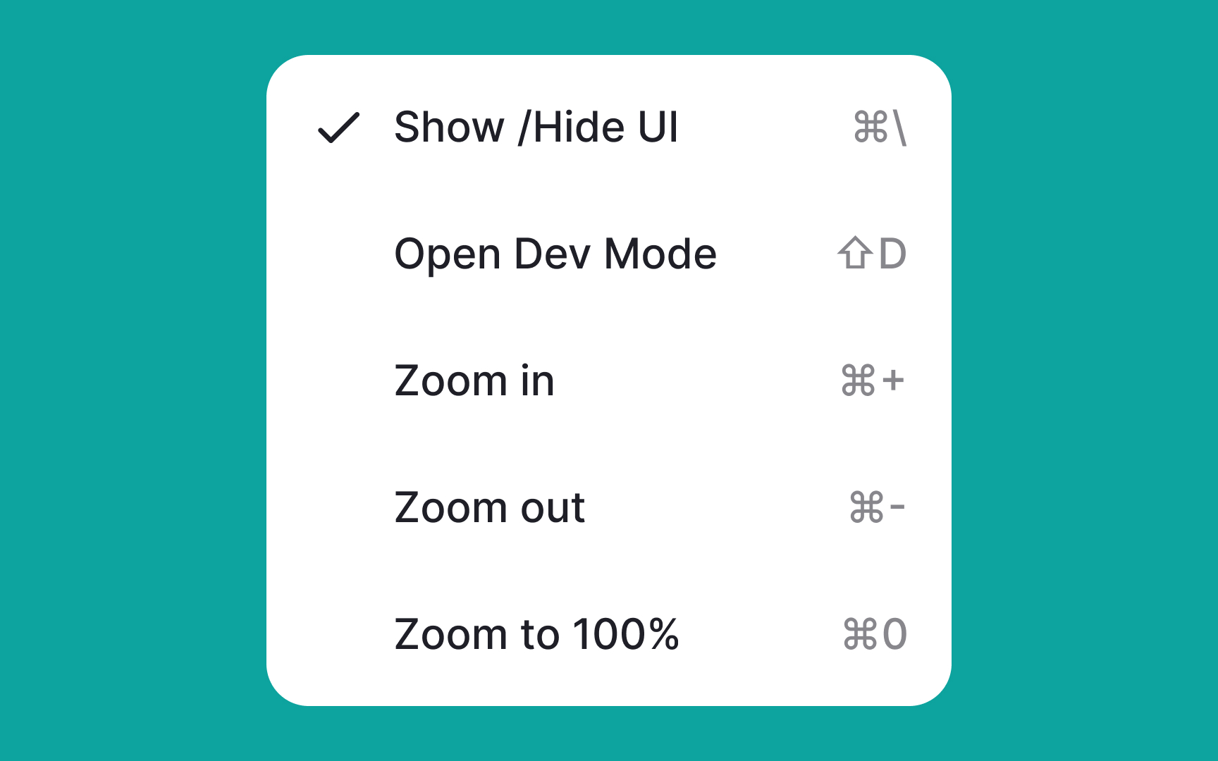
The selection state icon is the mark that indicates what item or items users have chosen in a single-select or multiselect
Most commonly it's either a checkmark or an "X." These symbols feel intuitive to users as that's what we use when we fill out paper forms. Avoid using unconventional marks for selection state icons to not confuse users.
Pro Tip: The selected option can also be indicated with color overlay.
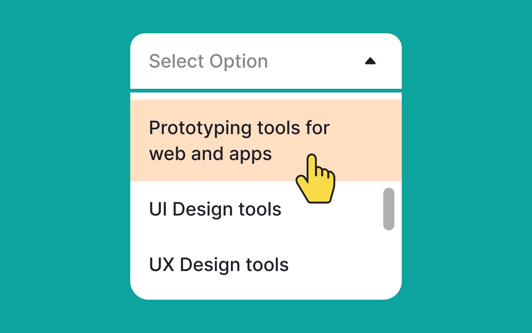
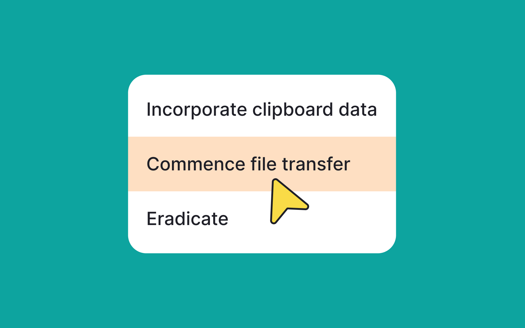
In interactive design, giving immediate visual feedback when users hover over
Commonly, designers opt for
In
Importantly, dividers achieve this without cluttering the
Pro Tip: Color overlays and negative space can also play the divider's role.
References
- Menu Design: 15 UX Guidelines to Help Users | Nielsen Norman Group
- Material Design | Material Design
- Material Design | Material Design
- Avoid Category Names That Suck | Nielsen Norman Group
Top contributors


Topics
From Course

Share


Similar lessons

Login & Signup Flows

User Onboarding
