Types of UI Inputs & When to Use Them
Choose the right input type for every form field to reduce errors and boost completion rates
Forms power nearly every meaningful interaction online. Signups, searches, checkouts, contact requests. The input fields within those forms determine whether users breeze through or abandon halfway.
Picking the wrong input type creates friction. A single-line field where someone needs to write a paragraph. A plain text box for dates when a calendar picker would prevent formatting headaches. A required field with no indicator, leaving users guessing why their submission failed.
The right input does more than collect data. It guides behavior. It sets expectations through visual cues like field size, icons, and placeholder examples. It reduces cognitive load by handling formatting automatically rather than forcing users to remember whether phone numbers need dashes or parentheses.
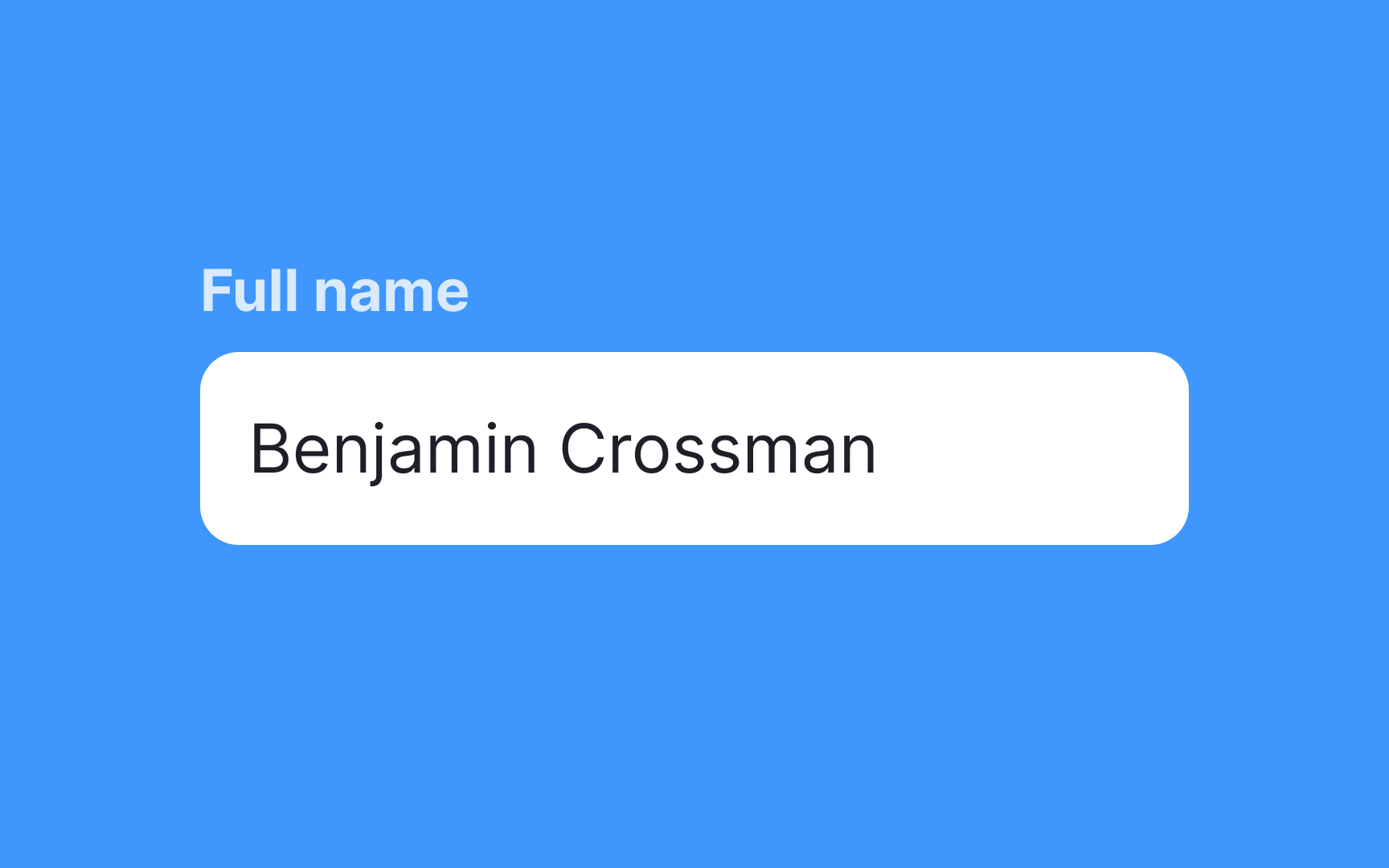
The most basic type of input is the single-line input. As the name suggests, single-line
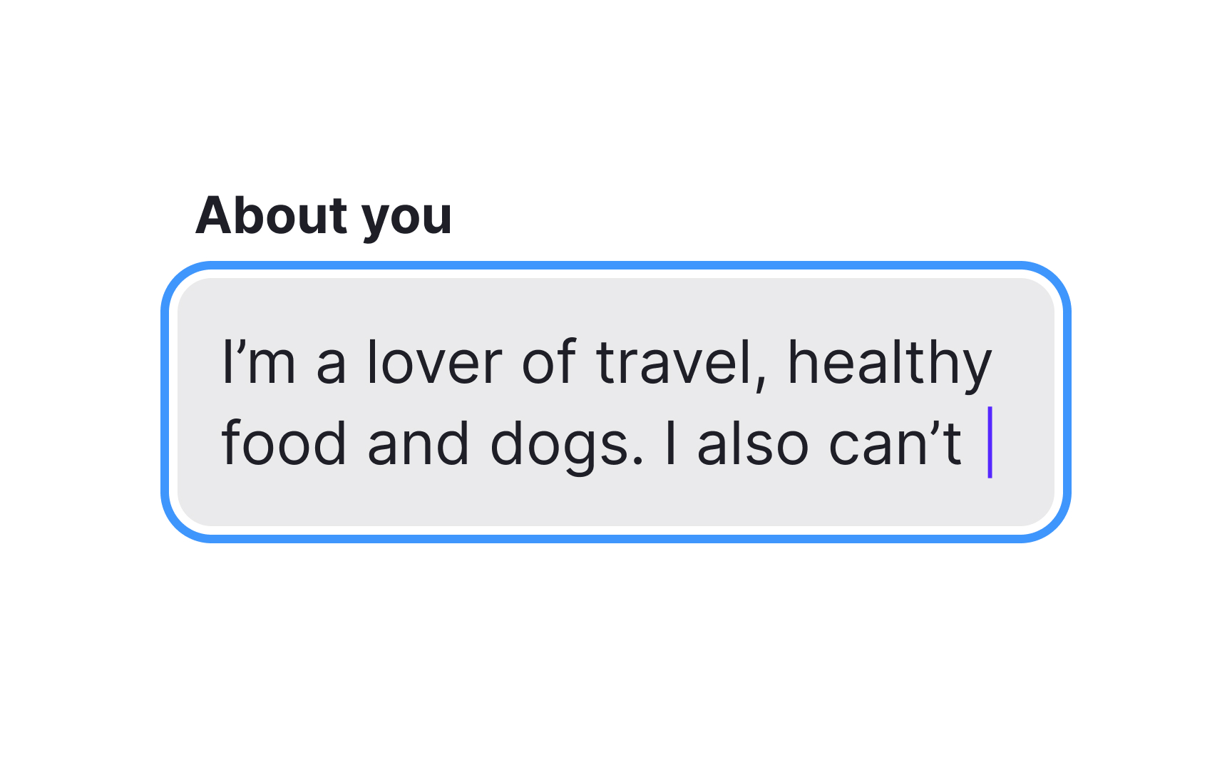
If users need to enter longer-form answers, then multi-line
They're an excellent option for compact layouts that still require users to enter large amounts of text, for example, when collecting feedback on a survey.
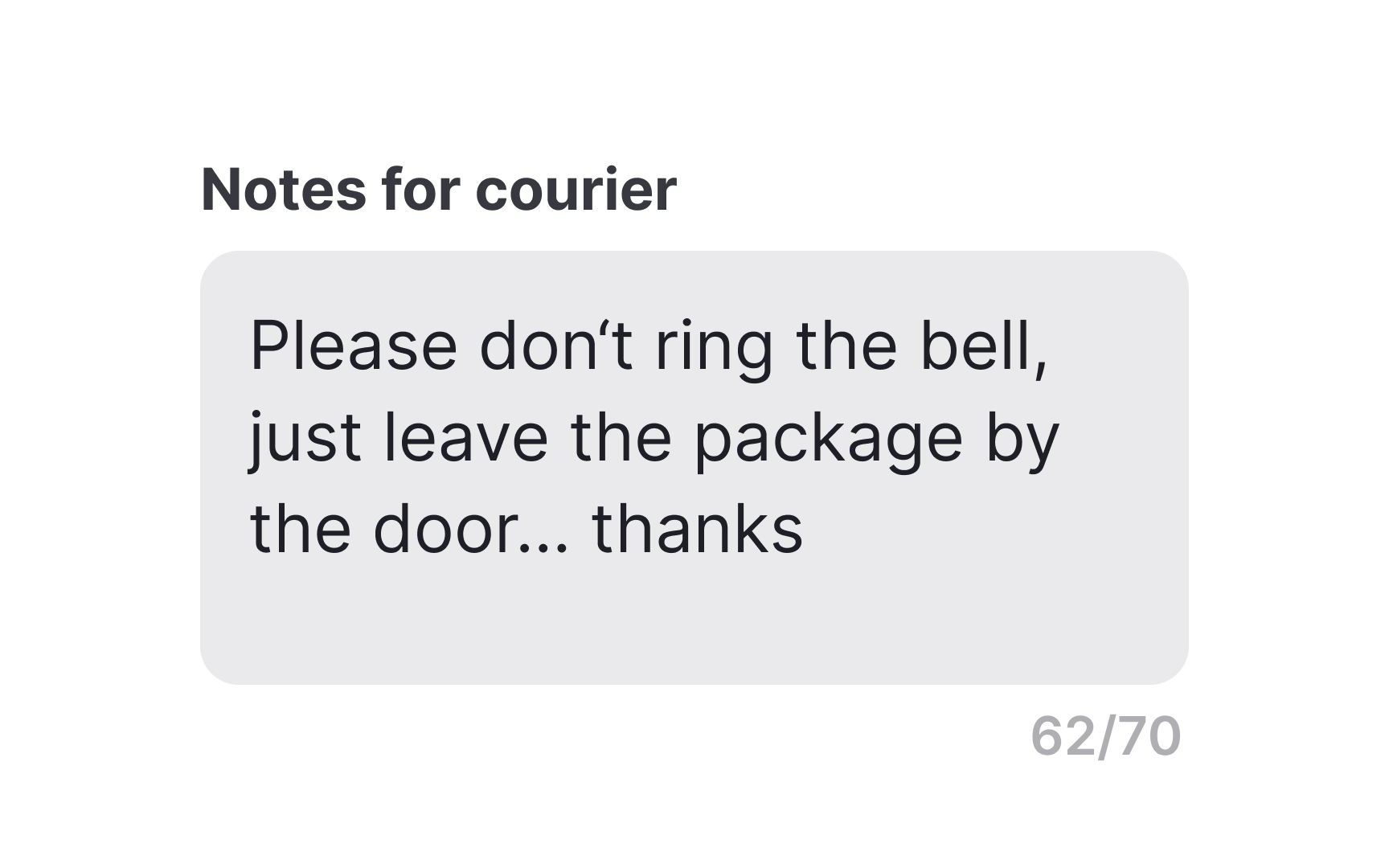
Like multi-line
The advantage of text areas over multi-line inputs is that text areas encourage longer responses with a larger initial size.
Pro Tip: If there is a limit to how much users can write, use helper text to indicate the character limit.
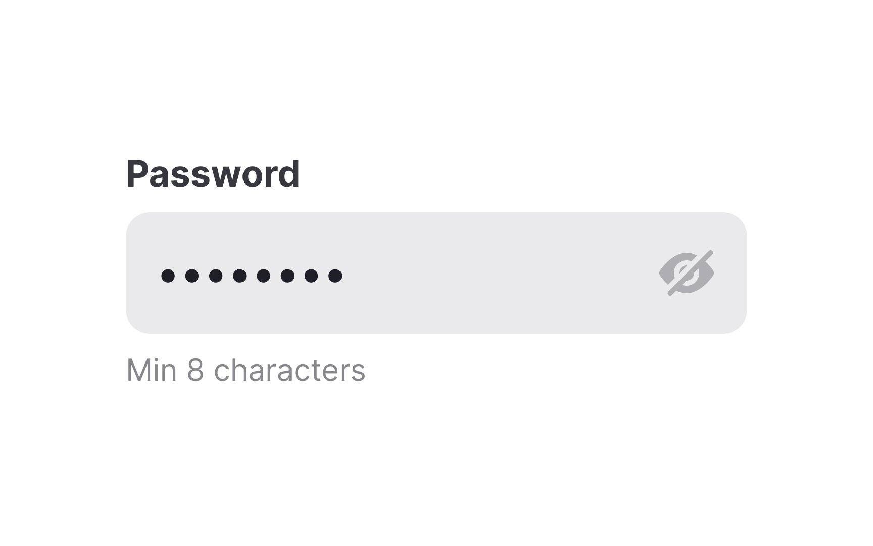
Text
It’s a good idea to give users the option to reveal the password they’ve entered (turning it back into real characters) if they need to check whether they’ve typed the correct password.
Pro Tip: To prevent users from not complying with password requirements, include a helper text next to the label.

Another special type of text input is the search input. Search
Search inputs are usually indicated with a magnifying glass
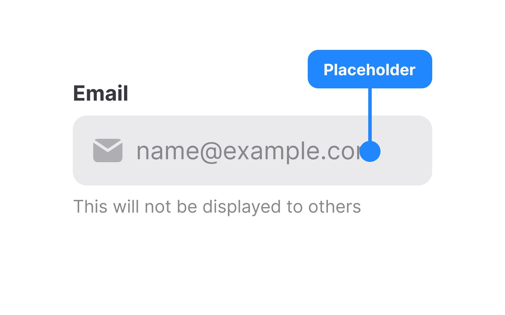
Regardless of the type of text
On complex and rarely used forms, disappearing placeholders are likely to strain users' short-term memory. If they get distracted, switch a tab, and then return to a form, they may not remember the hint. They'd need to remove what they've typed and click away from the input to see the placeholder text again.
To prevent such frustration, always use placeholders in combination with
Pro Tip: Make placeholder text more subtly colored than user-entered content so that users don’t mistake them for data they’ve already entered.
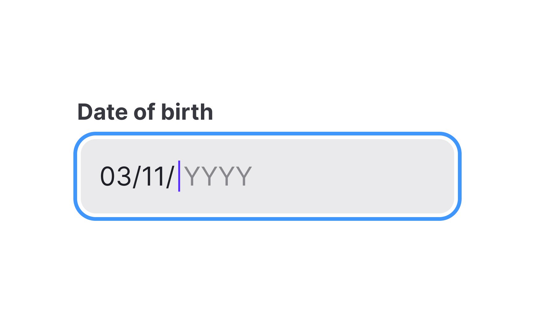
Date
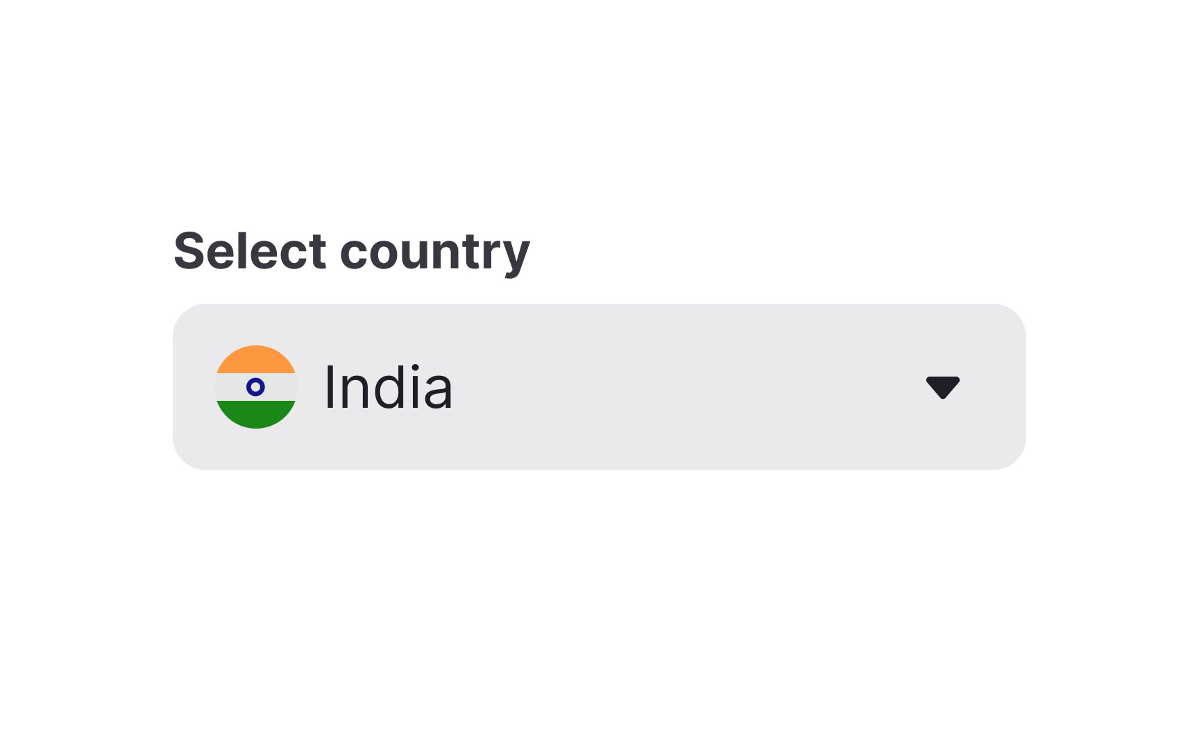
Select
This input type is beneficial for scenarios where there are limited, predefined choices, as it ensures data consistency and reduces input errors. Select inputs are space-efficient, as they only display one option until expanded, making them suitable for situations like choosing a country, state, or category.
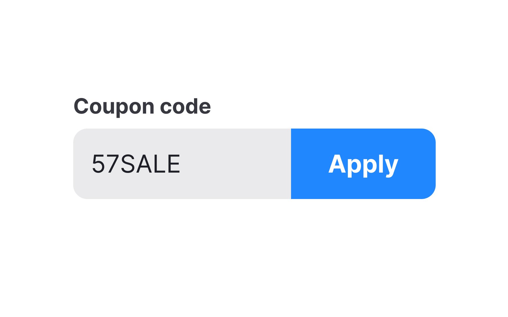
Action
You'll come across action inputs in various contexts. For instance, during online checkout, when users input a coupon code and click "Apply," or alongside the "
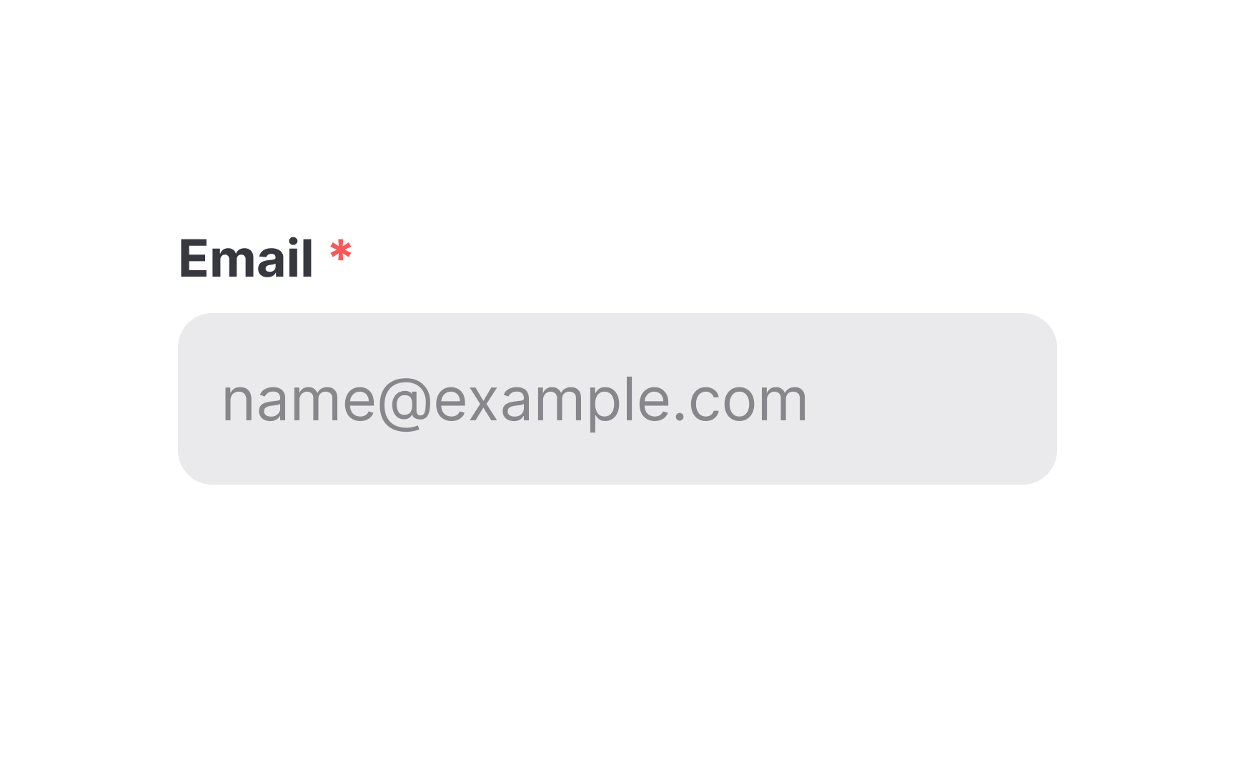
Required
- Should the asterisk follow or precede the input's label? Putting it before the
label may help users of left-to-right languages more quickly identify required inputs while scanning the form. - Should the asterisk be red? Not necessarily, but red is often associated with something that grabs attention. You can use your brand color if it's contrasting enough. The only recommendation is to try to avoid pale gray that users may not even notice.[2]
Pro Tip: To slightly reduce cognitive load, you may also mark optional fields with the word "optional."
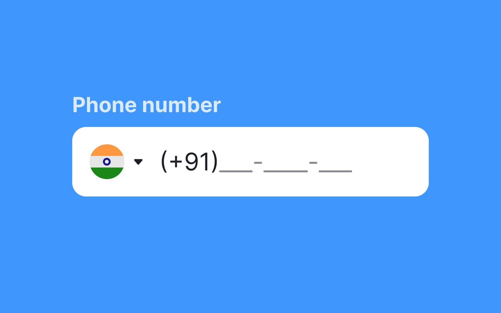
A study by Baymard reveals that 89% of users tend to enter numerical
To prevent validation
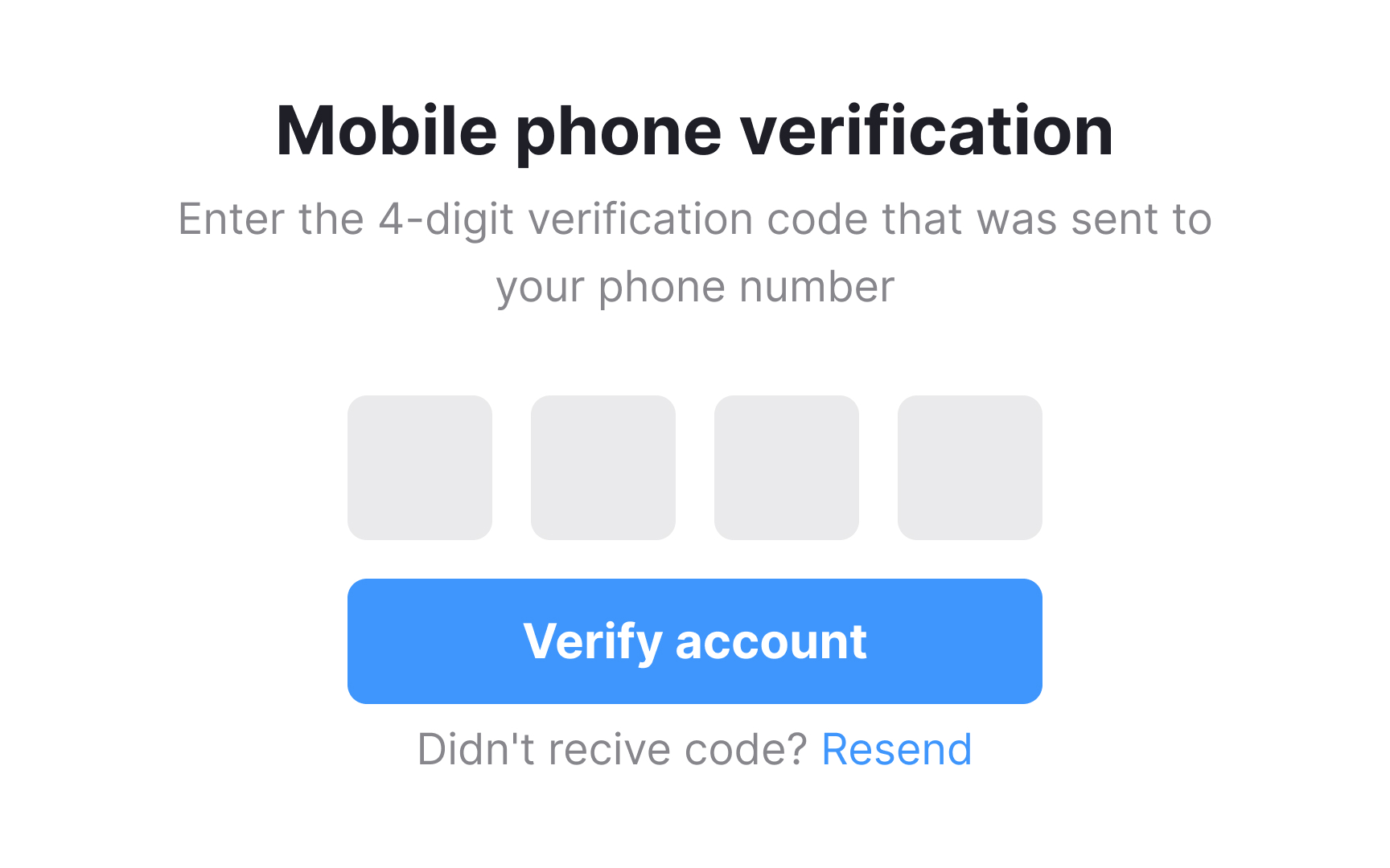
OTP (One-Time
OTP inputs are usually split into several small boxes, each meant for a single digit. This design makes it easier for users to track their progress and correct mistakes. Some versions auto-advance the cursor after each digit, which reduces friction.
If you expect users to paste the full code from a message, make sure your input supports auto-filling and pasting. On mobile, OTP auto-fill detection (available on both Android and iOS) helps speed up the process and prevents typing
Pro Tip: Always make sure the input clearly indicates when the code is incorrect or expired, and provide an easy way to request a new OTP without restarting the process.
References
- Material Design | Material Design
- Marking Required Fields in Forms | Nielsen Norman Group
Top contributors


Topics
From Course

Share


Similar lessons

Common UI Components Part I

Image Terminology
