Best Practices for Designing Lists
Apply layout and alignment principles that make lists easy to read and navigate
A list can present information clearly or turn it into a wall of text that users skip entirely. The difference comes down to how thoughtfully the list is designed. Alignment, spacing, dividers, and visual hierarchy all influence whether users can quickly find what they're looking for.
Well-designed lists guide the eye. Elements line up predictably. Related content groups together. Interactive controls sit where users expect them. The structure feels invisible because everything is where it should be. Poorly designed lists force users to work harder. Misaligned elements create visual noise. Inconsistent spacing makes scanning difficult. Users give up or miss important information.
Lists also need to perform well under real conditions. Long lists require strategies for loading content without freezing the interface. Large datasets benefit from search, filtering, and sorting options that let users narrow results. Different contexts call for different display densities.

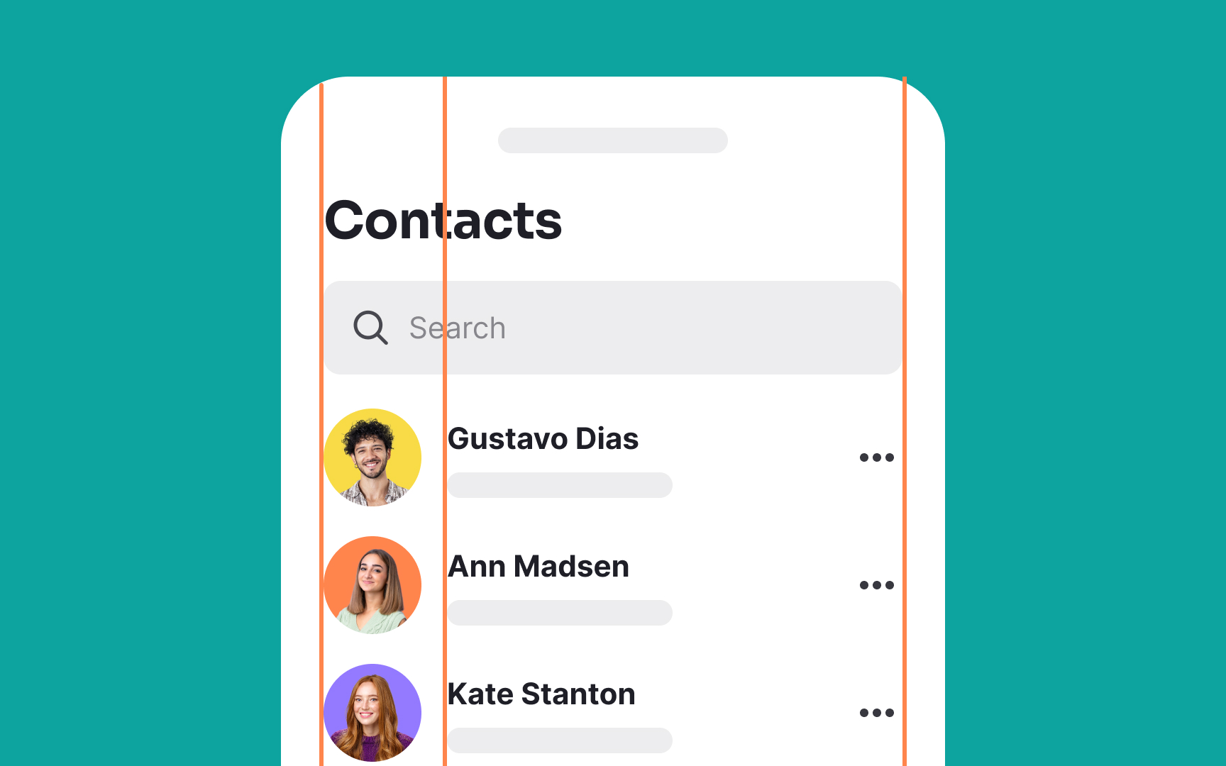
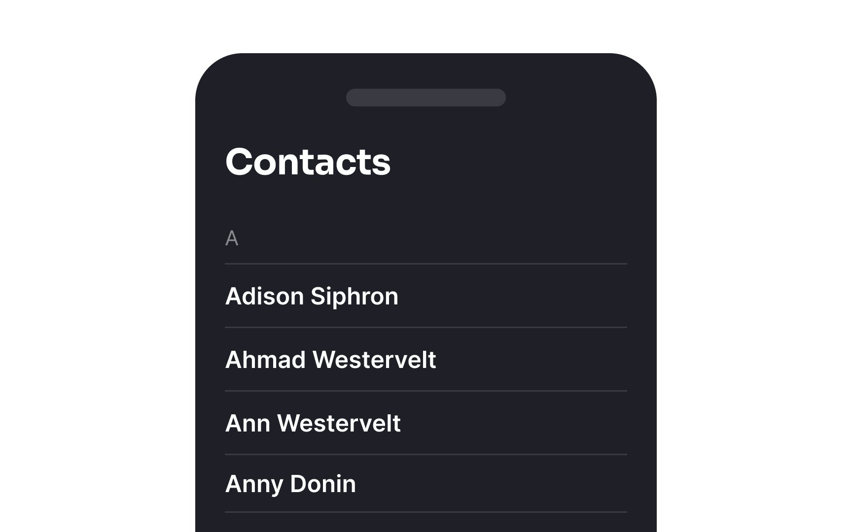
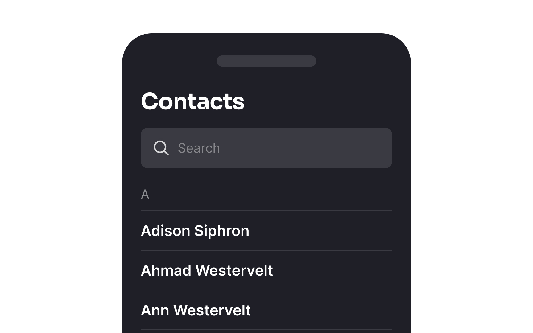
Keylines are invisible guiding lines used by designers to ensure consistent alignment and placement of elements within a layout. Though they don’t appear in the final design, these lines help designers position text, images, icons, and other components in a balanced, organized way. By following keylines, designers create a cohesive visual structure that improves readability and enhances the overall aesthetic appeal of the design.
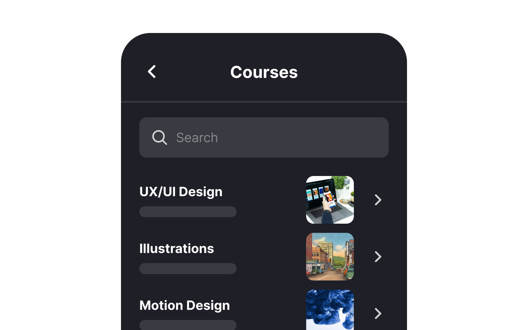
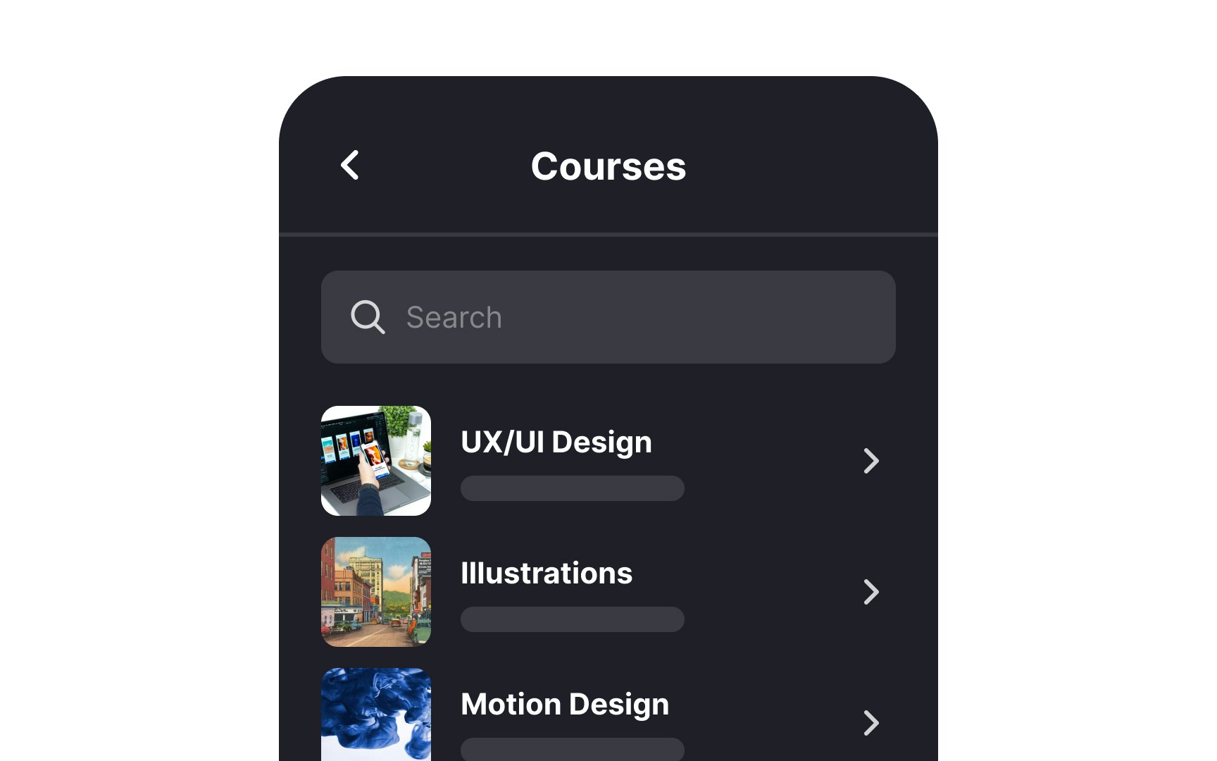
To maintain keyline alignment in lists, ensure all list items align with a specific vertical guide or keyline. Start by choosing a consistent point for alignment, such as the left edge of text or the center of icons. Align all elements of the list (text, numbers, images, or bullets) to this keyline.
When aligning text with
It's aesthetically pleasing because it provides symmetry and equilibrium, preventing any single item from dominating the visual space. The list also appears more organized and navigable, offering a smoother and more intuitive user experience.


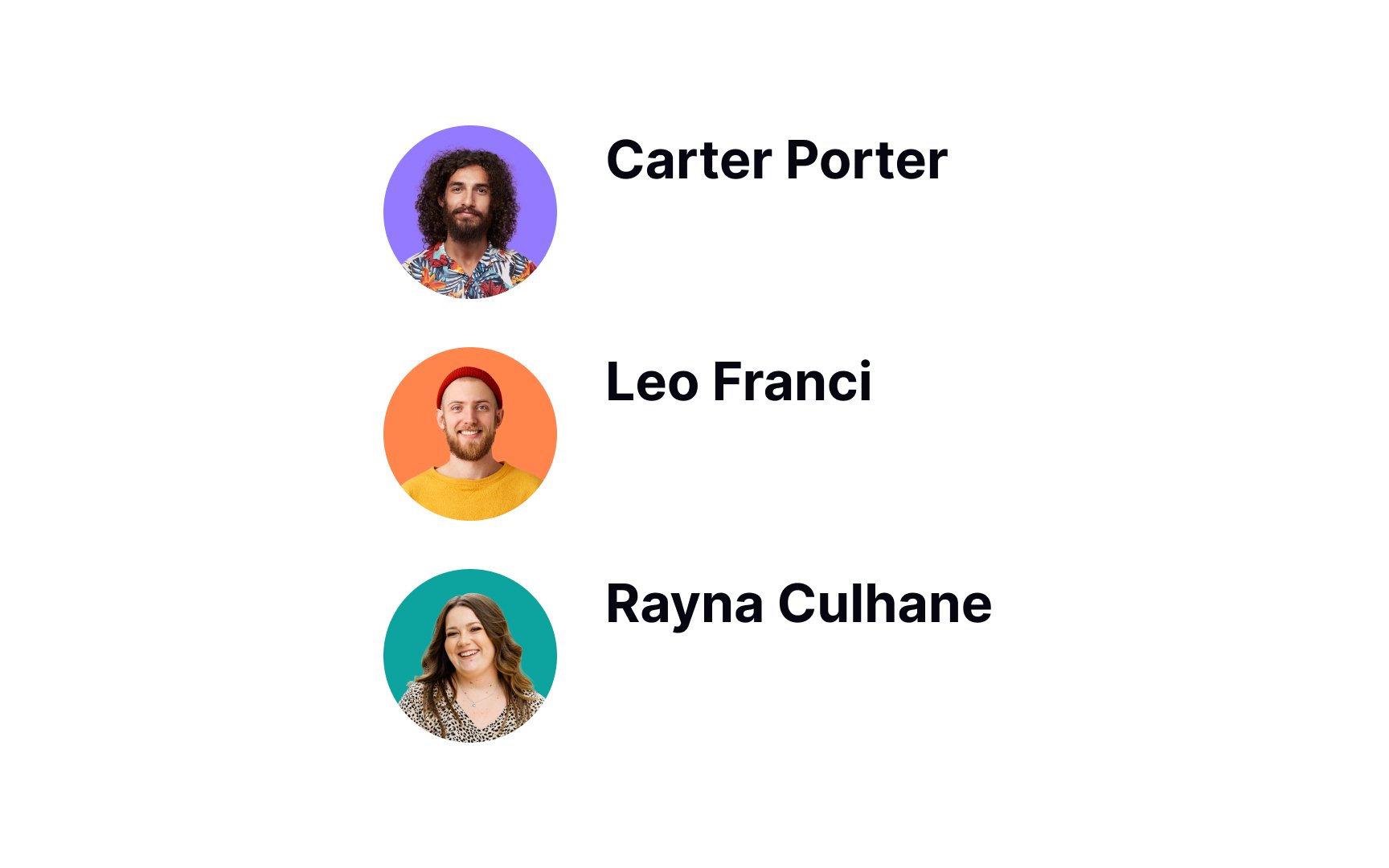
When you select the "Align Horizontal Centers" function in Figma or another design tool for a series of
This essentially lines up the middle horizontal points of the icons, making them align perfectly in a vertical line. It helps users scan lists without straining their eyes when looking at abrupt, uneven edges.
Pro Tip: Use square containers for icons to ensure proper alignment.
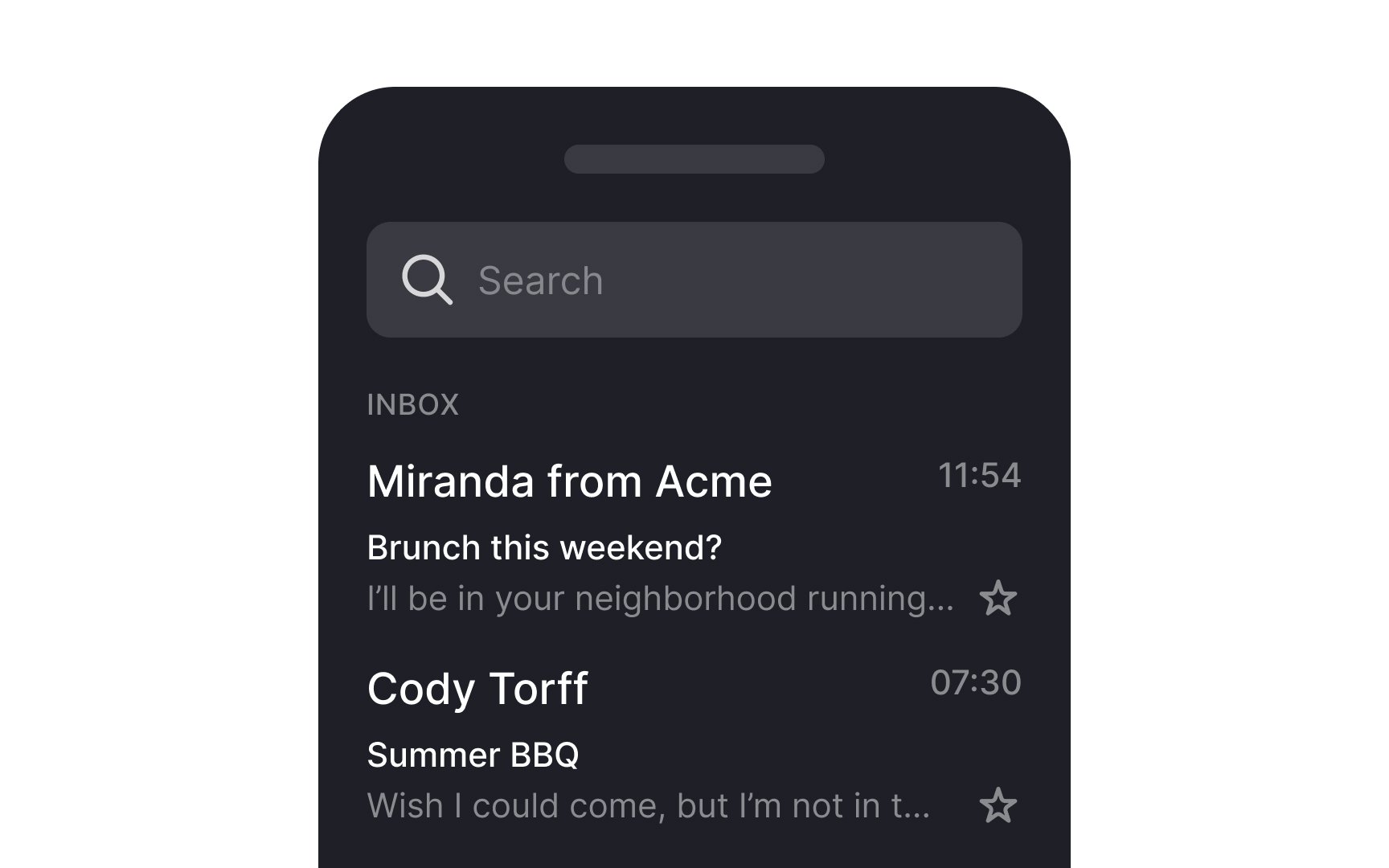
Be sure to use dividers that are visible without being too obtrusive. Material Design recommends using dividers sparingly to avoid overwhelming users.[1]

There are two types of popular
For lists that include
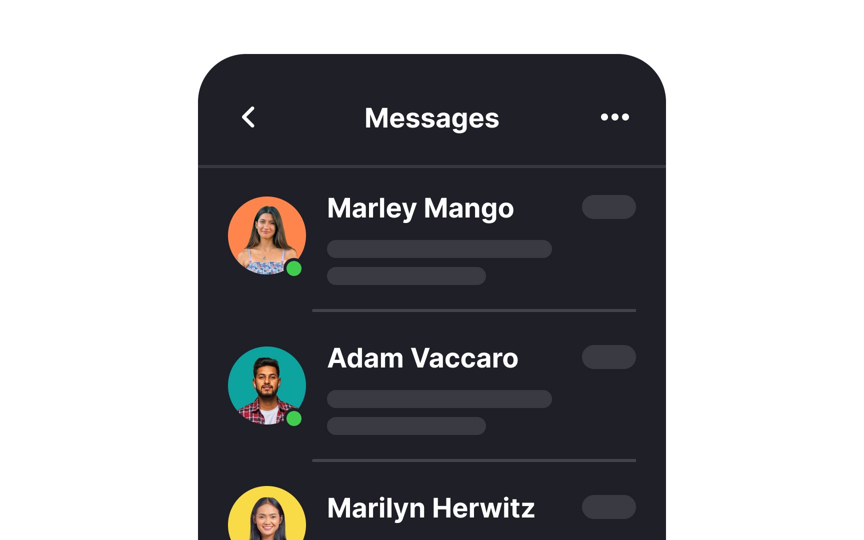
For users of left-to-right languages, the left side of the screen naturally draws the most attention. Therefore, for lists in such contexts, it's strategic to align essential media, like thumbnails, to the left. This placement ensures that these key visuals are immediately noticed, enhancing the content's impact and user engagement.
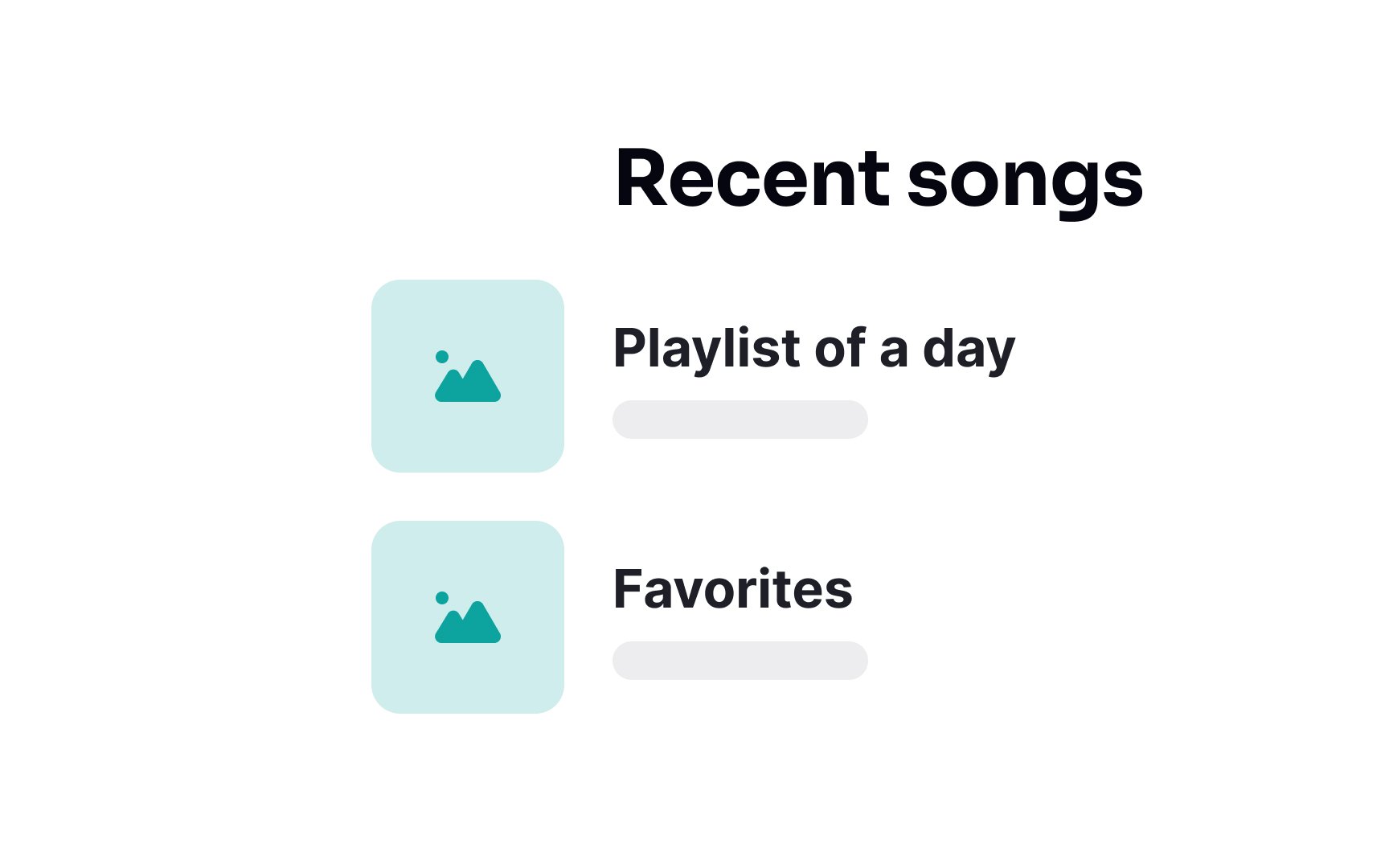
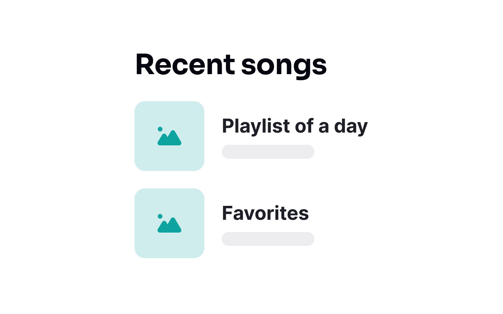
In left-to-right languages, aligning list headings to the left is generally the most natural and effective approach. This alignment matches the direction of reading and scanning, creating a consistent and comfortable visual flow for users. It ensures that the start of each line is predictably placed, facilitating quick recognition and readability.
The fullscreen spinner, once a common
Instead, use skeleton loaders that mimic the
Pro Tip: To create a smooth loading experience, make sure lists load sequentially rather than in a haphazard manner.
To create a smooth
This method gives users a sense of progress and order, reducing confusion and frustration. As each piece of
In today's diverse digital landscape, designing for a wide range of devices is essential. A single, universal design is no longer sufficient due to the vast array of device types, screen resolutions, and orientations users might use. This principle applies to lists as well — they should be responsive, meaning they adapt to the device's characteristics.[4]
On larger desktop screens, take advantage of the extra space to present more information or a more complex
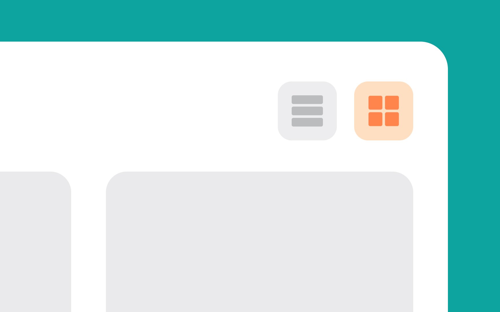
While some users might prefer the traditional, straightforward approach of a list view, others might find a grid view more visually appealing and easier to navigate. Offering a choice between these views with a list view control enhances
Beyond these, other list views like compact lists for data-dense screens or card views for a more detailed and visually rich presentation can be provided depending on the context.

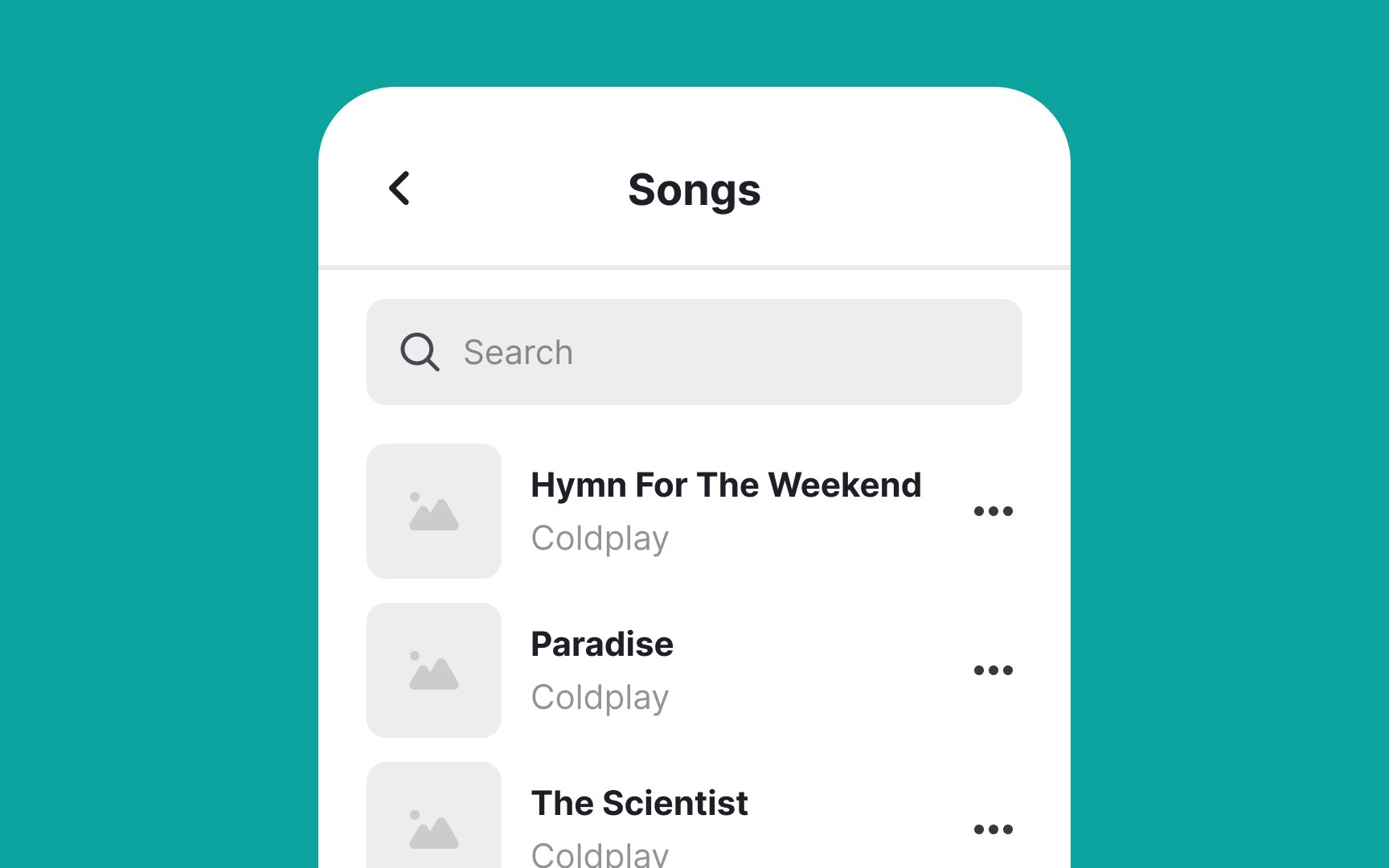
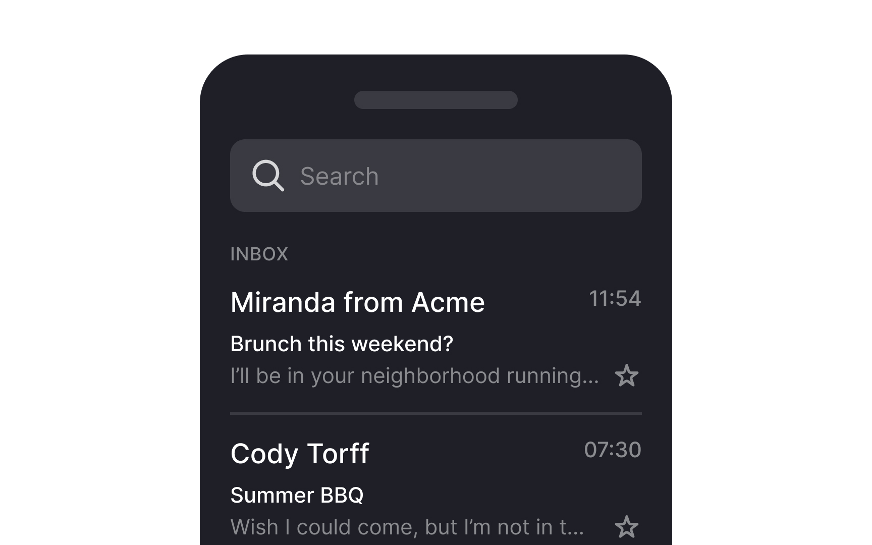
Align control elements like buttons, checkboxes, menus, or other interactive elements on the right side of list items. This approach is intuitive because it aligns with users' expectations based on standard design conventions. When controls are consistently positioned on the right, users don't have to
This works especially well for right-handed people using their phones, as they can easily reach these controls with their thumb. We know this isn't ideal for left-handed folks (about 10% of users), who've had to adapt to a right-handed world in apps just like they do with scissors and door handles.
To make it work better for everyone, make sure buttons are big enough to tap (at least 44x44 pixels) and keep them far enough apart to prevent mis-taps.
Enhancing UI with a


Enhancing list interfaces with filtering and
Keep these tips in mind:
- Position filter and sort
icons near the top of the list for visibility and easy access. - Use recognizable icons, like sliders for filters and arrows for sorting, to aid quick user understanding.
An intuitive design of these features streamlines user
References
- Material Design | Material Design
- Material Design | Material Design
- Responsive UI - Layout - Material Design | Material Design
Top contributors


Topics
From Course

Share


Similar lessons

Common UI Components Part I

Image Terminology
