Handling Large Blocks of Text in Typography
Explore strategies for breaking up large blocks of text into digestible chunks to guide readers
If you're like most readers nowadays, you're likely to skip this introduction and jump to the main content. Once into the theory, you most likely wouldn't read the content word by word. Instead, you'd pay attention to the headings, deciding whether you're interested in the whole paragraph or want to skip it.
The internet has trained us to pay less attention to large blocks of information and skim pages. We're more likely to read a short social media post than dive into an article.[1] And that's a new challenge for writers and designers. It's now their task to encourage users to read the text by making it look appealing and inviting.
Larger pieces of copy, especially theoretical and academic text, require more attention, time, and effort. That's why it's so essential to make textual content less intimidating and easy to scan. Typography tools like type scale system, weight, color, and spacing assist users in establishing a solid visual hierarchy. In turn, it will help users navigate pages, find what they're looking for, and decide whether each given piece of information will offer value to them.
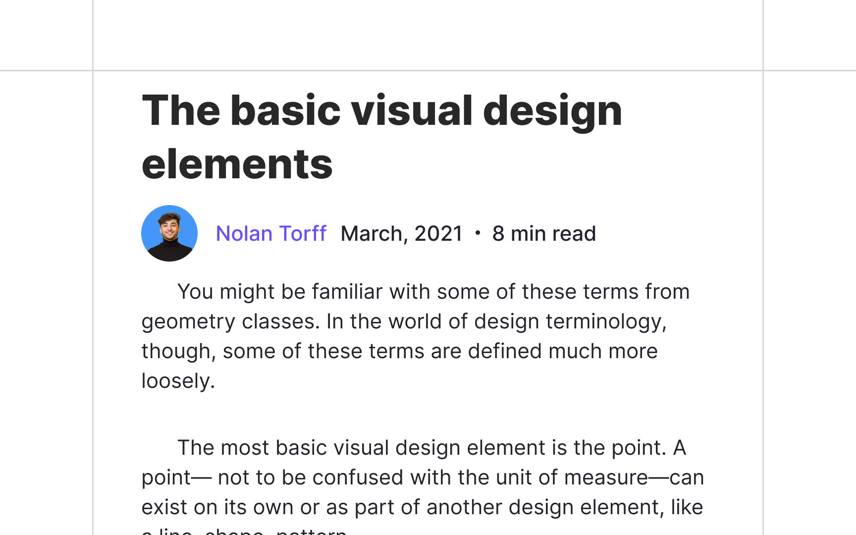
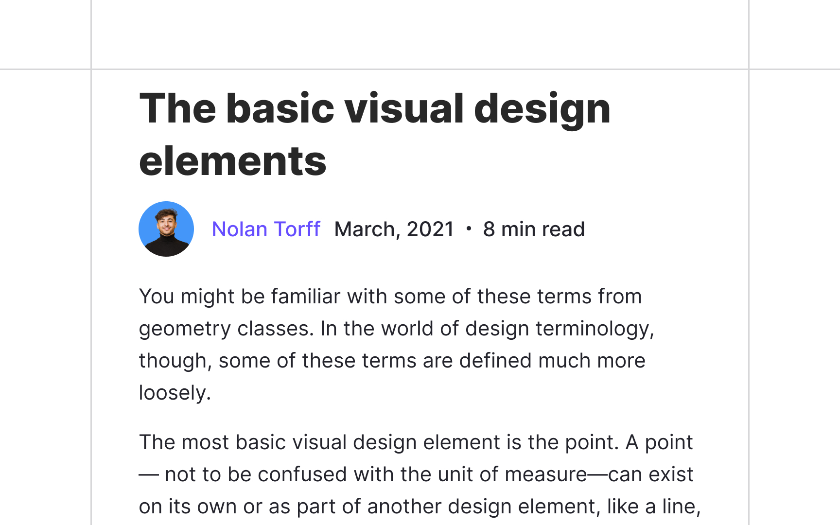
Articles refer to independent pieces of writing about a specific, usually non-fictional subject. You encounter them in digital and printed newspapers, magazines, blogs, or other written publications.
A byline is a distinguishing part of an article that usually sits between the headline and the body text. It provides the author's name and sometimes, their biographical information. The byline is considered secondary text and should be smaller than the body text.[2]
The first sentence of an article should grab users' attention, getting them to invest in the
In HTML, it's essential to use the <article> tag for article formatting. The tag specifies the article as an independent, self-contained piece that can be shared and reused on other websites. It commonly includes headings (<h1><h6>element) as children to facilitate
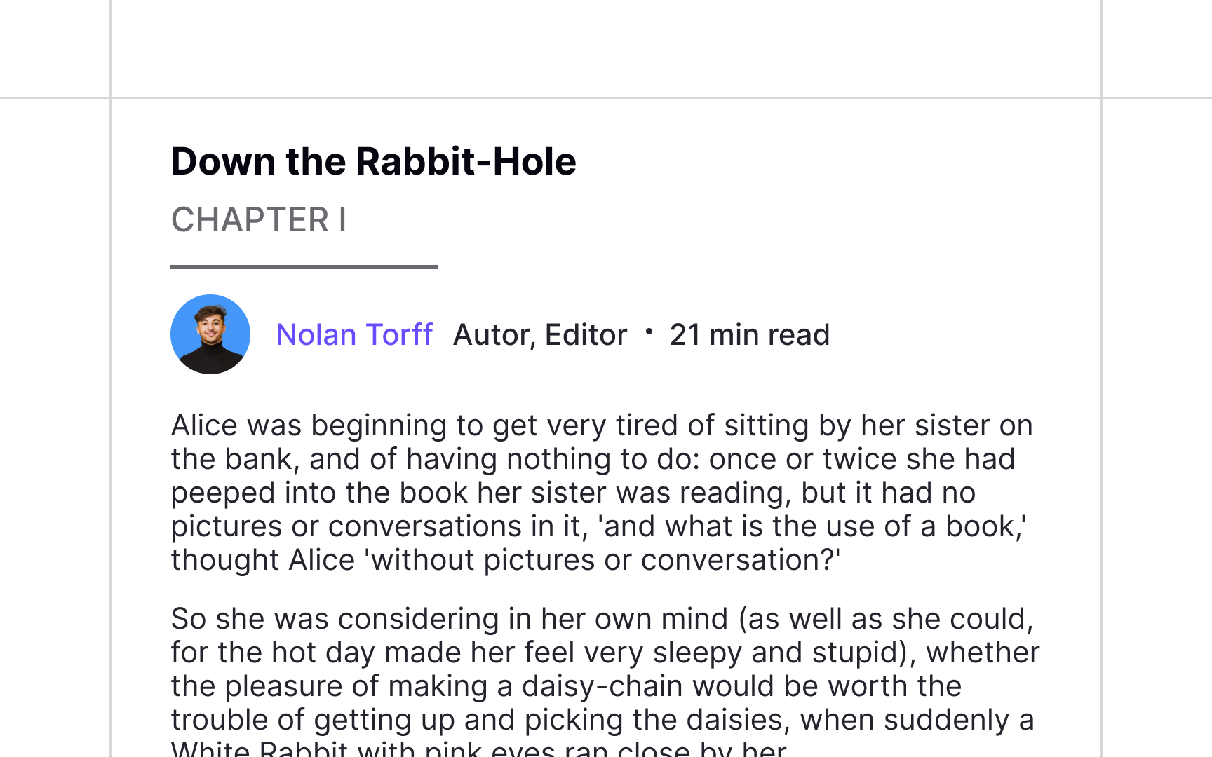
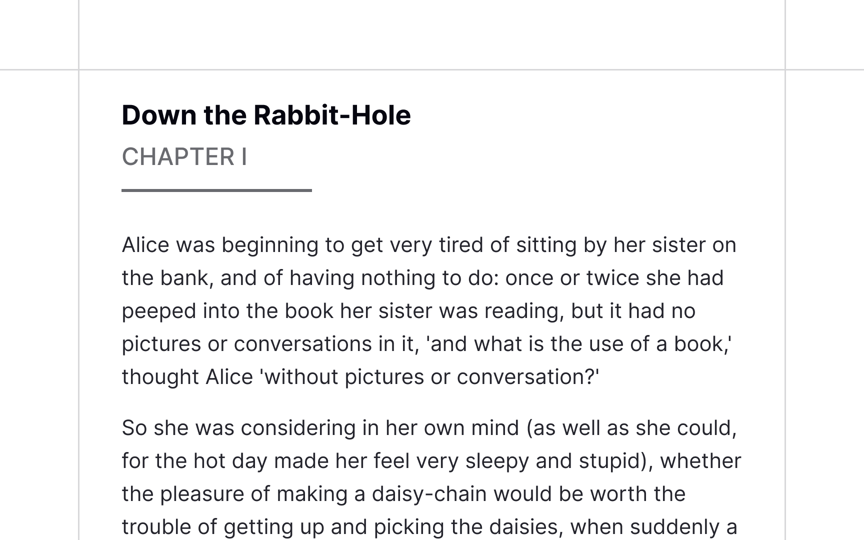
Chapters present an independent piece of a larger text such as a manual, book, or other written publication. They usually have titles and numbered
Commonly, chapters are listed in the table of contents to simplify navigation throughout a book and may have smaller subdivisions called sections.[4]
Pro Tip: A chapter's heading should be smaller than the main title of a book.
A section is a subdivision of a chapter separated from other sections with a break. It usually indicates a new twist in the story — changes in time, location, point-of-view character, mood, tone, emotion, and/or pace.[5] Sections have an extra space between them to improve readability since they do not always have titles or order numbers.
However, if you place a section under a heading, make sure it has a lower rank than the heading of a document (<h1>) and the subheadings of chapters (<h2>).
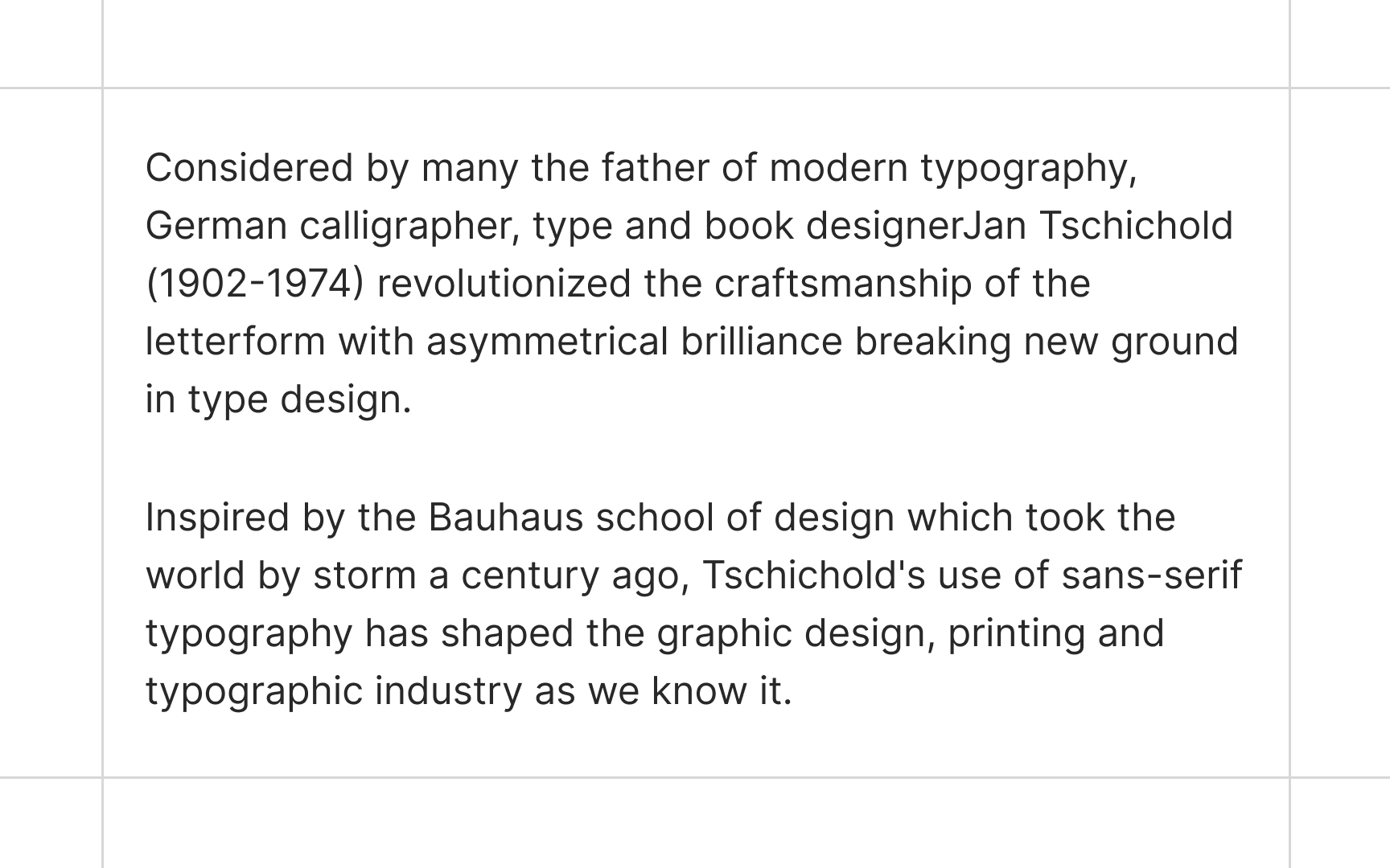
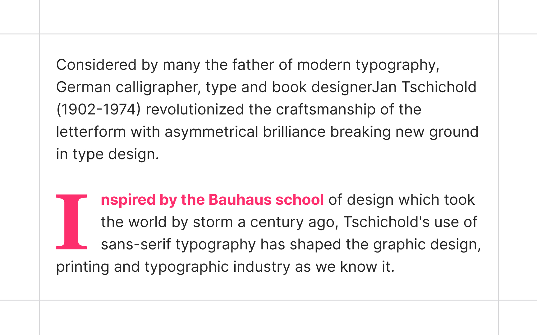
Designers don't always prefer subheadings to separate sections. Space breaks can be accompanied by an asterism (either proper ⁂ or manual * * *), drop cap, horizontal rule, fleuron (❦), section sign (§), or other ornamental symbols to emphasize a section visually.
Surprisingly, there's no definite term for such ornamental symbols. They are called dinkuses, space break symbols, paragraph separators, paragraph dividers, horizontal dividers, thought breaks, or instances of filigrees or flourishes.[6]
Users encounter
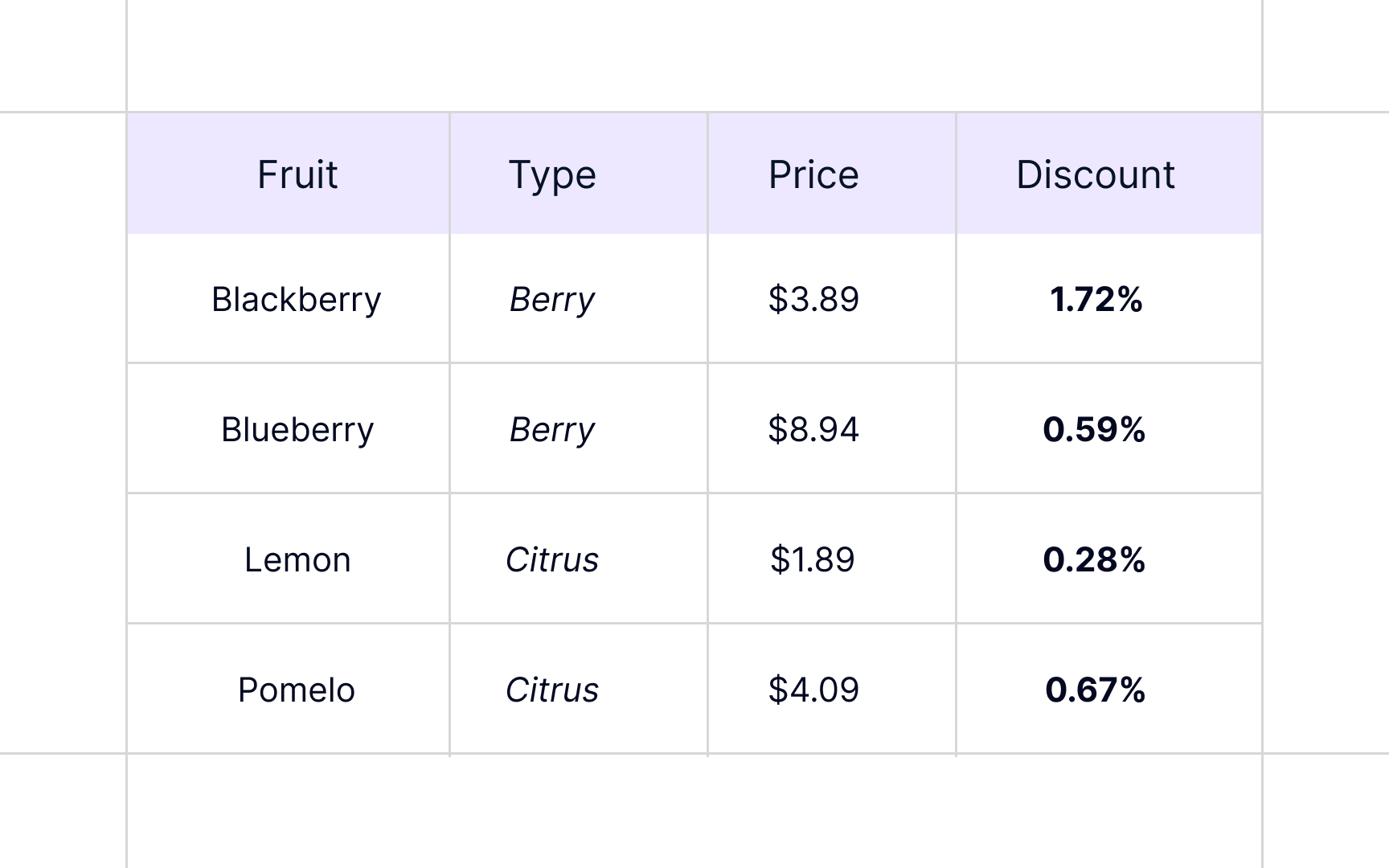
Ideally, users should be able to comfortably read and interpret tables from their normal position without changing their rotation or scrolling endlessly.
So what makes tables readable?
- Don't set a fixed width: Table columns should adapt to the width of
content automatically. Otherwise, some columns will look too empty, while others squeeze data making the table hard to read. - Avoid using too many fills and borders: The core focus of any table is to present data. Get rid of everything, like zebra striping, tints, fills, and italics that serve only decoration purposes, distract users, or make it harder for them to compare or interpret information.
- Apply proper alignment: Good alignment and white space can set a nice stage for tables. Sometimes, it's more than enough. The rule of thumb is to left-align text, right-align numbers, and align column headings with data.
- Use tabular numerals: Digits that occupy the same width make it much easier to scan tens, hundreds, and thousands aligned vertically in columns. Those are called tabular numerals, and they are generally found in monospaced typefaces. However, many proportional typefaces have an additional set of monospaced figures, so you don't need to put extra effort into combining typefaces.[7]
According to Nielsen's heuristics, each product should provide help and documentation to users who get stuck and can't solve a problem without assistance.[8]
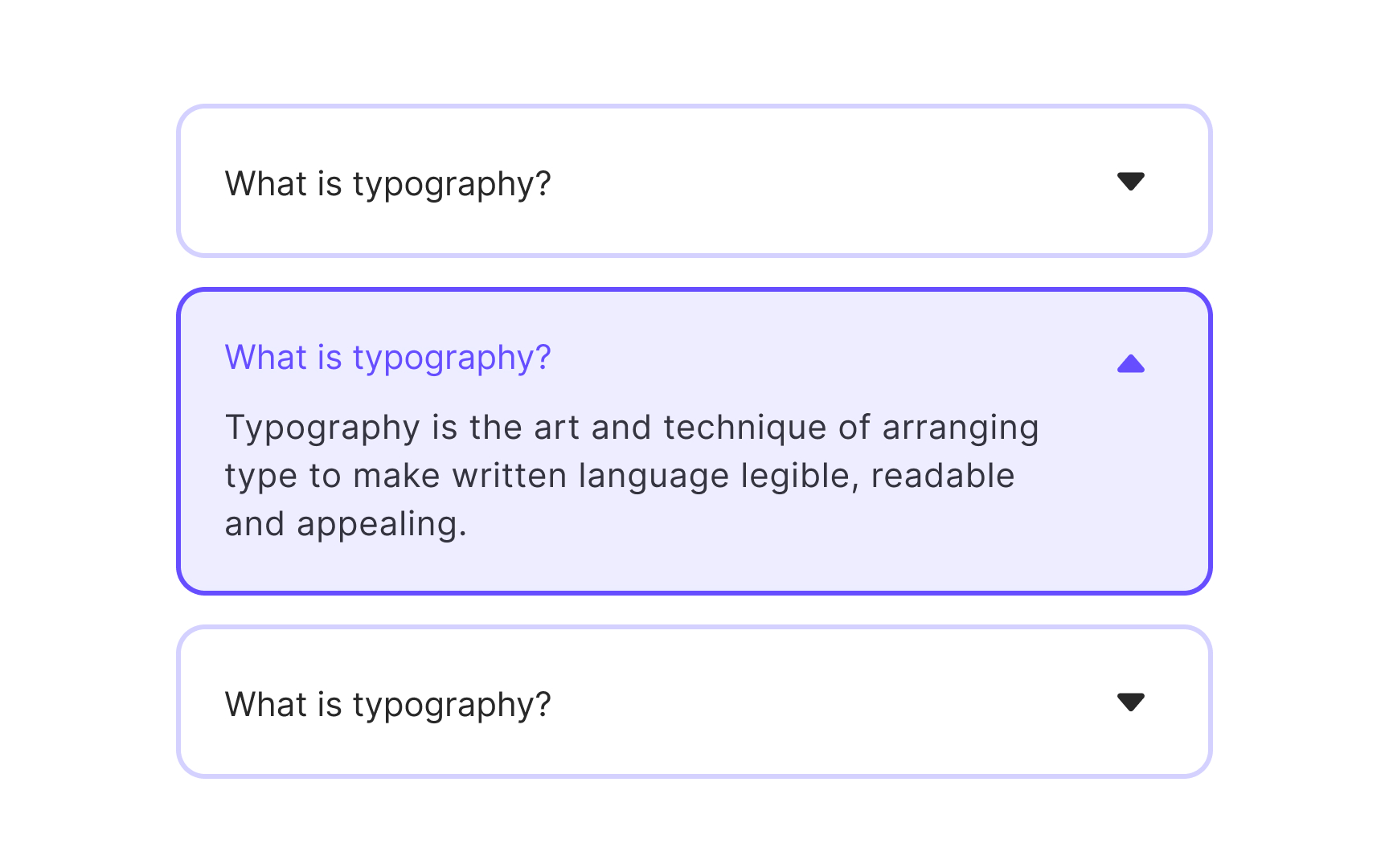
FAQ (frequently asked question) refers to a
What aids the scannability and readability of an FAQ page?
- Using groups and categories for related topics
- Using subheadings for each category
- Placing the most relevant questions first
- Providing links to relevant articles or tutorials for larger answers
- Chunking information into accordions
- Style links appropriately so they look like links[9]
Pro Tip: Effective FAQ pages can attract new visitors to your website via organic search and direct them to related content.
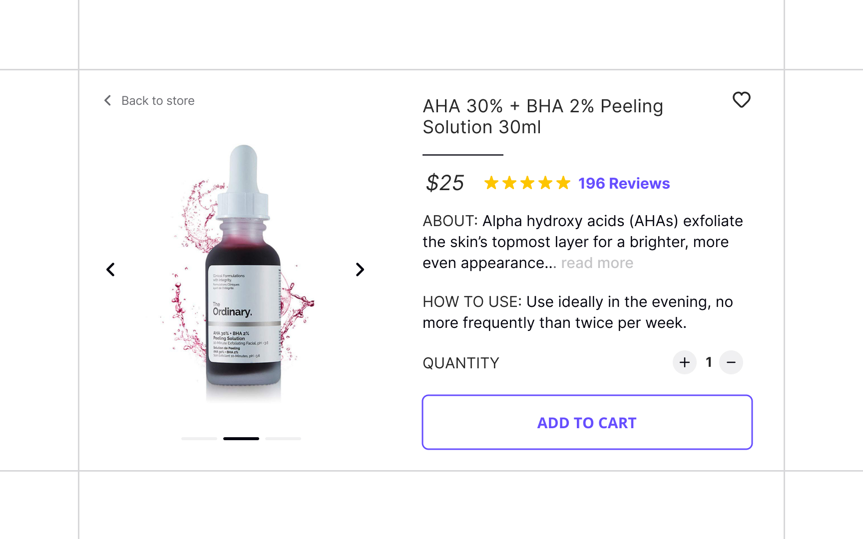
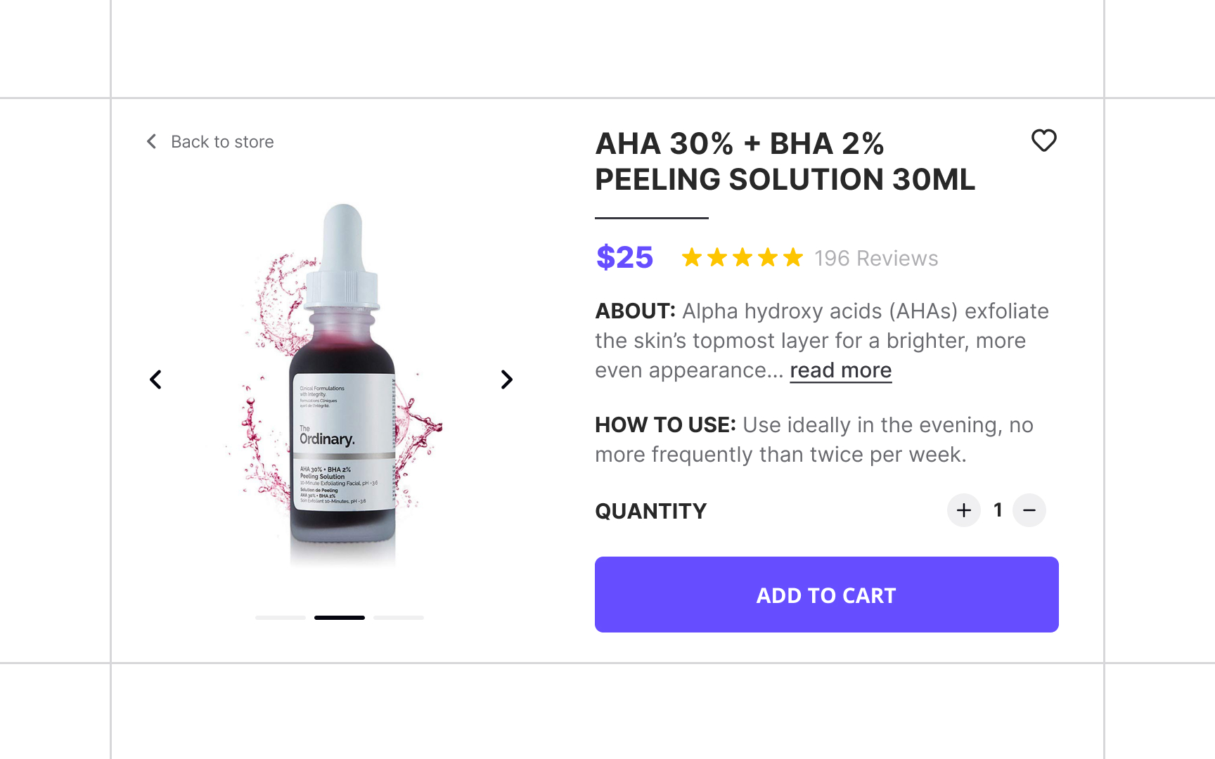
Product descriptions are commonly found on e-commerce product
A product description is not the place for marketing fluff — only include facts that assist users in comparing products and making purchase decisions.
Split the information into categories making sure each of these aspects has a title and enough spacing:
- Product name
- Price
- How to use it
- How it looks
- What it does
- Rating
Play around with font-weight,
Pro Tip: Images should be included and not contradict the product description.
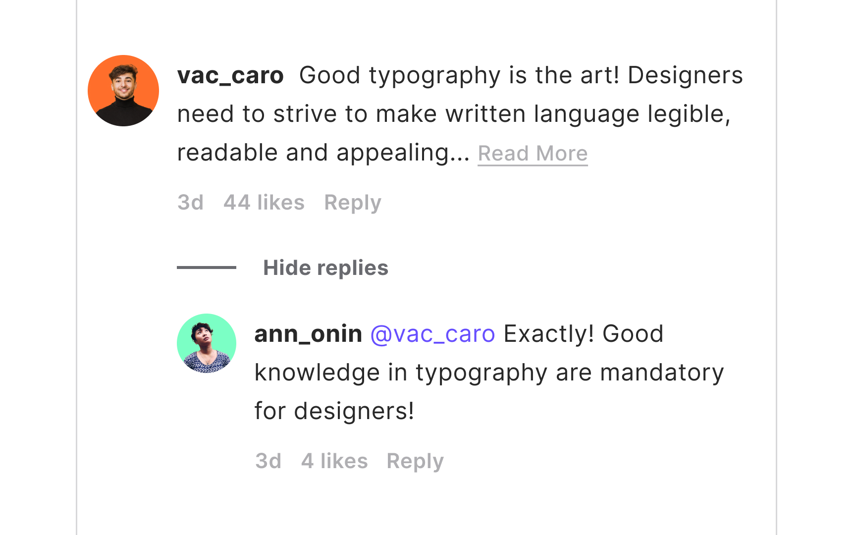
With the development of social media and remote communication, comments, replies, and mentions have become an essential part of any post. They work by allowing users to share their thoughts and participate in the discussion.
There are two types of comment systems:
- Flat view: Flat views display comments chronologically as a single list, and users can't directly reply to other comments.
- Threaded (or nested) view: Users can reply to a specific comment, and their replies appear indented under the original comment. When the thread is too long, it usually gets hidden behind the "Show replies/ Hide replies" link. Threaded views allow designers to save space and prevents users from getting overwhelmed by endless
pages of comments. The "Show more/Show less"links under extensive comments also make the comment section easier to scan.
Additionally, font-weight, size, and
Pro Tip: Use color and font-weight to indicate users' mentions.
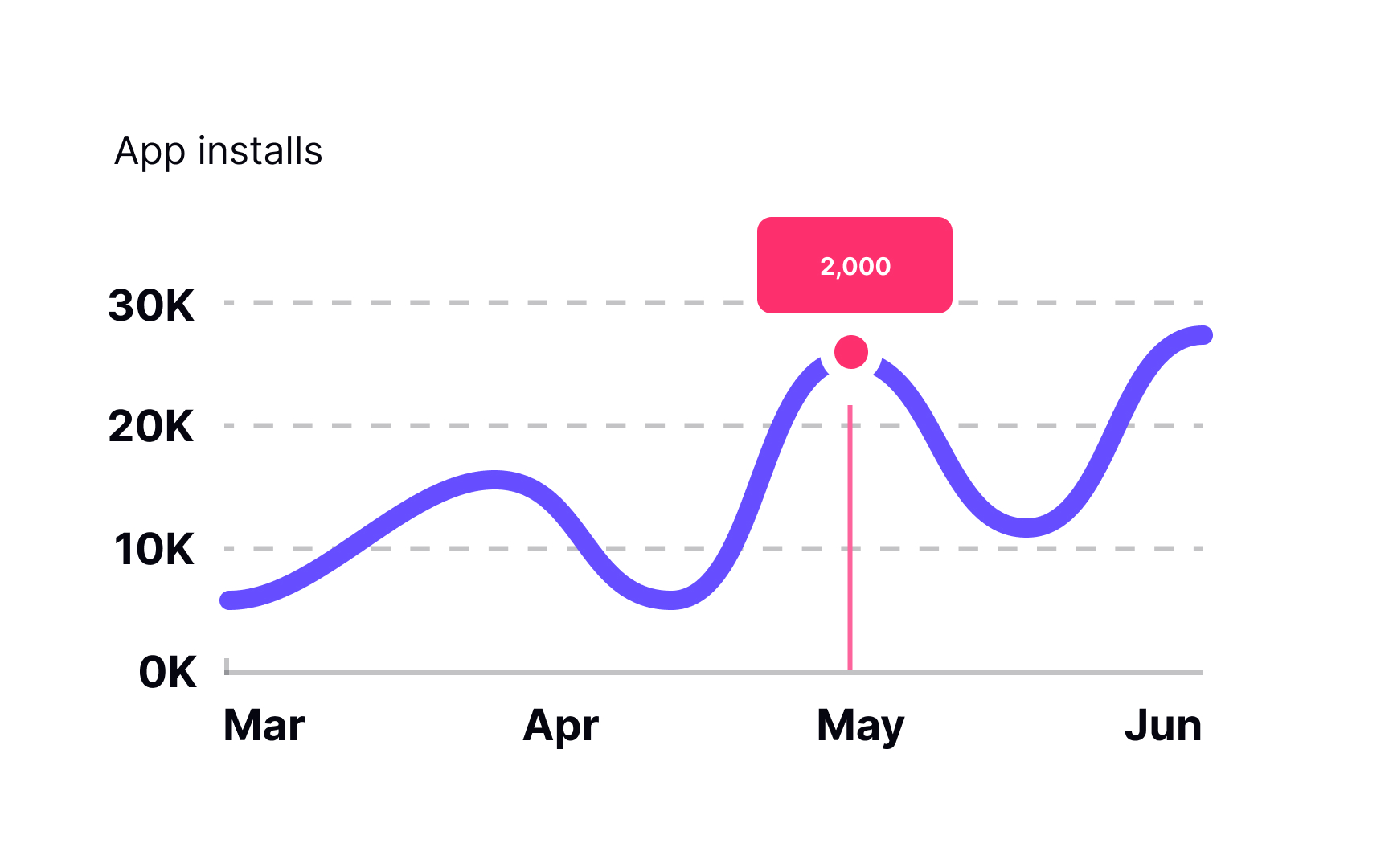
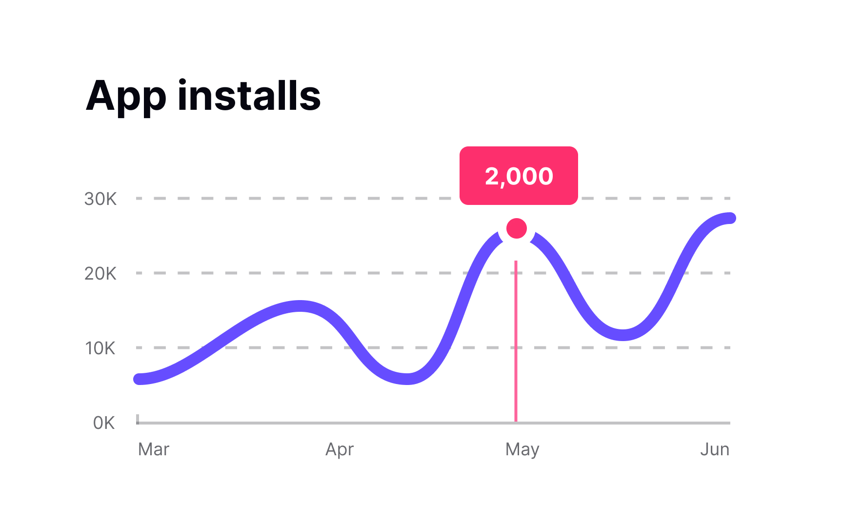
Bar charts, line charts, pie charts, donut charts — no matter how they look, their main goal is to present data efficiently. All charts provide a set of numerical or quantitative data in a way that users don't need to waste time figuring out what it means.
Like large blocks of text, charts contain vast quantities of information presented in an easier-to-perceive form. The title is one of the most important parts of a chart. It usually sits above the main graphic and provides a concise description of the graph topic.
Each indicated position of a graph usually has a label that identifies the value. Using vertical or diagonal text labels might be tempting, but it decreases readability. Orient labels horizontally, just like you would with most other text.
When the data in a chart is complex, there's usually a legend — a list of all variables on a chart and symbols representing each variable. What is obvious to you may not be that obvious to your users. Plus, providing a chart description and duplicating chart data in a
Establish the
References
- How the byline beast was born | Reuters
- Web Typography: Designing Tables to be Read, Not Looked At | A List Apart
- Help and Documentation: The 10th Usability Heuristic | Nielsen Norman Group
- An FAQ’s User Experience Deconstructed | Nielsen Norman Group
- UX Guidelines for Ecommerce Product Pages | Nielsen Norman Group
Top contributors


Topics
From Course

Share


