Designing Mobile Notifications & Dialogs
Learn how to design and time mobile notifications and dialogs without annoying users
Dialogs and notifications are often perceived as intrusive and annoying messages. Like it or not, they interrupt user flow and steal attention. Moreover, push notifications can make users feel stressed, frustrated, and overwhelmed.
However, they can be extremely helpful and informative if implemented correctly. By learning your users' preferences, you can gain insights into the best timing to send notifications and what information users expect to see in them.
Modal and non-modal dialogs appear to be more informative and are usually triggered by users' actions. Unfortunately, designers often sacrifice dialog clarity and don't put enough effort or thought into the copy or its usability.
Generally, dialogs on mobile should be used cautiously and only for delivering important warnings and preventing critical errors. Otherwise, it's better to look for alternative tools that are less interruptive and easier to operate.
In UI,
In contrast, non-modal dialogs don't impede
The most common use case of modal dialogs is to alert users to an
Modal
However, designers should be careful of timing and avoid modal dialogs interrupting high-stakes processes such as checkout flows. If there's no valid reason for modal dialogs, users can get easily distracted or lose their confidence.
We can also use
Pro Tip: If you want to deliver information that's not relevant to the current flow (e.g., a suggestion to sign up for an email newsletter), non-modal dialogs are a safe bet.
Mobile
For maximum effectiveness without frustration:
- Use dialogs sparingly for truly valuable
content - Time them appropriately around user tasks
- Ensure they're neither too intrusive nor too subtle
Design dialogs to be noticeable but not overwhelming. Make them large enough to read easily but not so large they block important content. Provide clear dismissal options and ensure touch targets are easily tappable.
Modal
These dialogs maintain context while obtaining necessary approvals. For instance, when unregistered users attempt to save
Non-modal dialogs offer a less disruptive alternative for collecting optional information that doesn't block the main task flow. These work well for feedback surveys or preference settings where immediate action isn't required.
Complex data entry requiring multiple fields should avoid dialog interfaces entirely. On mobile devices, navigating through form fields in a confined space creates unnecessary friction. Such interactions benefit from dedicated screens that provide adequate space and a clear structure for data input.
For dialogs showing non-critical information, offer several intuitive ways to dismiss them:
- The standard close button in the top right corner
- Background click/tap to dismiss
When dialogs contain important information or need specific actions, think carefully about closing options. While you want to prevent accidental dismissal, always provide clear ways to exit. The key is matching dismissal methods to the dialog's purpose — critical information might need more deliberate closing actions, while general updates should be easy to dismiss.
Even if users expect
Avoid generic words like "yes," "no," "cancel," "submit," or "confirm" if they don't add to the meaning. Instead, be more descriptive so users can immediately understand which action they should implement.
If you're struggling with formulating a better command, ask yourself, "What will happen after users tap the button? What will they get?" For example, after clicking the button, a file gets removed. In this case, the primary button label should say "Remove file," whereas the secondary button label should prevent users from doing it and say "Cancel.” "Cancel" is explicit enough here because it's combined with a more contextual primary button.
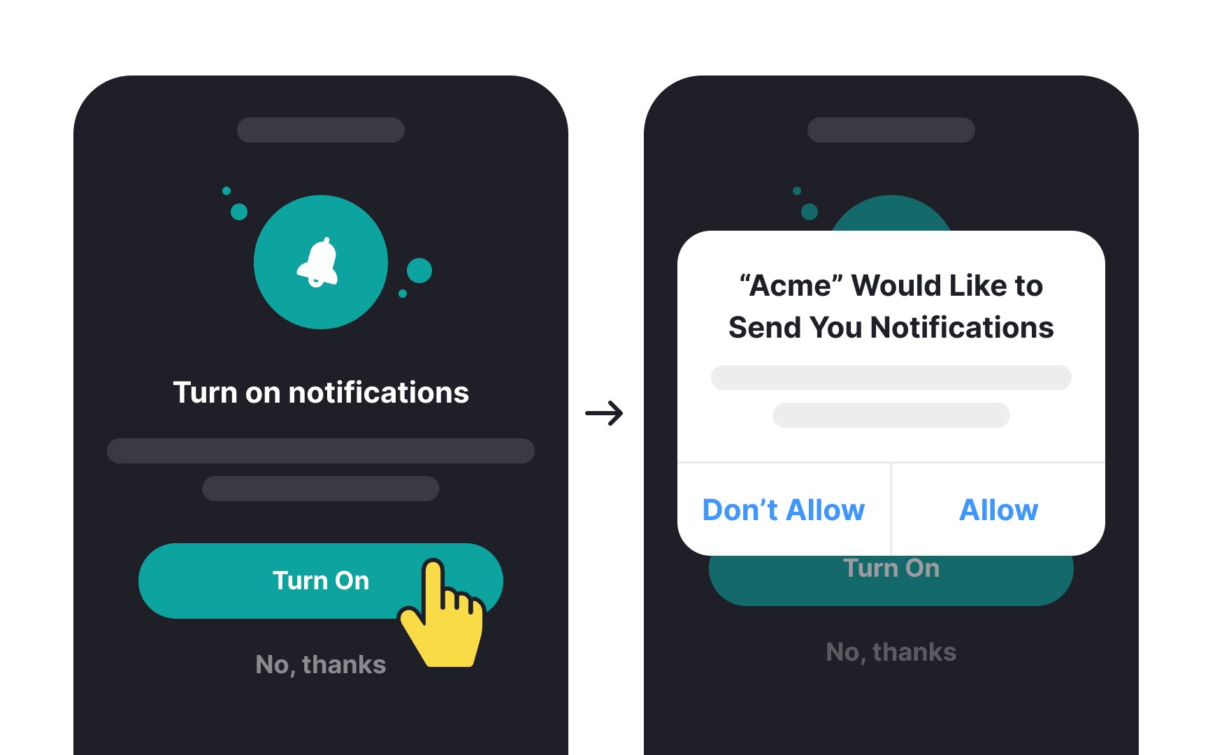
Plus, standard permission dialogs are often too small and rigid to properly explain why an app needs certain access. This makes it hard for users to understand the real purpose behind these requests.
This is why many apps now use primer screens — custom in-app messages that explain notification benefits before showing the system permission request. These primers match the app's design style while providing better context.
To design effective primers:
- Choose the right moment: Ask for
permissions when they make sense to users. For example, request notification access when someone creates a post they'd want to hear updates about - Show clear benefits: Use the primer's space to explain exactly how
notifications will help users, keeping your message friendly and direct
When designed correctly,
Ideally, push notifications are time-sensitive and deliver information that is beneficial for users. However, when
Make sure to send notifications at appropriate times and don't send non-critical push notifications at 3 in the morning. Use users' locations and rely on their preferences and behavior to send relevant messages.
Additionally, push notifications should be personal — demonstrating to users that the app cares about them. For example, if an individual goes to sleep every day at a certain time, a sleep tracker app can send a push notification reminding users that bedtime is approaching.
For example, Android push notifications have an app name and a small app icon provided by the system placed above the title.[3] On iOS, only the app's icon defines the sender.
How can a designer enhance the scannability of push notifications?
- Keep the title and body copy concise — 30 and 40 characters, respectively — to avoid truncation.
- Avoid repeating the brand name in the body copy if it's already clear from the title and icon.
- Use relevant graphics; refrain from using emojis or illustrations that don't enhance the meaning.
- Capitalize select words for emphasis, but use this sparingly.
- Employ clear and straightforward language so users immediately understand what they need to do or what to expect.
Pro Tip: Users can choose to hide notification previews in device settings. In this case, replace the default ”Notification” title and provide more descriptive text like "New Comment" or "Delivery Update."
First, explore your users’ needs and learn what information they find relevant and how often they consent to see it.
Second, avoid sending multiple notifications in bursts. Consider if you can combine a few notifications into a single message. Also, figure out if your users actually find all your notifications useful. Focus on quality rather than quantity.
Personalized
How can you make your push notifications more tailored to each individual?
- Address users by their name. People generally love to be addressed by their name and seeing it in the
body text can make them feel more relaxed. - Analyze their app behavior and remind them of activities they're used to doing, like ordering a takeaway at lunchtime or doing yoga in the morning.
- Learn your users' preferences and use this information to encourage users to take action. For example, you can send them
notifications to watch morecontent from profiles they visit more frequently or provide promo codes for the restaurants they order from all the time.
You may have created amazingly informative and well-timed
- They receive too many
notifications overall - They have an important task to concentrate on without any distractions
- Your app notifications are less relevant to them at the moment
In any case, the important thing is to allow users to stay in control. It makes them feel more comfortable knowing they can turn off notifications without having to manually dismiss them each time they appear on the screen. Ideally, users should be able to manage notification
Avoid using button
In turn,
Users stumble upon such ambiguities and slow down their flows. You make dialogs easier to close by avoiding vague language and making sure buttons are as specific to context as possible.
References
- Material Design | Material Design
- Modal & Nonmodal Dialogs: When (& When Not) to Use Them | Nielsen Norman Group
- Notifications overview | Views | Android Developers | Android Developers