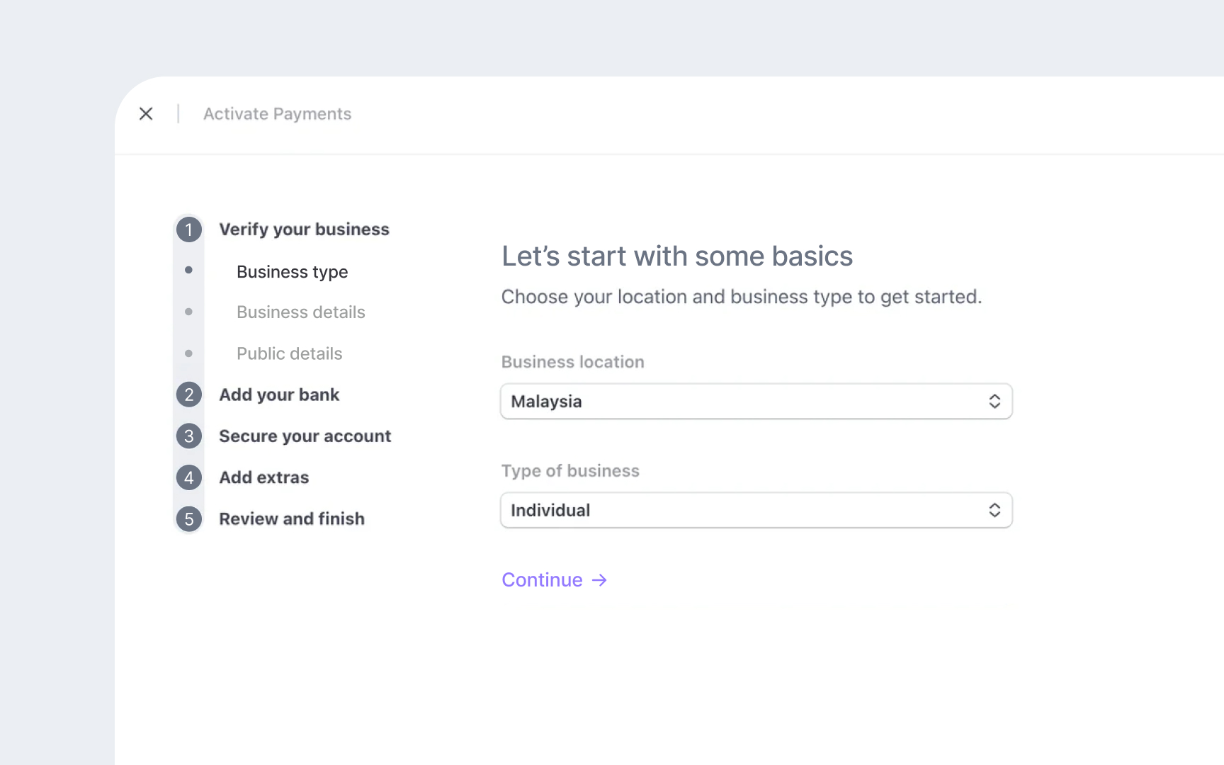
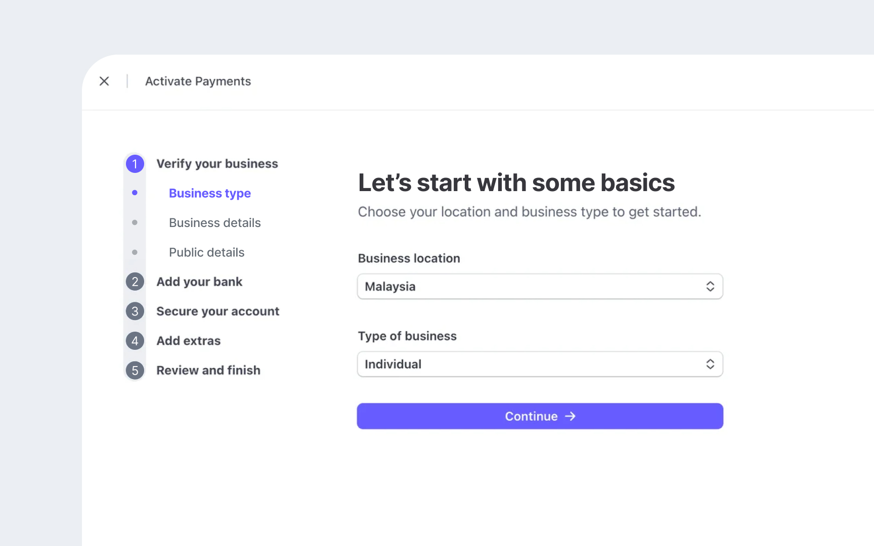
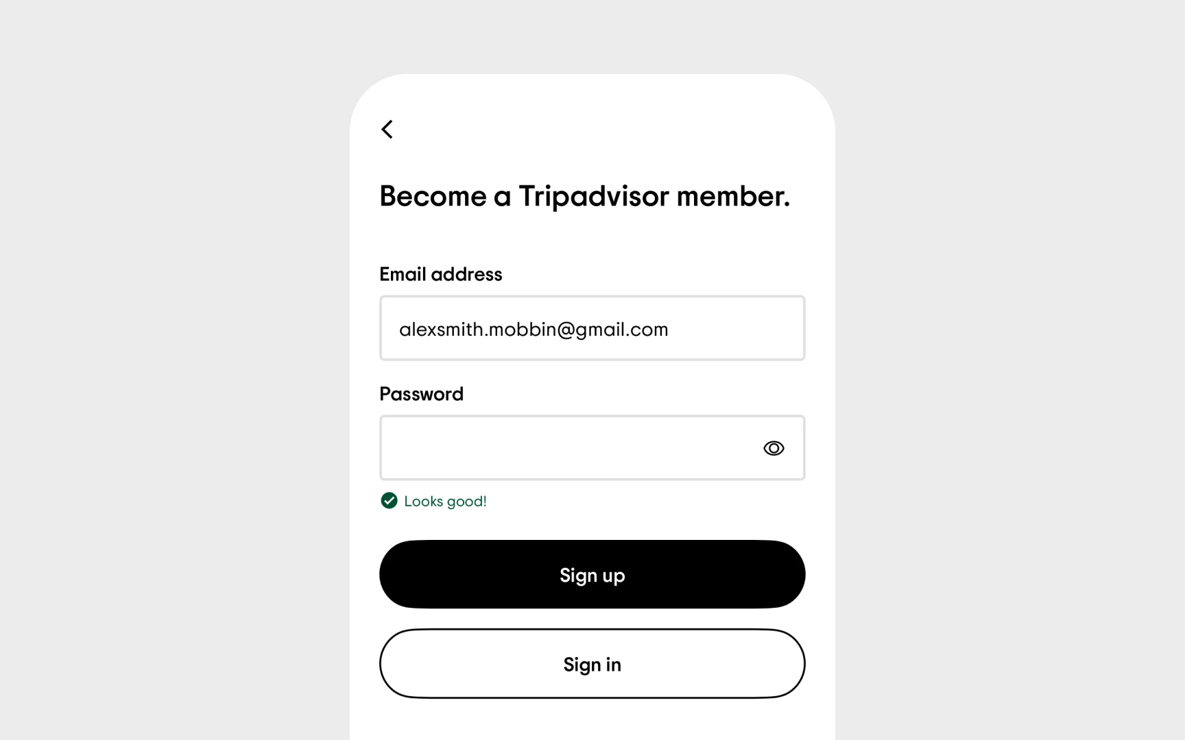
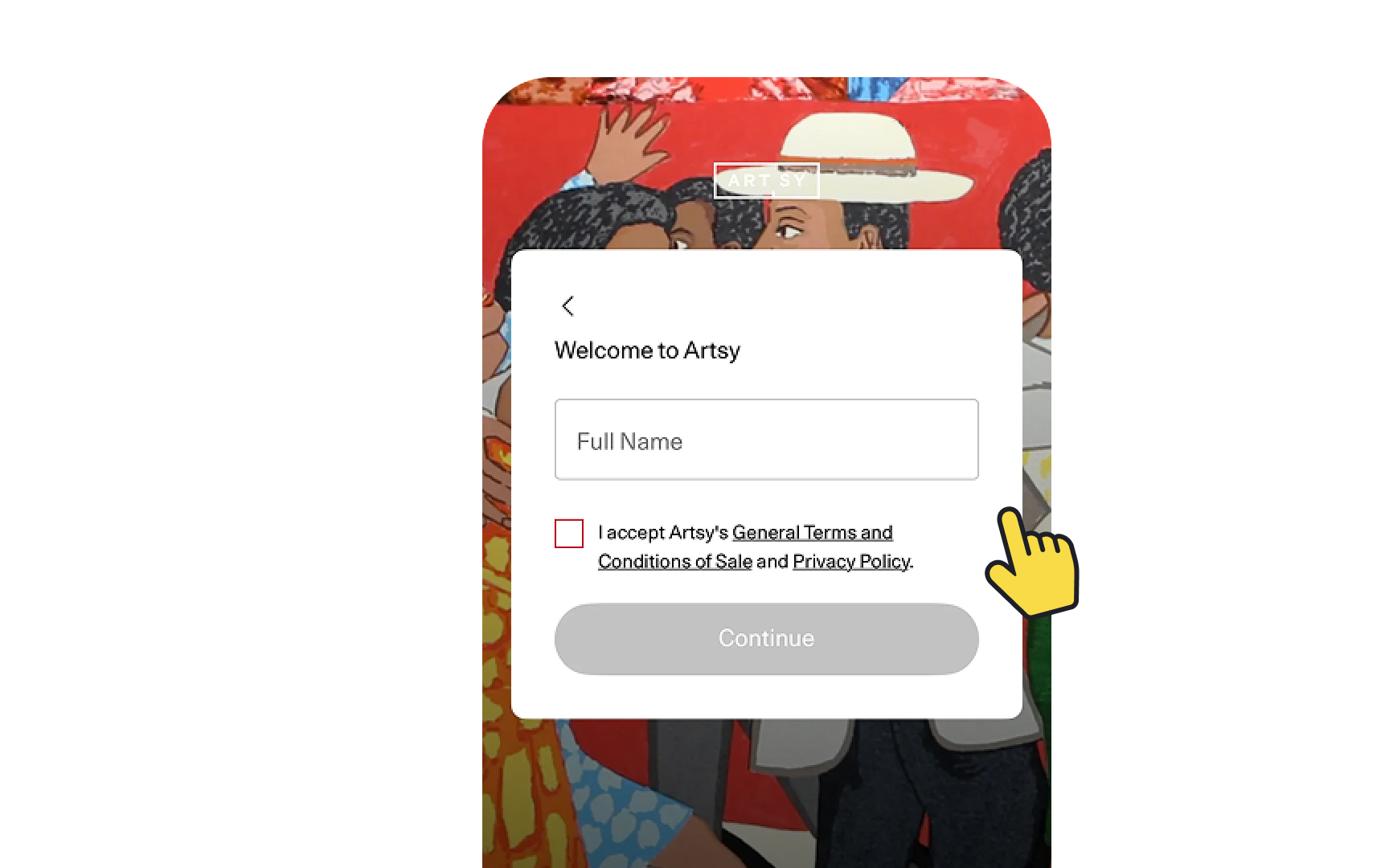
Visual Design Analysis
Evaluate and enhance design systems through systematic visual analysis techniques.
Visual design analysis goes beyond surface-level aesthetics to examine how design elements create meaningful digital experiences. Every typeface choice impacts readability, while color combinations influence both emotional response and accessibility. Layout decisions determine how easily users process information, and visual hierarchies guide them through complex interfaces.
This analytical process reveals hidden patterns in design systems, from inconsistent spacing that creates visual noise to typography combinations that hinder comprehension. Understanding these relationships helps identify precisely where designs succeed or fall short. Design teams use these insights to strengthen systems, eliminate inconsistencies, and create experiences that feel cohesive across every touchpoint. The process combines precise evaluation methods with strategic thinking to transform scattered design elements into robust, scalable systems that serve both users and business needs effectively.
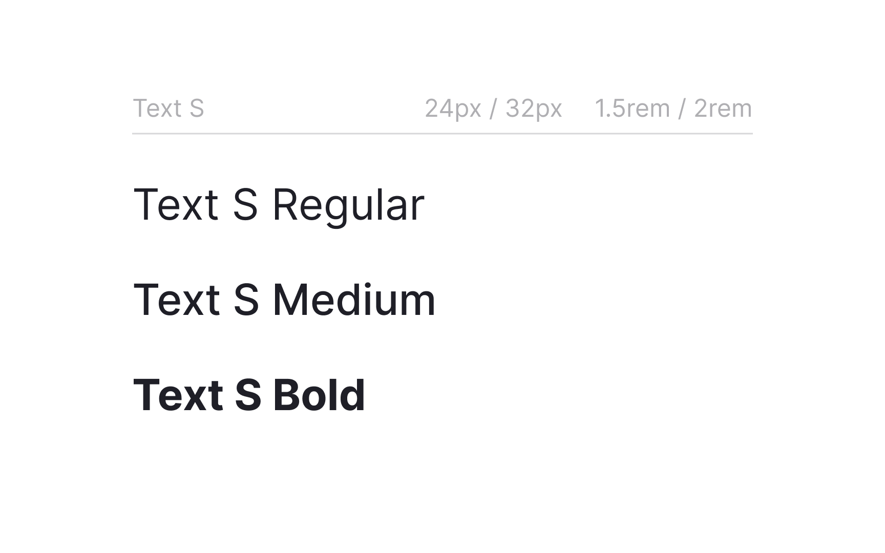
Typography system evaluation examines how type choices work together to create clear, readable interfaces. Well-structured
- Readability assessment: Review how body text performs across different screen sizes and contexts by checking line height, character spacing, and paragraph width
- Hierarchy analysis: Examine heading structures and their relationship to body text, ensuring clear differentiation between content levels
- Technical implementation: Document font loading strategies and fallback fonts, confirming consistent rendering across platforms
- Style documentation: Review naming conventions and implementation patterns by identifying any inconsistencies in the type system
- Performance impact: Evaluate how typography choices affect page load times and overall system performance
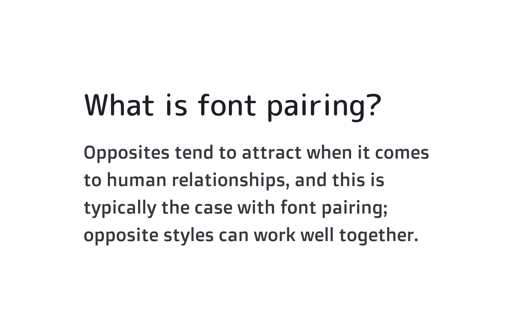
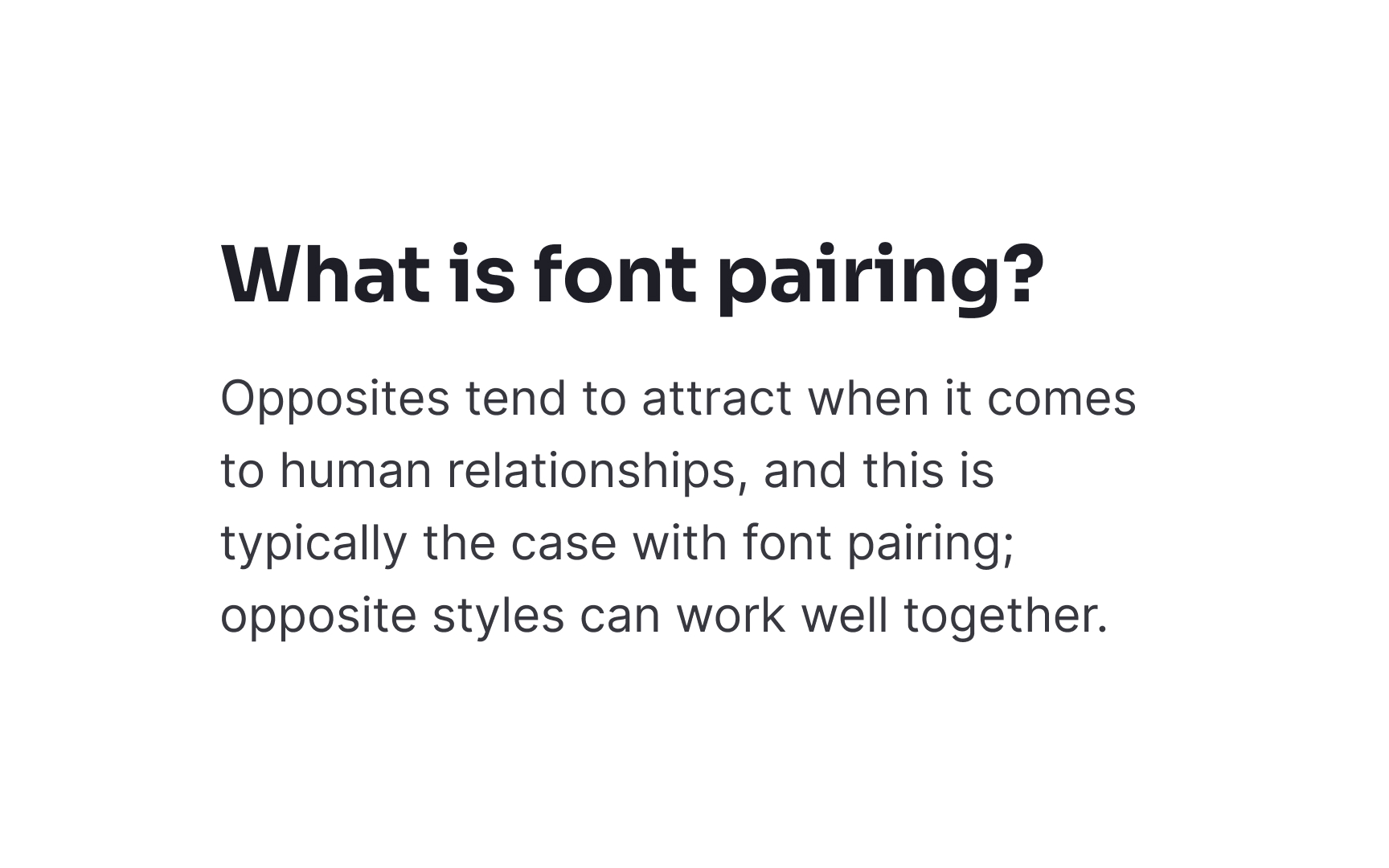
Font pairing and hierarchy assessment examines how different
- Pairing principles: Check how headline and body
fonts complement each other, ensuring they create harmony without losing contrast. - Scale relationships: Examine size ratios between different text levels. They should create clear visual separation.
- Family versatility: Review how font families perform across weights and styles and test their flexibility in different contexts.
- Content structure: Analyze how type choices support information hierarchy. Their goal is to guide users through content effectively.
- Cross-platform behavior: Test how font pairs render across different devices and spot any display inconsistencies.
A product's
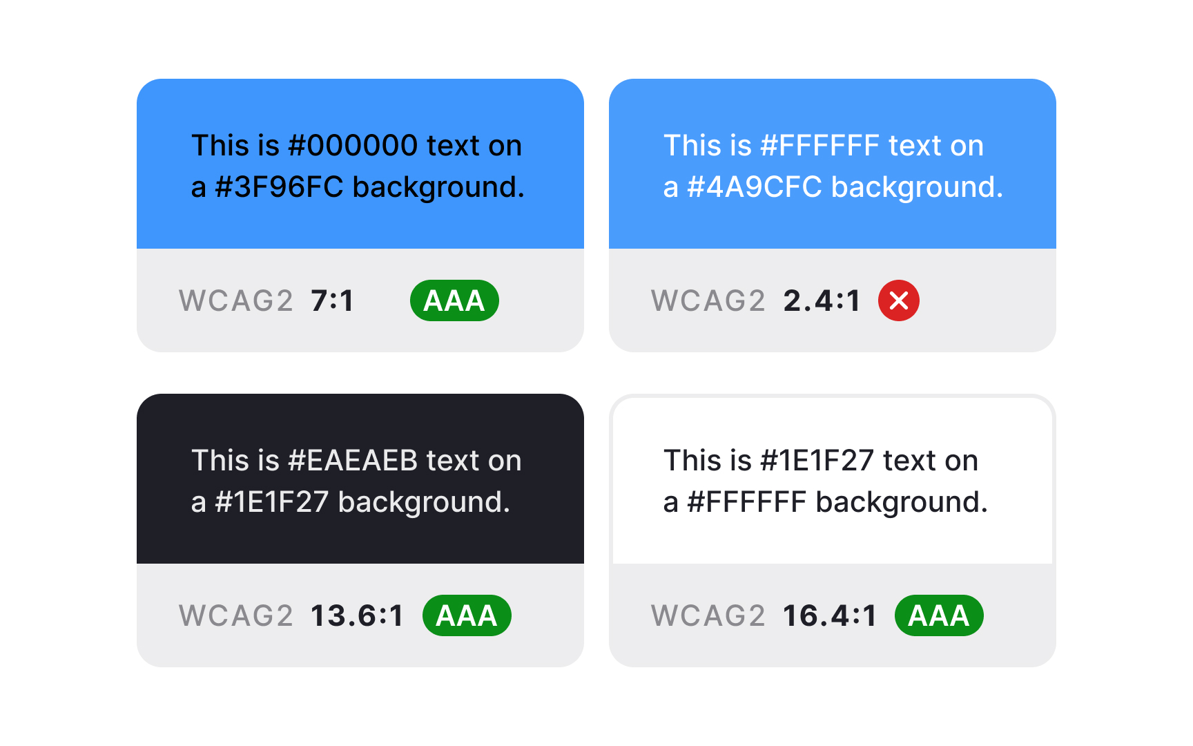
Start by mapping every color in your interface. Look for surprising variations: Is that gray actually a different tone than your system color? Are there three different blues where there should be one? Document these findings systematically.
Next, examine how colors behave in context:
- Do interactive elements maintain consistent colors across all states?
- How do background colors affect the visibility of UI elements?
- Are there enough color variations to support all necessary interface states?
The final step focuses on implementation details: how color tokens are named, whether dark mode alternatives exist, and whether
Pro Tip: Take screenshots of your interface and convert them to grayscale. This helps identify areas where you're relying too heavily on color to convey meaning.
Many apps pass basic
Begin your
Test your interface under various conditions:
- Switch to different display modes
- View screens under bright light
- Check how contrast behaves across different device settings
- Verify readability for all interactive states
Pay special attention to small text, error messages, and critical interface elements. Those are the areas where poor contrast can significantly impact usability.[1]
Pro Tip: Install a color blindness simulator in your browser. It helps quickly spot potential visibility issues during the design process.
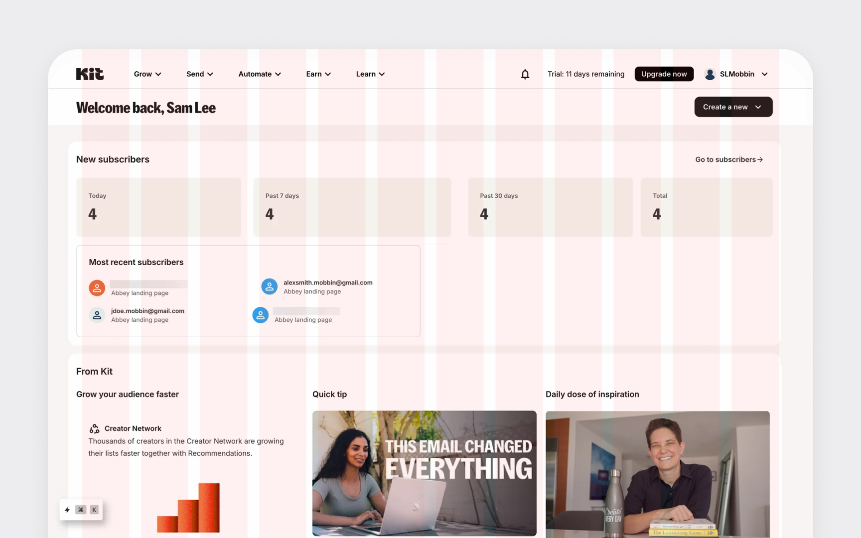
A well-implemented grid system acts as the invisible foundation of your interface. While users never directly see it, they feel its impact through consistent alignment, smooth
Start with your baseline grid specifications:
- Column structures
- Margins and gutters
- Breakpoint behavior
Then, observe how content actually lives within this framework. Common issues often hide in the details:
- Headers that don't align with your column structure
- Components that break grid rules at specific breakpoints
- Inconsistent spacing between similar elements
- Margins that don't match your defined grid values
Most importantly, analyze whether your grid system is helping or hindering
Whitespace isn't empty space but a functional design element that guides reading flow and organizes information. While grids establish the macro structure, spacing patterns create the finer rhythm within
Look beyond simple measurements to assess the purposefulness of your spacing:
- Information density: Is the content too crowded or too sparse for its purpose?
- Visual grouping: Do related elements share consistent spacing patterns?
- Content hierarchy: Does whitespace appropriately separate different information levels?
- Component consistency: Do similar components maintain identical internal spacing?
The best spacing systems don't just enforce specific pixel values — they establish relationships between elements. A 24px gap might work between sections, while half that value (12px) works for related items, creating a coherent visual language.
Remember that whitespace needs vary by device. Mobile interfaces often require tighter spacing than desktop counterparts while maintaining the same visual relationships.
Visual hierarchy guides users through
Don't just check individual screens in isolation. Track how hierarchy flows from one screen to another:
- Are primary actions consistently the most visually prominent elements?
- Can users easily distinguish between interactive and static elements?
- Do headings and subheadings create clear content relationships?
- Are similar information types presented with consistent visual weight?
The most common hierarchy problems occur when too many elements compete for attention. Look for screens where multiple items use visual emphasis techniques like large size, bold
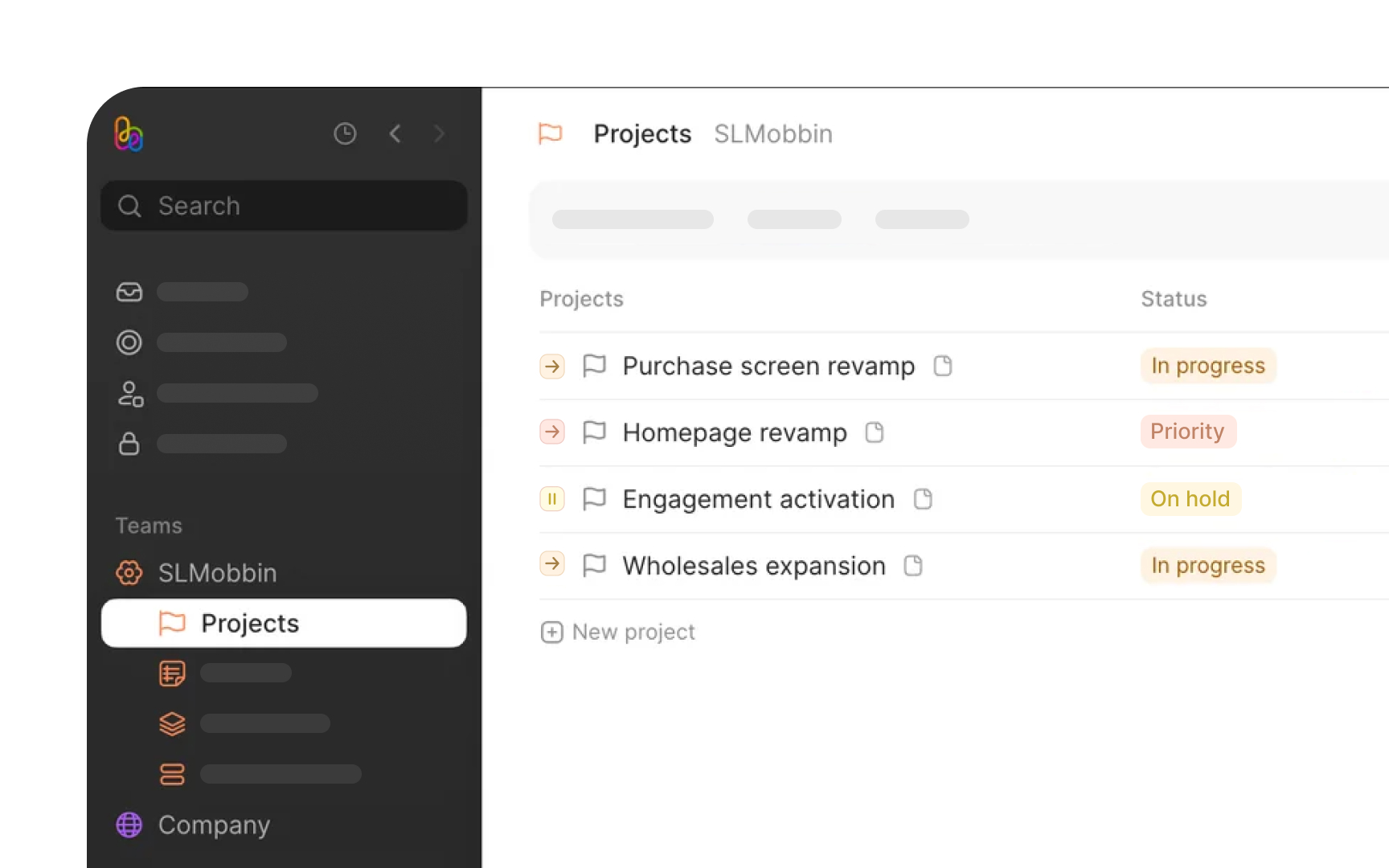
When users interact with your product, they gradually build a mental map of how things work. Inconsistently styled components force users to learn multiple patterns for the same
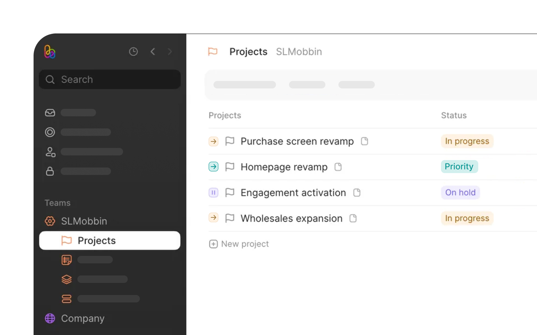
Component styling consistency goes beyond matching colors or shapes. It's about creating predictable patterns:
- Input fields should maintain consistent styling across the entire product
- Buttons with similar importance should share visual characteristics
- Alert messages need a uniform structure regardless of where they appear
- Interactive states (hover, focus, active) should follow consistent patterns
The audit process involves comparing instances of the same component across different contexts. Document variations and determine whether they represent necessary adaptations or unintentional inconsistencies.
Don't forget edge cases — components in modals, sidebars, or specialized workflows often drift from the main
When users interact with an interface, they expect clear signals confirming their actions. Visual feedback bridges the gap between user
The effectiveness of your visual feedback system depends on several factors:
- Responsiveness: How quickly do elements react to
interaction ?Buttons should show immediate state changes when clicked - Clarity: Is the feedback unmistakable? Users shouldn't wonder if their action registered
- Consistency: Do similar interactions produce similar feedback? This creates predictable patterns
- Appropriateness: Does the feedback match the action's importance? Critical actions warrant stronger visual signals
Identify feedback gaps in your interface: moments when users take action but don’t receive clear visual confirmation. Common problems include links without hover states, form fields lacking focus indicators, or system processes without
References
Top contributors


Topics
From Course

Share


Similar lessons

Introduction to Design Audits

Assumption Testing
