Super Simple Habit App

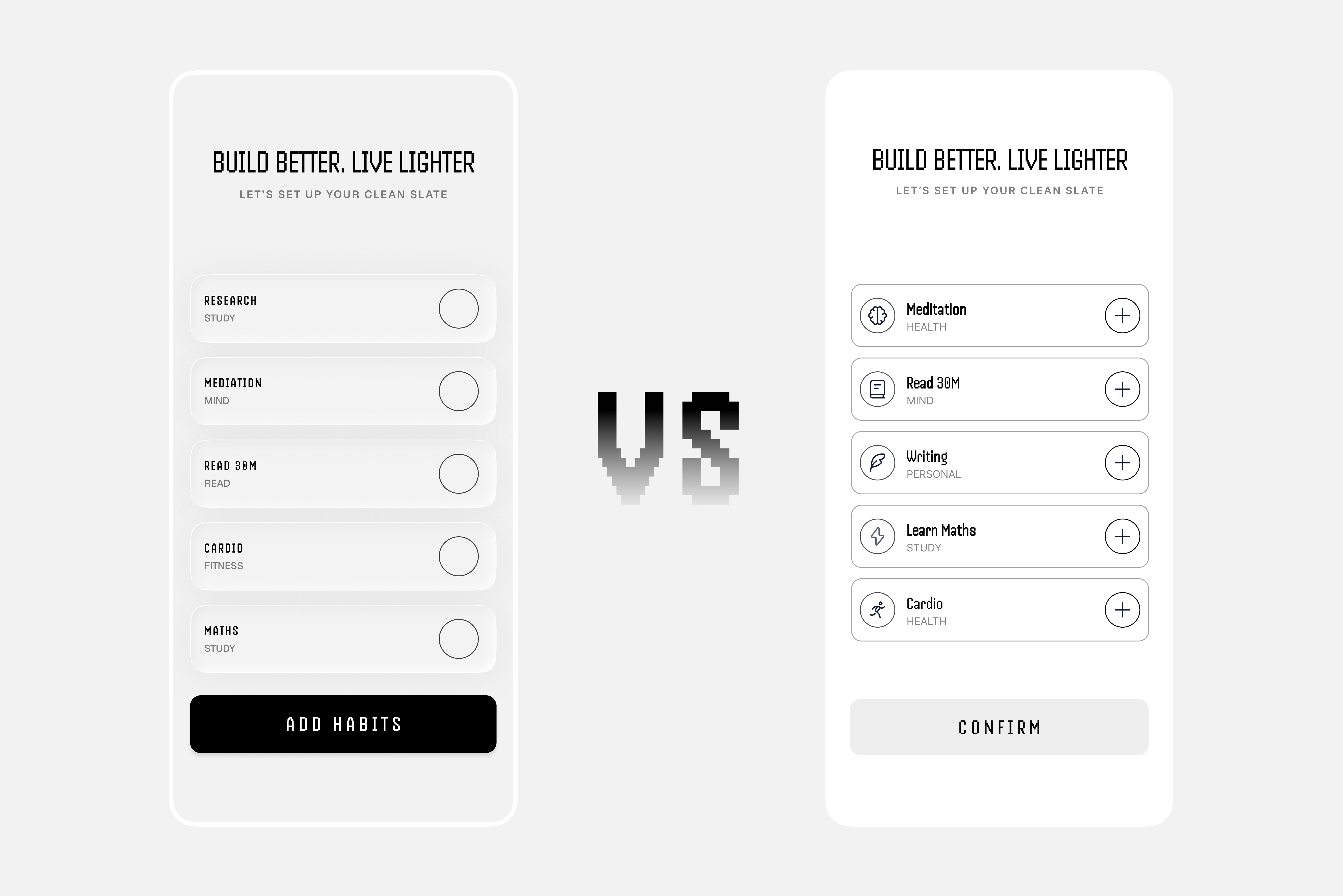
I’m exploring two approaches for a habit-selection screen. Which version feels clearer and more intuitive to you, and why?
Reviews
5 reviews

From a product philosophy standpoint, “Super Simple Habit App” signals discipline and that’s refreshing. Habit tools often over-engineer features, which ironically increases friction. If this concept truly prioritizes simplicity, that’s already aligned with behavior design principles.
What matters most in habit apps isn’t feature depth, but consistency reinforcement. If the interface reduces cognitive load and makes daily check-ins effortless, that’s strong thinking. Simplicity, when intentional, can be a growth strategy rather than a limitation.
To elevate it further, I’d examine how it sustains motivation over time. Minimalism works early on, but long-term retention often requires subtle reinforcement loops progress cues, streak psychology, or gentle nudges. Overall, this feels focused and principled, with a clear understanding of restraint as a design choice.

When it comes to the color palette, I prefer the option on the right, the lighter one, because the contrast is stronger. In the left version, the cards feel too close to the background and don’t stand out as clearly.
That said, I actually prefer the button copy in the left version. It explains what the action is about and gives the user more context and reassurance. On the right side, with just “Confirm,” it’s not very clear what I’m confirming. On the left, it’s immediately obvious that the action is related to habits.
Combining the stronger contrast from the right version with the clearer button copy from the left could give you the best of both options in my opinion.

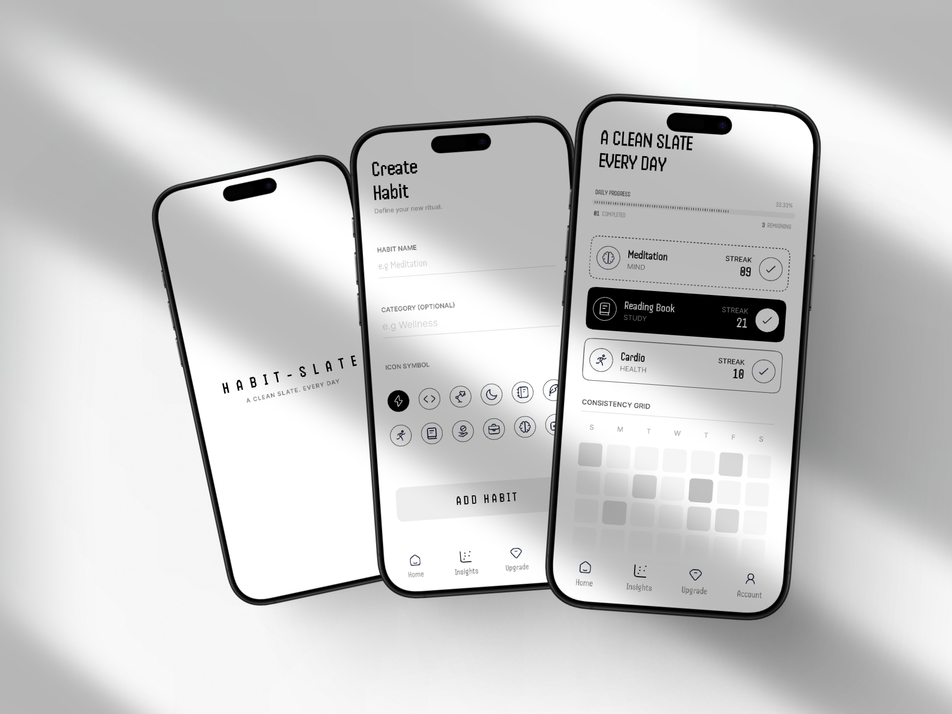
The screen is minimalist and elegant. It sets the app's mood nicely. The "Create Habit" screen is readable, and the icon grid gives users enough choice without overwhelming them. Nice touch making the category optional, less friction during onboarding.
The dashboard (right screen) does its job well. Progress bar at the top, streaks next to habits provide motivation, and the GitHub-style consistency grid is a great pattern for tracking regularity. The dark background highlighting "Reading Book" clearly communicates the active/selected state.
Overall, the project maintains very good visual quality and UX logic. The monochromatic palette works in its favor. It feels calm and "zen," which fits the habit-building theme perfectly. Solid work. 💪

I loved your project, Raghvendra. I would just be a bit more careful with contrast, but overall I really enjoyed the work.

Your screens are lovely and minimalistic, Raghvendra!
I personally prefer the version with icons on the right. Since users can choose an icon when adding their own habit, this helps demonstrate that interaction more clearly in practice.
A couple of additional thoughts:
- I haven’t checked the contrast on the secondary text (habit labels), but they feel a little hard to read. It might be worth increasing the contrast slightly for accessibility.
- I’m a bit confused by the progress bar. It shows 33.33%, but also says 81 completed and 3 remaining. Is the 33.33% what’s left to complete? Clarifying this could help avoid confusion.
Awesome project overall!
You might also like

Smartwatch Design for Messenger App


Bridge: UI/UX Rebrand of a Blockchain SCM Product


Pulse Music App - Light/Dark Mode


Monetization Strategy


Designing A Better Co-Working Experience Through CJM


Design a Settings Page for Mobile
Popular Courses

UX Design Foundations


Introduction to Figma

Design Terminology
