Best Practices for Designing Grids
Learn how to add structure, balance, and harmony to your UI with the help of grids
Grids are a layout system that helps organize and structure content within a design. They consist of intersecting horizontal and vertical lines that create a framework for placing elements on a screen. This system provides a sense of order, hierarchy, and alignment, making it easier for users to navigate and understand the layout of a user interface. Learning the best practices for designing using grids can help you create interfaces that are both aesthetically pleasing and user-friendly.
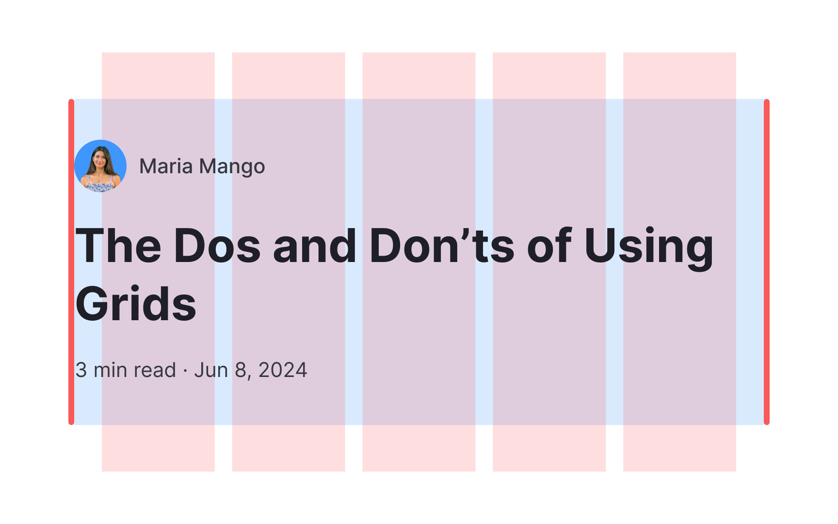
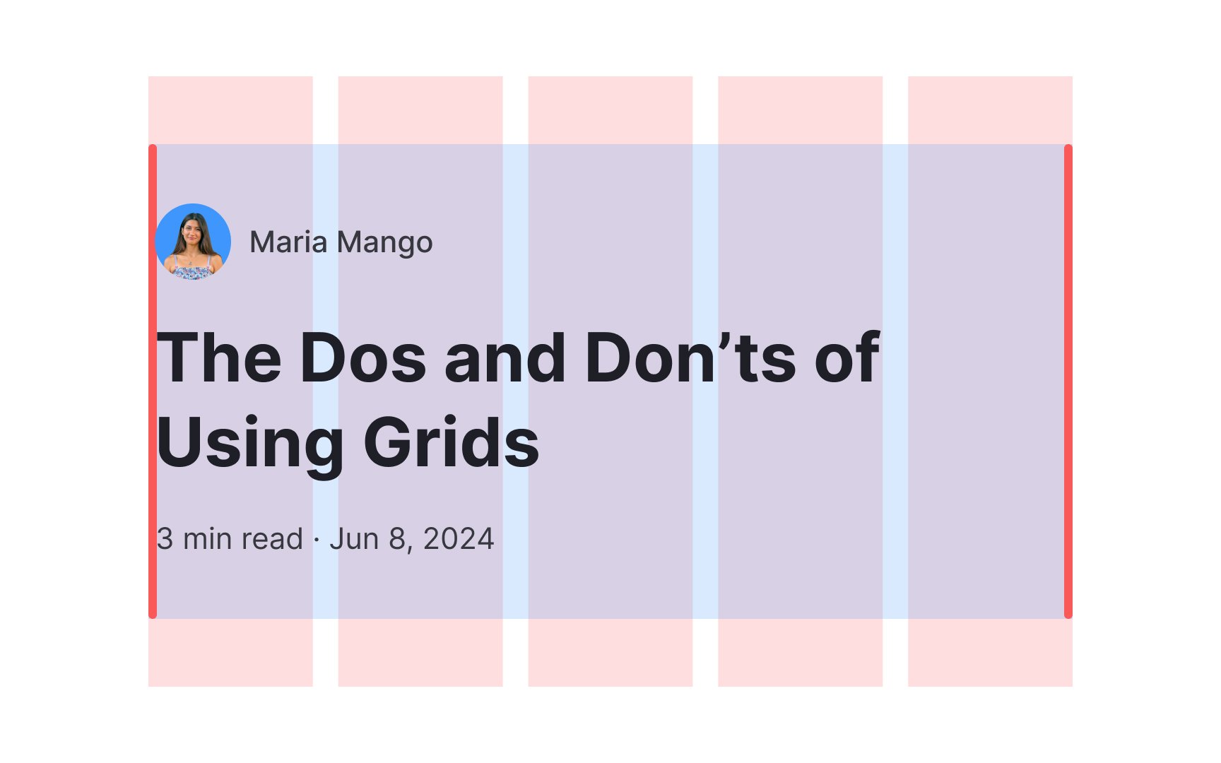
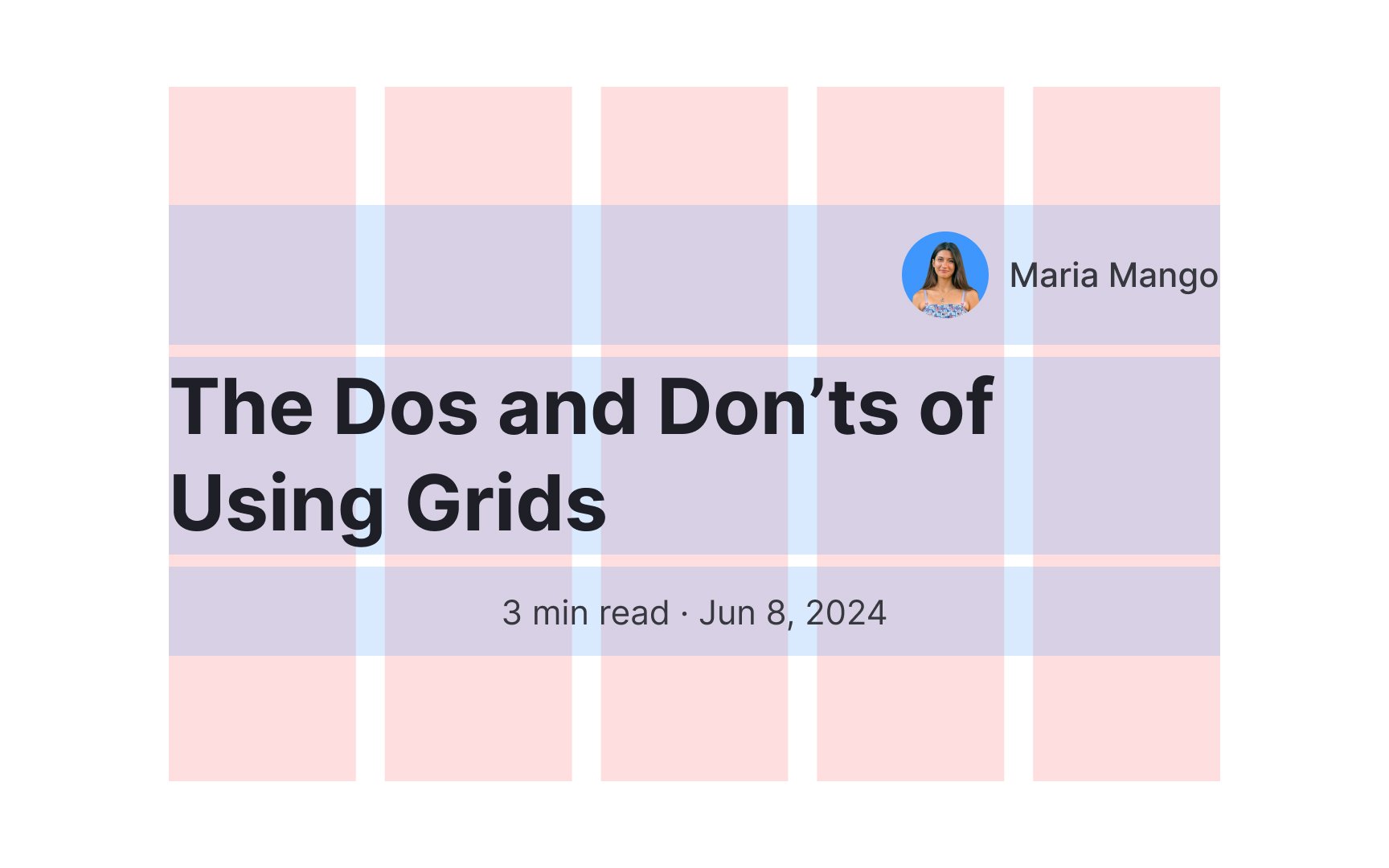
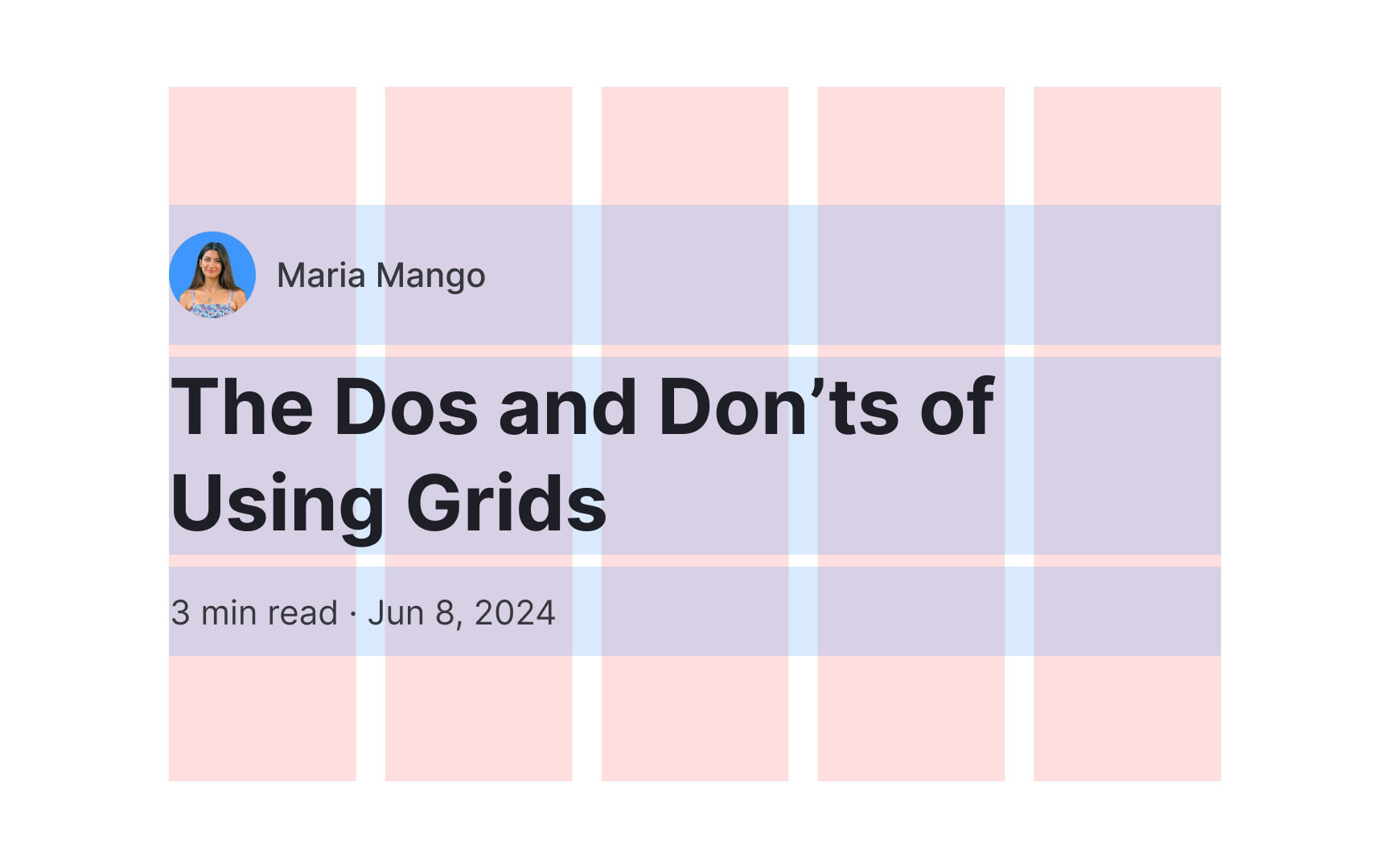
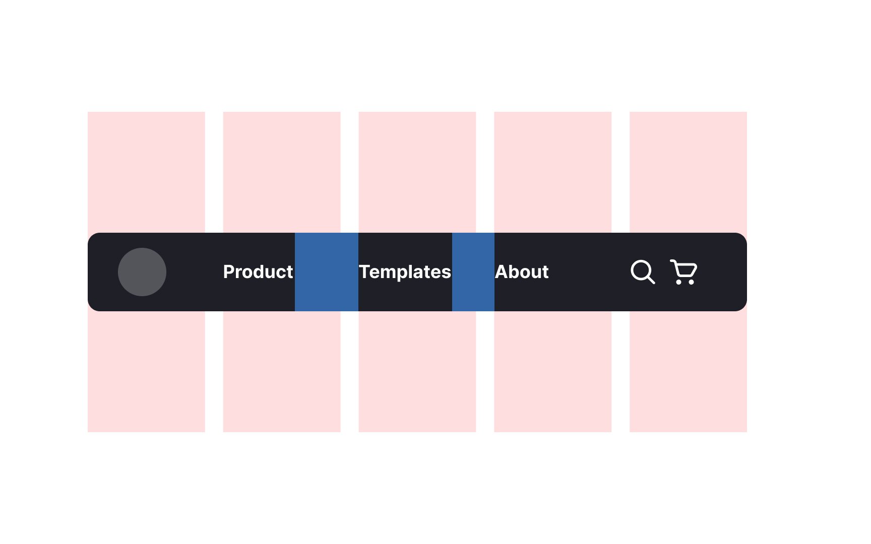
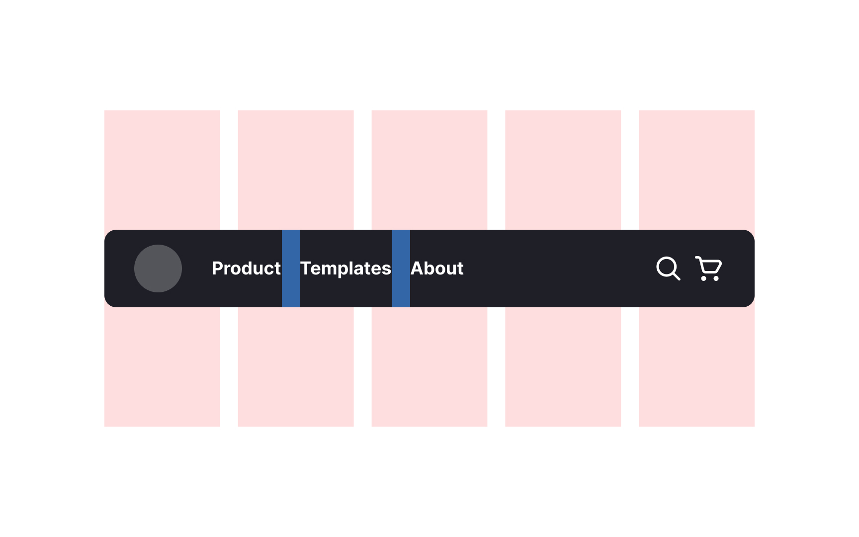
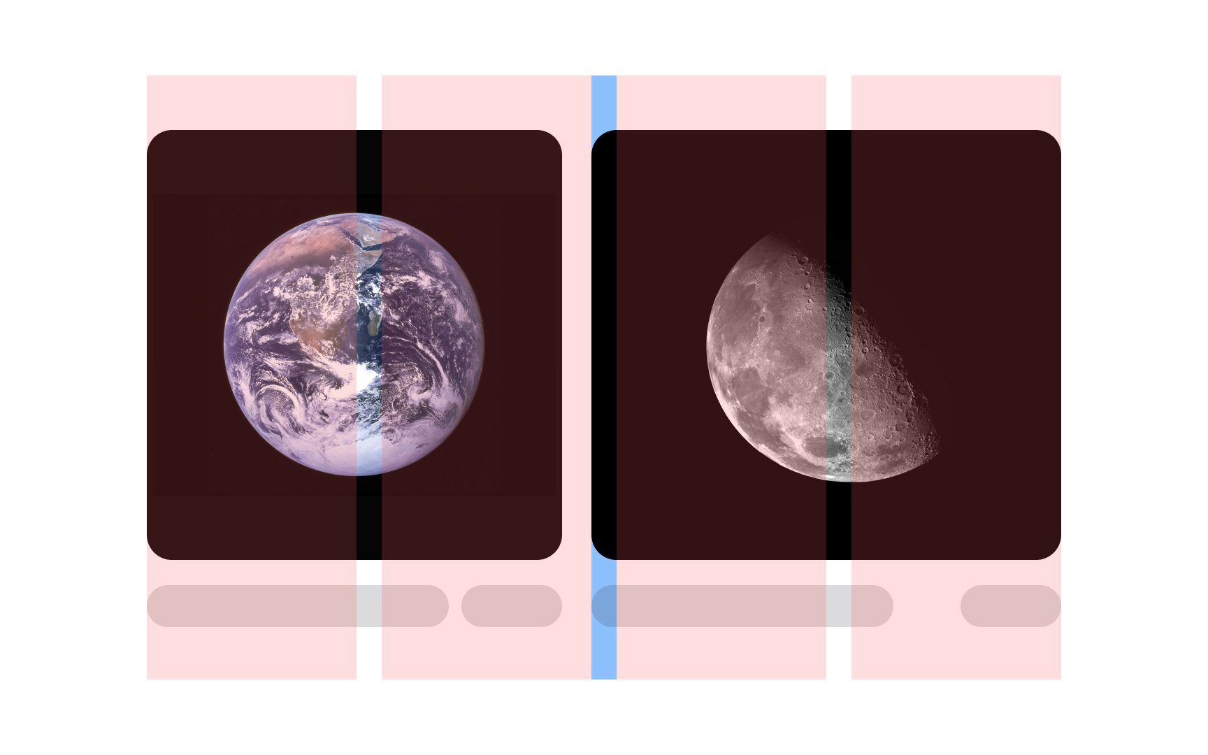
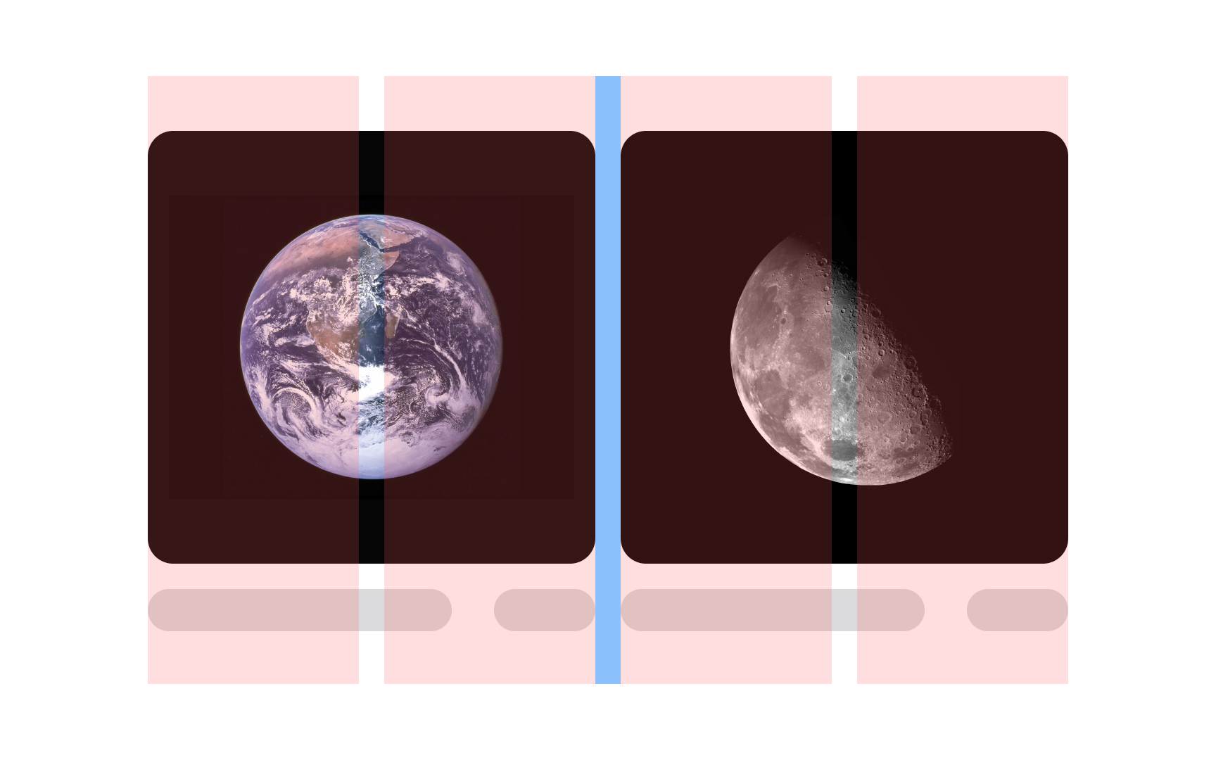
The column grid is probably the most popular type among graphic and web designers. It splits the page into vertical bars with homogeneous margins between them. There are many other types of grid systems too, but the main principle is the same — always keep the container aligned within grid borders. This precision in alignment not only improves the aesthetic appeal but also reinforces the grid system's functionality, creating a visually harmonious design.
Also, keep the
Consistent alignment contributes to a polished and professional appearance, reinforcing the coherence of your design. By aligning similar elements — such as buttons, text blocks, or images — in a uniform manner, you create visual harmony and improve the overall readability of your interface. You also enhance users' understanding of the
Pro Tip: Stay consistent in your alignment between pages and sections.
When incorporating
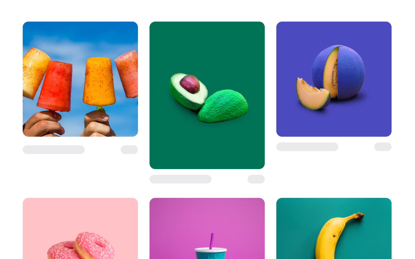
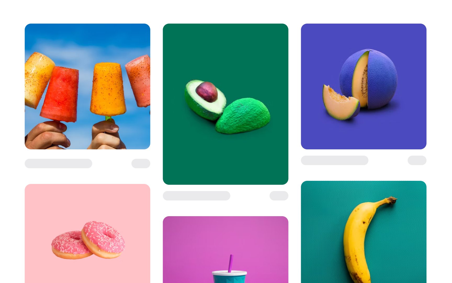
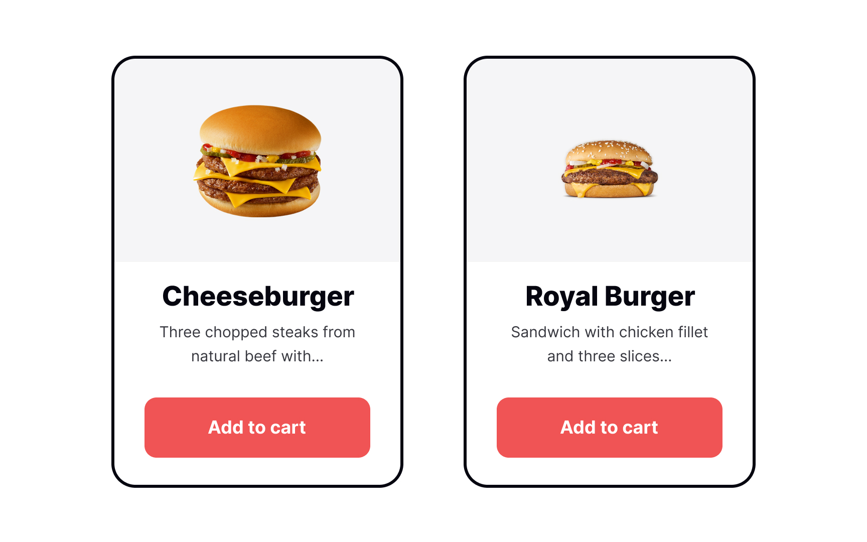
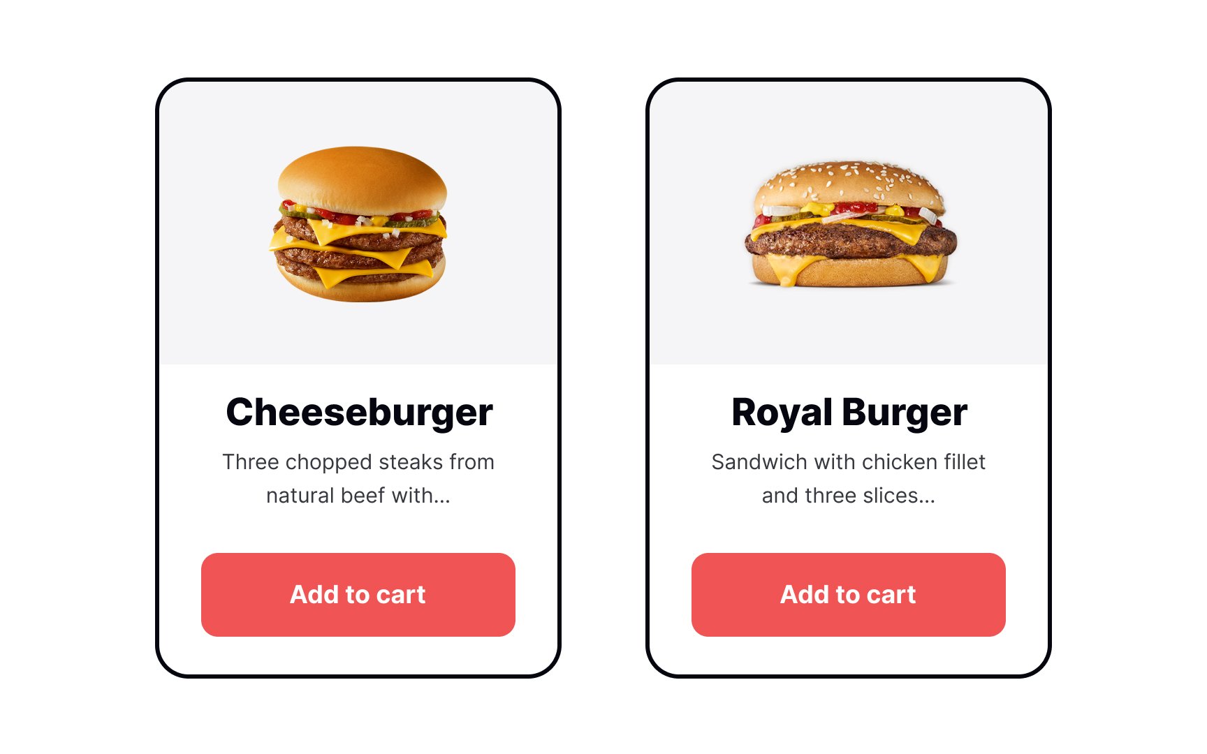
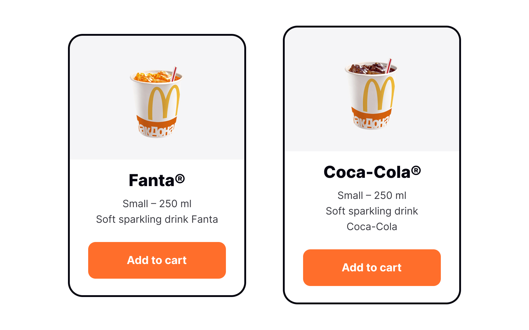
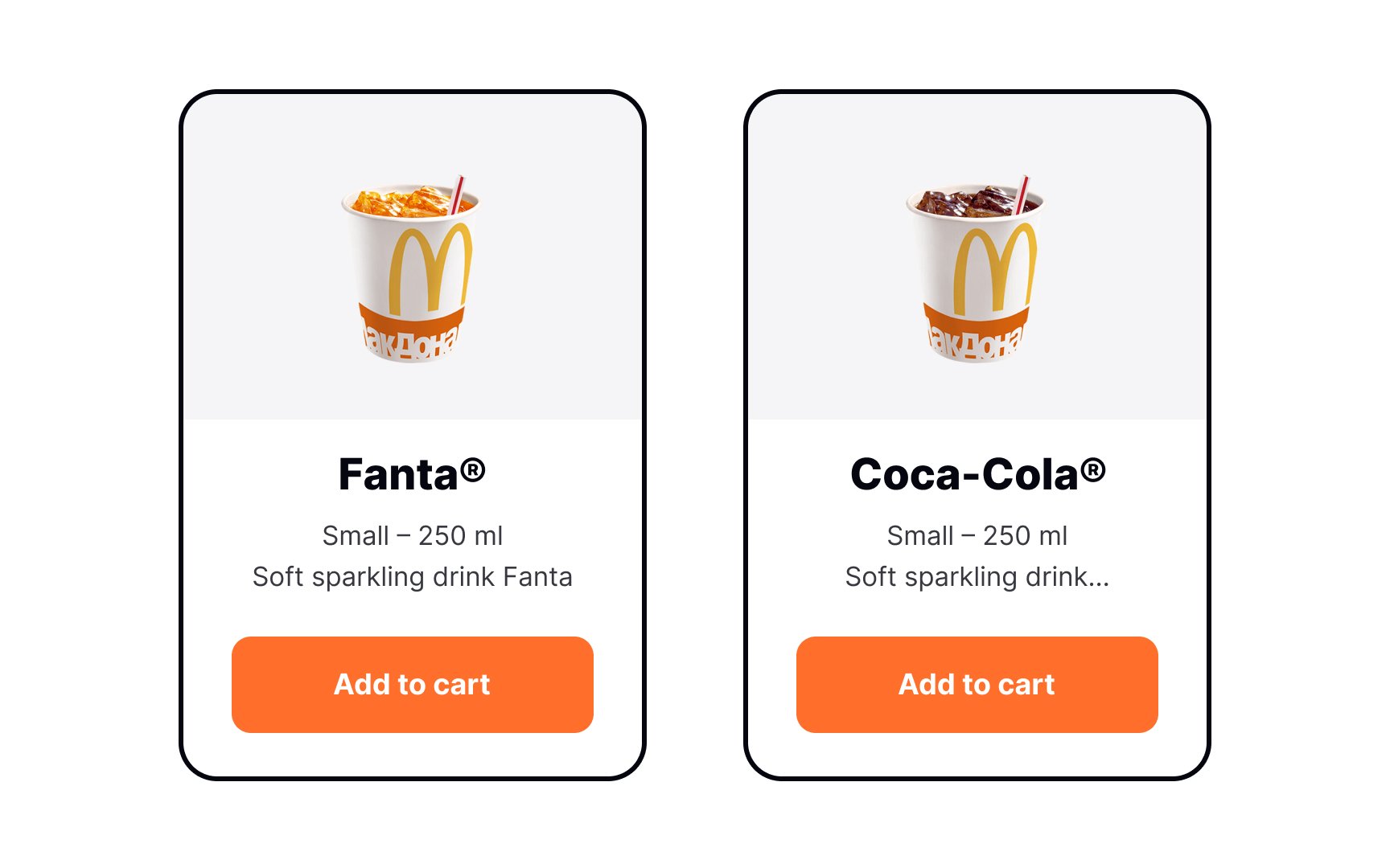
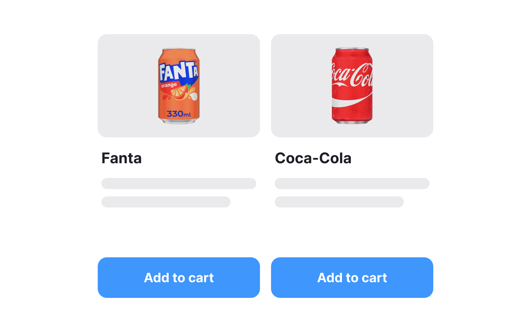
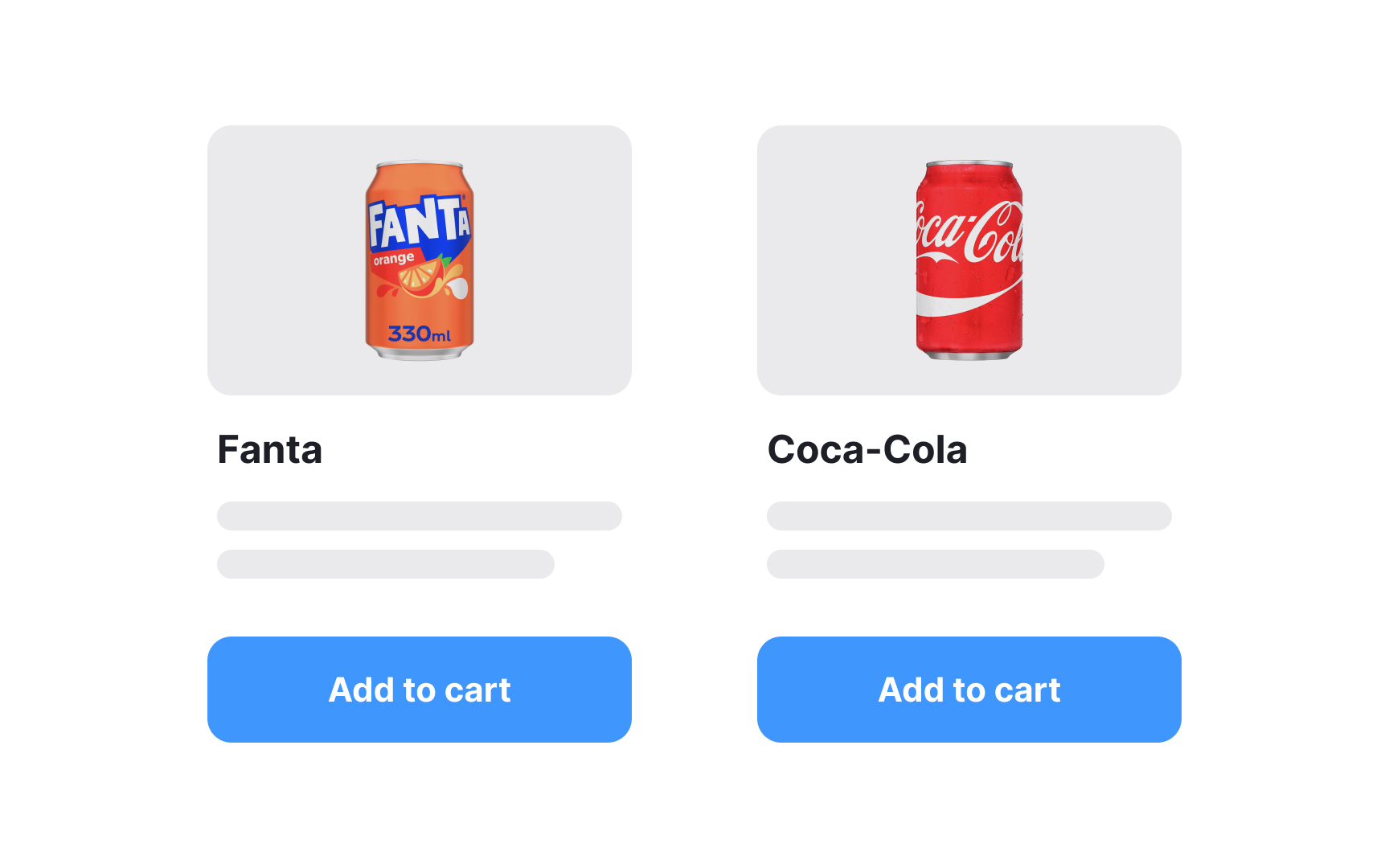
Avoid leaving large gaps between elements by aiming for a harmonious flow that accommodates diverse content sizes. For example, in a grid-based layout with text blocks interspersed with images, don't stick rigidly to fixed vertical spacing. Instead, adjust the spacing dynamically based on the height of the media elements. If an image is taller, let the adjacent text block align snugly next to it, minimizing excessive white space. This approach ensures a visually cohesive and balanced design, enhancing the overall user experience by making the layout look more structured and intentional.
When structuring a
This method not only enhances the overall aesthetics but also aids users in quickly scanning and comprehending the
Similar elements should follow the same alignment rules on both axes. Keeping your alignment consistent across similar
In web and app design, where diverse elements like
For instance, if you have a button or an image within a
When elements like a
Don't skimp on
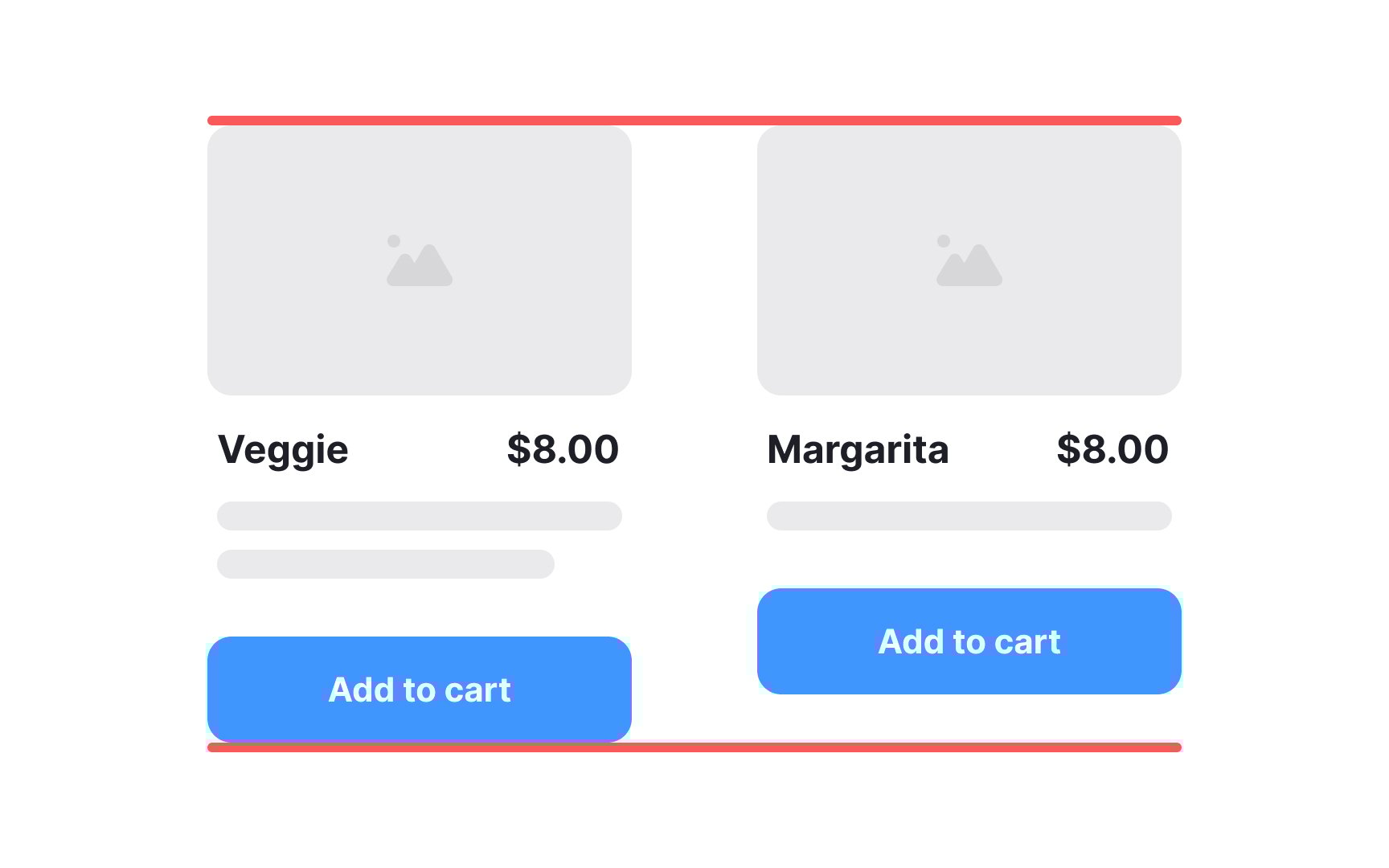
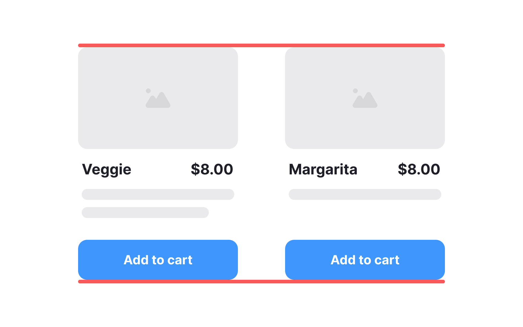
Consider a webpage with a form that includes input fields, labels, and a submit
While considering the overall
For example, if you have a grid with multiple columns, and an
Imagine a
Using a fixed grid makes adding new content easier and maintains consistency and predictability with the overall design vision. It reduces the endless possibilities of layout arrangements to a manageable number.
References
- Layout | Apple Developer Documentation | Apple Developer Documentation
- Material Design | Material Design
- Proximity Principle in Visual Design | Nielsen Norman Group
Top contributors
Topics
From Course

Share


Similar lessons

Intro to Design Layouts

Intro to Design Grids
