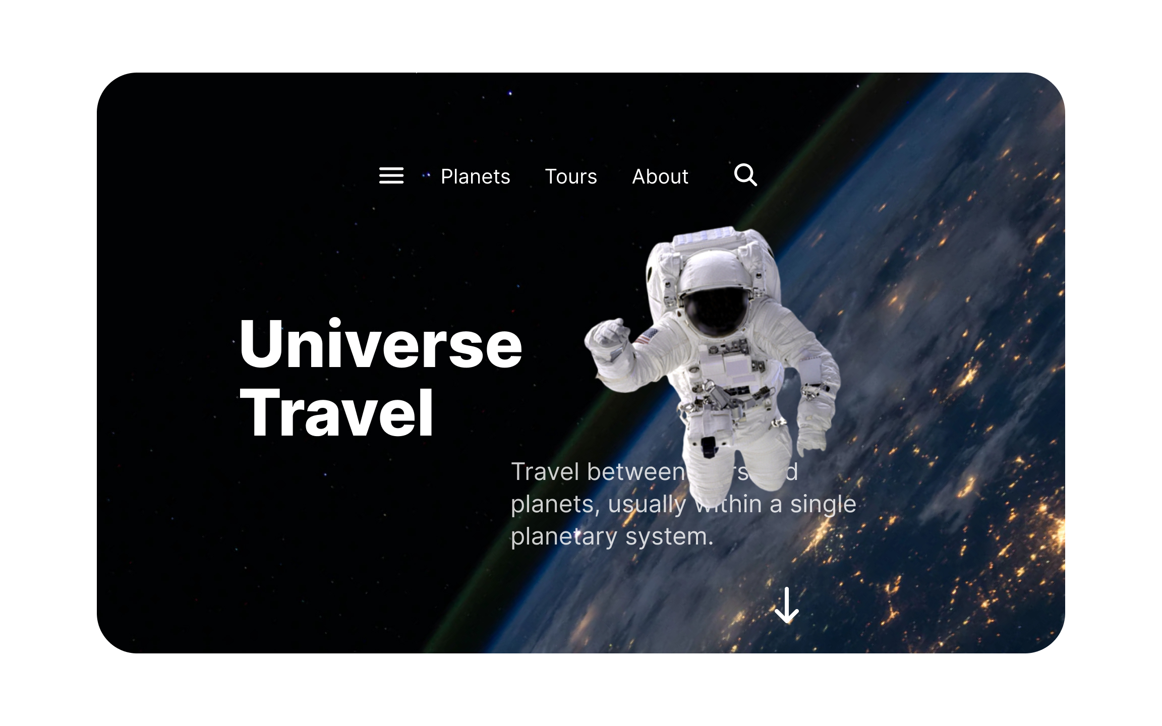
Design Format Properties
Explore design format properties that can be used to control visual hierarchy and guide user attention
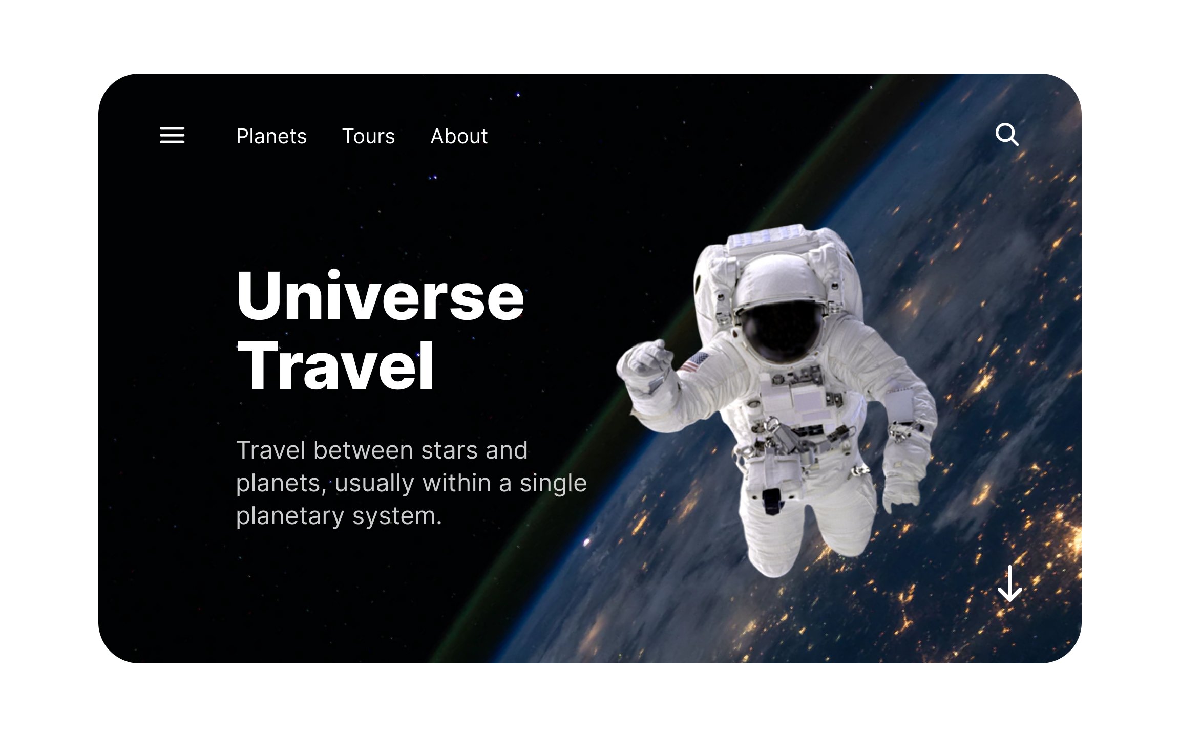
The way a layout is composed affects how users perceive information. These design formats and their properties can control where users’ eyes land and make them focus on the most important parts of your design composition.
From the rule of thirds and the golden ratio to the difference between static and dynamic compositions, learning these format properties will allow you to create designs that have the impact you’re aiming for.
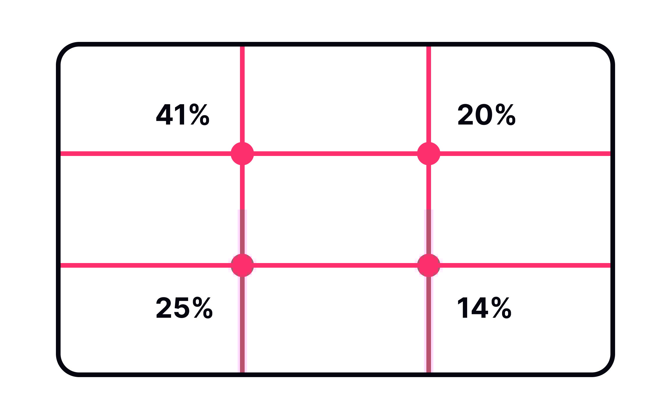
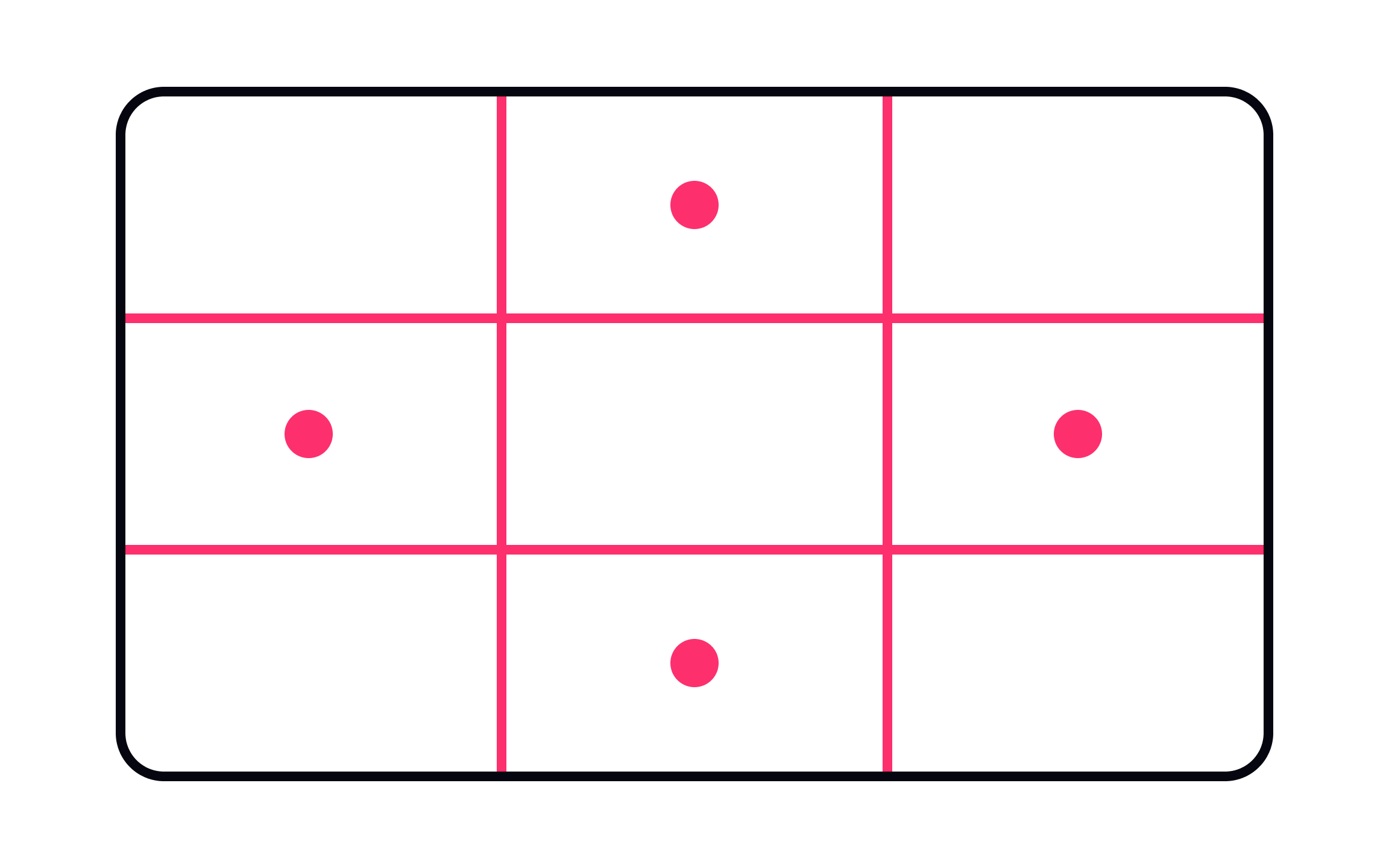
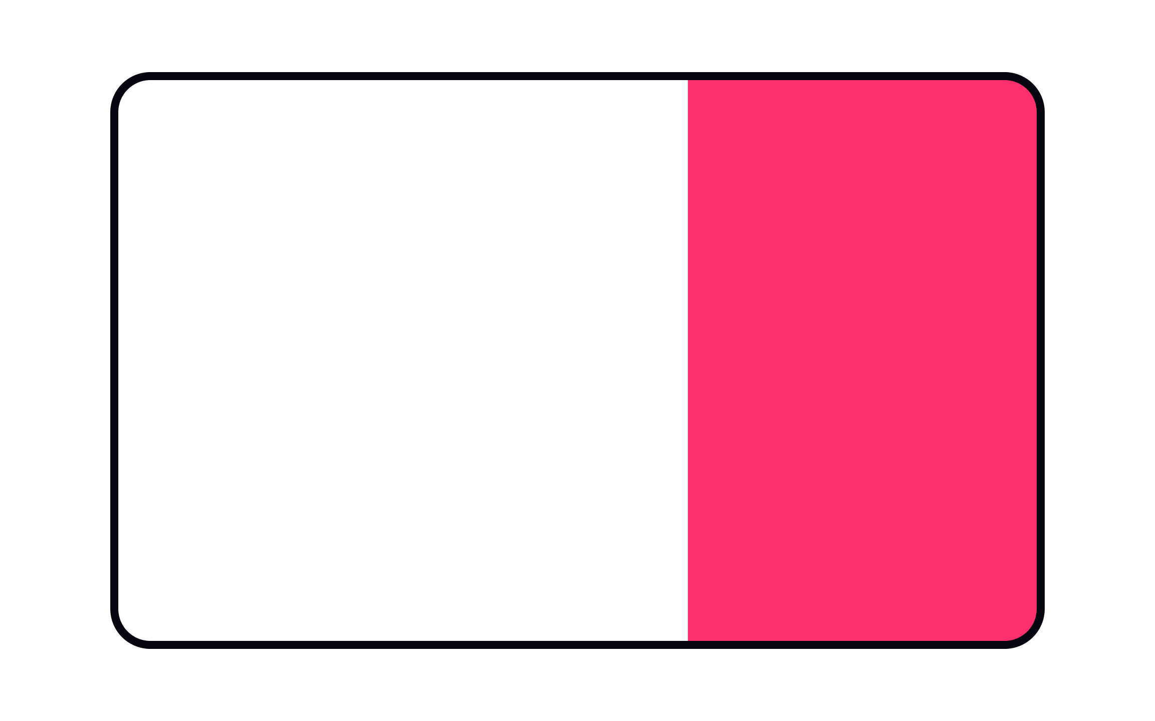
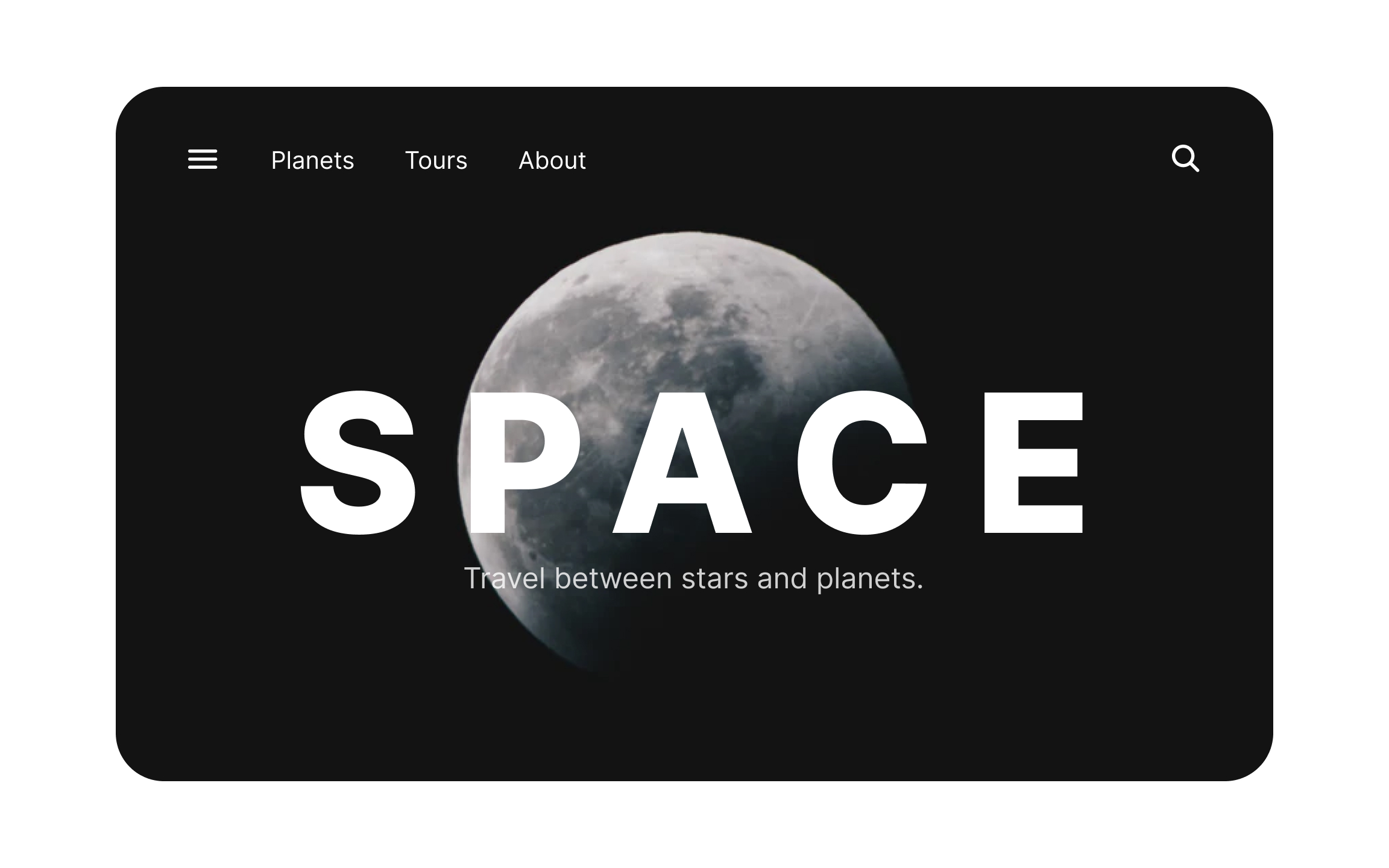
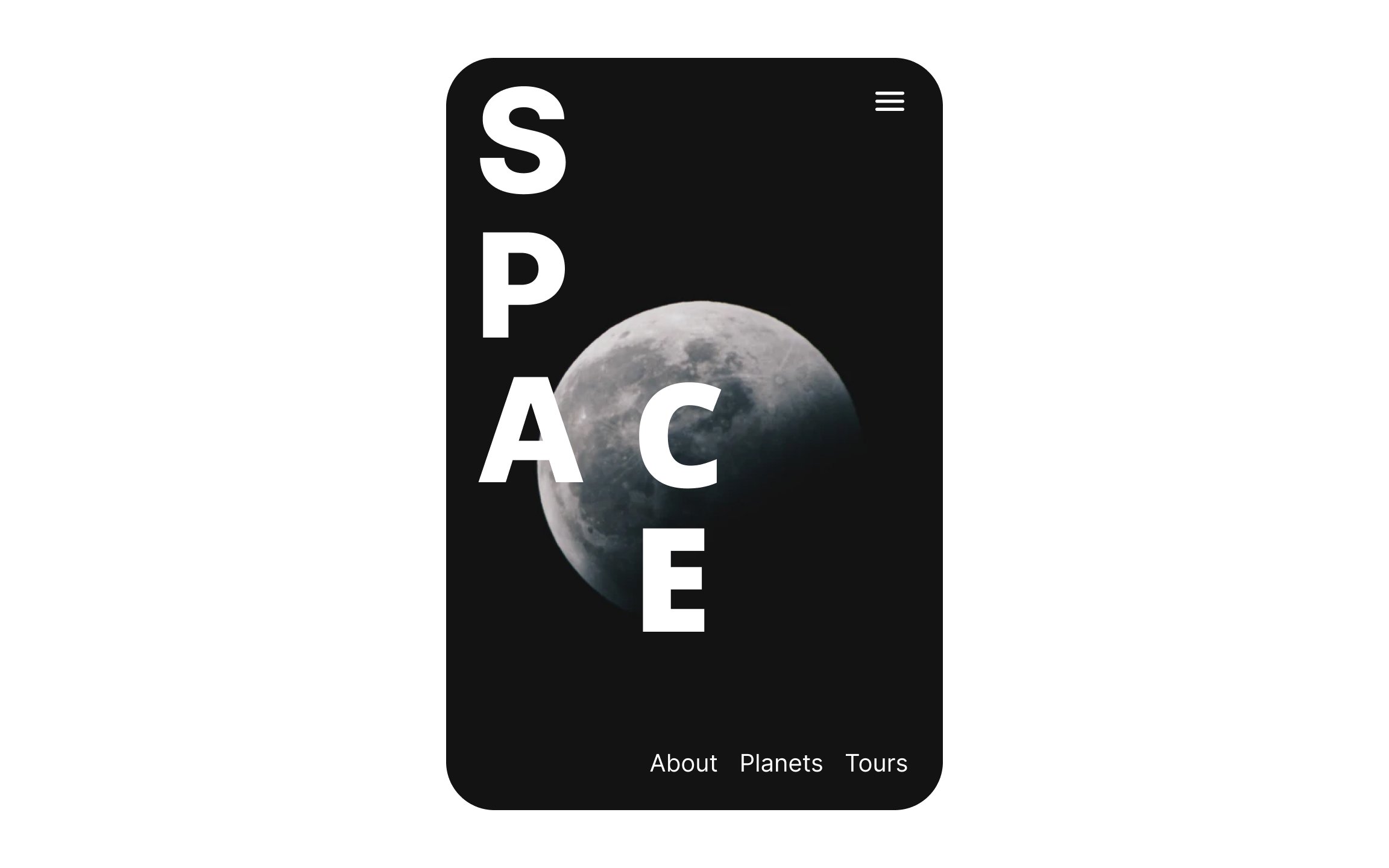
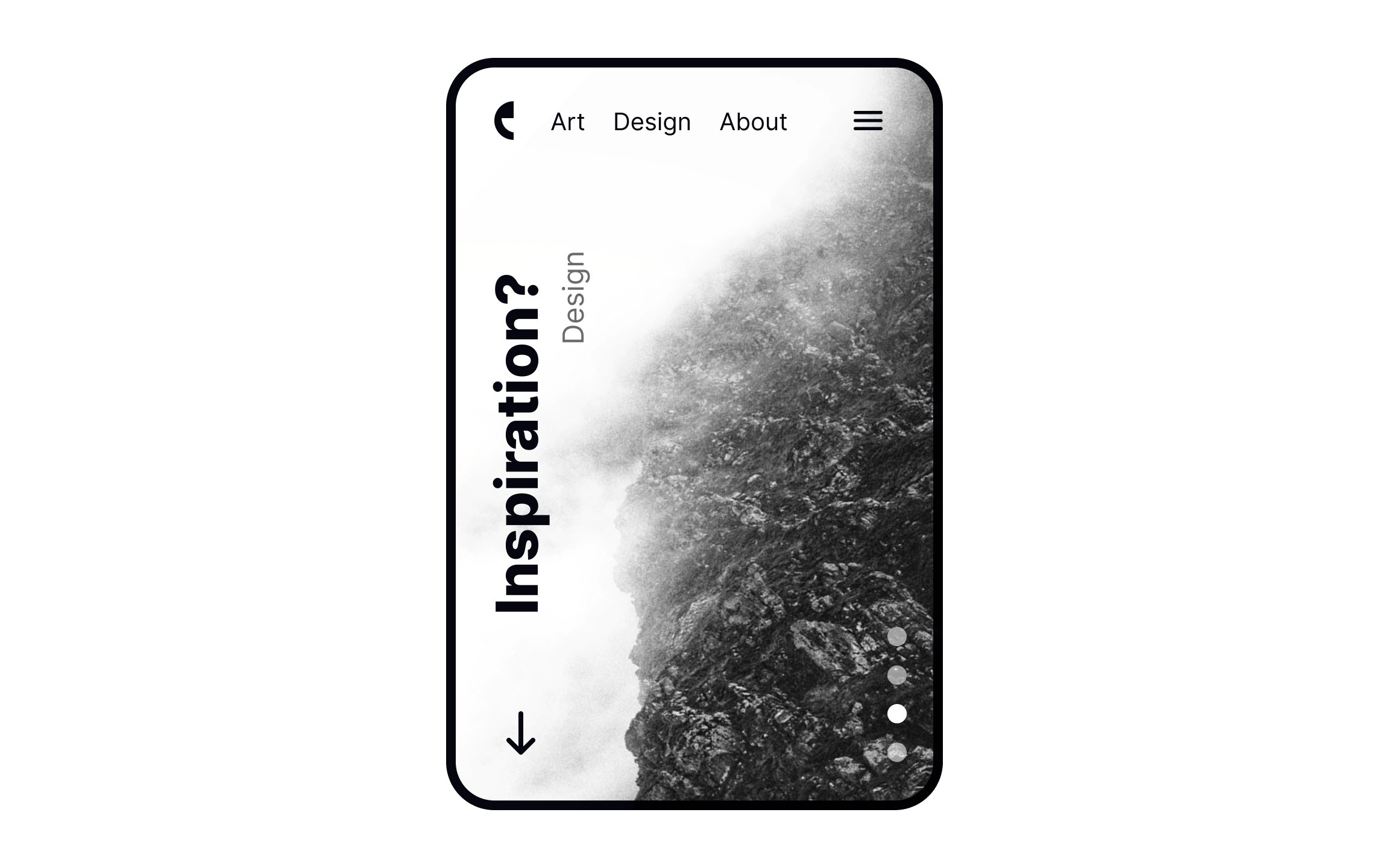
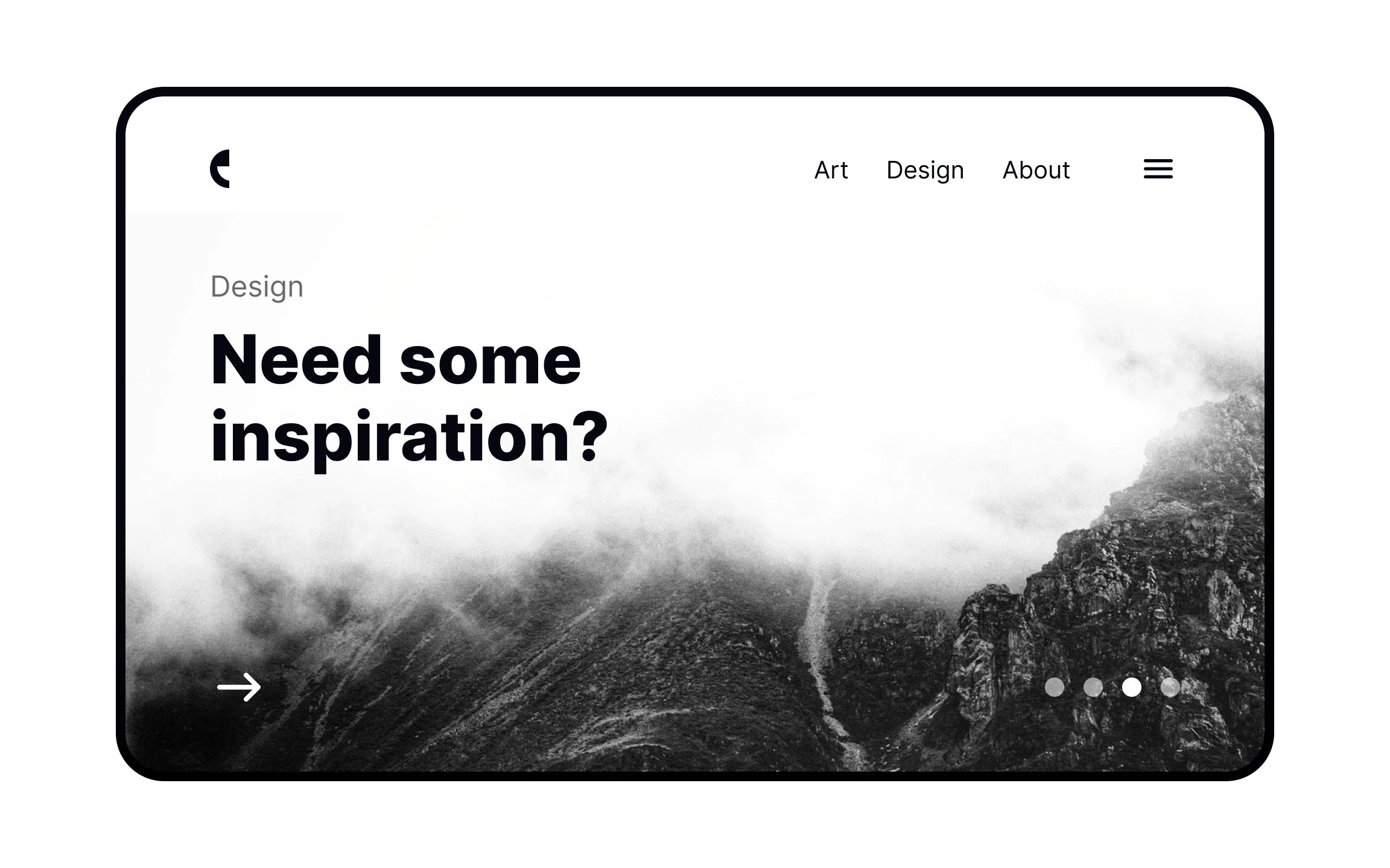
Create a grid of 2 equally spaced vertical and 2 equally spaced horizontal lines — dividing a rectangle into 9 equal parts — and you’ll have an example of the rule of thirds.[1] According to this rule, people tend to concentrate their attention along these lines and particularly at their intersections — the active zones of a
Photographers are taught the rule of thirds early on in their studies, as it’s one of the easiest ways to create a visually appealing, balanced composition. Designers should pay careful attention to these intersections when placing important page elements.
Pro Tip: Not all intersections in the rule of thirds receive equal attention — it varies by culture — but the top always gets more attention than the bottom.
The rule of thirds determines where the focal points of your
For example, you can place headers in the passive top zone. They’re easy to find when users need them, but don’t distract from the rest of the
Dynamic formats create the illusion of internal dynamics and movement, despite being made up of static elements.[2] This is done by placing elements in such a way that forces users’ eyes to move. Placing elements at an angle, leaving negative space before or after an element, and positioning on the
If you’re trying to create a calm and balanced
Static compositions use shapes that are balanced (often symmetrically) and don’t give the impression of movement.[3] Consider them more like a resting state compared to the active state of a dynamic composition.

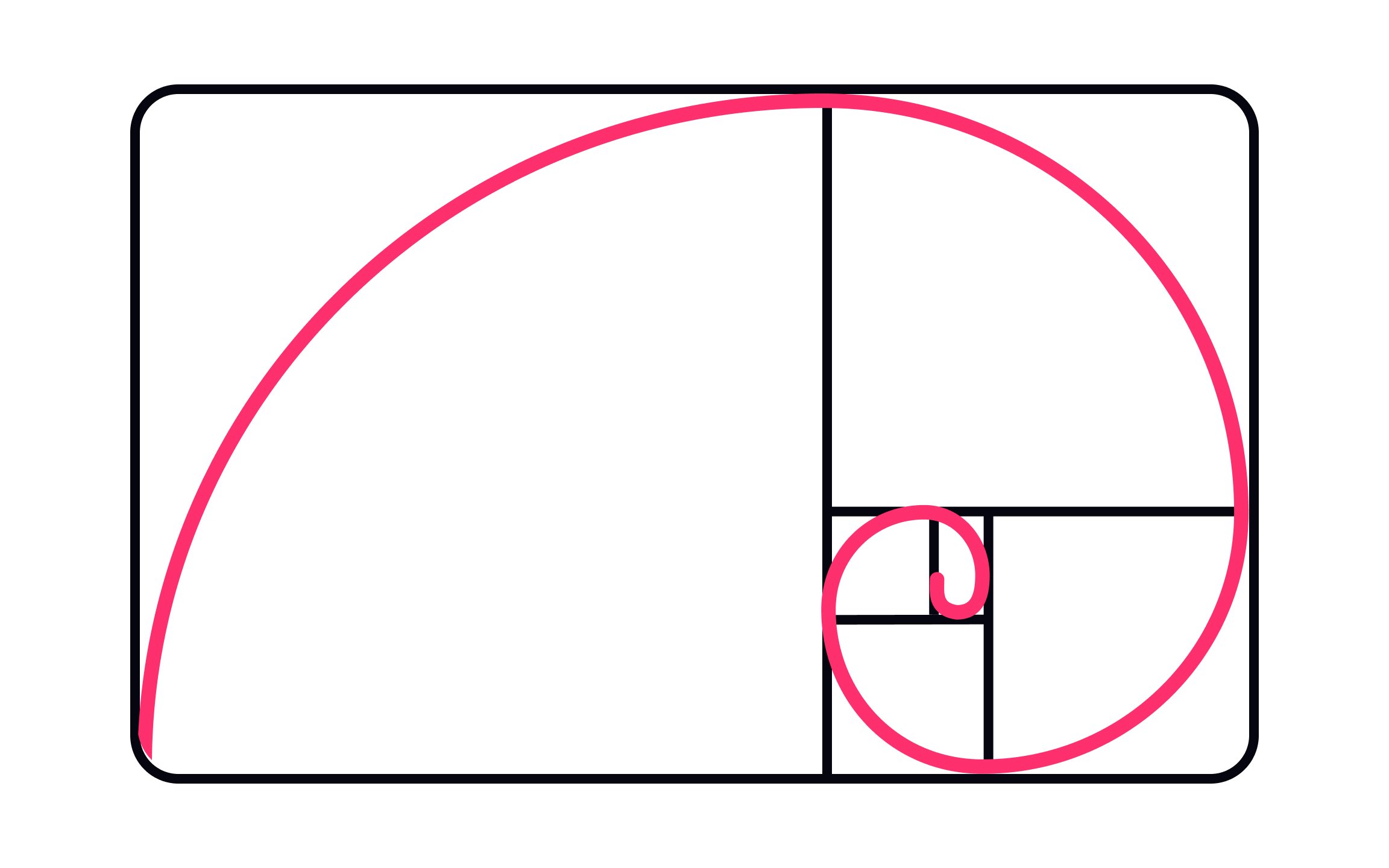
From Greek sculptors to the first typographers, humanity has always searched for perfect proportions. Their search led them to what we now know as the
The Golden Ratio brings harmony and structure to your designs. It gives them a certain sense of artistry. They’re also more appealing to the human eye — in fact, we may be biologically hardwired to prefer structures that follow this rule.[5]
The
Using the golden ratio in your designs can pull users’ attention to the most important elements, like a CTA button. It can also give your design a sense of balance and harmony that’s immediately appealing to users.
Pro Tip: In design, calculating the golden ratio for something like a rectangle is simple: determine the length of the shorter side, then multiply by 1.618 to find the most aesthetically pleasing length to use for the longer side.
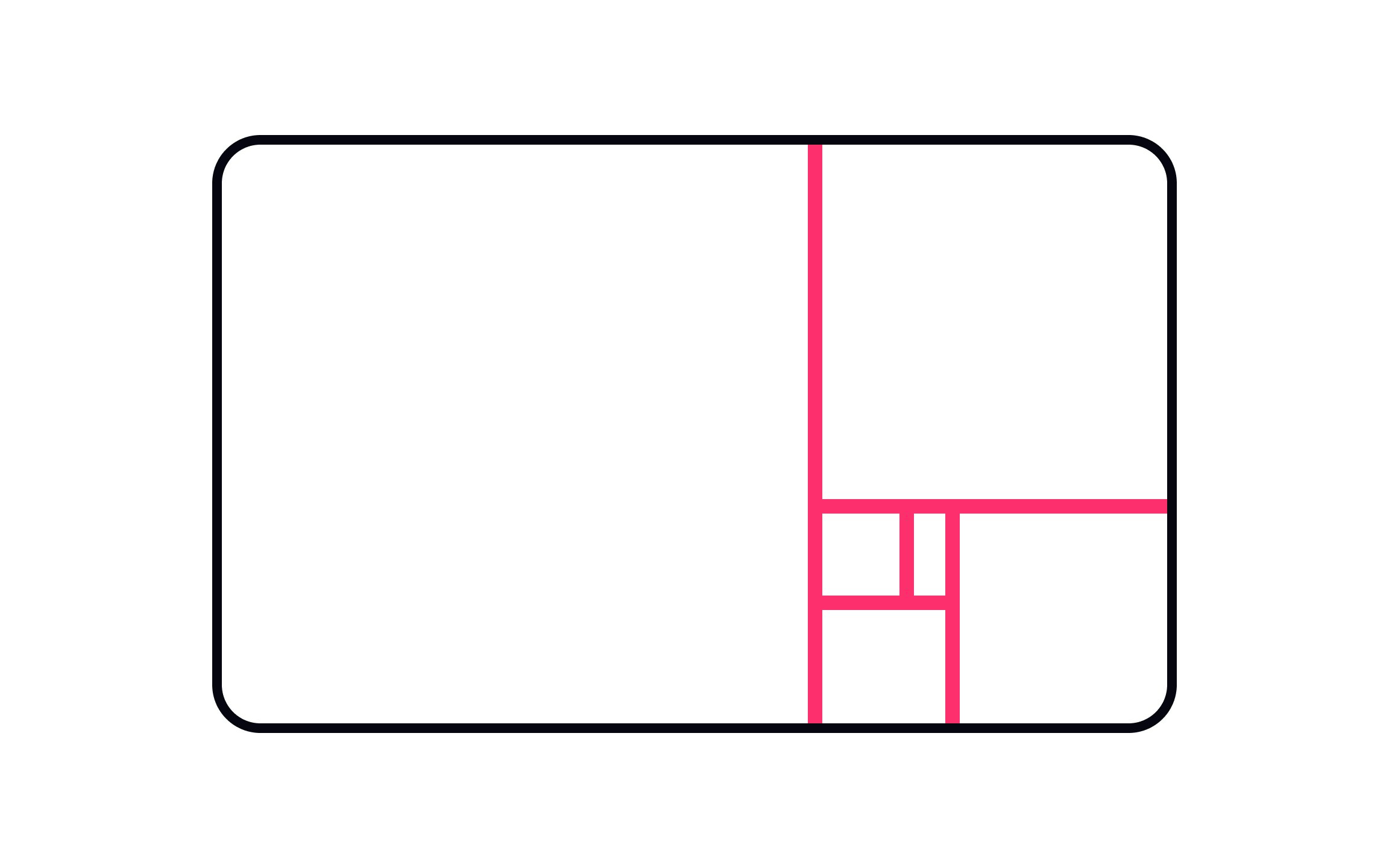
When setting up
Placing important design elements at points where the golden ratio grid intersects can also have a profound impact on how much they stand out to users. This is the perfect place to put important links or CTAs.

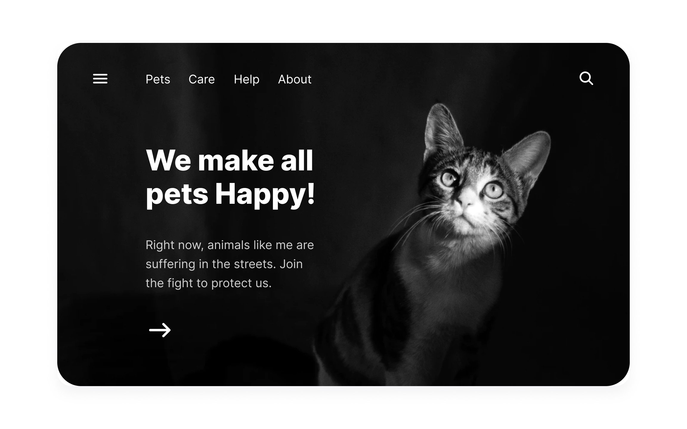
Placing elements according to the rule of thirds tells your users where to look first. Elements in active zones immediately draw our attention. Elements in passive zones are only noticed after, making them feel less important.
Place things like
Elements that don’t need immediate attention —
Vertical
For calm, relaxing interfaces, static formats are best. Horizontal layouts can more naturally lend themselves to static formats, as they don’t force users’ eye movement. By balancing elements on both sides of the vertical axis, a stable

Applying the
References
- The Rule of Thirds: Know your layout sweet spots | The Interaction Design Foundation
- Sense of Beauty Partly Innate, Study Suggests | livescience.com
- How the Golden Ratio Manifests in Nature | Treehugger
Top contributors


Topics
From Course

Share


Similar lessons

Intro to Design Layouts

Intro to Design Grids
