Common UI Button Styles
Learn how to format your buttons to elicit the exact actions you want from your users
Buttons are one of the most important interactive elements of any interface design. Well-designed buttons with recognizable styling entice users to click on them, which increases conversions. Isn't that what all businesses want?
Knowing how to format your buttons to maximize the impact you want them to have lets you create buttons that tickle exactly the right psychological motivators among your users. And one of the first considerations is the shape and size of your buttons.
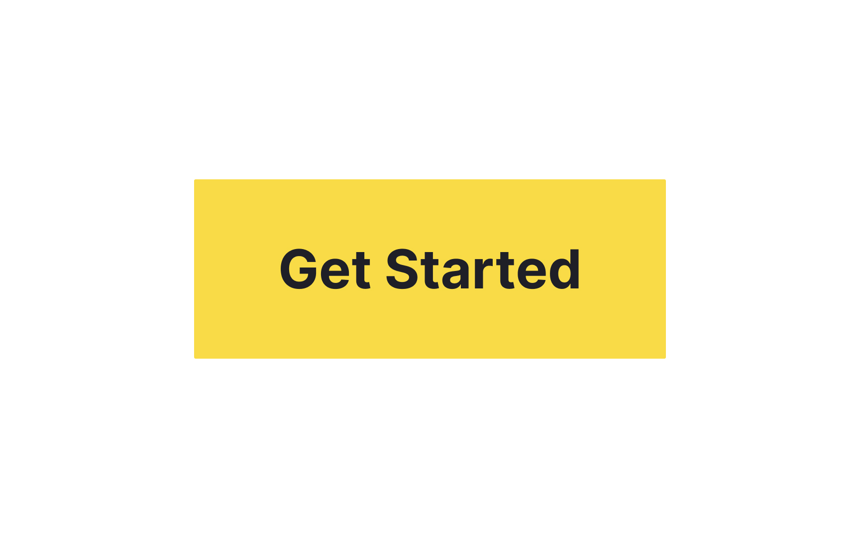
Sharp-corner
According to the psychological Bouba/Kiki effect, over 95% of people associate edgy, jagged objects with words like "Kiki" that don't require a large opening of your lips. In contrast, words that people pronounce with widely open, rounded lips, like "Bouba," are associated with curve-outlined shapes.[1] More importantly, sharp shapes feel more rigid and severe, while soft-edged shapes feel more friendly and easy-going.
Sharp-corner buttons may be a good solution for an insurance company website but could appear too harsh for a site selling blankets, clothing, and gifts for babies.
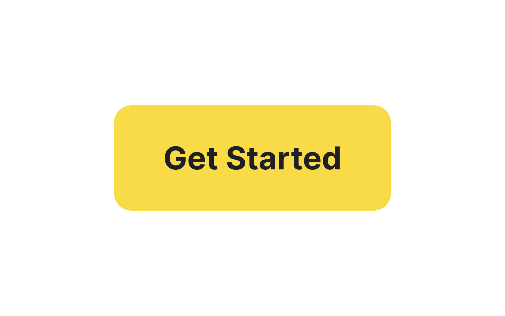
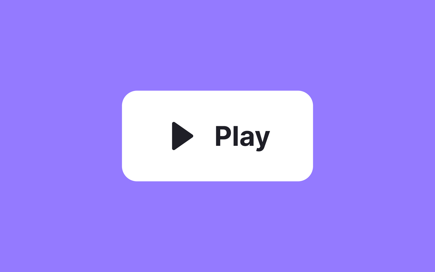
Rounded
During a study conducted by neuroscientists from the Zanvyl Krieger Mind/Brain Institute at Johns Hopkins University, visitors to the Walters Art Museum in Baltimore were presented with a series of abstract images. After that, they were asked to vote for the most preferred and least preferred shape. The majority of visitors chose shapes with gentle curves over those with sharp points.[2]
Rounded buttons will help you introduce the friendly personality of your brand and ensure safety and trust.
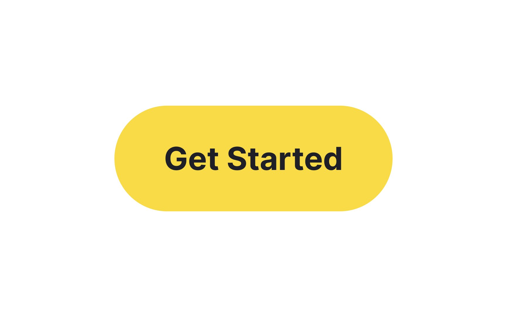
Pill
But crafting a great pill button involves more than just rounding the corners:
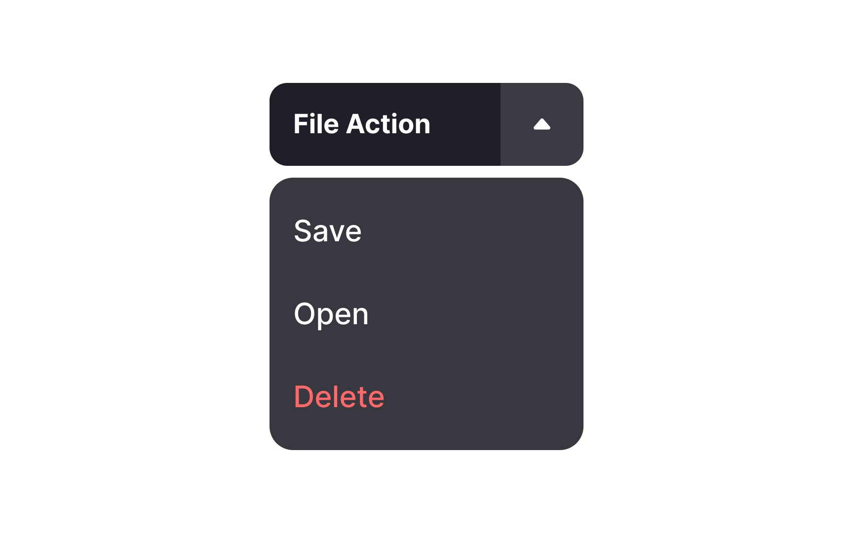
Dropdown
This can be a real advantage when screen real estate is at a premium or when you want to offer secondary actions without overwhelming users. However, it's crucial to ensure the dropdown only contains related actions and doesn't serve as a catch-all bucket. The aim is to make users' decisions easier, not more complicated.
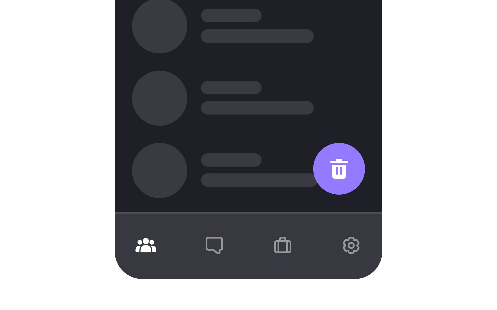
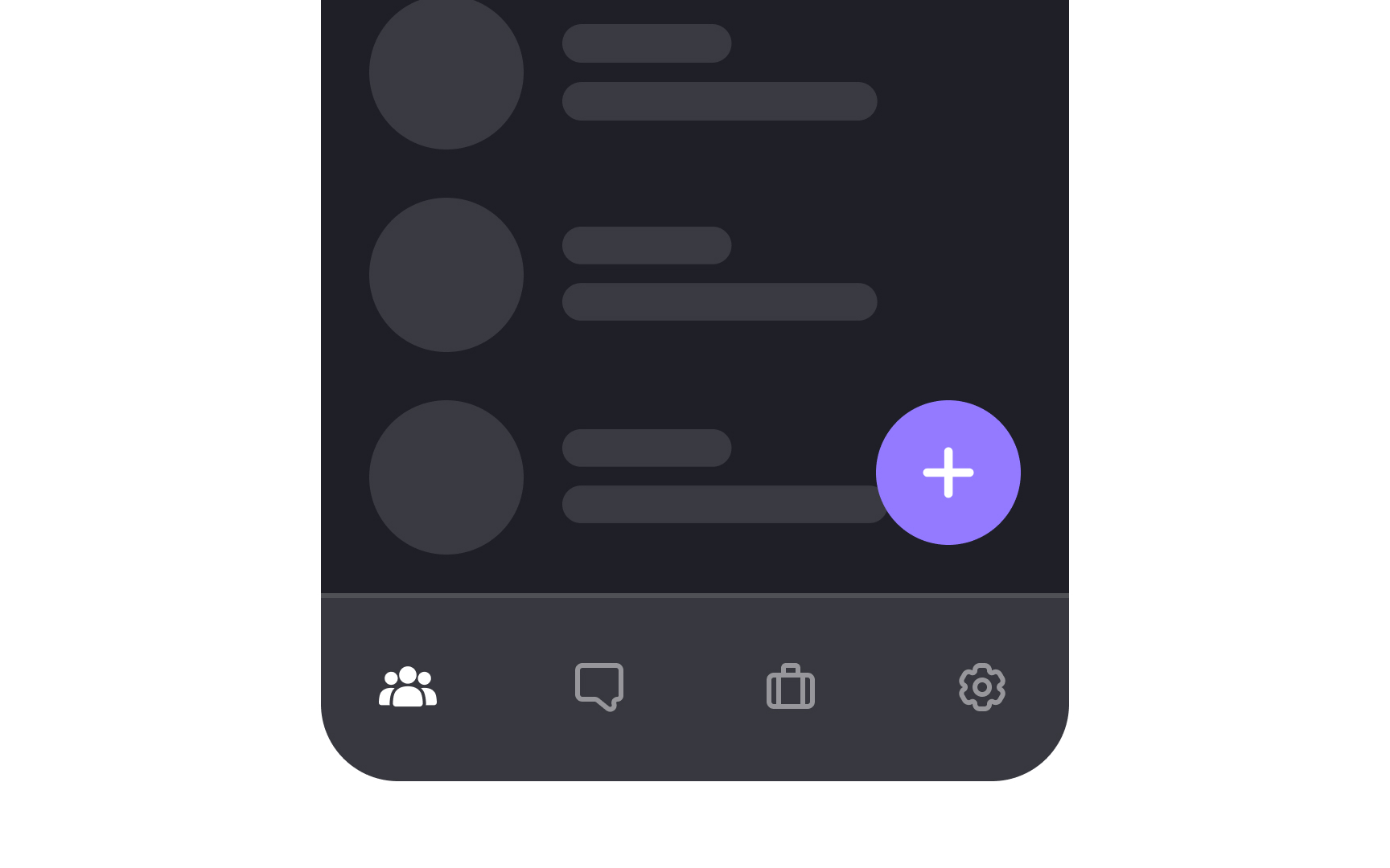
Floating action buttons (or FABs) hover over the content. They help users perform an action in one click without leaving the main app screen.
To make FABs as useful as possible, connect them to your app's most popular and needed functionality, such as adding a post or
To incorporate brand buttons in your design:
- Always consult the brand's guidelines: This ensures you're using the correct color, logo, and other assets.
- Place them thoughtfully: Usually, brand buttons go where the related action will take place, such as in a login or checkout section.
It's tempting to tweak these buttons to better match your design, but resist that urge. Deviating from the established look can confuse users and may even violate usage guidelines set by the brand. The primary role of a brand button is to establish trust and prompt action, so keeping their original design intact is crucial for user engagement.
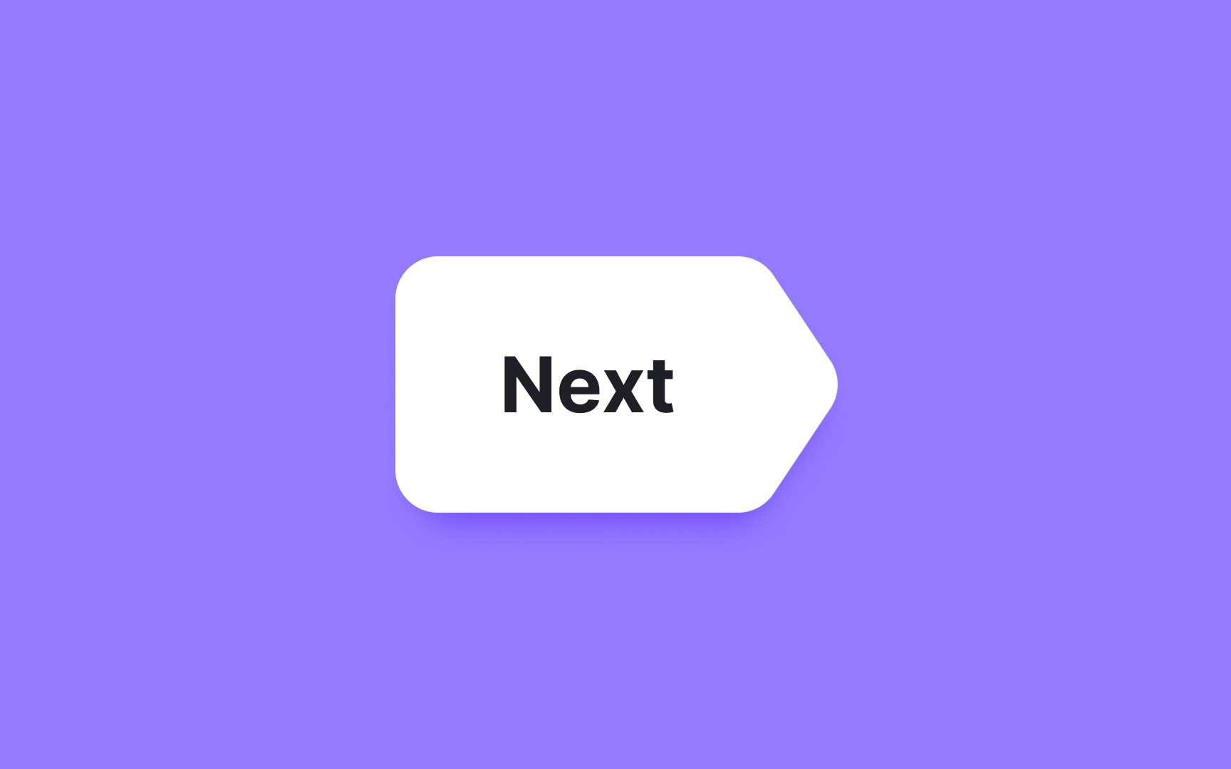
Custom-shaped
The unconventional shape should amplify its purpose, not obscure it. Utilize visual cues like
A well-balanced button is more than just a pretty element; it helps users navigate with ease. To achieve this, always center your button
When you're designing
References
- The bouba/kiki effect: how do we link shapes to sounds? | the Guardian
- Do Our Brains Find Certain Shapes More Attractive Than Others? | Smithsonian Magazine
Top contributors


Topics
From Course

Share


Similar lessons

Common UI Component Definitions I

Image Terminology
