Best Practices for Designing Tables
Explore the best practices for designing tables that elevate the overall user experience
Designing tables is a nuanced art that marries practicality with aesthetic appeal. Users should effortlessly find what they need, which calls for a thoughtful layout and alignment, complemented by appropriate spacing. The real challenge is in presenting complex information in a manner that is both clear and visually engaging.
An overload of information can lead to a cluttered and challenging-to-read table. Conversely, too little information may render the table ineffective. Striking a balance between these extremes is crucial. Understanding each user's context — the how and why of their interaction with the table — is also pivotal in guiding these design decisions.
While visual appeal is crucial, it should never compromise the clarity and scannability of your table. Strive for a balance where aesthetics enhance, rather than overshadow, functionality. To achieve this balance:
- Differentiate the header to establish an information hierarchy. This can be achieved by using a more prominent background, font weight, and color to bolster contrast and scannability.
- Consider the zebra-striped table style. Alternating row backgrounds in such
tables guide users' eyes, making large data sets appear more organized and harmonious. However, exercise caution with the contrast in stripe colors — too much can add unwanted visual noise, which might hinder rather than help scannability. - Maintain a thoughtful color hierarchy. Excessive or purposeless use of colors can lead to visual chaos, shifting focus away from the content's importance[1]
Pro Tip: For long tables, consider adding a sticky header at the top. This keeps column labels always in sight, making it much easier for users to find the information they need.
The contents of a
Numeric data is often the core of table design, and designers must understand how to present it correctly. Here are some key recommendations:
- Right alignment for numbers: Right aligning numbers is the most effective choice in
tables as it allows users to easily compare numeric values, no matter their length or size. - Utilizing tabular figures: Tabular figures refer to a font format where all digits have the same width. For instance, the digit '1' occupies as much space as '9'. This uniformity ensures that numbers with the same digit count appear consistently proportional, aiding in scanning and comparison.
- Choosing the right typeface: Choose typefaces that inherently include tabular figures. This ensures that your numeric data is visually appealing and practical for user
interaction .
Pro Tip: Align headers the same way as the content in their respective columns.
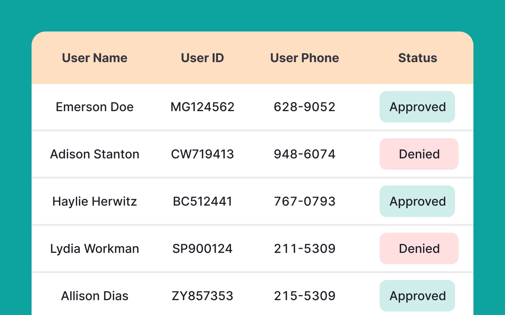
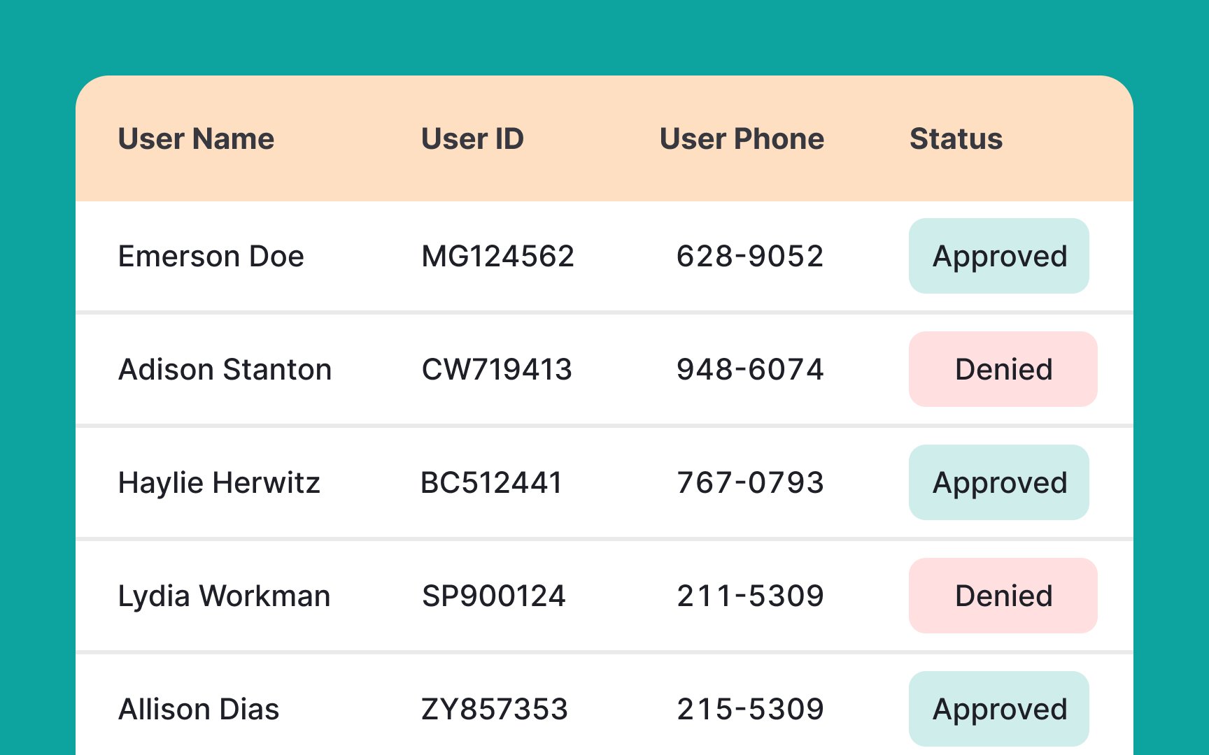
In left-to-right languages, such as English, the natural reading pattern is from left to right. When table text is not aligned to the left, users may find it difficult and frustrating to scan the content.
By aligning the text to the left, the content becomes more scannable and easier to read, allowing users to quickly locate the information they need. This is particularly important when dealing with large
Left-aligned text is also more aesthetically pleasing and can improve the overall look and feel of the table.[2]
When designing a
Pro Tip: Avoid the overuse of italics or bold fonts.
- Resizable columns: Enabling users to resize
columns enhances their ability to view complete, relevant information without constant scrolling. Use a cursor icon that indicates the columns are resizable, making this feature intuitive and user-friendly. - Sorting capabilities: Permit users to sort
content in various ways, like alphabetically or chronologically, either in ascending or descending order. Indicate sortable columns with upward or downward arrow icons, signaling this functionality.[3] - Pinning columns: Some columns might contain crucial data frequently referenced by users. Introducing an option to pin or fix these columns in place with a 'sticky' feature ensures they remain visible, no matter the horizontal scroll extent.
Pro Tip: Adding an option to reorder the columns gives users the power to arrange content as they see fit.
When dealing with lengthy
Pro Tip: Avoid small item-per-page ranges and offer those that can significantly alter the page view — such as 20, 50, and 100.
Furthermore, it's essential for accessibility that the link color is distinct from the table's background. As per the Web Content Accessibility Guidelines (WCAG), text and interactive elements should have a
Pro Tip: Make sure the link changes its color to purple once it's been opened so that users know what links they've already clicked on.
Line borders between
To facilitate bulk operations, ensure that multi-select checkboxes are always visible. When a user selects one or more checkboxes, corresponding bulk action
Pro Tip: Keep the bulk action icons at the top of the table — a prominent and familiar place for users.
Using a consistent string format in
Consistency enables easier data comparison and analysis. It removes the mental hurdle of translating different formats, allowing users to focus on the data's meaning.