"You’re Here" Navigation System
Learn techniques to clearly indicate users' location within an interface for smooth navigation
Navigation systems guide users through interfaces, but it’s not enough to just show where users can go. Good navigation also needs to clearly indicate where users are at any given moment. Every page could be the first one a visitor sees, so it becomes important to provide context that helps users quickly move toward their goals. "You're Here" navigation uses signs and indicators to orient visitors, ensuring they always know their current location within the site. In this lesson, you’ll learn how to use strong location indicators to enhance user experience and make navigation seamless.
Not all users start at the homepage of a website — search engines can drop them on any
Even when users start from the homepage, clear
Linking the logo to the homepage is a simple but effective way to help users navigate your website and identify your brand. When users click the logo, they instantly return to the homepage. This helps them quickly reorient themselves if they get lost or want to start fresh.[1] For example, if users are browsing different sections of your site and gets confused, they can click the logo to go back to the homepage. This makes
Additionally, the logo and other branding elements, such as color palettes and signature fonts, help users recognize your website. Each time they see these elements, they are reminded of your brand, reinforcing your identity. This small feature improves the overall
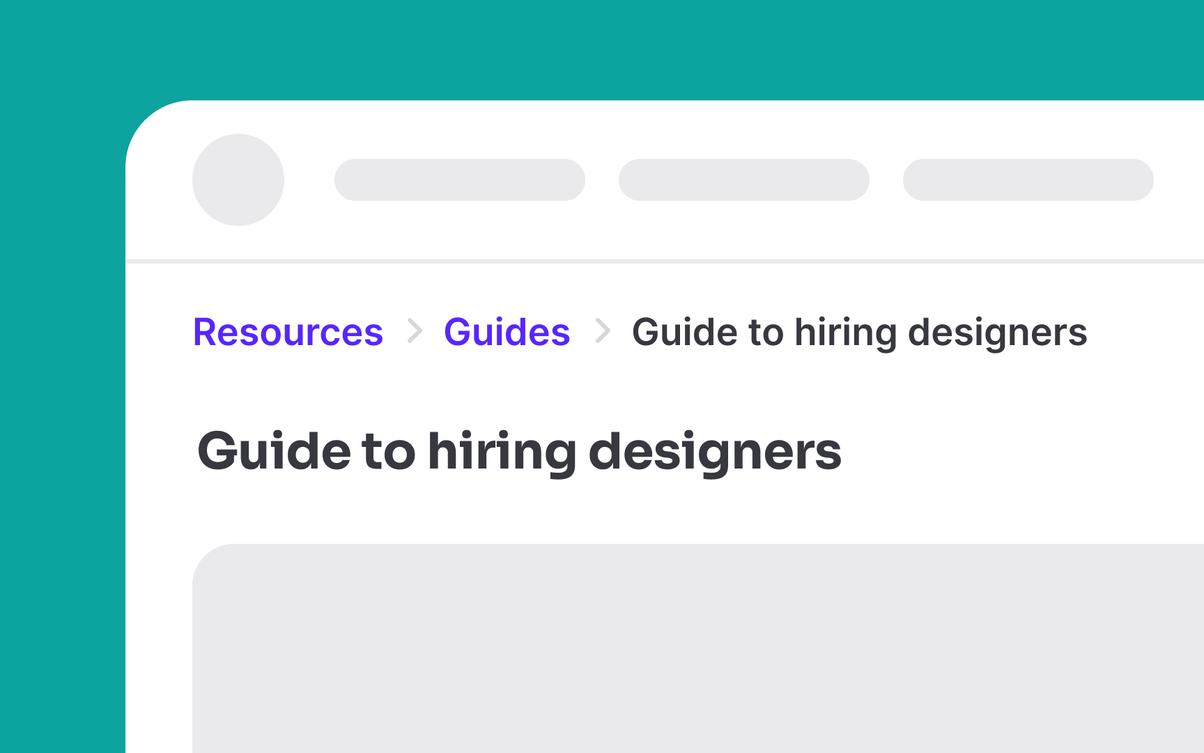
Make sure to indicate the current
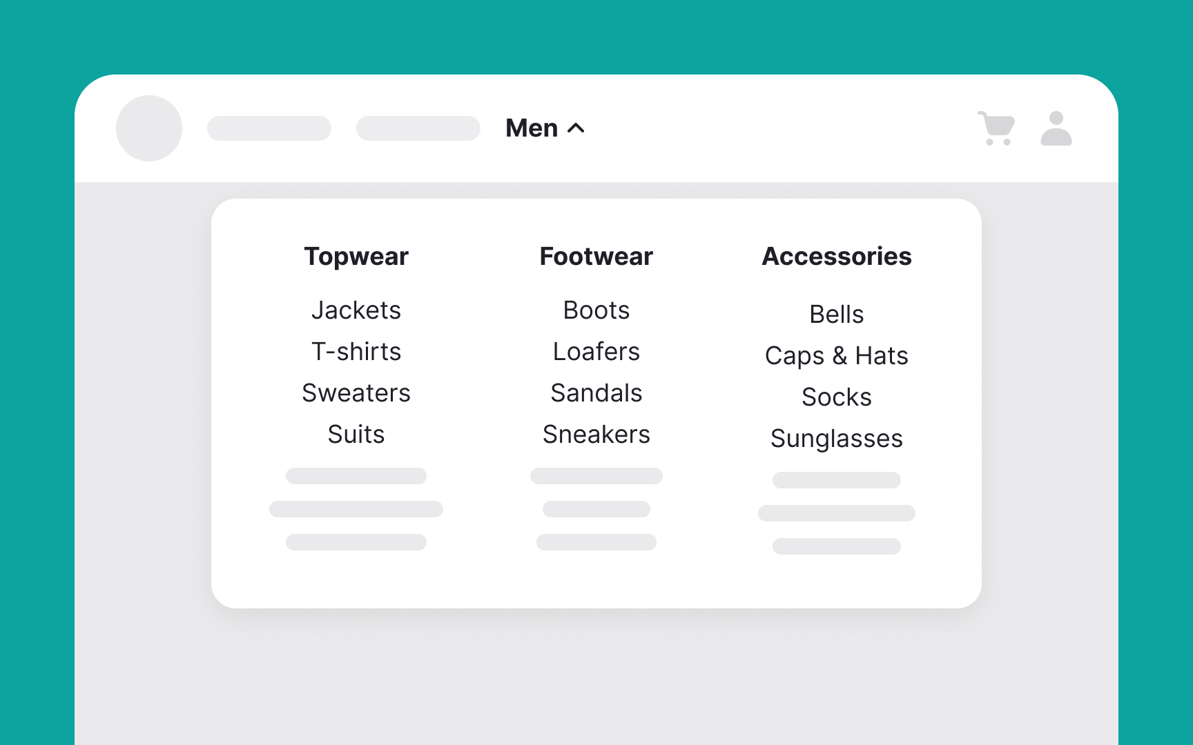
Left-aligned
This clear, organized structure shows context and path information, helping users navigate your site more efficiently and find what they are looking for faster.[2]
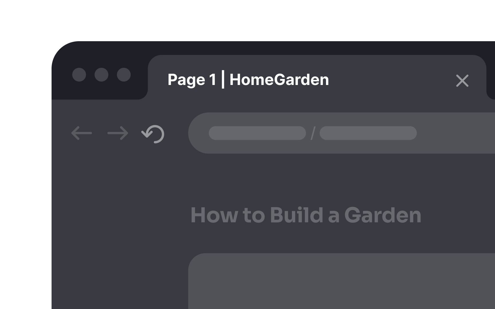
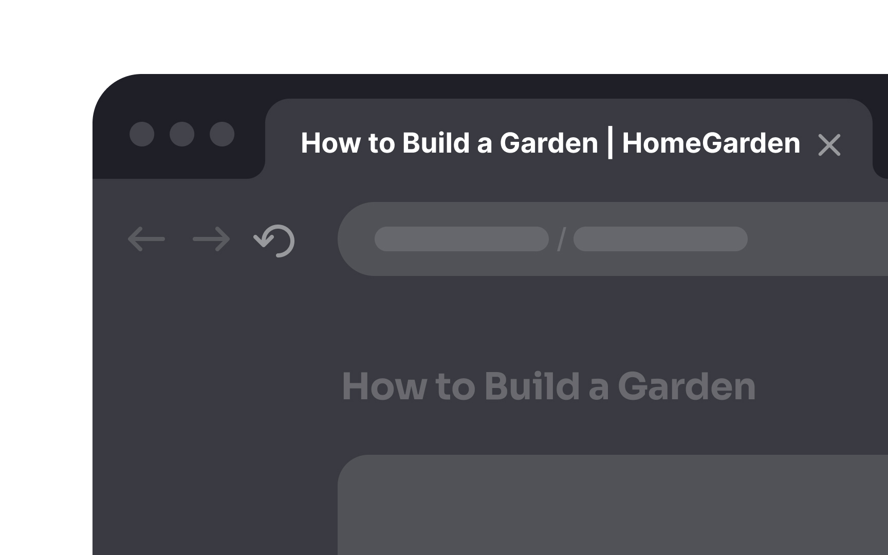
Providing descriptive HTML titles is crucial as they appear in the title bar, aiding both users and
Here are some pointers to consider while writing an HTML title:
- Be specific: Use clear and specific titles that accurately describe the page content. For example, instead of "Page 1," use "Summer Sale - Women's Dresses."
- Keep it short: Titles should be concise, ideally under 60 characters, so they don't get cut off in search results.
- Include keywords: Use relevant keywords naturally in your titles to improve search engine ranking and further provide context to users.
- Branding: Include your
brand name at the end of the title. For example, "Summer Sale - Women's Dresses | XYZ Store." - Unique titles: Ensure each page has a unique title to avoid confusion and improve search engine optimization (SEO).
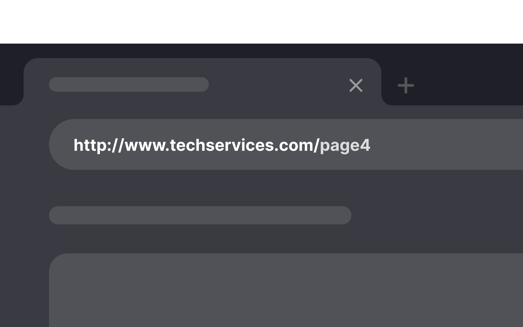
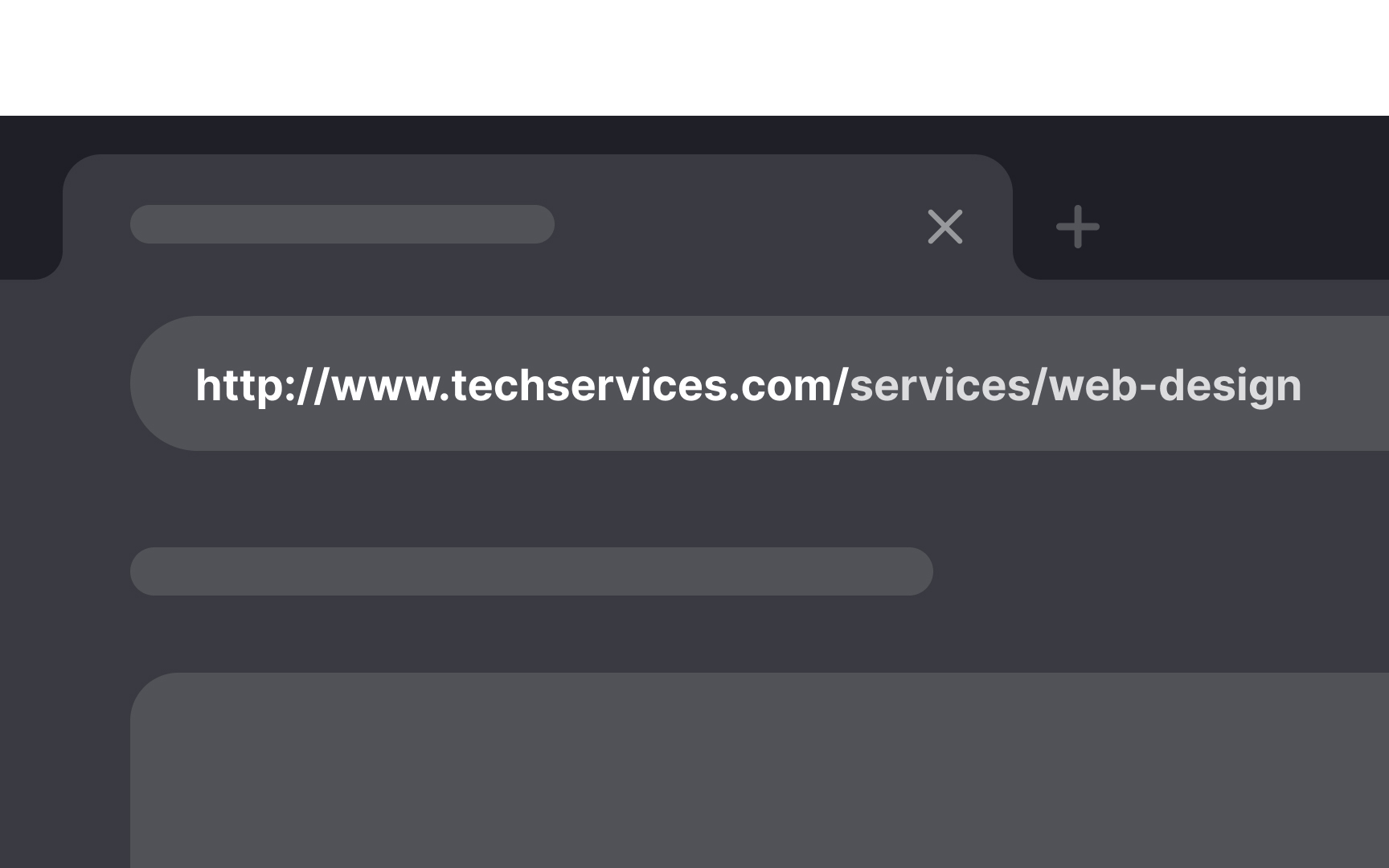
Since the URL appears in the address bar, having a clear and descriptive URL helps users know exactly where they are on your site and what to expect from the
Here are some best practices to write URL addresses:
- Be clear and contextual: Use simple, understandable words that describe the page
content . For example, use "www.eazybaking.com/blog/how-to-bake-cookies" instead of "www.eazybaking.com/page1." - Use keywords: Include relevant keywords in the URL to improve
SEO and provide more context to users. - Avoid special characters: Stick to letters, numbers, and hyphens. Avoid using spaces, underscores, or special characters.
- Keep it short: Shorter URLs are easier to read and remember. Aim for no more than 2-5 words.
- Use lowercase letters: This avoids confusion and ensures consistency.
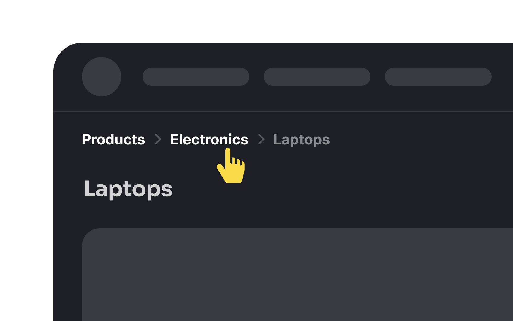
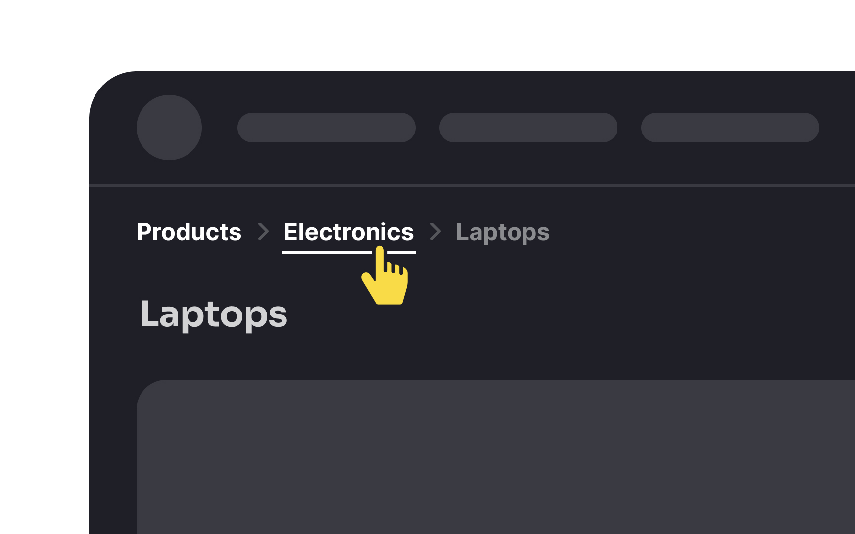
Here are some best practices for using breadcrumbs:
- Use clear labels. Each
link should clearly describe the page. For example, "Home > Products > Electronics > Laptops." - Don’t include too many levels. Only show the path relevant to users’ current location.
- Make each part of the breadcrumb a clickable link so users can easily navigate back.
- Place breadcrumbs at the top of the page, usually under the main
navigation . - Use symbols like ">" or "/" to separate links, making the path easy to read.


Providing contextual clues helps users know where they are on your website. Here are a few examples:
- Dates: Show the date when the
content was published. This helps users know if the information is current. - Tags: Tags categorize content, making it easier for users to find related information. For example, tags like "Technology," "Health," or "Recipes."
- Icons: Icons can quickly convey the type of content. For example, a calendar icon for events or a chat bubble for comments.
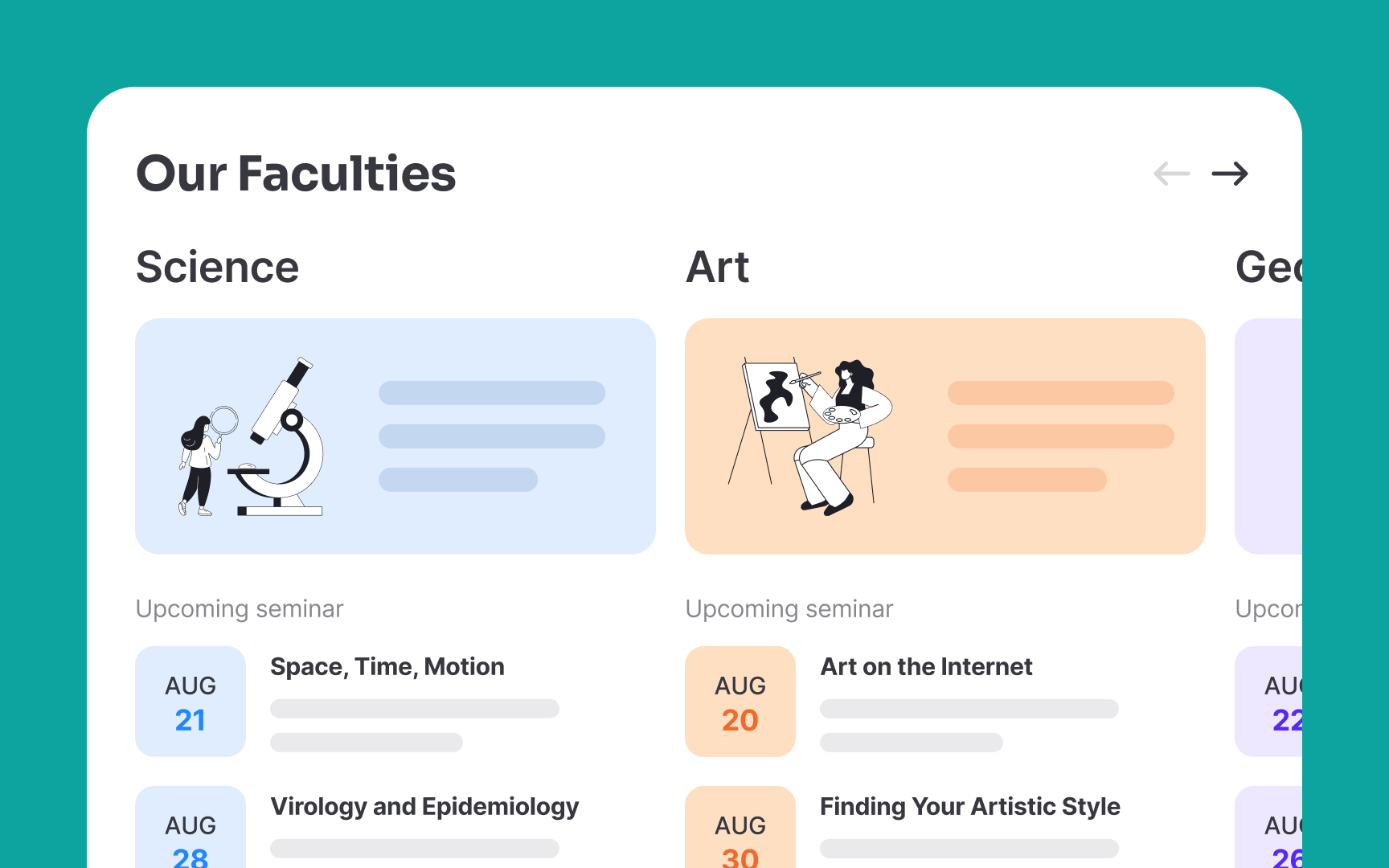
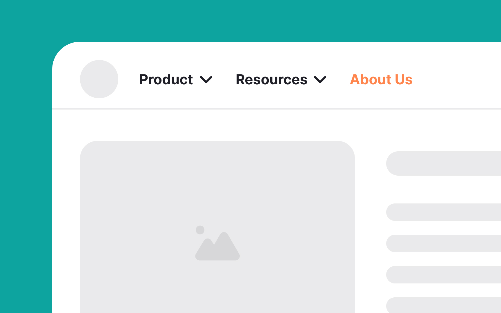
Using visual changes to indicate a change in location on your website, particularly on deeper websites with numerous subpages or sections, can help users navigate more easily.
Here are some ways to do this:
- Color-coding: Change the predominantly used
color depending on the section. For example, a news site might use blue for "World News" and green for "Sports." - Branding changes: Adjust logos, color schemes,
fonts , or language to reflect different sections. For instance, a university might use differentbranding elements for its science and arts faculties. - Images and icons: Use clear visual cues like banners or
icons to signal different site areas. For example, a magazine site might have a unique header image for each department, like "Fashion" or "Travel."
Pro Tip: Be careful not to overdo these changes. Too many visual differences can confuse users and make the site feel disjointed. Keep changes consistent and purposeful to enhance navigation without overwhelming users.

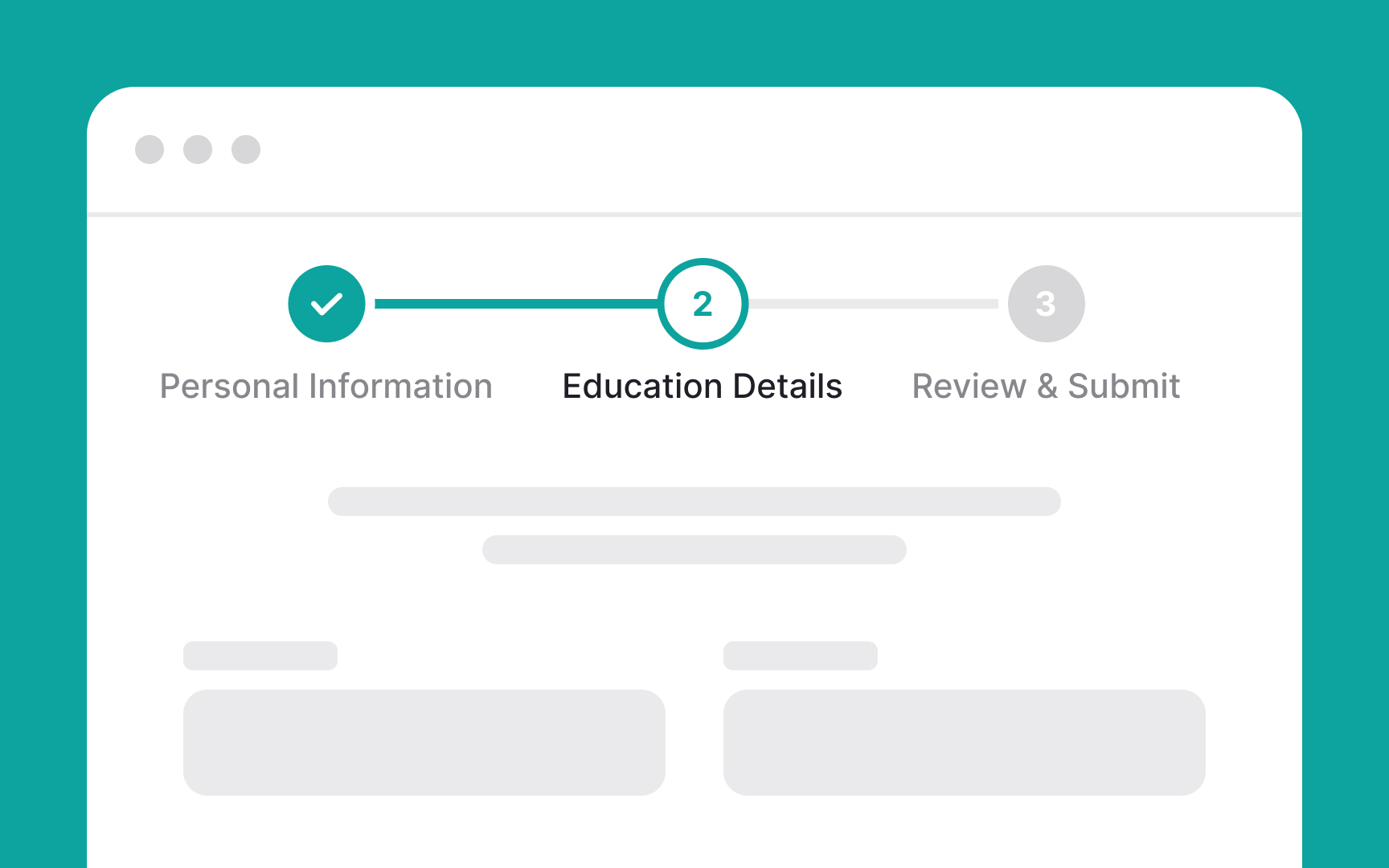
Progress trackers help users understand where they are in long processes, such as filling out forms or completing multi-step tasks like checking out their cart. They show users how many steps they've completed and how many are left. This helps them feel in control and reduces frustration. For example, when filling out an online application, a progress bar at the top might show steps like "Personal Information," "Education," and "Review & Submit." Seeing their progress helps users know what to expect and encourages them to complete the process.
Here are some best practices for designing progress indicators:
- Use a clear design that shows the total number of steps, how many are completed, and how many remain.
- As users move through the steps, update the progress indicator in real-time.
Label each step clearly to give users context.- Place the progress indicator in a consistent location on each
page , typically at the top.
Many websites use subtle location indicators that users easily miss. Designers, who know the site well, may overlook this because they don't need help navigating. However, visitors might be new or visit infrequently, making everything feel unfamiliar. Signals that seem obvious to designers often go unnoticed by users.
Here’s how to test if your website uses strong location signals:
- Show users various pages without navigating to them.
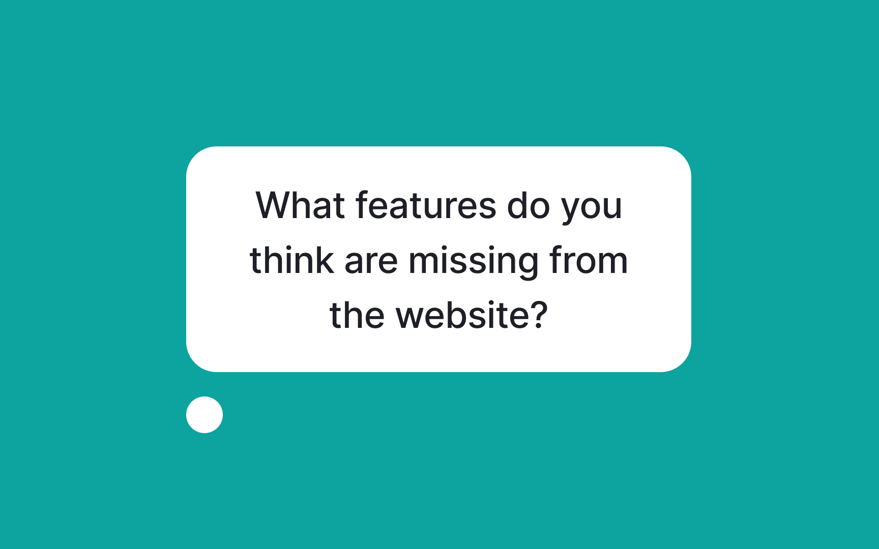
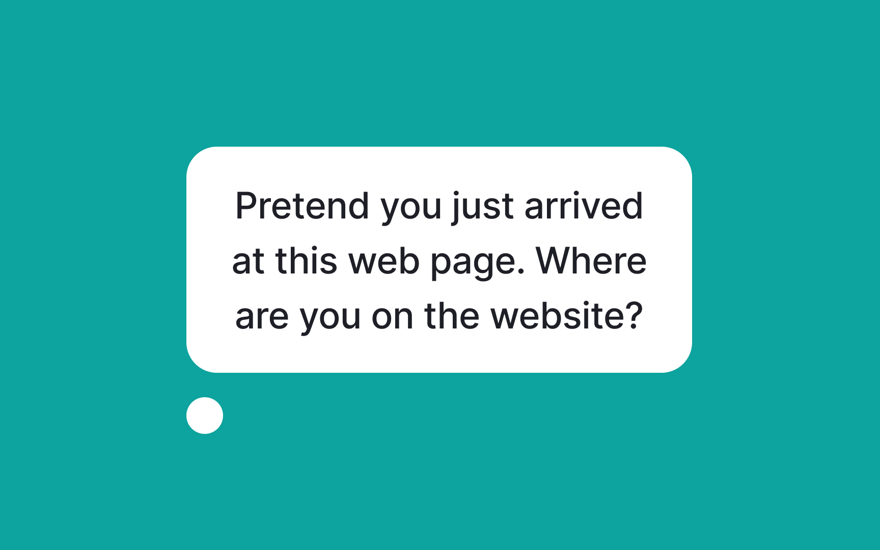
- Ask, "Pretend you just arrived at this web
page . Where are you on the website?" - If they answer, ask, "How can you tell?"
- If they’re unsure, ask, "What would you expect to see here to help you know where you are?"
- If they’re still unsure, ask, "What would you normally do to find out?"
This process will reveal if your visual location cues are strong and well-placed. Existing websites can test location signaling anytime. For new websites in progress, test during the high-fidelity stage. Use real
References
- Best Practices for Homepage Links on websites | Nielsen Norman Group
- Navigation: You Are Here | Nielsen Norman Group
- Navigation: You Are Here | Nielsen Norman Group
Top contributors
Topics
From Course

Share


Similar lessons

Intro to Information Architecture

How to Design Good Search Experiences in UIs
