Utility Navigation
Learn how to enhance user experience by effectively designing utility navigation tools
Designing an effective and user-friendly navigation involves more than just organizing content into menus. It also requires thoughtful design of the tools users need to interact with the site. Creating effective utility navigation requires understanding what elements are necessary, where to place them, and how to display them clearly. Good design ensures that users can quickly find these tools and understand how to use them. In this lesson, we’ll explore the best practices for designing utility navigation, including selecting the most essential utility tools, optimizing their placement for easy access, and leveraging them to improve overall site usability.
Utility
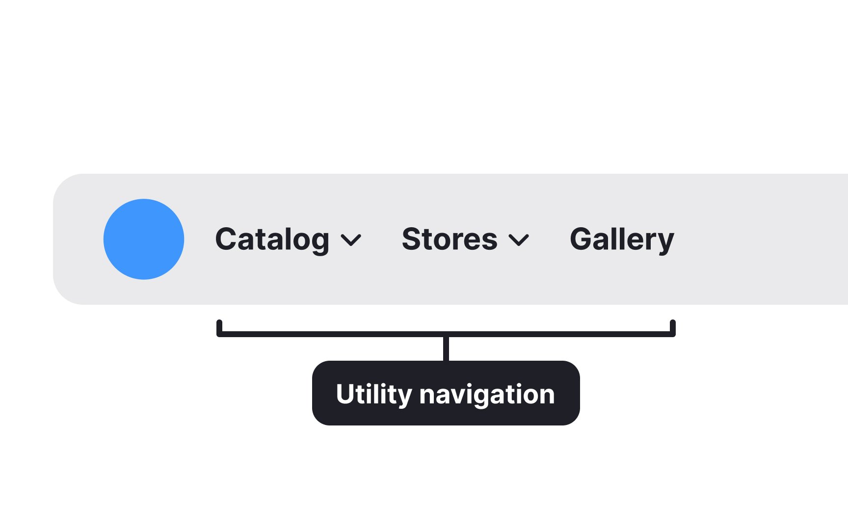
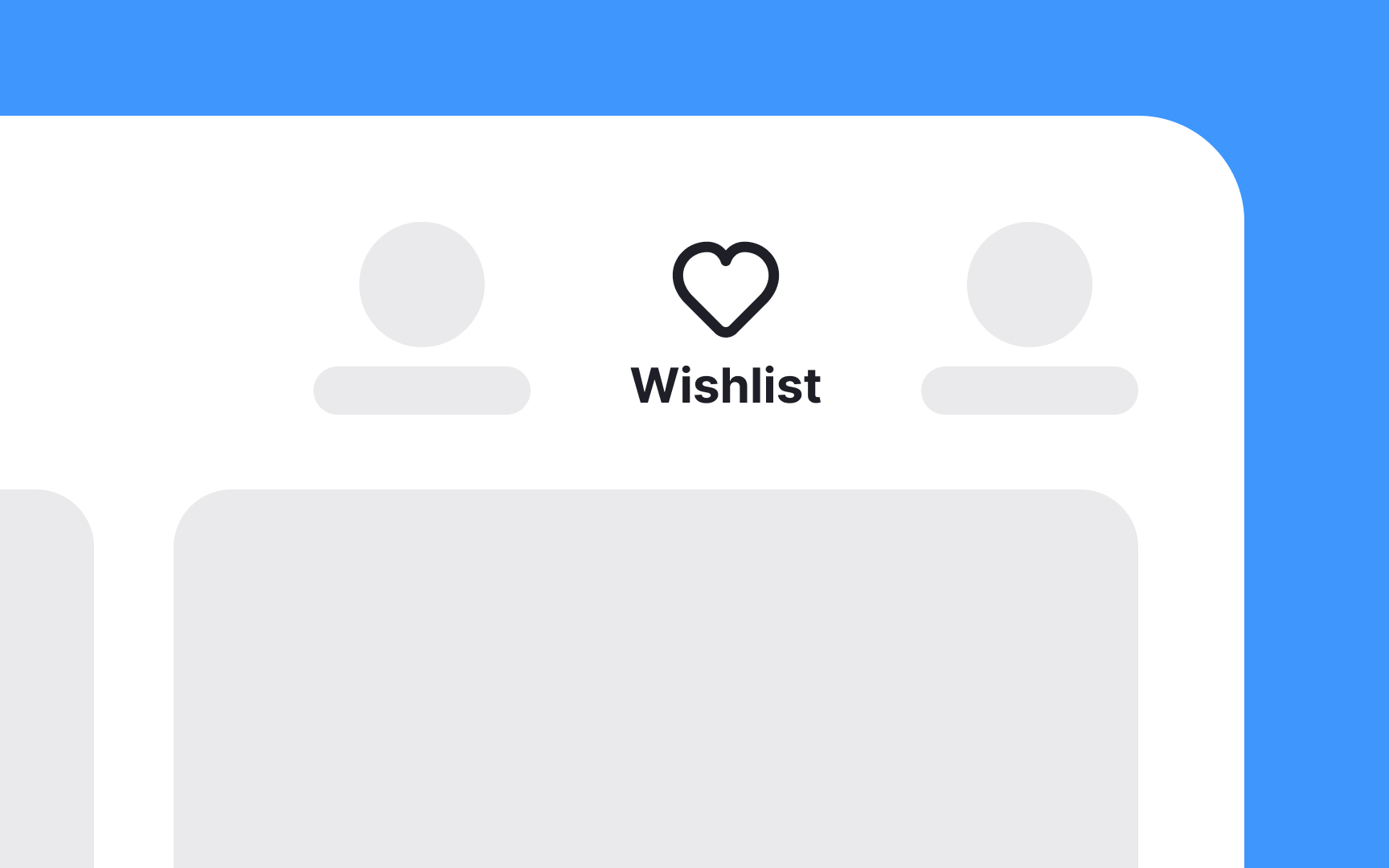
Utility navigation includes various tools like:
- Contact links
- Follow links
- Share links
- Language and country selectors
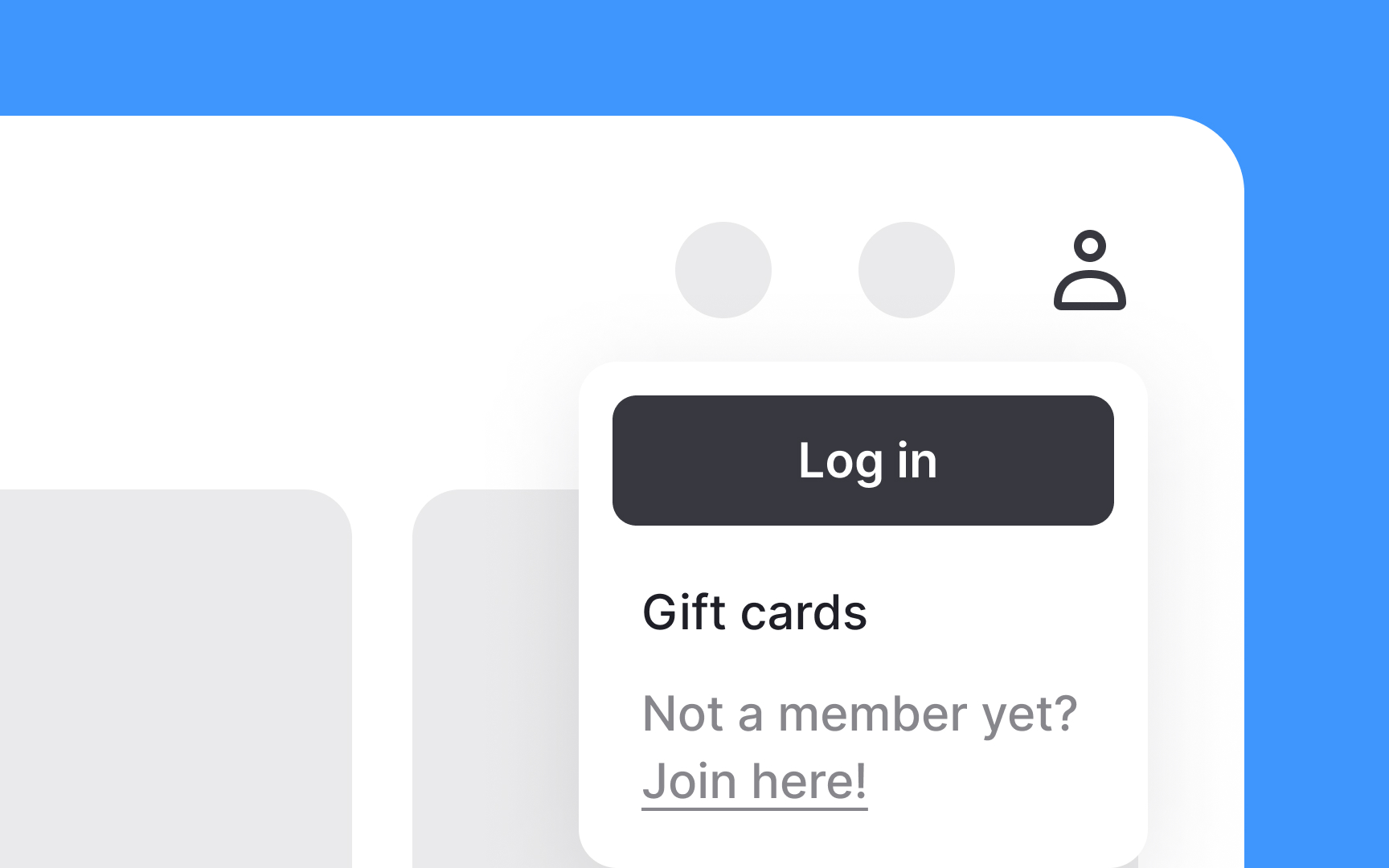
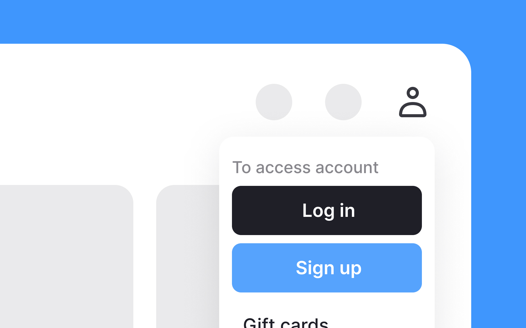
- Login/ signup options
- Print options
- Save options
- Subscribe options
- Font size adjustors
- Shopping cart
- Search functionality[1]
These tools make it easier for users to manage their experience without disrupting their primary tasks.
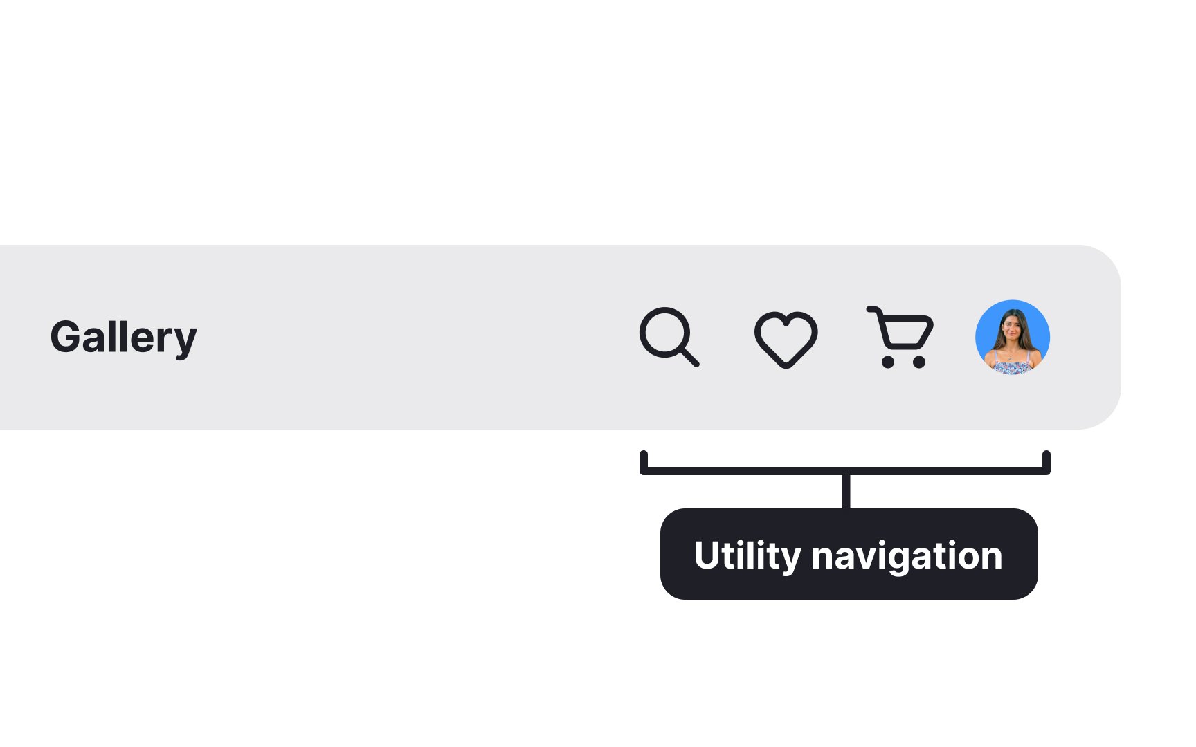
When deciding where to place utility
Informational sites can split utility tools into 4 locations:
- Sitewide tools go top-right
- Article-specific tools go top-center
- Subscribe tools are usually at the bottom
- Sharing tools can appear at the beginning or end of articles
The rule of thumb is to always ensure that their placement is intuitive and that users can quickly find what they need. Avoid hiding important utilities in hamburger menus or other click-to-display elements without user testing.
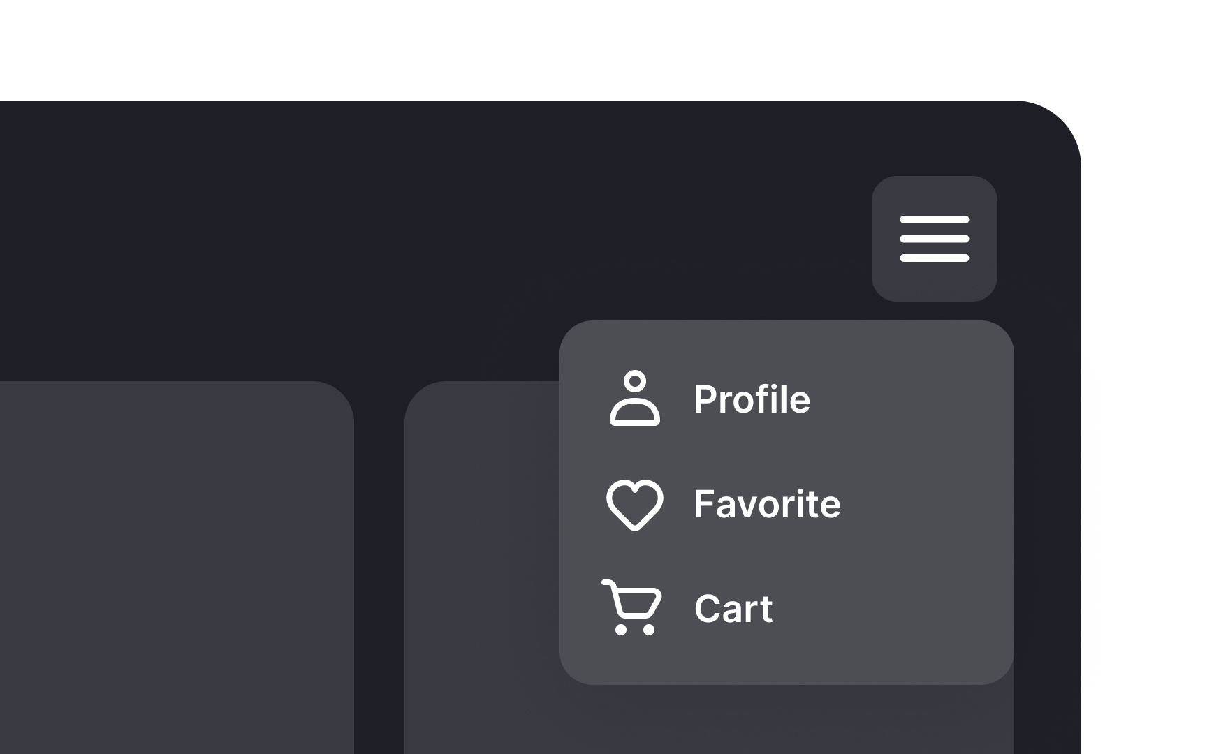
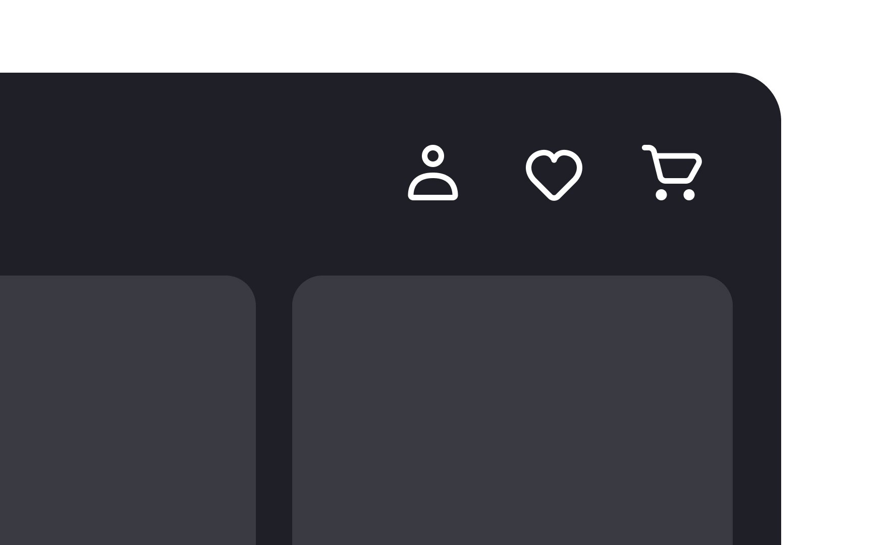
Using familiar label names alongside icons for utility tools is important because it helps users quickly find what they need. Standard labels like "
By using standard labels, you ensure that users can easily navigate your site without misunderstanding. This improves
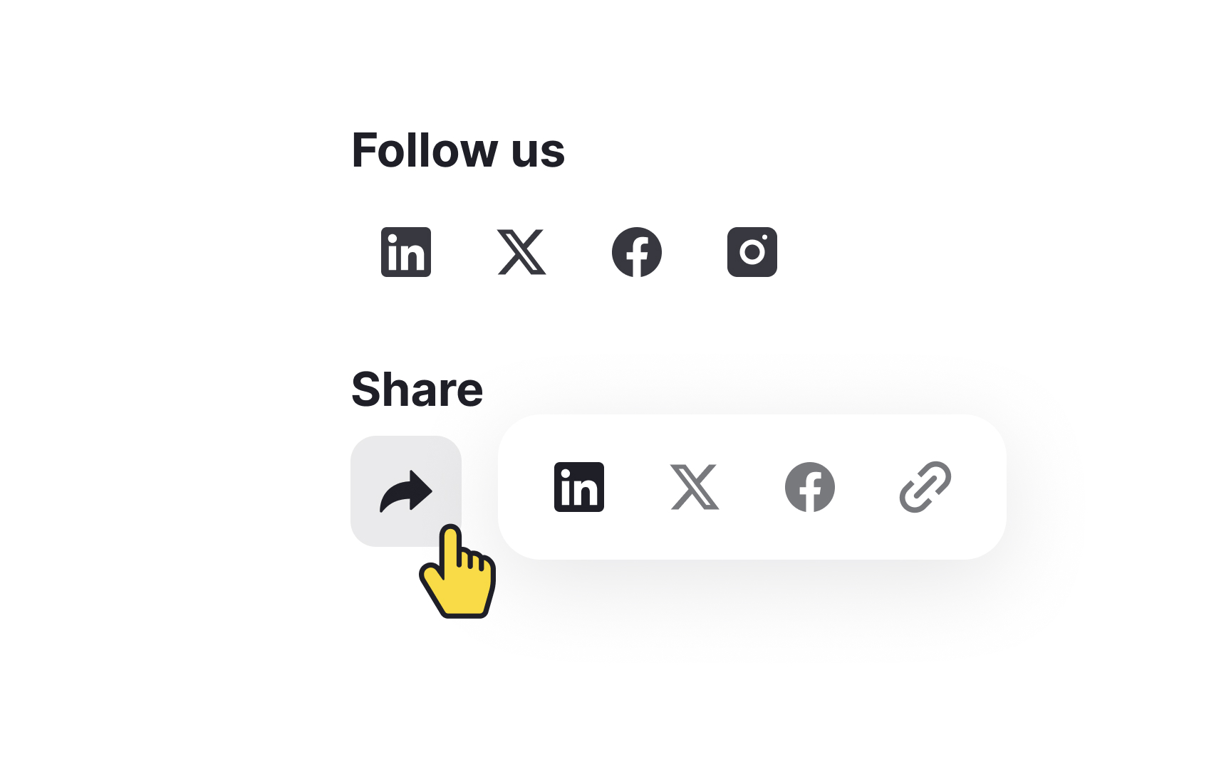
Follow
Here’s how to do it:
- Different sections: Place follow icons in the website header or footer, where users expect to find them. Share icons should be placed near the content, such as at the beginning or end of articles or product pages.
- Distinct labels: Clearly
label the sections. Use headings like "Follow Us" for your social media profiles and "Share" for sharing options. - Hide sharing options behind the share icon: Use a recognizable share icon (like an arrow) to reveal available sharing options. This helps users find the share feature quickly and easily without confusing it with follow options.
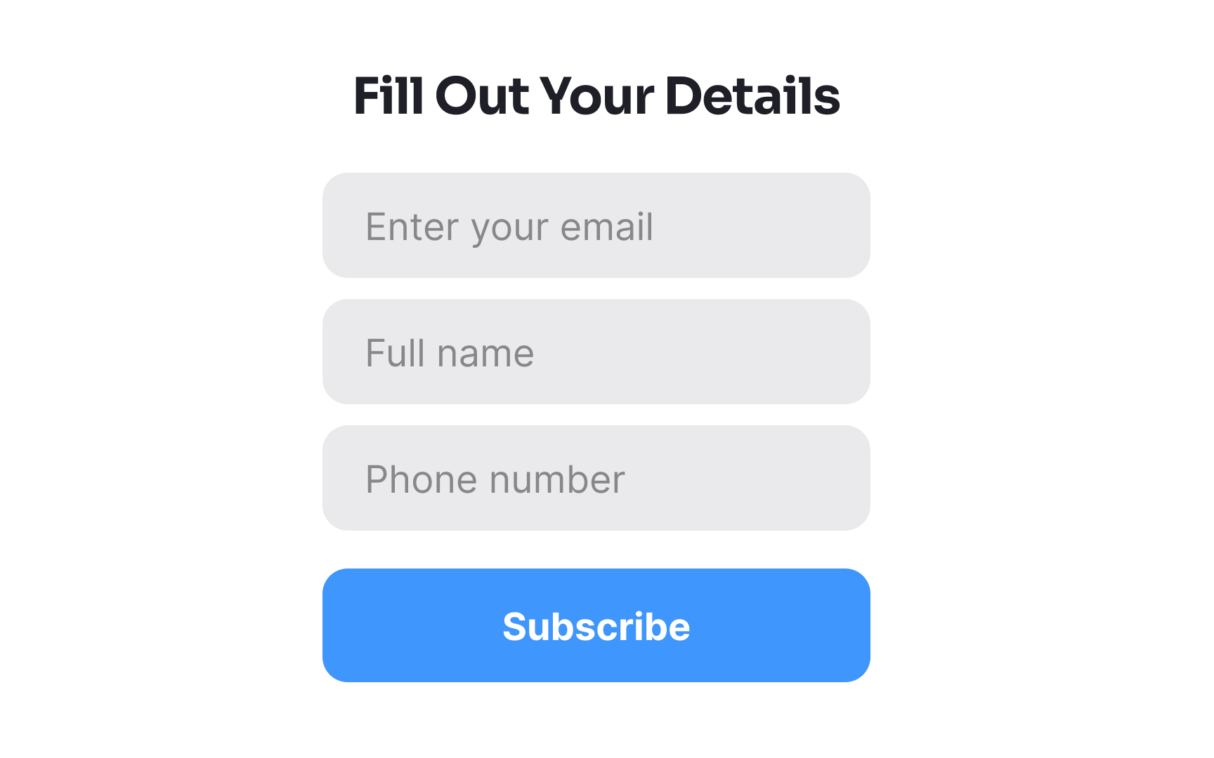
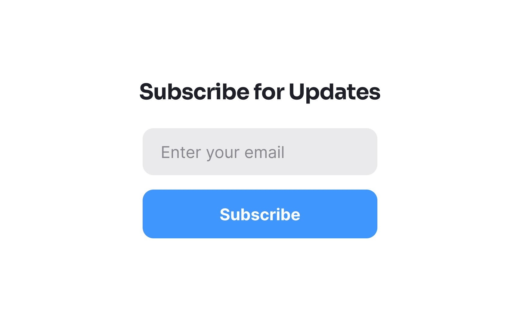
Make it easy for users to subscribe to your website to keep them engaged with your
Here's how to do it:
- Placement: Put the Subscribe button or link in a prominent location, like the
header ,footer , or near the main content. This makes it easy to find. - Labeling: Use a clear
label , like "Subscribe" or "Sign Up for Updates," so users know what to expect. - Information: Make the subscription form short and straightforward. Ask only for essential information, like an email address.
- Confirmation: Provide a quick confirmation message after users subscribe, so they know it worked.
By making it easy to subscribe, you can build a loyal audience who regularly engages with your content, boosting your website’s effectiveness.
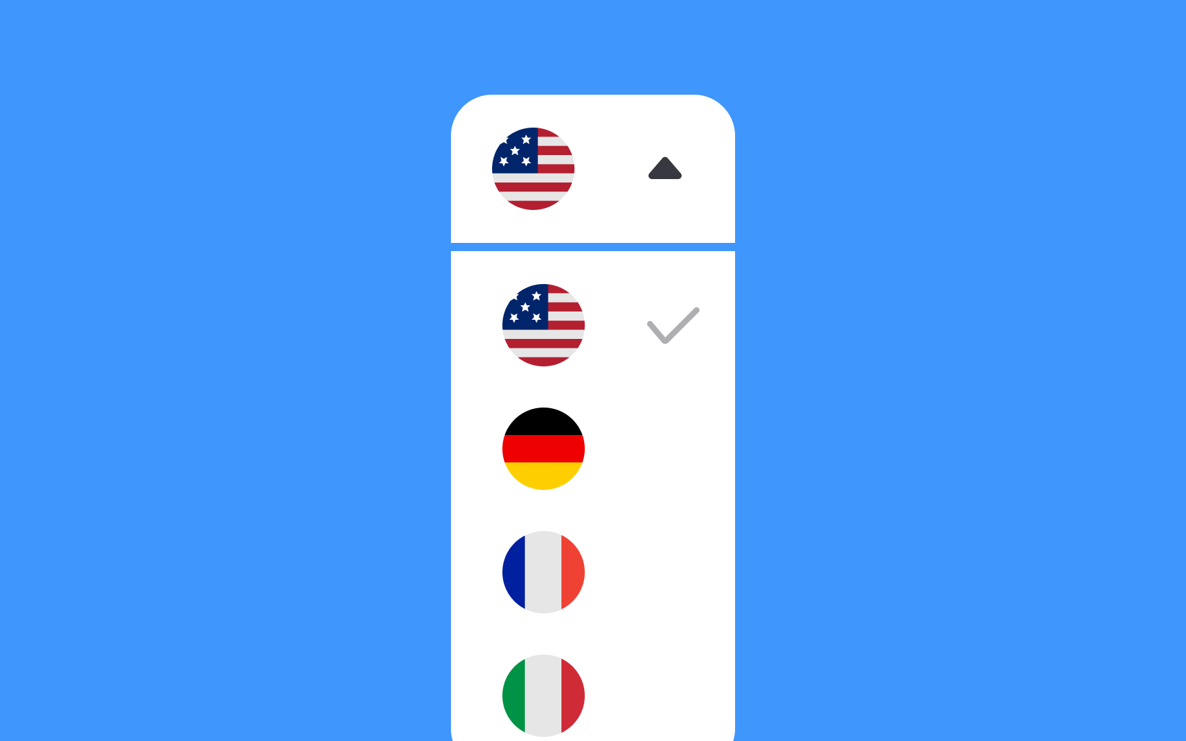
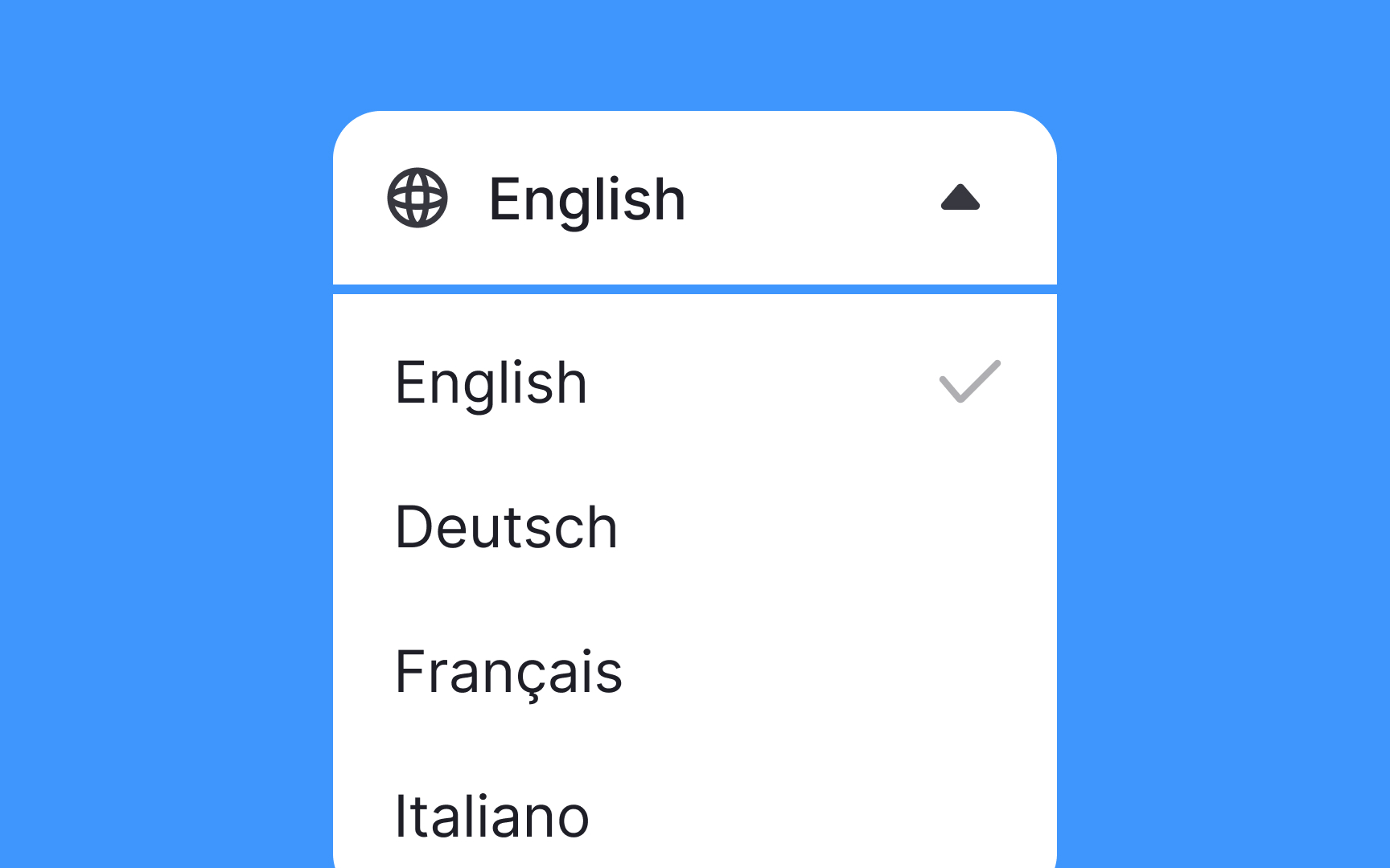
Use text instead of flags for the language selector tool that often appears at the top of your website. Flags can be confusing because many languages are spoken in multiple countries, and some countries have more than one official language. For example, Portuguese is spoken in both Portugal and Brazil, and Switzerland has multiple official languages.
Instead, use text
Also, ensure you include any special characters or accents in the language names. This accuracy helps users recognize their language quickly and improves their experience on your site. By following these practices, you make your website more user-friendly and accessible to people from different language backgrounds.[2]
To make your website user-friendly, place the
Use distinct
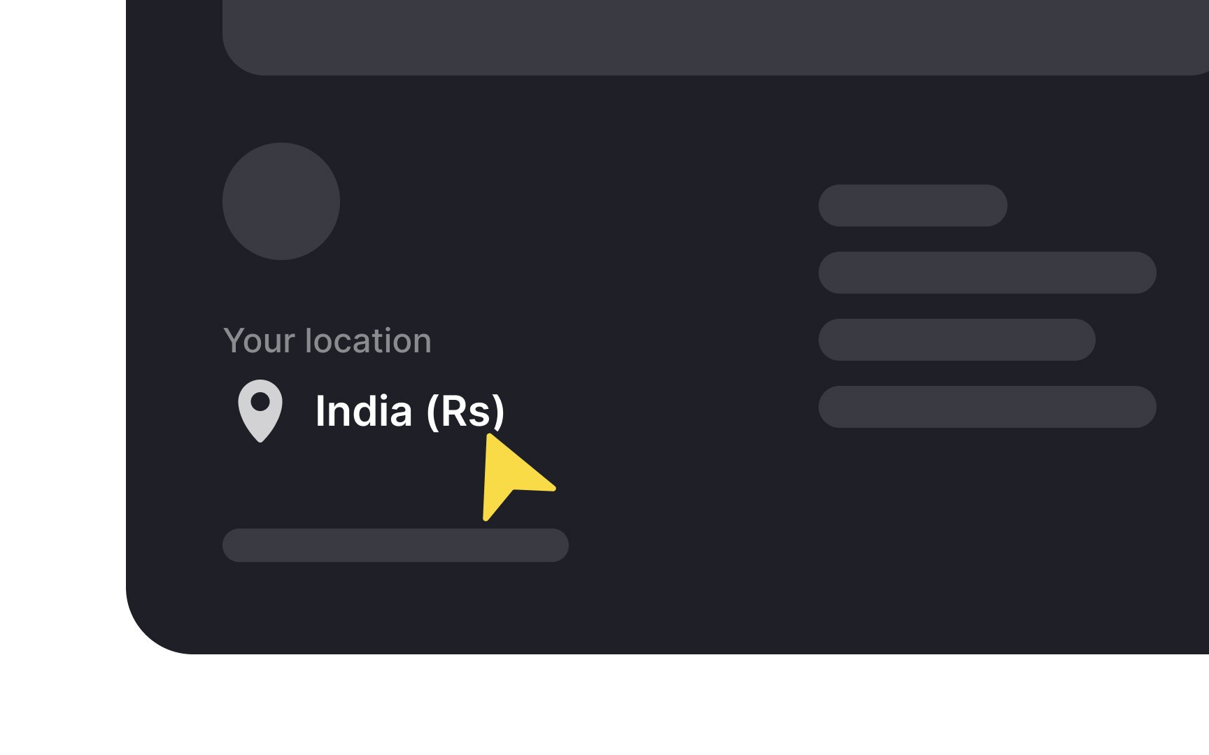
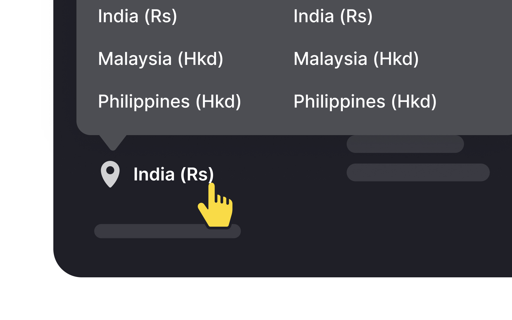
Country or region selectors in utility
Here are some
- Placement: Place the country selector in a prominent location, like in the
header orfooter . - Clear labels: Use clear
labels like "Select Country" or "Choose Region." - Flags: Unlike language selection, it's acceptable to use national flags for country selectors.
- Interactive maps: For large international sites, you can consider using a clickable world map.
This helps users find the right content for their region, improving their overall experience.
References
- Utility Navigation: What It Is and How to Design It | Nielsen Norman Group
- Designing Web Navigation | O’Reilly Online Learning
Top contributors

Topics
From Course

Share


Similar lessons

Intro to Information Architecture

Intro to Search Functionality in UI
