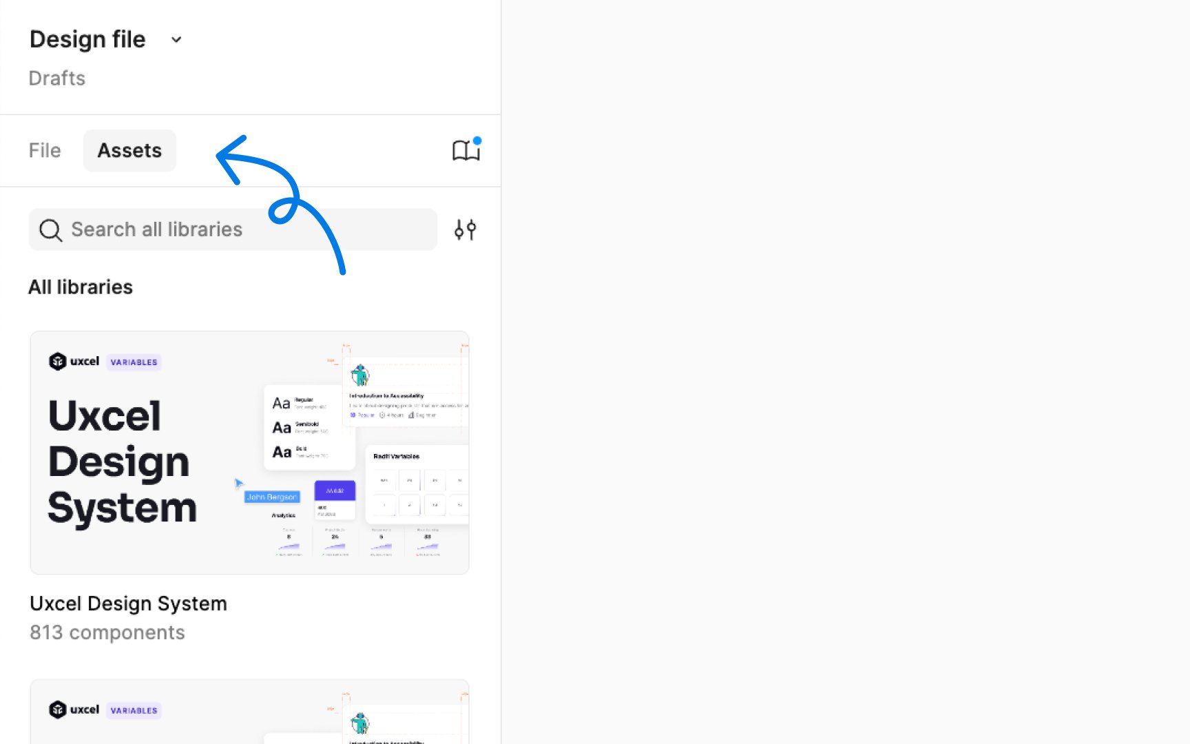
Assets panel
The Assets panel in Figma is a library for reusable design elements. It stores components and styles that you can easily drag and drop into your designs. Components are reusable elements like buttons or icons, while styles are predefined attributes like colors or text formats. By using assets, you ensure consistency across your design and save time.
To open the Assets panel, click on the "Assets" heading in the Layers panel, or use the keyboard shortcut:
- Mac: Option 2
- Windows: Alt 2
To add an element from the canvas to the Assets panel, right-click on it and choose the Create component option. Once it’s converted to a component, it gets automatically added to the Assets panel and you can use it in any part of your project by dragging it from the panel.
In the Assets panel, you can also search for components, manage libraries via the Library modal, switch between Grid and List views, filter components by library, view Local components, and explore enabled libraries.
Pro Tip: Figma organizes components in the Assets panel by file, page, and frame, presented as a path. You can expand each heading by clicking the arrow to explore a file, page, or frame.
