What is a Design System?
Understand what design systems are and why they bring structure, clarity, and collaboration to product design.
Every product relies on an internal structure that keeps its parts working in harmony. In modern products, this structure starts with design tokens. Tokens capture core decisions like color, spacing, and typography and turn them into a shared foundation for both design and code. A design system builds on this foundation to keep interfaces clear, consistent, and recognizable across platforms.
What sets design systems apart from traditional UI kits or static style guides is the close connection between Figma and engineering. Most design systems focus on keeping design decisions and implementation in sync, so changes made in design can reliably flow into code. This shared source of truth helps teams avoid duplication, maintain quality, and scale interfaces with confidence.
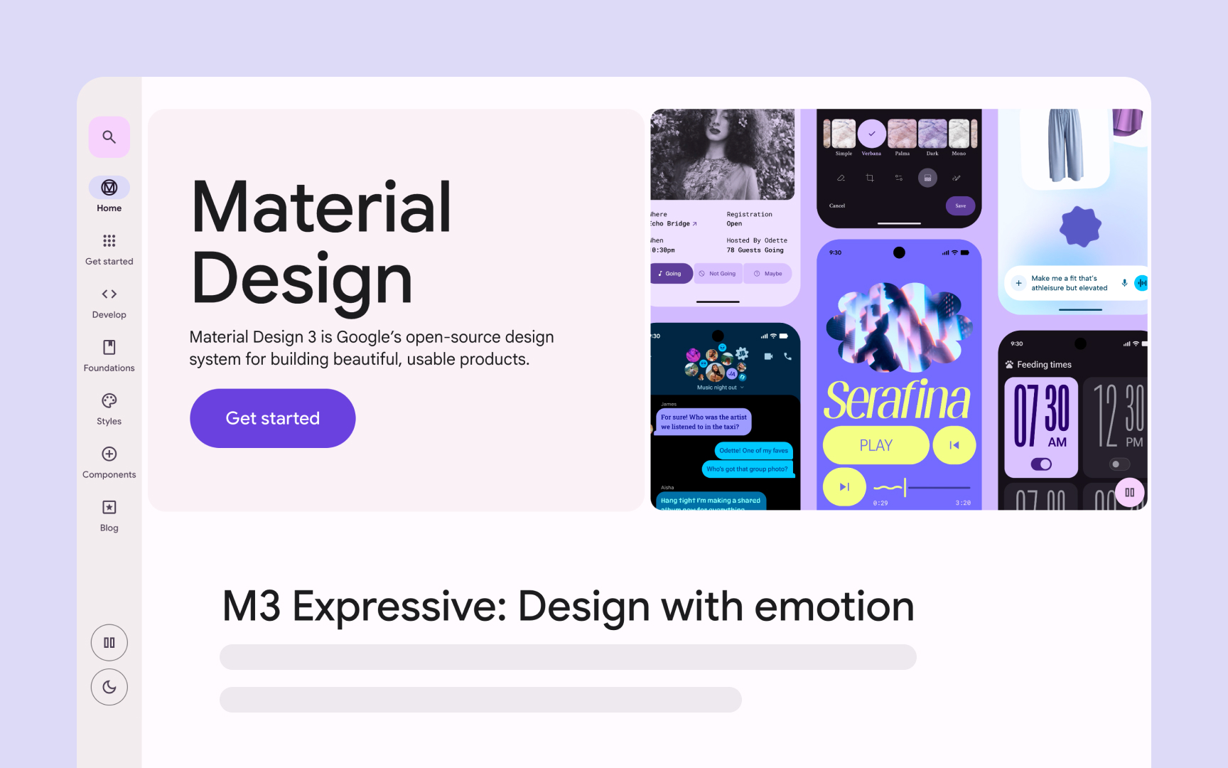
Design systems also go beyond visual style. They define the patterns and rules behind how a product looks and behaves across web, iOS, and Android. Systems like Material Design and Carbon Design System show how shared foundations and reusable parts bring clarity to complex, multi-platform products.
Not every team needs a full system from day one. Some start small with a token library or a limited set of foundations. What matters is having a shared structure that aligns design and development and helps teams build products that feel connected and consistent.
A
With a design system, all visual and interactive elements follow the same standards. Buttons,
A strong system doesn’t stay static. Governance is what keeps it healthy and relevant over time. Regular reviewing, updating, and versioning ensure that the system grows with the product instead of becoming outdated. This way, it remains a living framework that supports both new ideas and long-term consistency.[1]
Pro Tip: Think of your design system as the product’s memory that keeps every design choice consistent over time.
Each part of a
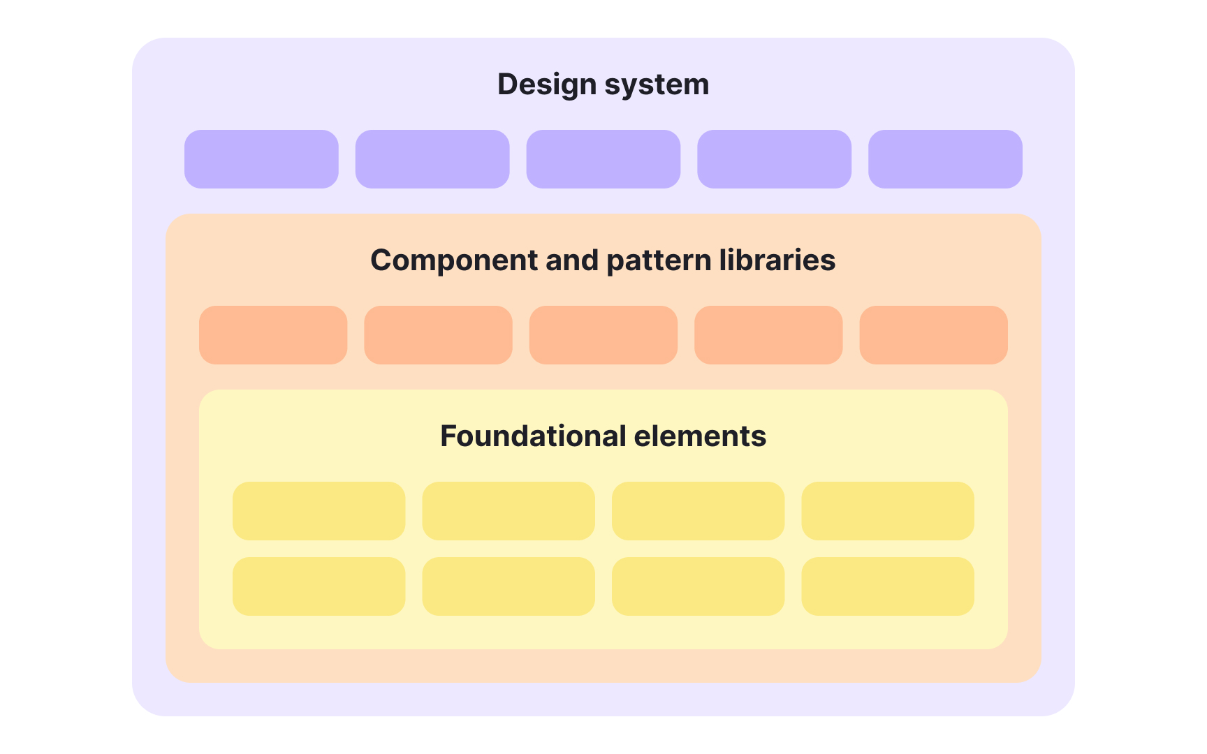
The main categories within a design system include:
- Design system: The top-level structure that holds the system’s principles, design tokens, documentation, and shared best practices. It guides how all elements should work together and evolve over time.
- Component and pattern libraries: Collections of reusable pieces that make up the product interface. Components represent individual elements, while patterns describe how these elements combine to create layouts, navigation, or workflows.
- The visual and conceptual base of the system. This includes
colors ,typography , spacing, radius,icons , states (hover, pressed, disabled, focused), and accessibility rules. Design tokens live here as well, capturing these decisions in a structured, cross-platform format. They help teams express the brand consistently while adapting to the specific guidelines of web,iOS , andAndroid .
Together, these layers connect creative decisions with technical execution, turning design principles into practical tools. This structure keeps the product’s identity consistent across platforms, even when each platform has its own rules. It also allows the system to grow with the organization while staying clear and dependable.[2]
A well-structured
The layers are:
- Foundations: The core that defines how the
brand translates into digital form. It covers colors,typography , photography, motion, and visual principles specific to interface design. - Tokens: Named values, such as colors or spacing, that codify design decisions for use across platforms. Tokens make it possible to change a single value, like a primary
color , and apply it everywhere automatically. - Core systems: The reusable structures built from tokens, such as grids, elevation, and type scales. They solve
layout or spacing challenges, define type scales, and support consistent theming. Core systems show how different design rules work together. - Components: The visible interface parts, from
buttons and input fields tonavigation and headers. They are the most tangible part of the system, built on top of all previous layers.
Together, these layers create both flexibility and order. When the inner layers are strong, the outer layers can evolve smoothly without breaking the design’s consistency.[3]
Pro Tip: Think of layers as a chain of dependency — small design choices at the core shape every component users see.
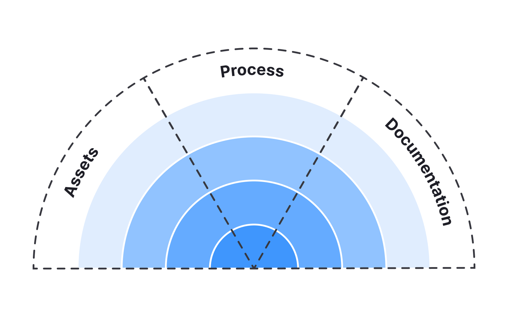
Each layer of a
- Assets: The tangible resources that teams use: design kits, code libraries, or software tools. Inner layers like Foundations, have fewer assets, while outer layers such as Components, include many that teams can directly build from.
- Documentation: The written explanation of what each part does and how to use it. In foundational layers, it often explains the reasoning behind decisions like spacing,
color , or states. In higher layers, it includes detailed design and code guidelines,accessibility requirements, and platform-specific notes so that web,iOS , andAndroid teams apply components correctly. - Processes: The workflows that define how people contribute to and maintain the system. Processes answer questions like who approves changes, how updates are reviewed, and how cross-team collaboration is managed.
These 3 parts bring balance between tools, knowledge, and teamwork. Without them, even the most polished components can lose coherence or trust over time.
As products and teams grow, keeping design consistent becomes increasingly difficult. A
There are several key reasons why teams invest in design systems:
- Speed and efficiency: Designers and developers reuse existing components instead of building everything from scratch, which shortens delivery time.
- Consistency and clarity: Visual and behavioral patterns remain uniform across screens, improving usability and user trust.
- Collaboration and shared language: Teams use the same definitions for elements and interactions, reducing misunderstandings and design drift.
- Accessibility and scalability: System rules make it easier to maintain
accessibility standards and expand the product to new platforms. - Reduced design and tech debt: By using standardized components and guidelines, teams avoid constant rework, patching, and one-off solutions that accumulate over time.
- Stronger brand coherence: Shared foundations such as
colors ,typography , spacing, and tone ensure that the product feels consistent and recognizably “on-brand” across platforms. - Learning and onboarding:
Documentation helps new team members understand how things work and start contributing faster.[4]
While design systems offer many benefits, they are not always necessary. Building and maintaining a system requires time, resources, and continuous collaboration. For small teams, one-off projects, or early product ideas, that level of investment may not bring enough value. In such cases, simpler solutions like shared style files or a basic component library can be enough.
A
The decision depends on context. The key is to understand what problem the team is trying to solve and whether a design system is the right tool for it.
Before creating a
Several signs often indicate readiness:
- Repeated design work: Teams recreate similar
buttons , forms, or screens because no shared source exists. - Inconsistencies across products:
Colors , spacing, andinteractions differ between platforms or versions, causing confusion for users. - Multiple brands or themes: The company manages several products or modes, such as light and dark themes, that need alignment.
- Inefficient collaboration: Designers and developers use different terms or duplicate work, slowing down delivery.
- Team growth: Onboarding new members takes too long because there is no clear reference for design and code standards.
- Tooling readiness: The team already has shared resources like a Figma library, reusable code components, or basic tooling that supports reuse. When these foundations are in place, a design system becomes a natural next step.
However, readiness is not only about scale. A supportive culture and leadership buy-in are just as important. Teams must be willing to invest in maintaining the system over time, share ownership across roles, and view it as an evolving product rather than a one-time project.


Similar lessons

Anatomy of UI Components

Atomic Design by Brad Frost
