Tokens: The DNA of a Design System
Use design tokens to turn visual styles into structured, reusable rules for consistent products.
Design tokens translate visual decisions, like color, spacing, or typography, into reusable data shared between design and development. They serve as the single source of truth that keeps every element aligned, reducing inconsistencies and saving time when products scale.
Tokens are most valuable in large or multi-platform systems, where design updates must stay consistent across tools and codebases. In smaller, static projects, they might add unnecessary complexity.
Design tokens form the connective tissue between design and code, turning style decisions into data that can be easily shared, updated, and automated. They can be structured in 2 or 3 tiers, defining what options exist, how they are applied, and where they appear in components. Together, these data units create a flexible foundation that keeps design systems scalable, themeable, and consistent across platforms.
Design tokens are the smallest units of a color.text.primary = #000000. This format makes design attributes readable for both designers and developers. Instead of hardcoding values like colors or font sizes in different places, teams define them once as tokens and reuse them consistently across components, tools, and platforms.
Tokens act as a shared language between design and development, ensuring that the same visual decisions appear correctly everywhere, from web interfaces to mobile apps. They capture choices about
A design token is built from two essential elements: a clear name and an assigned value. The name defines what the token controls, like color.background.success or space.medium,while the value sets the exact property, such as #E3FCEF or 16px. Using meaningful names instead of raw values creates transparency. It allows teams to understand the intent behind each token rather than focusing only on visual appearance.
Naming conventions often follow a hierarchy that explains the token’s purpose and context. For instance, in Atlassian’s system, the name might include a foundation (
Design tokens bring the most value in environments where multiple teams, platforms, or brands need to stay visually aligned. By storing design decisions as data, tokens make updates fast and predictable. For example, changing a single
They are especially effective for large-scale or multi-platform products, where consistent themes must appear across web, iOS, and Android. Tokens also support dynamic features like
Pro Tip: Use tokens when designs must stay consistent across products, themes, or platforms.
While tokens improve scalability, they can add unnecessary complexity in smaller or short-term projects. If a product has a single interface, limited visual elements, or infrequent updates, manually managing styles may be simpler and faster than implementing a full token system. Introducing pipelines, naming structures, and repositories for a small set of components can slow development rather than streamline it.
Tokens also require maintenance and clear processes between designers and developers. Without active collaboration, token layers may become redundant or outdated. In teams where design changes rarely occur or consistency is easy to maintain manually, the benefits of automation do not outweigh the setup cost. In such cases, a lightweight style guide or a shared Figma file may serve the purpose more efficiently.

Option or base tokens define the base visual values available in a
Keeping option tokens abstract helps teams maintain flexibility when brands or themes evolve. Designers can adjust the base palette or spacing scale while keeping the system structure intact. Option tokens are often called base or primitive tokens because they establish the set of visual resources the system can build from. They are used to support the next layers of tokens rather than being applied directly in components.
Pro Tip: Treat option tokens as foundational resources. Keep them flexible so they can support different themes and future updates.
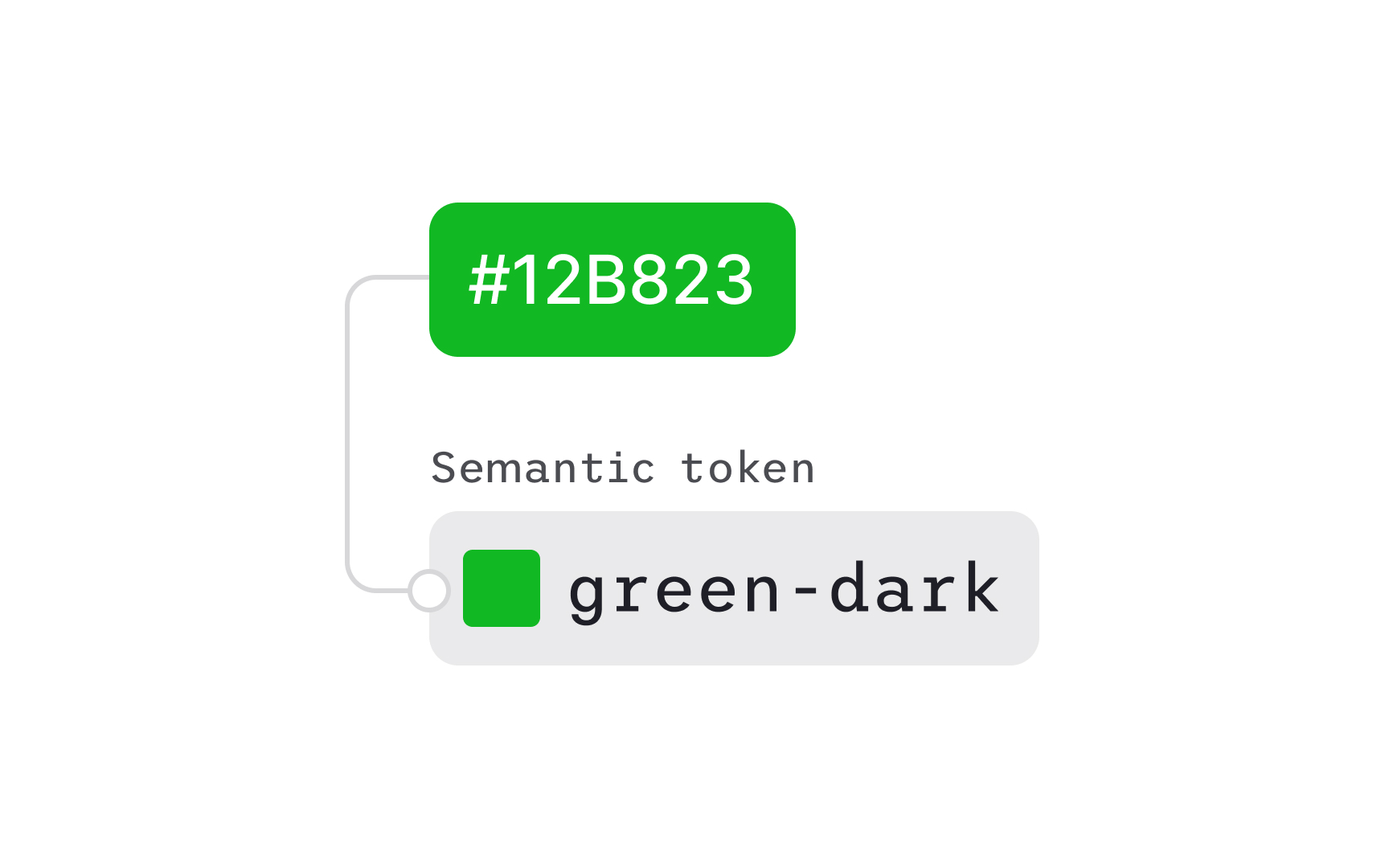
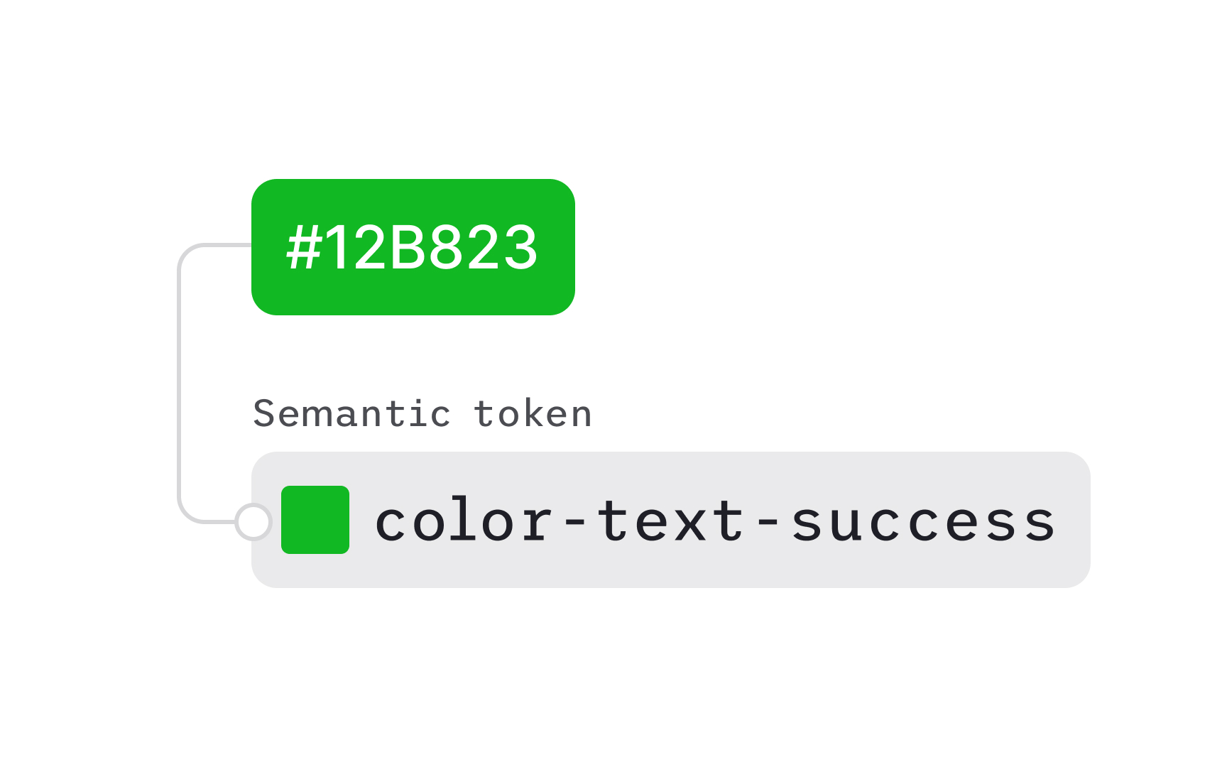
Decision or semantic tokens define how design options are used across the interface. They assign meaning to abstract values by describing their function, for example, mapping a gray tone to a “disabled background” or a dark blue to a “primary text.” Decision tokens turn a
Unlike option tokens, which only describe available styles, decision tokens connect those styles to specific roles and contexts. They make it clear which
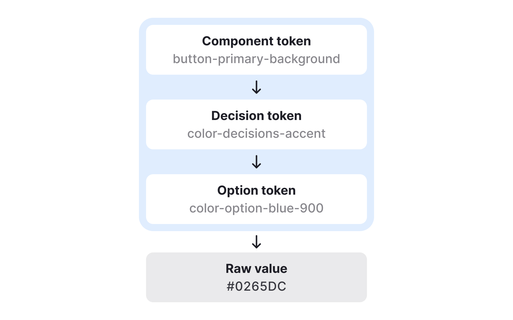
Component tokens map decision tokens to specific parts of the interface and describe exactly where styles are applied. They show how semantic choices become concrete visual rules inside components. For example, a primary
Component tokens do not always correspond to a single technical component. A “button” might be a coded component in one product, but in another it may simply be an HTML element styled through design tokens. In both cases, component tokens ensure the same visual decisions are applied consistently. They can group several decision tokens at once, such as background, text, and border values for different button variants or states.
Because component tokens describe the exact styles for each part of a UI element, they remove guesswork for developers. They clarify how to apply decisions across states like hover, pressed, or disabled and can extend beyond color to include spacing, radius, or elevation. This provides detailed control and ensures that even complex components stay aligned across platforms and design tools.
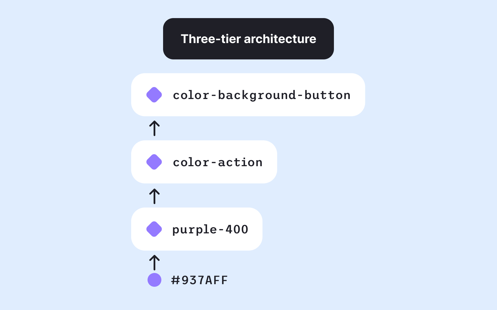
Design token systems can be structured with either two or three layers, depending on complexity. The right approach depends on scale, collaboration needs, and the expected lifespan of the system.
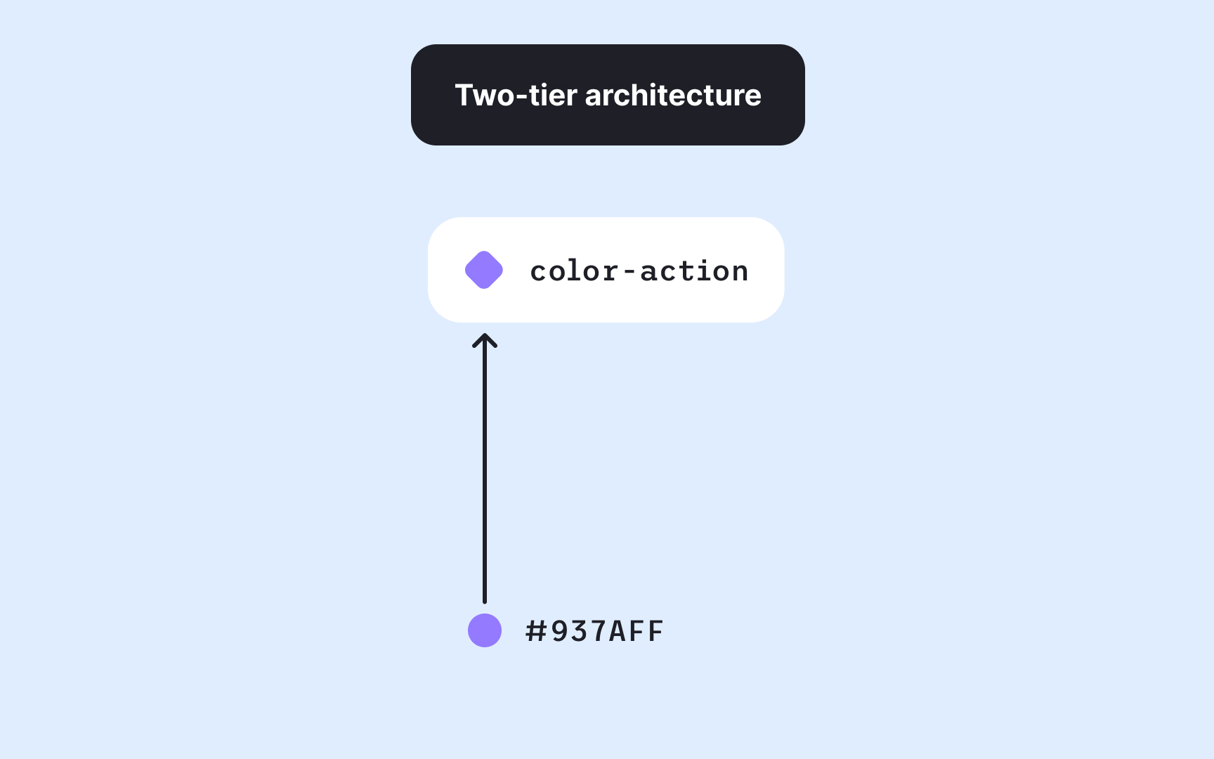
- A two-tier setup includes option and decision tokens. It’s simpler to maintain and works well for smaller teams or stable
design systems where major changes are rare. Designers define the base options and then map them directly to their contextual uses. - A three-tier setup adds a component layer on top of option and decision tokens. This structure offers more flexibility and precision, especially for systems that support multiple brands, themes, or products. Changes made in one layer cascade predictably through the others, helping maintain both consistency and adaptability. However, it also increases maintenance effort, as each new component may require its own token definitions.[4]
Building a token structure starts with defining a clear hierarchy that moves from broad foundations to specific applications. For example, for colors, this usually begins with option tokens, which describe all available blue-100, blue-200, or grey-900. These raw values serve as the visual building blocks for the system.
The next step is defining decision tokens, which assign meaning to those colors. For example, color.background.default might reference grey-100, while color.text.link connects to blue-800. This gives colors a purpose where each token name describes its intended use rather than its appearance.
Finally, component tokens specify how these decisions apply in context, such as button.primary.background or alert.error.icon.
Organizing tokens in this layered way keeps systems scalable and easy to maintain. Each tier builds on the previous one, allowing teams to swap a palette, adjust a theme, or expand a component library without rewriting styles. Following this structure ensures that color updates cascade logically and stay consistent across interfaces.
Pro Tip: Structure tokens from broad to specific by starting with options, defining meaning, then mapping them to components.
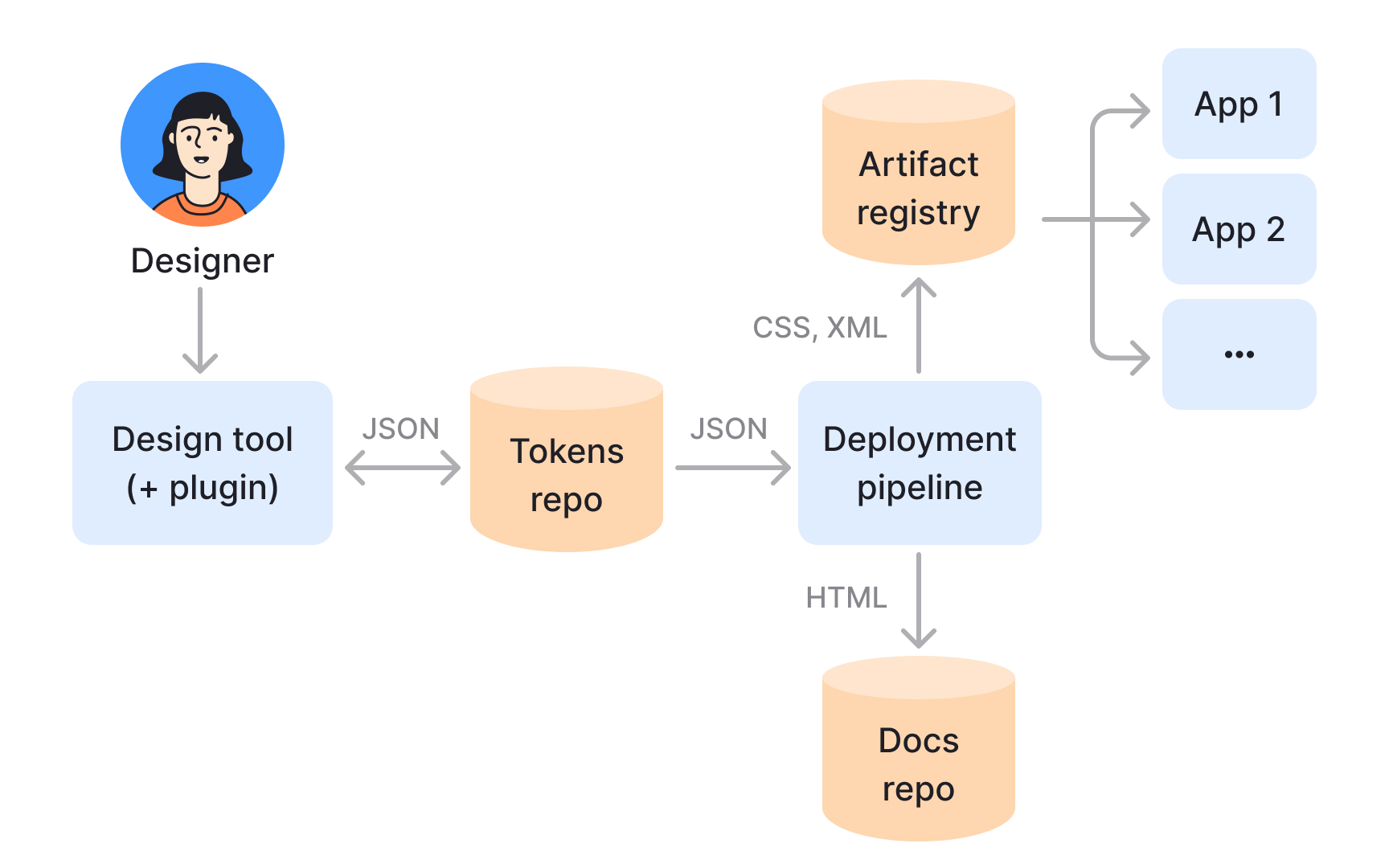
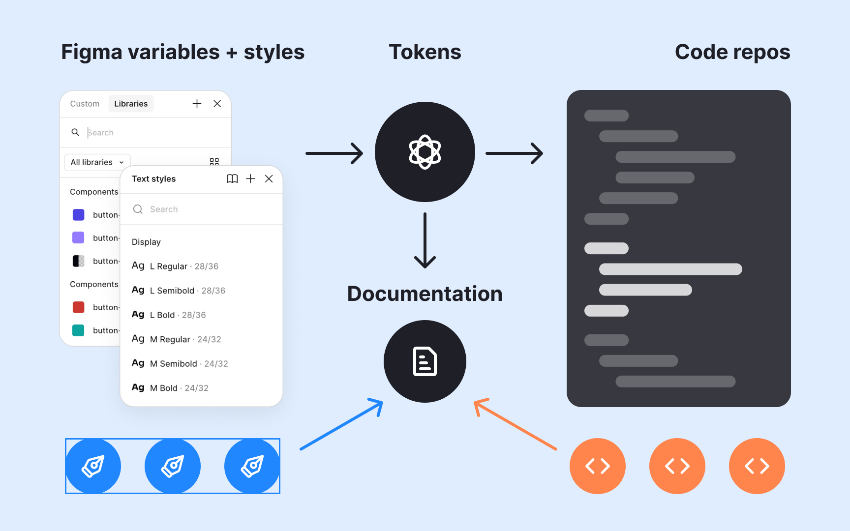
Design tokens become powerful when integrated into automated workflows. Once defined and stored, often in a version-controlled repository, they can be transformed into platform-specific code, such as CSS variables, Swift constants, or
Pipelines can be fully automated or include a review step before release. After validation and testing, the updated tokens are published to package managers or internal libraries. Developers simply update dependencies to apply the latest design changes. This approach bridges design and engineering in real time, making tokens not just a design artifact but part of the product’s continuous delivery process.
References
- Overview - Primitives - Atlassian Design System | Atlassian Design System
- Design tokens – Material Design 3 | Material Design
- The Many Faces of Themeable Design Systems | Brad Frost
Topics
From Course

Share


Similar lessons

Anatomy of UI Components

Atomic Design by Brad Frost
