Interface Inventory as the Foundation of Design Systems
Lay the groundwork for a design system by capturing a clear, honest picture of your product’s current interface.
Every design system begins with understanding what already exists. Before defining tokens, patterns, or rules, teams need a realistic view of the interface they are trying to systematize. An interface inventory provides that foundation. It gathers the real building blocks of the product in one place, including visuals like buttons, fields, icons, color uses, layouts, and also interactions such as hover, focus, error, and disabled states. This helps teams study how the interface behaves, not only how it looks.
This step reveals the true condition of the product. Over time, especially in larger organizations with multiple teams, products accumulate variations that stay unnoticed until they are placed side by side. An inventory exposes inconsistencies, highlights outdated or duplicated patterns, and helps teams separate intentional decisions from accidental drift.
By treating the interface as a system instead of a collection of isolated screens, the inventory becomes the starting point for building a unified design language. It gives teams shared evidence, a clearer scope, and a stable base for defining the first version of the design system. It also prevents teams from designing components or styles that do not reflect real usage. Without this step, many decisions would rely on assumptions instead of facts.
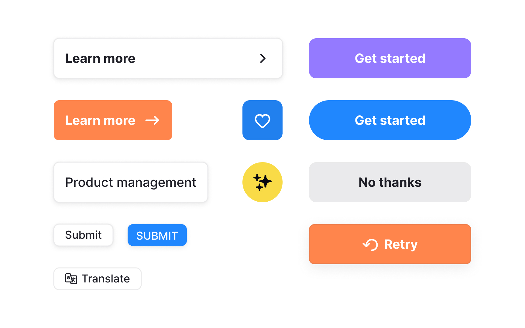
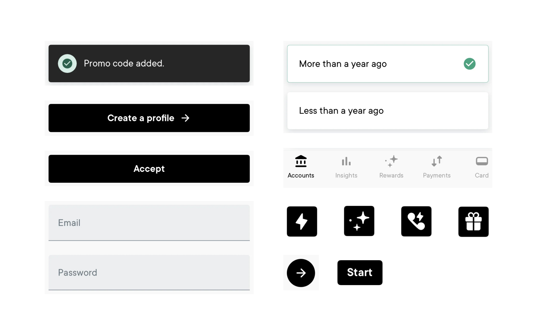
An interface inventory is a complete overview of the UI elements actually used across a product. It includes
Seeing these elements side by side reveals how many variations exist. Small differences in
In modern products, an interface inventory goes beyond screenshots. It is built by reviewing rendered UI, design libraries such as Figma styles and variables, and existing code. This approach captures both design intent and real implementation, giving teams a shared and factual starting point before defining tokens, components, or system rules.[1]
Pro Tip: When mapping UI elements, focus on distinct variations rather than every instance. This keeps the inventory manageable and more useful.
A
When teams review the full set of existing elements, the underlying foundations become visible.
This visibility also helps align stakeholders. Seeing the same evidence makes it easier to explain why changes are needed and builds support for improving consistency.
Starting with an inventory ensures that future system structures are grounded in reality. It becomes the reference point for defining tokens, naming conventions, removing outdated patterns, and shaping the first version of the design system. Without it, teams risk creating rules that do not reflect how the product truly works.
Pro Tip: When presenting the inventory, highlight patterns rather than individual screens. This helps others see the scale of the inconsistencies more clearly.
Interfaces often grow through many separate updates. Over time, teams introduce new components, adjust old ones, or create quick solutions for specific features. These choices may seem small in the moment, but they accumulate. When viewed together in an inventory, they reveal multiple versions of similar elements, each slightly different in size,
A major source of these inconsistencies is cross-platform work. Web, iOS, and Android interfaces often evolve in parallel, sometimes handled by different teams. Platform rules, tooling, and delivery timelines vary, which can lead to diverging patterns even when the intent is shared. Without a unified view, these differences stay hidden inside each platform.
Some inconsistencies also come from older parts of the product that were never revisited, while others appear when new contributors join or teams move quickly between project phases. The inventory makes all of this visible by pulling elements from all platforms into one place. It shows which patterns have drifted apart and which styles no longer align with newer work.
Understanding where these inconsistencies come from explains why the product can feel uneven and highlights what needs to be unified before building reusable components and shared foundations.[2]
Gathering screenshots is a practical starting point for building an interface inventory. This step focuses on capturing distinct
Screenshots are then placed into a simple template or workspace where they can be grouped and labeled. Viewing these elements together makes duplicated components, inconsistent styling, and small visual differences easier to spot. Because the evidence is visual, these issues become simpler to discuss and align on.
This step can be supported by tools and plugins that help extract interface elements directly from design files. For example, some Figma plugins can surface duplicate components, styles, or variables automatically, reducing manual work and making gaps more visible.
Once screenshots and supporting data are collected, teams can move into deeper analysis. At this stage, the inventory is ready to be categorized, cleaned up, and used to decide which patterns should form the foundations of the
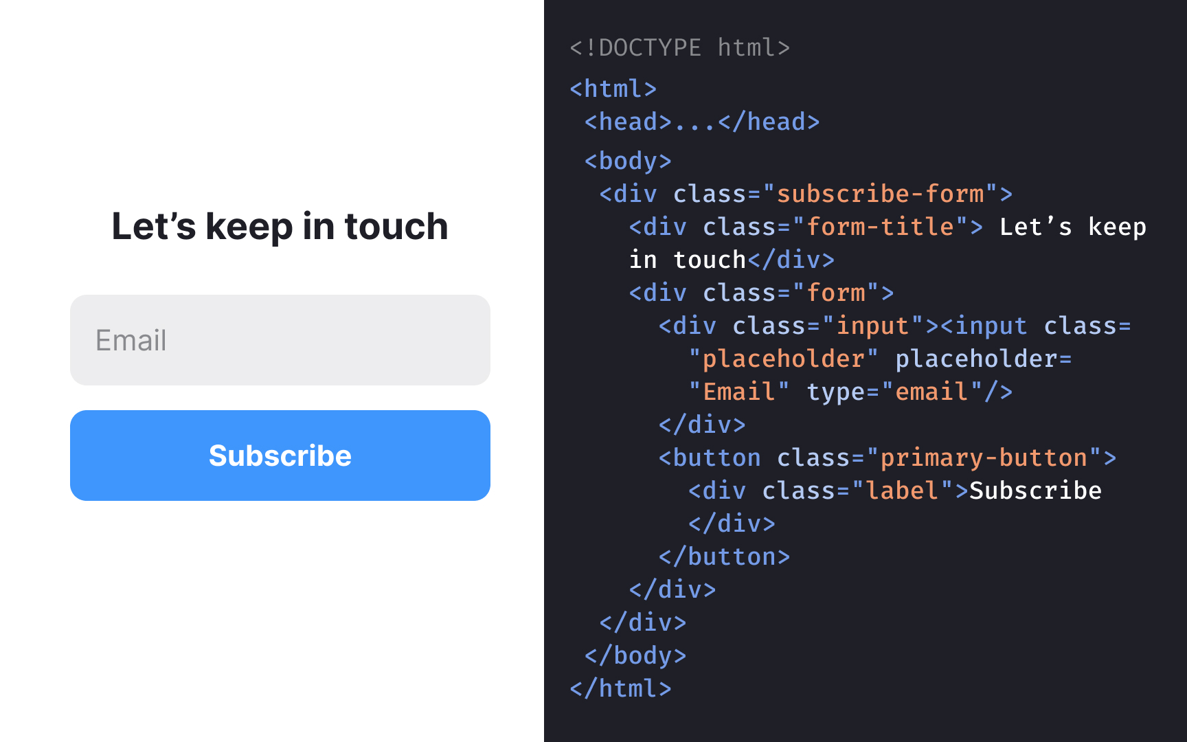
Inspecting the code behind
Code inspection also helps identify duplicated or outdated definitions. For example, a single
Pro Tip: When inspecting code, look for repeated patterns in class names or variables. These repetitions can help reveal how components were meant to function originally.
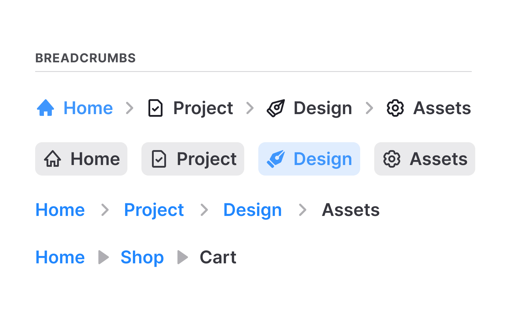
Once
Clear categories make repeated patterns and inconsistencies easier to spot. When elements are organized side by side, visual differences stand out quickly, and duplicate components become obvious. This structure also sets the base for deciding which items will become part of the future
Good categorization supports collaboration across teams. Designers and developers can discuss elements more easily when everything is labeled and logically grouped.
Pro Tip: Keep category names simple and aligned with the code or naming teams already use. This reduces confusion later when the design system begins to form.
Documenting interface elements begins by collecting each item in a format that can be viewed and compared easily. For colors, this means listing every
As teams review the collected elements, they often find differences that were never planned. Some variations arise from quick fixes, older designs, or different contributors. Others were introduced intentionally to support specific
Accidental variations become obvious when similar components do not follow the same structure or styling. These gaps point to areas where the
Intentional variations, such as different
Making this distinction ensures the system removes confusing inconsistencies without eliminating differences that serve a real purpose.
As the inventory becomes more complete, teams can add notes directly to each element. These notes point out outdated patterns, missing styles, duplicated
Annotations also help others understand why certain elements appear the way they do. When teams record file names, classes, or specific concerns, the inventory becomes more informative for both designers and developers. These notes act as a light form of documentation that supports future work without requiring a separate document.
Pro Tip: Keep notes brief and factual. Clear annotations reduce confusion when the team returns to the inventory during system planning.


Similar lessons

Anatomy of UI Components

Atomic Design by Brad Frost
