Email Design
Explore the best practices for designing emails that actually get opened
Email marketing can be an incredibly effective tool when used strategically. However, it's essential to understand that you have a very limited window of opportunity, just a few seconds, to grab the attention of your email recipients. In this short span, everything within your email, from the subject line to the call-to-action (CTA) button, needs to work seamlessly to convey your message effectively.
To make the most of this brief opportunity, invest time and effort into crafting your emails thoughtfully. The ultimate goal is to maximize the number of users who not only open your emails but also take the desired action you're encouraging through the CTA.
Informational
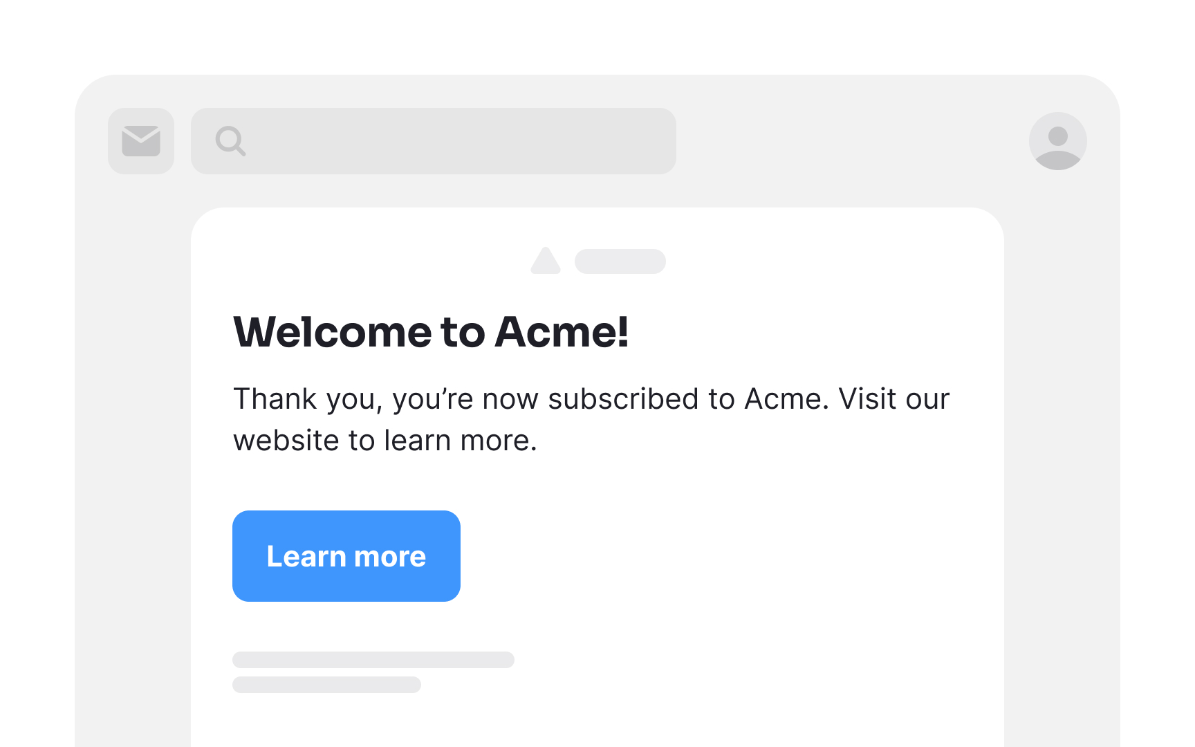
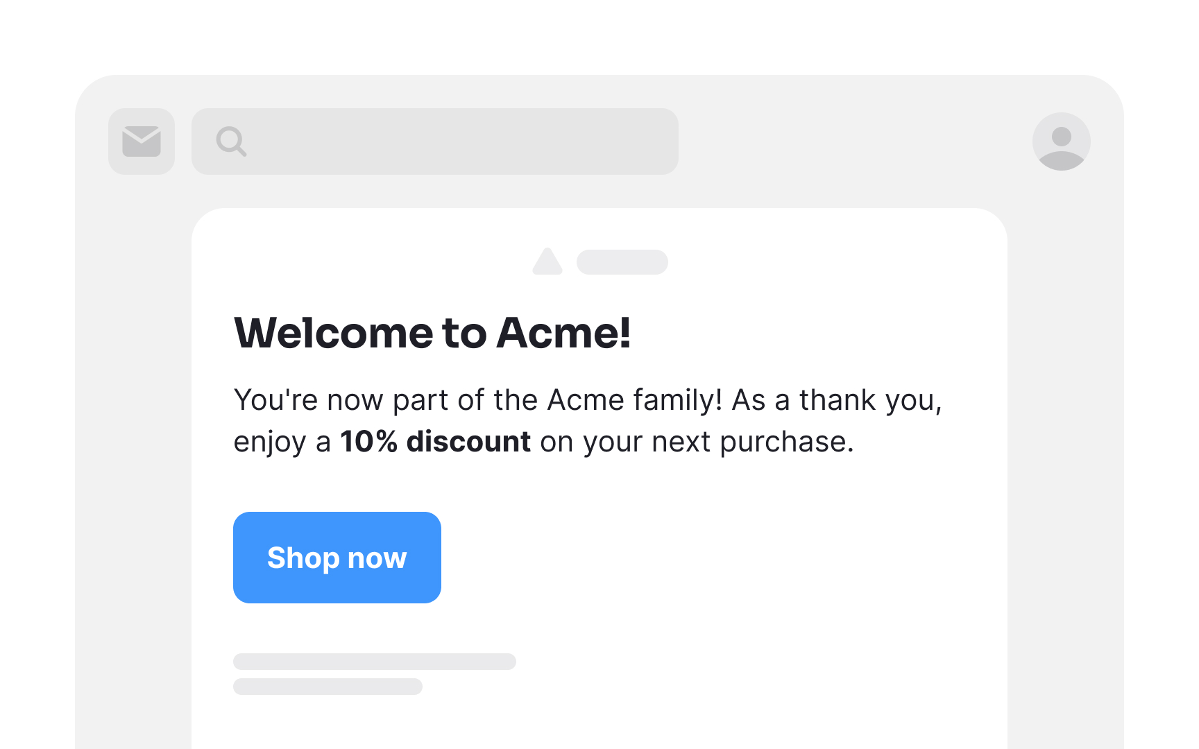
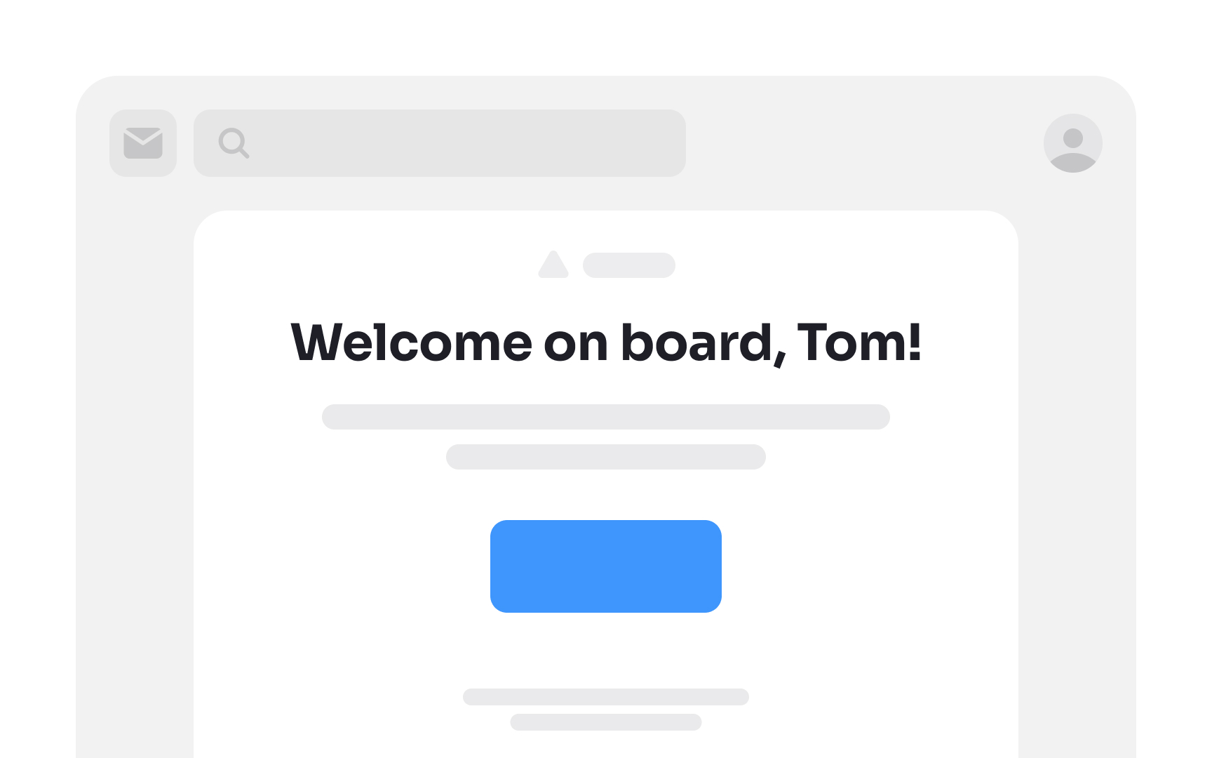
- Welcome emails: Initial messages to new subscribers, aiming to make them feel valued and leave a positive impression. These express gratitude, introduce products or services, and encourage further exploration.
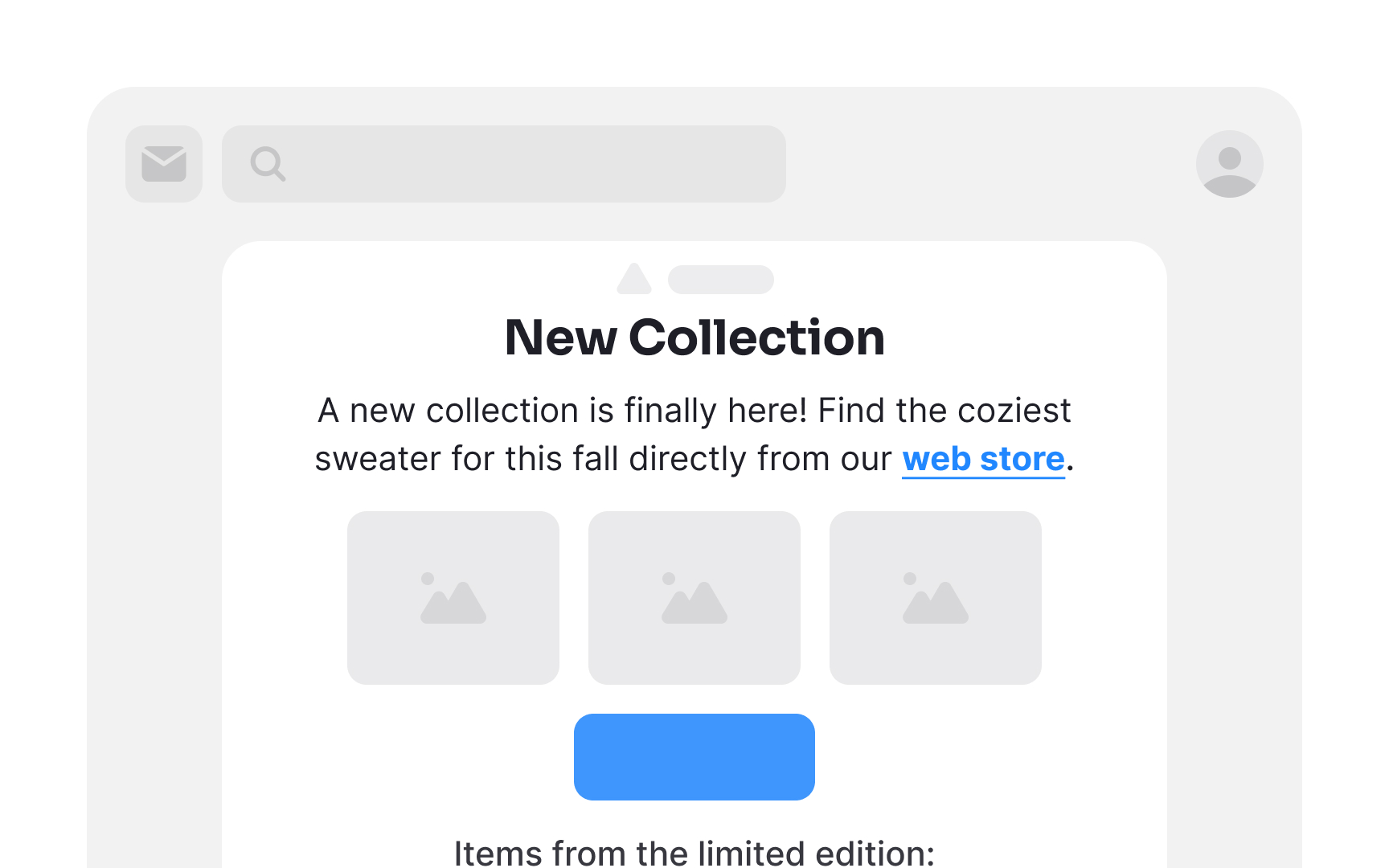
- Newsletter emails: Content-rich messages featuring updates, news, and crucial information about your products or services. The goal is to spark curiosity and prompt readers to delve deeper into your offerings.
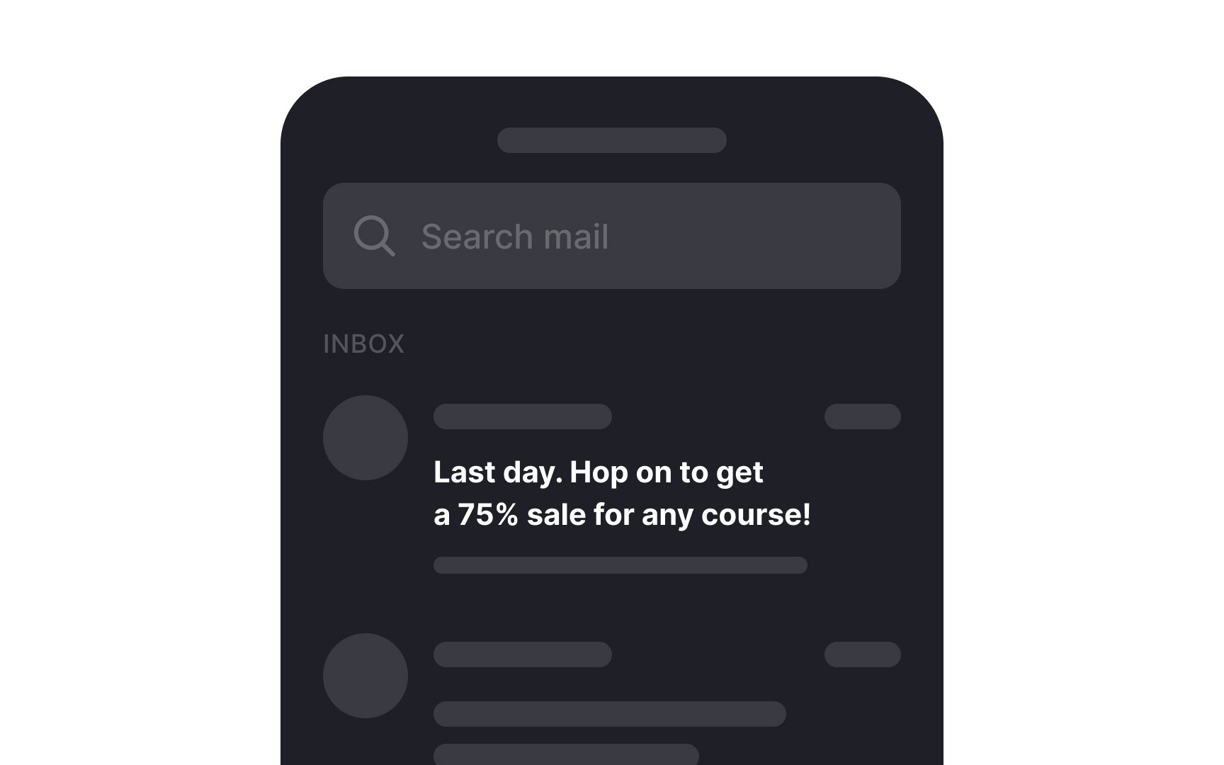
- Announcement emails: Used to inform subscribers about upcoming changes, events, or offers, these are crafted to generate excitement and anticipation.
- Order receipt emails: These provide essential transaction details, confirming a purchase and instilling confidence in the customer. While this is a good place to display offers to encourage more purchases, be mindful not to overdo it.
In all cases, find the right balance between providing valuable information and engaging your audience effectively.
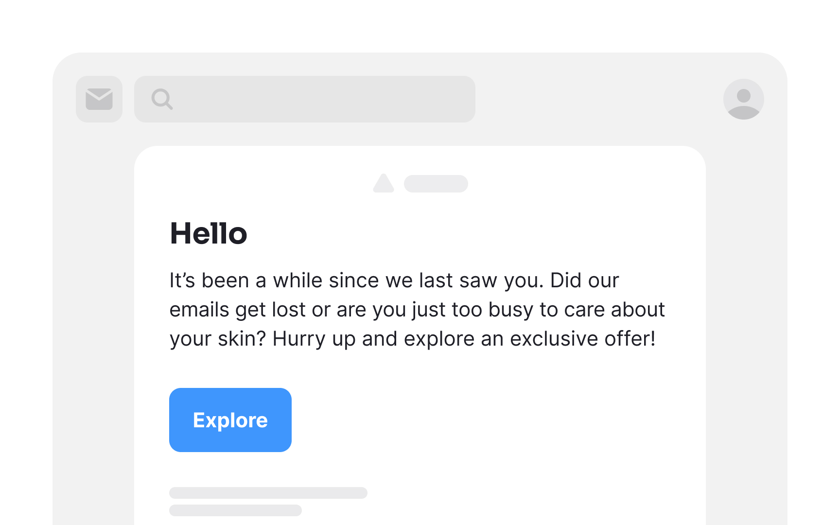
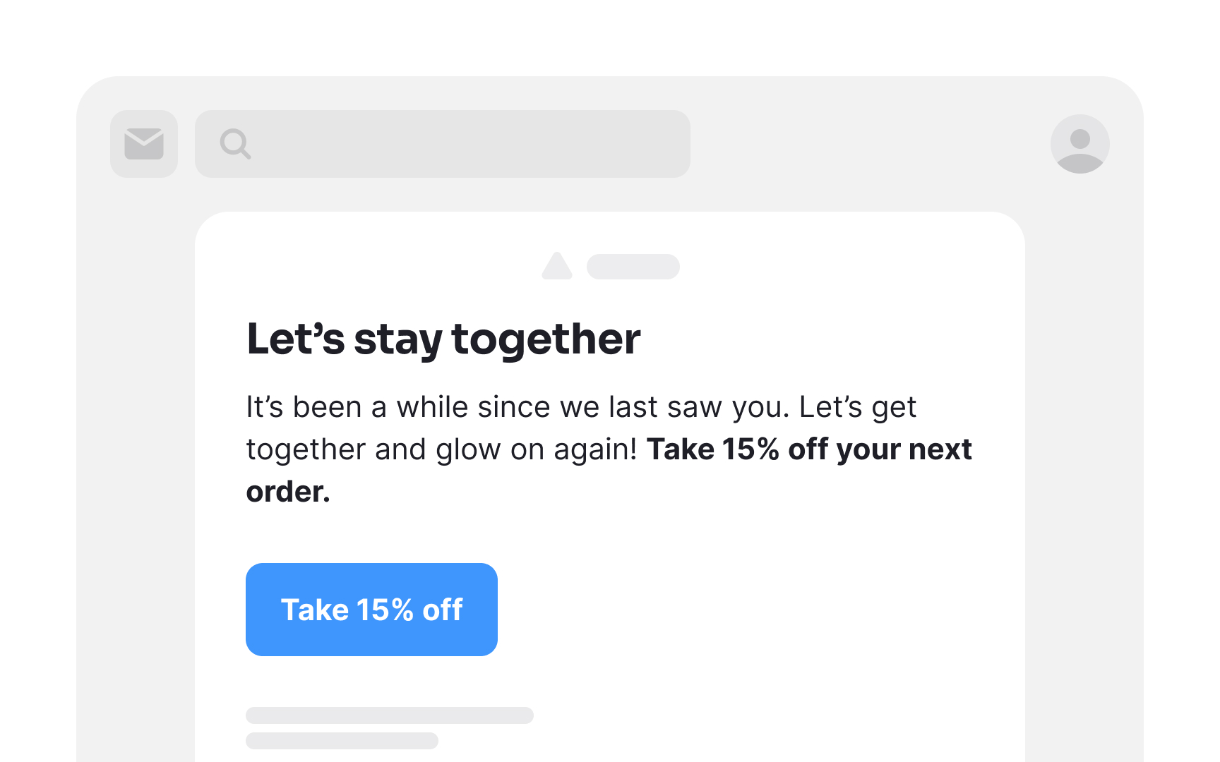
As time goes on, subscribers might gradually lose their initial enthusiasm for opening your
Reengagement emails serve as a compelling nudge, providing them with an enticing reason to reconnect with your product.[1] This incentive could take the form of rewards, updates on products or services, or exclusive opportunities they may have missed out on.
Pro Tip: Avoid being passive-aggressive or appearing desperate in re-engagement emails. A polite and respectful approach is more likely to resonate with your audience.
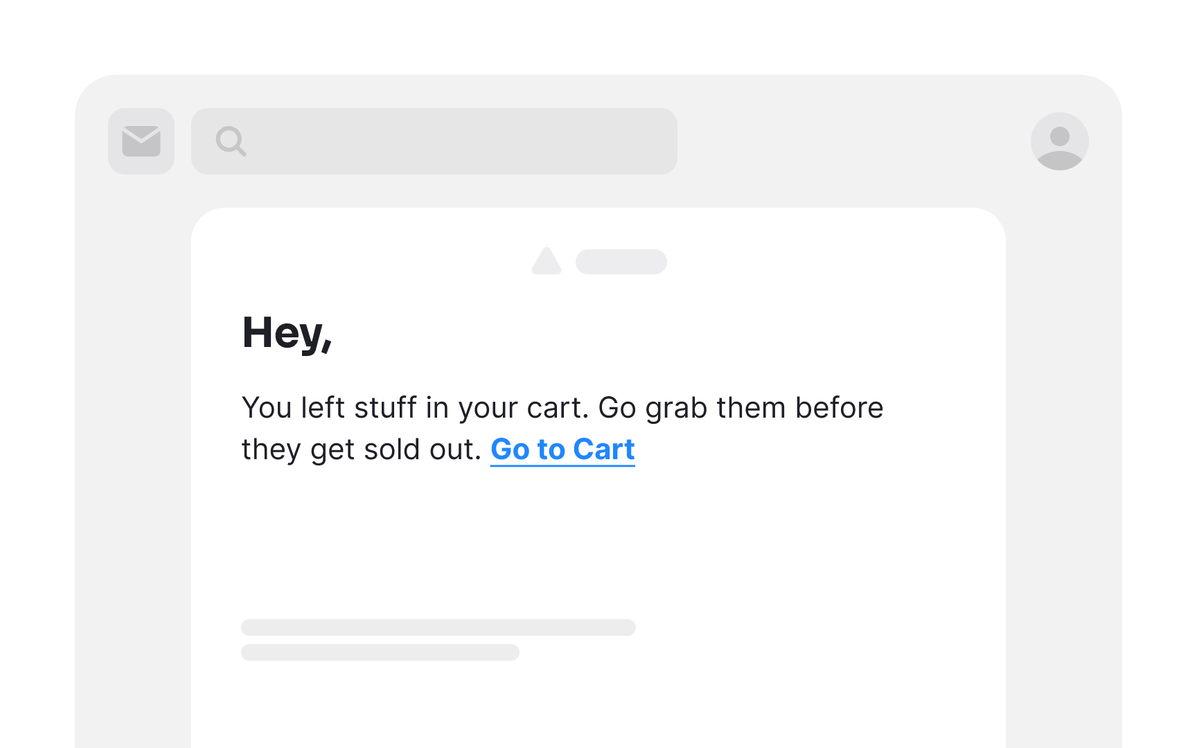
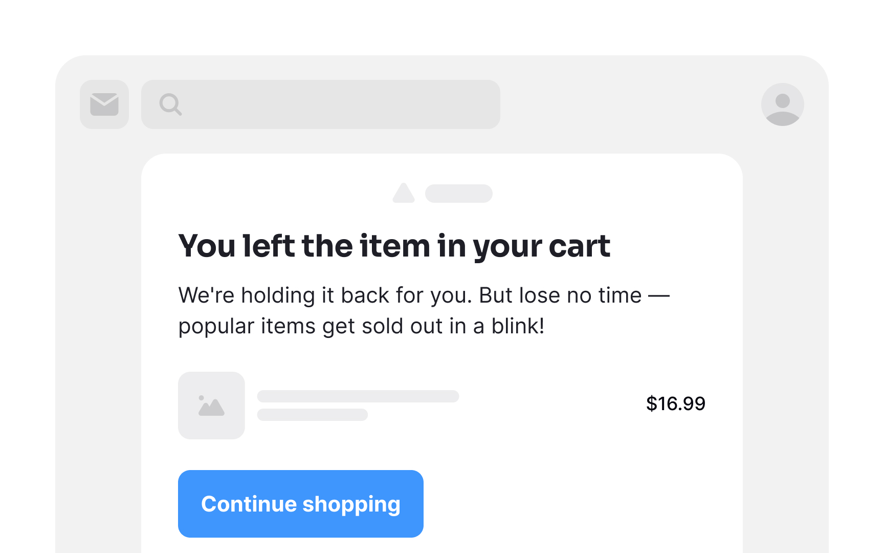
Abandoned cart emails mean to re-engage shoppers who left items in their carts without completing checkout. Research shows that almost a third of clicks on abandoned cart
Give your users a nudge and remind them about their unfinished purchases. Time is of the essence — cart abandonment emails sent within the first hour of abandonment perform best. Regardless of why shoppers abandon their shopping carts, you have a minimal window to win them back.
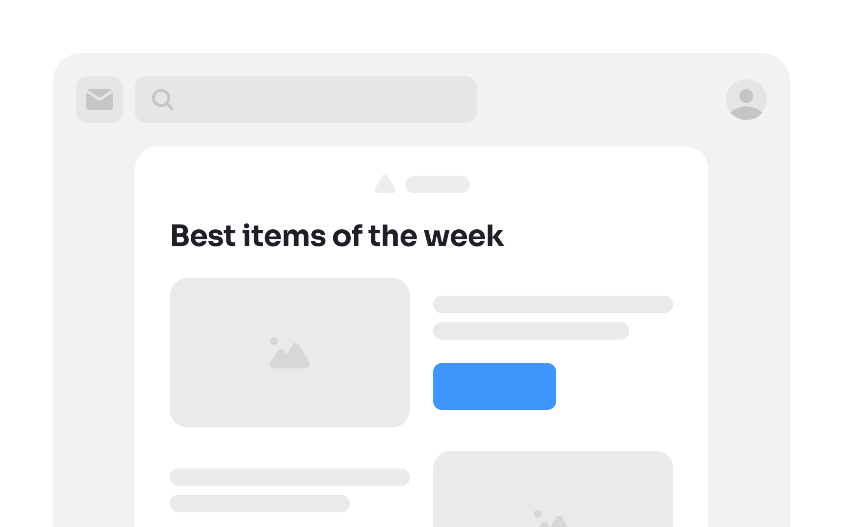
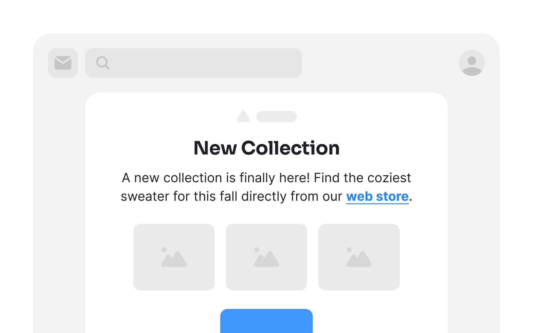
The inverted pyramid layout is a design technique meant to grab users' attention, excite them, and then guide them to take action. It is made up of 3 essential layers:
- Headline: This attention-grabbing statement presents your value proposition or a compelling promise. Its purpose is to pique readers' curiosity, encouraging them to delve deeper.
- Engaging details: The following segment adds depth and substance, furnishing supporting information for the value proposition or promise. Here, you have the opportunity to enthuse readers about what you have to offer and how you intend to deliver it.
- CTA: The concluding layer represents the
CTA , where you seal the deal. With the preceding layers executed well, readers should be primed and eager to click and convert by the time they reach the CTA.[3]
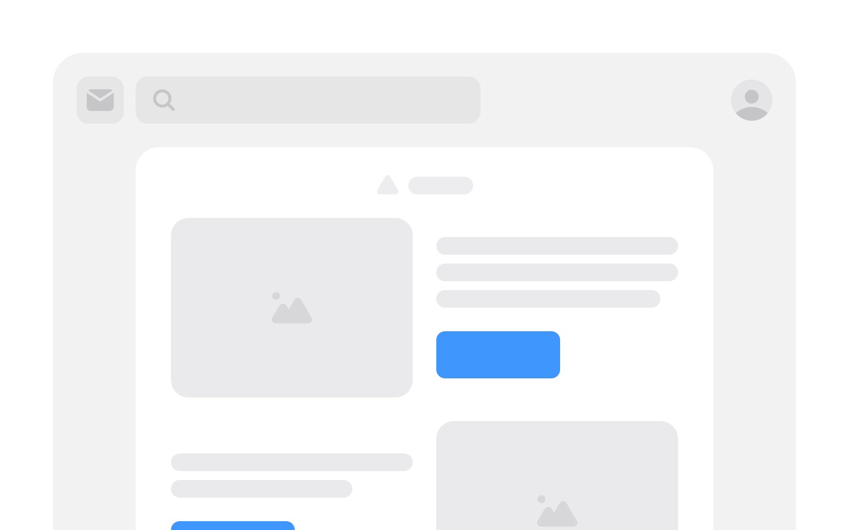
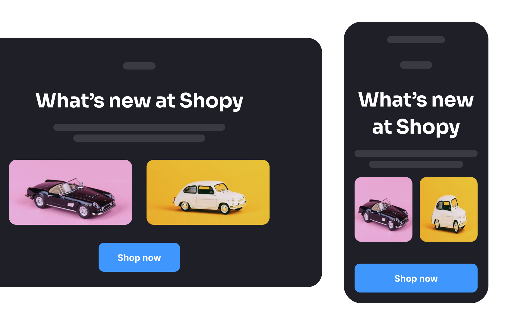
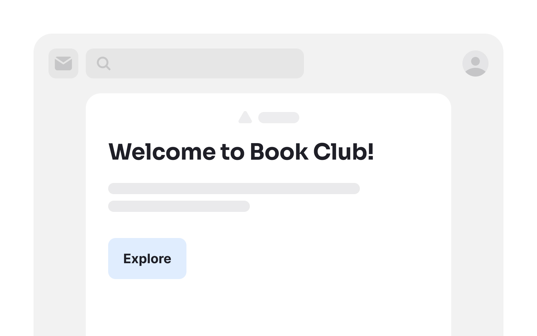
The zigzag
While the zigzag design excels on desktop platforms, ensure it gracefully collapses for consistent viewing on mobile devices. This layout is particularly effective for content-heavy messages, where you aim to capture attention swiftly and guide readers through key information with engaging visuals and succinct titles.
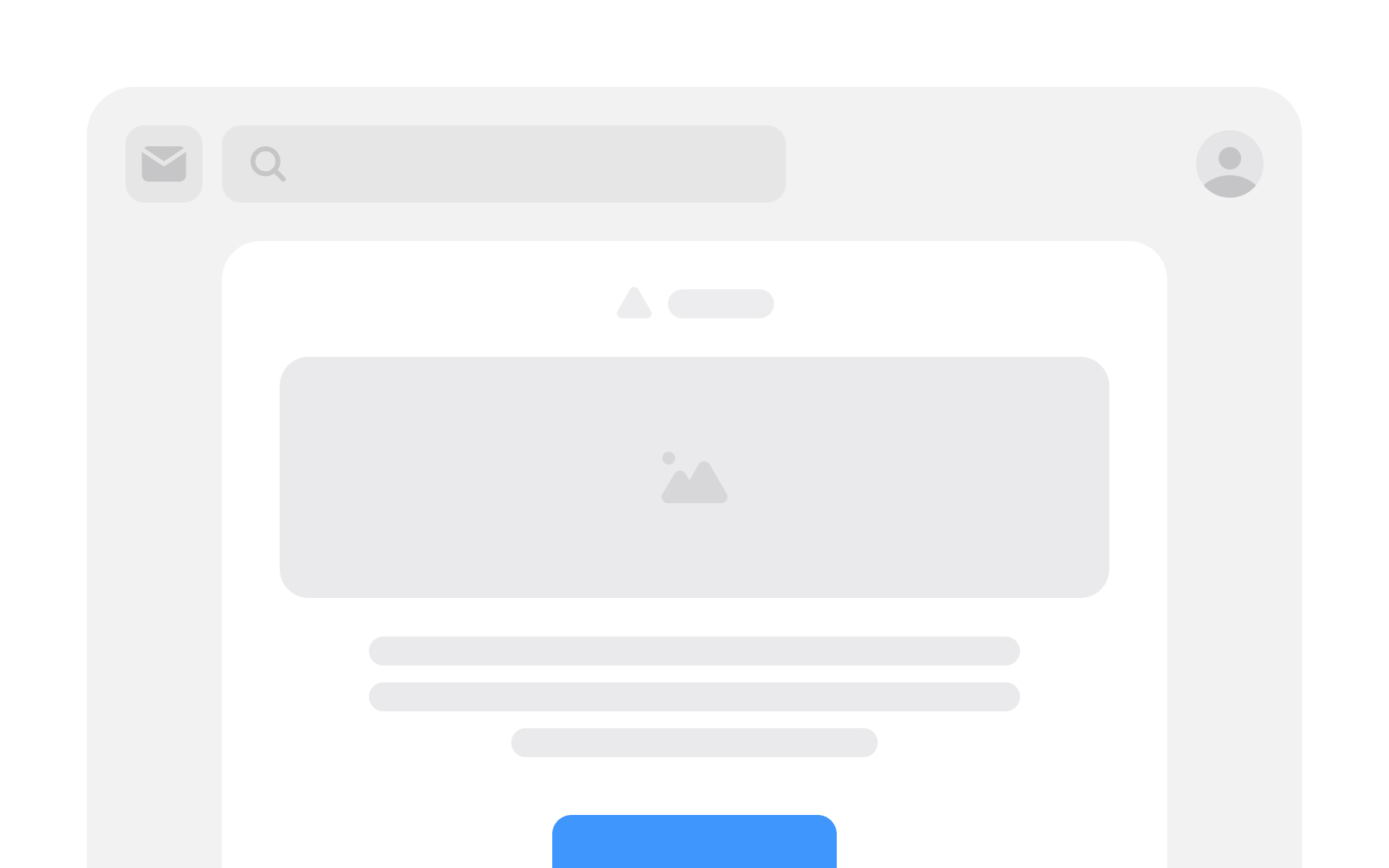
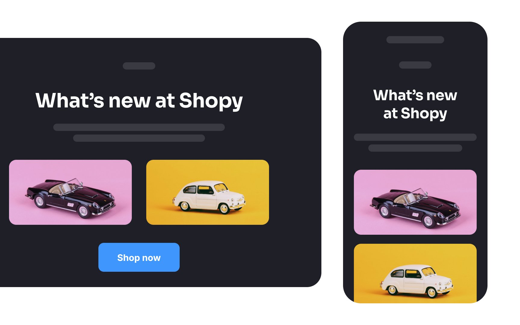
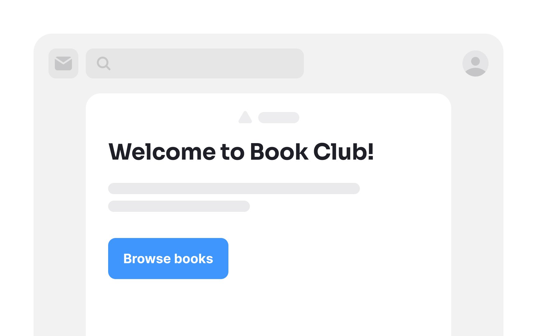
Single-column
These emails are designed to be long and narrow, ideal for swift scrolling. This layout is effective because users are accustomed to vertical navigation on mobile screens, placing information precisely where they anticipate it. It's best employed for ensuring seamless accessibility and user-friendly engagement on mobile devices.
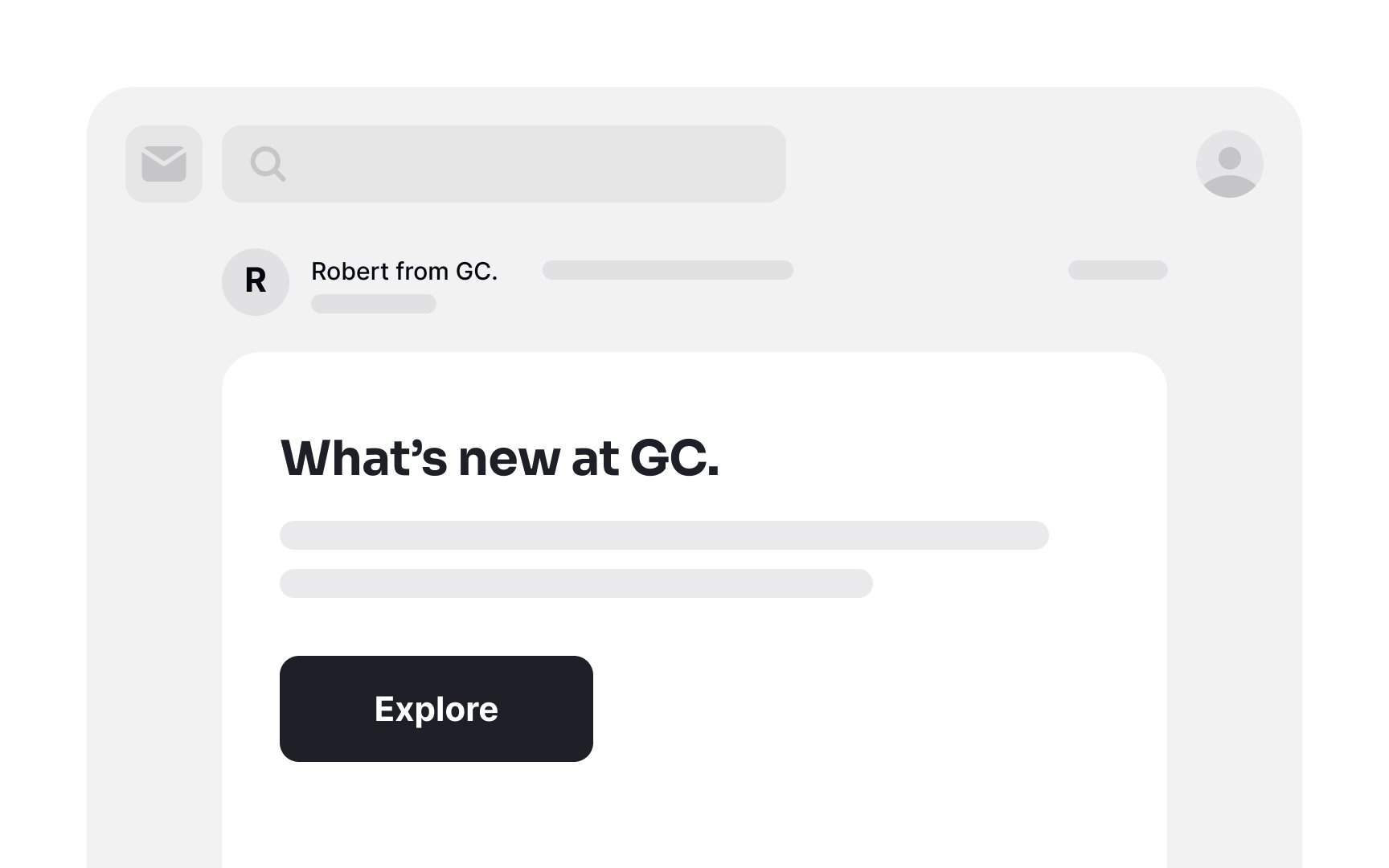
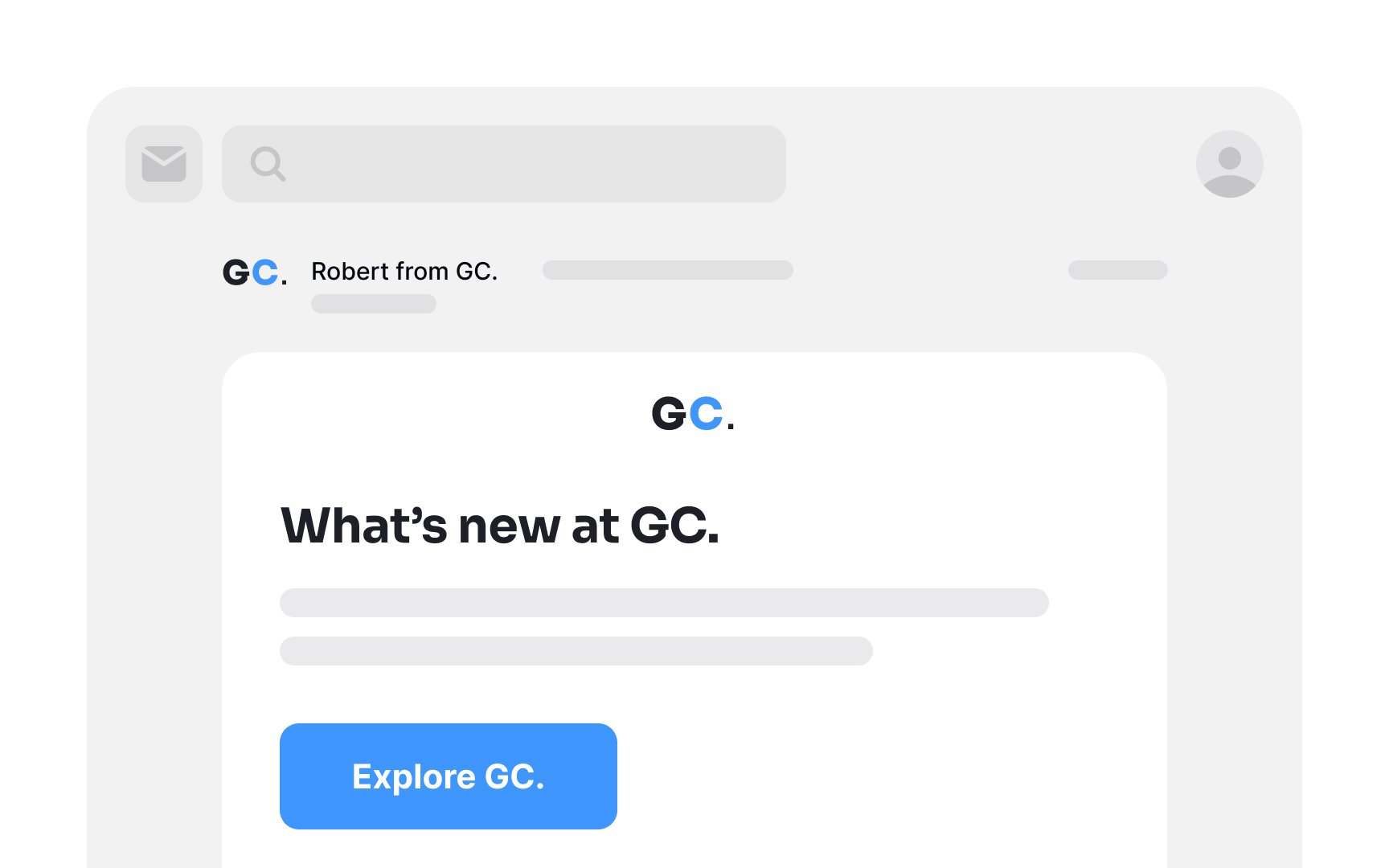
Integrate brand elements in your emails to establish recognition and trust. These elements could include your logo, brand colors, fonts, and other distinctive visual components. When users instantly identify your brand, it greatly reduces the likelihood of your
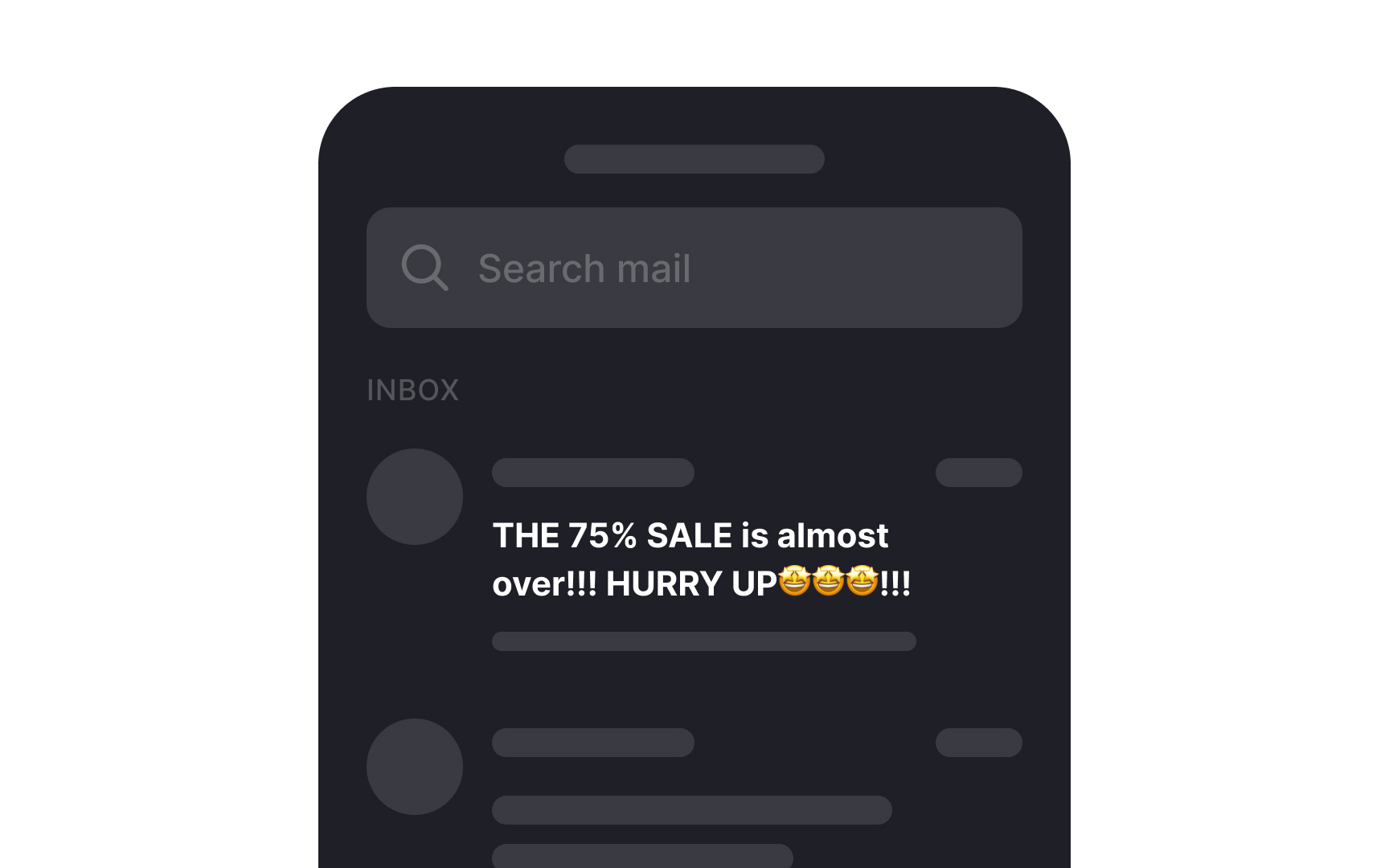
Steer clear of employing overly aggressive subject line formatting, which encompasses:
- Excessive use of capital letters
- Over-reliance on exclamation and question marks
- Generic
marketing phrases - An abundance of emojis
These tactics do not lead to higher open rates; rather, they make your
Moreover,
The preheader, often referred to as the "Johnson Box," is a valuable companion to the subject line. Positioned just below it, its purpose is to succinctly outline the email's
Craft a concise preheader that complements the subject line, offering value or a compelling
Dale Carnegie's renowned quote, "A person's name is to him or her the sweetest and most important sound in any language," rings true for
This personalized touch fosters a culture of respect, recognition, and consideration. Embrace this approach by incorporating the subscriber's first name in both the subject line and the body of your email for more engaging and effective communication.
When creating
Employ responsive design techniques to ensure your
Pro Tip: Take a width of 600px for desktop and 320px for mobile as a starting point for email design.
Generous use of white space in your
Ensuring a prominent
To enhance the visibility of the CTA button, consider factors like
When crafting the CTA label, use action-oriented verbs such as "buy," "get," "try out," or "grab." These words instill a sense of urgency and nudge users to take the desired action promptly.
Pro Tip: Adding enough white space around the CTA enhances its legibility.
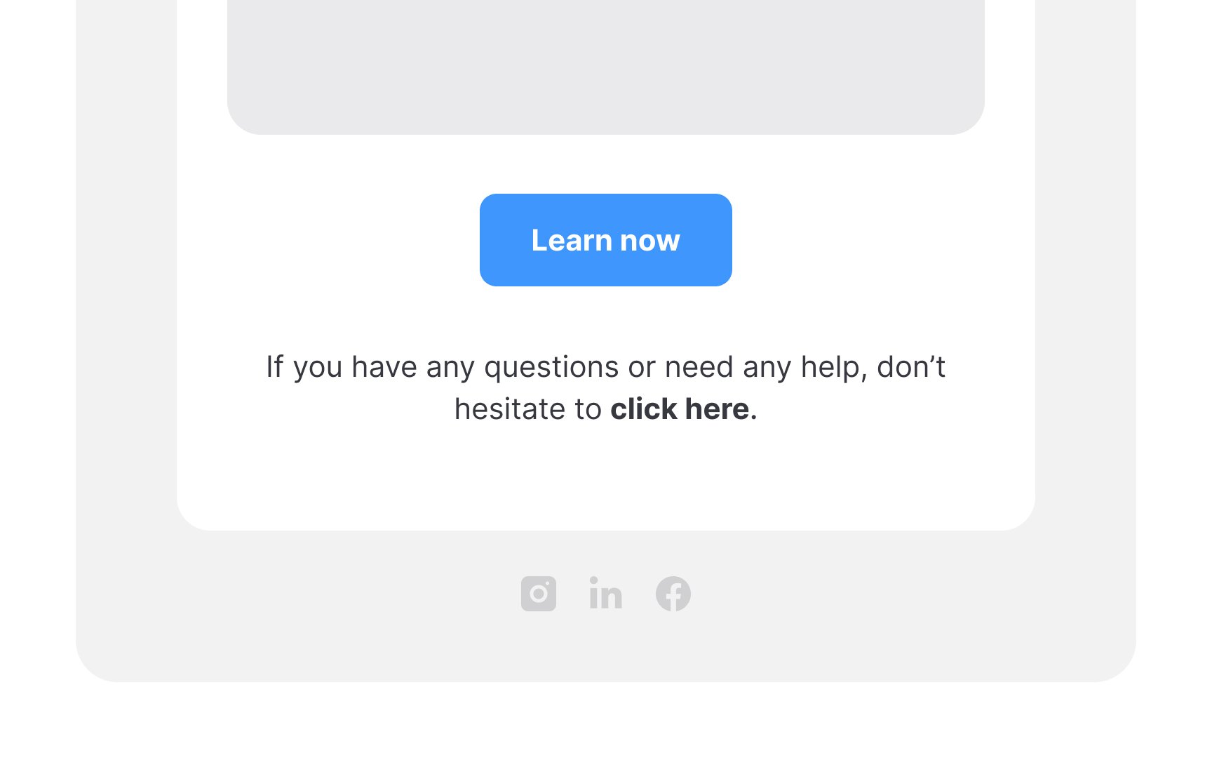
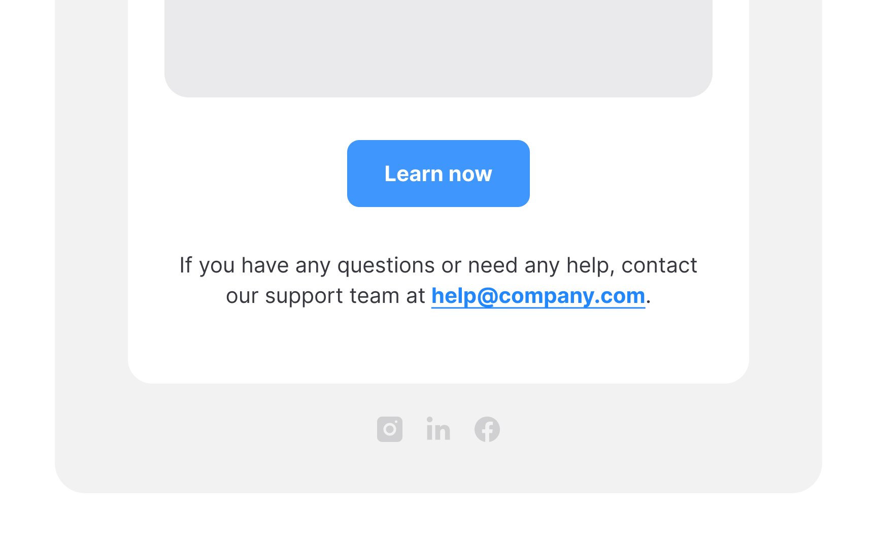
Link styling has remained consistent with underlined, typically blue text for years. Attempting to substitute it with italic or bold formatting can lead to user confusion.
Also, ensure that link text is self-explanatory; avoid vague phrases like "click here." This clarity benefits all users, particularly those relying on screen readers who greatly benefit from knowing where a link will take them.
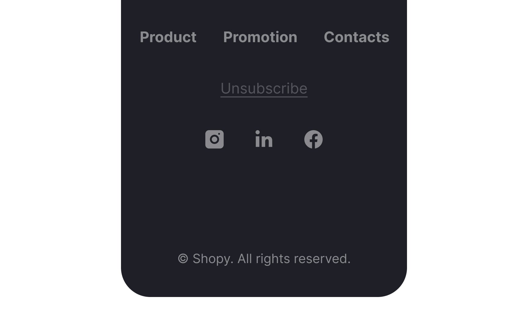
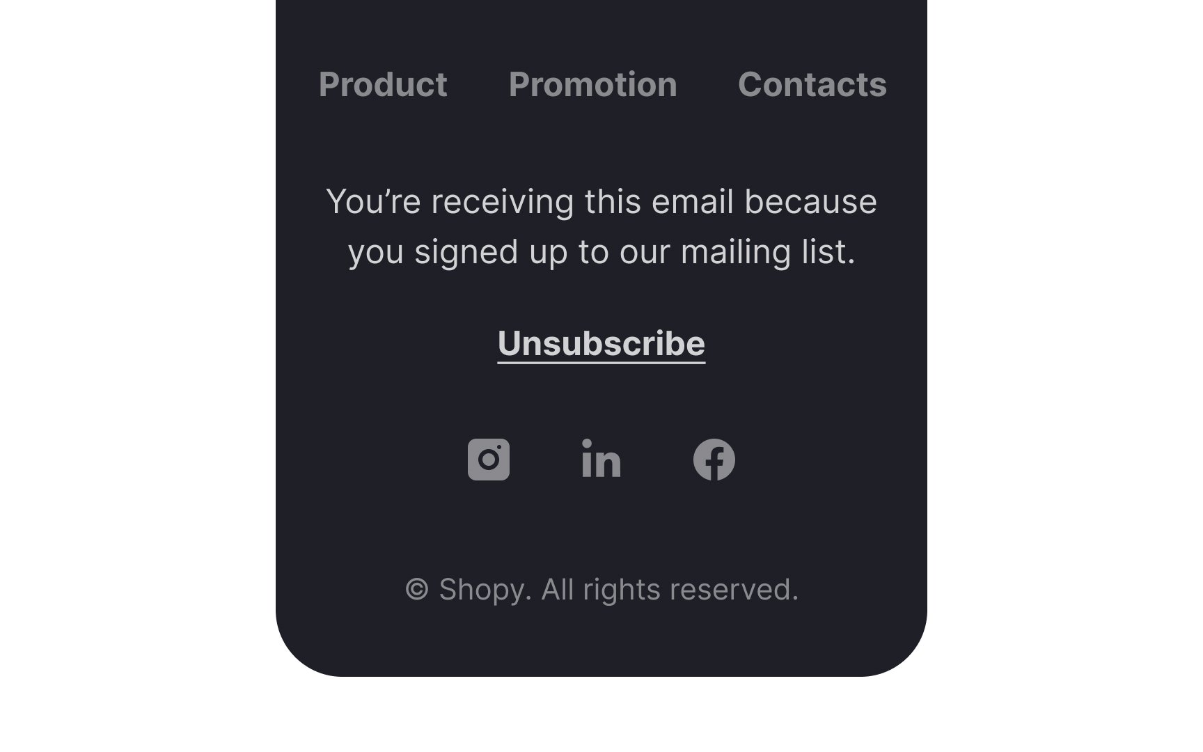
The footer of your
Equally crucial is the presence of an Unsubscribe
References
- The art and science of killer abandoned cart emails | Dynamic Yield
- Mobile Email Statistics - TrueList 2022 | TrueList
- Email Subject Lines: 5 Tips to Attract Readers | Nielsen Norman Group
- Emojis in Email Subject Lines: Advantage or Impediment? | Nielsen Norman Group
Top contributors


Topics
From Course

Share


Similar lessons

Login & Signup Flows

User Onboarding
