Accessibility Across Platforms
Design inclusive experiences that adapt thoughtfully across all Apple platforms.
Every Apple device offers different ways to make apps more accessible to all users. iPhones support specific VoiceOver gestures, Macs work well with keyboard navigation, and Apple Watch needs unique approaches for its small screen. Each platform brings its own tools for helping users see, hear, and interact with apps in ways that work best for them.
Creating truly accessible apps means thinking beyond a simple feature checklist. Good accessibility adapts naturally between devices — like moving smoothly from touch exploration on an iPad to mouse control on a Mac, or keeping text readable whether it's enlarged on an iPhone or zoomed on an Apple Watch. These thoughtful adaptations ensure apps remain usable and efficient across all platforms while supporting each device's unique accessibility features.
VoiceOver is an assistive technology that reads screen content aloud, letting users navigate their devices without seeing the display. While essential for people who are blind or have low vision, it's also helpful in situations like using devices while walking or in moving vehicles.
How VoiceOver works on each platform:
- iOS/iPadOS: Navigate with one-finger taps and swipes to select items and double-tap anywhere to activate. Use two, three, and four-finger
gestures for additional controls. The rotor gesture (two fingers rotating) changesnavigation methods. - macOS: Enable through System Settings or Command-F5. Navigate using Control-Option commands or trackpad gestures that match iOS patterns. VoiceOver cursor shows current focus.
- watchOS: Use one-finger taps to select items and double-tap to activate them. Two-finger gestures control reading and volume. Swipe with one finger between elements, or use the Digital Crown for navigation.[1]
Pro Tip: Create a VoiceOver navigation map to test logical content flow across platforms.
Each Apple platform offers unique
Core assistive technologies:
- Switch Control: Lets users navigate using external switches or screen taps. Available on
iOS , iPadOS, macOS, and watchOS, with controls adapted for each platform's interface. - Voice Control: Enables complete system
navigation through voice commands. Supported on iOS, iPadOS, and macOS with platform-specificcommand sets. - AssistiveTouch: Creates customized touch interactions for limited mobility. Available on iOS, iPadOS, and watchOS, offering device-appropriate
gesture alternatives. - Mouse and Pointer Control: Supports various pointing devices and
cursor customization. Available on iOS, iPadOS, and macOS, including features like Head Pointer on Mac.
Consider how your interface works with each assistive technology. Controls should remain accessible through alternative input methods while maintaining core functionality.

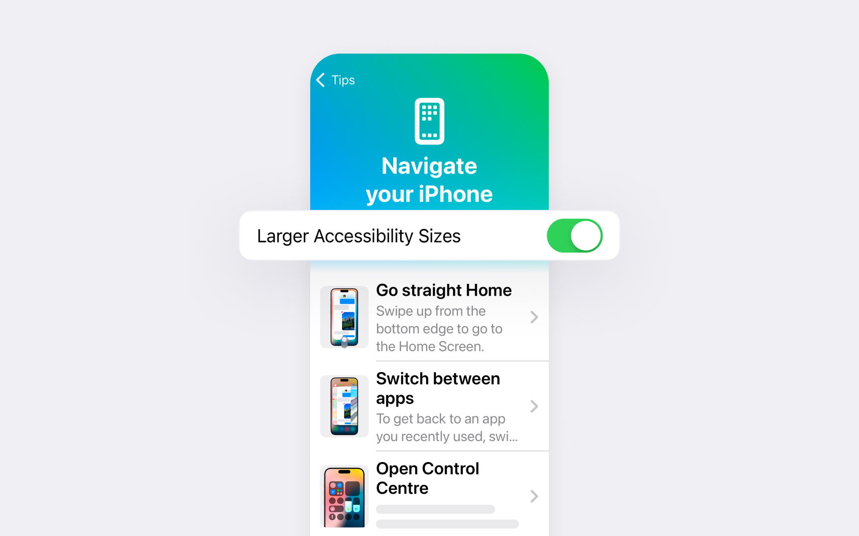
Dynamic Type lets users choose their preferred text size across Apple platforms. Understanding its implementation helps create interfaces that remain readable and usable at any text size.
Key scaling principles:
- Text adaptation:
Content scales smoothly with user preferences. Layouts adjust to prevent truncation, especially in scrollable areas. Multiple text columns might need to become a single column at larger sizes. - Layout changes: Interface elements are reorganized when needed. Inline items may stack vertically at larger sizes to maintain readability. Primary content stays at the top regardless of font size.
- Typography choices: Use Regular to Bold weights for better visibility. Avoid Light or Thin styles, and limit the use of italics or all caps. Left-aligned text rather than full justify for improved readability.[2]
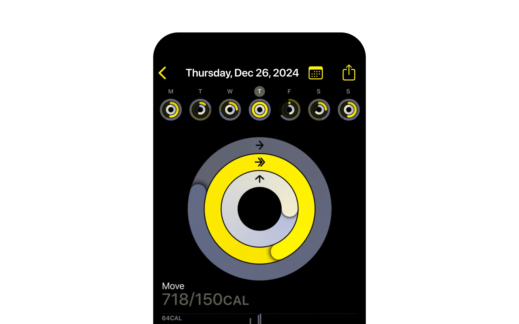
Color and contrast choices significantly impact interface
Key color considerations:
- Contrast ratios: Maintain minimum contrast between text and backgrounds. Text requires higher contrast ratios at smaller sizes, while large text can use slightly lower ratios.
- Color independence: Ensure interfaces work without relying on color alone. Use additional visual cues like icons, patterns, or labels to convey information.
- System support: Respect user preferences for increased contrast and reduced transparency. Test with different color filters and Smart Invert to ensure content remains clear.
Verify color choices work for color-blind users. Test interfaces in grayscale to ensure important information remains distinguishable. Check contrast ratios meet accessibility guidelines.

Different motor abilities require specific
Key adaptation areas:
- Touch targets: Every button, link, and control needs clear boundaries and adequate spacing.
iOS requires at least 44x44pt touch targets, while macOS pointer targets can be more precise. Small, crowded controls create barriers for users with tremors or limited mobility. - Gesture alternatives: Complex actions like pinch-to-zoom or three-finger swipe need simple alternatives. AssistiveTouch lets users replace multi-finger
gestures with custom single-finger actions or switch control. Standard system gestures already include built-in alternatives. - Timing controls: Quick actions or hold-to-activate features might be challenging for some users. Provide options to extend time limits or disable timing requirements entirely. Auto-scanning in Switch Control lets users navigate without time pressure.[3]
Pro Tip: Enable Switch Control to verify tasks can be completed without direct manipulation.
Sound and haptic feedback provide important cues for users with visual or motor limitations. These non-visual signals help confirm actions and convey system states.
Key feedback patterns:
- System haptics: Use standard haptic patterns for success, failure, and warnings. These familiar physical signals help users recognize
interaction results and upcoming events. - System sounds: Support built-in audio alerts and interface sounds that users expect. These standard sounds maintain consistency across apps.
- Alternative feedback: When haptics aren't available (like on iPod touch), provide clear audio feedback for custom interface elements to confirm interactions.

Clear
Description principles:
- Meaningful alternative descriptions: Describe the information that the image conveys. Focus on content that isn't explained by surrounding text or captions. Skip describing decorative elements.
- Infographic access: Provide concise descriptions of data visualizations. Make interactive elements accessible through proper
labels and actions. Ensure complex information remains understandable. - Media content: Support videos with closed captions, audio descriptions for visual-only information, and complete transcripts. Let users choose their preferred way to consume content.
Pro Tip: Read your descriptions aloud to verify they provide meaningful information without redundancy.
References
- VoiceOver | Apple Developer Documentation | Apple Developer Documentation
- Accessibility | Apple Developer Documentation | Apple Developer Documentation
- Set up and turn on Switch Control on iPhone | Apple Support
Topics
From Course

Images provided by

Share


Similar lessons

Intro to Accessibility

Inclusive Design Basics
