Shopping Carts
Explore the key considerations to keep in mind while designing digital shopping carts
Shopping carts are a crucial part of user experience and play a huge role in the decision-making process. They serve as a bridge between browsing and purchasing, allowing users to review and finalize their choices.
A well-designed shopping cart should not only display product details but also provide easy access to individual product pages for further information. It's also important to acknowledge that users often use shopping carts as a way to temporarily store items while they consider their options.
Designers should recognize the value of a shopping cart and ensure it is user-friendly and intuitive, ultimately enhancing the overall shopping experience.
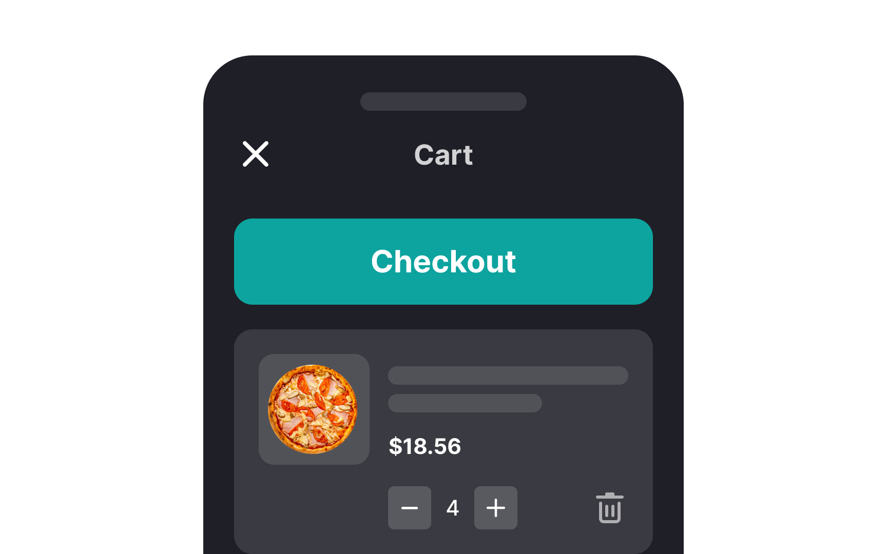
Once users add an item to their cart, let them know about it by implementing a cart item count badge next to the
Pro Tip: The cart badge should stand out — red is perfect for adding a strong accent.
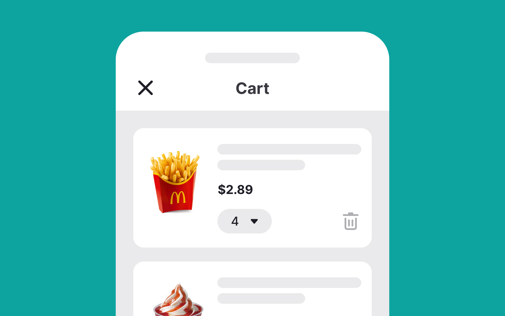
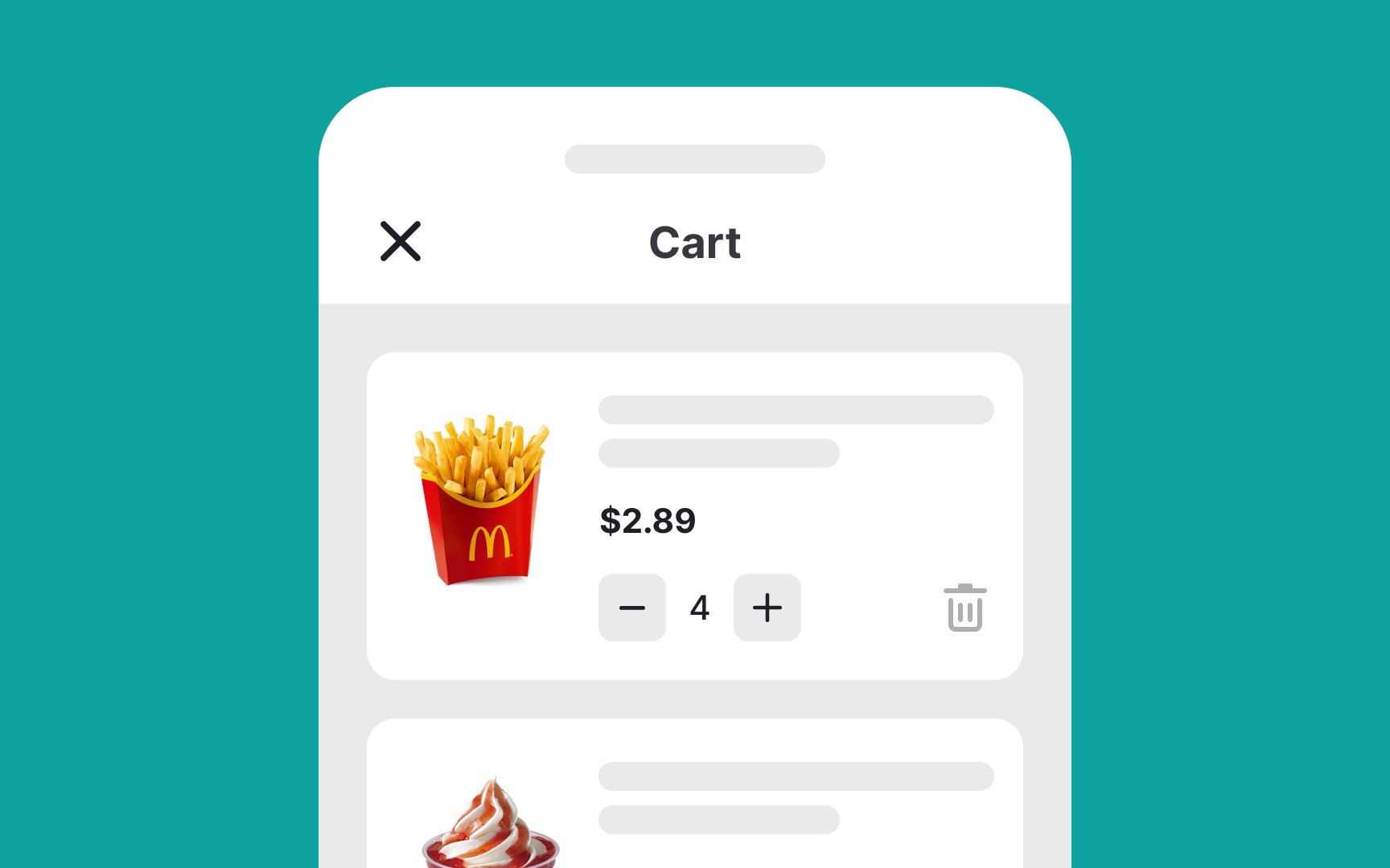
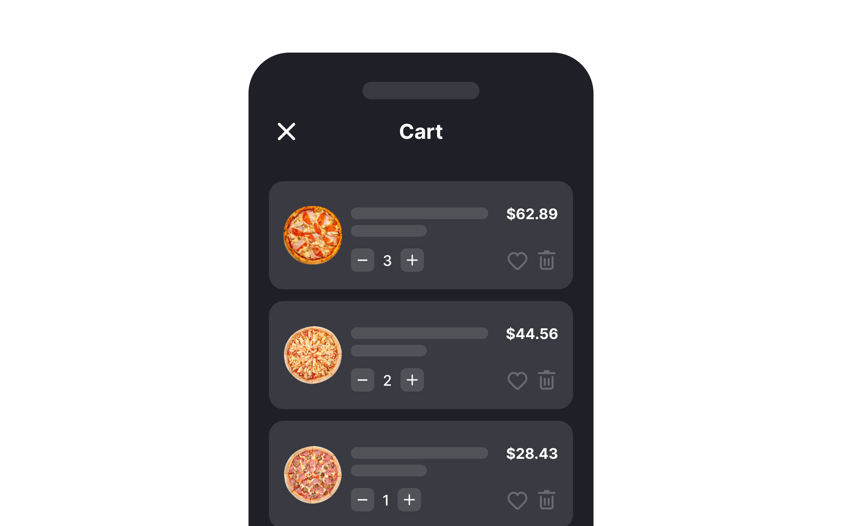
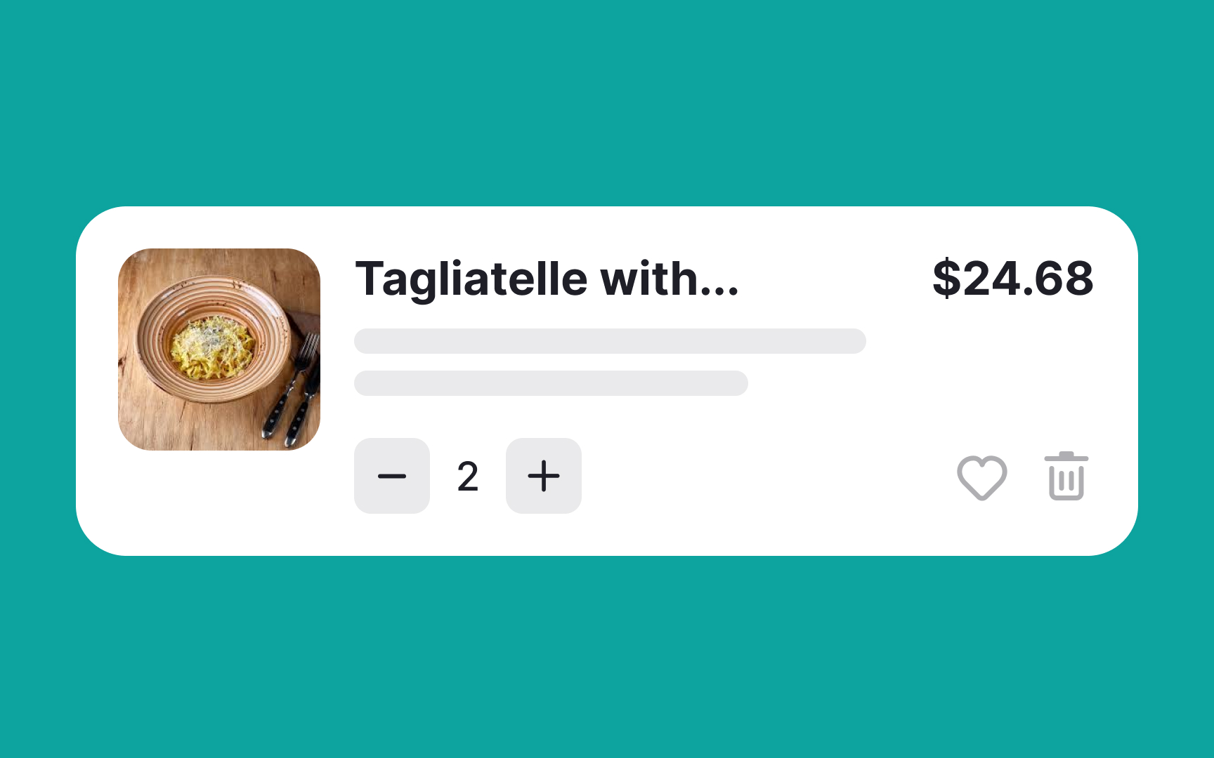
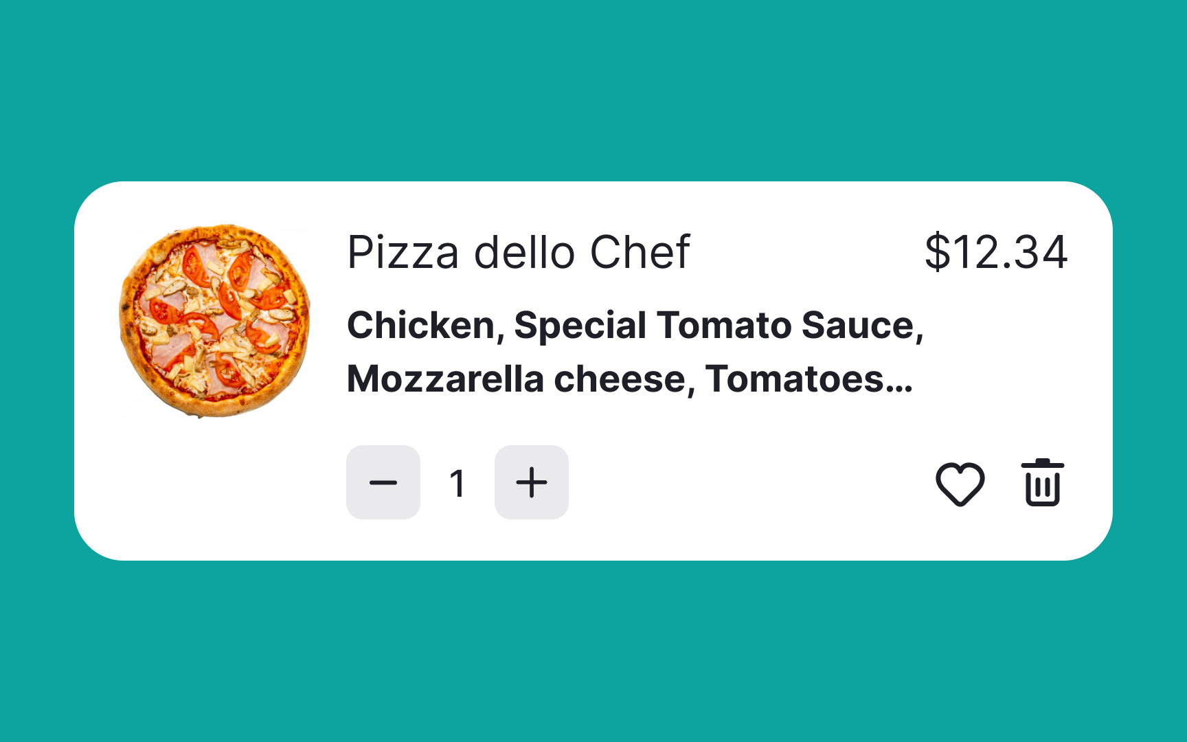
To minimize friction during the shopping experience, it’s crucial to let users easily edit the number of items in their cart.[2] If they make a mistake, they shouldn't have to restart the entire process, as being forced to do so can significantly diminish the likelihood of completing the purchase.
Particularly for mobile users, adjusting item quantities needs to be user-friendly. Dropdown controls can be cumbersome on smaller screens, leading to longer interaction times. A more efficient solution is to implement an input stepper control. This simple toggle allows users to increase or decrease quantities with just a tap, offering a more intuitive and hassle-free shopping experience.
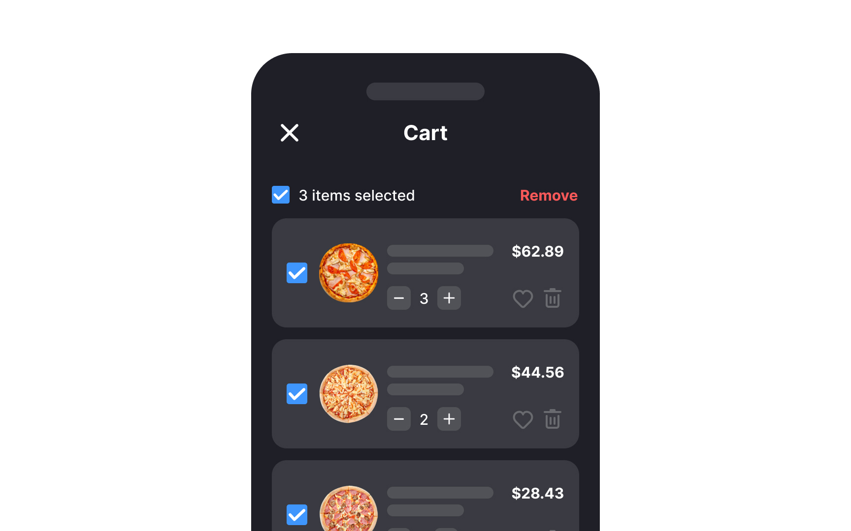
When users have to delete items from their
In designing e-commerce websites, it's essential to use a
On desktop interfaces, where there’s more screen real estate, complementing the icon with a clear label, like "Your Cart" or "View Cart," adds another layer of clarity. This label helps reinforce the icon’s purpose, especially beneficial for users who might be less familiar with standard e-commerce symbols.
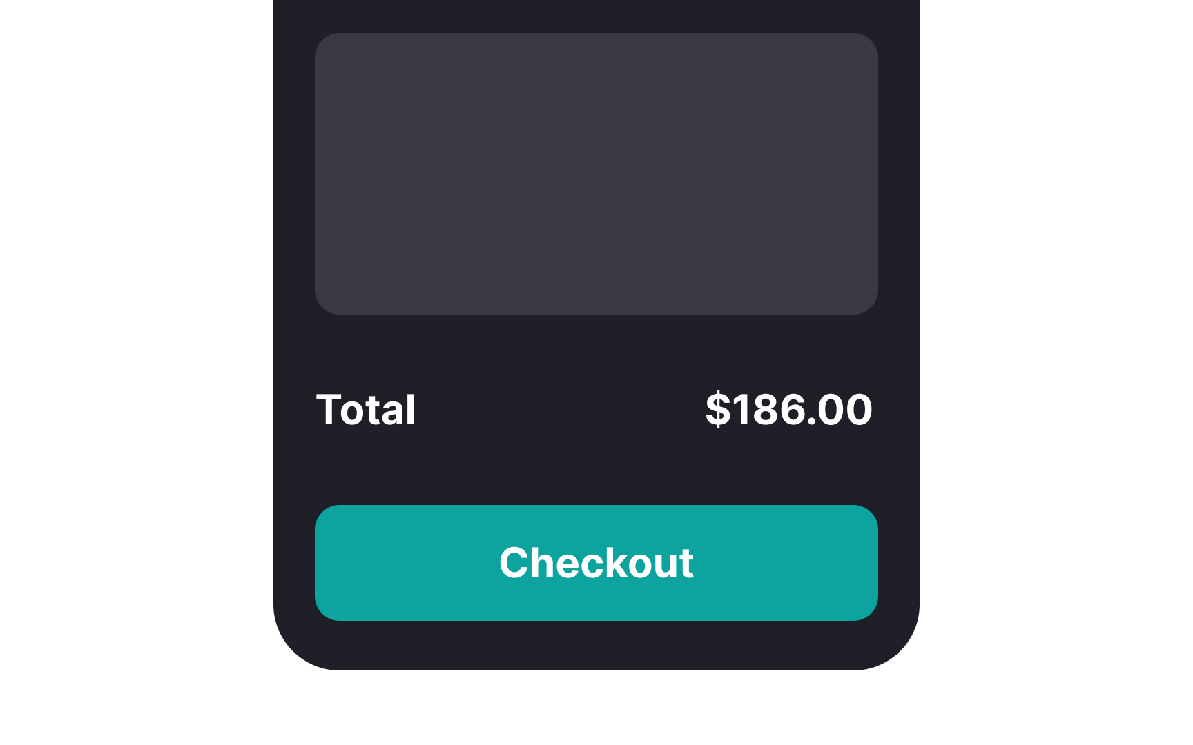
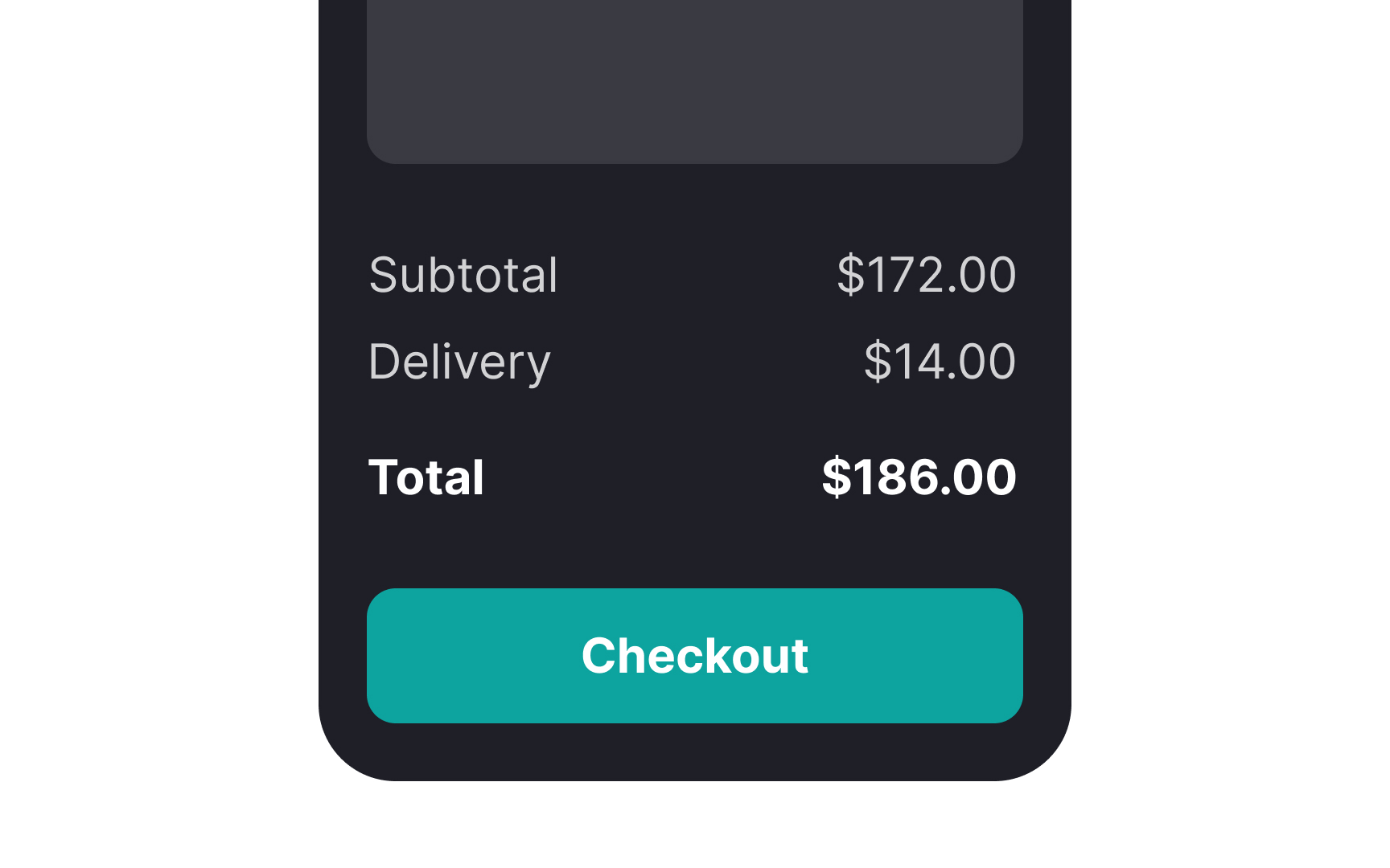
Ensuring users have trust in your platform starts with clear communication, particularly about their
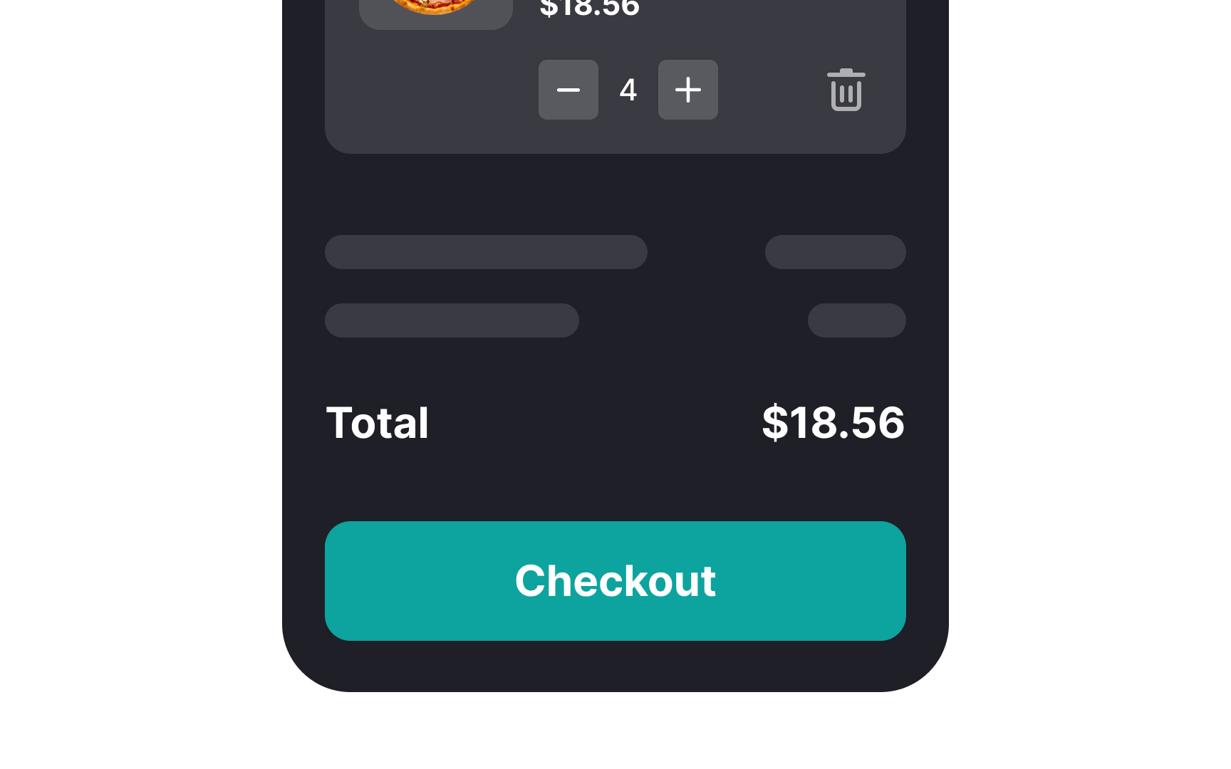
In this summary, users can verify their choices, look over product details, and make comparisons. They have the flexibility to tweak their spending, whether it's to stay within a budget or to tap into discounts. This level of transparency empowers users, boosting their confidence and trust in your service.[3]
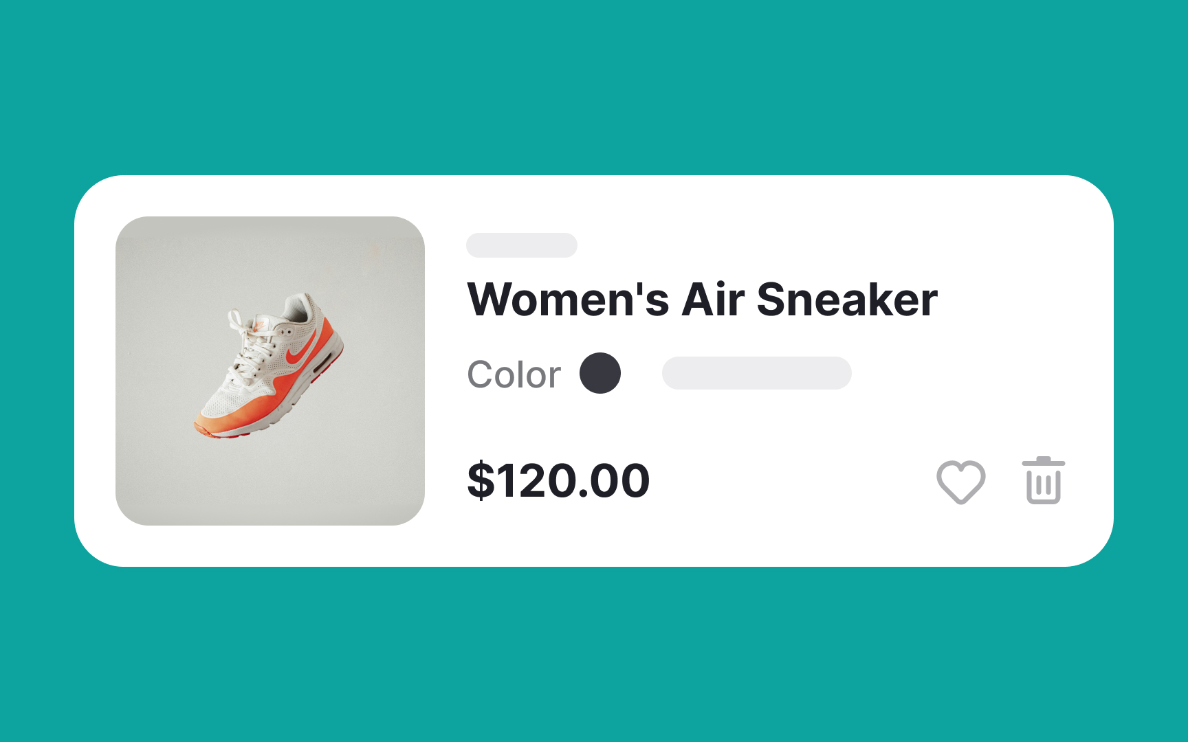
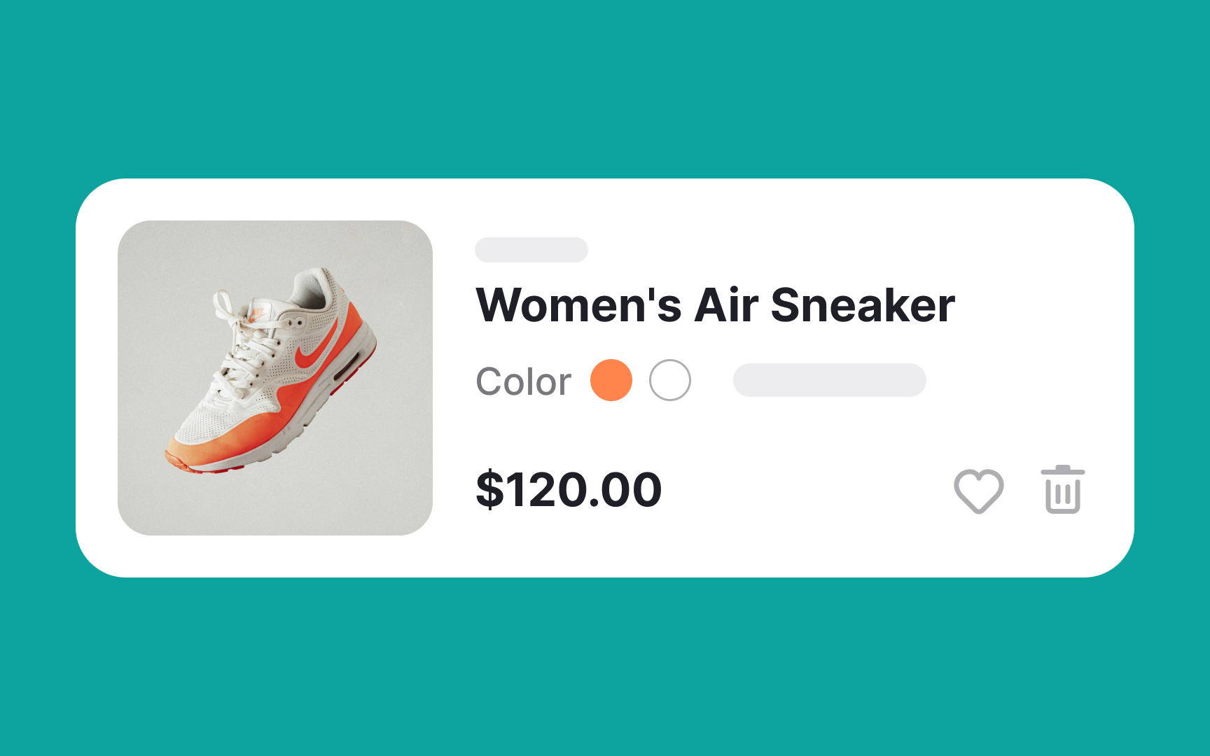
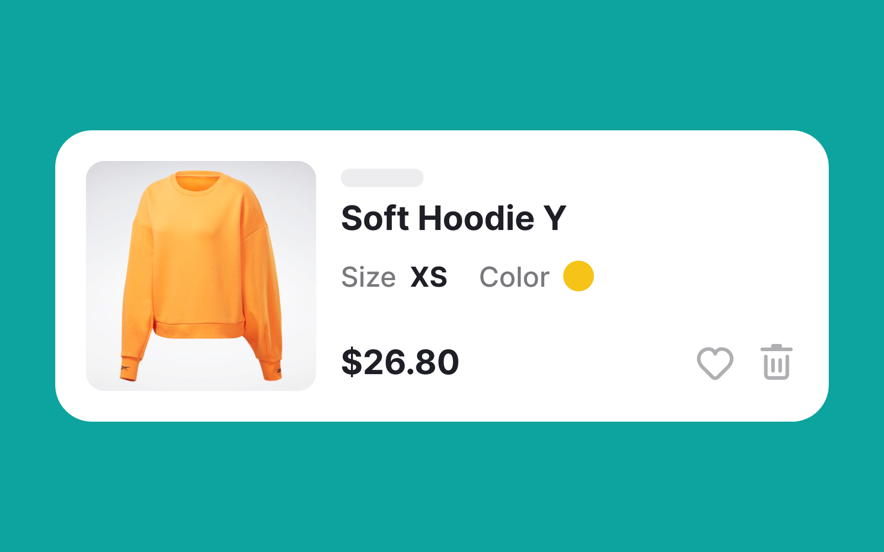
Typically, products come in various sizes and colors. It's important to ensure that the thumbnail image in the
Moreover, ensure that the thumbnail images in the shopping cart are visible enough for users to preview their purchases or compare items before continuing to the
Displaying the correct information is key to building brand trust and eliminating any potential confusion. Accurate, high-quality thumbnails help users quickly confirm their choices, contributing to a smoother shopping experience and reinforcing their confidence in your brand.
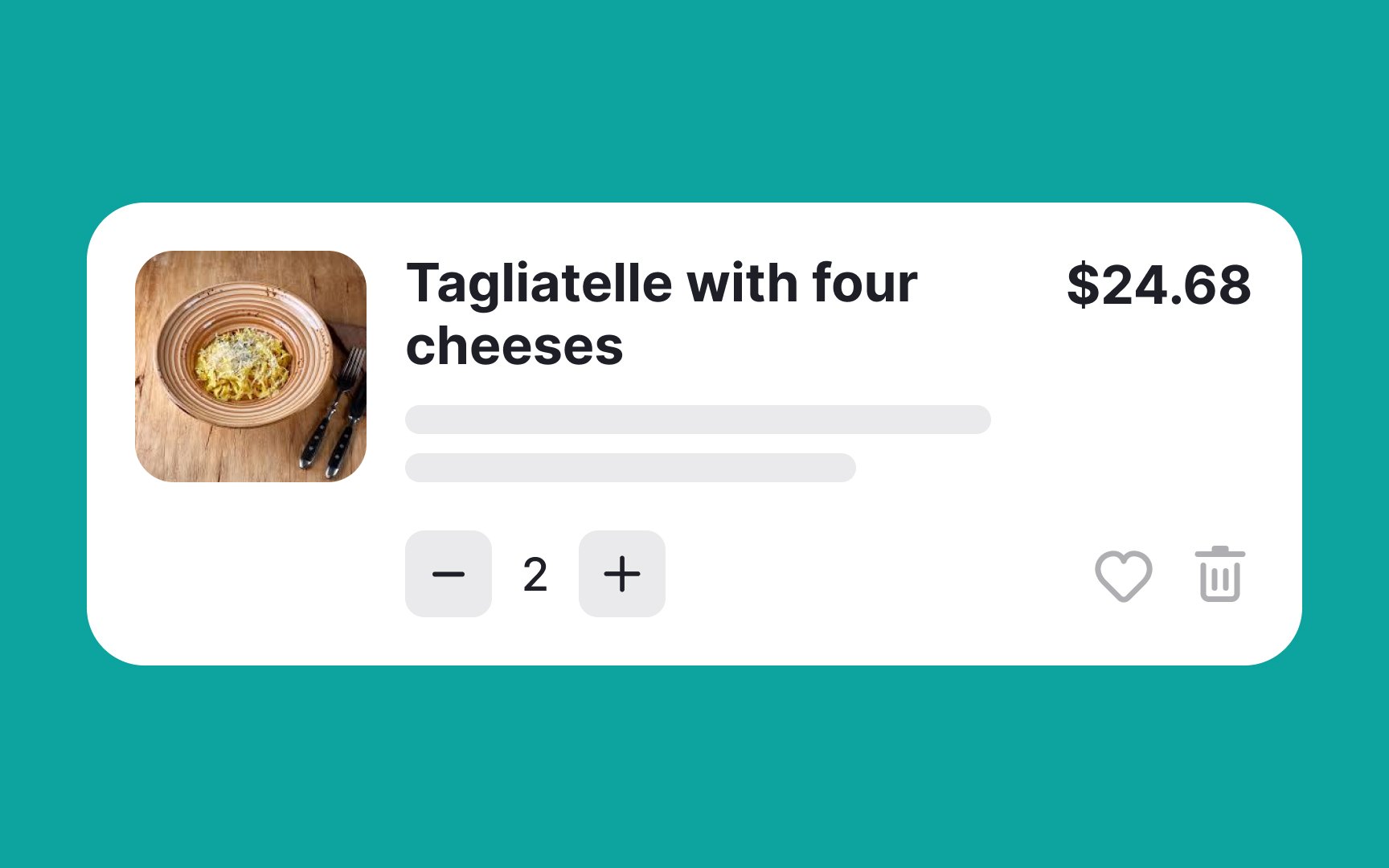
Always display the full product name in the
Also, ensure that both the product name and
Playing around with the natural hierarchy of
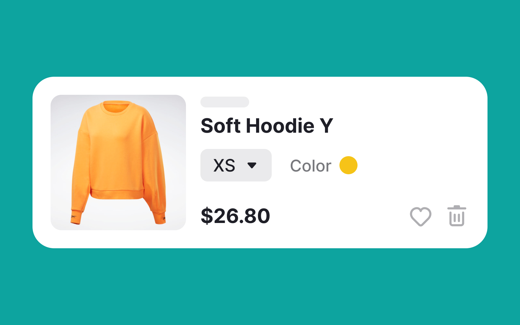
Allow in-cart editing and provide
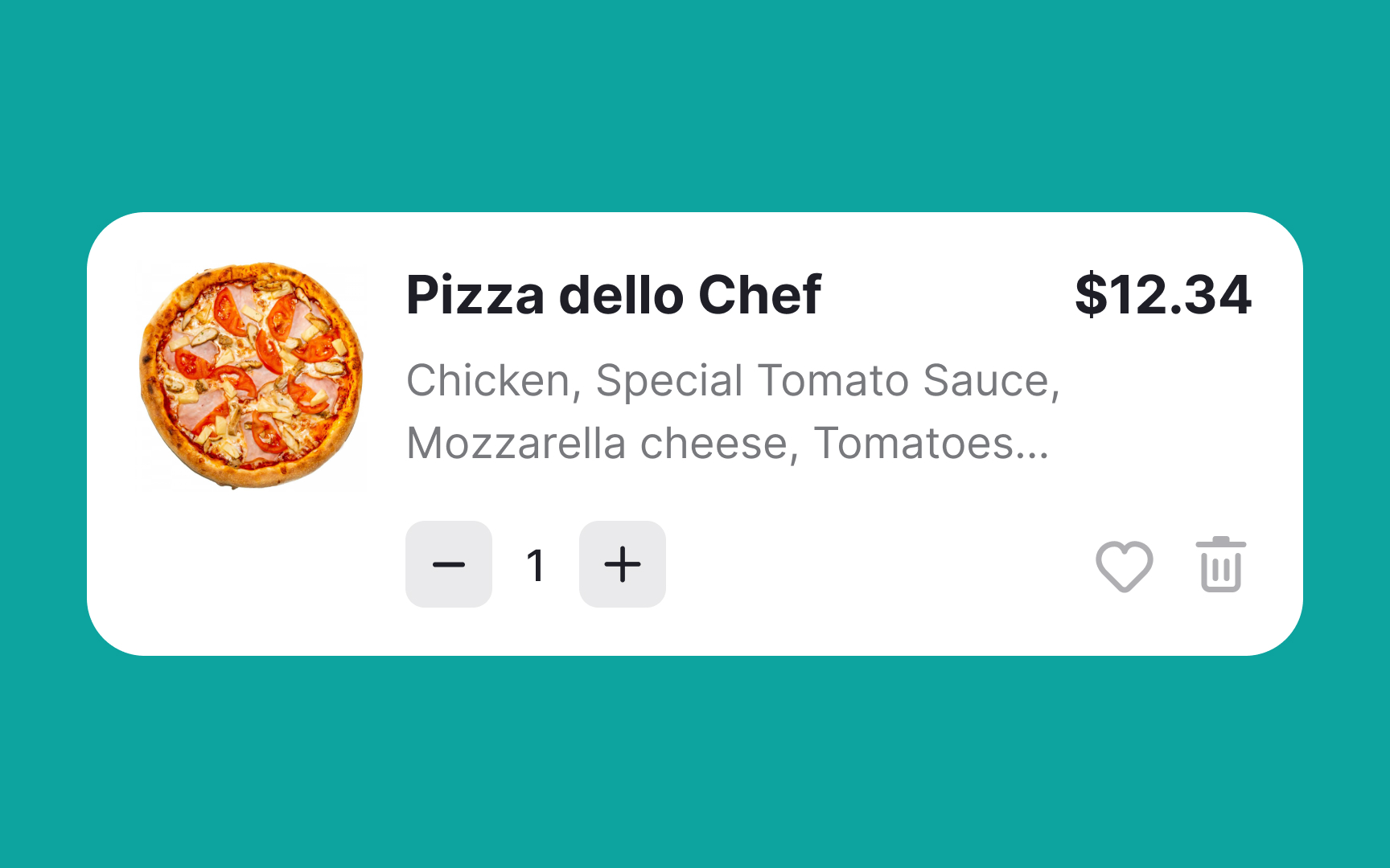
Visual hierarchy is a powerful tool for guiding users through a seamless and intuitive experience. It plays a significant role in shaping how users perceive and interact with a
Utilizing size and font weight effectively can help achieve this. By making the product name and price slightly larger or bolder compared to other elements on the page, you naturally draw users' attention to these crucial pieces of information. This ensures that they are clearly visible and easily digestible, allowing users to make informed decisions without confusion or hesitation.
References
- Adding an Item to a Shopping Cart: Provide Clear, Persistent Feedback | Nielsen Norman Group
- Decision Making in the Ecommerce Shopping Cart: 4 Tips For Supporting Users | Nielsen Norman Group
Top contributors


Topics
From Course

Share


Similar lessons

Login & Signup Flows

User Onboarding
