Shadows & Blurs
Explore Figma's functionality for adding realistic and visually appealing shadows.
Shadows play a crucial role in design by adding depth, dimension, and emphasis to elements, making your designs more dynamic and engaging. In Figma, crafting beautiful and effective shadows is straightforward, thanks to a range of customizable options.
Each shadow type can be finely tuned with settings for color, opacity, blur radius, and X/Y offsets, allowing you to simulate lighting and depth with precision. For example, a subtle drop shadow with low opacity and a larger blur radius can make a button appear clickable without overwhelming the design. Using these tools, you can create shadows that add life to your interfaces, from subtle text shadows that improve readability to pronounced shadows that highlight interactive elements.
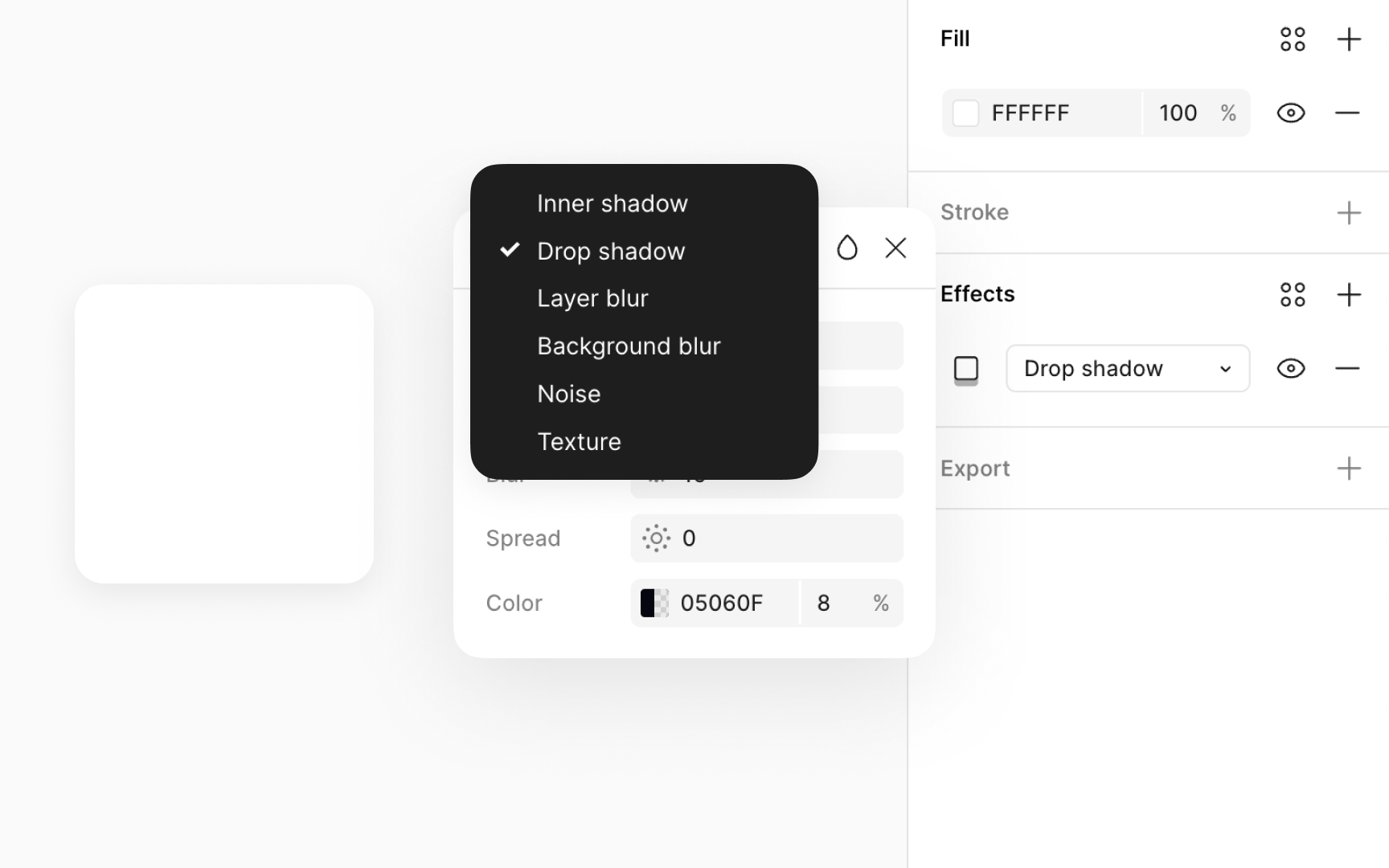
Figma offers four effect types:
- Drop shadow
- Inner shadow
- Layer
blur - Background blur
These effects can be layered with blend modes and
Drop
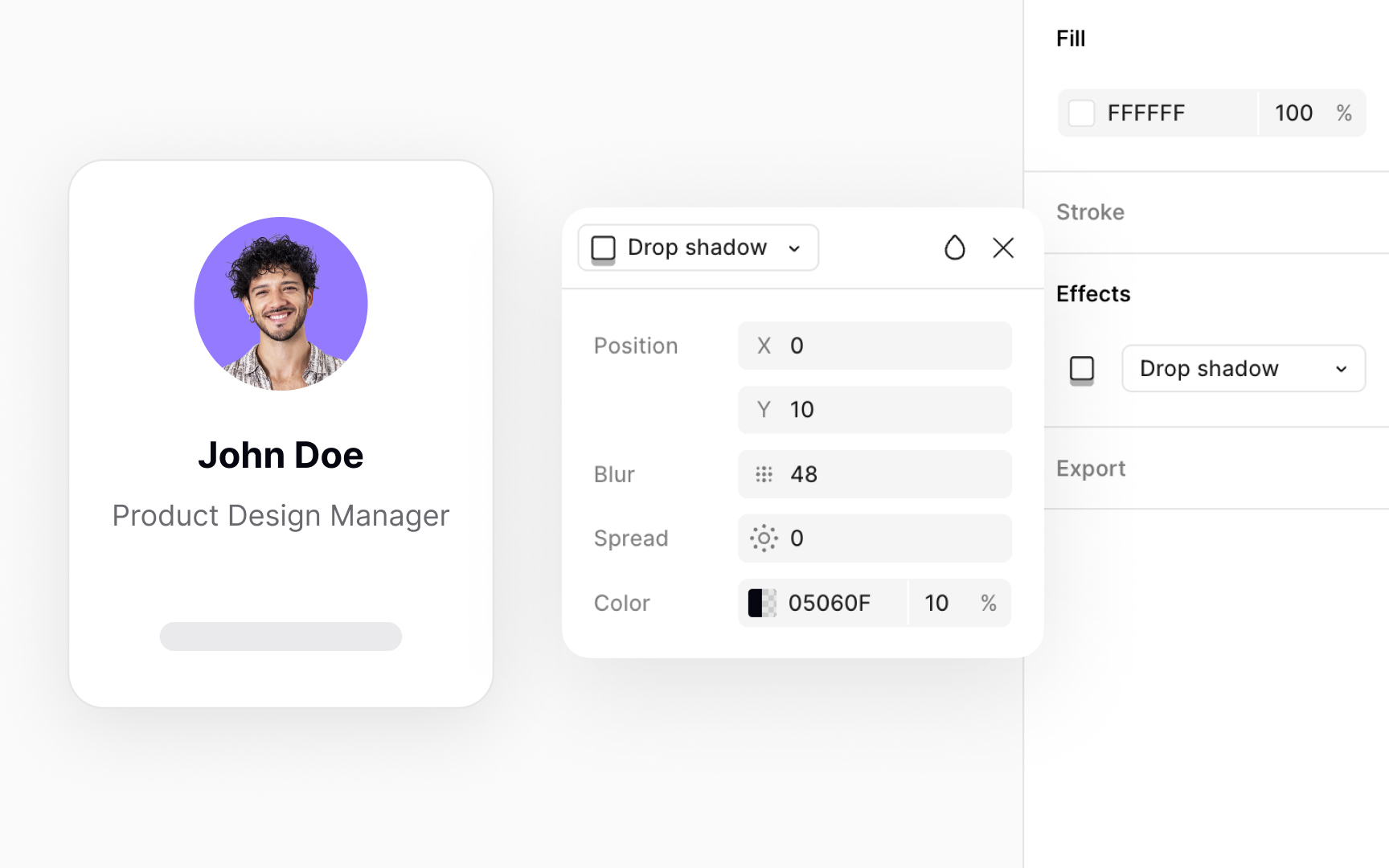
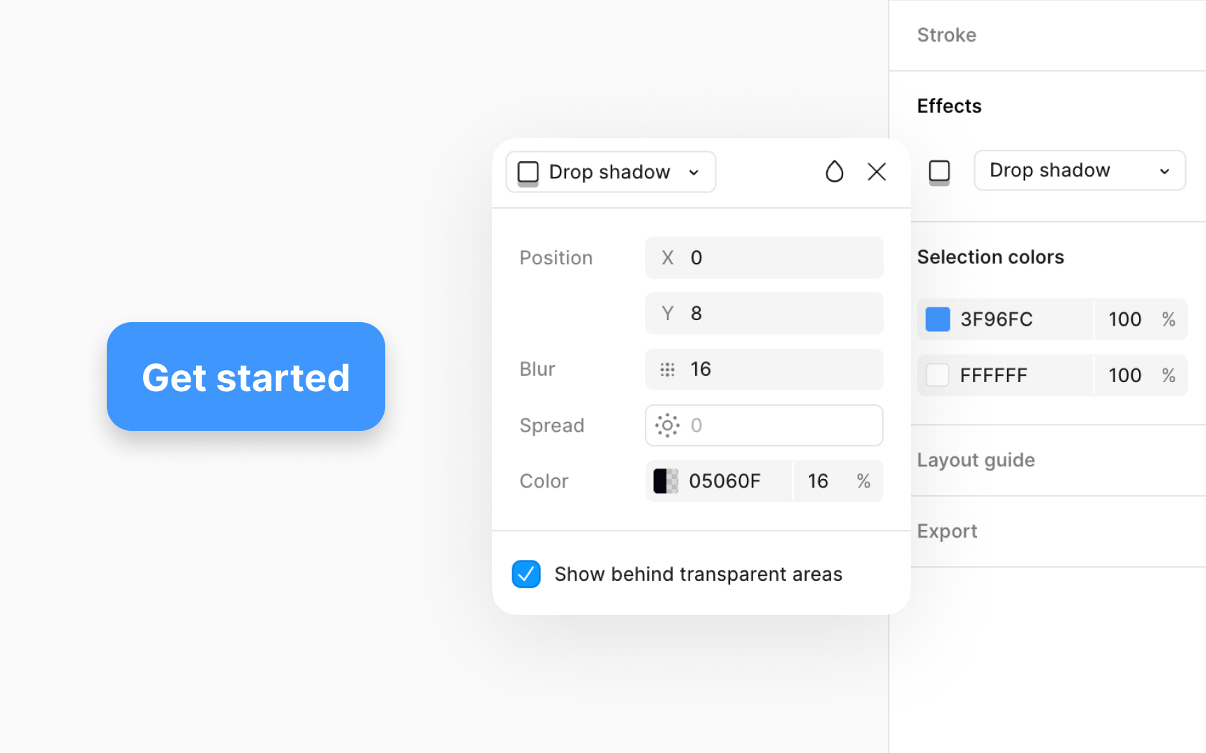
To apply a realistic drop shadow to an element:
- Head to the Effects section in the Design panel.
- Select Drop shadow from the
dropdown . - Click on the Effect
settings icon on the left of the dropdown to reveal amodal with more settings. - Set the
opacity to around 8-16% to keep shadows soft. - Adjust the
blur to 8-12px for a natural blur. - Use 2-4px offsets to mimic natural lighting, with X for horizontal light direction and Y for vertical.
- Opt for a dark grey with adjusted opacity over solid black for a more lifelike shadow. Alternatively, you can use the same
color as the element's fill or a branding color of the interface. - For spread, a value of 2-4px works well for most designs, adding subtle expansion without overpowering the element.
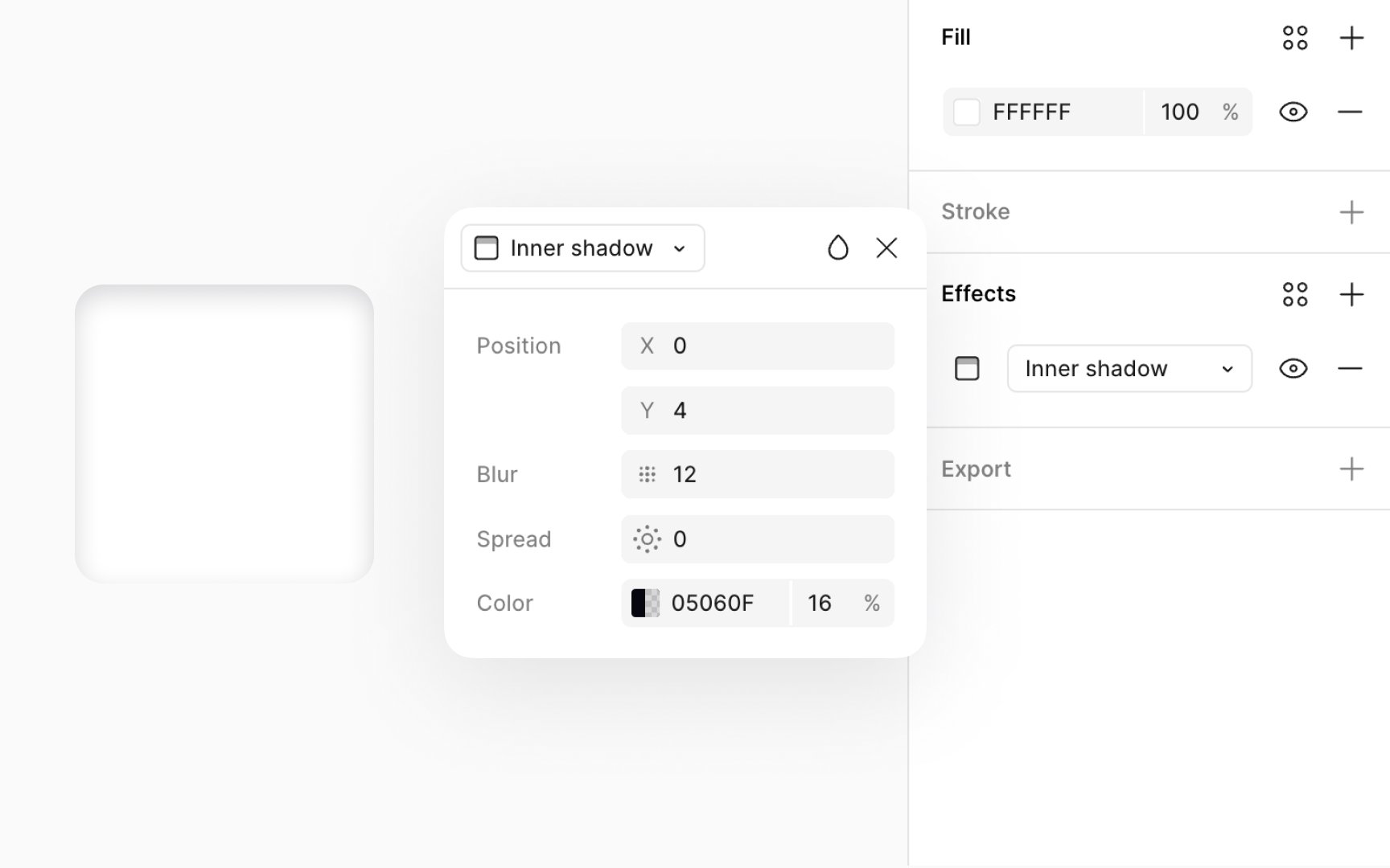
Inner
Inner shadows are great for:
- Adding depth to text, making it pop
- Creating a recessed or indented look on objects
- Indicating an active or clicked state for
buttons , enhancing UI interactivity.
For crafting an inner shadow for a clicked button, use these specific
- Opacity: 30-40% to achieve a subtle, yet discernible shadow
- Offsets: X: 0px, Y: 2px to simulate the shadow falling inside the button
- Color: Use a
color slightly darker than the button’s background — for a light button, a dark grey like #646464 can work well - Blur: 4-6px to soften the edges of the shadow, making it appear as if the button is pressed down.
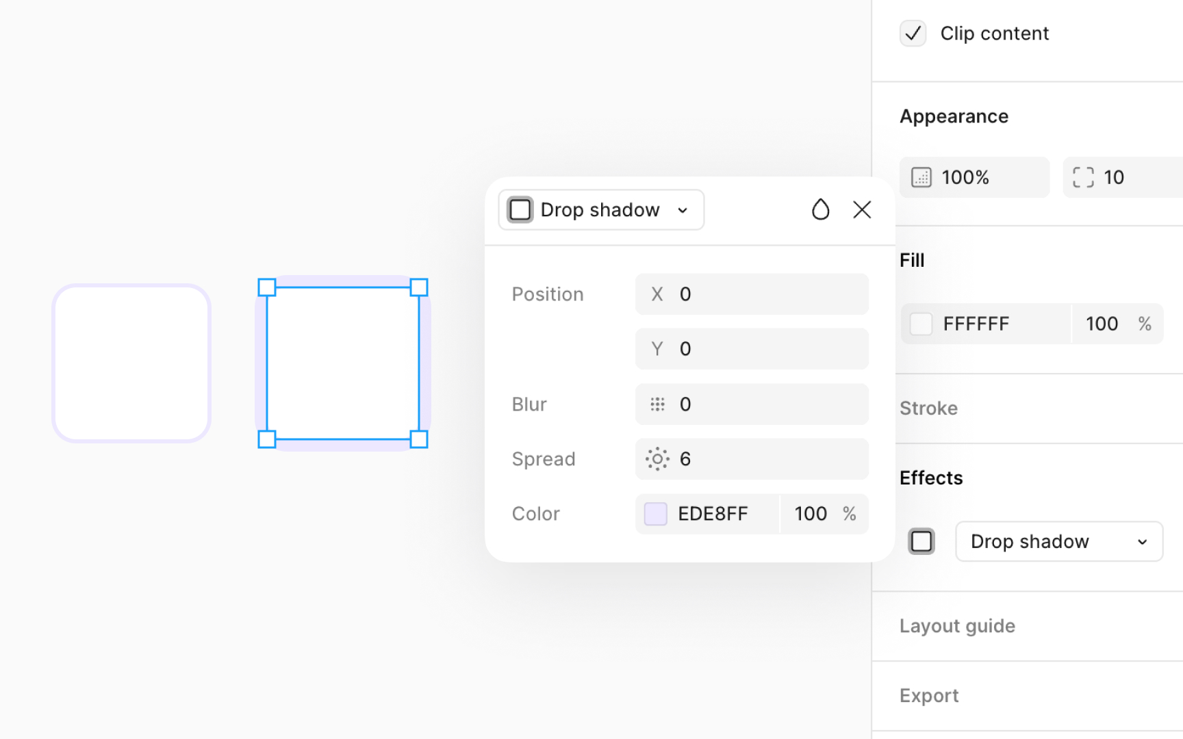
To use shadow spread on frames or components, make sure Clip content box is checked in the Design panel under the Layout section. This option ensures that any shadow applied doesn't exceed the boundaries of the object it's applied to. Also, your element needs to have a visible fill set to at least 1%
To adjust the shadow spread, go to the Effects section on the Design panel. Click on the Effect settings
- X offset: Moves the shadow left or right. This simulates the horizontal position of your light source. For example, a positive value moves the shadow to the right, suggesting the light comes from the left.
- Y offset: Moves the shadow up or down. This mimics the vertical position of the light source. A positive value here drops the shadow lower, indicating the light is above the object.
Using both X and Y offsets together, you can precisely control the shadow direction, making objects appear as though they're lifted off the page or embedded within it. This technique is perfect for
To adjust the shadow offsets, go to the Effects section on the Design panel. Click on the Effect
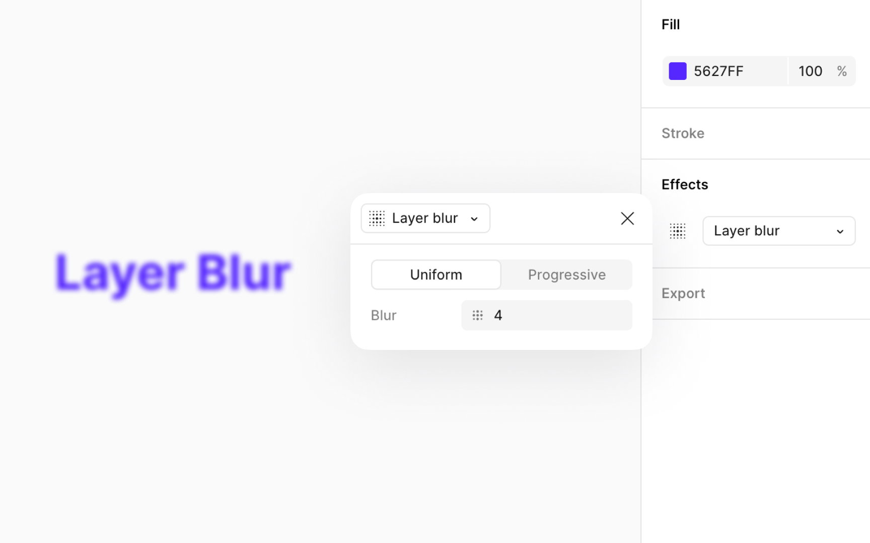
Blurs can improve your designs by adding a sense of motion, depth, or focus. They’re useful for obscuring sensitive data or personal details, reducing distractions, and emphasizing key elements. Blurs can also mimic camera effects like bokeh or depth of field. For backgrounds, a slight
To add a blur effect, go to the Design panel, open the Effects section, and choose Layer blur from the
- Uniform blur: Applies a constant blur across the entire layer. Select the Uniform option and enter the desired blur value.
- Progressive blur: Applies a blur that increases or decreases gradually across the layer. Select the Progressive option to adjust the start and end blur values. This works well for simulating depth or directional focus without using extra layers or masks.
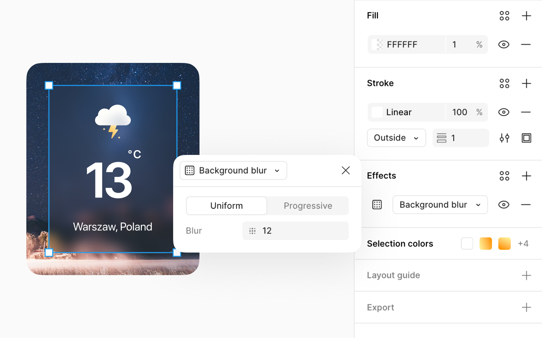
Background blurs add a soft, out-of-focus effect to the area behind a selected layer, unlike layer blurs that
To add a background blur effect, go to the Design panel, open the Effects section, and choose Background blur from the
- Uniform blur: Applies a constant blur across the entire layer. Select the Uniform option and enter the desired blur value.
- Progressive blur: Applies a blur that increases or decreases gradually across the layer. Select the Progressive option to adjust the start and end blur values.
Keep in mind that for the blur effect to be visible, the selected layer must have some transparency. You can adjust the top layer's


Similar lessons

Common UI Component Definitions I

Image Terminology
