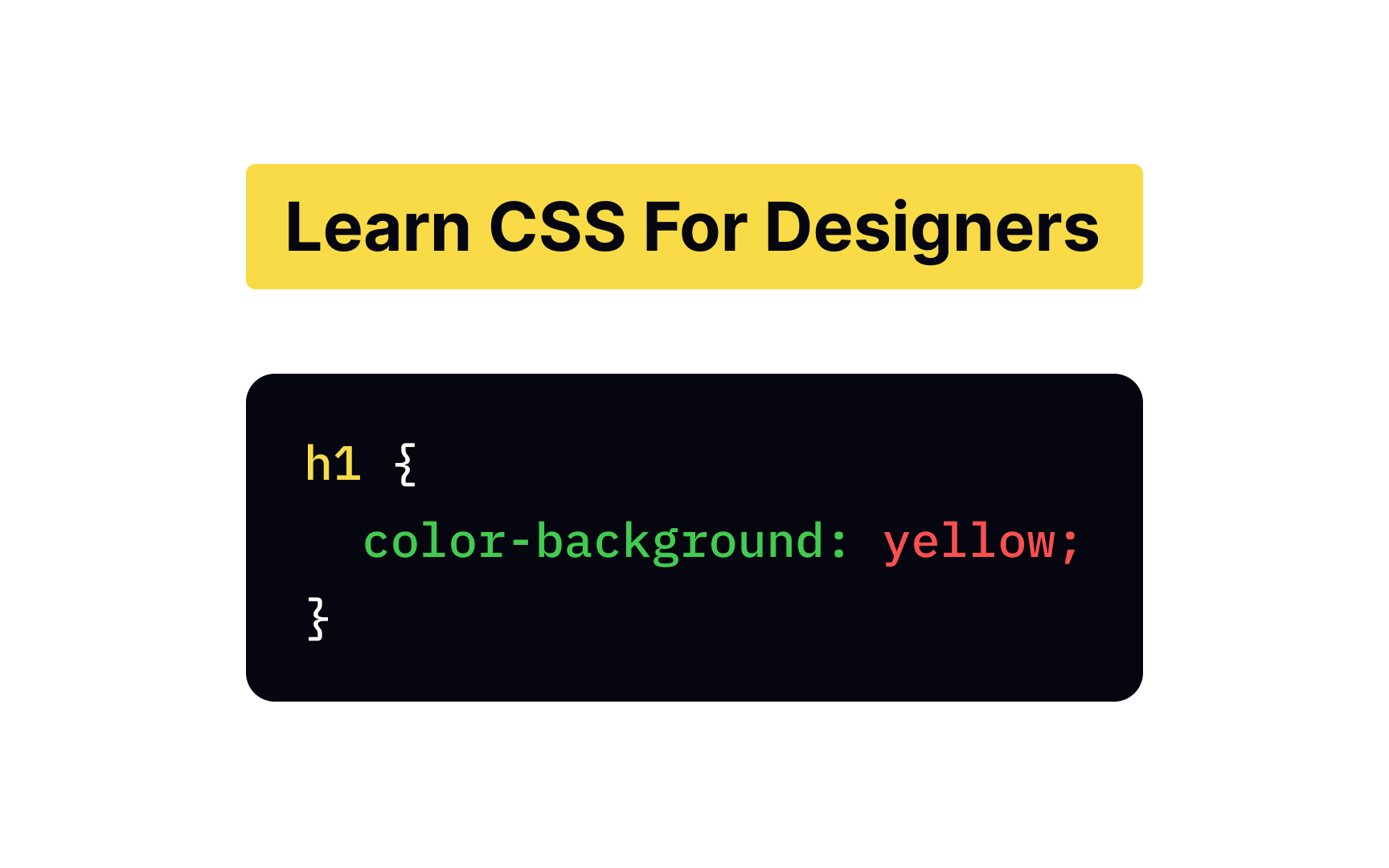
<?xml version="1.0" encoding="utf-8"?>

Some designers still find CSS daunting and challenging to learn. The good thing is that you don't have to learn everything to master CSS and create appealing interfaces. With CSS knowledge, you have much more control over your designs — you can implement them exactly how you intend them to look. Plus, you don't need a developer to troubleshoot an issue.

Even though HTML and CSS are separate languages, you never use one without the other. If you haven't already been through our HTML for Designers course, we recommend you start with an intro to HTML before learning CSS.

Exercise #1

Cascade

Cascade Bad Practice
Cascade Best Practice

To better understand what CSS is, let's have a closer look at what the abbreviation stands for — Cascading Style Sheets. The word "cascading" implies that styling rules "cascade" down from different levels. In other words, in CSS syntax, the order matters. When style rules have equal specificity, the last rule in a file has a higher priority and overrules the ones listed above it.

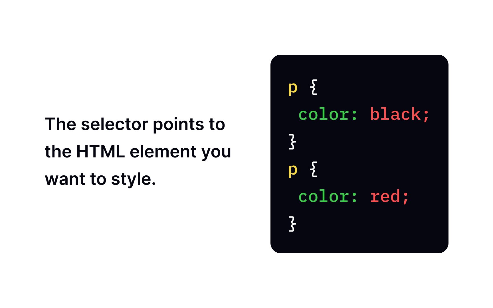
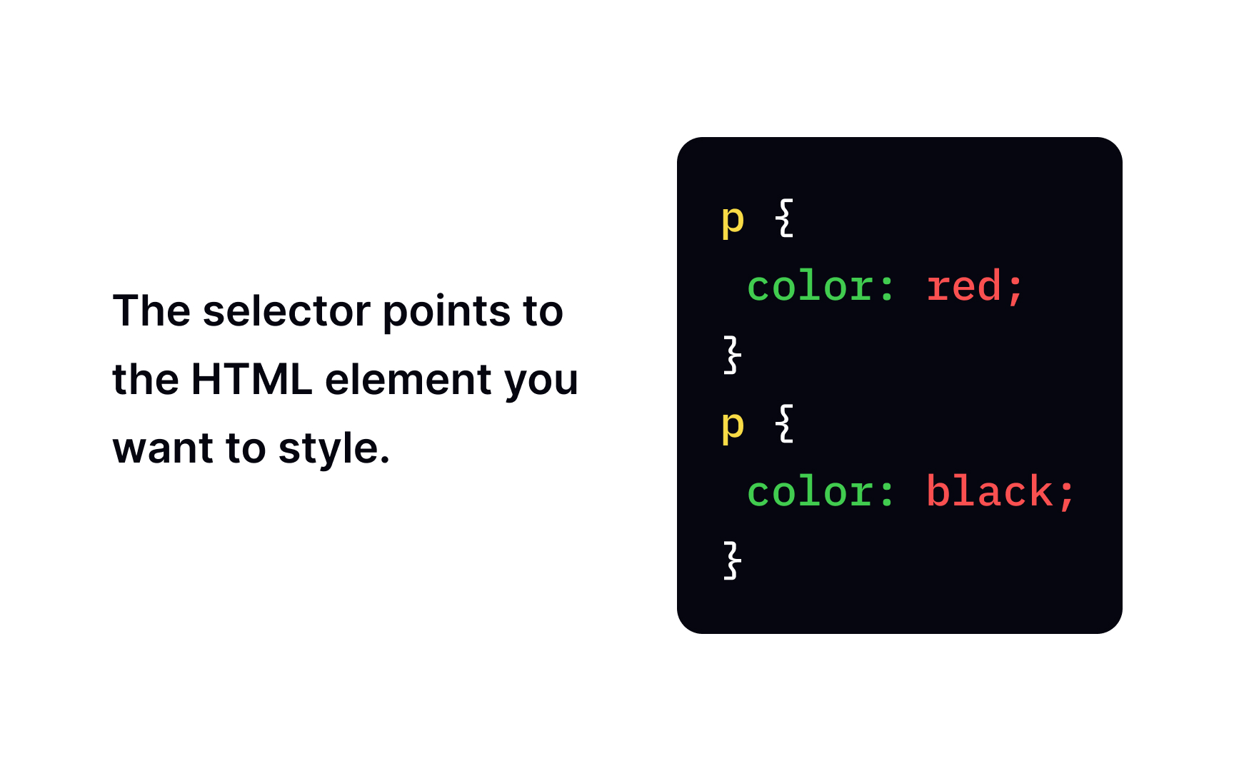
For example, imagine you're a designer, and the client sends you a task: "Make the <h1> red." In an hour, they send you an update: "Make the <h1> blue." What color will you set for the headline? The last word has a bigger weight. The headline should be blue. Yes, it has lower precedence, but that's how CSS works.

Exercise #2

Applying CSS

Applying CSS

Let's say that you composed a style sheet, and it's ready to go. How can you apply CSS to your HTML page? There are 3 ways:

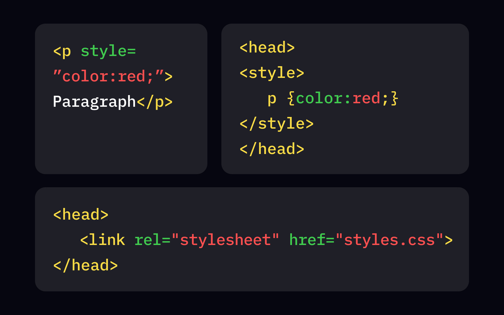
  • External stylesheet: You add a standalone CSS file from an external resource. This one file can change the look of the entire website.
  • Internal stylesheet: You add the <style> element in the head section of an HTML file and apply them only to this particular web page.
  • Inline styling: Inline styling applies unique rules to only one component using the <style> attribute.
Exercise #3

CSS default page style

CSS default page style Bad Practice
CSS default page style Best Practice

The default page style is like the blank canvas of a painter (or developer in our case) who hasn't touched it yet. Every browser has its own default style, also known as browser or user-agent (UA) stylesheet, which exists to make any website readable by default if you haven't applied any styles yet.

Default style varies slightly from browser to browser but generally includes some basic settings for buttons, links, padding, margin, borders, different headings, and other useful things. If you want to see browser defaults to make sure they'll comply with your cascading sheets, you can find them online, e.g., Chrome default styles.[1] Some developers use special tools like Meyerweb's CSS reset or Normalize.css to remove those defaults.

Exercise #4

CSS background-color property

CSS background-color property Bad Practice
CSS background-color property Best Practice

For setting a background for elements, we use the background-color property. To specify the color, developers usually refer to its valid HTML name,[2] HEX, RGB, or other codes supported by CSS.[3]

Exercise #5

CSS property for setting text color

CSS property for setting text color Bad Practice
CSS property for setting text color Best Practice

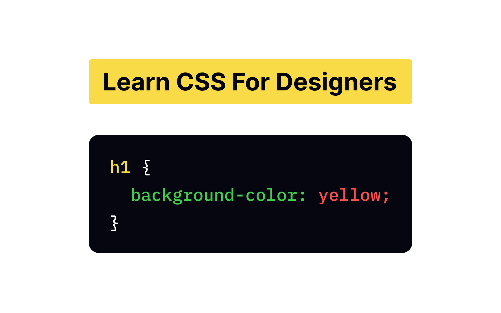
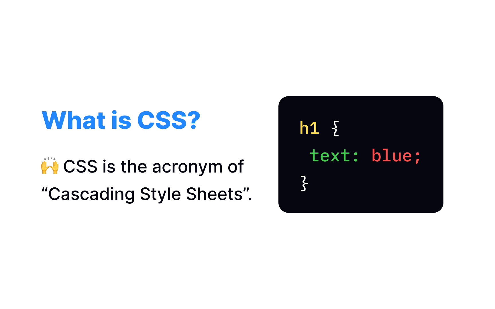
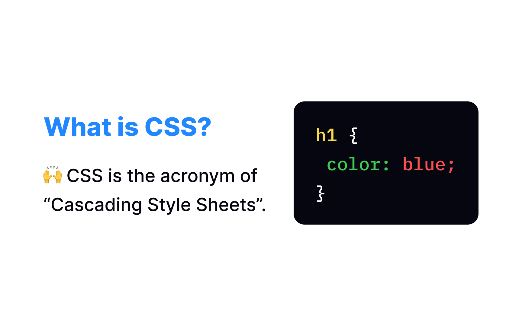
You can apply a wide range of formatting properties to text with CSS. You can change text color, align its position, transform its direction, specify the line height to add more space, make it bold, italic, or underlined — you name it! In the example, to change the color of a heading, we apply the color property using an internal stylesheet. As with the background-color property, developers use HTML color names, HEX, RGB, or other color codes to specify a certain color.

In this example, we inserted styles with an external stylesheet method that separates CSS code from HTML, by linking the .css file inside the <link> element.
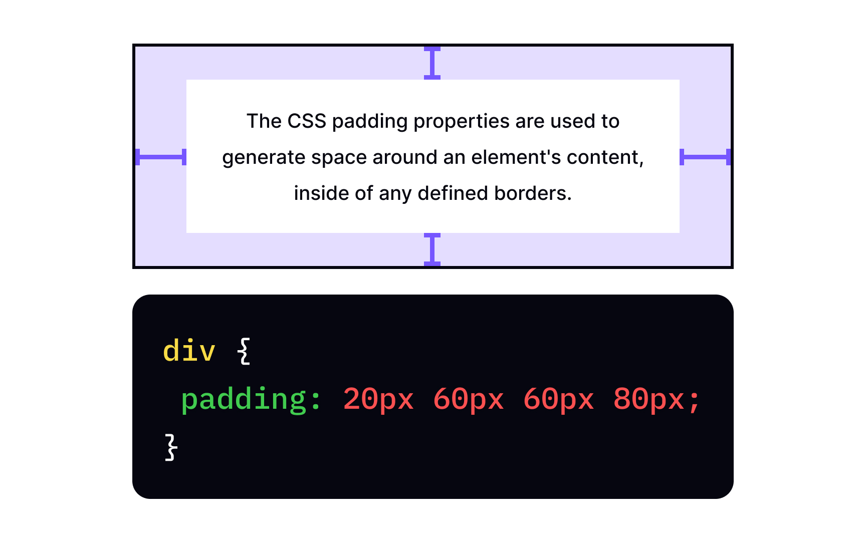
Exercise #6

CSS padding property

CSS padding property Bad Practice
CSS padding property Best Practice

Padding creates space around an element within the defined borders of its container. We need padding to let the content breathe and bring visual clarity to the design. CSS provides you complete control over the padding.

You can either use a common padding property and define all four values (top, right, bottom, and left padding) at once. Or you can specify each value separately with the padding-top, padding-right, padding-bottom, and padding-left properties.

Exercise #7

CSS margin property

CSS margin property Bad Practice
CSS margin property Best Practice

Unlike padding, the margin is responsible for external affairs. It creates negative space outside the element's borders and prevents it from bumping into other content parts. Without margin, the design will turn into a graveyard with no fresh "air," which is negative space.

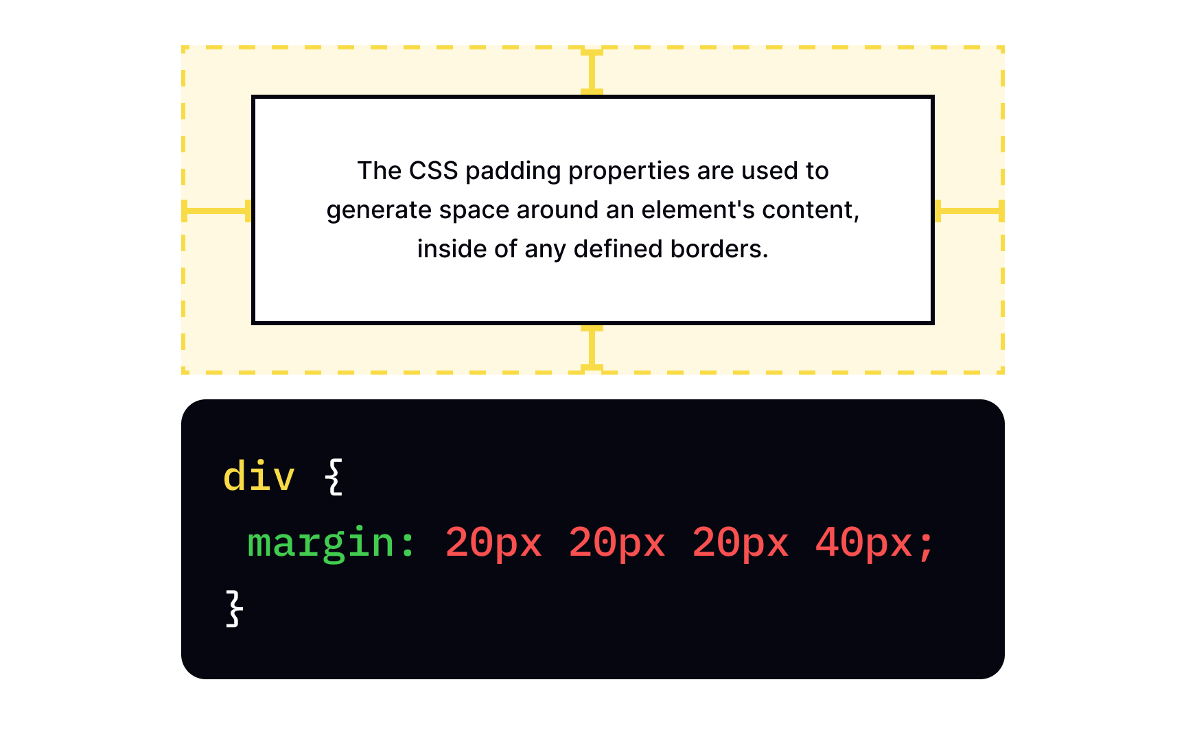
You can either select a shorthand margin property and list all values separated by spaces or use unique properties for each element's side (margin-top, margin-right, margin-bottom, and margin-left).

Exercise #8

CSS text-align property

CSS text-align property Bad Practice
CSS text-align property Best Practice

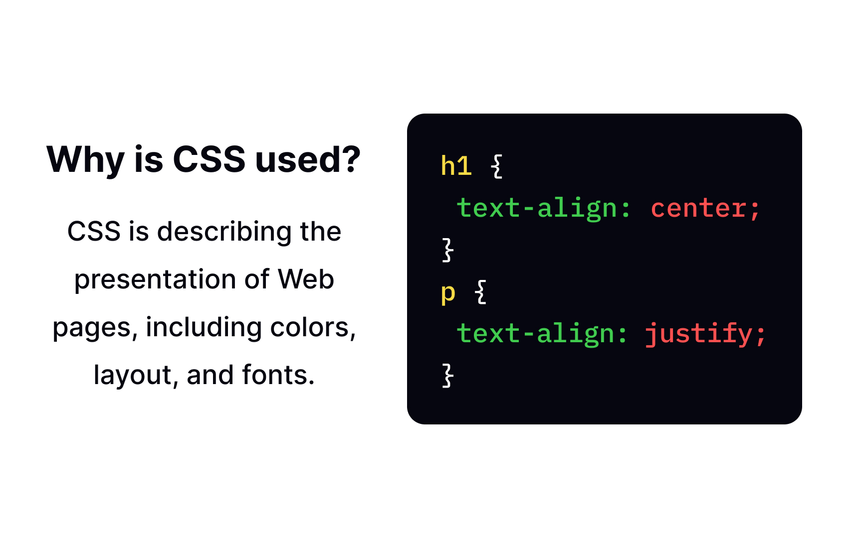
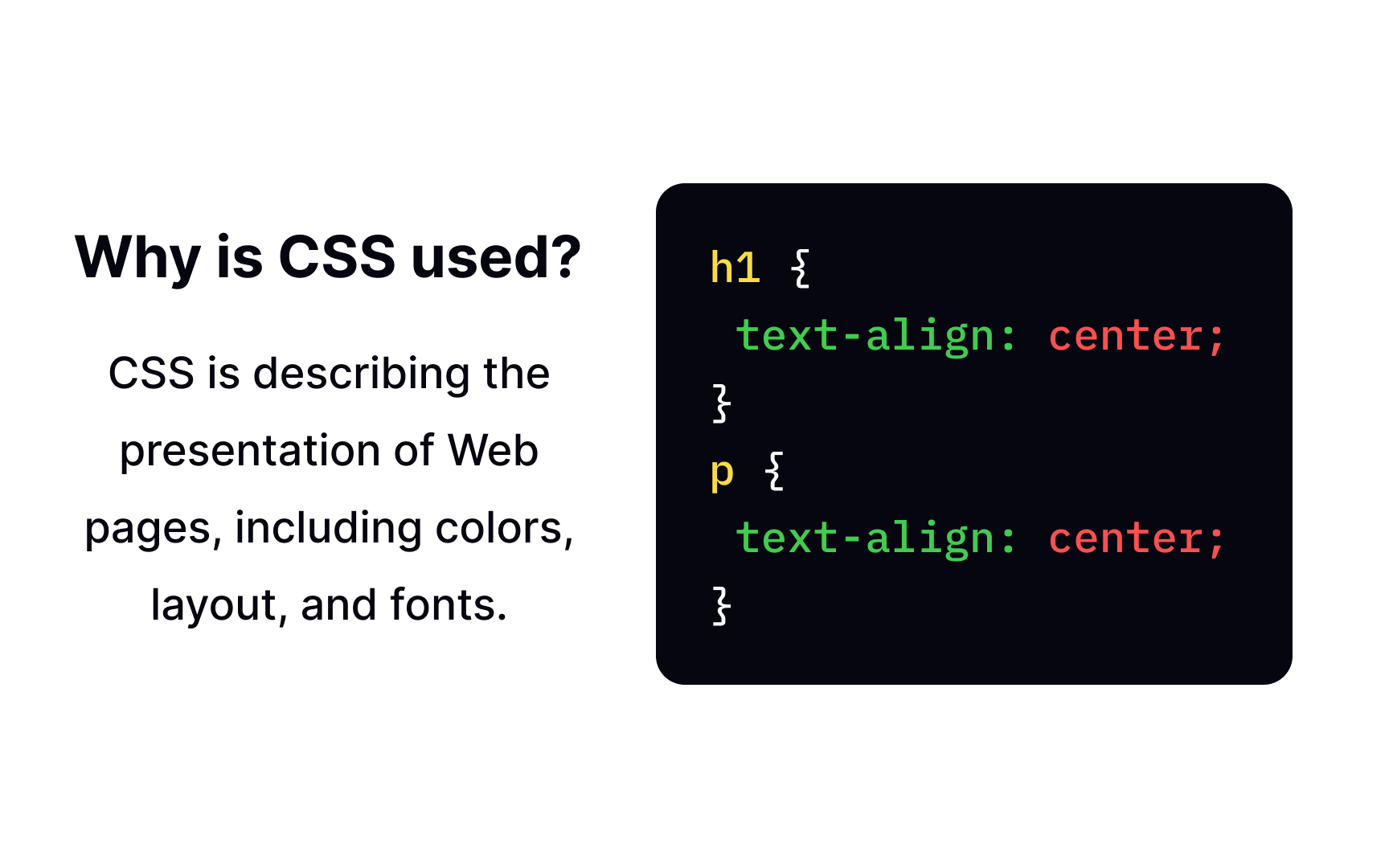
For horizontal text alignment, developers use the text-align property. It allows you to apply centered, left, right, or justified alignment (which stretches the lines so that each line has equal width). The respective values are center, left, right, or justify.

Like in the example, centered alignment is a good fit for titles and short copy, while the left alignment is the most popular type for large blocks of text.

Exercise #9

CSS font-size property

CSS font-size property Bad Practice
CSS font-size property Best Practice

CSS allows you to change the font size, sure thing. However, avoid the temptation to adjust the paragraph's font size and make it look like a heading, and vice versa, make headings look like paragraphs. Use proper HTML tags for headings (
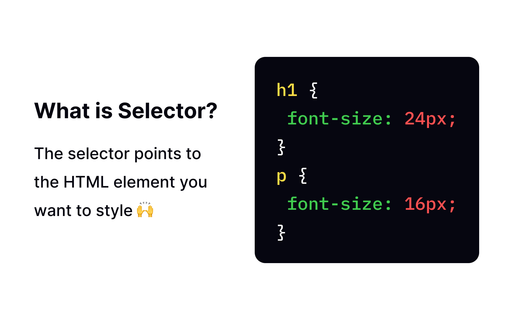
<h1>...<h6>) and paragraphs (<p>) and specify their values according to their priority on a page. It's crucial for visual hierarchy and general scannability.

There are two ways to define the font-size property — using either absolute or relative size values. The first one doesn't allow users to change the text size in all browsers, which is horrible from the accessibility viewpoint. On the flip side, it works perfectly for designs with predefined physical measurements when text needs to match other elements.

Conversely, the relative size allows you to change the font size in browsers. It's the best choice for large body text pieces, so users can change it to fit their needs. Developers usually use pixels to specify the absolute font-size value and em for relative font sizes.

Complete this lesson and move one step closer to your course certificate